The 'Icons Row' section can be used to present short bursts of information to your customers. Use them in combination with predefined icons or with your own images.
Adjust the icon's width and color of this section. Individually adjust the icon style and text for each block. Add up to 6 blocks.
Add blocks by clicking on the small arrow next to the section then clicking 'Add block'.
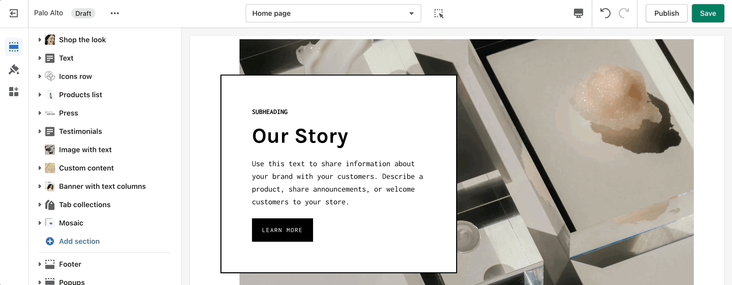
'Image with text' uses a solid color block to make the text stand out over the image. Use this more striking design to grab your customer's attention.
Set up your image, text, positions, and buttons by using these section settings.
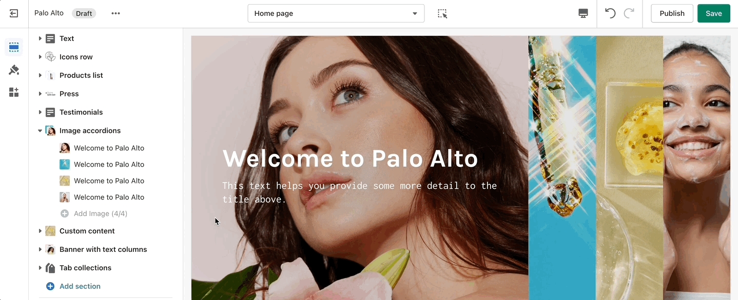
One of our newest sections, Image accordions, allows you to set a unique look and showcase multiple images that reveal more information as you hover over them.
Set a style and height for the section. Set the image, text, and button settings for each block.
Add blocks by clicking on the small arrow next to the section then clicking 'Add block'.
A small section perfect for a brief summary with the ability to use images and showcase your products.
The settings for this section allow you to set two images, links for each image, headings, buttons, text, and a small video link.
The video opens up in a popup box.
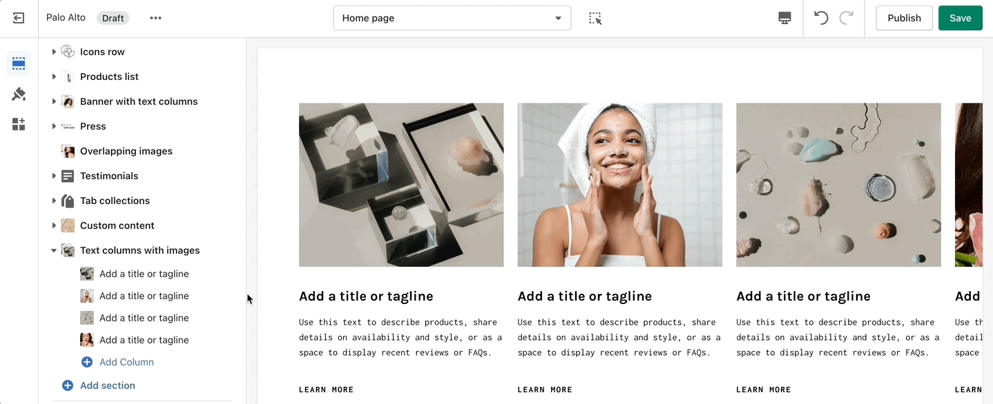
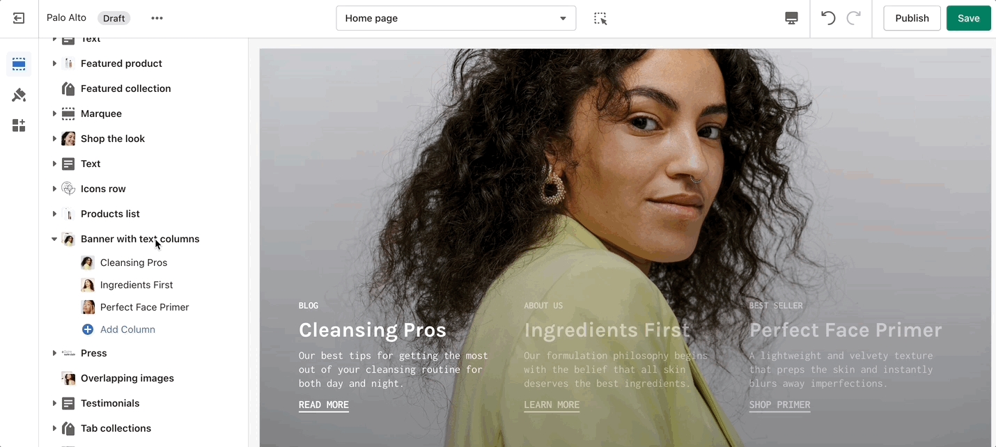
Inspired by the blog posts section, 'Text collums' allows you to create your own highlights from the theme editor without having the need to create blog posts.
Adjust the heading, colors, and general settings of the section. Adjust the individual blocks' text, buttons, links, images, video popups, and more.
Add blocks by clicking on the small arrow next to the section then clicking 'Add block'.
A new way of showing text boxes each with its own background image.
Set the section height and text color from the main section settings. Adjust each individual Column from a new block.
Add blocks by clicking on the small arrow next to the section then clicking 'Add block'.
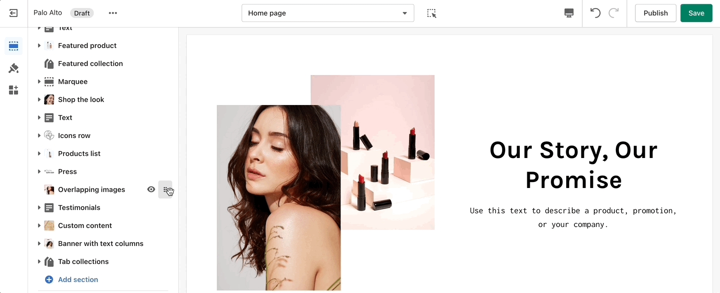
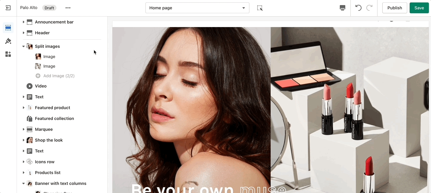
Create a split view to showcase your products or product images.
Set the section height, alignment, and text settings. Set the individual images.
Add blocks by clicking on the small arrow next to the section then clicking 'Add block'.
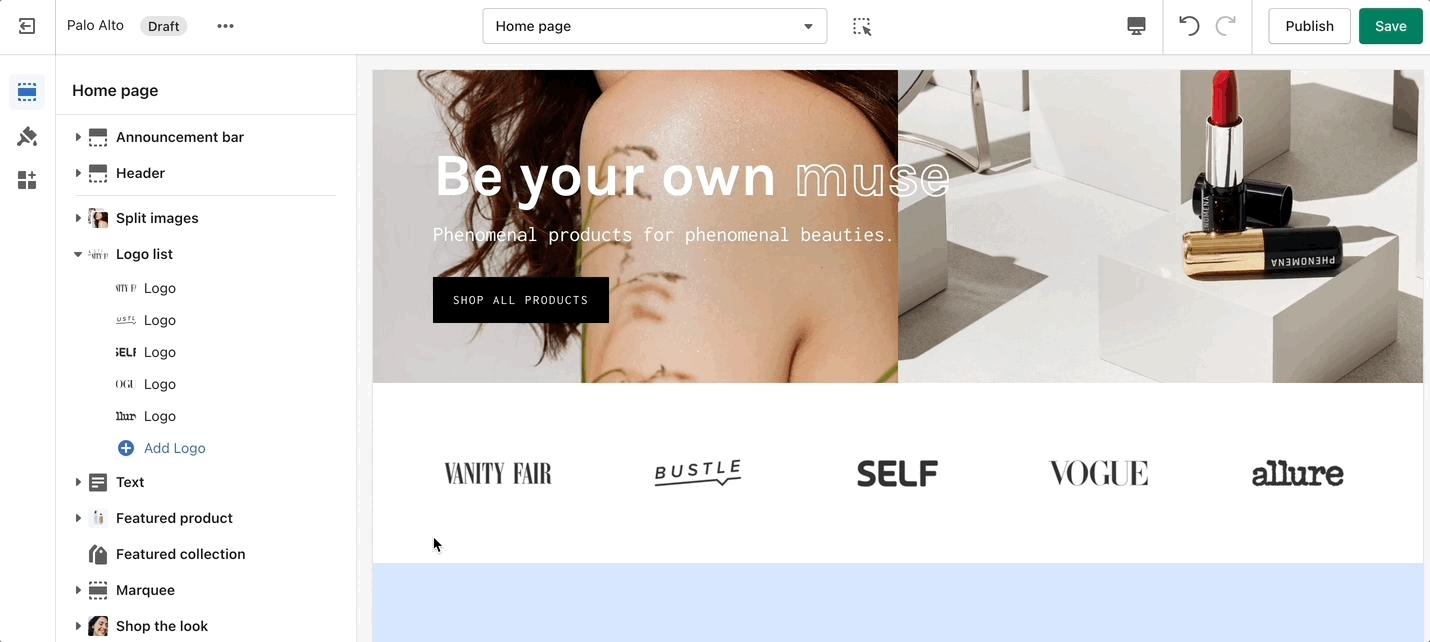
'Logo List' creates a carousel view that you can use to showcase your brand or partnered brand logos.
Add the logos with their respective links. Also, the background color can be changed. Set the individual images and sizes for your logo blocks.
Add blocks by clicking on the small arrow next to the section then clicking 'Add block'.
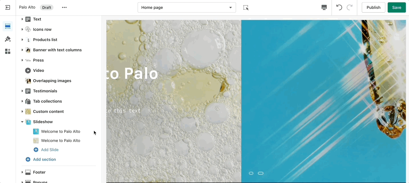
This is the perfect hero section for most stores. Use the Slideshow to create a home page banner with incredible customizability.
Adjust the general settings of the section. Adjust the individual block settings of this section.
If the button text is empty, the whole slide becomes the link.
Add blocks by clicking on the small arrow next to the section then clicking 'Add block'.
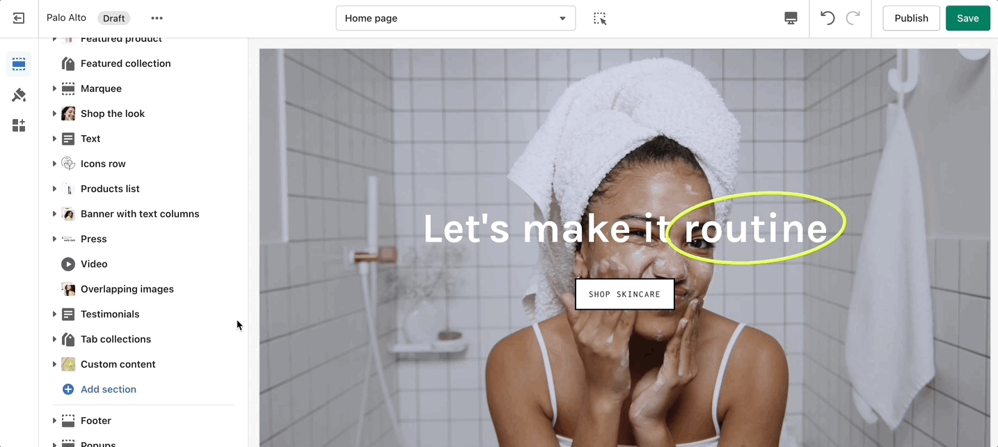
Add a video to your store pages that will autoplay as a background over text.
Set an MP4 link from your Shopify Files and regulate the size of your video section.
Shopify only supports YouTube and Vimeo. For any further customizations, we recommend using a third-party app.
