Product sections
Collection list
The 'Collection list' section is here to help you add links to collections you want to highlight on your store pages. This is a quick and easy way to run promotions or let your customers know about new collections.
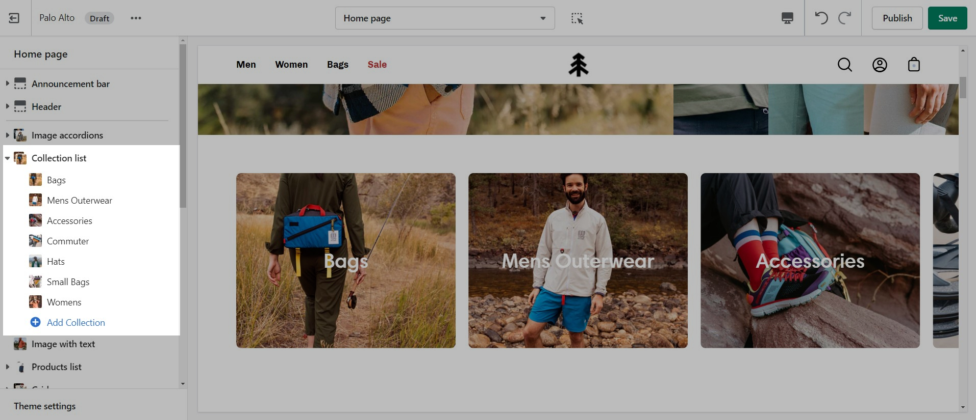
The 'Collection list' section allows you to add up to 12 collection blocks per section. You can use multiple sections to show more collections.
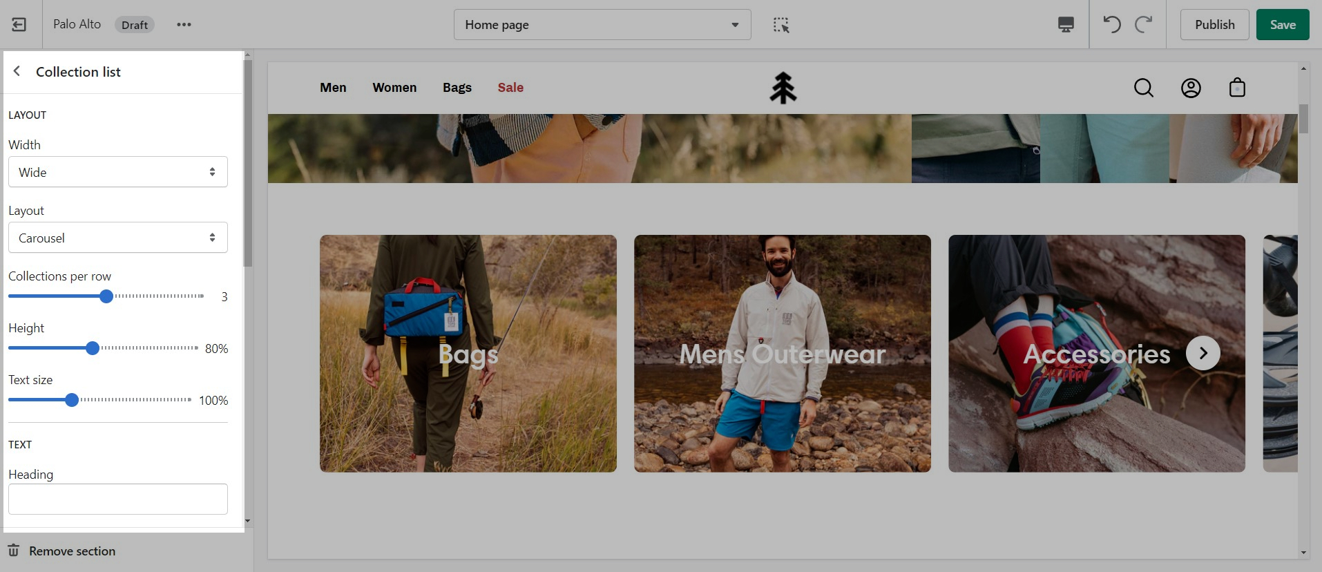
Layout
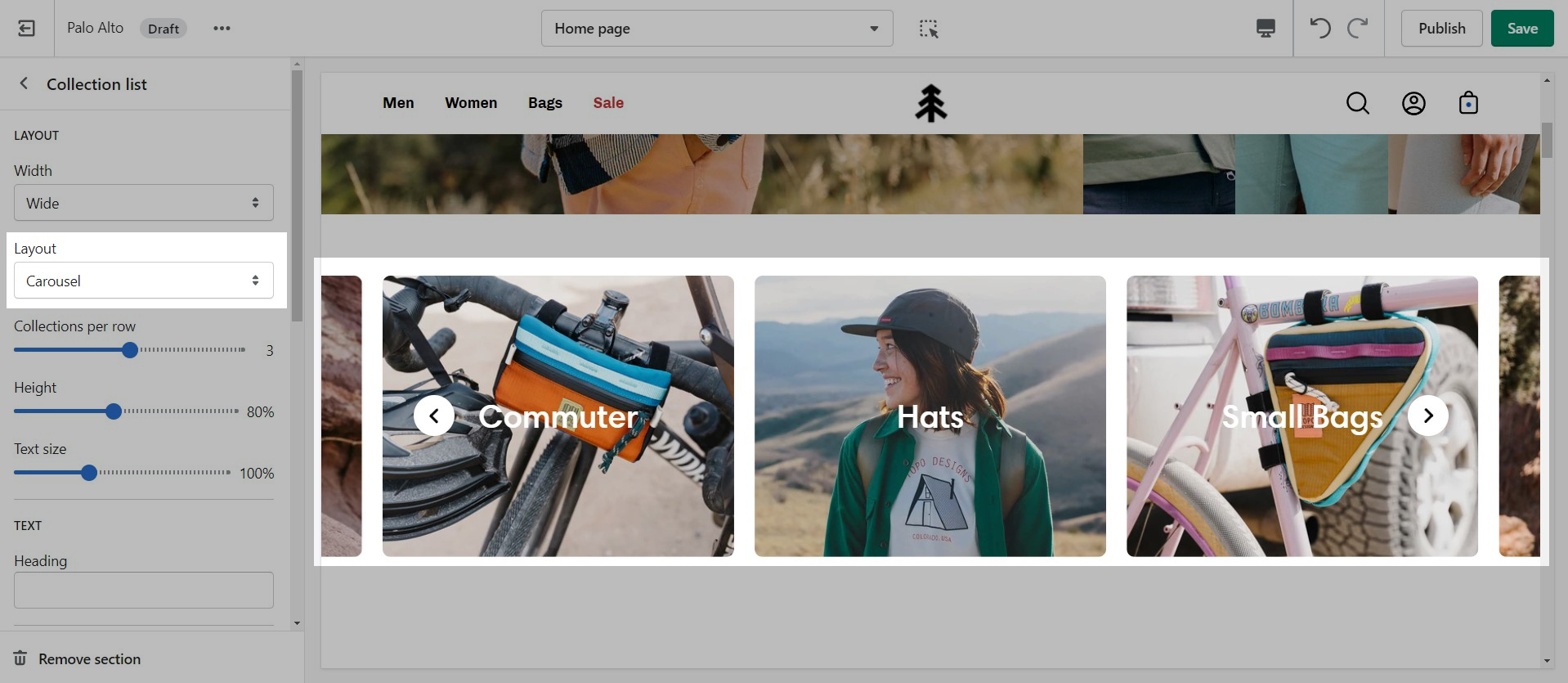
There are two different layouts for this section: carousel and grid:
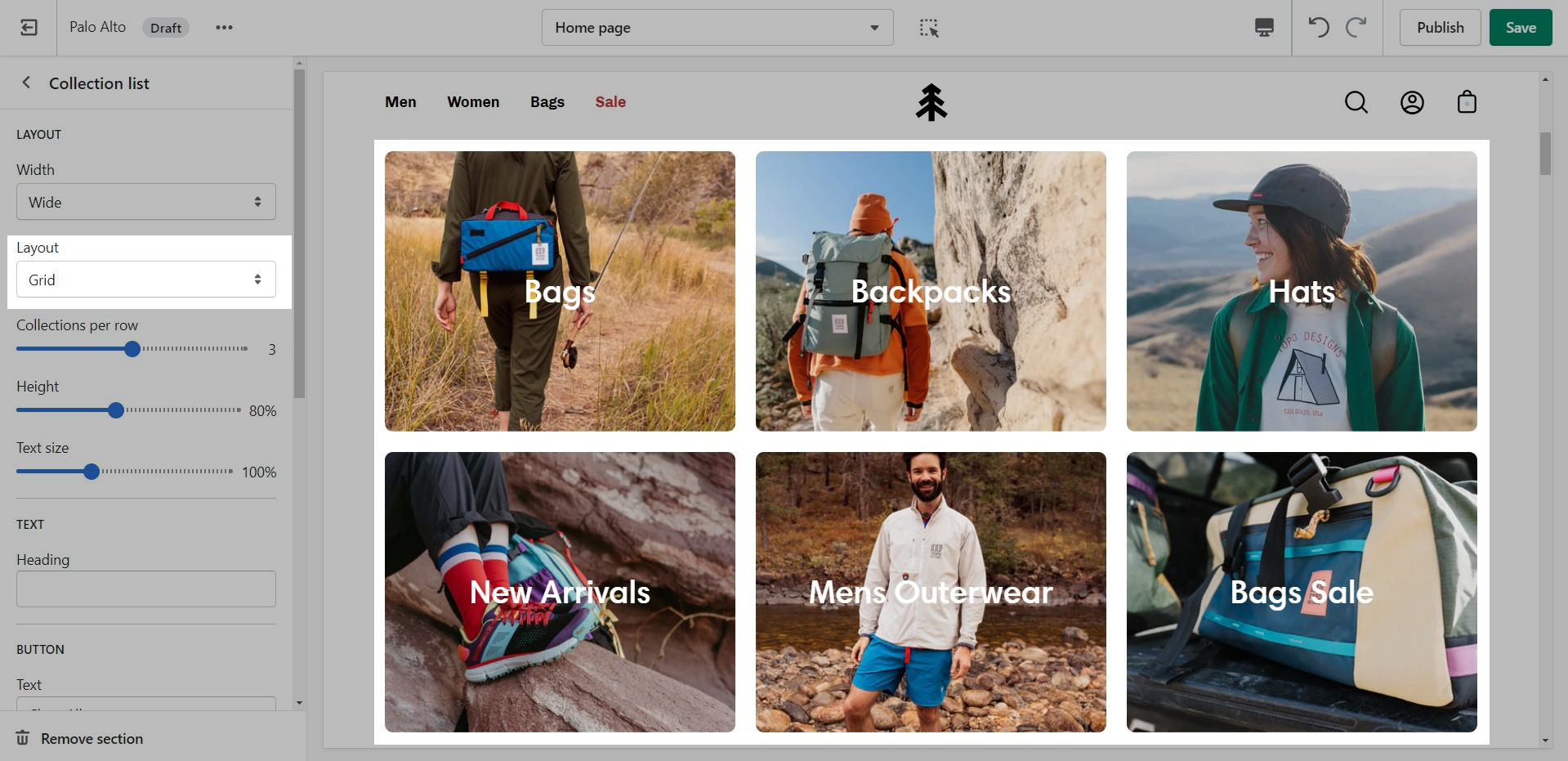
There are also controls for the main heading and button text.
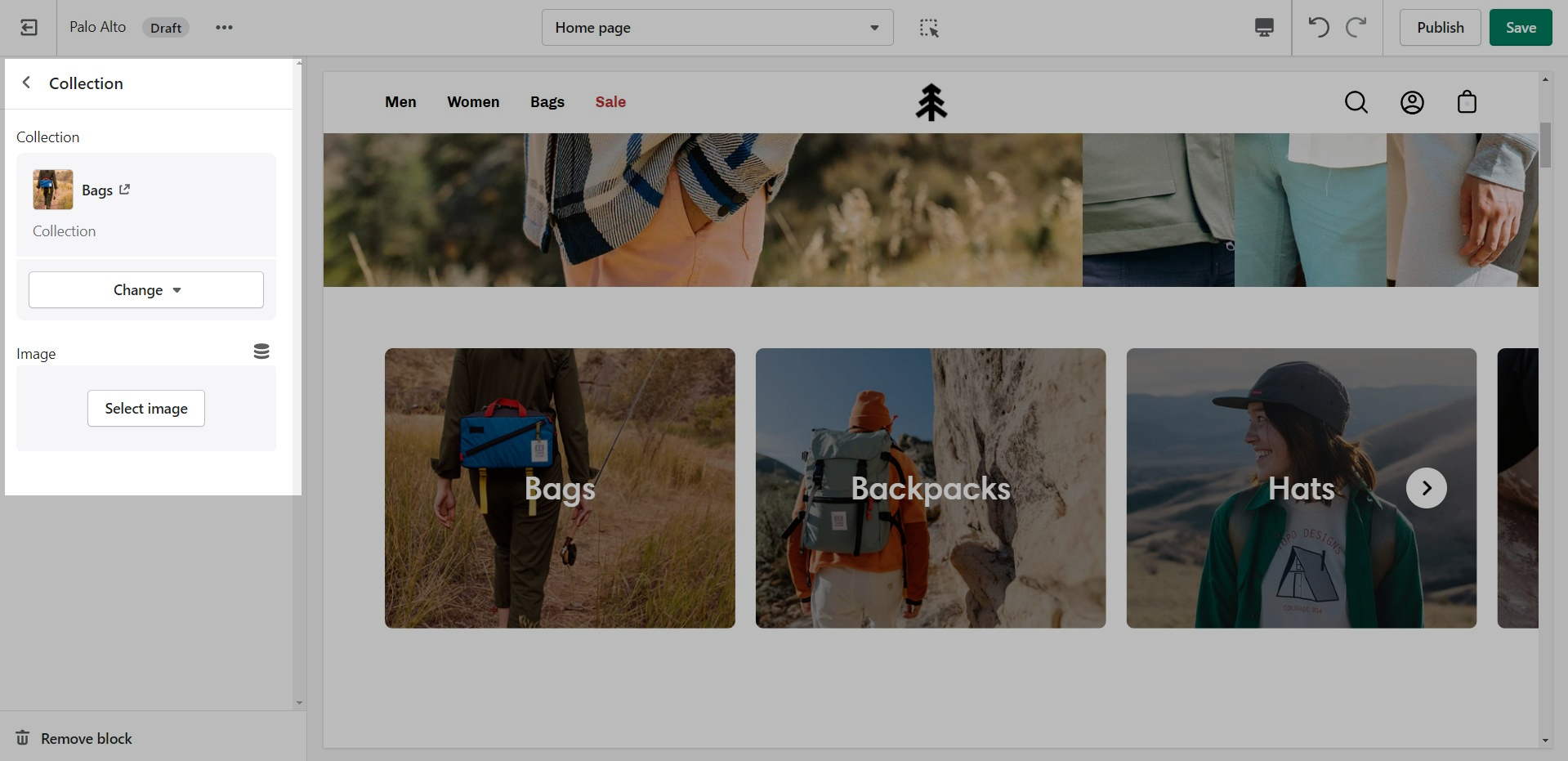
Collection marbles
A stylish new section to help showcase your most recent or most popular collections with small icons.
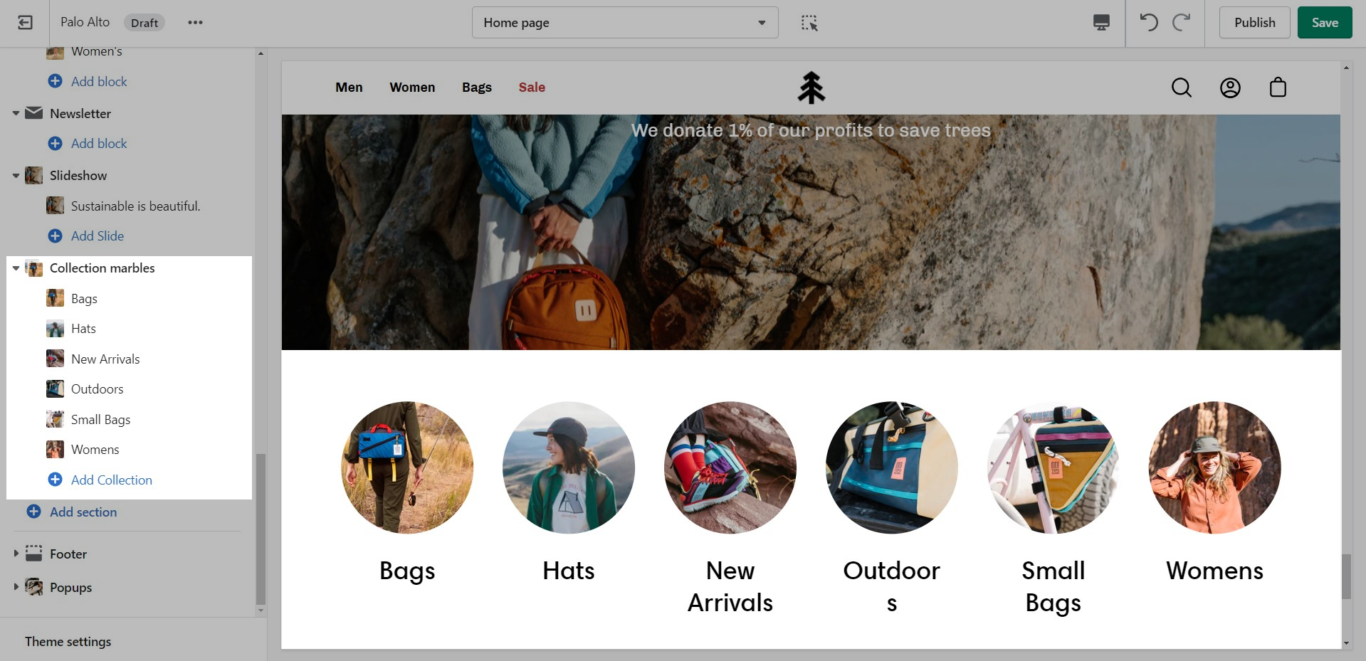
Set the layout, main heading, and sizes for the section.
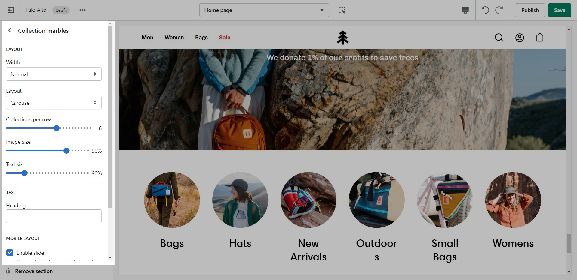
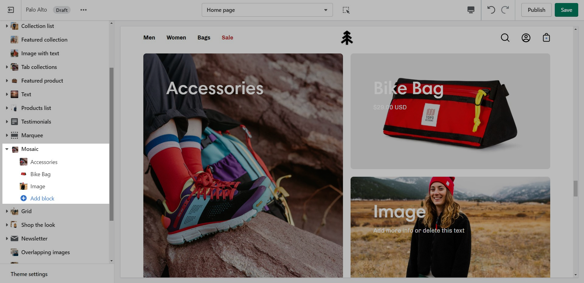
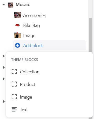
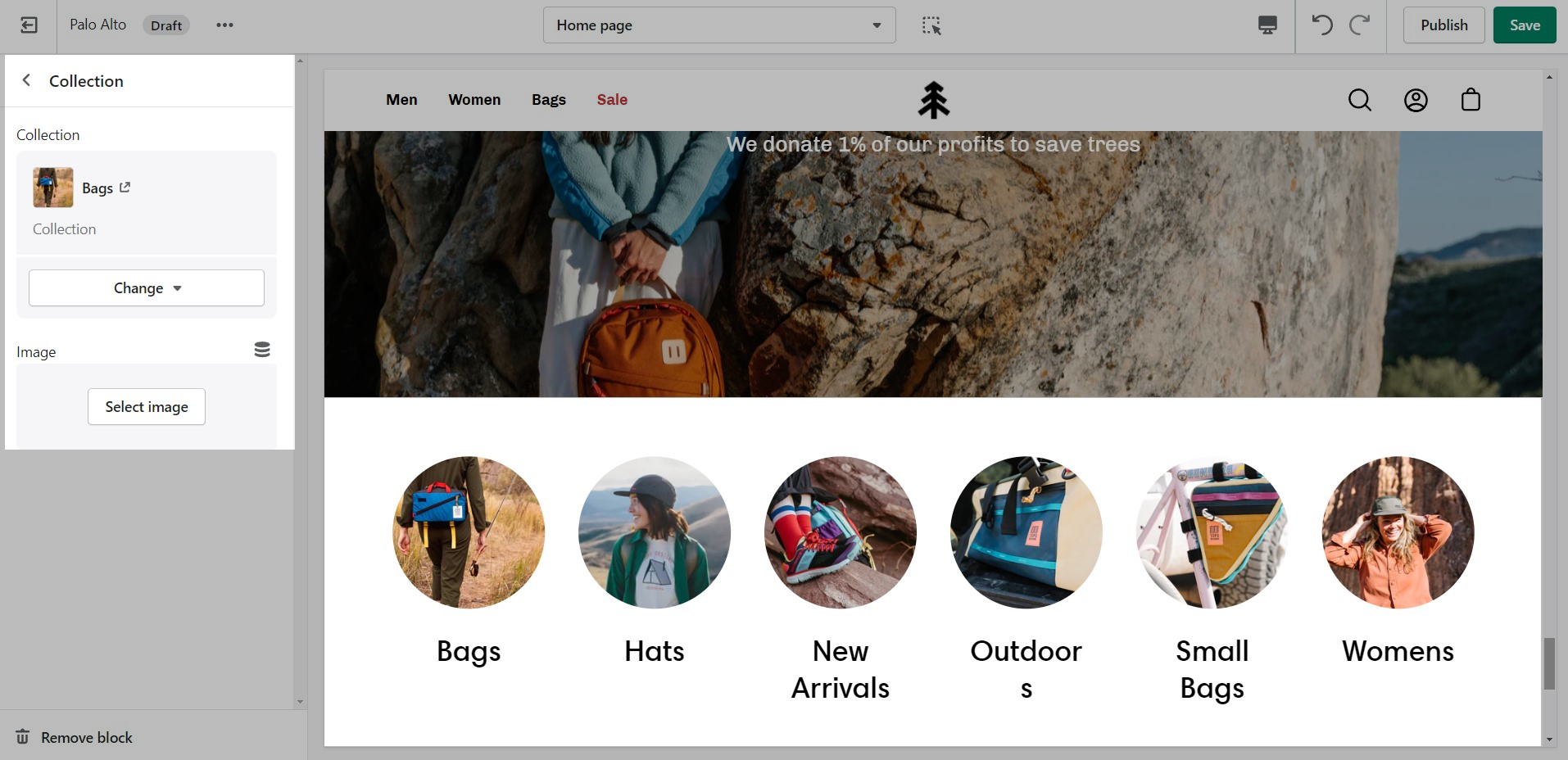
Add blocks by clicking on the small arrow next to the section then clicking 'Add block'
Choose the collection link and image for each block.
Featured collection
The 'Featured collection' section allows you to highlight a specific collection of products on your store pages. This section generates blocks with links to each product page.
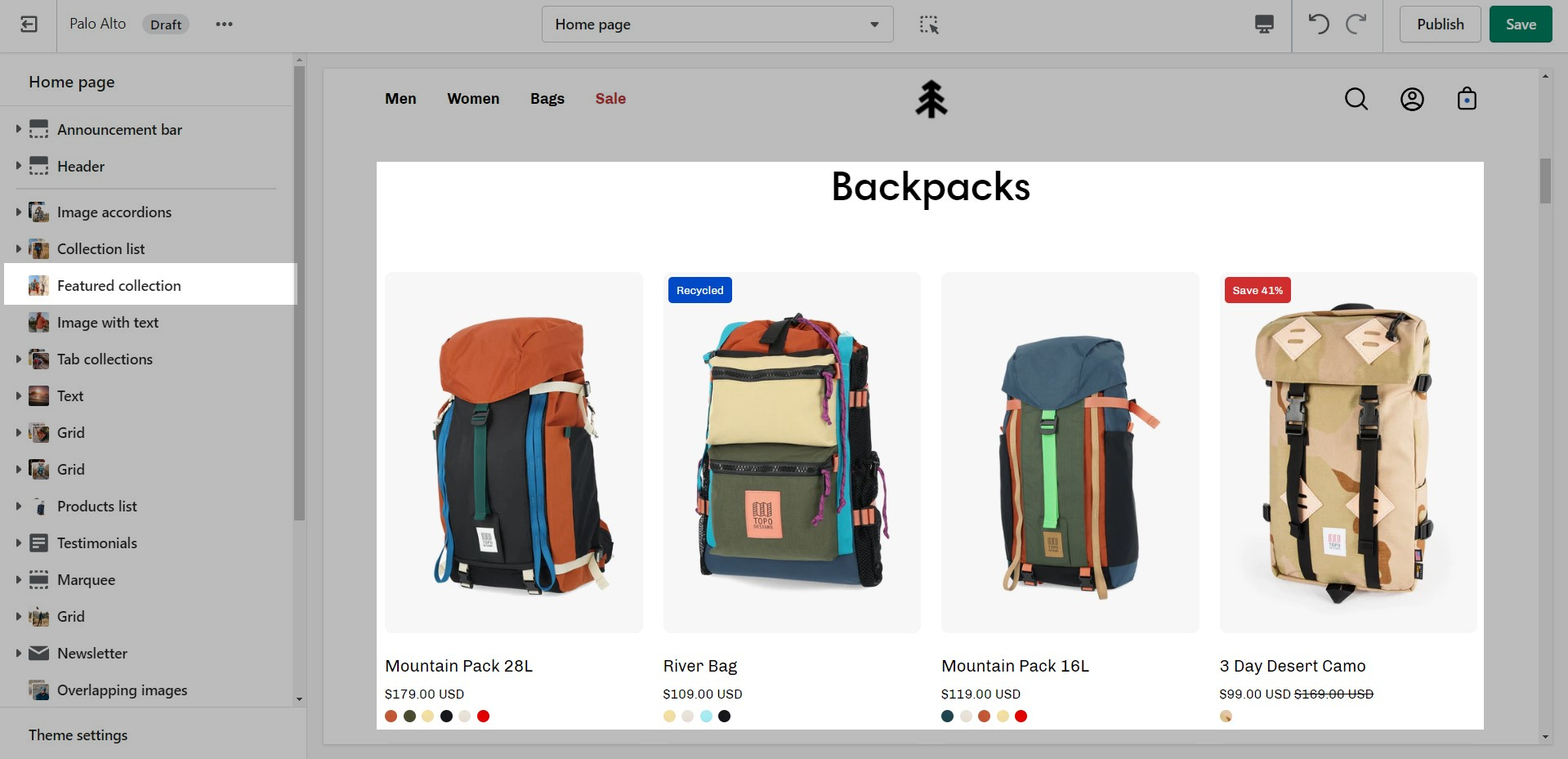
From the settings of this section, you can control which collection to display, the number of rows, as well as a handful of other settings.
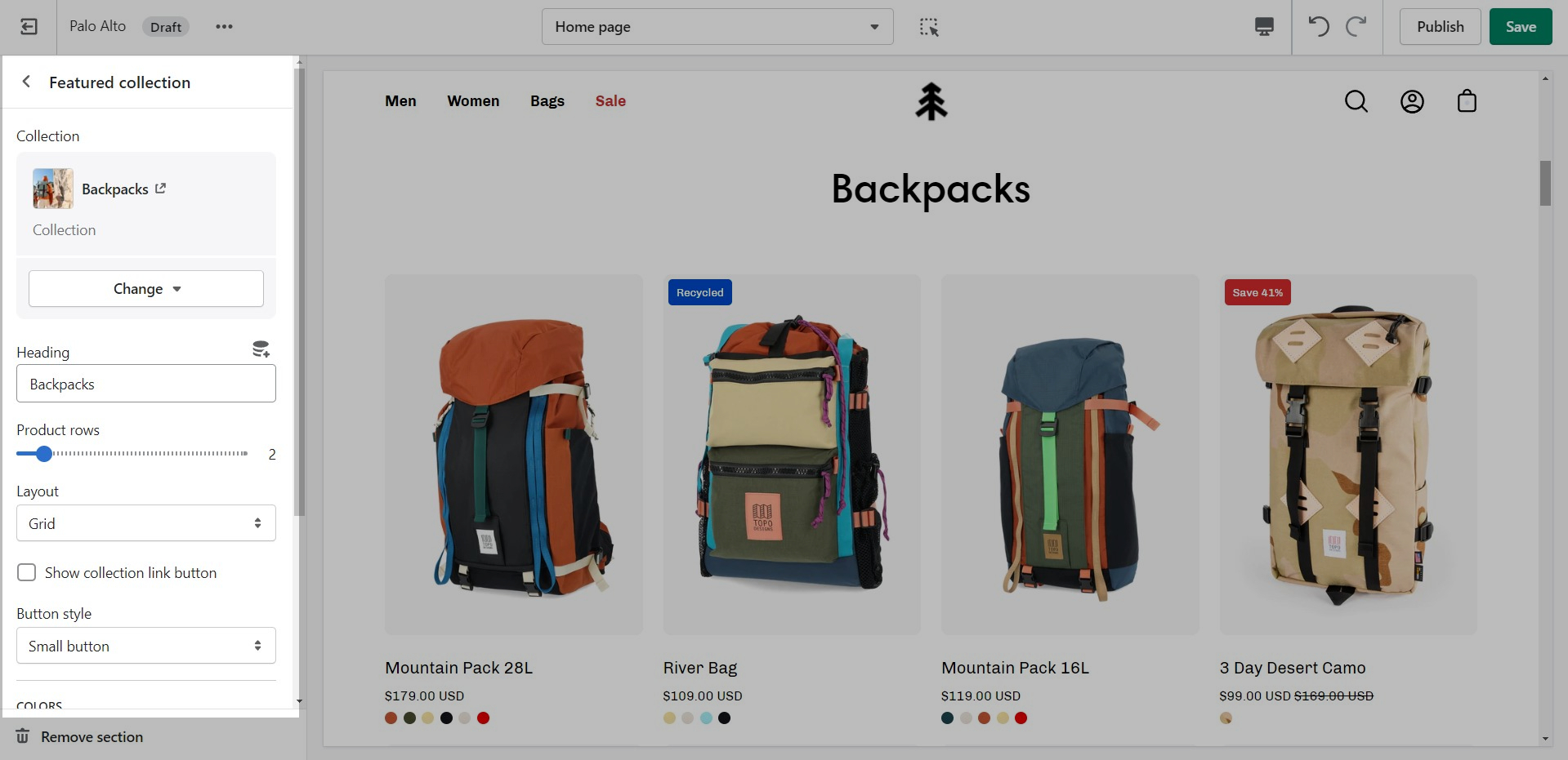
At the bottom of all the section settings, you can find a tab with some more features.
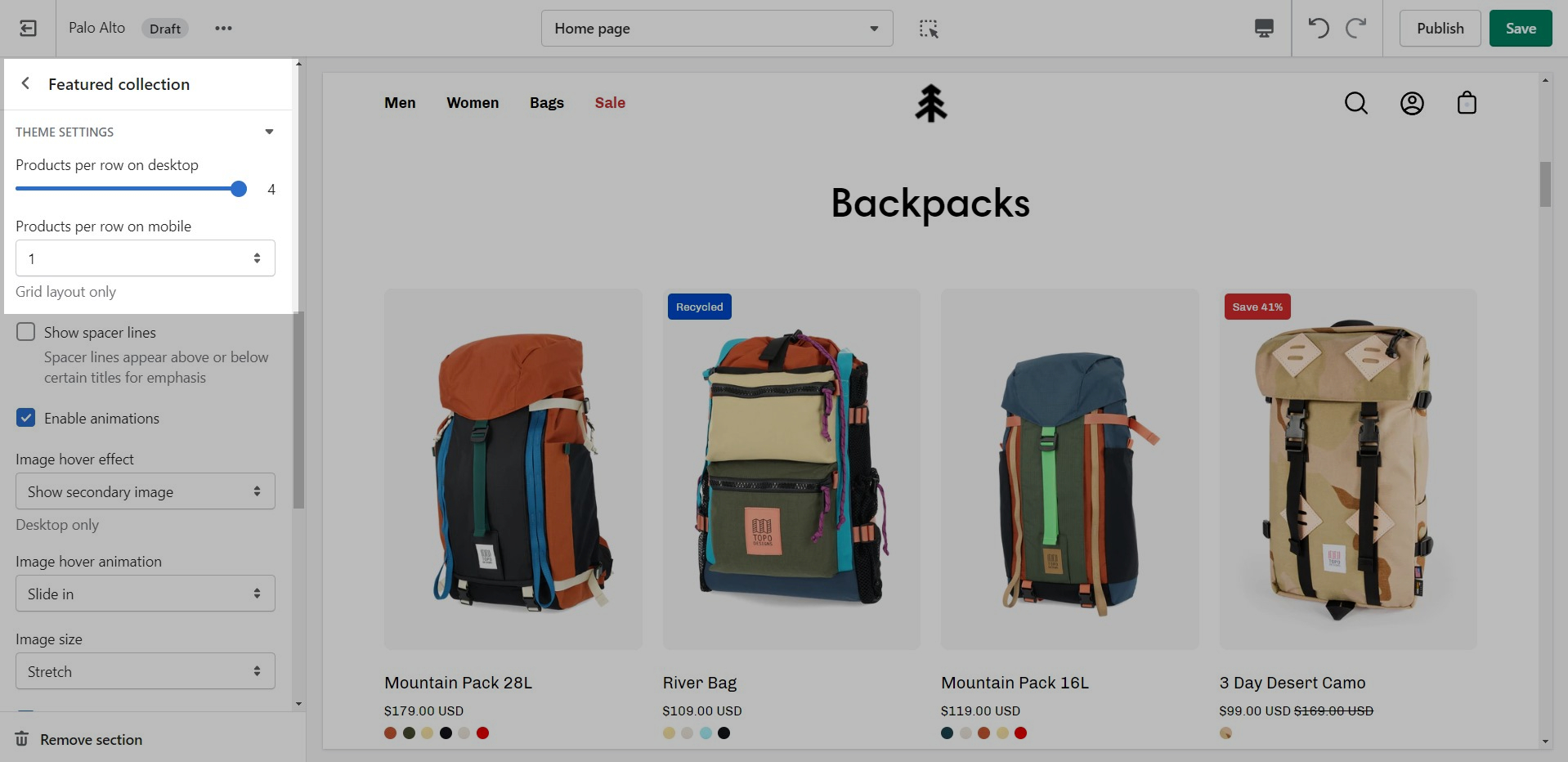
Theme Settings is a tab that allows you quick access to the global options. These options may affect areas of your store that you do not see on the current page.
A common example here is the 'products per row' option. This option allows you to set the number of products per row but also affects the look of your collection pages.
Products list
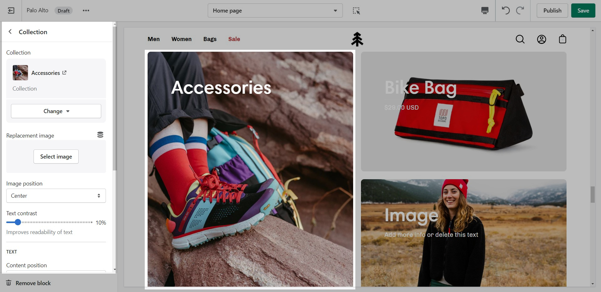
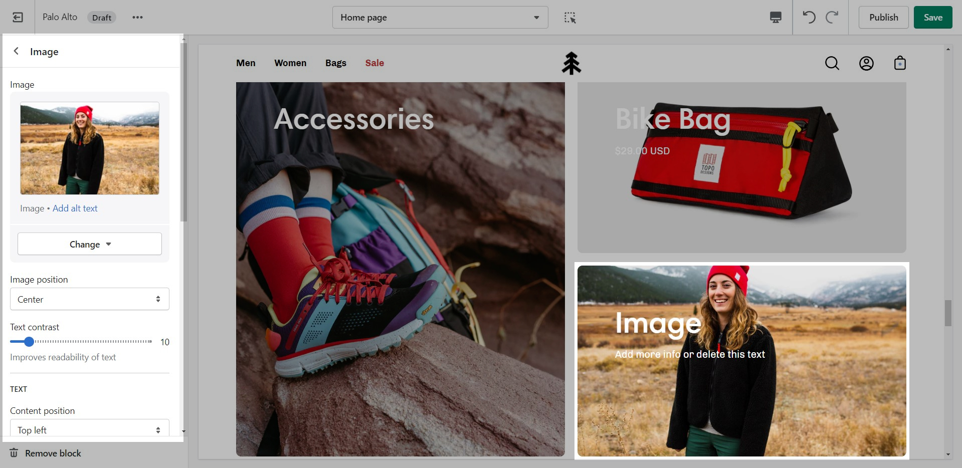
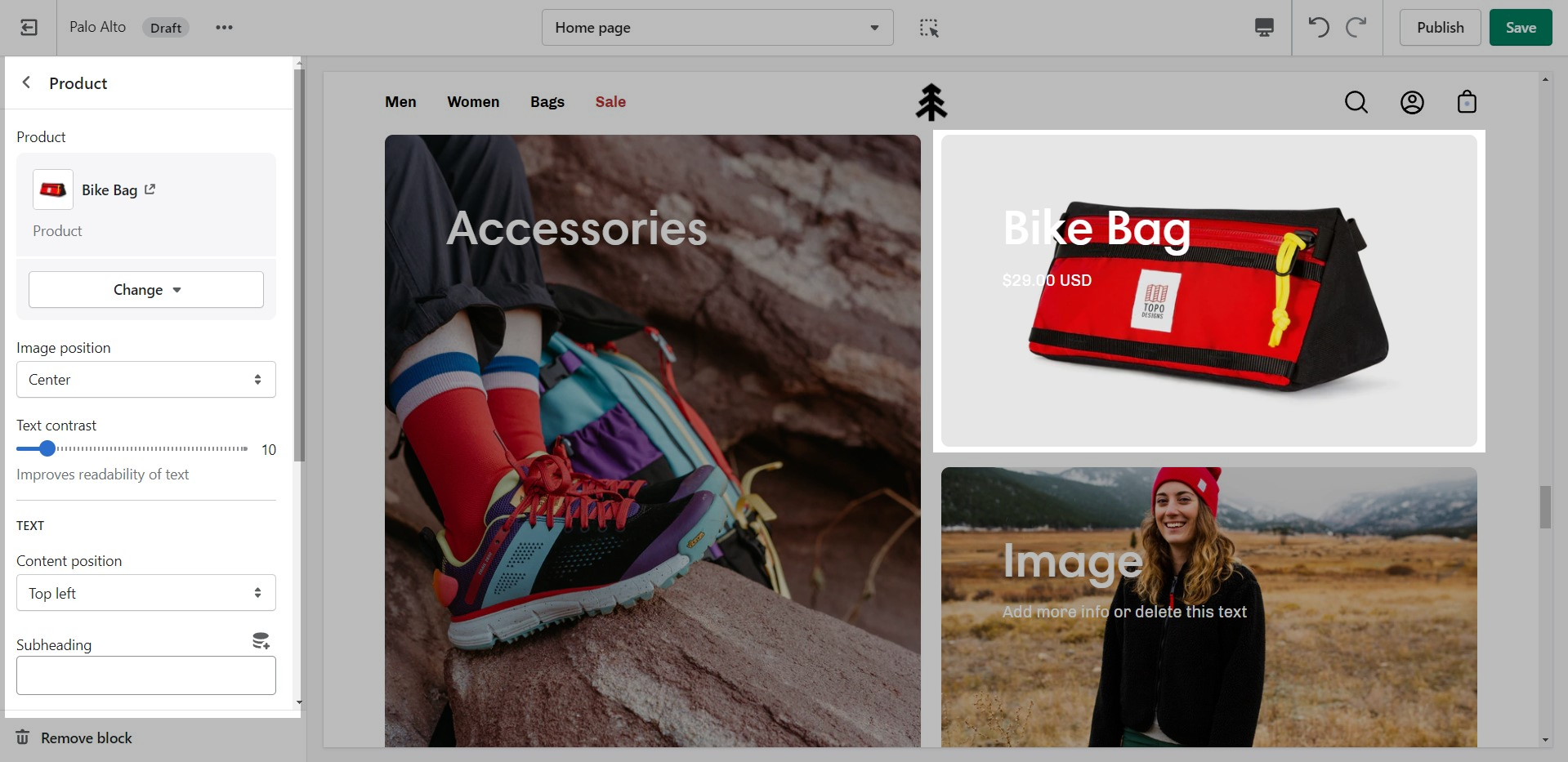
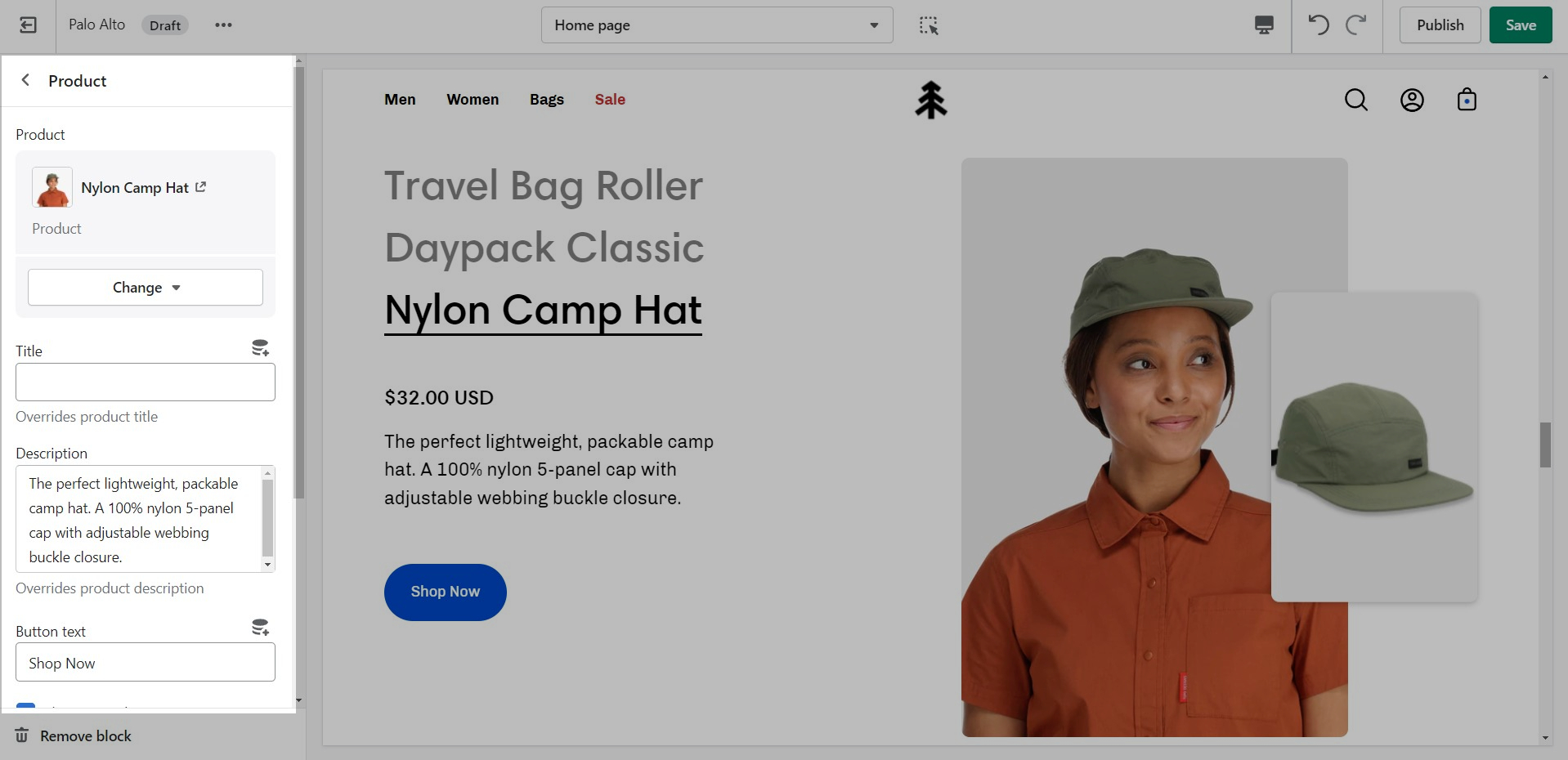
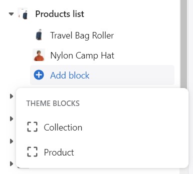
The 'Products list' section creates a split view of text and images. This section can show products or collections.
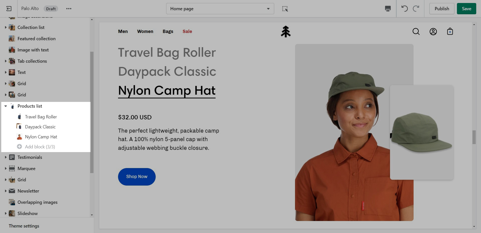
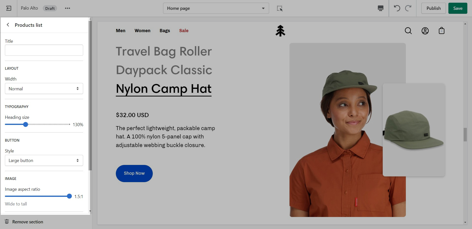
Add blocks by clicking on the small arrow next to the section then clicking 'Add block'
Add up to 3 blocks
Featured product
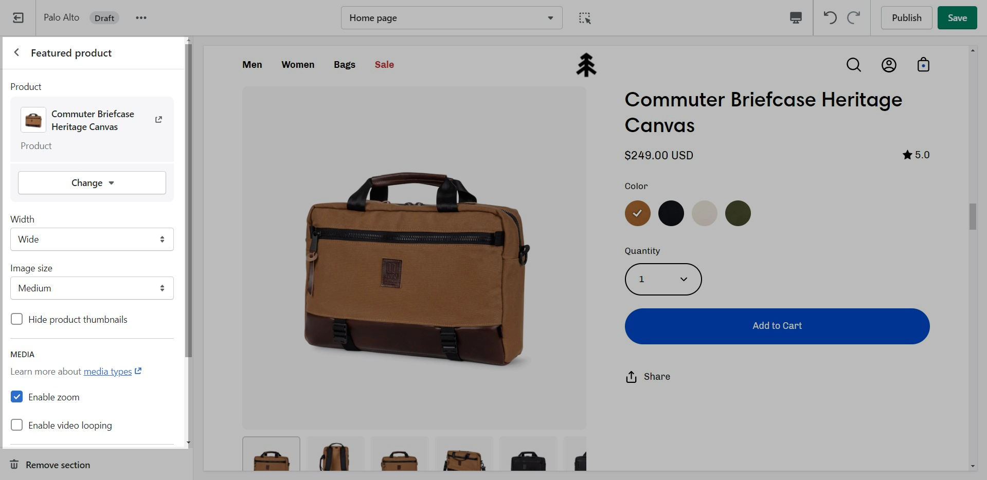
Use the 'Featured product' section to bring a product gallery and form to your store pages.
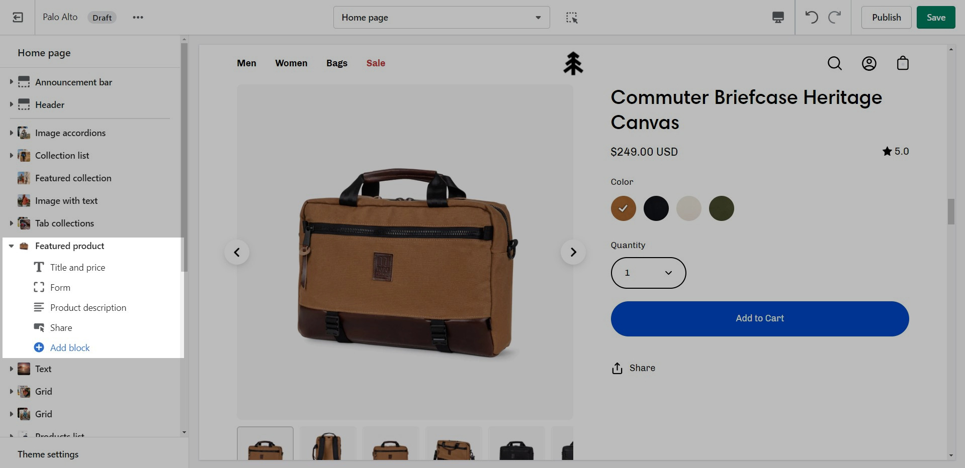
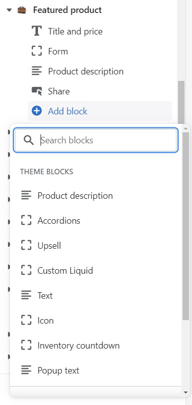
Add blocks by clicking on the small arrow next to the section then clicking 'Add block'.
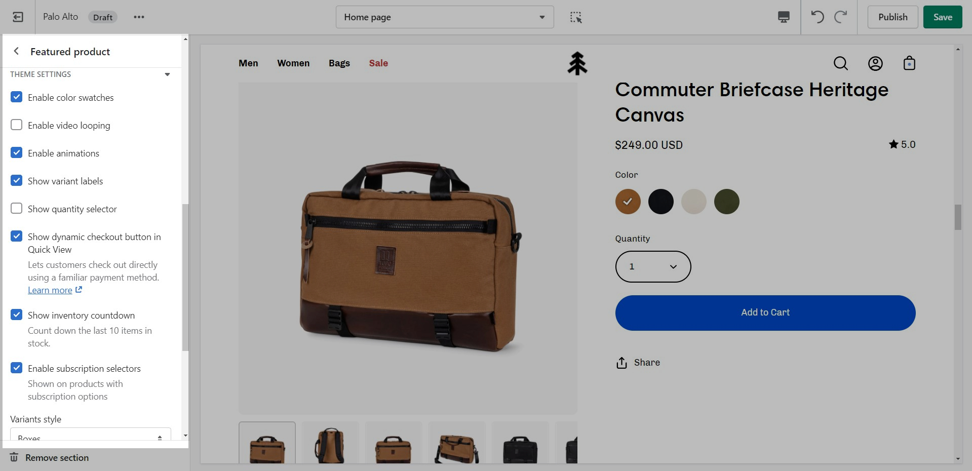
At the bottom of all the section settings, you can find a tab with some more features.
Theme Settings is a tab that allows you quick access to the global options. These options may affect areas of your store that you do not see on the current page.
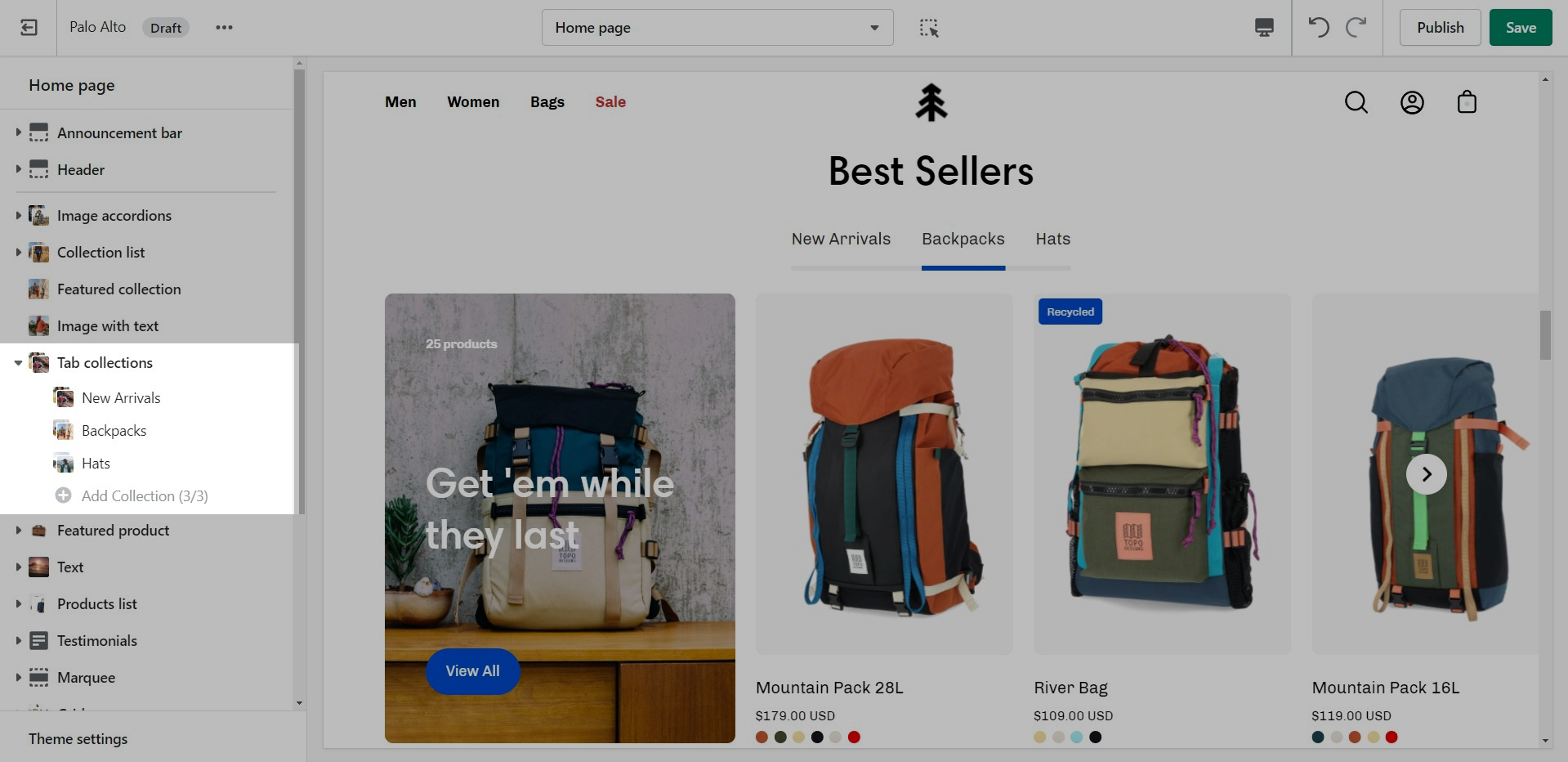
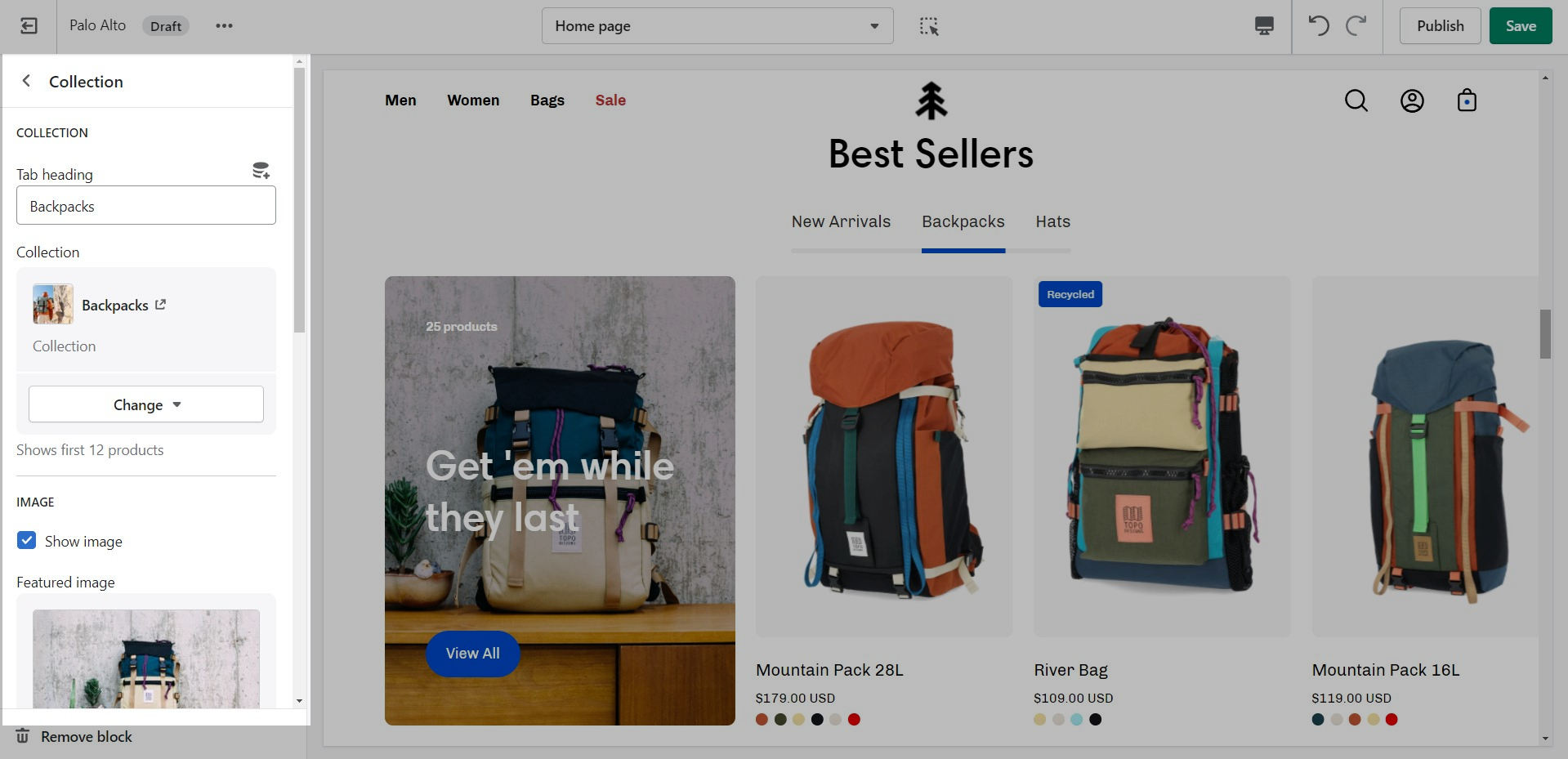
Tab collections
Showcase up to three collections on your store pages.
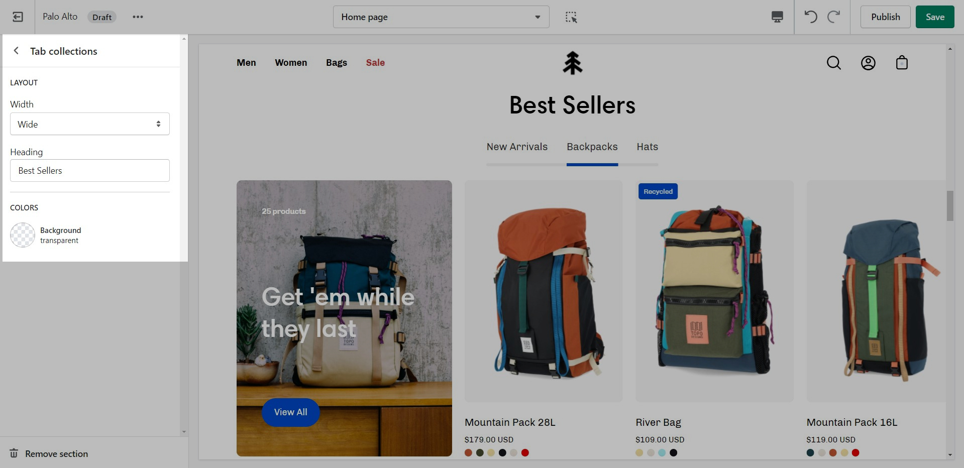
Change the width and the heading of this section from the Section settings.
Add blocks by clicking on the small arrow next to the section then clicking 'Add block'.
Set the individual block links, images, text, and overlay.
Shop the look
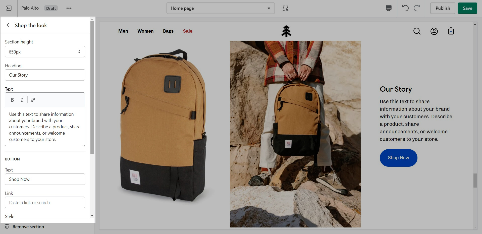
'Shop the look' allows you to use images and dots to highlight specific points of your products. Use this section to create a unique way of getting your customer's attention!
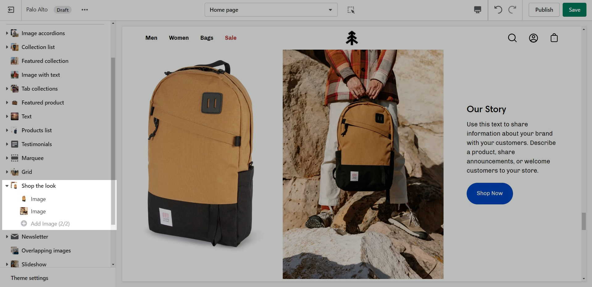
Add blocks by clicking on the small arrow next to the section then clicking 'Add block'.
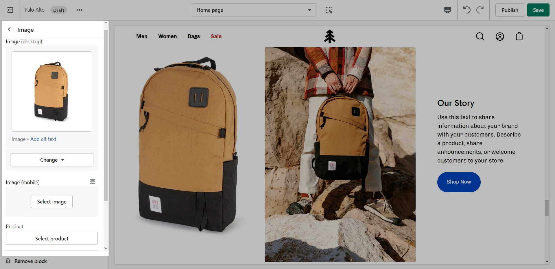
The individual blocks of this section are images. From their own settings, you can gain access to add different images as well as move the dots to different places.
