> For the complete documentation index, see [llms.txt](https://palo-alto.presidiocreative.com/llms.txt). Markdown versions of documentation pages are available by appending `.md` to page URLs; this page is available as [Markdown](https://palo-alto.presidiocreative.com/palo-alto-4.2/products/theme-blocks.md).
# Theme blocks
Add, arrange and customize Product page theme blocks
The Palo Alto 'Product pages' section blocks help you customize the primary or core content for your product pages and product templates. Adding sections further enhances your merchandising.
### Types of theme blocks
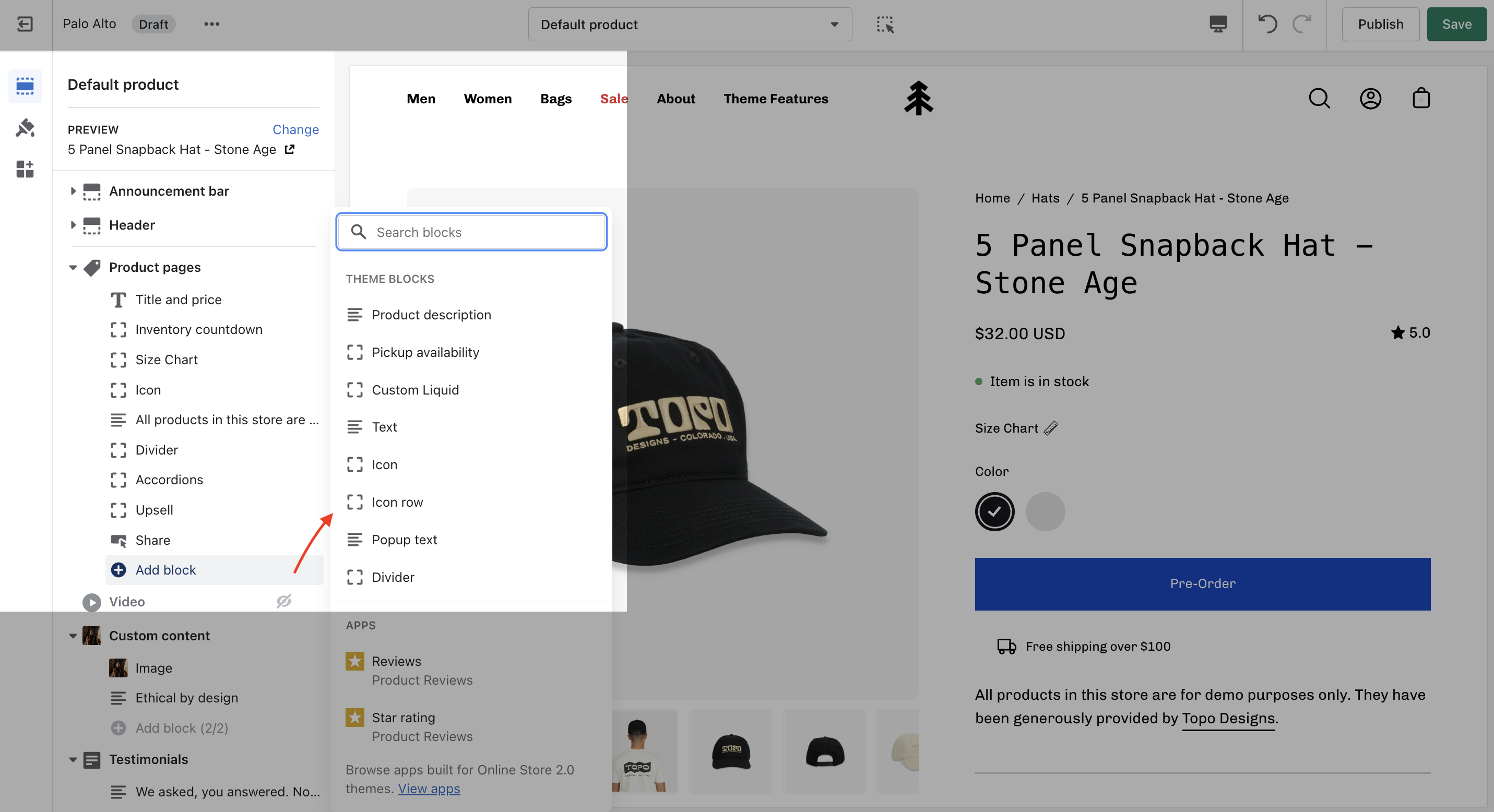
Palo Alto includes the following theme blocks for product pages/templates:
{% hint style="success" %}
* [Title and price](#title-and-price)
* [Inventory countdown](#inventory-countdown)
* [Form](#form-product-form)
* [Product Description](#product-description)
* [Accordions](#accordions)
* [Upsell](#upsell)
* [Share button](#social-sharing)
* [Pickup availability](#pickup-availability)
* [Custom Liquid](#custom-liquid)
* [Popup text](#popup-text)
* [Text](#text)
* [Icon](#icon)
* [Divider](#divider)
{% endhint %}
### Title and price
{% tabs %}
{% tab title="Render" %}
Displays product price, title, and star rating when using the Shopify Ratings app. Includes an option to display Navigation breadcrumb above the title (including vendor option, see settings)

{% endtab %}
{% tab title="Settings" %}
Navigation options
* None
* Breadcrumb
* Collection
* Vendor
{% hint style="success" %}
If the product price is set to $0, it's replaced by a translatable string - 'Free'.
{% endhint %}

If you want to change this text you can go into your Online Store > Themes and click on Actions > Edit Languages:

Search for `free` in the Filter bar and edit the field under **General > Money > Free**:

{% endtab %}
{% endtabs %}
### Inventory countdown
{% tabs %}
{% tab title="Render" %}
Display a notification about the current inventory quantity. If there are less than 10 products available this block will show how many are left.

{% endtab %}
{% tab title="Settings" %}
No customizable settings.
{% endtab %}
{% endtabs %}
### Form
{% tabs %}
{% tab title="Render" %}
Displays all buying-related elements including product variants and swatches, quantity selector, the add to cart button, and the buy it now button. Optional **size chart** link is placed above variant options.

{% endtab %}
{% tab title="Settings" %}
* Size chart - Dynamic source supported
* Show variant labels
* Show quantity selector
* Show dynamic checkout buttons
* Subscription selectors (with supported app)
* Icon with text
{% endtab %}
{% endtabs %}
### Product description
{% tabs %}
{% tab title="Render" %}
Show the product description text onto the product pages.

{% endtab %}
{% tab title="Settings" %}
No customizable settings.
{% endtab %}
{% endtabs %}
### Accordions
{% tabs %}
{% tab title="Render" %}
Displays accordions separately from your product description.

{% endtab %}
{% tab title="Settings" %}
* Tab heading - Dynamic source supported
* Tab content - Dynamic source supported
{% endtab %}
{% endtabs %}
### Upsell
{% tabs %}
{% tab title="Render" %}
Display an upsell product on your page and in the cart.

{% hint style="info" %}
When selecting a product for the 'Buy it with' promotion, we recommend you choose products with one variant.
{% endhint %}
{% endtab %}
{% tab title="Settings" %}
Select the upsell product. It will only be displayed in the product page.
You can also use a metafield Namespace and key 'theme.upsell' to allow product upsells to follow users into the cart.

Learn more about our cart Upsell feature [here](/palo-alto-4.2/upsell/upsell.md).
{% endtab %}
{% endtabs %}
### Share button
{% tabs %}
{% tab title="Render" %}
Displays a share icon for sharing current product page on social platforms or link to send.

{% endtab %}
{% tab title="Settings" %}
Set the text for the 'Share' button.
{% endtab %}
{% endtabs %}
### Pickup availability
{% tabs %}
{% tab title="Render" %}
Displays where customers can pick up the product.
{% endtab %}
{% tab title="Settings" %}
No customizable settings. [See Shopify documentation for setup details](https://help.shopify.com/en/manual/shipping/setting-up-and-managing-your-shipping/local-methods/local-pickup#show-pickup-availability-to-your-customers).
{% endtab %}
{% endtabs %}
### Custom Liquid
{% tabs %}
{% tab title="Render" %}
Add your own 'liquid' code to implement custom features or app functionality.
{% endtab %}
{% tab title="Settings" %}
Single text field to copy and paste liquid code.
{% hint style="warning" %}
Please note that this field doesn't have any debugging capabilities. Make sure that your code is correct before pasting it to avoid any errors.
{% endhint %}
{% endtab %}
{% endtabs %}
### Popup text
{% tabs %}
{% tab title="Render" %}
Create a slide-out block with extra text. Perfect to showcase policies or a chart with extra information.

{% endtab %}
{% tab title="Settings" %}
* Button text - Dynamic source supported
* Page link - Dynamic source supported
{% endtab %}
{% endtabs %}
### Text
{% tabs %}
{% tab title="Render" %}
Add more details about your products.

{% endtab %}
{% tab title="Settings" %}
* Text field - Dynamic source supported
* Text alignment selector
{% endtab %}
{% endtabs %}
### Icon
{% tabs %}
{% tab title="Render" %}
Add bits of information with icons to your product description pages.

{% endtab %}
{% tab title="Settings" %}
#### Icon
* Select an icon
* Icon color - Dynamic source supported
* Replacement Image - Dynamic source supported
* Width (Icon size)
#### Text
* Heading - Dynamic source supported
* Size (text size)
#### Layout
* Width
* Alignment
* Background color - Dynamic source supported
* Padding toggle
{% endtab %}
{% endtabs %}
## Divider
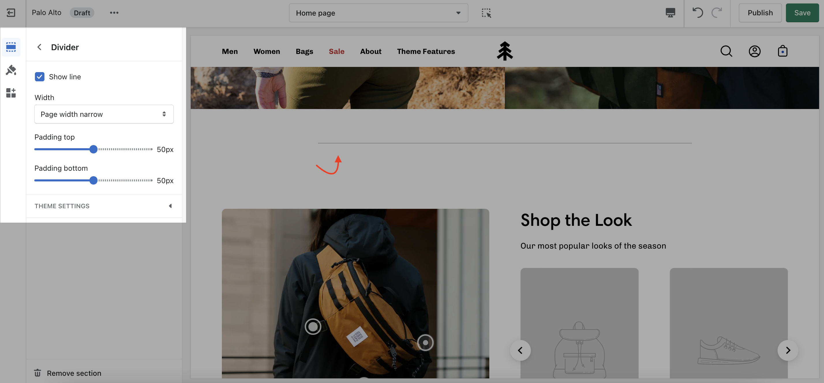
A simple line with top and bottom spacing settings.