Recommended Image Sizes
Image Size Recommendations in Palo Alto
The key across all image sections is to keep the focal point of the image in the center. For example, if you're adding text or graphics on top of the image they can easily be cropped out of view.
Check out the new 'Focal point' feature in Shopify:
Slideshow Section Images
The Slideshow section allows you to specify desktop and mobile images as well as specify the slide height.
Image width
Desktop: We recommend using images 1920px in width.
Mobile: We recommend using images 1080px in width.
Remember: Mobile devices are tall. You need to use an image that has a bigger height than it does width in order to fill the vertical aspect ratio.
Image height
Palo Alto provides an option to specify various slide height sizes: Fullscreen, Auto, 750px, 650px, 550px, and 450px.
Static sizes: If you want to use a static slide height (750px, 650px, 550px, or 450px), make sure your image height is around that size.
For example, if you'd like to use a slide image height of 750px, you'll want to save your image around this same size. This will prevent image cropping both towards the top and bottom. This applies to the other slide height sizes (650px, 550px, and 450px).
Note: Because these settings keep the height static across all devices, the width will change. Your images may be cut off from the side so make sure that the focal point is in the center.
Fullscreen: This option will fit the images to the entire height of the browser window. This option is recommended for images with medium height sizes and not for images with large height sizes, as these will be cropped at the bottom of the image.
Auto: Setting this option will have the images displayed in the original height as uploaded. This option is quite useful if you want to have the full image displayed as there will be no cropping of the images.
Note: It's important to use equal-sized images in terms of height for this option to maintain consistency in the slide height as the slideshow advances.
Product Images
We recommend using images at a ratio of one to one and sizes around 1024 by 1024 pixels or smaller images of about 600 by 600 pixels.
Using high-resolution images will make them sharper but slow down your load times
Blog Images
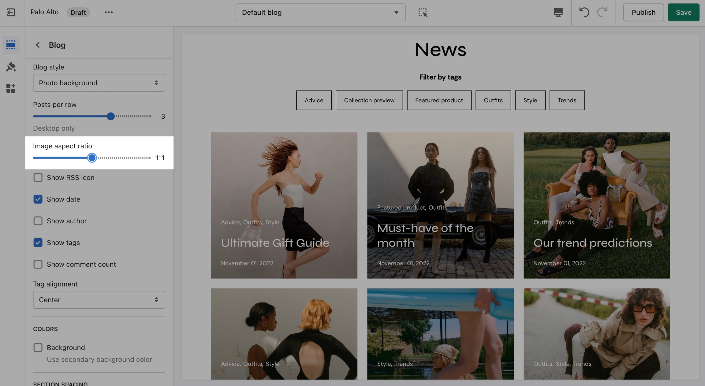
Palo Alto provides an option to adjust image aspect ratios for the blog page.
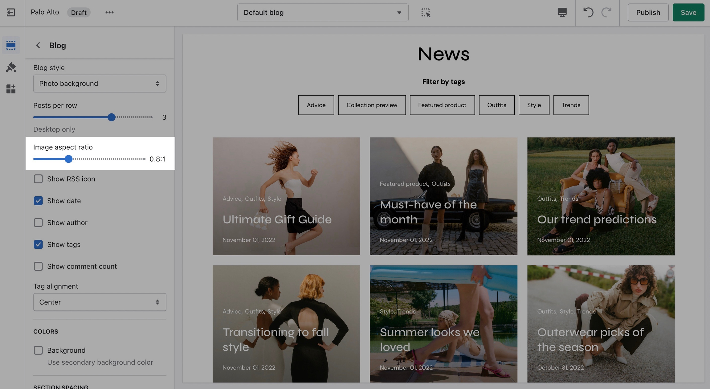
Aspect Ratio 1 to 1
This is the standard setting that works well with square-shaped images. We recommend this square ratio because the images will be cropped square on the blog overview page and they'll display in their uploaded ratio on the individual blog post page.
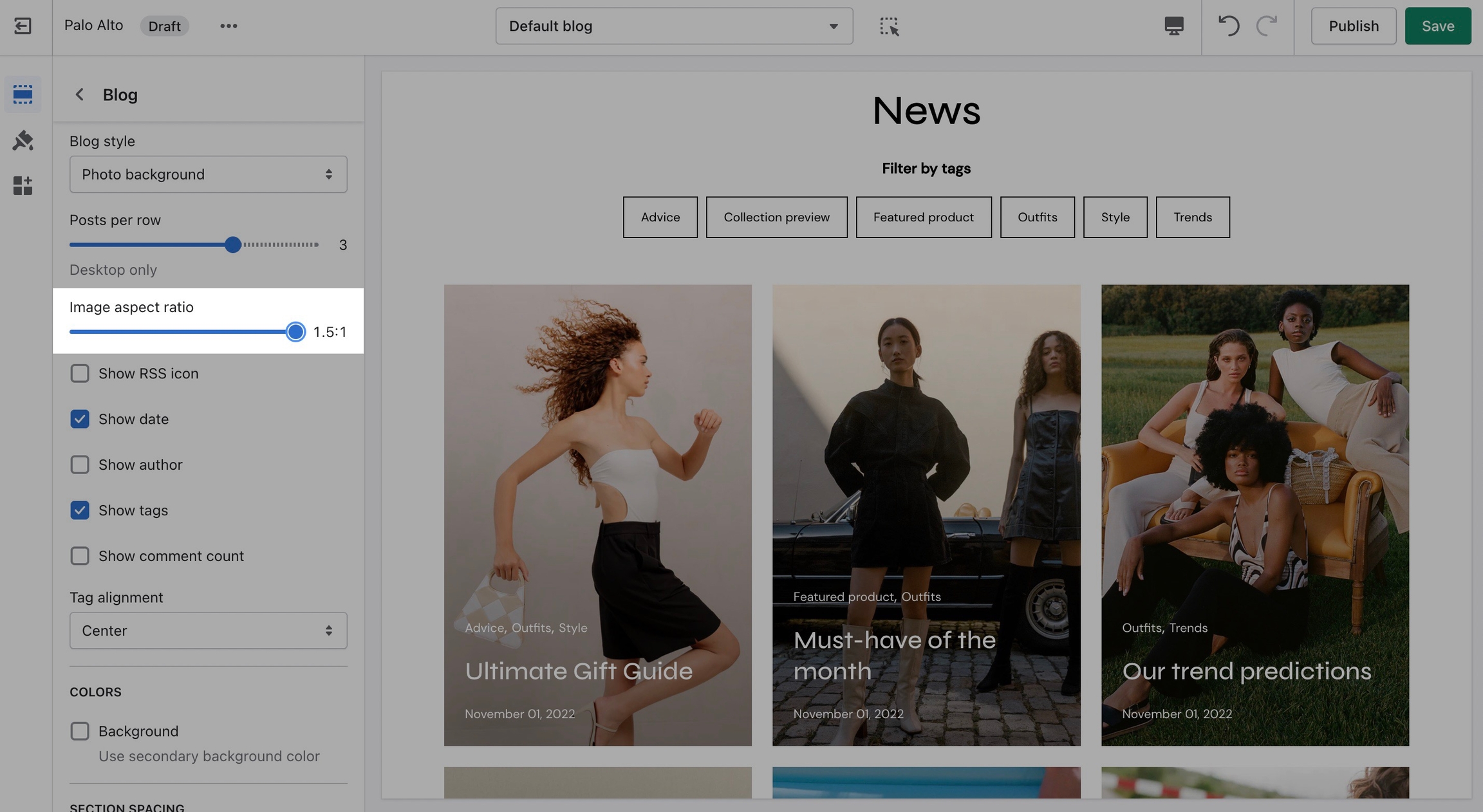
Aspect Ratio 1.5 to 1
This ratio will result in taller images or portrait images.
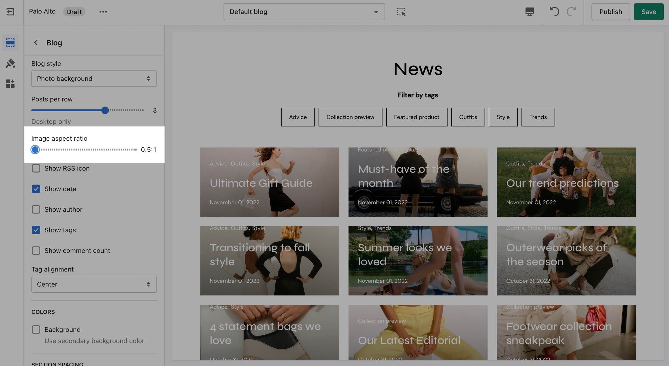
Aspect Ratio 0.5 to 1
This ratio can be used to display wider images. We recommend it for landscape images.
Catalog Banner Images
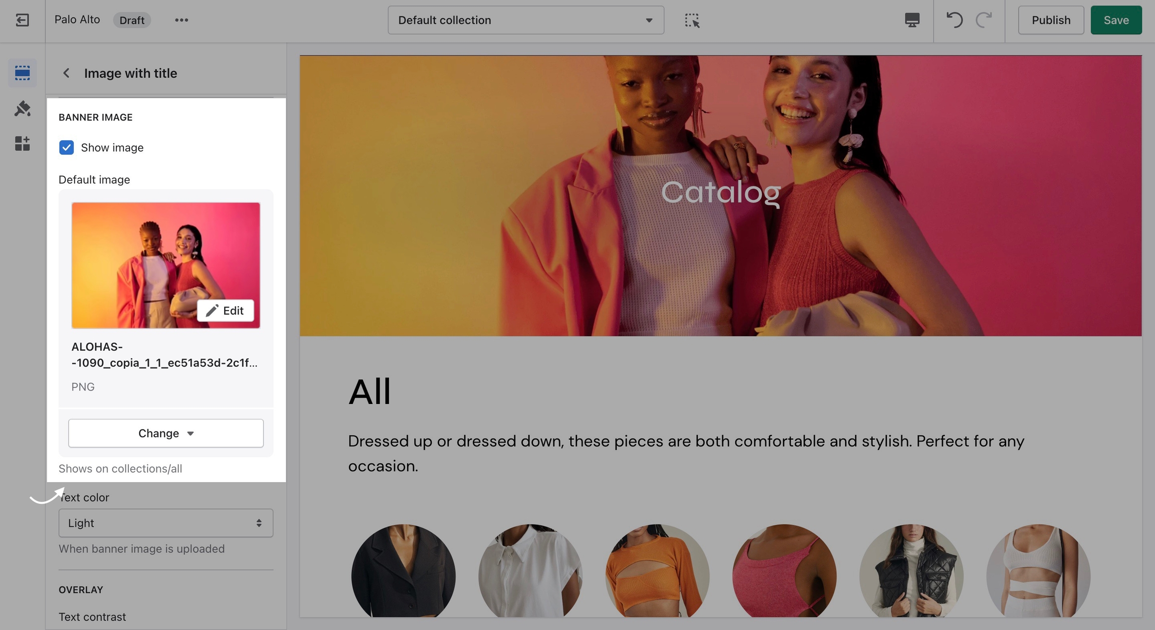
This is the page with the "/collections/all" URL that lists all of the visible products in the store. By default, products on the catalog page are shown in alphabetic order.
Palo Alto provides an option to specify this image within the Image with Title section settings.
We recommend using image sizes around 1400px in width.
Palo Alto provides you with options to specify the banner height. These include Fullscreen, Auto, 750px, 650px, and 550px.
These options are similar to the Slideshow section.
Logo Images
We recommend using logo images at a width of around 440px.
The maximum logo height applied is 100px therefore it is ideal to have a logo with a height around this size or lower.
Popup Images
For our Popup section, we recommend using an image with at least 600 pixels in its lower dimension. The default aspect ratio here is 8 by 7.
In pixels that should translate to 690 by 600 pixels or 1380 by 1200 pixels if you're looking to create a retina image.
A retina image is an image twice as big as its block or recommended size. This ensures that the final image is sharp even if rendered on an unusually bigger device.
There are also triple retina images which are three times the recommended size.