Palo Alto 6.2.1 has been released
Release notes
Palo Alto Doumentation
NewSupport
Palo Alto 4.6
Palo Alto 4.6
  • Palo Alto Theme Documentation
  • Changelog
    • The new experience
    • What's new in 4.6
  • Header
    • Announcement bar
    • Transparent header
    • Mega Menu
    • Highlighted link
    • Logo
  • Sections
    • Target Settings
    • How to use sections
    • Recommended Image Sizes
    • Highlight words
    • Palo Alto sections
      • Collection list
      • Featured collection
      • Featured product
      • Products list
      • Tab collections
      • Marquee
      • Custom content
      • Grid
      • Image accordions
      • Image with text
      • Overlapping images
      • Shop the look
      • Slideshow
      • Split images
      • Video
      • Banner with text columns
      • Blog posts
      • Contact form
      • Custom Code
      • Icons row
      • Locations
      • Newsletter
      • Press/Logo
      • Shoppable blog posts
      • Tabs
      • Testimonials
      • Text
      • Text columns with images
      • Promotion row
      • Divider
  • Upsell
    • Upsell
  • Theme Settings
    • Theme Settings Intro
      • Colors
      • Typography
      • Appearance
      • Product Grid
      • Quick shop
      • Cart
      • Loading icon
      • Checkout
      • Theme style
      • Buttons
  • Products
    • Product Pages
    • Creating new Product page templates
    • Pre-order
    • Theme blocks
      • Title and price
      • Form
      • Product description
      • Accordions
      • Upsell
      • Share button
      • Text
      • Icon
      • Icon row
      • Inventory countdown
      • Popup text
      • Divider
      • Cutline
      • Complementary products
    • Swatches
    • Product ratings
  • Collections
    • Collection Pages
    • Filtering options
    • Sub-collections
    • Collection pages promo
    • Cutline
    • Badges
  • Popups
    • Popups
    • Popup Behavior
  • Footer
    • Footer
      • Logo
      • Link list
      • Text
      • Blog
      • Newsletter
    • How to remove the Shopify credit
  • Blogs
    • Blog Pages
    • Creating blog page templates
    • Recommended posts
  • Pages
    • Pages
  • Updates
    • Checking your theme version
    • Downloading the latest version
    • Updating your theme
  • Support
    • Contacting support
    • Sharing a preview link
  • Custom
    • How to make CSS customizations
    • How to add Custom Fonts
Powered by GitBook
On this page
Export as PDF
  1. Footer

Footer

PreviousPopup BehaviorNextLogo

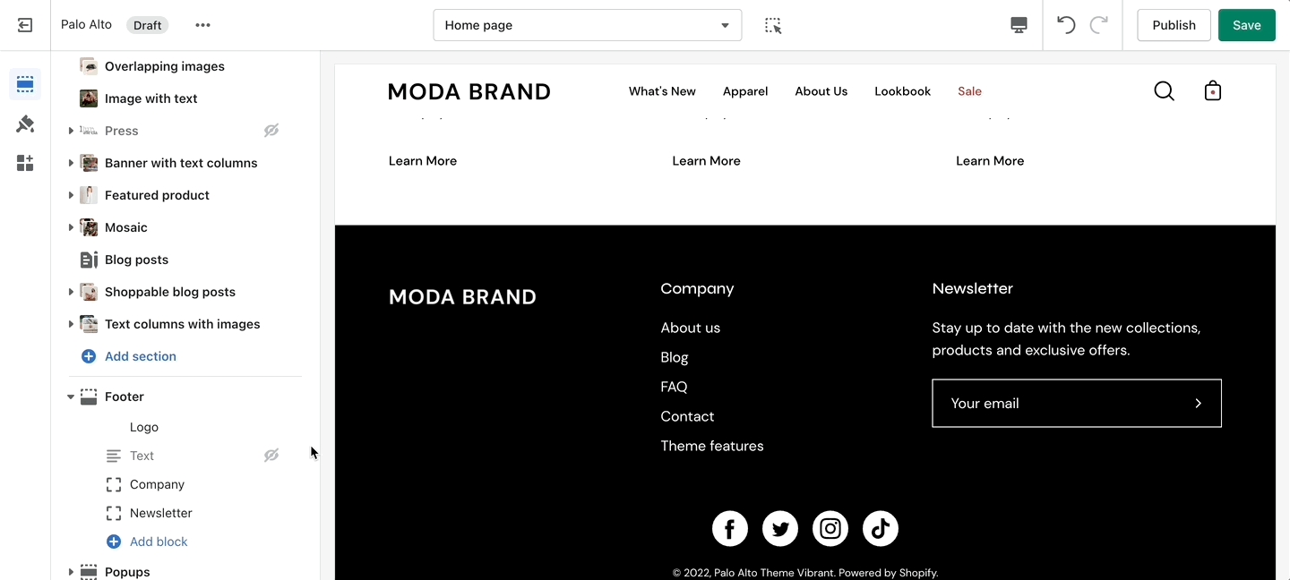
The Footer in Palo Alto has customizable elements in the form of section blocks. You can add in blocks by clicking the small arrow icon next to the Footer section then clicking the 'Add block' buttons:

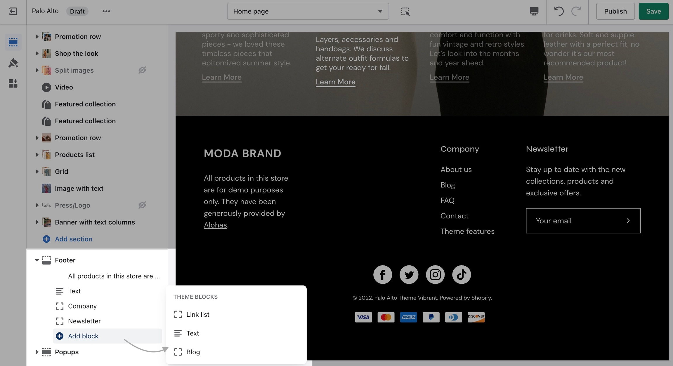
While there are a good number of different blocks, you can only use four blocks here. Be sure to use the ones you need the most.

Settings

Other than the individual blocks, the Footer section also has a number of settings itself. You can set the background and text color, disable the footer wave style or set a different color for it.

There is also the option to show payment icons, currency, and language selectors, as well as a short menu in the Bottom bar.

Note: There is no option to remove the 'Powered by Shopify' text in the section settings.

To remove it, please check out our next post.