Palo Alto Doumentation
NewSupport
Latest version
Latest version
  • Palo Alto theme documentation
  • Updates
    • What's new in Palo Alto
      • Release notes
      • About 6.2 Release
      • About 6.1 Release
      • About 6.0 Release
      • About 5.9 Release
      • About 5.8 Release
      • About 5.7 Release
      • About 5.6 Release
      • About 5.5 Release
      • About 5.4 Release
      • About 5.3 Release
  • Sections
    • Palo Alto sections
      • Explore the sections
      • Accordions
        • Text block
        • Page block
      • Accordions with images
        • Text block
        • Page block
      • Banner image
        • Subheading block
        • Heading block
        • Text block
        • Timer block
        • Buttons block
        • Video button block
      • Banner with text columns
        • Column block
      • Blog posts
      • Buttons list
        • Button block
      • Collection list
        • Collection block
      • Contact form
        • Form heading block
        • Email block
        • Message block
        • Text line block
        • Telephone block
        • Divider block
        • Single checkbox block
        • Select dropdown block
        • Radio buttons block
      • Countdown
        • Subheading block
        • Heading block
        • Text block
        • Timer block
        • Buttons block
        • Video button block
      • Custom code
      • Custom content
        • Image block
        • Text block
        • Newsletter block
        • Testimonial block
        • Product block
        • Video block
        • Collection block
      • Divider
      • Featured collection
        • Promo block
      • Featured product
      • Grid
        • Collection block
        • Product block
        • Image block
        • Text block
      • Icons row
      • Image
      • Image accordions
      • Image with scrolling text
      • Image with text
      • Locations
      • Marquee
      • Multi column
      • Newsletter
      • Overlapping images
      • Press/Logo
      • Products list
      • Products with image
      • Promotion row
      • Recently viewed products
      • Shop the look banner
      • Shop the look grid
      • Shoppable blog posts
      • Slideshow
      • Social gallery
      • Split images
      • Sticky image cards
      • Sticky images and text
        • Sticky images and text: Horizontal
      • Tab collections
      • Testimonials
      • Testimonials with images
      • Text
      • Text columns with images
      • Video
  • Theme Settings
    • Theme settings
      • How to make changes
      • Colors
      • Typography
      • Buttons
      • Product grid
      • Product form
      • Quick shop
      • Cart
      • Upsells
      • Loading overlay
      • Appearance
      • Animation
      • Badges
      • Swatches
      • Pagination
      • Search
      • Social media
      • Currency
      • Favicon
      • Size chart
      • Custom CSS
      • Theme style
  • Header
    • Announcement bar
      • Settings and blocks
      • Text
      • Free shipping message
      • Custom HTML
      • Target settings
      • Image
    • Header
      • Header settings
      • Mega menu
      • Logo
      • Highlighted link
      • Transparent header
    • Mobile menu
      • Menu
  • Footer
    • Footer
      • Settings and blocks
      • Logo
      • Text
      • Link list
      • Newsletter
      • Blog
  • Products
    • Product pages
      • Variant images
      • Settings and layout
      • Size chart tabs
      • Size chart metafields
      • Custom color swatches
      • Pre-order
      • Gift card product
      • Out of stock notification
      • Metaobjects
      • Creating new product page templates
    • Blocks
      • Product blocks
      • Title and price
      • Form
      • Product description
      • Cutline
      • Accordion
      • Upsell
      • Share button
      • Pickup availability
      • Custom code
      • Text
      • Icon
      • Icon row
      • Siblings
      • Inventory countdown
      • Popup text
      • Line item property
      • Divider
      • Feature
      • Complementary products
      • Badges
      • Timer
      • Fit guide
  • Collections
    • Collection pages
      • Filtering options
      • Custom product badges
      • Cutline
      • Catalog banner images
      • Collection pages promo
  • Cart
    • Palo Alto Cart
      • Cart types
      • Empty cart buttons
      • Free shipping message
      • Custom message
      • Terms and conditions
      • Upsell promotion
  • Pages
    • Page templates
  • Blogs
    • Blogs and articles
      • Settings and layout
      • Recommended posts
      • Creating blog page templates
  • Overlay
    • Popups
      • Popup with image
      • Popup small
      • Cookie consent
      • Popup behavior
  • Promotions
    • Upselling
      • Upsell promotions
  • Siblings
    • Product siblings
      • About product siblings
      • How to setup siblings
      • Define a metaobject
      • Add product list entries
      • Activate using a metafield
      • Bulk update sibling products
      • Siblings block
  • FAQ
    • Frequently asked questions
      • Updating your theme
      • Highlight words
      • Image aspect ratio
      • Recommended image sizes
      • Adding a section
      • Reordering sections
      • Sharing a preview link
      • Check your theme version
      • How to add custom fonts
      • Remove 'Powered by Shopify'
      • CSS customizations
  • License
    • Theme license
  • Support
    • Contacting support
    • Shopify Experts
Powered by GitBook
On this page
Export as PDF
  1. Products
  2. Blocks

Feature

PreviousDividerNextComplementary products

Last updated 10 days ago

Add info text with rich text capabilities.
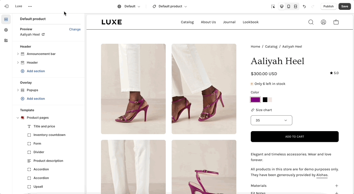
How to set up

Settings
Type
Description

Select an icon

select

Pick an icon to visually represent the feature. You can also upload a custom image that overrides the icon.

Image

image_picker

This setting allows you to use an image that overrides the selected icon.

Width

range

Set the width of the icon/image in pixels (between 20px and 50px).

Heading

text

The title that will appear above the feature's description.

Text

richtext

Use rich text to add formatted content, such as bold text, hyperlinks, or other HTML elements, to enhance your description.

Background color

color

Pick a color to set the background of the feature block.

Text

color

Customize the color of the text to match your design.

Padding bottom

range

Use the range slider to set the bottom padding (between 0px and 50px).