Palo Alto Doumentation
NewSupport
Latest version
Latest version
  • Palo Alto theme documentation
  • Updates
    • What's new in Palo Alto
      • Release notes
      • About 6.2 Release
      • About 6.1 Release
      • About 6.0 Release
      • About 5.9 Release
      • About 5.8 Release
      • About 5.7 Release
      • About 5.6 Release
      • About 5.5 Release
      • About 5.4 Release
      • About 5.3 Release
  • Sections
    • Palo Alto sections
      • Explore the sections
      • Accordions
        • Text block
        • Page block
      • Accordions with images
        • Text block
        • Page block
      • Banner image
        • Subheading block
        • Heading block
        • Text block
        • Timer block
        • Buttons block
        • Video button block
      • Banner with text columns
        • Column block
      • Blog posts
      • Buttons list
        • Button block
      • Collection list
        • Collection block
      • Contact form
        • Form heading block
        • Email block
        • Message block
        • Text line block
        • Telephone block
        • Divider block
        • Single checkbox block
        • Select dropdown block
        • Radio buttons block
      • Countdown
        • Subheading block
        • Heading block
        • Text block
        • Timer block
        • Buttons block
        • Video button block
      • Custom code
      • Custom content
        • Image block
        • Text block
        • Newsletter block
        • Testimonial block
        • Product block
        • Video block
        • Collection block
      • Divider
      • Featured collection
        • Promo block
      • Featured product
      • Grid
        • Collection block
        • Product block
        • Image block
        • Text block
      • Icons row
      • Image
      • Image accordions
      • Image with scrolling text
      • Image with text
      • Locations
      • Marquee
      • Multi column
      • Newsletter
      • Overlapping images
      • Press/Logo
      • Products list
      • Products with image
      • Promotion row
      • Recently viewed products
      • Shop the look banner
      • Shop the look grid
      • Shoppable blog posts
      • Slideshow
      • Social gallery
      • Split images
      • Sticky image cards
      • Sticky images and text
        • Sticky images and text: Horizontal
      • Tab collections
      • Testimonials
      • Testimonials with images
      • Text
      • Text columns with images
      • Video
  • Theme Settings
    • Theme settings
      • How to make changes
      • Colors
      • Typography
      • Buttons
      • Product grid
      • Product form
      • Quick shop
      • Cart
      • Upsells
      • Loading overlay
      • Appearance
      • Animation
      • Badges
      • Swatches
      • Pagination
      • Search
      • Social media
      • Currency
      • Favicon
      • Size chart
      • Custom CSS
      • Theme style
  • Header
    • Announcement bar
      • Settings and blocks
      • Text
      • Free shipping message
      • Custom HTML
      • Target settings
      • Image
    • Header
      • Header settings
      • Mega menu
      • Logo
      • Highlighted link
      • Transparent header
    • Mobile menu
      • Menu
  • Footer
    • Footer
      • Settings and blocks
      • Logo
      • Text
      • Link list
      • Newsletter
      • Blog
  • Products
    • Product pages
      • Variant images
      • Settings and layout
      • Size chart tabs
      • Size chart metafields
      • Custom color swatches
      • Pre-order
      • Gift card product
      • Out of stock notification
      • Metaobjects
      • Creating new product page templates
    • Blocks
      • Product blocks
      • Title and price
      • Form
      • Product description
      • Cutline
      • Accordion
      • Upsell
      • Share button
      • Pickup availability
      • Custom code
      • Text
      • Icon
      • Icon row
      • Siblings
      • Inventory countdown
      • Popup text
      • Line item property
      • Divider
      • Feature
      • Complementary products
      • Badges
      • Timer
      • Fit guide
  • Collections
    • Collection pages
      • Filtering options
      • Custom product badges
      • Cutline
      • Catalog banner images
      • Collection pages promo
  • Cart
    • Palo Alto Cart
      • Cart types
      • Empty cart buttons
      • Free shipping message
      • Custom message
      • Terms and conditions
      • Upsell promotion
  • Pages
    • Page templates
  • Blogs
    • Blogs and articles
      • Settings and layout
      • Recommended posts
      • Creating blog page templates
  • Overlay
    • Popups
      • Popup with image
      • Popup small
      • Cookie consent
      • Popup behavior
  • Promotions
    • Upselling
      • Upsell promotions
  • Siblings
    • Product siblings
      • About product siblings
      • How to setup siblings
      • Define a metaobject
      • Add product list entries
      • Activate using a metafield
      • Bulk update sibling products
      • Siblings block
  • FAQ
    • Frequently asked questions
      • Updating your theme
      • Highlight words
      • Image aspect ratio
      • Recommended image sizes
      • Adding a section
      • Reordering sections
      • Sharing a preview link
      • Check your theme version
      • How to add custom fonts
      • Remove 'Powered by Shopify'
      • CSS customizations
  • License
    • Theme license
  • Support
    • Contacting support
    • Shopify Experts
Powered by GitBook
On this page
Export as PDF
  1. Products
  2. Blocks

Icon

PreviousTextNextIcon row

Last updated 10 days ago

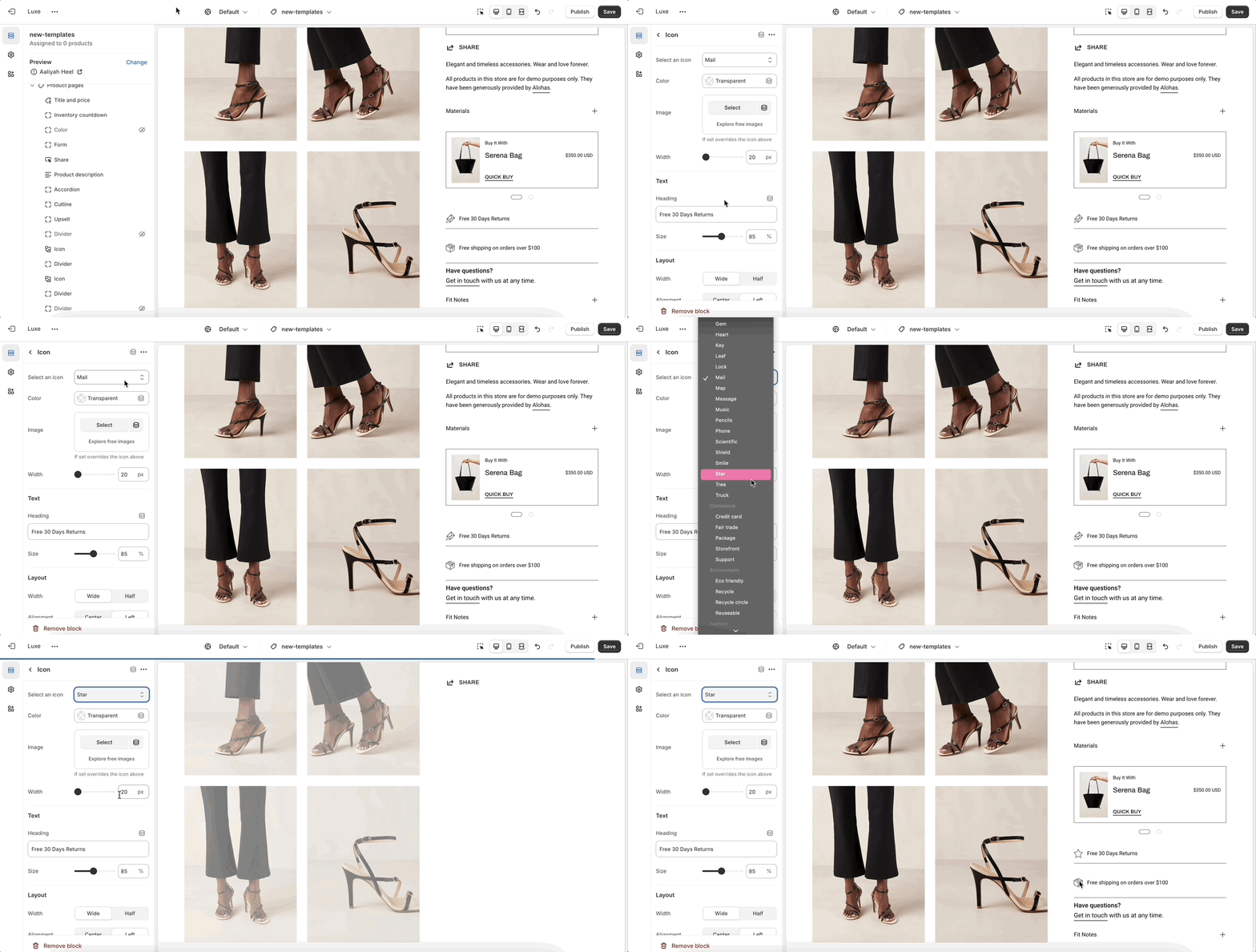
The Icon block highlights product features or benefits using visual icons, optional images, and supporting text. Ideal for building trust and conveying quick information.

How to set up

Settings
Type
Description

Select an icon

select

Choose from a categorized list of icons (e.g., commerce, food, fashion, and others).

Color

color

Customize the icon’s color.

Image

image_picker

Upload an image to override the selected icon.

Width

range

Set the icon size (20–50px).

Heading

text

Add a short description.

Size

range

Adjust the text size (50–125%).

Width

select

Choose between Wide or Half.

Alignment

select

Align text Left or Center.

Background color

color

Set a background color for the block.

Padding bottom

range

Adjust spacing below the block (0–50px).