Loading...
Loading...
Loading...
Loading...
Loading...
Loading...
Loading...
Loading...
Loading...
Loading...
Loading...
Loading...
Loading...
Loading...
Loading...
Loading...
Loading...
Loading...
Loading...
Loading...
Loading...
Loading...
Loading...
Loading...
Loading...
Loading...
Loading...
Loading...
Loading...
Loading...
Loading...
Loading...
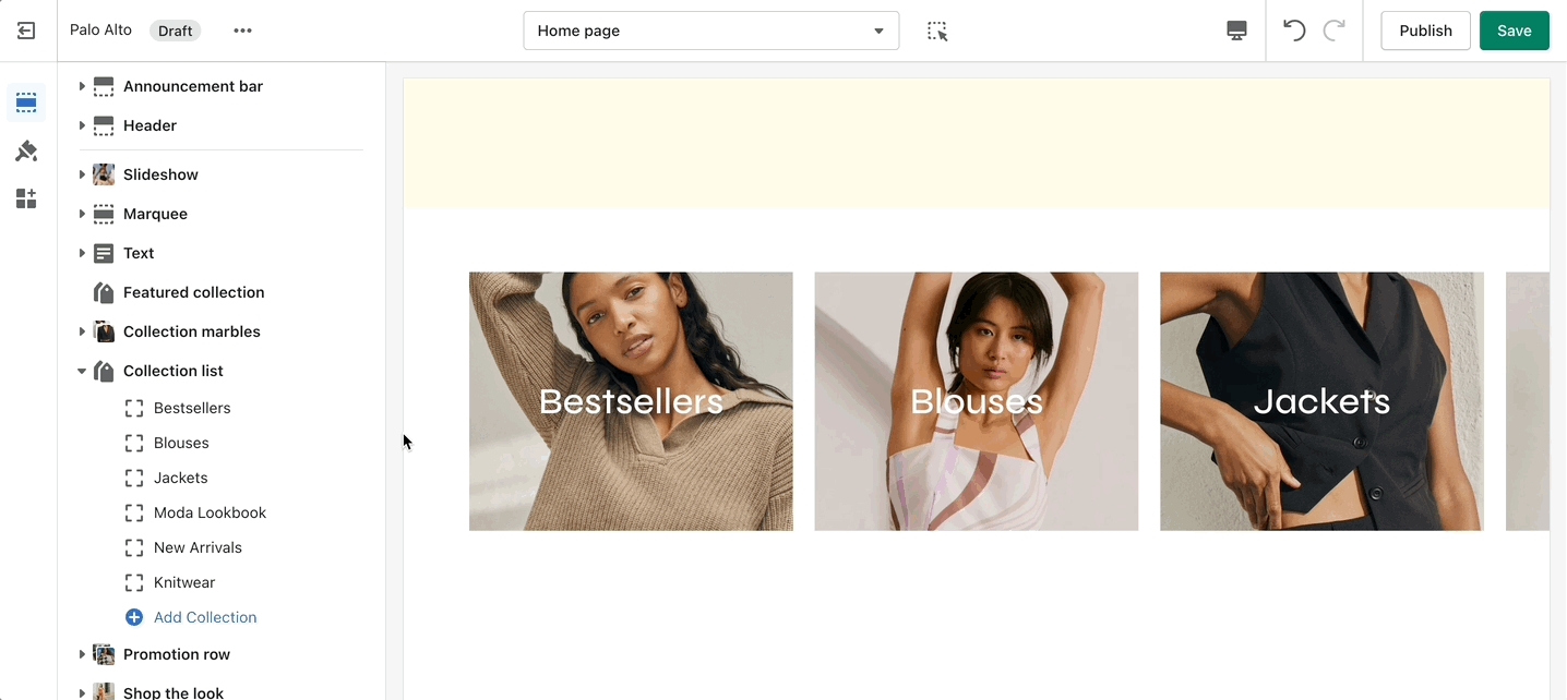
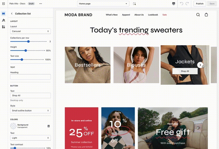
The 'Collection list' section is here to help you add links to collections you want to highlight on your store pages. This is a quick and easy way to run promotions or let your customers know about new collections.
The 'Collection list' section allows you to add up to 12 collection blocks per section. You can use multiple sections to show more collections.
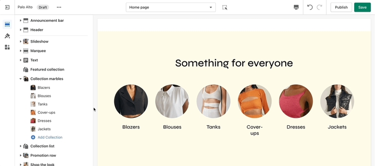
A stylish new section to help showcase your most recent or most popular collections with small icons.
Set the layout, main heading, and sizes for the section. Choose the collection link and image for each block.
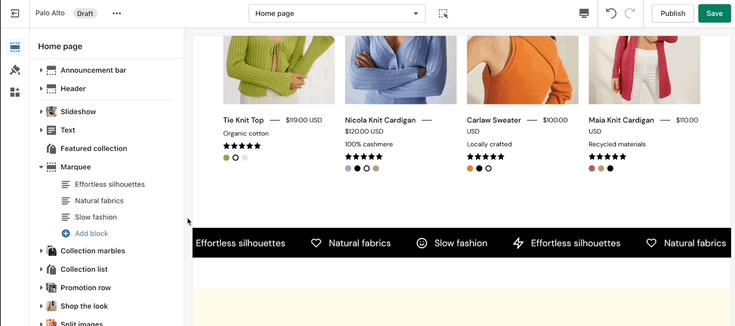
Add blocks by clicking on the small arrow next to the section then clicking 'Add block'
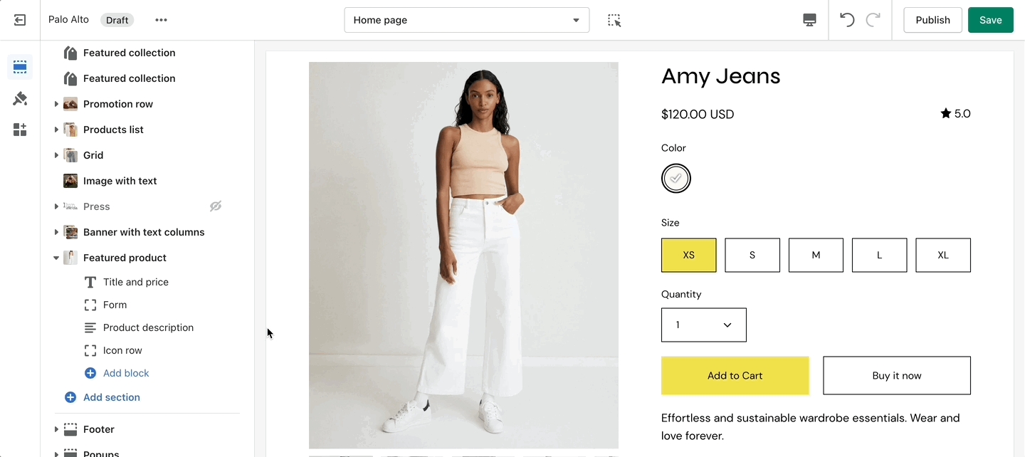
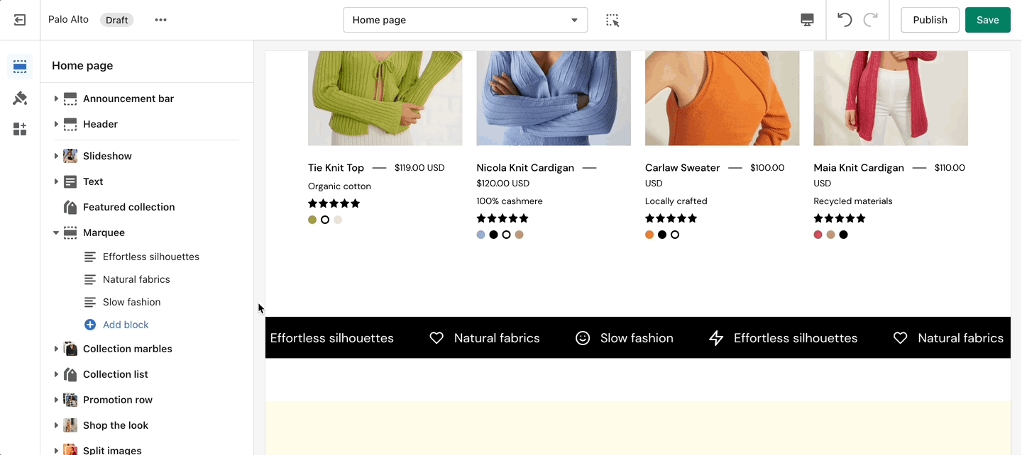
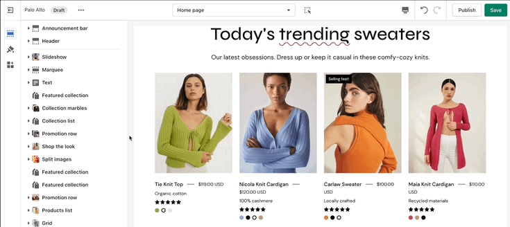
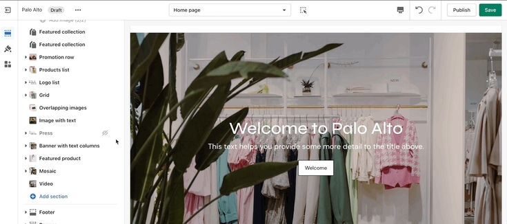
The 'Featured collection' section allows you to highlight a specific collection of products on your store pages. This section generates blocks with links to each product page.
From the settings of this section, you can control which collection to display, the number of rows, as well as a handful of other settings.
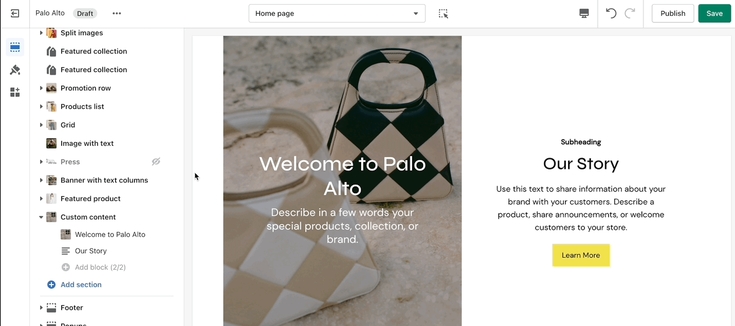
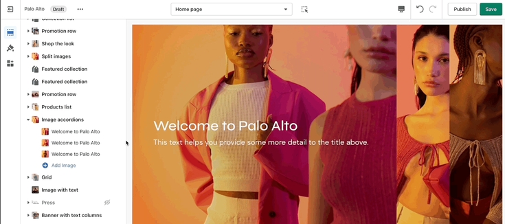
One of our newest sections, Image accordions, allows you to set a unique look and showcase multiple images that reveal more information as you hover over them.
Set a style and height for the section. Set the image, text, and button settings for each block.
With the new Palo Alto 4.5 update we have introduced the option to set a height for your mobile layout to the Images accordions section.
Add blocks by clicking on the small arrow next to the section then clicking 'Add block'.
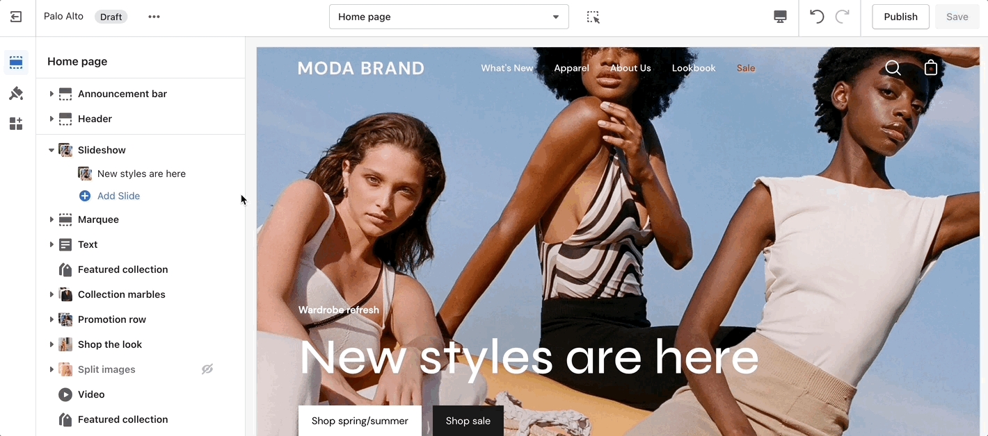
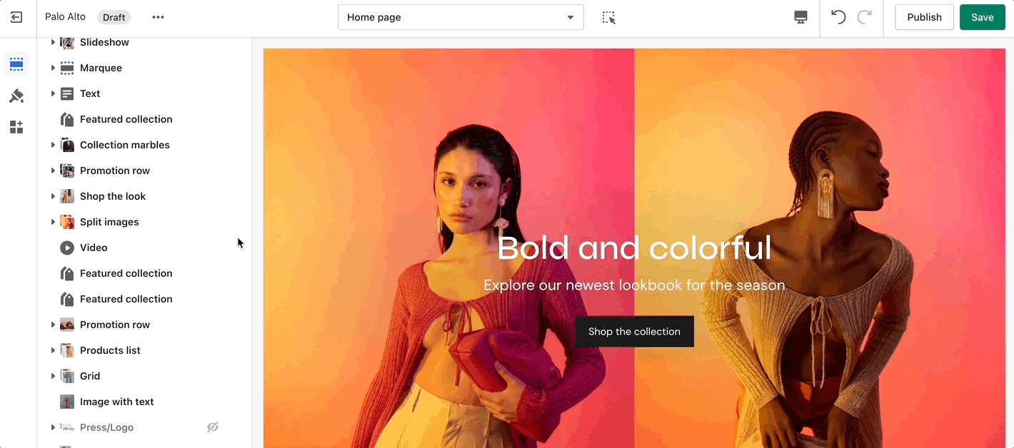
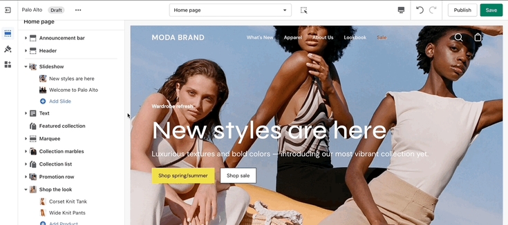
This is the perfect hero section for most stores. Use the Slideshow to create a home page banner with incredible customizability.
Adjust the general settings of the section. Adjust the individual block settings of this section.
If the button text is empty, the whole slide becomes the link.
With the new Palo Alto 4.5 update we have introduced the option to set a height for your mobile layout to the Slideshow section.
Add blocks by clicking on the small arrow next to the section then clicking 'Add block'.
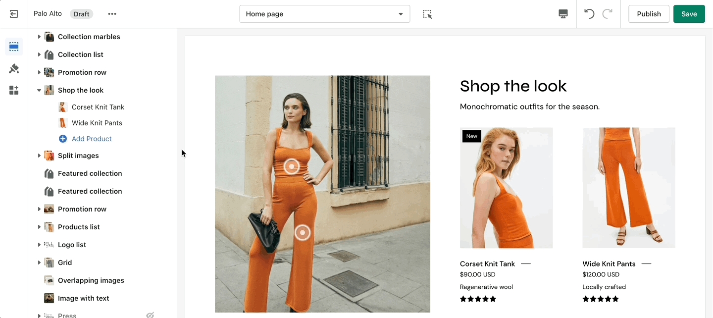
'Shop the look' allows you to use images and dots to highlight specific points of your products. Use this section to create a unique way of getting your customer's attention!
The individual blocks of this section are images. From their own settings, you can gain access to add different images as well as move the dots to different places.
Add blocks by clicking on the small arrow next to the section then clicking 'Add block'
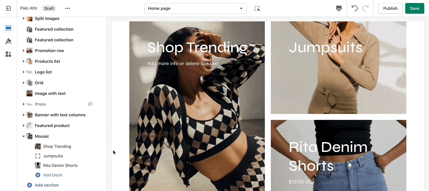
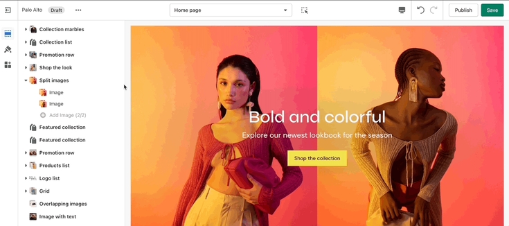
Create a split view to showcase your products or product images.
Set the section height, alignment, and text settings. Set the individual images.
With the new Palo Alto 4.5 update we have introduced the option to set a height for your mobile layout to the Split images section.
Add blocks by clicking on the small arrow next to the section then clicking 'Add block'.
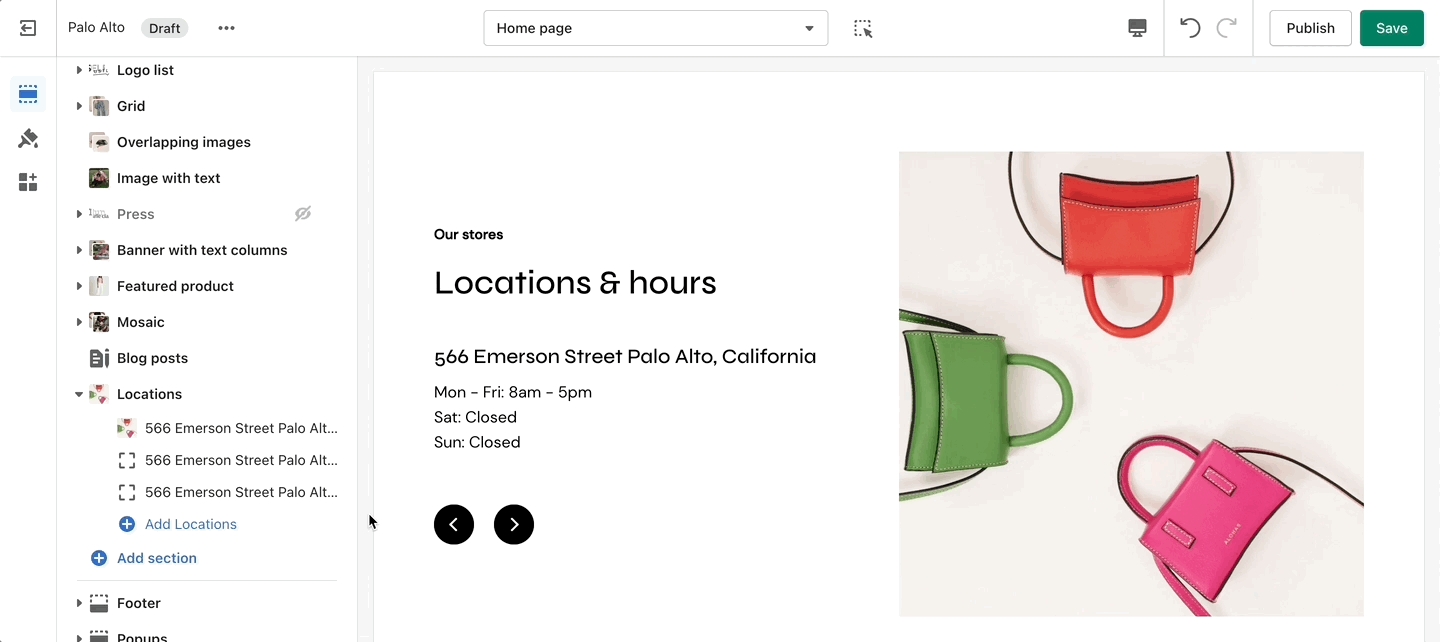
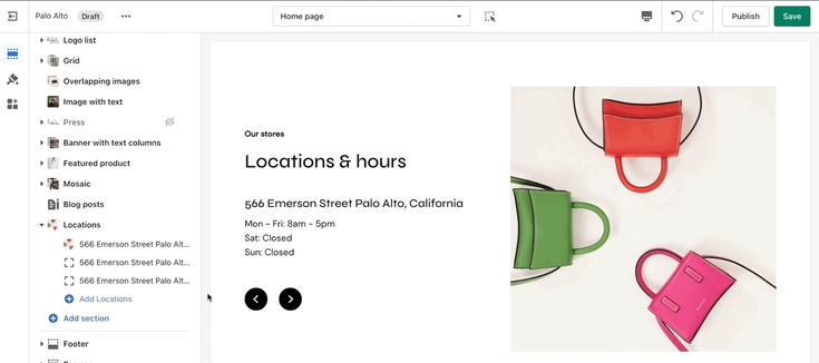
Let your customers know about your store locations. You can add more than one block if you have multiple stores.
Set the general headings and colors of the section. Set different options for different blocks such as different working hours, images, or addresses.
Add blocks by clicking on the small arrow next to the section then clicking 'Add block'.
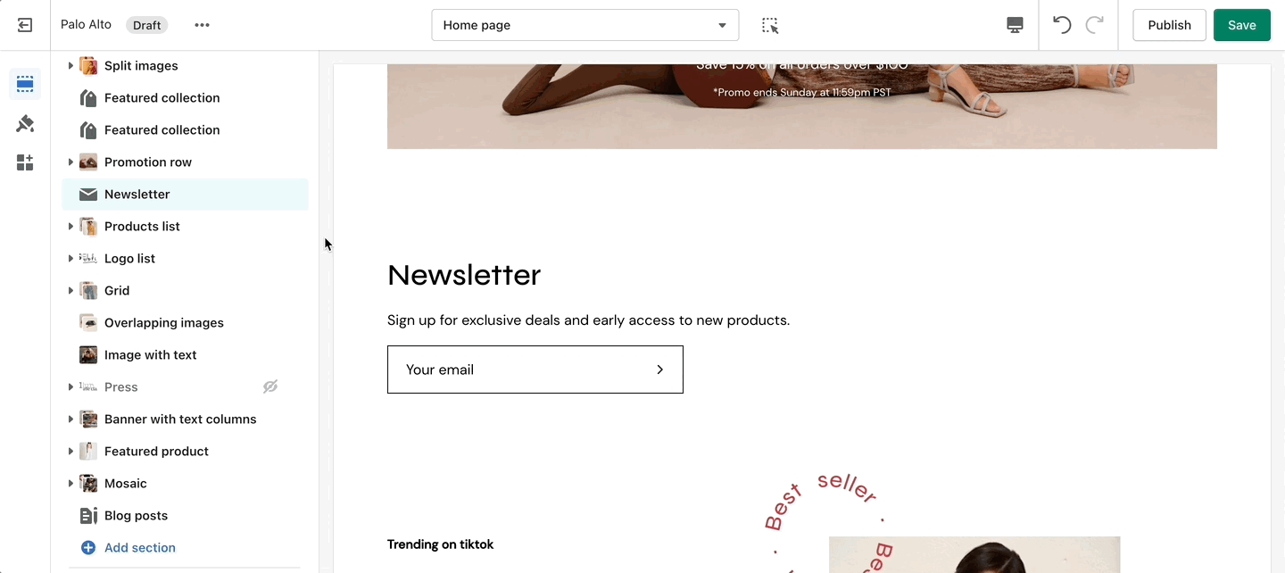
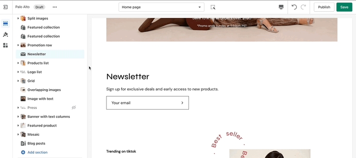
Display a small-sized newsletter signup message.
Out of the box, there aren't any blocks for this section. It solely relies on blocks from third-party mailing apps to create a link between the newsletter subscribers and the mailing lists.
Use mailing applications to integrate blocks and more advanced email marketing lists.
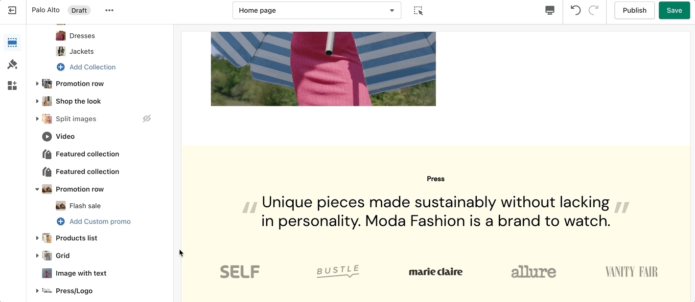
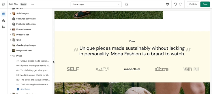
Use the 'Press/Logo' section to present short bursts of information to your customers.
Each block gives you the option to add a logo and text. The text is swapped out whenever a different logo is selected.
Add blocks by clicking on the small arrow next to the section then clicking 'Add block'.

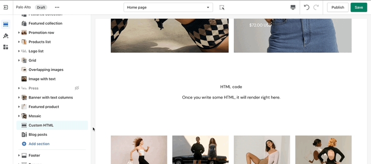
Include custom HTML snippets to create a unique look. Add partner badges via HTML snippets easily to any of your store pages.
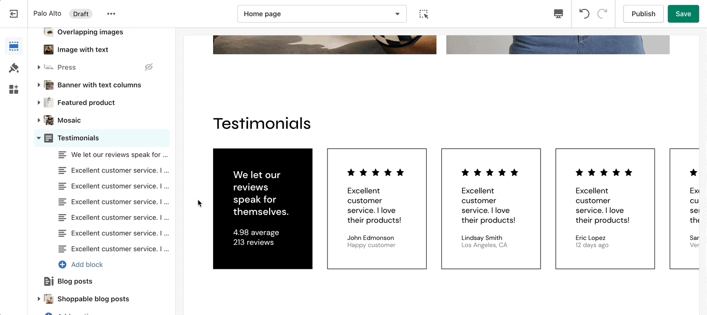
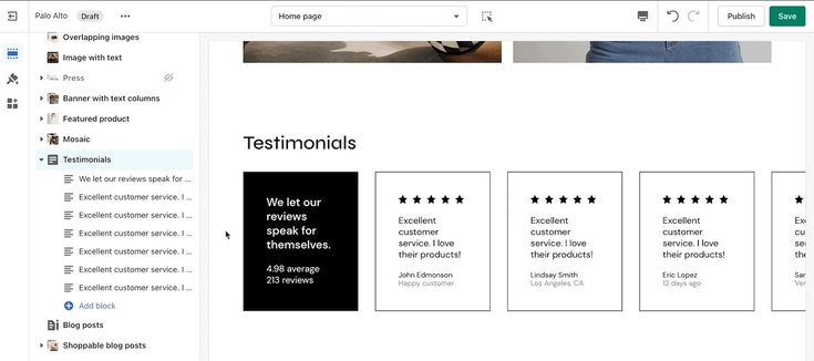
Add quotes from business partners and client testimonials to your store pages.
Add a heading and set the colors, alignment, and navigation style of this section. Add individual testimonial blocks to the section.
Add blocks by clicking on the small arrow next to the section then clicking 'Add block'.
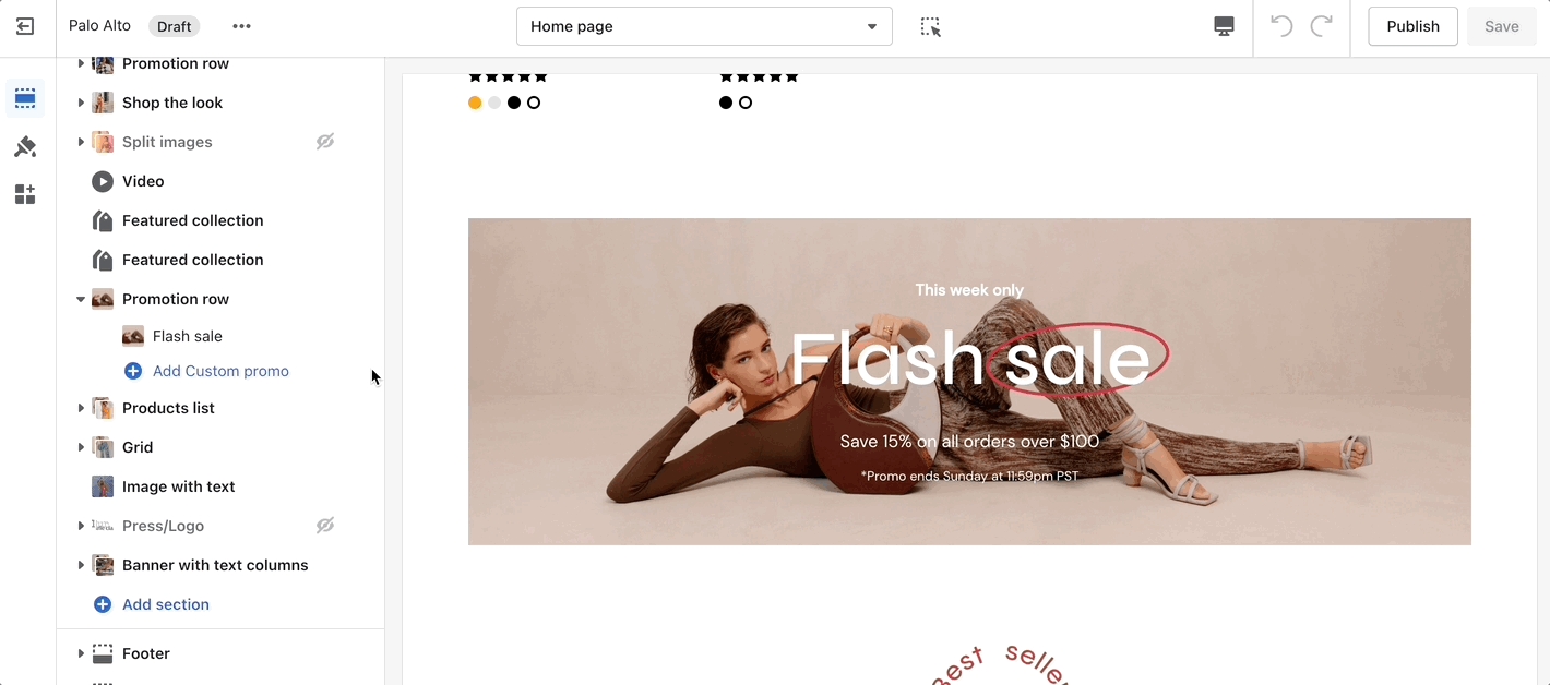
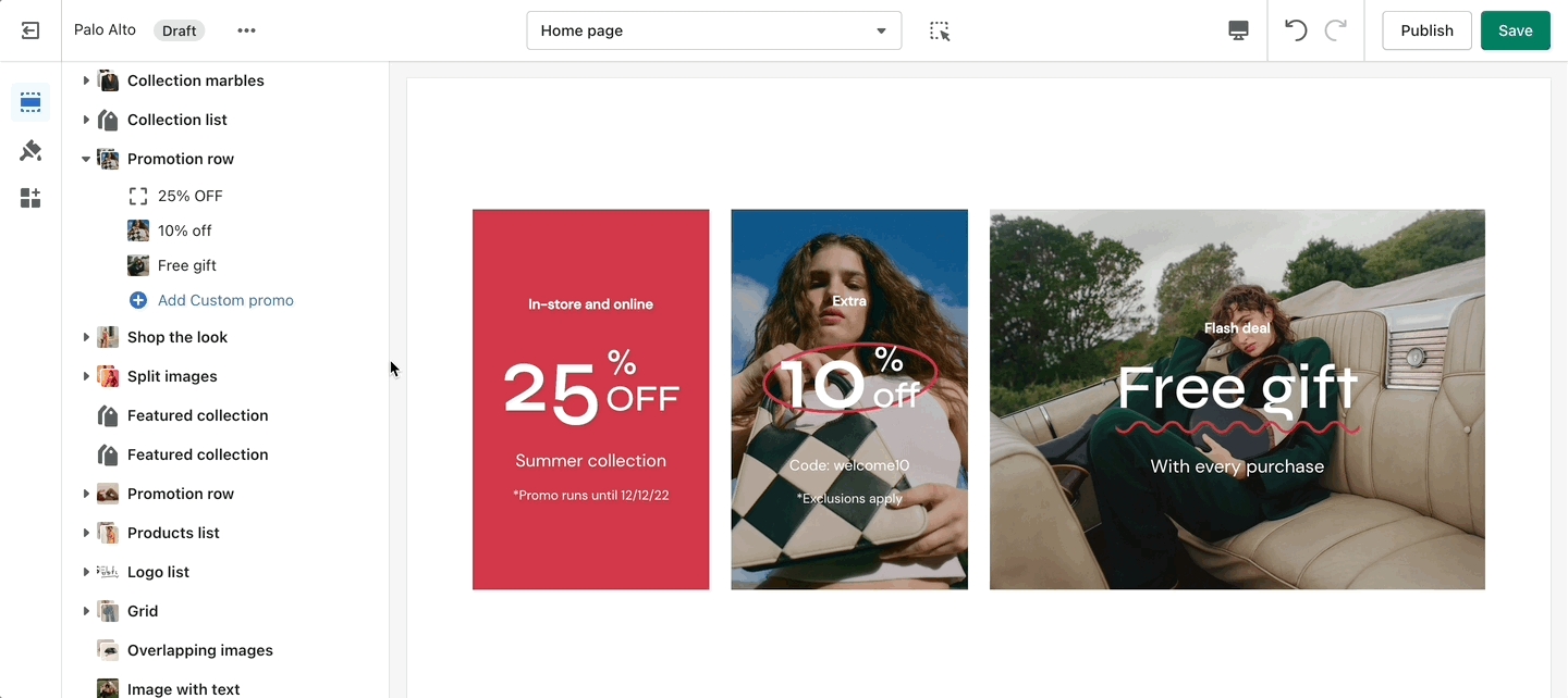
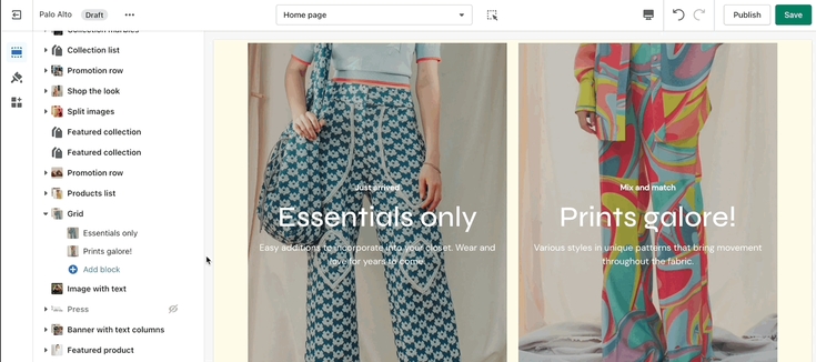
A new addition to our section set to help promote your brand or current discounts:
Color Gradients are a new feature recently added to Shopify. We've made use of them in our Promotion Row section with the new Palo Alto version 4.5 release. Available now for download on the Shopify Theme Store!
Color Gradients are tricker to set up (compared to regular color options). We highly recommend checking out the Shopify Help documentation for this new feature.
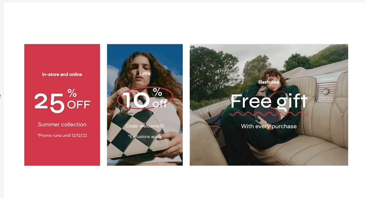
Set an image with text overlay and highlight select text to give it a pop. This new section in Palo Alto gives you the ability to let customers know about your discounts and current promotion on any store page.
Add blocks by clicking on the small arrow next to the section then clicking 'Add block'
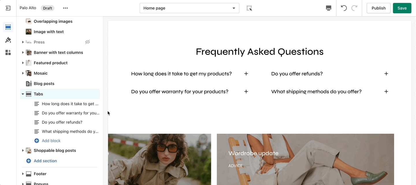
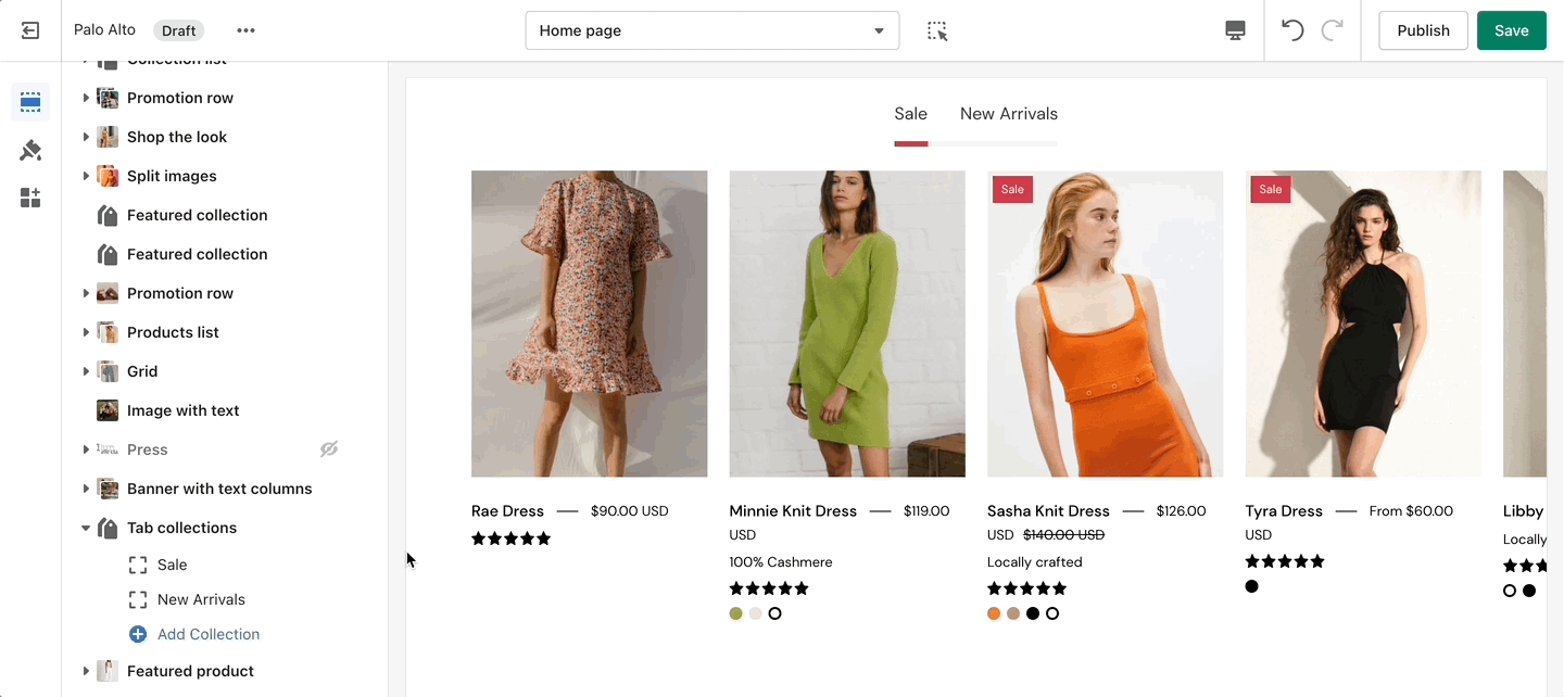
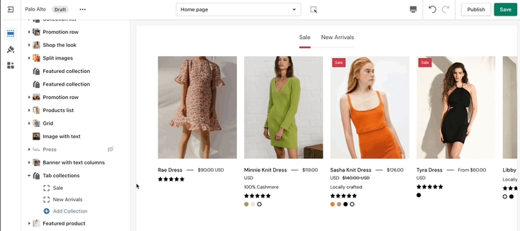
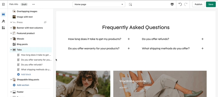
Palo Alto includes a 'Tabs' section to help you provide frequently asked questions. A place to promote your services, and brand strengths and also include product reviews.
The blocks in this section help to create the individual tabs. Here you can add the heading and text for each question and answer. Add Text and Page.
Add blocks by clicking on the small arrow next to the section then clicking 'Add block'.
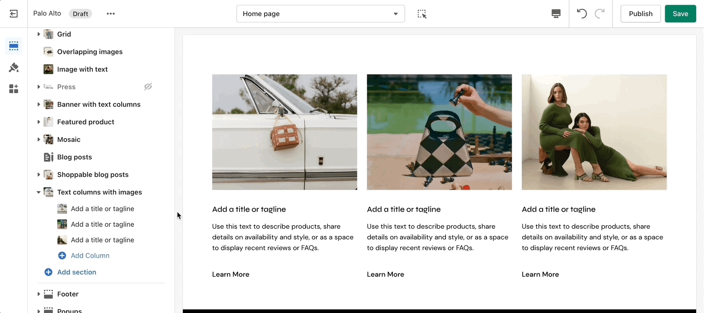
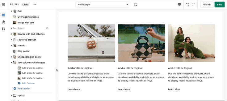
Inspired by the blog posts section, 'Text collums' allows you to create your own highlights from the theme editor without having the need to create blog posts.
Adjust the heading, colors, and general settings of the section. Adjust the individual blocks' text, buttons, links, images, video popups, and more.
Add blocks by clicking on the small arrow next to the section then clicking 'Add block'.
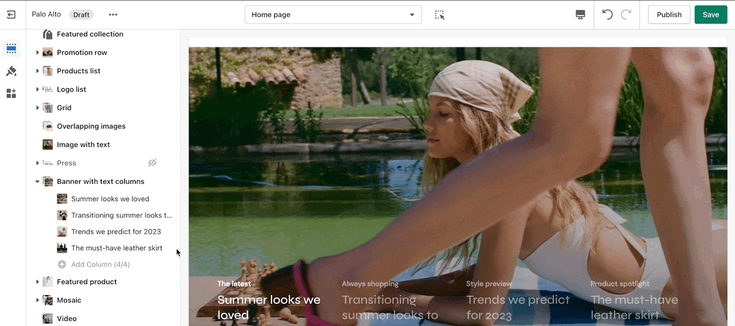
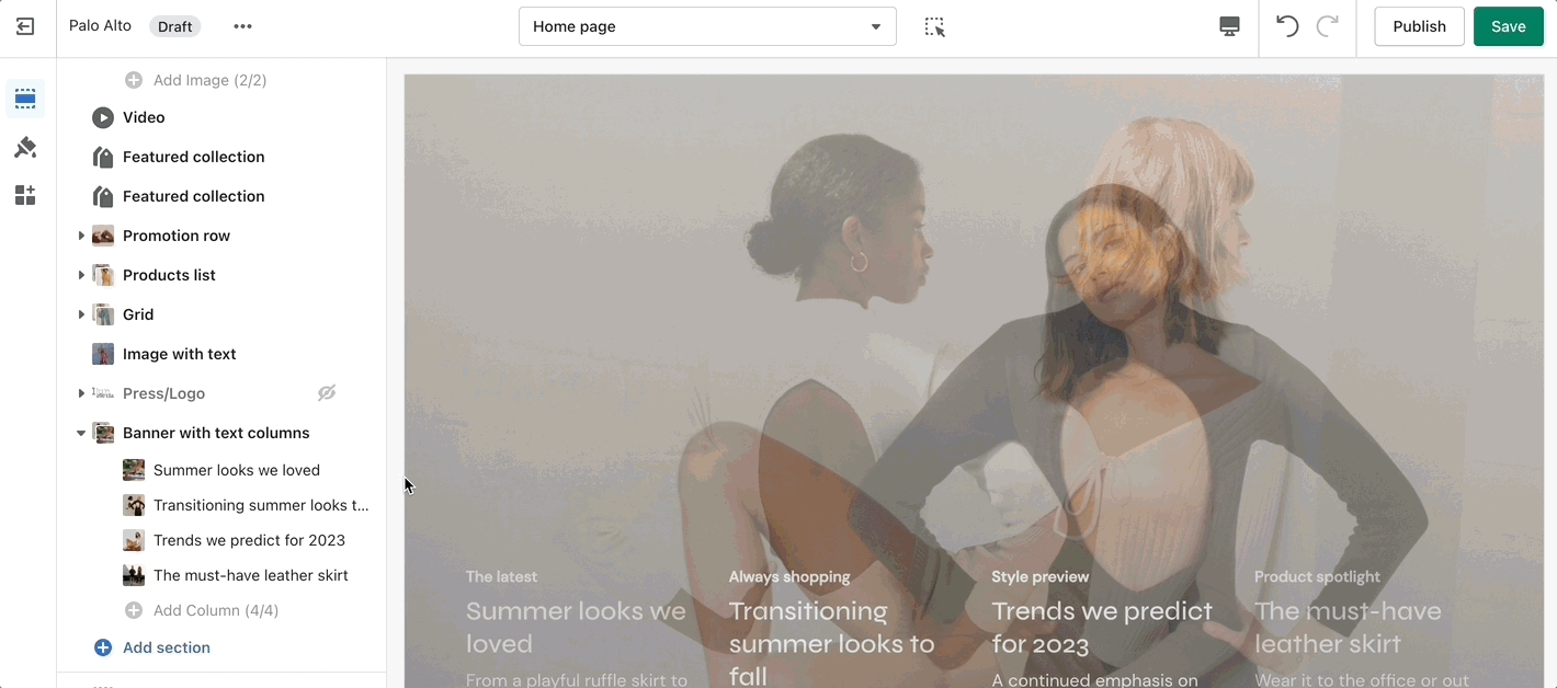
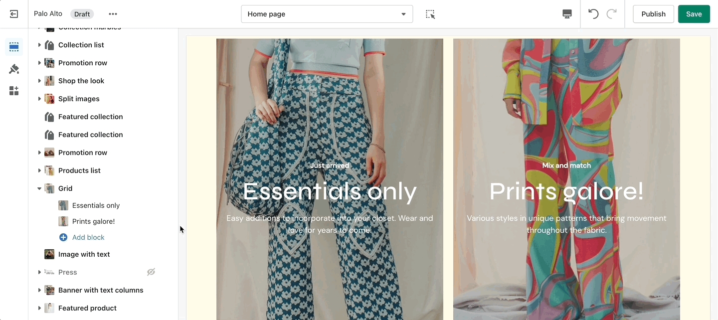
A new way of showing text boxes each with its own background image.
Set the section height and text color from the main section settings. Adjust each individual Column from a new block.
With the new Palo Alto 4.5 update we have introduced the option to set a height for your mobile layout to the Banner with text columns section.
Add blocks by clicking on the small arrow next to the section then clicking 'Add block'.
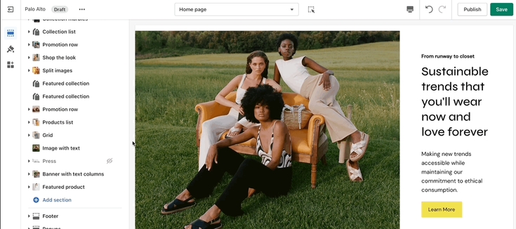
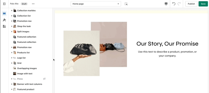
'Image with text' uses a solid color block to make the text stand out over the image. Use this more striking design to grab your customer's attention.
Set up your image, text, positions, and buttons by using these section settings.
With the latest update to Palo Alto, we have improved the Image with a text section. It now includes a set of two new settings that will allow you to set the width for your image:
Please note that the Image width option only applies to the 'Inline' Layout style.
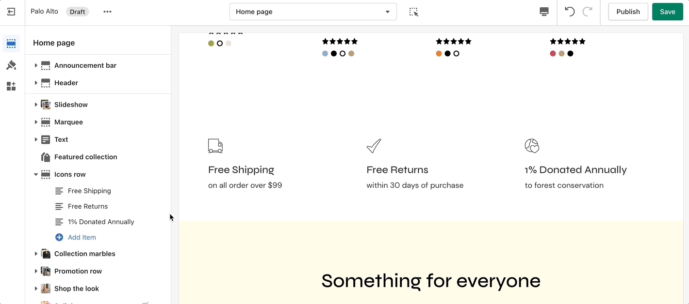
The 'Icons Row' section can be used to present short bursts of information to your customers. Use them in combination with predefined icons or with your own images.
Adjust the icon's width and color of this section. Individually adjust the icon style and text for each block.
There are over 50 new icons to choose from with a fresh and modern design. We have also grouped them so that you can more easily find icons that suit your needs.
Add blocks by clicking on the small arrow next to the section then clicking 'Add block'.
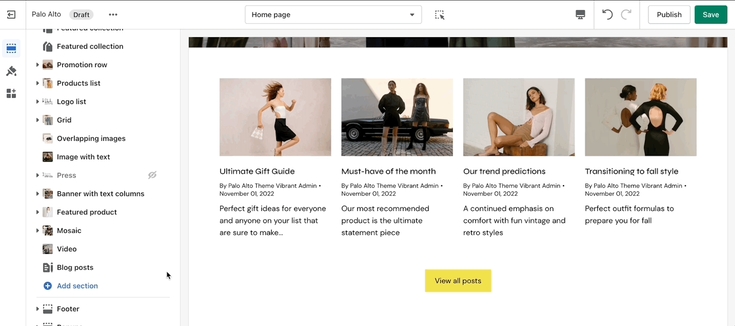
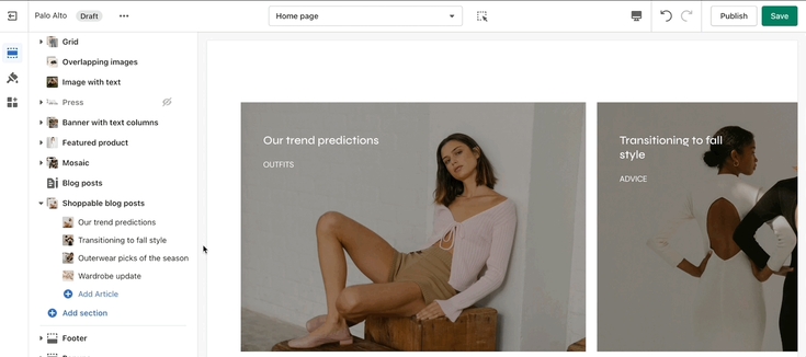
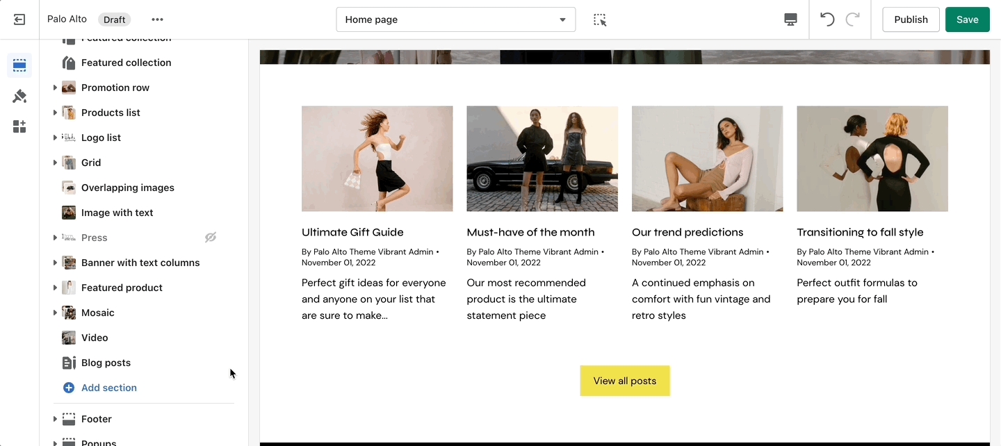
Highlight your latest and greatest blog posts. Use this section to generate traction and bring exposure to your blogs on any store page.
Set the heading and background color for the section. Set the individual block settings for each article added.
Add blocks by clicking on the small arrow next to the section then clicking 'Add block'.


