Loading...
Loading...
Loading...
Loading...
Loading...
Loading...
Loading...
Loading...
Loading...
Loading...
Loading...
Loading...
Loading...
Loading...
Loading...
Loading...
Loading...
Loading...
Loading...
Loading...
Loading...
Loading...
Loading...
Loading...
Loading...
Loading...
Loading...
Loading...
Loading...
Loading...
Loading...
Loading...
Loading...
Loading...
Loading...
Loading...
Loading...
Loading...
Loading...
Loading...
Loading...
Loading...
Loading...
Loading...
Loading...
Loading...
Loading...
Loading...
Loading...
Loading...
Loading...
Loading...
Loading...
Loading...
Loading...
Loading...
Loading...
Loading...
Loading...
Loading...
Loading...
Loading...
Loading...
Loading...
Loading...
Loading...
Loading...
Loading...
Loading...
Loading...
Loading...
Loading...
Loading...
Loading...
Loading...
Loading...
Loading...
Loading...
Loading...
Loading...
Loading...
Loading...
Loading...
Loading...
Loading...
Loading...
Loading...
Loading...
Loading...
Loading...
Loading...
Loading...
Loading...
Loading...
Loading...
Loading...
New features and updates
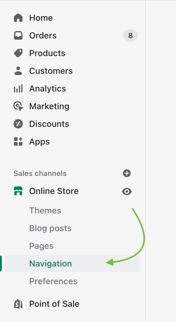
Additional information on recent Palo Alto updates
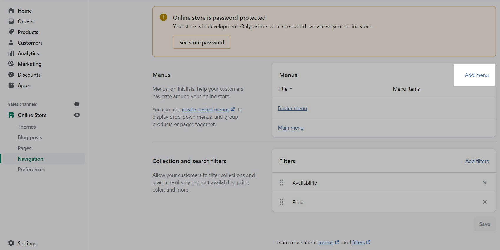
Palo Alto has added a new Social gallery" section to help users curate images without using a social media app.
Use the section settings to design the layout of the image carousel and configure the heading and buttons:
You can customize the image, text, and button with each image block. Use the "Open link new tab" toggle for external links.
You can now incorporate rich accordions into the "Image with text" section in Palo Alto. Insert images into the accordion to create a modern interactive design:
Add one or more accordion blocks to build the accordion and rearrange blocks for the perfect layout:
Palo Alto has added a new super-charged accordion section, "Accordion with images." This section lets you quickly create modern accordion designs with various options and layouts.
Add images to the accordions, customize the background with support for gradients, and much more:
Each text block can add the accordion content, including an image. Images can be sized individually and placed inline or above the text:
The popular "highlight" feature in Palo Alto now includes an alternate font style. You can choose the option from Palo Alto's highlight dropdown and add color to the design:
Configure the font type in the Theme settings under Typography:
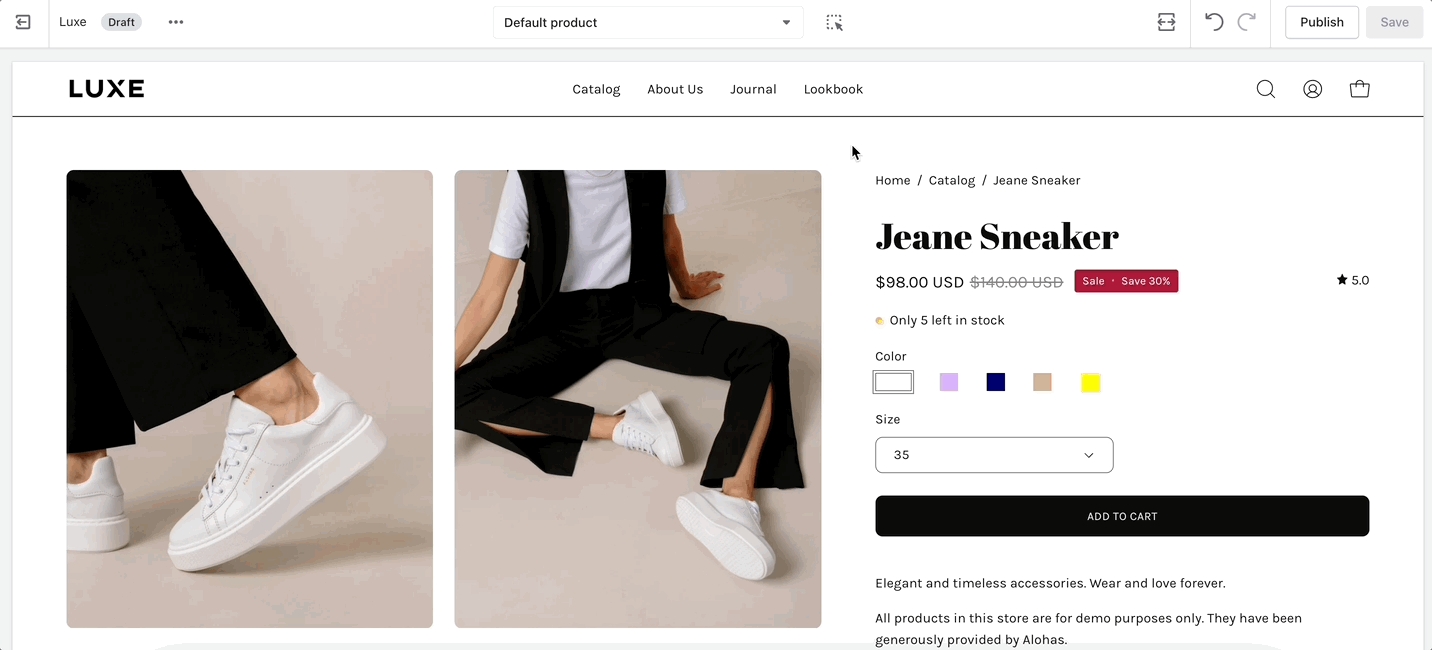
The Product detail page (default product template) now has an option to display badges in the product gallery:
Configure the "Badges" block with new toggle options, including "Show images over gallery".
Sale badges can also be displayed over the product image.
The description and accordion blocks can now be placed below the product gallery with a new toggle to "Enable full with":
When enabled, the accordion or description will be moved from the product form column to a new full-width column below the image gallery.
Palo Alto has introduced new global button sizes to the theme. You can now choose the button size within many sections and blocks.
To configure the default sizes, use the Theme settings under Buttons. Scroll down to Advanced:
Adjust the sizes, including the Font size, Width, and Height:
Tip: Experiment with larger and smaller font sizes to see if there is a noticeable difference. At first, the choices may seem subtle. The font size might affect the width of the button.
Palo Alto now includes more background options for sections. You'll find the complete color picker in our sections, giving you flexibility for each section:
The gradient picker is also available as a background overlay with many sections:
For additional examples and to try Palo Alto for free, visit our demo stores and download the latest version of Palo Alto:
Existing customers can update for free. To preserve your live published theme, use the Shopify Update tool. The update tool will download an additional theme to your theme library and only copy the settings from your live theme. This is the safest and easiest method of updating your theme.
Welcome to Palo Alto theme by Presidio Creative
Dive into a world of elegance with Palo Alto’s exquisite design quality and smooth animations. The meticulous attention to detail and cohesive visual elements create an immersive and aesthetically pleasing environment, captivating visitors and emphasizing your products’ uniqueness and appeal.
Palo Alto is designed with a strong emphasis on promotions. It features promotion-focused sections, newsletters, and pop-ups alongside ad placements strategically located on your home page, within collections, and on product pages. This thoughtful integration allows you to drive sales effectively and engage your audience with your latest deals and offerings. Explore creative designs with our demonstration stores and learn how to use sections and features within Palo Alto throughout our documentation.
Unleash your creative freedom with over 30 customizable sections, including standout options like "Shop the Look," a multifaceted "Featured Collection" with multiple layout choices, and an engaging "Image Accordion" section. These sections empower you to tailor your storefront uniquely, aligning perfectly with your brand aesthetics and vision:
Explore and learn about the new features and changes in Palo Alto. Our What's New guides detail changes and new features with each release:
Explore the changelog for details on our previous versions:
You can download a free trial version from the Shopify theme store if you are new to Palo Alto. Discover how Palo Alto can help you build the right store for your brand, products, and services. Use it as a draft theme for as long as you like. Pay only when you publish:
If you have questions or need additional assistance with using Palo Alto, our support staff is here to help you by email. Reach out to us from our contact form:
Additional information on recent Palo Alto updates
Introducing a new mobile menu section for the header. In Palo Alto, you can now use the mobile menu section to display a rich, modern-designed navigation instantly:
Collection images can automatically added without any customization.
Sub-menu items have a new, clean design.
Easily add your shop logo to the new menu.
Plus, new blocks will be coming soon for greater customization.
Customize the mobile menu block with options to choose a menu and text size, toggle images, scale images wide or tall, highlight any menu item with color, and optionally display a tag:
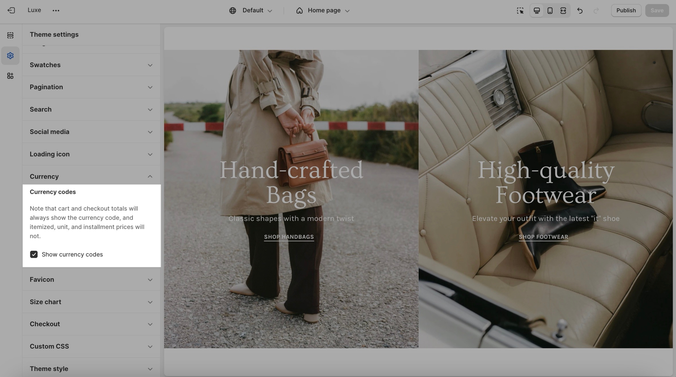
In this release of Palo Alto, we've added some additional settings for the header:
Language selector dropdown
Currency chooser dropdown with optional country flags
Border color picker
Border opacity range slider
Find the new options under the Header settings:
Palo Alto has added a new section that features scrolling text over an image banner:
We've combined the powerful Banner Image section with the popular scrolling text feature. This section is optimized to handle scrolling text:
The original Banner Image section is still available and supports split images. The new Image with Scrolling Text section uses one image and offers separate desktop and mobile image options.
The product template in Palo Alto now includes three new blocks to enhance product page customization further.
Timer - Countdown timer to add urgency.
Fit guide - Visual gauge to help customers know how a product fits.
For best results when using the fit guide block, use metafields to set a value for each individual product.
Here's a video walk-through on how to create a simple metafield for the fit guide feature:
The Palo Alto product form and cart now have two Quantity field styles. You can choose from between the new -/+ style shown below or a dropdown:
To switch between styles, use the Theme settings -> Product form:
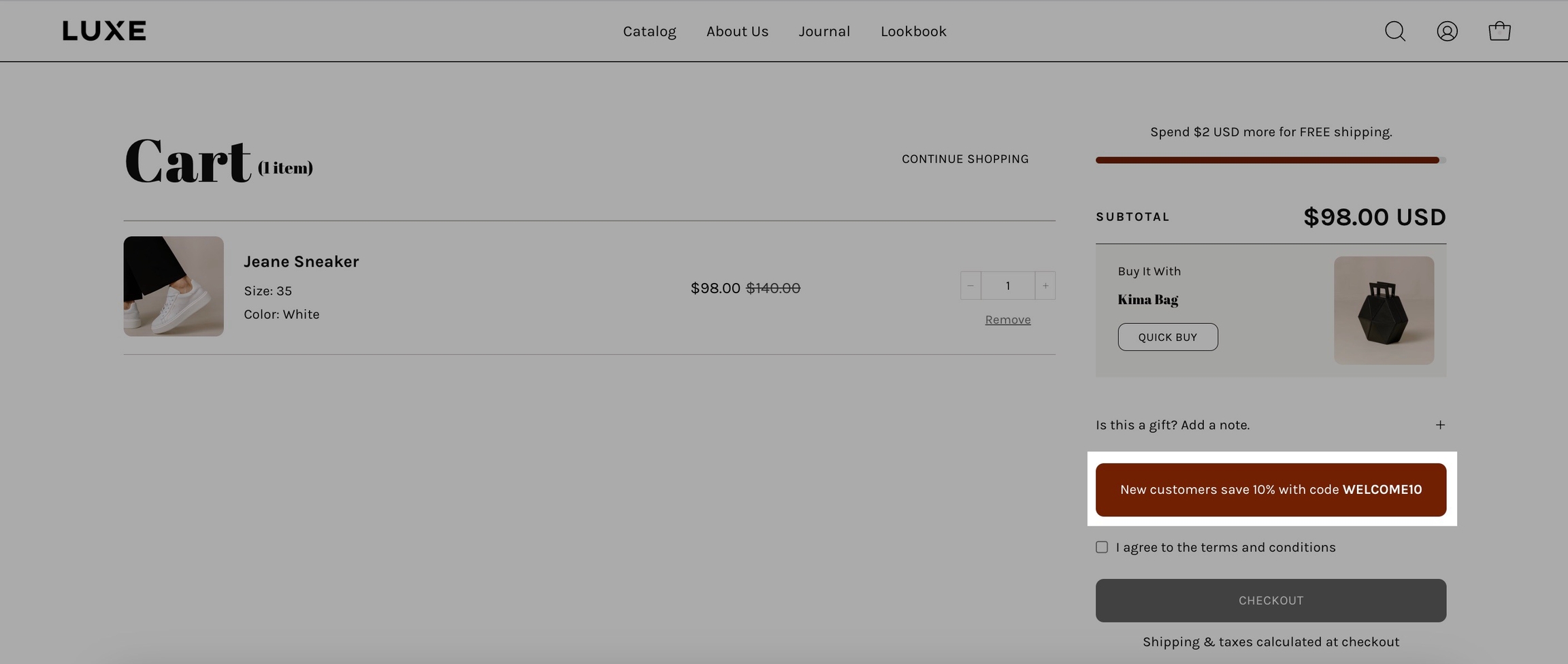
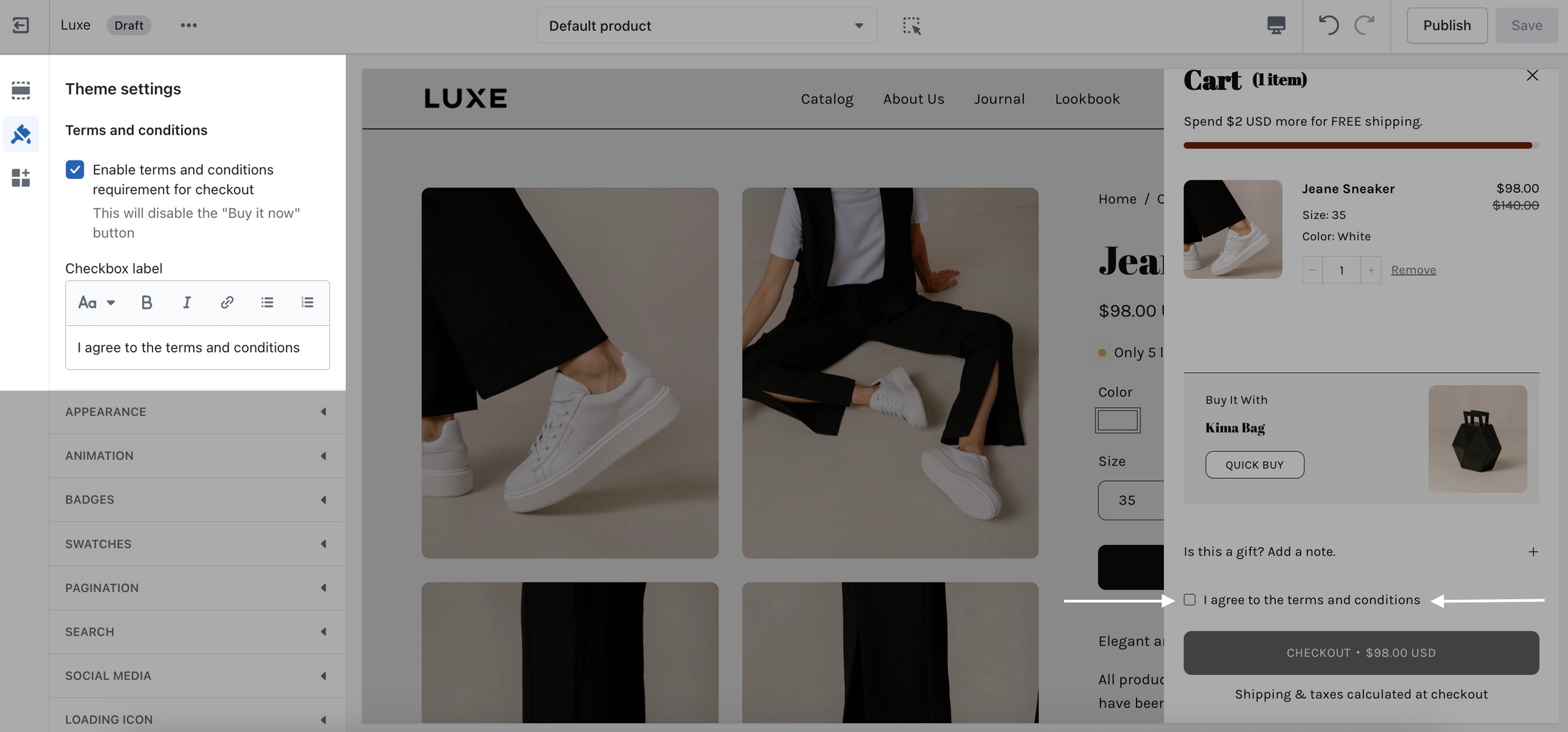
With Palo Alto, you can display a Final Sale message to inform your customers of the conditions of a final sale.
Palo Alto can display a final sale message on all sale items with info-text upon hover:
To configure the final sale feature, use the Theme settings -> Product form:
Video walk-through on how to set a custom metafield for the final sale feature:
Palo Alto now includes a soft, modern button style to the list of button options:
Combine with colors to see variations of the new soft button style.
We've added a font-picker to the Marquee section in Palo Alto. Now, you can choose any font in your font library for the text message. We've also added a Space between messages slider to customize how much space is shown after messages:
Palo Alto now lets you add MP4 and MOV videos to our modern Sticky image cards and Sticky images with text sections:
Paste the video URL from your Shopify files:
Click on the files link to open your Shopify Files list, and then use the link icon to copy the URL:
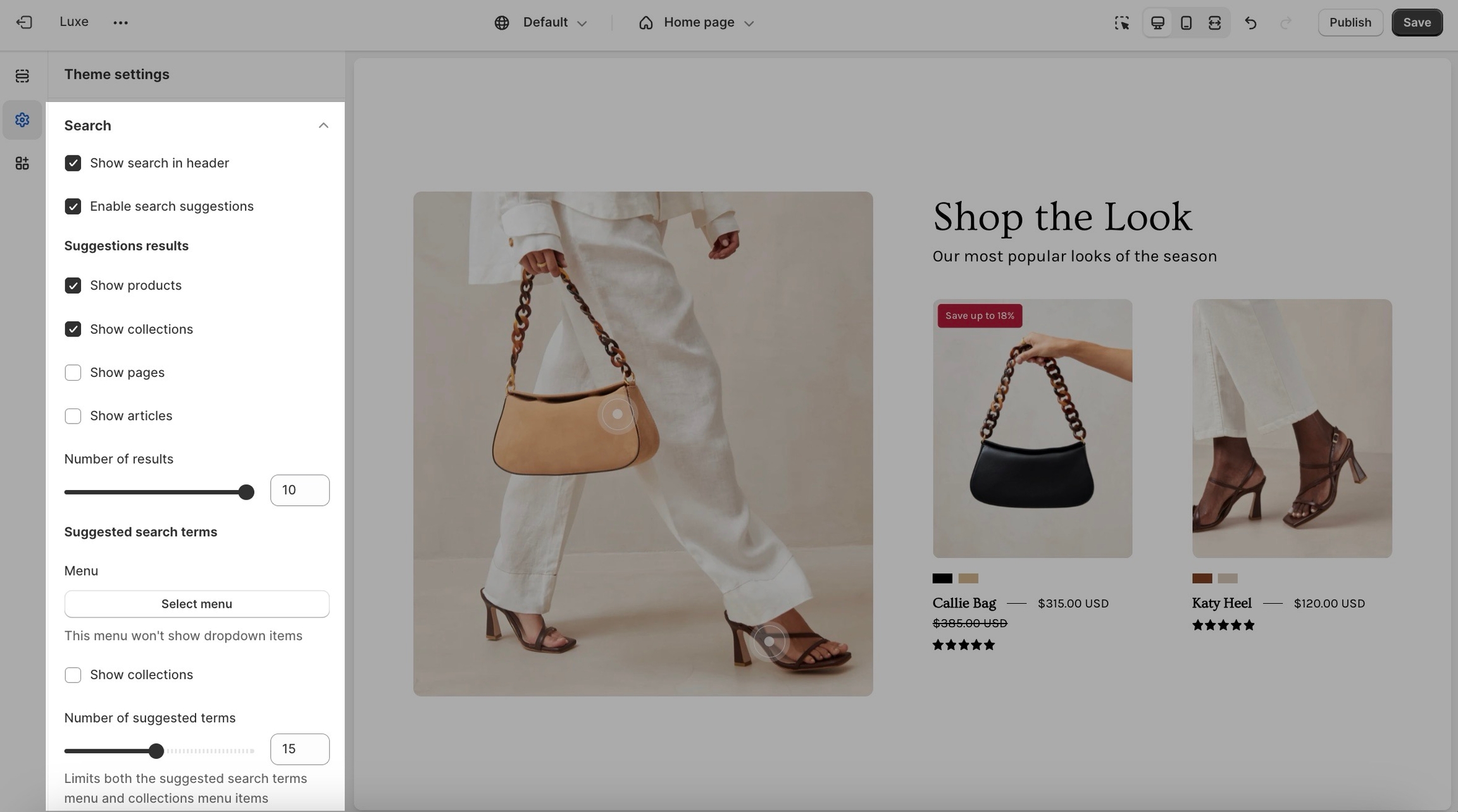
In this release, Palo Alto has increased the number of heading and text sliders within various sections, and we've added a few more settings to these sections:
Split images - Heading/text size options.
Grid - Added 'top center' and 'bottom center' content positions and heading/text sizes.
Video - Option for two buttons, text 'width' options (narrow, normal, wide), and heading/text sizes.
Text columns with images - Heading and text size options.
Custom content - Heading/text size options.
Overlapping images - Subheading option and heading/text sizes.
Shop the look grid - Heading/text sizes.
Slideshow - Heading/text sizes.
Banner - In the countdown timer block, we added an option to display days/hours/minutes/seconds text underneath the digits, similar to the countdown section:
For additional examples and to try Palo Alto for free, visit our demo stores and download the latest version of Palo Alto:
Existing customers can update for free. To preserve your live published theme, use the Shopify Update tool. The update tool will download an additional theme to your theme library and only copy the settings from your live theme. This is the safest and easiest method of updating your theme.
Release notes latest version of Palo Alto
A new section called “Image with scrolling text”
New blocks for the Product template: “Timer”, “Fit guide”
Final sale shoutout on the Product page to call out products that cannot be returned or exchanged
A new section called "Mobile menu" (under the "Header") that utilizes blocks — more blocks to come!
Font picker added to the “Marquee” section
Option to enable the language and country/region selectors in the Header
Border color and opacity slider added to the Header
New “Soft” button style added
More heading and text sizing settings have been added to many sections including "Split images", "Grid", "Video", "Text columns with images", "Custom content", "Overlapping images", "Shop the look grid", and "Slideshow".
The timer block in the “Banner image” section now allows for a stacked layout
Quantity field styles within the product form and cart to choose between -/+ or a dropdown
Support for inline MP4/MOV videos added to the “Sticky image cards” and “Sticky images with text” sections
Hover state added to the Menu block in the “Multi column” section
Product variant image option improved
“Social gallery” section now displays navigation dots on mobile
Section height for the “Video” section fixed
Right alignment option on “Sticky image cards” and “Sticky images and text” sections fixed
Background color applies to the “Recommended posts” section on the Blog post template
New advanced button size settings. Merchants will now be able to control the font, width and height sizes for small, medium and large buttons within the theme settings.
New "Social gallery" section available. Upload social proof and curate images without having to use an app.
New "Accordions with images" section
New "Alternate text" option added into the "Highlight" feature
"Accordion" block added to the "Image with text" section
Badges block added to the Product page.
Option to display custom and sale badges on top of product gallery images on the Product page.
Improved button hover animation
"Image with text" section is now built with blocks to allow for more flexibility. Important: Please note that merchants will have to reconfigure this section with blocks after updating.
Background color picker added to all sections, replacing the "secondary background" setting
Gradient background color picker added to more sections
Option added to display accordions and descriptions full width under the product gallery on the Product page
Optimized CSS rendering to improve page speed performance
Improved border settings in the Icons row section
Letter spacing setting now available for the Heading font
Improved product page loading on iOS devices
An optional greyscale style for payment options in the Footer
Bottom center text alignment for Slideshow text
Improved the user experience for Search input
Updated accessibility tabbing on the Quick View drawer
Improved animation when removing items in the Cart drawer
Out-of-stock notification now works for more than one product at a time
Banner image text no longer becomes cropped for some font families and sizes
The button was missing from the Image Accordion if no header or text was entered
Dynamic checkout buttons now align with the Add to Cart button (decreased height to match)
Improved button margins in Text columns with images section
A new section called "Shop the Look banner" 🎉
New custom sale badge option for the Header
Font size sliders for the product page title and price
Width settings for "Banner image" and "Announcement bar."
Mobile height settings for "Promo row", "Custom content", and "Video."
Product count design option for "Collection list."
"Increase border-radius" is an appearance setting that can be applied to more sections.
Renamed the existing "Shop the look" section to "Shop the look grid" and improved the overall design
Option to move button below the product grid for "Tab collections" and "Featured collection."
Updated active state for "Press/Logo"
Color option for the loading overlay animation (previously black by default)
Countdown timer - If expired, the section is hidden
Improved rounded corner style
Custom content - The video was cropped, preventing the entire image from appearing
Location - Resize proportions were not accurate
Shop the look - Unable to click mobile hotspots when the hover animation was set to "Slide."
Improved accessibility for the "Quick Add" drawer
A new section called “Multicolumn”
New "Empty cart" design to funnel customers into a purchase flow
Introduced "Font weight" and "Accent font" options to the Buttons
Connect images to your product variant boxes
Option to include the price in the "Add to cart" button
Slideshow & Image banner - Additional alignment settings and an optional stacked button style
Grid - design updates for the mobile experience
Updated "Quick add", "Product form", "Cart drawer" and "Footer" styles for an improved user experience
Icons row - improved mobile design
Implemented new Shopify requirements for the "Dynamic checkout buttons"
Testimonials - Updated the gap to match other sections for a unified appearance
Added Romanian translations
Removed "Reviews" from the product page as the Shopify app is no longer available
New section called "Sticky image cards"
New section called "Testimonials with images"
Card scroll animation for the "Banner image" and "Slideshow"
Two new type highlights: hand-drawn circle and hand-drawn underline
Animation improvements for the "Promotion row" and "Grid" sections
Editions ’24 taxonomy and filter updates
Cumulative layout shift in the Footer
Optimized "Slideshow" and "Banner image" zoom animation on scroll
Version 5.7.0 includes key updates in text reveal animations in banner image sections, additional layout settings for mobile layouts, support for parallax scrolling effects in ticker and footer sections, and improved loading states for a much better user experience.
Updated "Slideshow", "Banner image" and "Split images" animations and order of appearance when text is being revealed
Optimized products and columns display on mobile devices with additional layout settings in most of the sections.
Option for parallax scrolling effect in "Footer" for a more dynamic experience
Two new layout options in the "Marquee" sections combining ticker animations with a parallax effect on scrolling
We've updated the zoom animation on hover and implemented it in more sections and blocks.
Support for all HTML tags inserted from rich-text fields where text highlight decorations are used
Headings style and size settings for "Product recommendations", "Search pages," and size chart drawers
Updated loading state overlays, on opening product pages images gallery, and on changing collection filters
Improved default color settings in the "Buttons list" section
Improved upsell design for a more engaging user experience.
Loading animation for "Image accordions" sections for enhanced visual appeal
Updated body overlay animation on page load by merging "Loading icon" settings with improved "Loading overlay" settings
Added body overlay when megamenu is opened for better visibility
Increased readability in predictive search dialog with more proportional font sizes
Increased the spacing control between blocks in "Grid" sections on mobile
Fixed block height issue on mobile in "Promotion row" when only images are used
Fixed predictive search results animation issues when the page is resized
Improved headings spacing in "Video" sections depending on the presence of text decorations
Fixed collections sorting dropdown visibility when scrolling animations are disabled
Fixed missing slider arrows in the "Product recommendations" section
Version 5.6.0 enriches the theme with improvements in section animations, with design enhancements of predictive search, rectangle swatches and footer, as well as with new sections for dynamic visual storytelling and effortless product showcasing, which not only bring value but are fun to interact with
New "Sticky images and text" section that utilizes vertical and horizontal layouts for engaging visual storytelling
New "Products with image" section to showcase both collections and product lists
New block in the "Footer" section for customizable designs with full-width logos
Parallax scrolling effect for the images in the "Overlapping images" section, which supports both multiple animation styles and adjusting the animation intensity
Unified hover effect for all instances where links are over the entire images
Enhanced loading experience of "Banner image" contents with a variety of options for the animation style
The Countdown Timer block can now be included in the "Banner image" sections
Refined styles of the search bar and the predictive search dialog box
Additional uppercase setting for all headings throughout the theme for easier control of their appearance
Improvements in rectangle swatch designs with a checkmark icon for better visibility of the active states with all colors
In the "Footer" and "Footer minimal" sections, the maximum number of blocks is increased
The navigation drawer is animated from the left to correspond to the position of the menu button in the header on mobile devices.
Adjusted spacing and balance of navigation icons in the header
Improved countdown timer sequential animations in both "Countdown" and "Banner image" sections
Updated "Size Guide" button positioning by aligning it with the last variant in size options
"Accent" typography is now used for tab headings in all places which can accommodate tabs, such as "Tab collections", "Product recommendations", "Search pages", and size chart drawers
The shimmer effect in image-loading animation now uses contrasting colors that correspond to the chosen body background color
Colors of the price range slider and filter remove buttons in Collection and Search pages are optimized for better visibility regardless of section color
The height of Promo block responds to Product grid image height settings whenever it is a single item in a row
Included alignment fixes for spacer lines below headings
Fixed search closing issues in the latest Safari versions
Version 5.5 adds enhancements to the theme including new sections, typography updates, optimizations for images loading, improved animations on page load and bug fixes
New "Buttons list" section
New "Recently viewed products" section
Better optimization for images loading in sections with options for both mobile and desktop images for improved site speed
Option to include a secondary navigation menu in closer to header icons
Support for metaobject swatches in the Search and Discovery app
Added "Labels" typography settings which allow adjustments for tooltips, filter titles, product variants and form labels
Buttons "Add to cart" and dynamic checkout in Product pages have option to be displayed with either half or full width
"Product recommendations" section allows for setting up tabs with both dynamic product recommendations as well as recently viewed products
Header layout on mobile is improved by moving menu button on the left side and positioning the site logo in the center
"Announcement bar" and "Marquee" slider layouts now have arrows for navigation
Improved animations on page load for Product pages using exponential delays
Improved "Slideshow" animations execution and emphasized more the different animation styles
Updated localization form selectors styles in footer
Improved "Countdown" inline layout so that the main focus of section content remains in the center
Fixed tooltips display issues
Resolved display issues in product form selectors and size guide popups
Fixed issues with "Image with title" heights to handle collections with lots of description or without any
Improved "Featured collection" grid layouts for tablet devices
Product pages - Fixed quantity selector overlap
Text columns with images - Fixed scrollbar issue
Performance - Improved image-loading animations
Typography - A global font picker for subheadings ("Accent")
Color - "Background Accent" color is removed
Banner with text columns - New layout
Footer minimal - New section
Header - Icons can be textHeader - Dot hover effect for header top-level links
Marquee / Announcement bar - sections are merged and improved
Nav / Product grid - typography adjustments
Product pages - accordion blocks have heading/body styles
Slideshow - Highlights added for headings
Image with text - Changed textarea type to richtext
Image with text / Overlapping images - Overlay gradient added
Custom content - Updated textarea to richtext / Reverse blocks checkbox on mobile
Collection list - Image aspect ratio min value reduced
Text columns with images - Borders between blocks / Mobile height and layout settings
Product grid - Sideshow progress bar issue in Firefox is fixed
Header - Nav menu hover when search-popdown is opened issue is fixed
Video - icon appearance in Safari is fixed
Image with text - Fixed inline layout overflow
New section - Countdown timer
Introduced "Uppercase" font styles
Improved hovering over the mega nav dropdowns
New design improvements for the Footer
Fixed "Image with text" and "Grid" wrapper alignments
Fixed swatch tooltip position
Main menu "letter-spacing" option for navigation
Featured collections - Added a "Products per row" setting
Added the highlight feature to the "Featured collection", "Marquee" and "Overlapping images" sections
Footer - Added width settings to each block to provide greater control over footer styles
Collection list - Made settings more user-friendly and introduced additional width controls
Split images - Introduced a secondary button option
Split images - Fixed an issue that was causing the "Highlight" type to not appear
This new version of Palo Alto includes the Shopify section groups feature and focuses on general improvements to design/UX, accessibility, performance, and settings.
Size chart titles can be more easily customized
Tab collections now include a grid ratio option
Move accordions to blocks
Add lazy loading has been added to the product template
Hide swatches after 2 rows on the product grid and product pages
UX improvements for the marquee section
Automatically rotate through the press section
UX improvements for text highlights
Minor UX improvements for predictive theme search
Fixed bug with section height for the grid and custom content sections
Improved resolution of loading image
Minor bug fix for buttons
Improve UX for collection filters
Includes the Shopify section groups feature and focuses on general improvements to design/UX, accessibility, performance, and settings.
Section groups Shopify feature
'Feature' block added to product form
Updated button settings and design
Updated collection filtering settings and styling
Product grid swatches show on over when there are more than 5
The collection list section now has a circle layout option
Typography options for collection filters
Improved performance, including video loading
Improved typography options in the custom content section
Improved accessibility
Improved mobile breakpoints
Improved quick buy design
Improved size chart design
Improved font sizing options
Improved color swatch design
Improved sub-collection section
Improved settings flow and visibility
Product grid swatches show on over with there are more than five
Variant labels fixed in quick buy
Additional information on recent Palo Alto updates
Palo Alto now includes new options to promote the empty cart drawer. Add collections, custom buttons, and more to funnel customers into a purchase flow:
Use the options found under the Theme settings -> Cart to customize:
Tip: You can also use a Shopify Navigation menu to auto-generate buttons for the empty cart drawer.
New design options with borders and additional layouts for building eye-catching information sections:
Mobile layout options to build grid, stacked, and slider versions:
A new section in Palo Alto, “Multicolumn”. Design promotion layouts with custom column sizes:
Choose from various block types, including Text, Image, Menu, and Collection:
Customize the column width for each block to build unique designs:
Palo Alto has made it simple to add images to your variant options. This feature is designed to help display images for variant choices. Ideal for showing the size, type or can even be used to show colors instead of swatches:
Currently, the feature can be set to only one variant type, such as size, style, or color. Multiple types will be supported in future releases. If your shop needs images shown for a particular variant type, this feature will easily link images to your variant options. We suggest using the Siblings feature in Palo Alto for more complex solutions.
How to setup:
The Add to Cart Button now has the option to include the price inside the button, which helps customers see the cost of the current selection.
Toggle the feature in the Theme settings -> Product form:
We've refined the design for the Quick Add feature, making it cleaner on both desktop and mobile.
We've introduced "Font weight" and "Accent font" options to the Buttons:
Slideshow & Image banner - Additional alignment settings and an optional stacked button style:
On mobile designs, the buttons are displayed as stacked.
New design updates for the mobile experience. Items can now be shown in a two-column layout:
Additional information on recent Palo Alto updates
Introducing a brand new section to Palo Alto - the buttons list:
This section allows you to add a customizable list of buttons that you can use as a banner to break between content or as an addition to your header.
The individual block settings are where you will find the option to change the background, text color, and border color for each block.
In the more general section settings, you will find all of the layout options and general styles for the sections such as:
Enabling grid/carousel layout. Changing the border style for the buttons. Changing the size of the buttons. Changing the number of buttons per row. Text size and letter spacing.
A new addition to our product recommendations section is the ability to add a 'Recently viewed' block. The content here will be automatically generated as customers browse trough your store.
You can easily sort them by changing the block order in the theme editor. We've also included an option to show them as tabs or stacked:
In the header section, you can now add a secondary menu right next to the header icons:
Note: Having too many items in the header can cause the hamburger style navigation to trigger on laptops.
A new style of typography style, labels, allows you to set a separate style for your tooltips, filter titles, product variants, and form labels. Find these new options in the theme settings tab:
The 'add to cart' and dynamic checkout buttons, on product pages, have the option to be displayed with either half or full-width:
Change the size of these buttons by going into the theme settings tab (the gears icon on the side of the theme editor) and opening up the product form tab:
The announcement bar and marquee sections now have the option to toggle navigation arrows for the slider layout.
Better optimization for images loading in sections with options for both mobile and desktop images for improved site speed.
Improved animations on page load for product pages using exponential delays.
Improved slideshow animation execution and emphasized the different animation styles.
Updated localization form selectors styles in the footer.
Improved countdown inline layout so that the main focus of section content remains in the center.
Fixed tooltips display issues.
Resolved display issues in product form selectors and size guide popups.
Fixed issues with image with title heights to handle collections with lots of descriptions or without any.
Improved featured collection grid layouts for tablet devices.
Additional information on recent Palo Alto updates
Introducing a new sticky version of Image with text. Now you can keep the text message always visible while scrolling through the image blocks:
Palo Alto provides both horizontal and vertical layout options for this new section:
Another exciting new section in this version of Palo Alto is Products with image. Build a promotional message with an image and include the product line next to it:
The image remains sticky while scrolling through the product list.
New in Palo Alto is the "Logo full width" block for building beautiful, rich footers. Showcase your brand for a modern footer design:
This new block is available in the Footer and Footer minimal sections.
We've also increased the maximum number of blocks to six from four in both sections.
We've added new scrolling animation effects to the Overlapping images section:
Customize the animation direction and intensity to enhance your store's scrolling effect.
The "Banner image" section now includes a countdown timer block. Now you have even more options to promote flash sales with Palo Alto:
We've added a checkmark to the selected variant option to the rectangular swatch design. This visual effect helps customers ensure they have chosen the correct variant option:
In this version of Palo Alto, we've refined the search experience with improved colors, borders and the layout for both the mobile and desktop dropdown designs:
The accordions section is a user-friendly way to organize and present frequently asked questions (FAQs) or other informative content on your website. This feature-rich section allows you to create a well-structured and visually appealing display for your customers.
Heading and subheading: Craft an engaging heading and provide additional context. Customize the heading and text within each block to tailor your content to your specific needs.
Accordions customization: Personalize the appearance of your tabs by selecting a background color. Opt for either light or dark text colors to ensure readability and maintain a cohesive design. You can also enable a secondary background color if it complements your website's overall aesthetic.
Text blocks: Ideal for creating custom content within each tab. You can add headings and detailed text to address different topics or questions.
Page blocks: These blocks enable you to embed content from other pages seamlessly. Simply select the page with the desired content and display it within a tab.
Additional information on recent Palo Alto updates
In the latest update, Palo Alto 5.7 introduces an engaging visual feature - a parallax scrolling effect for your website's Footer. This feature adds depth and movement to your webpage, creating a more dynamic user experience:
The parallax effect can be applied to both the standard Footer and the Footer minimal sections for a cohesive aesthetic across your site.
This effect is designed exclusively for desktop use to ensure optimal performance without compromising the website's loading speed on mobile devices.
Palo Alto version 5.7 enhances mobile settings, offering single and double-column customization options for enhanced flexibility.
We've added mobile column options to the following sections:
Blog posts, Buttons list, Collections list, Featured collection, Grid, Promotion row, Product recommendations, Recently viewed products, Shoppable blog posts, Tab collections, Testimonials, and Text columns with images
Examples:
One product per row displayed on the mobile slider with the Featured collection section:
Two columns per row brings in more assets into the slider viewport:
Now, in Palo Alto, you can customize the Heading to choose your heading tags:
Use line-breaks in the Heading editor to create multiple rows for your headings:
You can now choose from Heading, Body and Accent styles for your tab headings. Finetune the size of the text with the size slider:
We've added this feature to tabbed sections like:
Product recommendations
Search pages
Size chart drawers
Learn more about tabbed sized charts:
We're excited to unveil two innovative layout options for the "Marquee" sections. We've added new parallax scrolling effects, offering modern design elements to improve your messaging elements throughout your store.
We've brought new modern animation design elements to these popular sections in Palo Alto:
Slideshow
Banner image
Split images
The animations appear in order as each text block is revealed, resulting in a finetuned animation experience for your content.
In addition, the zoom animation for hover effects has been added to more sections and blocks throughout the theme.
We've added additional color options to the popular "Buttons list" section in Palo Alto 5.7.
The section now contains a set of default colors for the buttons and the section:
Each block contains override color options for complete customization:
The upsell promotion design has been improved to help with wider layouts. The image has been moved to the left, and the spacing has been optimized for the columns.
Standard image, wide product form:
Large image, smaller product form:
Palo Alto comes with over 40 different sections. Our theme is purposely built to support both Shopify's online store 2.0 and section group updates. It offers easy-to-use features, powerful search capabilities, and quick buying options for customers on mobile and desktop devices.
Additional information on recent Palo Alto updates
You can now change the Heading style for the Product Grid display. Choose between the Heading or Body font styles:
To configure these font styles, use the Typography settings and choose which style to use for your Product Grid display.
You can also change the Text size to make the heading, price, and description smaller or larger with the Text size slider:
Choose between Line or Dots for the Link hover effect in the navigation:
A new option to display the Search, Account, and Cart as Text or Icons:
Uncheck to use icons:
You can now easily build promotions throughout your shop with Text Columns and Images. We've added a Show borders option to help you create multiple promotions within one section:
We've also added a Mobile height option when using images in this section. You can finetune the aspect ratio to match your images for both desktop and mobile devices:
Now you can choose from Grid, Stacked, and Slider options for mobile devices:
We've added more options to customize font and font styles for subheadings. The Typography has a new section for the Accent font style which is used throughout the theme including subheadings:
Headings in the Slideshow section can now display the Palo Alto highlight effects:
To use, highlight a word or words in the Heading area and italicize the word or words:
Choose from various effect styles by Palo Alto:
Tip: Styles like circle work best with one word highlighted. Others like Stroke or Highlight will work well with multiple words. Experiment with the styles to match your branding
Add borders to the top and/or bottom of the Marquee section:
We've also added more text options - Choose from the Heading, Body, and Accent font styles and also toggle for uppercase text:
Links are now styled with Palo Alto's hover animation. Use the highlight feature to draw attention to certain words:
Build a simple minimal footer instantly with Palo Alto's new Footer minimal section. Add the section from the Footer group:
Palo Alto will build a simple footer with easy-to-configure blocks and settings:
Simply hide the regular footer and only display the Footer minimal section. For more advanced options and flexibility, use the standard Footer.
Blocks are stacked for mobile devices. Now you can reverse the order placement on mobile:
Regular block order is used if unchecked:
Current customers can download a free update from the Shopify Theme Store. The update is added to your Theme Library as a draft. You can explore the new features without affecting your live store.
If you are new to Palo Alto, you can download a free trial version from the Shopify Theme store. Discover how Palo Alto can help you build the store that's right for your brand, products, and services. Use it for as long as you like as a draft theme. Pay only when you publish:
Support for Product Siblings via Metaobjects.
New ‘’ section
New '' section
Ability to add promotional blocks to a
The buttons list section allows you to create and customize a list of interactive buttons, either in a grid or carousel layout, with adjustable button styles, colors, and animations. This section can hold up to 12 buttons, and each button can have its own settings for text, links, images, and more.
Title and size: Set a custom title for the buttons list and adjust the heading size.
Layout: Choose between a ‘grid’ or ‘carousel’ layout for the buttons, select the alignment, set the number of buttons per row on desktop, and choose whether to display 1 or 2 buttons per row on mobile.
Button style: Choose a font style for the buttons, select the button shape, adjust the text size, modify the letter spacing, and toggle the display of an arrow icon on the buttons.
Colors: Set the button background, text, and border colors, define the section's background color, add a gradient overlay for visual effect, and choose the text color for the section.
Mobile layout: Toggle to enable a horizontal slider for the buttons on mobile devices.
Animations: Toggle to enable or disable animations for the buttons list.
Text: Define the label text for each button.
Link: Set the URL to which the button will link.
Image: Upload an image to be displayed on the button.
Overlay opacity: Adjust the opacity of the overlay image from 0% to 100%.
Color overrides: Customize button colors individually by setting the text color, background color, and border color for each button.
The collection list is an interactive showcase for your handpicked collections. With rich customization options, you can captivate your audience and urge them to explore more.
Heading: Set a custom title for the section and adjust the heading size between 50% and 200%.
Layout: Choose between a grid or carousel for display, align content to the left or center, and set 2 to 6 collections per row on the desktop. On mobile, display 1 or 2 collections per row. Select circles or squares for the image shape, and adjust the image aspect ratio from 0.3:1 to 1.5:1.
Collections: Adjust the collection name text size between 75% and 200% and enable or disable the overlay text on collection images.
Mobile layout: Turn on a horizontal slider for better navigation on mobile.
Colors: Set a background color for the entire section and choose the color for any section-level text.
Collection: Choose the specific collection to display, upload a custom image to override the default collection image, and add a custom heading or label for the collection block.
Color: Set the text color for the specific block, define the background color behind the collection, and adjust the overlay opacity from 0% to 100%.
Present a full-width image.
Enhance visual appeal while serving functional purposes such as branding, content highlighting, and user engagement. Basic customization options include height settings, overlay opacity, text positioning, and button styles.
Layout: Customize height with predefined options. Enable and set a different height for mobile devices if needed.
Image: Upload an image. Optionally, add a mobile-specific image. Adjust text contrast with overlay opacity for better readability.
Animations: Choose a loading style. Enable a zoom effect on the scroll, a card scrolling effect for overlapping sections, and increase the border radius for rounded top corners when the card scrolling effect is active.
Text: Adjust content width and position text. Align text within its container and choose between light or dark text colors.
Subheading: Edit subheading text using a rich text editor and adjust the size.
Heading: Edit the main heading text using a rich text editor, adjust the size, and apply various highlight styles with customizable highlight and text colors.
Text: Edit paragraph text using a rich text editor and adjust the size.
Timer: Choose between an Inline or Stacked layout, set a countdown end date and time with an AM/PM option, define a message to display when the timer ends, and adjust digit size and text size.
Buttons: Option to stack buttons on larger screens. For button 1 and button 2, define the text, link, color, style, and size.
Video button: Define the button text and provide a YouTube, Vimeo, or MP4 link for a popup video.
Note: Use text and buttons to comply with best practices for web .
Allows you to showcase products from a selected collection with optional promotional blocks and rich customization. This section supports grid and carousel layouts, responsive settings, highlighted text styles, and optional promotional content.
Collection: Select which Shopify collection to feature.
Layout: Choose between a grid or carousel layout.
Products: Set how many products to display, with 2–4 per row on desktop and 1–2 per row on mobile.
Text: Add a heading and description with optional highlights. Align text left, center, or right. Adjust heading and text size.
Highlight: Style italicized words in the heading with effects like underline, squiggle, or highlight. Choose a decoration color and set the main text color.
Button: Display the button at the top or bottom of the text. Customize the color, style, and size.
Note: The mobile view of this section is always a grid unless the mobile slider option is enabled.
You can add up to 5 promo blocks to appear within the product grid.
Image: Upload a promo image.
Layout: Choose the promo's position in the product sequence and select the layout width.
Text: Add an optional promo heading and adjust its size. Include supporting content and scale the text size.
Highlight: Style italicized words in the heading with effects like underline, squiggle, or highlight, and set the decoration color. Choose the main text color and position the text over the image. Select between Stacked or Inline. Adjust background overlay opacity for better readability when no image is set.
Button: Customize the button or leave it blank to make the entire promo clickable. Add a link, choose a color style, and set the size.
Implement your own HTML or liquid code into your website. The custom code section is also a great tool to integrate older apps or embed custom elements.
Add HTML: This section provides a platform for unique elements, rich multimedia embedding, and layout customization.
Add liquid code: The ability to incorporate Liquid code enables dynamic content, conditional logic, and third-party integrations.
Flexibility: Choose from various width options and adjust padding to achieve your preferred layout dimensions.
Versatile and dynamic component that allows you to showcase a single product prominently in your store. This section is designed to enhance the visual appeal of a product while providing a seamless shopping experience for your customers.
Product: Select the featured product to display using the product picker. Add a header above the product description section. You can also enable the sticky form, which, when activated, ensures that the product form remains visible on the screen as users scroll, with the default setting set to 'true'.
Image layout: Allowing you to choose between grid, stacked, or carousel. Select the image width. You can hide product thumbnails in the carousel layout and enable an equal image aspect ratio for the grid layout.
Media: Include zoom for product images and video looping for continuous video playback.
Title and price: Includes a subheading, adjust the title and price sizes. You can also bold the product price.
Form: Include a size chart link, variant labels, a quantity selector, and a dynamic checkout button.
Description: Includes an option to expand the description to full width below the product gallery and allows adjustment of bottom padding from 0 to 50px.
Cutline: Choose a text color and adjust the bottom padding.
The divider section is a powerful tool to toggle a sleek line. This section offers a clean and sophisticated design, making it ideal for creating a modern look.
Show line: Clean line to divide sections.
Colors: Add different background colors or overlay gradients.
Width options: Choose between full width, full width padded, or page width.
Padding: Adjust top and bottom padding for precise spacing.
The contact form section is a versatile tool for enhancing communication on your website, making it easier for your customers to reach you.
Button: Specify button color and select style and size.
Colors: Allows you to select the background color and overlay gradient.
Form heading: This block defines the heading of the contact form.
Email: Input field for email.
Message: Add a wider text field to your form.
Text line: Use a text line to collect additional data such as your customer's first and last names.
Telephone: This block is set to a telephone input field.
Divider: Toggle a visual line element.
Single checkbox: Customize the label and mark it as required. Multiple checkboxes can be checked at the same time.
Select dropdown: Dropdown field with up to six customizable options.
Radio buttons: Buttons with customizable options. Unlike checkboxes, only one radio button can be selected at a time.
The countdown section is your go-to tool for adding a dynamic and attention-grabbing element to your website. Whether you're running a limited-time sale, promoting an event, or simply looking to engage your visitors, this versatile section has you covered.
Layout: Adjust the style, and height and choose mobile text alignment and height.
Image: Select an image, and enable zoom animation on scroll. Customize the background color and overlay gradient, to match style and color.
Text: Choose the color 'light' or 'dark' for text and width 'narrow' or 'normal'.
Subheading: Set text and choose size.
Heading: Create a captivating headline with a customizable size, and experiment with different highlight effects to draw attention to specific words.
Text: Describe your promotion, event, or offer with compelling text and adjust its size.
Timer: This block helps you to set the time, date and customize color.
Buttons: Customize the text, link, color, style, and size buttons.
Video button: Integrate video content by adding a video button with text and a link.
Siblings: Splits colors into separate products, allowing you to customize the label, select related products, and choose between showing images or swatches. Learn more about Siblings .
Complementary products: Shows product recommendations based on the 'Shopify Search & Discovery' app. Learn more about this app .
The Image with scrolling text section is a mix of our Banner image and Marquee sections. It's designed to display an image with overlaid text that scrolls across the screen.
Image: Upload a desktop image and an optional mobile image.
Layout and height: Choose the section height and enable separate mobile height.
Animations and effects: Choose a loading style and enable optional zoom or card scrolling effects.
Text and scrolling: Align text and choose a color.
Scrolling text: Set direction and adjust font and size.
Scrolling text: Custom scrolling text to display messages.
Subheading: Subheading to provide additional context to your image and scrolling text.
Heading: A headline or title to your section.
Text: Regular text content to your section.
Timer: Countdown timer with an optional end message. You can set the countdown's end date and time.
Buttons: Configurable text, links, color, style, and size. You can add two buttons in total.
Video button: This triggers a video popup. You can link to a video hosted on YouTube, Vimeo, or an MP4 video file.
The image with text allows you to configure a section in your website that includes a combination of images, text, and buttons. This section is highly customizable, providing options for layout, styling, colors, padding, and spacing.
Layout options: Includes divider lines for transparent accordions, rounded corners for block backgrounds, and adjustable desktop and mobile heights. Choose between 'Inline' or 'Overlay' layouts with left or right image positions. Image width is only adjustable for 'inline' layout.
Image: Allows you to select and upload an image for display within the section.
Colors: Let you set the block background, text color, background color, and overlay gradient.
Subheading: Set the text, adjust the size, choose the text position, and control block spacing.
Heading: Set rich text, adjust size, and position, apply highlights, choose colors, and manage block spacing.
Text: Add rich text, adjust size, choose text position, and manage block spacing.
Button: Add button text and URL, select button color, style, and size, and include a video link, with options to set text position and adjust block spacing.
Accordion: Select an icon image, adjust the icon width, and choose the icon position. Set a heading, FAQ heading style, and heading size. Include text with adjustable text size. Customize the tabs' background color, border thickness, and block spacing.
Create a grid of customizable blocks of different sizes. The grid section is a great way to break up the look of your page and set apart your store.
Layout: Set the height for the desktop view using the desktop height option. To use a different height on mobile devices, toggle enable mobile height on, then specify the desired value using the mobile height setting.
Text: Adjust text appearance by scaling the heading size from 50% to 200% and the text size from 70% to 150%
Buttons: Customize primary and secondary buttons independently by selecting the button color, style, and size to small, medium, or large.
Mobile: On mobile, you can enable a horizontal slider for scrolling, set the number of items per row to either 1 or 2, and toggle the option to overlay text directly on images.
Using one 33% and one 66% wide block will fill out a row perfectly.
In the section settings, you’ll find common options like button colors and styles. However, this section's uniqueness lies in its versatile blocks and their settings. Available block types:
Collection: The collection block allows you to display a featured collection with an optional image, configurable width, support for text, a subheading, and a single button, along with adjustable overlay opacity and text positioning.
Product: A featured product with pricing, configurable width, and support for a title, subheading, description, button, and overlay settings.
Image: Show a static image with optional text and buttons, supports two buttons with independent links, and offers fully customizable overlay, text position, and width.
Text: A purely textual content block that includes a subheading, heading, description, and buttons, making it perfect for promotional messages, announcements, or callouts.
Additional information on recent Palo Alto updates
A new modern design in Palo Alto. Now, you can showcase cards with vertical scrolling on desktop and mobile.
This new section is easy to set up. Add up to four blocks that make up the cards. Add a photo, supporting text content, and a call-to-action button to each card. Mobile options include a custom image for mobile devices and a stacked or sticky layout.
We have a new, improved testimonials section called Testimonials with images. This section will supercharge your reviews with photos, ratings, and new design elements.
Choose from three block types: Testimonial, Text, and Image:
Each block has new design options:
Palo Alto now includes a new card scrolling animation effect for the Banner Image and Slideshow sections. The section below will overlap and continue on the scroll:
To use, toggle on the option in the Banner Image section under Animation or under Transition for the Slideshow section:
We've added two new text highlight animations: A hand-drawn circle and an underline.
Highlight the text to apply the effect.
Use the Italics format tool to italicize the text.
Under Highlight Type, choose the effect type and colors.
The "Promotion row" section now includes a count-up animation effect:
We've added animation improvements for the "Grid" section. The zoom animation of the product grid images appears once the section is mostly in view and on hover.
Additional information on recent Palo Alto updates
Palo Alto 6 now has an interactive hero-style Shop the Look Banner section to help promote your products. Display product cards that point to different items on the banner image. Customers can choose variants and add items to the cart using the Quick Buy button:
Dot placements can be customized for both Desktop and Mobile devices:
Mobile shoppers will see a beautiful pop-up card to choose variants and view product images.
Add an attention-getting sale badge right into the header. Palo Alto includes options to customize and toggle the badge in the header settings:
Now, with the product page templates, you can customize the title and price sizes in Palo Alto:
Modernize your page design with more padding options in Palo Alto:
Promo Row, Custom Content, and the Video sections have new mobile height settings:
When showcasing your collections with the Collection List section, you can now toggle a count of products that are within the collection:
You can now increase the border radius for many of Palo Alto's sections. This new setting will also make the corners more round.
Example when off:
Example when toggled on:
Find the new setting in the Theme Settings, under Appearance.
A new option to set the payment icons in the footer to grayscale has been added to help shops that want consistency with a gray/mono-themed footer.
New features and changes in Palo Alto 5.1 - 5.3
Palo Alto now supports product siblings with metaobjects. With siblings, you can link directly to other products as product swatches. The result is rich product detail pages that only include product images for that style and also include image swatches that are automatically generated by Palo Alto:
Discover the new features of Siblings with this short video:
Size chart headings can now be customized. Here's a short video on how to customize it:
We've added the ability to adjust the image sizes in this section:
The accordion block has been updated to hold individual content and can be placed in different positions on your product pages:
We've improved the options in the scrolling Marquee section and included an image block for creative designs:
Auto-slideshow options have been added along with support for rounded corners for your logos:
These are some of the key changes in this release of Palo Alto. You'll also find various speed, UX improvements, and bug fixes.
Create an organized layout with up to four text columns and a prominent banner image, offering flexibility in appearance, colors, button styles, and image configurations for a visually appealing and content-rich webpage.
Layout settings: Choose between ‘row’ or ‘columns’. Set vertical alignment ‘top’, ‘center’, or ‘bottom’, with content always centered on mobile in a ‘row’ layout. Align text to ‘center’ or ‘left’.
Color: Choose the text color for the banner: either ‘Light’ or ‘Dark’.
Button: Select the button color, style, and size.
Image control: Display only the image added to the first column item if enabled.
Heading: Control the size of the heading. Adjust the value from 50% to 150% in 5% increments.
Column: Add an image to the column. Adjust the text contrast overlay for better readability.
Text: Provide a subheading and heading for the column, and use the rich text editor to add text content.
Button: Define the button text and add the button link.
This section allows for the display of blog articles in a customizable layout. Provides flexibility in blog styles, image configurations, text options, and button customization to enhance user engagement.
Layout: Select a blog, choose between ‘standard’ or ‘photo background’ style, adjust the image aspect ratio, and set 1 to 4 rows with 2 to 4 articles per row on the desktop. Toggle options for tags, author, date, and comment count.
Image: Set a default blog image or choose a replacement color when no image is available.
Text: Add a title for the blog posts section.
Button: Customize the button text, color, style, and size.
Colors: Set the text color to ‘light’ or ‘dark’, define a background color, and add a gradient overlay effect.
Section spacing: Choose width and adjust top and bottom padding between 0px and 100px.


Images play a pivotal role in capturing the attention of your audience and conveying your brand's message. Our image section offers a versatile set of tools to help you curate and display images effectively on your website.
Image: Upload or select an image for the section.
Layout: This setting lets you choose image height for both desktop and mobile, with options to stretch the image on desktop and position it left, center, or right.
Colors: Select a background color for the section and choose a gradient to overlay on the image.
Allows you to display dynamic scrolling text or images with customizable settings. It can be configured to appear as a marquee, slider, and others.
Layout: Choose between slider, marquee, parallax, or marquee with parallax. You can also toggle the top and bottom borders and adjust the height of the marquee or slider.
Marquee: Allows you to set the autoplay speed for scrolling text, and choose the text direction to scroll either left-to-right or right-to-left.
Slider: Adjust the autoplay speed between 5 to 20 seconds and choose whether to display arrows for navigation.
Text: Convert text to uppercase, select a font, adjust the text size, control letter spacing, and modify the space between individual messages.
Color: Customize the appearance of the section, including choosing a background color, adding an overlay gradient, selecting the text color for the marquee, and setting the border color.
Image: Upload a background image for the section to customize its appearance.
Text: Add customizable text with options for color, highlighting, and icon use. It includes a rich text field for content, text color selection, various highlight options such as underline, italics, or squiggle, and icon selection with color and image customization.
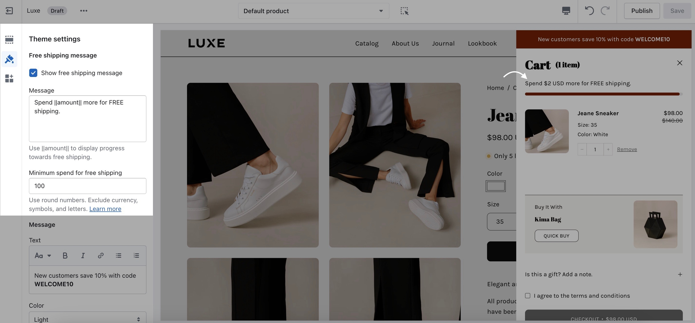
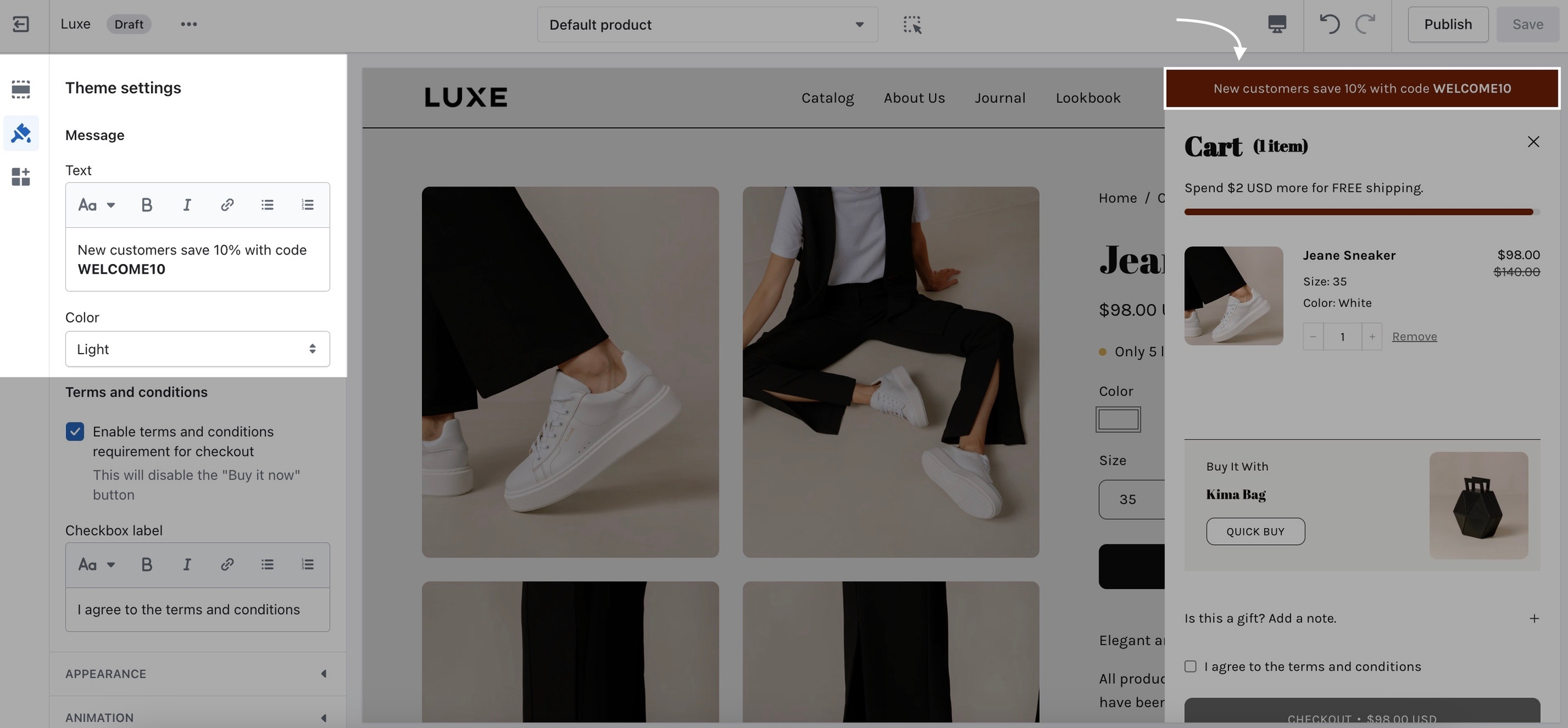
Free shipping message: Display a message related to free shipping with dynamic variables like ||amount||.
Custom HTML: Content with options to limit visibility based on device type or referrer.
Image: Add an image with an optional link, and adjust its width.
Each block can be customized to show on desktop or mobile only, offering flexibility in targeting specific devices.
The newsletter section is a valuable addition to your website, helping you connect with your audience and build a loyal subscriber base.
Layout: Position the content to the left, center it, align it to the right, or split the content between the left and right sides.
Text: Choose the text color, customize the heading, and set the body text.
Additional field: Allows you to customize the subscription form. You can choose to add no additional fields, a single name field, or separate first and last name fields. Additionally, you can customize the button text for the subscription button.
Background: Customize the section's background with a color selection, optional gradient overlay, or by uploading an image. You can also choose the height of the background image.
Overlay: Adjust the opacity of the overlay, improving text readability. The value can range from 0% to 95%.
In today's fast-paced digital world, grabbing your audience's attention is crucial. The Icons row section is your solution to make a lasting impression. With its flexible layout, customization options, and visually appealing icons, this section lets you convey key messages in a stylish and engaging way.
Heading: The main heading is the section title and an optional subheading with rich text for additional context or description.
Layout: Alignment options such as center, left, inline center, or inline left. You can set how many icons display per row, ranging from 2 to 4, and adjust icon width between 20–100px, with a mobile max of 40px. You can also toggle the visibility of top, bottom, and vertical borders.
Text: Allow you to scale the heading size from 70% to 200% and adjust the body text size from 70% to 150%.
Buttons: Add an optional call-to-action with customizable text and link, select from four colors, choose a style, and define the size.
Mobile: Choose between grid, stacked, or slider (carousel).
Icon blocks: Up to 6 blocks, each supporting:
Icon selection from a predefined set.
Optional image upload to override icon.
Heading text.
Rich text description.
With the image accordions section, you can effortlessly create immersive and engaging experiences for your website visitors. This dynamic section combines stunning images, customizable text, and interactive elements to showcase your content in a unique way.
These global settings affect the overall layout, height, spacing, and typography of the entire accordion section.
Layout: Set the section height for desktop and mobile.
Heading: Adjusts the font size of titles within each accordion block.
Section spacing: Adjust section width and padding. Choose from full, padded, or page width.
Each block in this section represents one image accordion panel. You can add up to 4 panels.
Image: Set a main background image for desktop and an optional one for mobile. Use text contrast to add an overlay that improves readability.
Text: Customize the text width, position, and color for readability. Add a heading and subtext to convey your message.
Buttons: Set the buttons text, link URL, color, style, and size.
The Multi column section is a versatile and customizable layout that allows you to showcase various types of content in a structured format.
This section is perfect for highlighting categories, promotions, or important navigation links, creating a dynamic and user-friendly shopping experience.
Multi column supports the following block types:
Text – Add informational or promotional text to engage customers.
Image – Display high-quality visuals to enhance product appeal.
Menu – Feature a navigation menu to help users explore your store.
Collection – Highlight specific product collections for easy browsing.
Displaying multiple store locations with relevant details in a structured format.
Subheading: Set the subheading text for the section, while the heading field enables users to define the main heading of the section.
Colors: Set background color and overlay gradient.
Section spacing: Allows you to adjust the padding top and bottom controlling.
Each block allows you to add individual locations to the section. Each location includes the following settings:
Address: Input the address of the location.
Hour: Define the working hours for the location in rich text format.
Store image: Upload an image representing the store.
The accordions with images section allows users to create a structured FAQ section with text and optional images. This section supports multiple layout options, customizable text styles, colors, spacing, and content blocks.
Heading: Title for the text block.
Text: Rich text content.
Image: Upload an optional image.
Image width: Adjust image width.
Image position: Align image inline-left or above-left.
Heading: Title for the page block.
Content: Select a page to display within the accordion.
Overlapping images is a dynamic tool that empowers you to merge images, text, and buttons creatively. Whether you want to narrate a story, exhibit products, or emphasize critical details, this section provides the means to do so.
Layout: Allow you to adjust the text position relative to the images, with options to place the text on the left or right. Additionally, text alignment lets you control the positioning of the text, offering options to center it or align it to the left.
Images: Adjust the image width, and set the image offset, from 30px to 150px. You can upload the Image and second image, along with providing respective Image links. Additionally, there's an option to Hide the second image on mobile, which is disabled by default.
Text: Add a subheading and customize the heading. You can also adjust the heading size.
Highlight: Style specific words in the heading with choices like Italics, highlight, underline, squiggle, circle, stroke, or an alternate font, and customize the highlight color and text color. Add a description paragraph and adjust the text size.
Button: Let you customize the button text, link, color, style, and size.
Video button: Allows you to customize the video text and set the video link for a popup, supporting YouTube, Vimeo, or MP4 files.
Colors: Choose a background color for the section and add an overlay gradient to enhance the visual effect.
Scroll animation: Allow you to choose the animation direction and adjust the animation Intensity, ranging with a default of 50%.
The products with image section can help you display a collection of products.
General settings: Choose a collection and products to display. Set the image position and set products per row.
Background image: Upload desktop and mobile images with adjustable overlay opacity. The sweet spot is usually from 20% to 50%.
Text settings: Choose text position, color, and size. Add a heading with optional highlights.
Button settings: Customize button text, link, style, and size.
Mobile layout: Enable a horizontal slider for mobile views.
The Press/Logo section showcases media mentions, brand partnerships, or testimonials in a rotating slideshow format with press logos and optional quotes.
Heading: Customize the title, toggle quotation marks, and rounded corners, and set inactive logo opacity.
Autoplay: Enable automatic logo and text slideshow and set slide interval between 3–8 seconds.
Colors: Set a solid background color and optionally add a gradient overlay for visual depth and contrast.
Each block represents a press feature.
Text: Add a rich text snippet or quote about your brand.
Link: Optionally make the logo or text clickable, linking to an external source.
Press logo: Upload a logo image of the publication or partner.
Custom logo width: Set the logo size between 40px and 180px.
The products list section is a flexible Shopify section designed to showcase a curated group of collections or individual products with customizable styling, layout, and interactivity.
Title: Allows setting a custom heading for the section.
Typography: Heading size lets you adjust the title's size.
Button: Button settings allow customization of color, style, and size.
Image: Controls image proportions from wide to tall.
Colors: Customize the section's appearance with a solid background color and an optional overlay gradient for added depth and visual interest.
It supports up to 3 blocks, either Product or Collection type.
Product: The product block showcases a single product with customizable options. You can select the product to display, override its title and description, and set the CTA button text. An alternate variant image can be toggled on, or you can manually upload custom Images 1 and 2. Circle text settings—such as text content, custom image, rotation type, word spacing, size, and mobile visibility—mirror those available in the collection block.
Collection: The collection block displays a Shopify collection with up to 5 products. You can select the collection to feature, override its heading, and customize the call-to-action button text. Decorative circular text can be toggled on, hidden on mobile, and animated using options like None, Rotate, or Rotate on Scroll. You can customize the circular text content, adjust word spacing, and set the circle’s size. Alternatively, a custom circle image can be used instead of text.
Display up to 4 customizable promotional blocks, offering options for layout, animation, styling, mobile optimization, and spacing. This versatile section is designed to help you create engaging promotional content that captures your customers' attention and encourages them to take action.
Layout: Adjust the width of a selected block, with options to choose from 4 different widths or set it to none for an even layout across all blocks.
Number animation: Enable a count-up animation with adjustable speed and set custom heights for both desktop and mobile views.
Style: Choose a solid color for the section background and add an overlay gradient for extra depth and style.
Mobile slider: Allows you to enable horizontal scrolling on mobile devices and choose the number of promotions to display per row.
Each block within the promotion row can be customized with the following settings:
Image: Upload a custom image for the promotional block.
Text: Let you customize the subheading and heading with various highlight styles like underline, italics, or squiggle. Add a description for more details and an optional disclaimer text for additional information.
Highlight: The font choice for the 'Alternate font' type can be configured in the theme typography settings. Customize the heading highlight style and color, and add a description with promotion details.
Buttons: Allows you to add custom button text, provide a link, choose the color, select the style, and adjust the size for a personalized look and functionality.
Colors: Customize the block's background color, add an overlay gradient, adjust the text color, and set overlay opacity for better readability.
Custom content offers a modular approach to building your website. This section is broken into blocks each with its own range of settings to fine-tune your content's appearance and functionality.
Height and color: Set the section height and add a specific color background to fit your store’s look.
Section spacing: Select the width from the drop-down menu and adjust the padding top and bottom.
You can only choose two blocks to be shown at a time:
Image: Display images with alignment options, overlay opacity, and text contrast settings.
Text: Incorporate text with options for custom headings, text colors, and sizes.
Newsletter: Engage your audience with a newsletter block featuring customizable headings and background colors.
Testimonial: Share customer feedback through testimonials with star ratings, custom text, and optional customer photos.
Product: Showcase your products with adjustable text colors and backgrounds.
Video: Add videos with options for alignment, overlay opacity, and customizable buttons.
Collection: Present your product collections with customizable headings and background colors.


This is the perfect hero section for most stores. Use the slideshow to create a home page banner with incredible customizability.
Layout: Adjust the slide height, with options for mobile-specific settings. You can enable navigation dots, arrows, and a down arrow for further scrolling.
Autoplay: Enable or disable automatic slide transitions and adjust the duration between each slide change.
Transition: Choose a transition style, enable zoom animation on a scroll, activate card scrolling for content overlap, and increase the border radius of the next section when card scrolling is enabled.
Each block in the slideshow represents an individual slide.
Image: Upload an image for the slideshow and, optionally, a separate image for mobile devices. You can also adjust the overlay opacity to improve text readability.
Text: Control the content width, choose the text position and alignment on the image, and select light or dark text for better visibility. You can also set a main heading and add a subheading for additional context or emphasis.
Highlight: Customize the text highlight style and the highlight color.
Buttons: Configure two buttons per slide, where you can customize the button label, add a link, choose the button color, select the style, and adjust the size.
Video button: Add a video button with a link to a video that will pop up when clicked.
This section displays a list of recently viewed products with customization options for product limit, layout, and spacing.
Product limit: Set a maximum of 1-6 products to display.
Display threshold: Set how many products need to be viewed before the section appears.
Mobile layout: Choose 1 or 2 products per row on mobile.
Background color: Select a background color for the section.
Padding: Adjust the top and bottom padding.
The social gallery section allows you to add images that link to your social media with customizable text and button settings. This section can be configured to display images in a grid with options for alignment, image scaling, and button styling.
Layout: Adjust heading and text alignment, images per row on desktop, and image scaling for both desktop and mobile.
Text: Define the subheading, set the main heading, and adjust the heading size.
Buttons and colors: Choose the button color, style, and size, and set the section’s background color, overlay gradient, and text color.
Each social gallery block has the following customizable options:
Image: Upload an image from social media or any other source.
Text: Add custom text and adjust the text size on the image.
Button: Define the button text and provide the URL the button will link to.
Link: Choose if the link should open in a new tab.
Highlight your latest and greatest blog posts. Use this section to generate traction and bring exposure to your blogs on any store page.
Layout: Choosing 1 or 2 articles per row on mobile, setting a custom heading, toggling tag visibility, and adjusting the text contrast for better readability.
Colors: Set a custom background color for the section.
Six article blocks showcase multiple blog posts and integrated product features.
Article: Select and display a specific blog article.
Featured products: Add up to 3 products to be featured alongside the article. This option is available only on desktop views.
This section allows you to add a prominent image with interactive product hotspots. It’s ideal for showcasing popular products visually appealingly with customizable.
Image: The main visual element for your banner.
Layout: Adjust image scaling, show product title arrows, and set product card aspect ratio.
Text: Set heading, description, and text alignment with adjustable sizes.
Mobile: Option to upload a separate image for mobile and customize the aspect ratio.
Colors: Customize text, hotspot, and background colors.
Section spacing: Select section width and adjust padding.
Product: Select a product to feature in the hotspot.
Hotspot position: Create interactive product hotspots over the image, with adjustable positions.
Product title position: Adjust the placement of product titles in the desktop and mobile layouts.
Shop the look grid section is designed to display a grid layout of products in an interactive format, where users can view products linked to specific 'looks' in a visually appealing way.
Products and image: Upload the image, select position, and set aspect ratio. Choose 1-3 products per row.
Text and popup: Set heading, description, and alignment. Customize the popup title and toggle free shipping message.
Hotspots and buttons: Enable hotspots and show the arrow button.
Colors and spacing: Customize text, hotspot, background, and overlay gradient. Adjust padding and section width.
Product block: This block allows you to configure individual products within the grid. Each product can be positioned as a 'hotspot' on the image, with customizable product details and title positioning. You can adjust the horizontal and vertical position of the product on both desktop and mobile views.
Split images section offers a creative and engaging way to present your content. This section allows you to showcase two images side by side, providing a dynamic visual contrast.
Layout: Adjust image height from full screen to fixed pixel values. You can enable 'mobile height' for optimized display on smaller screens and choose a mobile layout. Content Alignment controls text positioning over images with options like top left, bottom center, center, or other.
Images: Adjust the opacity of the overlay to improve text readability against the background image. The range for opacity is from 0% to 95%, with a default of 10%.
Text: Customize the text width and choose light or dark text for better contrast. Adjust the heading with HTML formatting and set its size.
Highlight: Effects like underlining or highlighting and others setting the color, and adjusting the text size of the body text.
Buttons: Each image can have up to two buttons with customizable options: set the text, link, color, style, and size.
Image and Mobile: Each block represents an image with options to upload both desktop and mobile-specific images.


Add quotes from business partners and client testimonials to your store pages.
Add a heading and set the colors, alignment, and navigation style of this section. Add individual testimonial blocks to the section.
Add blocks by clicking on the small arrow next to the section and then clicking 'add block'.
The 'Tab collections' section is here to help you present your best sellers, new arrivals, and more with a modern and customizable design.
Layout: Adjust the number of products per row on mobile, set image aspect ratios, align text over images, and customize the main heading and body text size. You can also style tab headings with options like heading, body, or accent, and adjust their size.
Buttons: Choose the position, text, color, style, and size. You can also toggle the collection link buttons.
Colors: Choose the background color for the section.
Allows you to display a collection of products. Each collection can have the following settings:
Collection: Customize the tab heading, select the collection to display, and set the number of products to show in the collection.
Image: Choose to show or hide the collection image and upload a featured image for the collection.
Overlay: Adjust the opacity of the text overlay to improve readability.
Content: Enter a heading for the collection, adjust its size, and choose between light or dark text color for better visibility over the background.
Button: Customize the button text and add a URL link. Choose the button color, style, and size.
Create a flexible scrolling layout with customizable options for text styling, buttons, and spacing adjustments.
Layout: Adjust text alignment, choose image position, and set the image scaling ratio.
Mobile: Choose between stacked or sticky.
Colors: Customize text color and select a custom background color.
Section spacing: Set width to full-width padded or page-width, and adjust top and bottom padding.
Each section supports up to 4 image cards, with the following settings:
Images: Select separate images for desktop and mobile.
Video: Add an MP4 video link.
Text content: Subheading, heading, and optional truncation with a length limit.
Button: Customize text, link, color, style, and size.


The sticky images and text section is a visually engaging component that allows for scrolling text and images with flexible layout options.
Image and text: Adjust text alignment and image placement.
Colors: Modify text, background, and overlay gradients.
Each block contains an image, text, and optional button or video.
Image: Upload an image for desktop view or mobile device.
Video: Add an MP4 video link from Shopify files.
Text: Enable truncation, set heading length, and text length, add an optional subheading, customize heading, and adjust text size.
Button: Set text, link, color, style, size, or add a video button with a link and play text.
Text options: Customize the section's text with a subheading and heading, adjust their sizes, and align text to the left or center.
Colors: Use different colors for the background, gradient overlay, testimonial block, stars, and text.
A mix of 3 different blocks to create an engaging layout.
Testimonial block: Customize star rating, border, heading, text, customer name, and an optional subheading.
Image block: Modify star rating, border, image, aspect ratio, heading, customer name, background, and text color.
Text block: Adjust star rating, border, heading, supporting text, background, text color, and alignment.
Scroll direction: Choose between or vertical scrolling.
The testimonials with images section allows you to showcase customer .
Back to and read more.


A commonly used section to break apart image-heavy templates.
The 'text' section allows for a ton of customization. Use this section to tell a story to your customers.
Layout: Specify the alignment of the text position, you choose from left, right, and center.
Colors: Customize the background color, apply an overlay gradient, and choose between light or dark text color for your section.
Subheading: Customize the subheading text, adjust its size, and set the bottom margin in pixels for proper spacing.
Heading: Enter the heading text, adjust its size, and customize highlights with options like italics, underline, squiggle, or other. Choose highlight and text colors for the heading.
Text: Enter the content text with rich text editing and adjust its size.
Split text: Text for the left and right sides, adjusting the size of each accordingly.
Button: Customize the button text, provide a URL link, and select the button color, style, and size.
Image: Upload an image to display, define its custom width in pixels, and add a URL link for the image.
Icon: Select an icon to display, choose its color, and adjust its width in pixels.
Icon row: For all icons in the block, you can select an icon, and the color, add a photo, adjust the width, and write a heading.

Configure Palo Alto's site-wide settings and options under the Theme Settings
To customize the appearance of your online store, you can utilize the Theme settings. This feature allows you to modify the typography, colors, social media links, and checkout settings. Any changes you make in the Theme settings will be applied to your entire online store.
When in the theme editor, click on the settings icon to view all the various global settings in Palo Alto:
Take advantage of the various global settings and options to personalize your online store to your liking. These settings will aid you in accessing options available in sections and blocks, as well as other features in Palo Alto.
Global settings will affect multiple sections and pages throughout your site

A powerful all-in-one video section for banners and building attention-grabbing promotions
With Palo Alto's video section, you can create affluent, modern, video-based promotional sections to enhance and showcase your brand, products, and services.
The video section can loop MP4 or MOV format videos from your Shopify content library. Videos can also appear with a pop-up player, ideal for longer video content.
Palo Alto presents a clean branded experience for shoppers, including options to add separate poster images for desktop and mobile devices. These images will load first while your video is loading into the browser and then be replaced by the video content.
Adding videos to your store is perfect for creating attractive promotions. You can easily incorporate them into any page of your store.
YouTube and Vimeo videos can only be displayed as Popup videos. Shopify can't control the ads and linked videos that YouTube or Vimeo display in the video, resulting in a very unprofessional background section.
If you need to use a YouTube or Vimeo video, we have a couple of recommendations:
To use as a background video, download the YouTube or Vimeo video and convert it to MP4 or MOV format. Then, you can simply add it to your Shopify library.
In the Popup section, you can add the YouTube or Vimeo URL for a Popup video. To represent the video, use a branded image or a still frame from the video.
Use the section settings to configure all the options for the video section.
To loop an MP4 or MOV video, select a supported video from your content library into the video option.
To use the optional popup feature, check the toggle option and select a video from your content library or a YouTube/Vimeo link address. In the section settings, lower down, find, and adjust the button style and colors to modify the play icon.
In the image section, add a branded image or still frame image for desktop and mobile options. These images will be used while your video is loading into the browser. The mobile version is optional but recommended with a taller portrait-style image. For desktop, we recommend a 16:9 aspect ratio image, and for mobile, an 18:9 or 19:9 aspect ratio image.
Under Layout, use the desktop and mobile height options to find the right size for the video and poster image. Desktop and mobile controls are available.
For a banner-style image, choose the full-width option or add padding when using it to promote a page that incorporates padding on the sides.
Add any optional text content with the heading and text settings. You can adjust the size for each of them.
You can configure a call-to-action button or use the button settings to customize the popup play button style. Two buttons can be displayed.
Watch this walkthrough video to learn how the settings and features work, including the popup and looping background video:

Inspired by the blog posts section, this section allows you to create your own highlights from the theme editor without having the need to create blog posts.
Heading: Enter the heading text for the section and adjust the size of the heading.
Layout: Choose the text alignment, and set the number of columns per slide on desktop, and on mobile. You can toggle the display of images and borders within the section.
Height: Equalize image heights across the section, and adjust the image height aspect ratio for both desktop and mobile views.
Colors: Set the background color, define a gradient overlay for the background, and adjust the border color within the section.
Mobile: Choose the layout style for mobile views, with options including grid, stacked, and slider.
Image: Pick an image that best represents your content.
Heading: Add a title or tagline for your column.
Text: Use rich text to describe products, share details, and more.
Button: Customize the button's text, link, color, style, and size.
Video popup: Optionally include a video link for each column and choose between light and dark text colors for video links.
Set three or four main colors that will represent your brand.
Try to use colors that are high in contrast. It will make your text easier to read. Here is a great contrast checker:

Set two main fonts.
Font stacks in the theme settings are predetermined. You can not remove or add fonts to this list. To use custom fonts, check out our documentation post on the topic below:
Other options include:
Selecting a font for your navigation menu
Selecting a font for your buttons
Selecting a font for your subheadings
Setting different sizes
Setting different letter spacing
Letter capitalization (ALL CAPS)
Adjust the style and functionality of your variant selectors and 'add to cart' buttons.

The main product grid settings can be used to make the best fit for your images.
Set up different colors for your primary and secondary buttons.
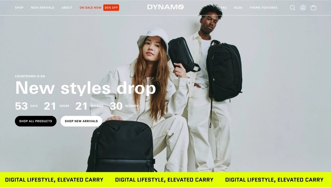
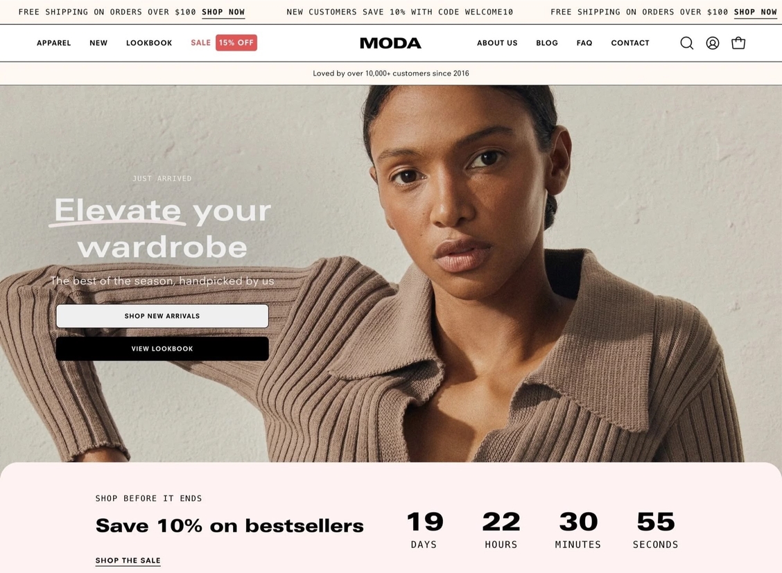
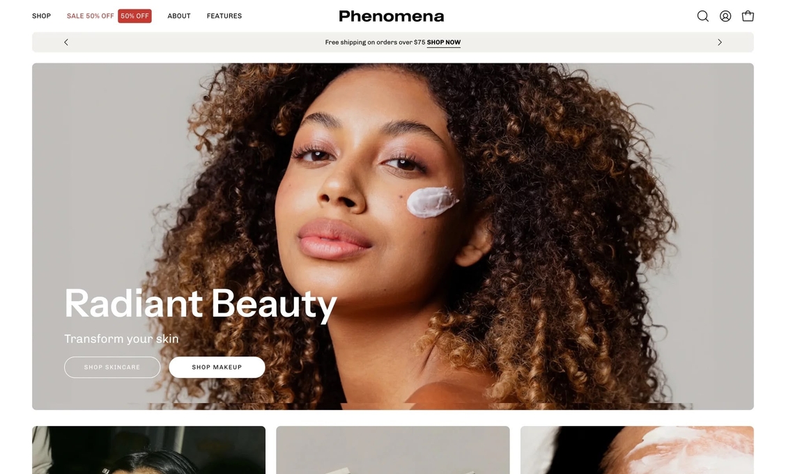
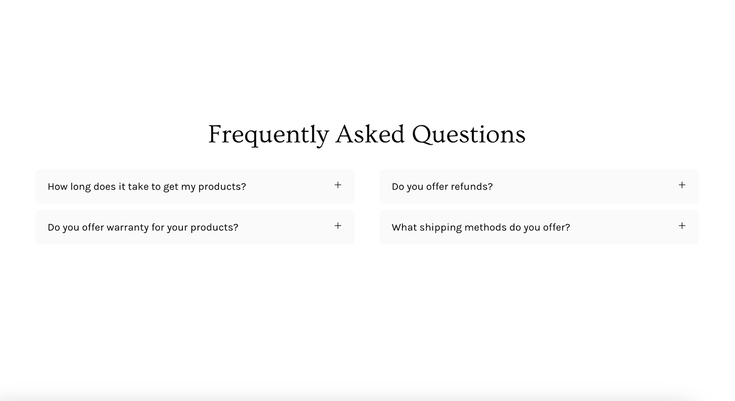
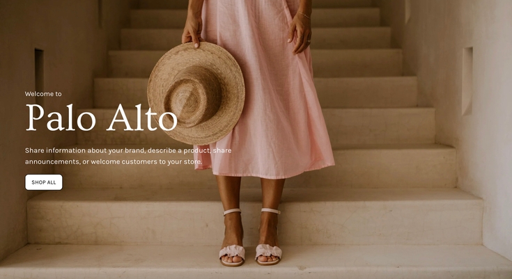
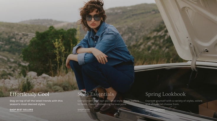
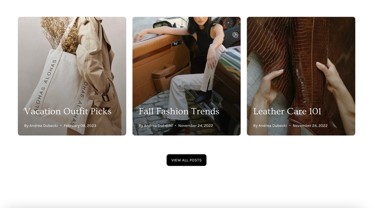
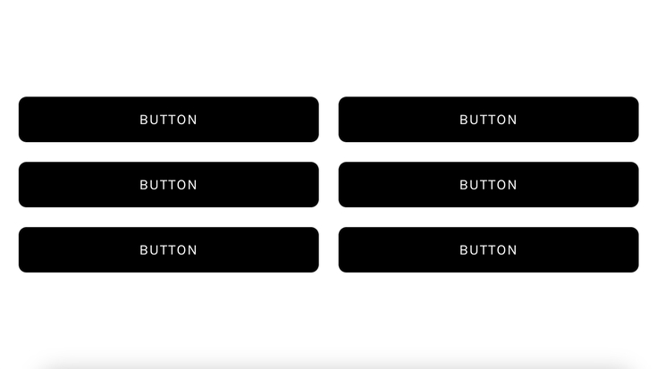
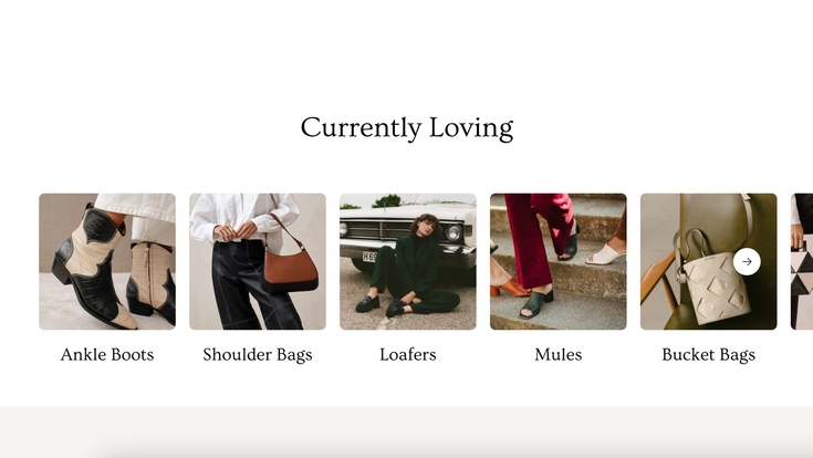
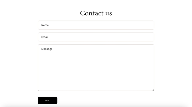
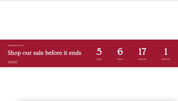
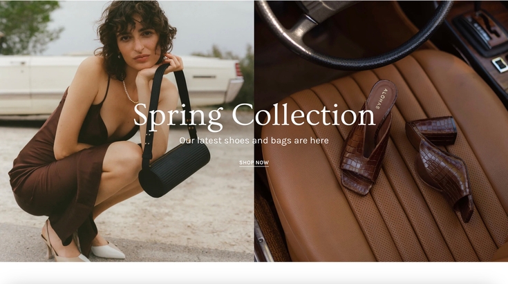
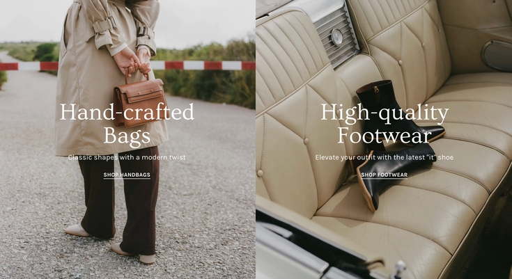
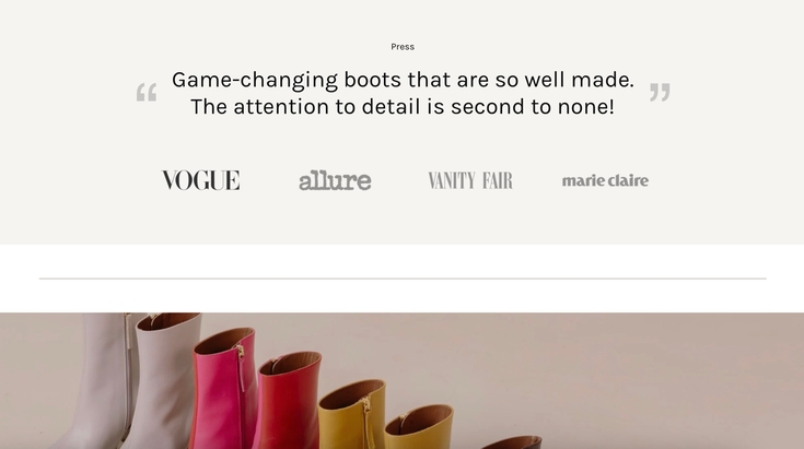


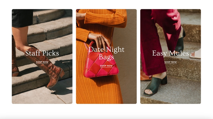

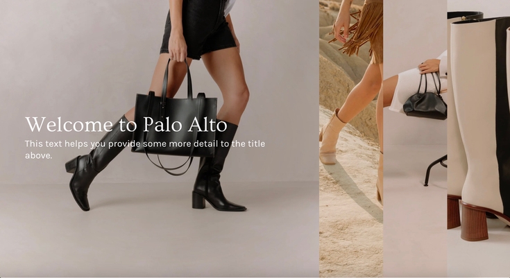
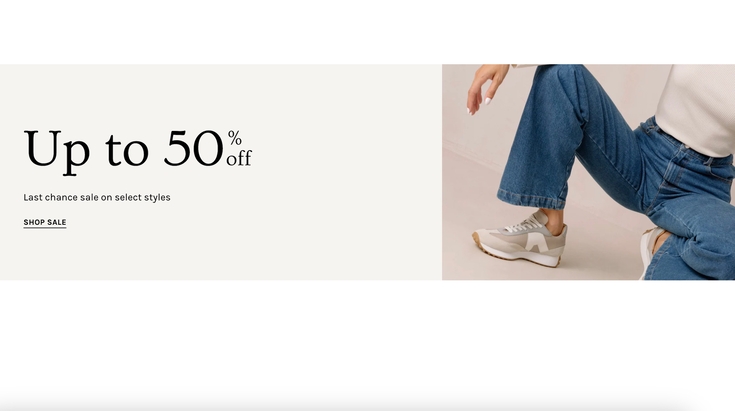

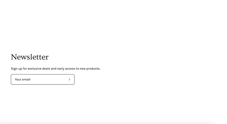
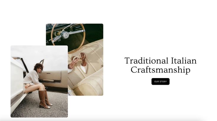
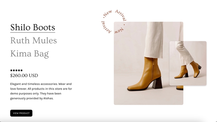

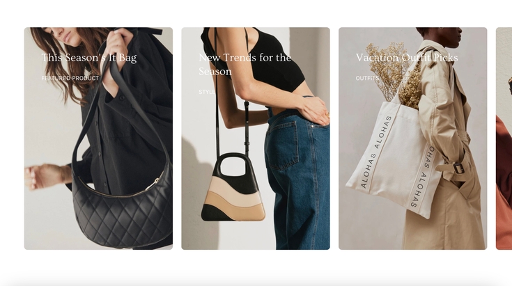
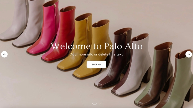
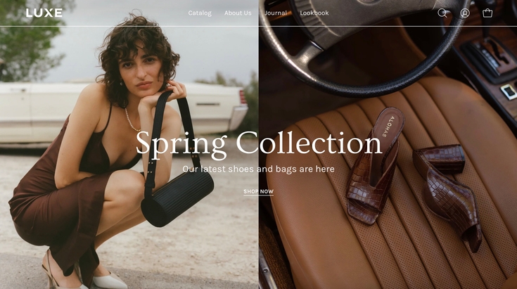
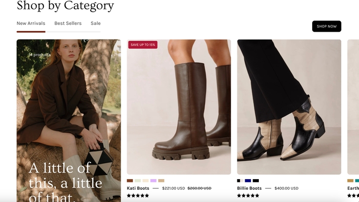

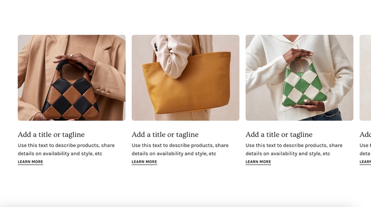
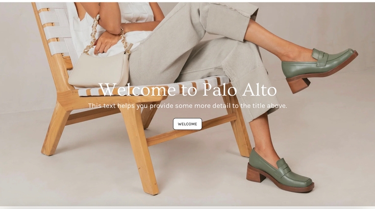
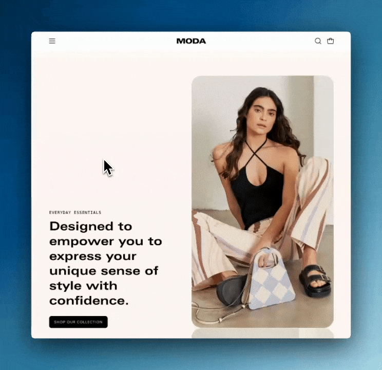
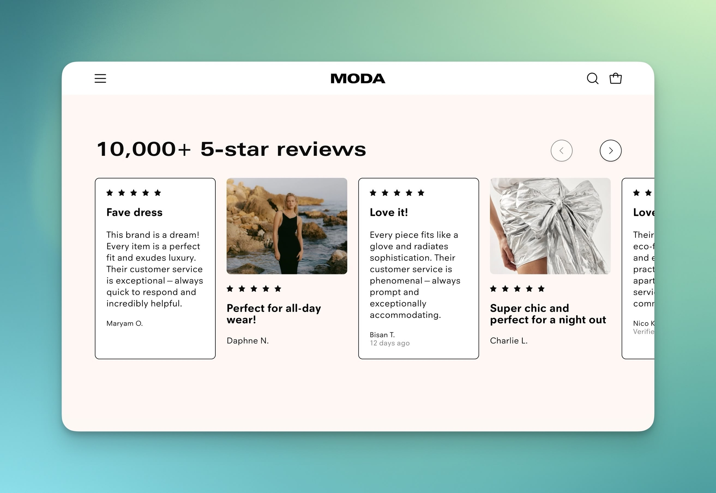
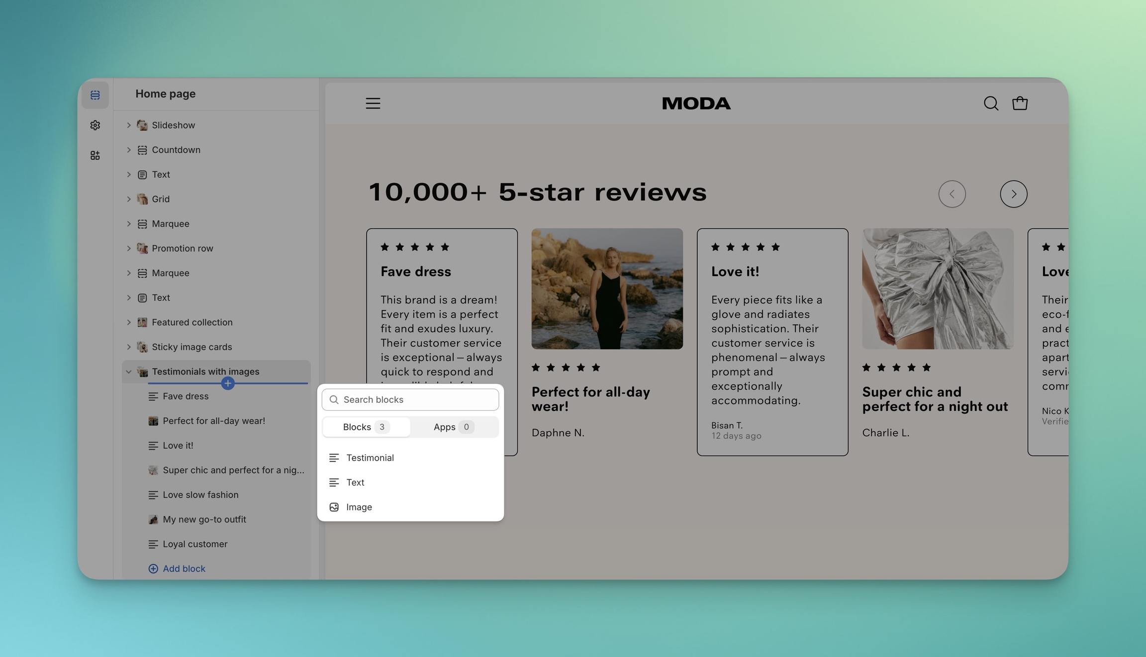
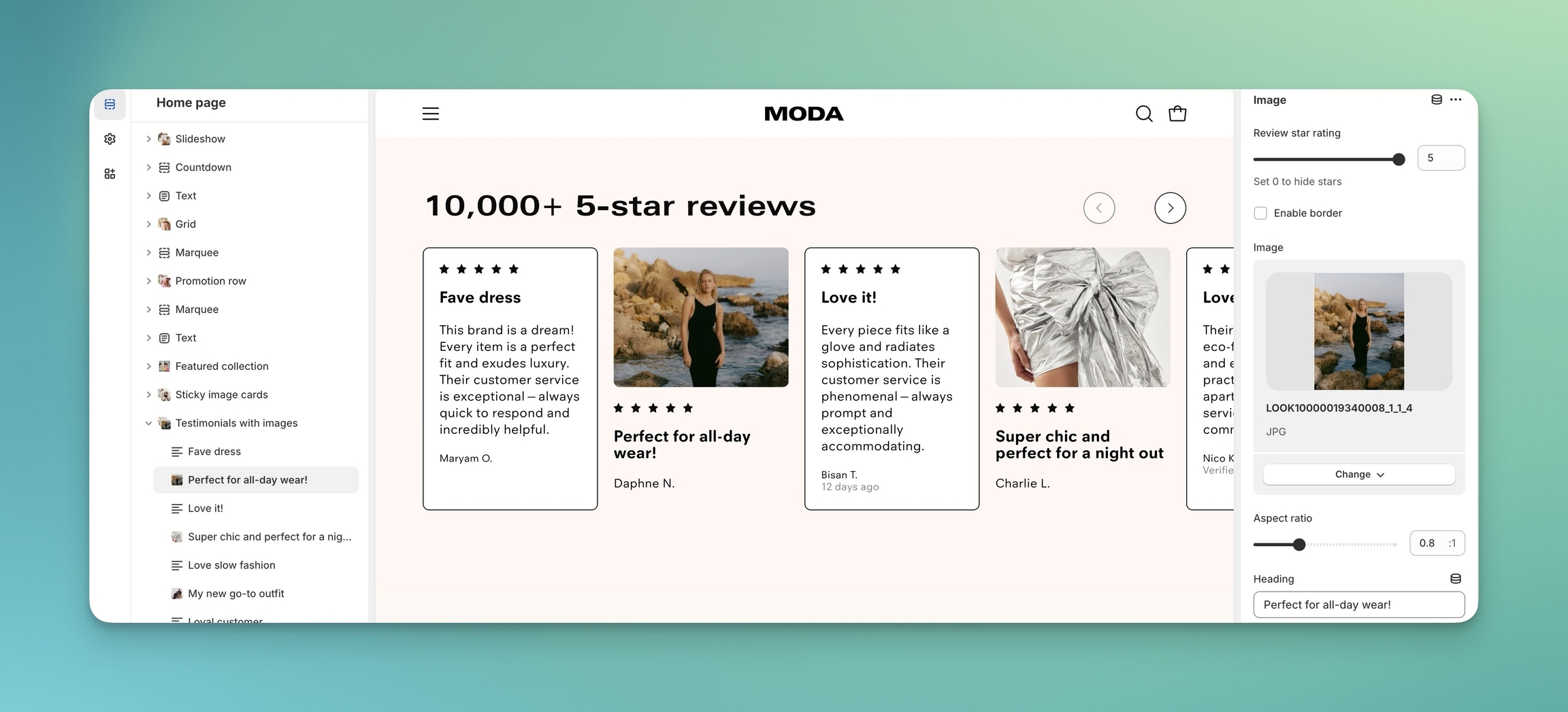
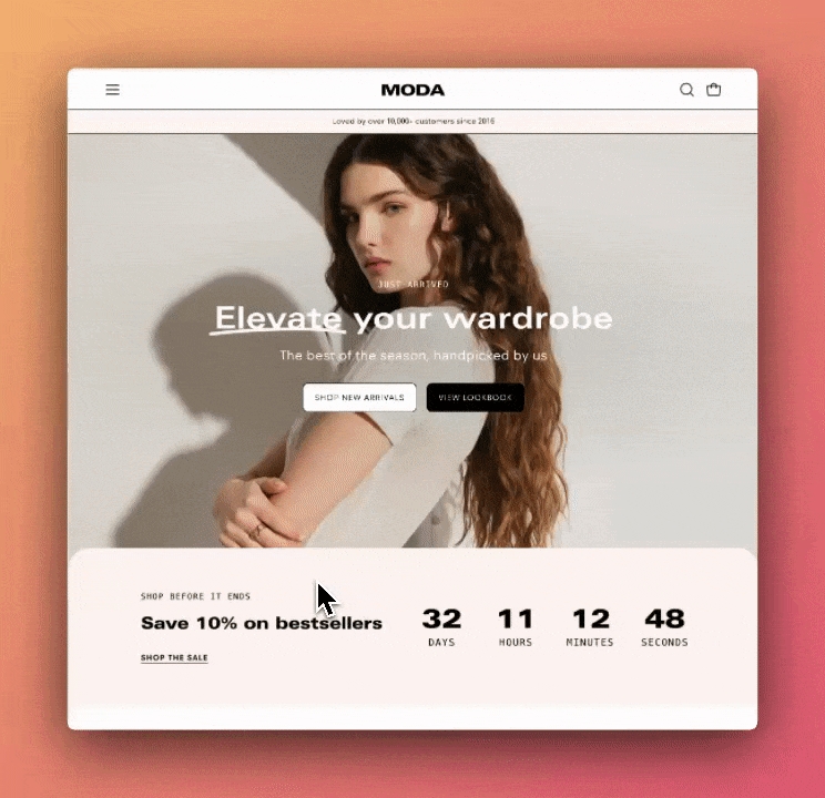
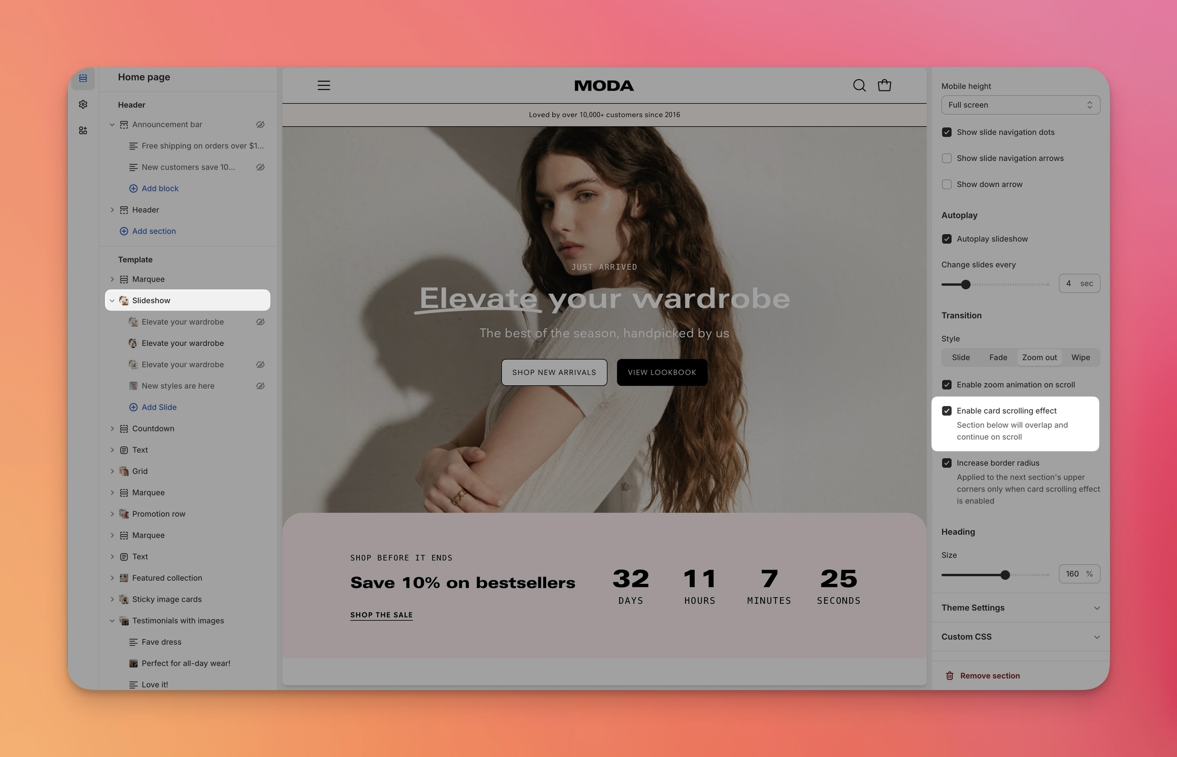
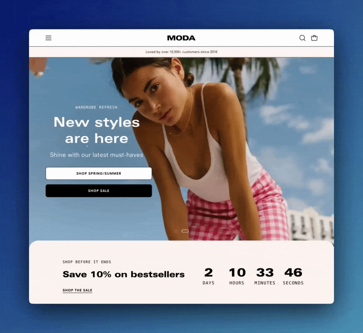
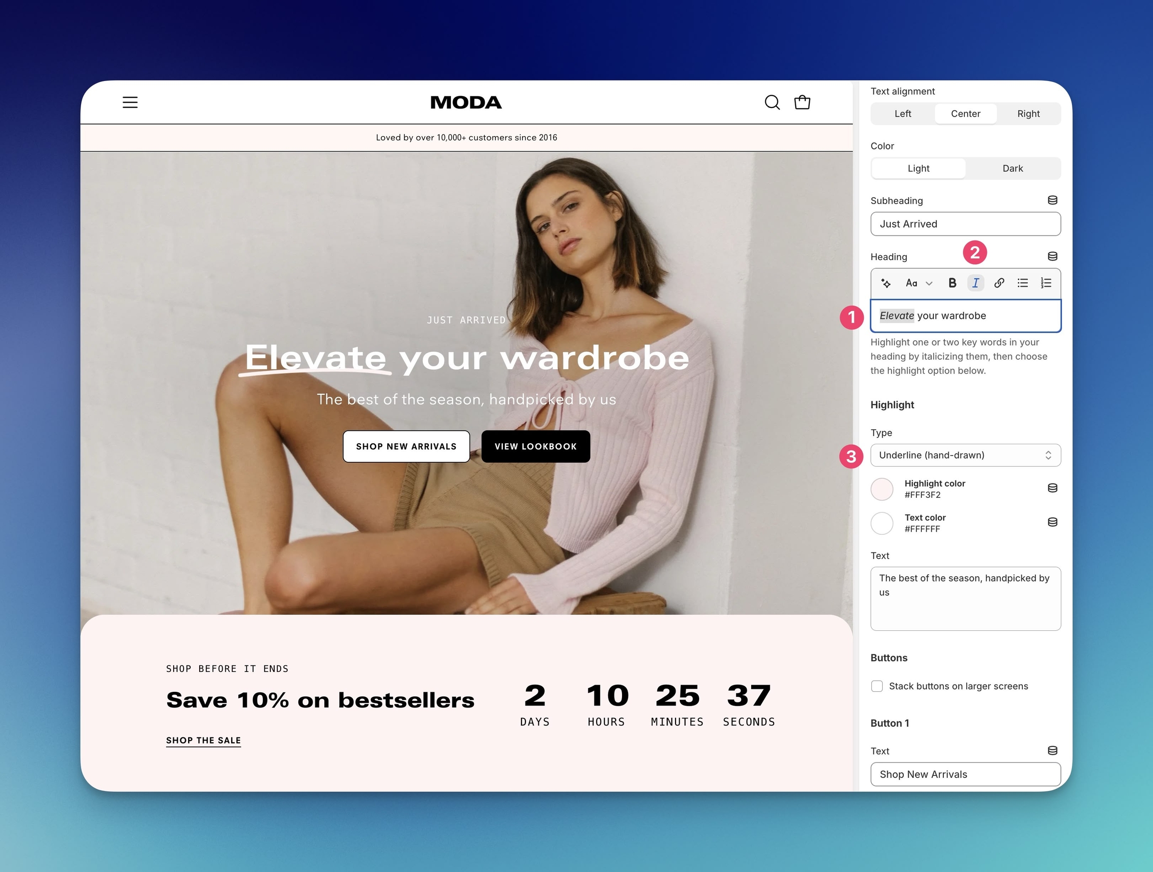
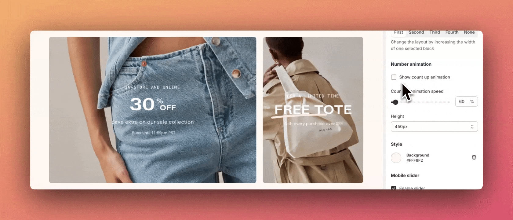
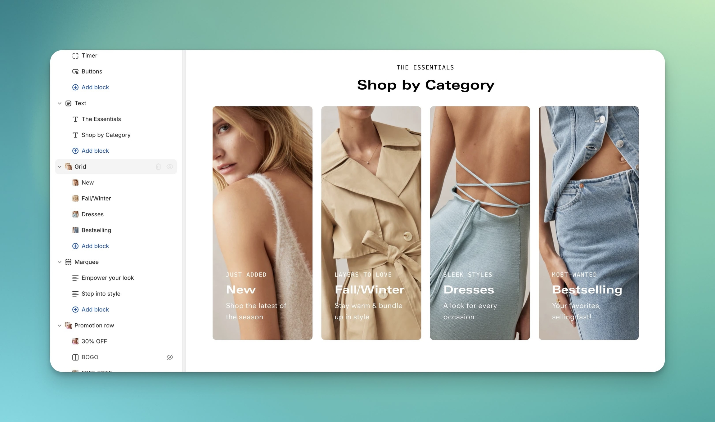


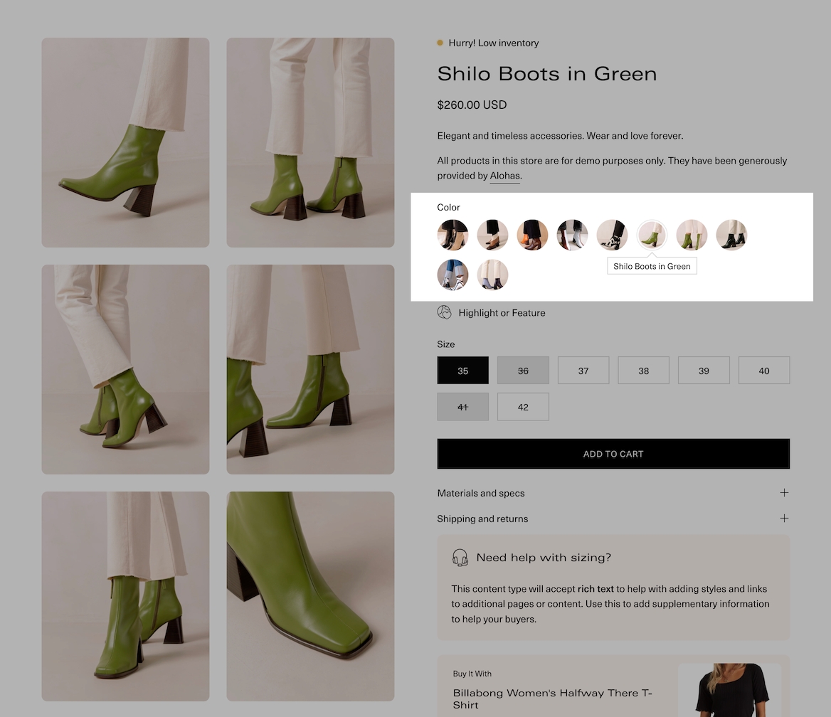
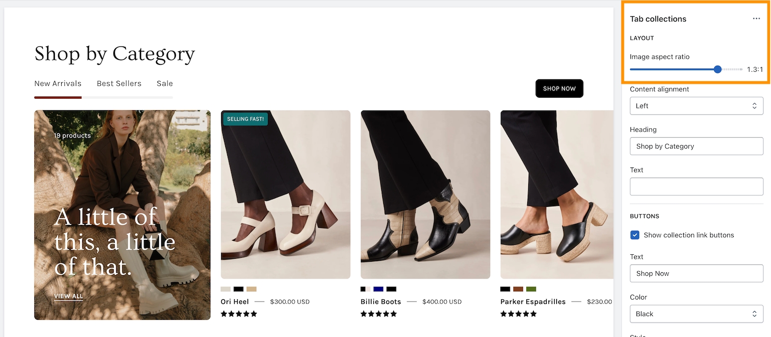
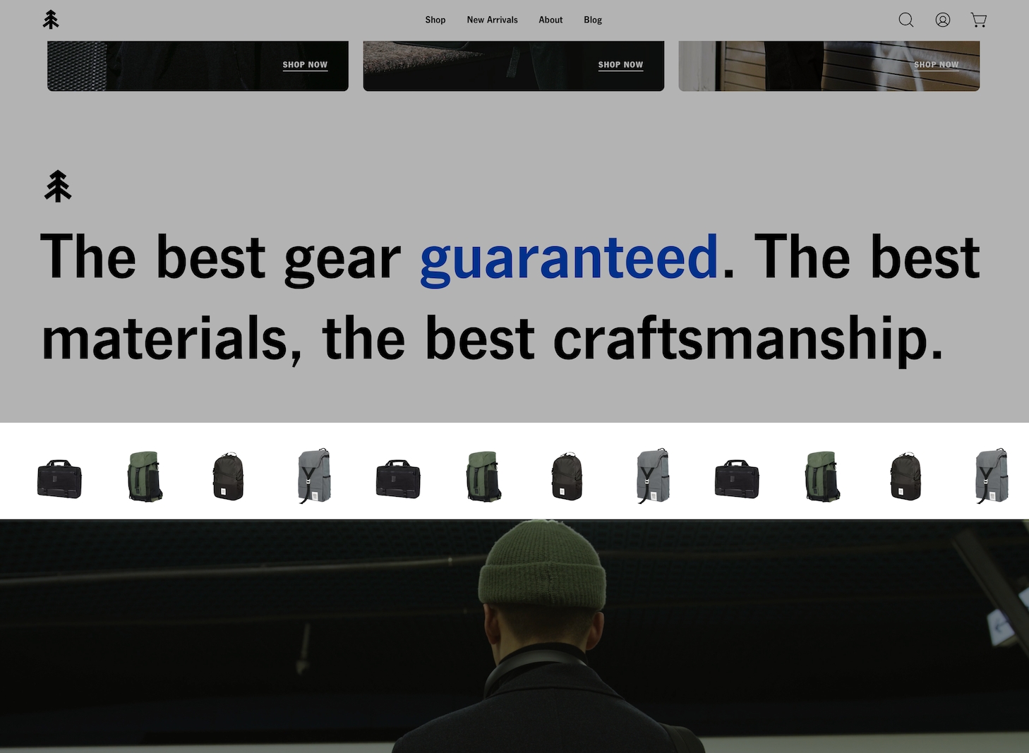
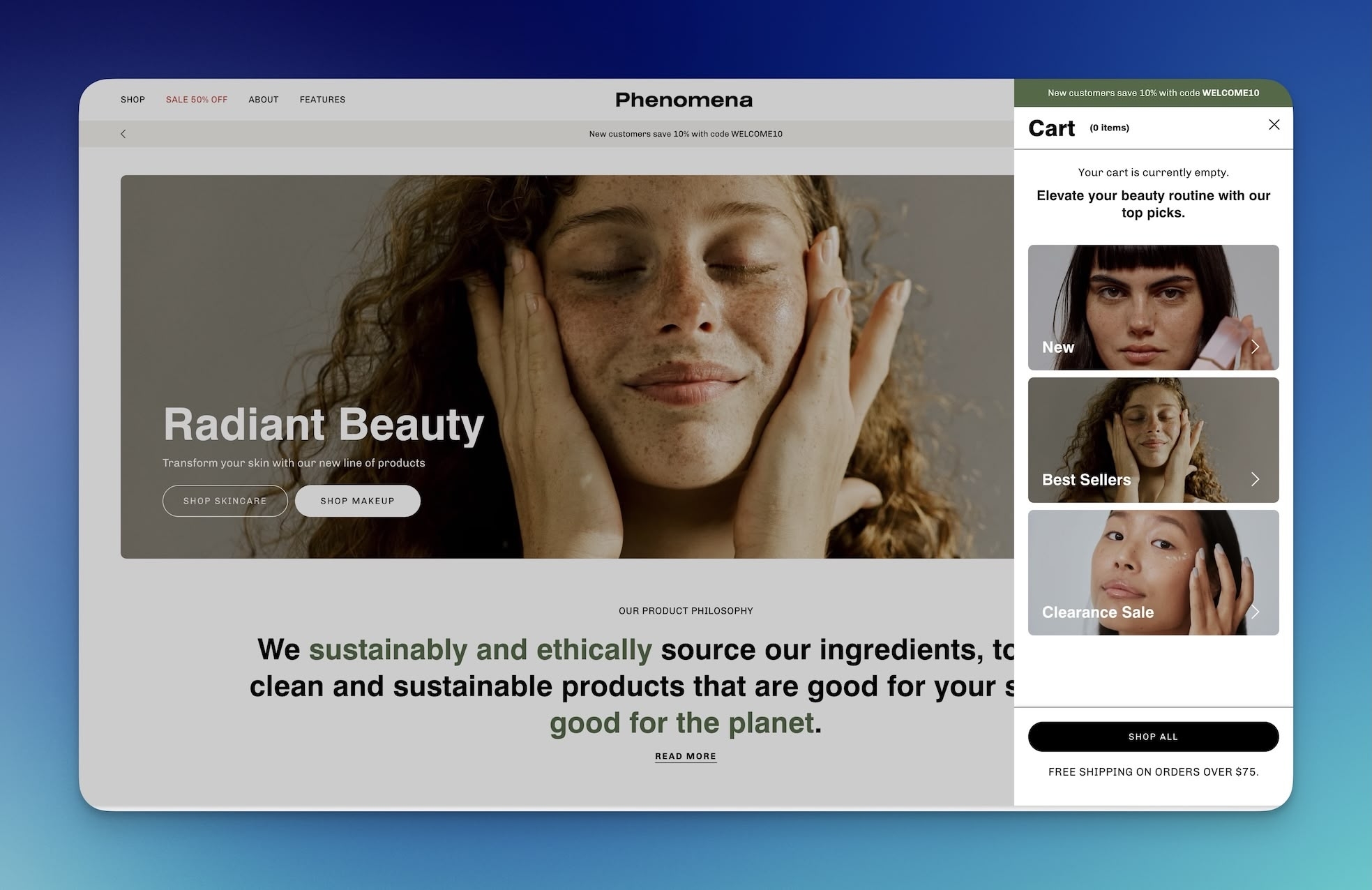
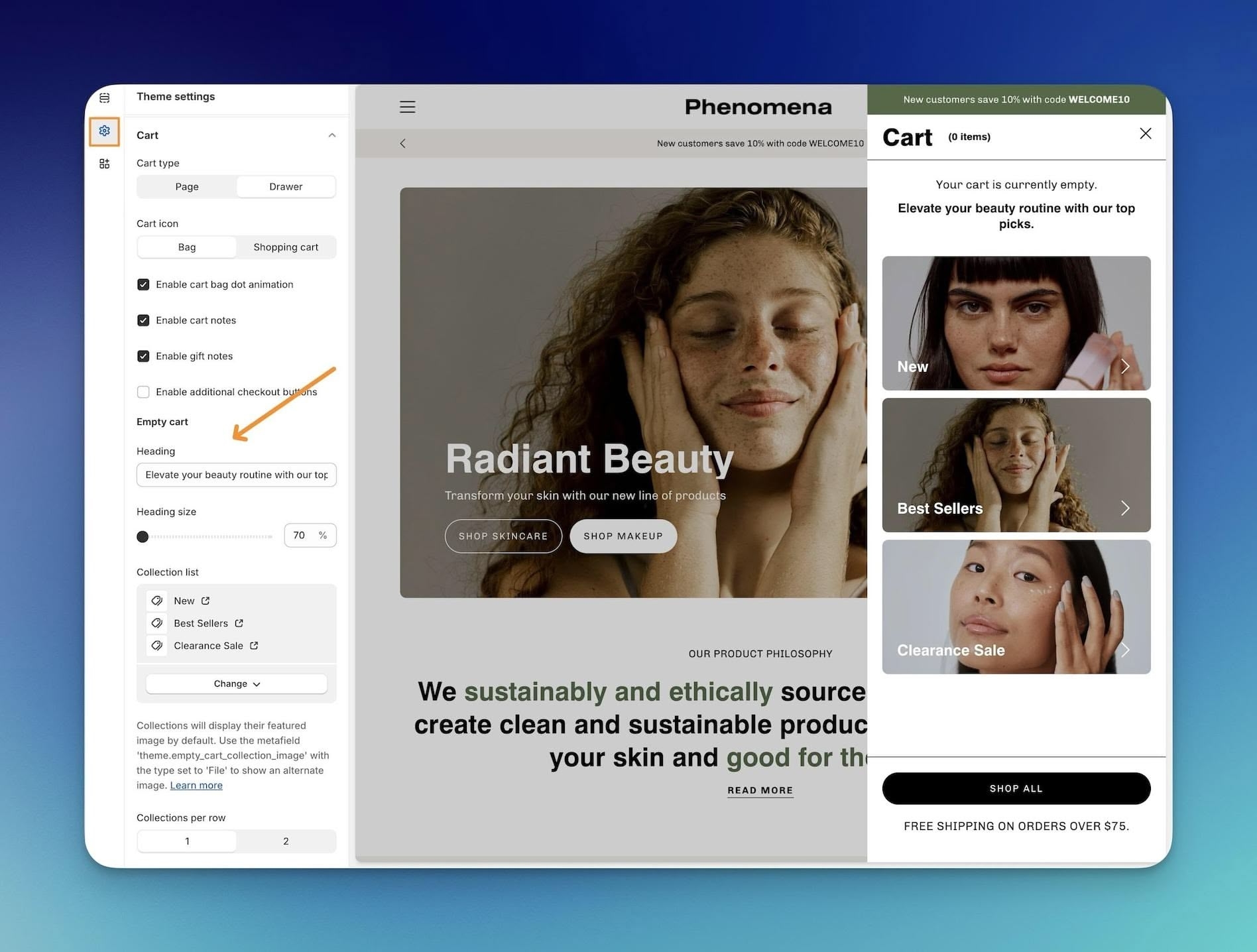
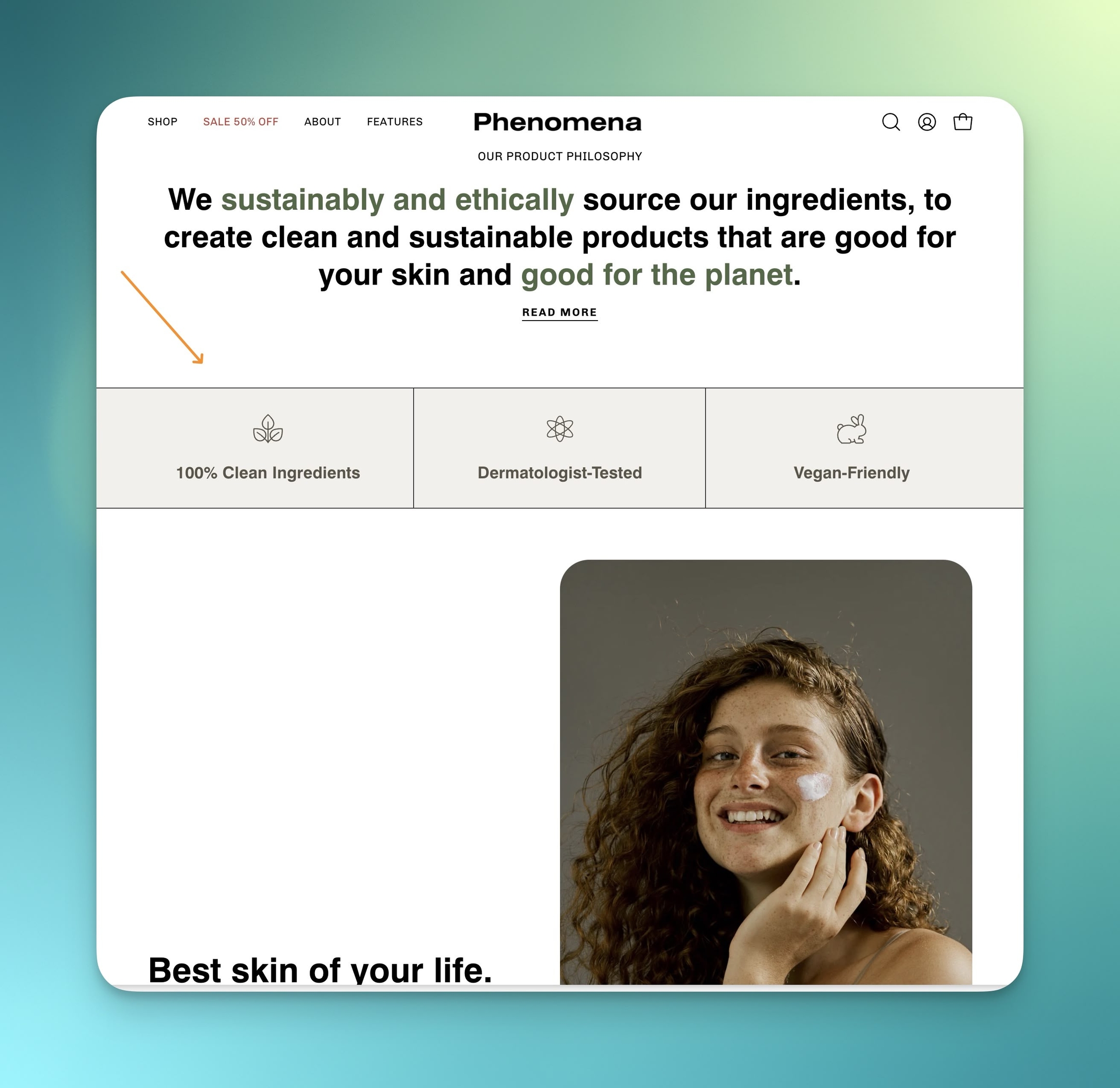
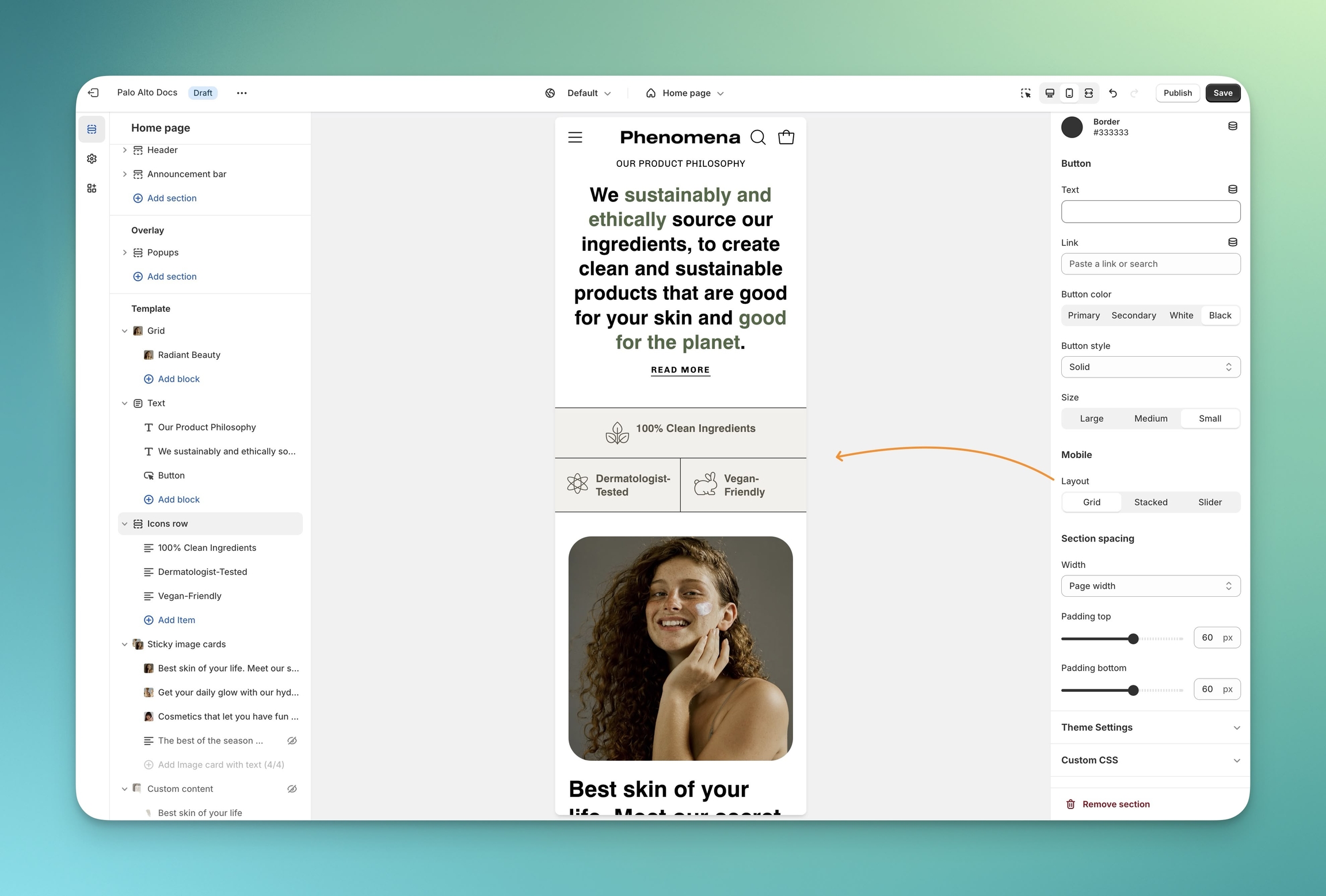
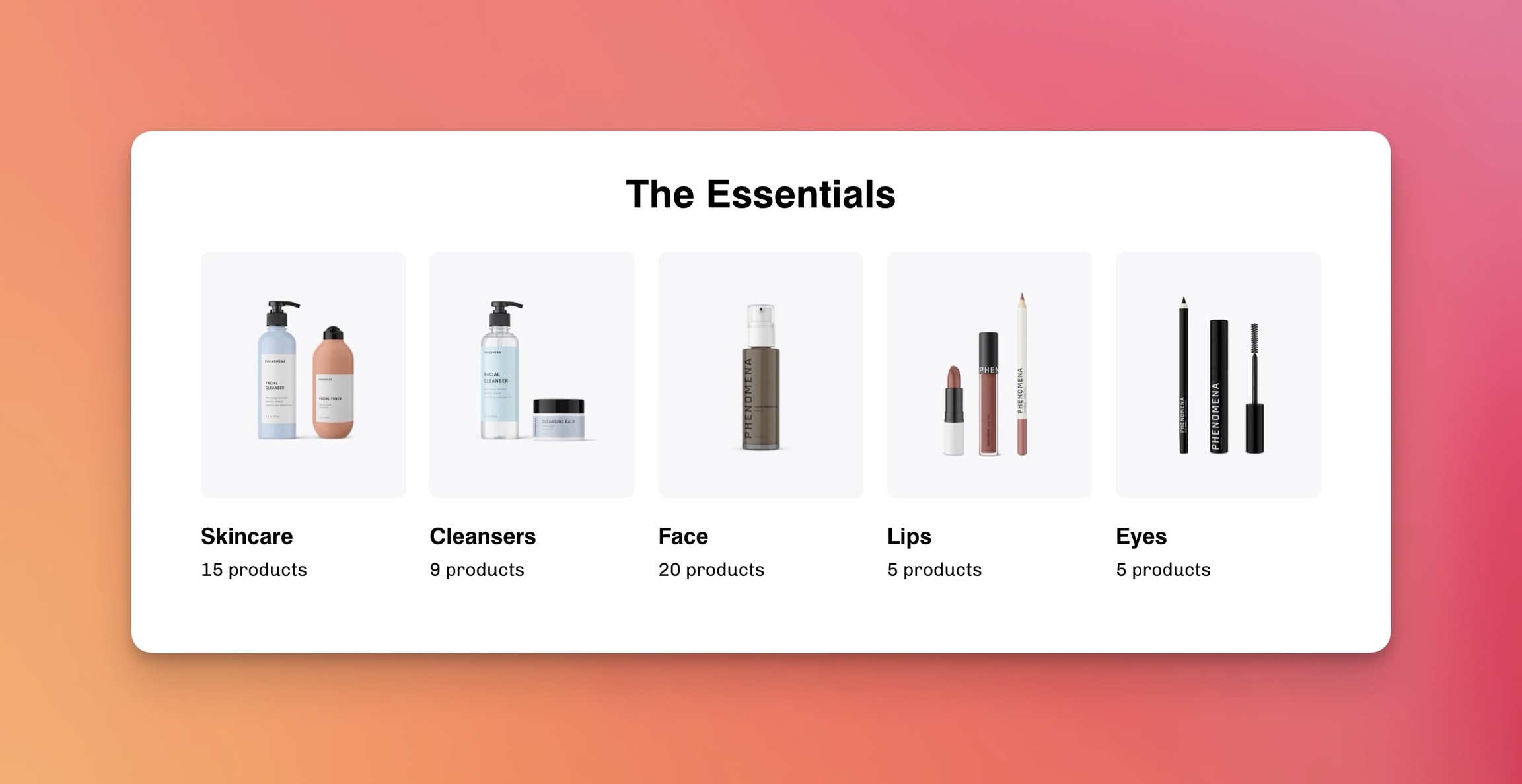
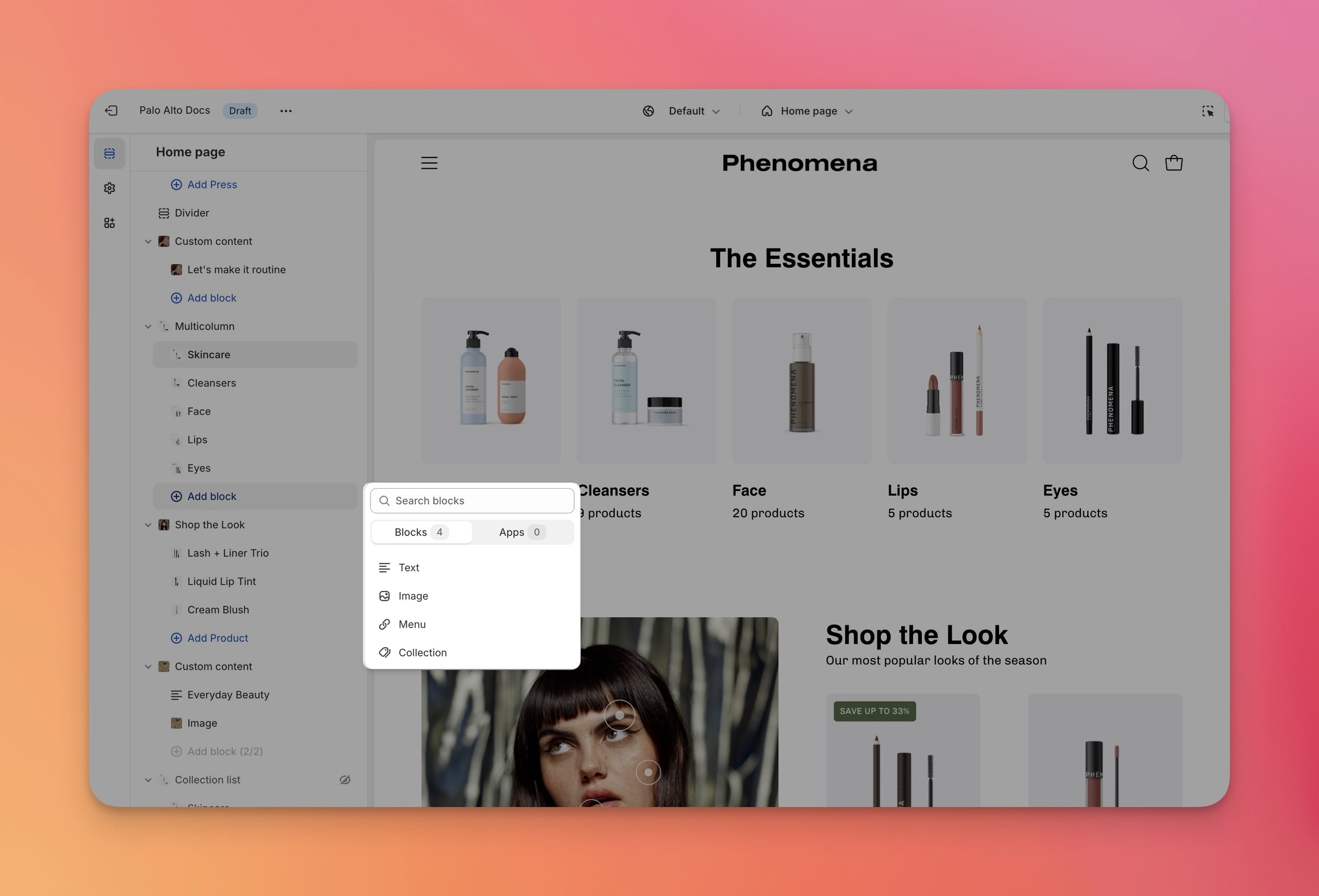
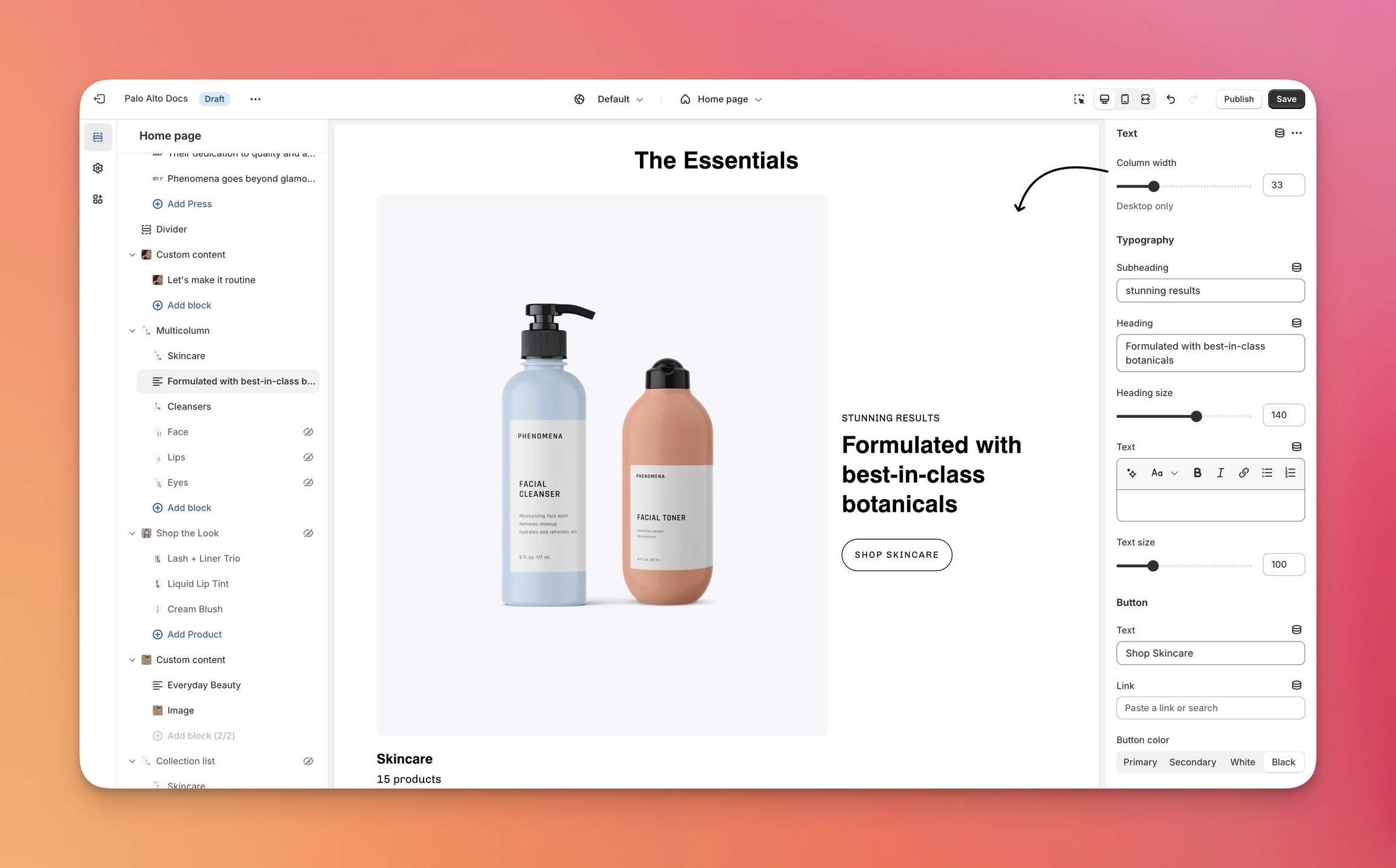
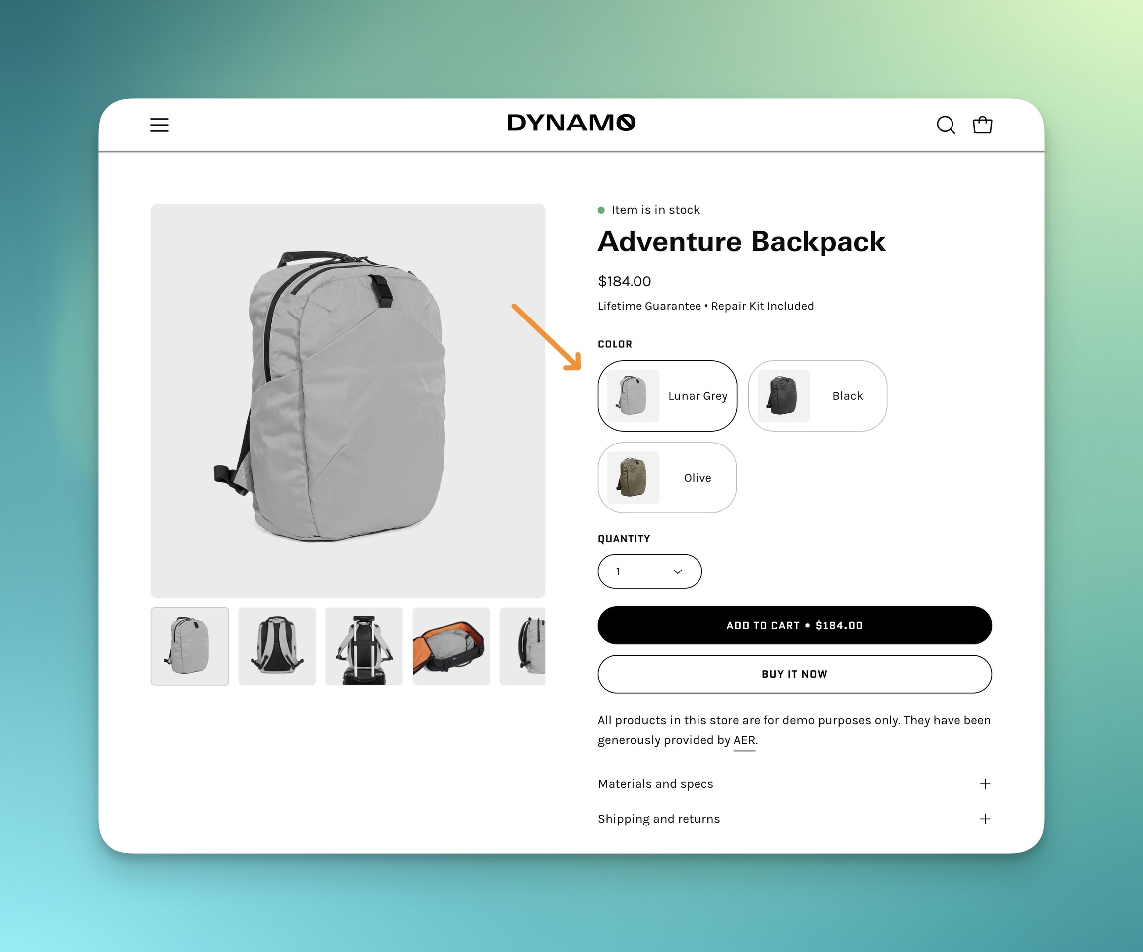
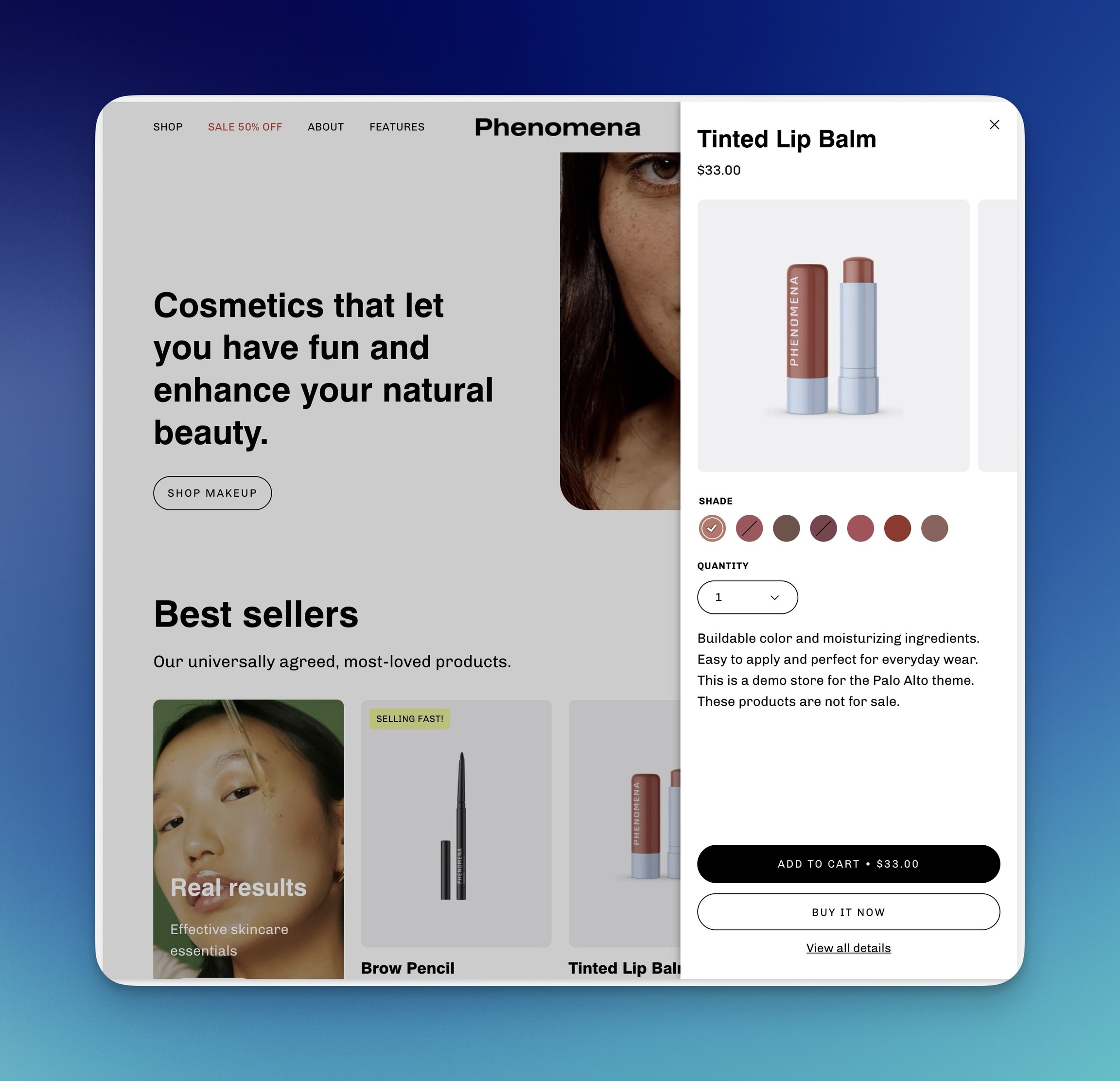
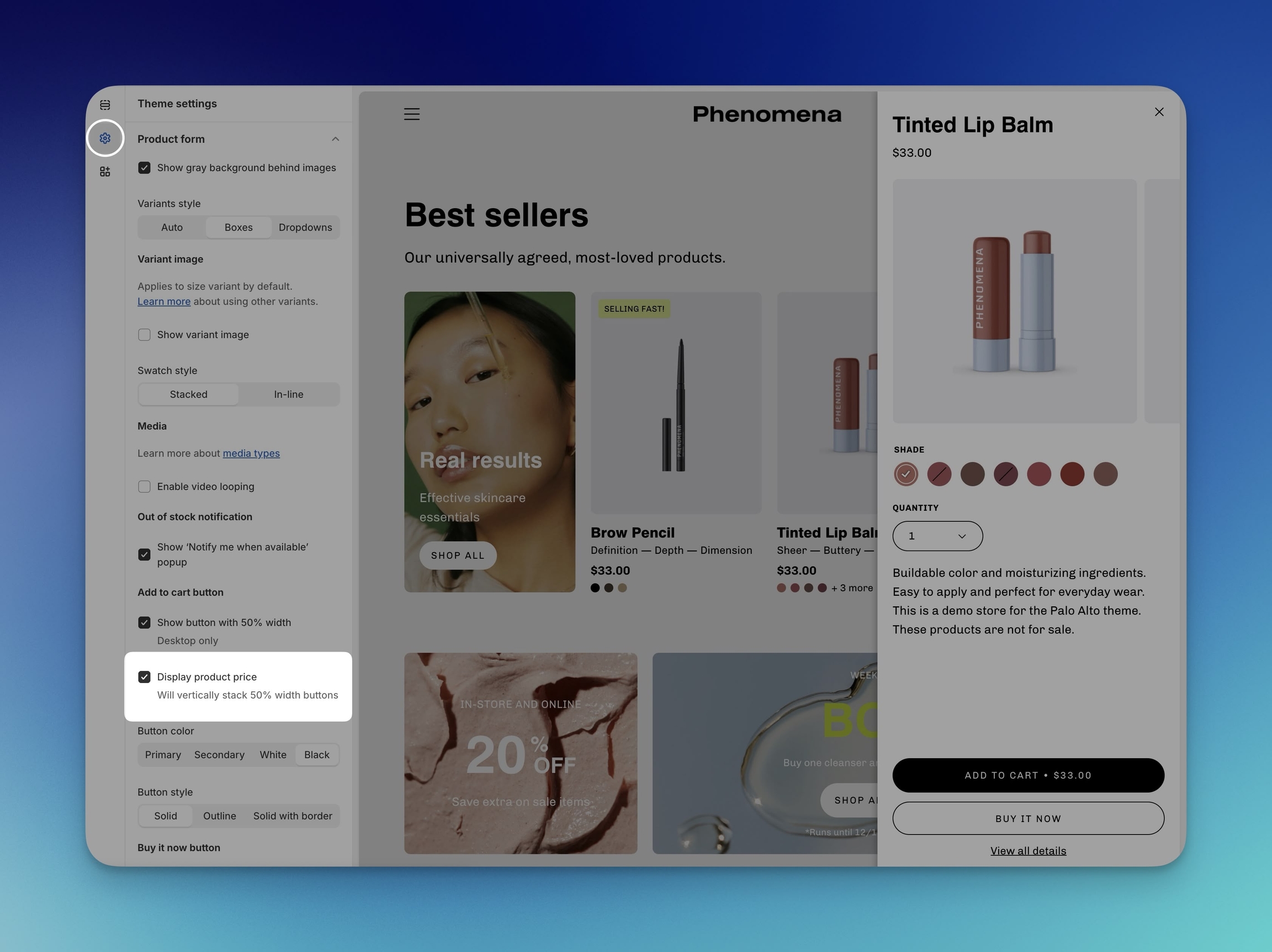
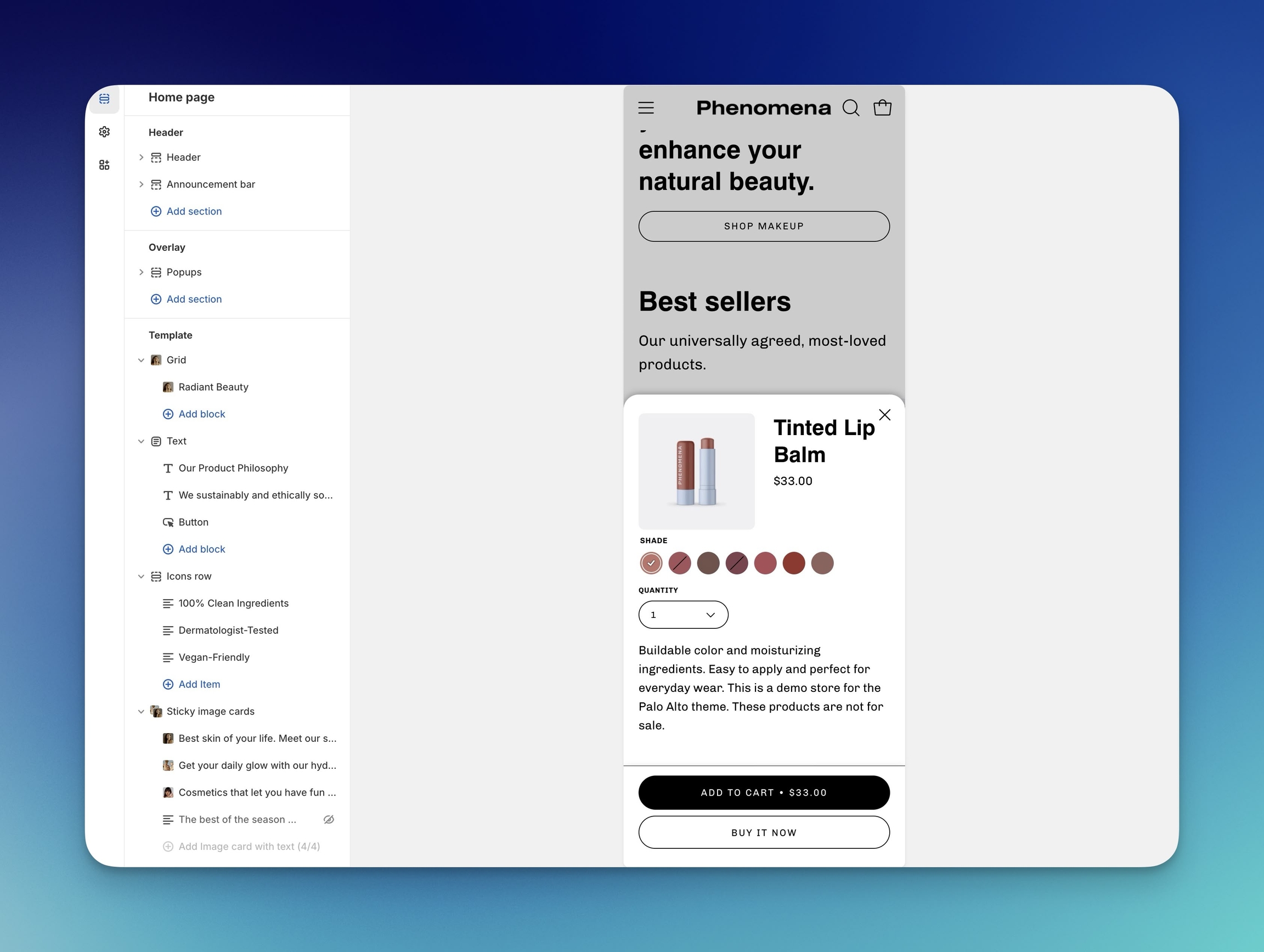
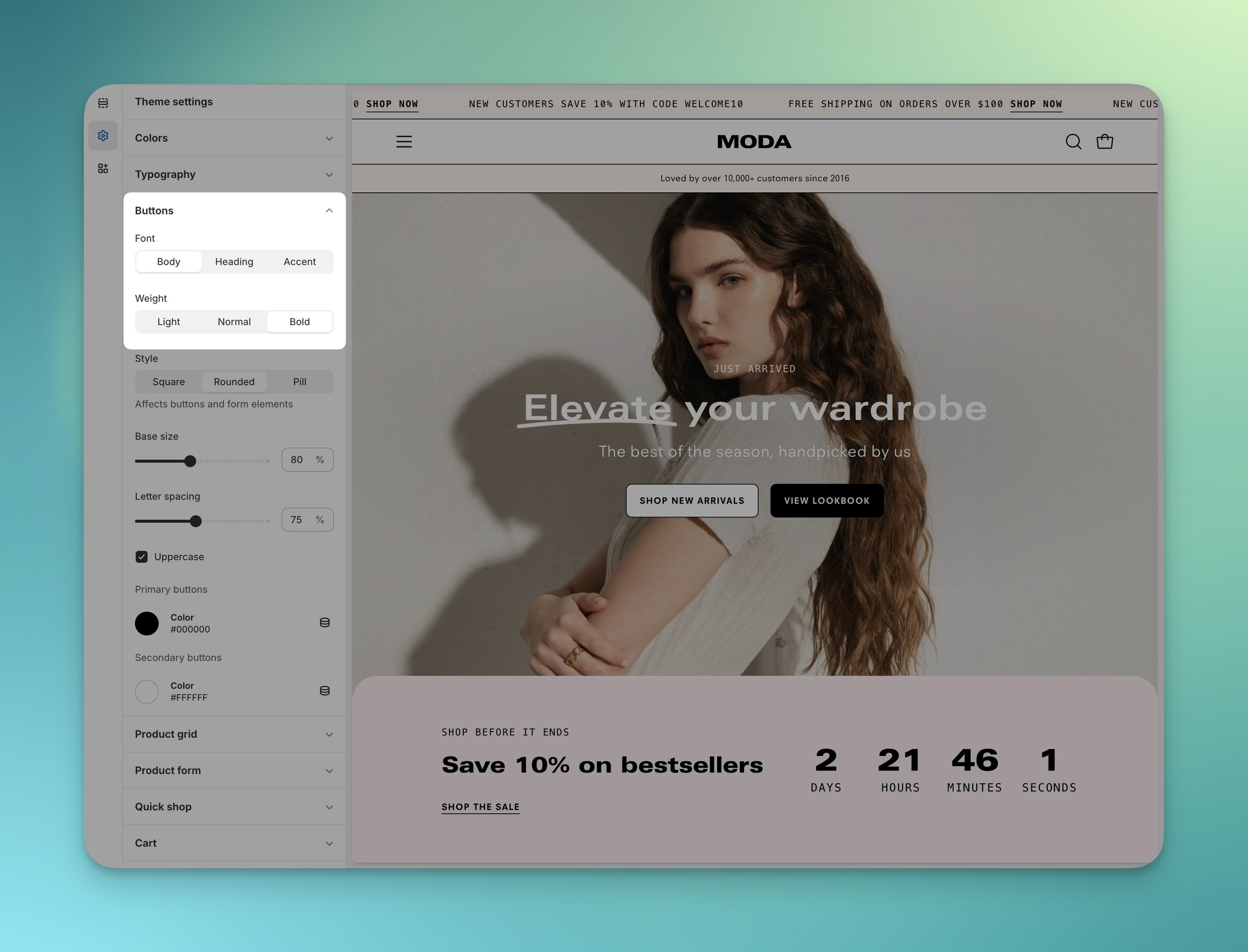
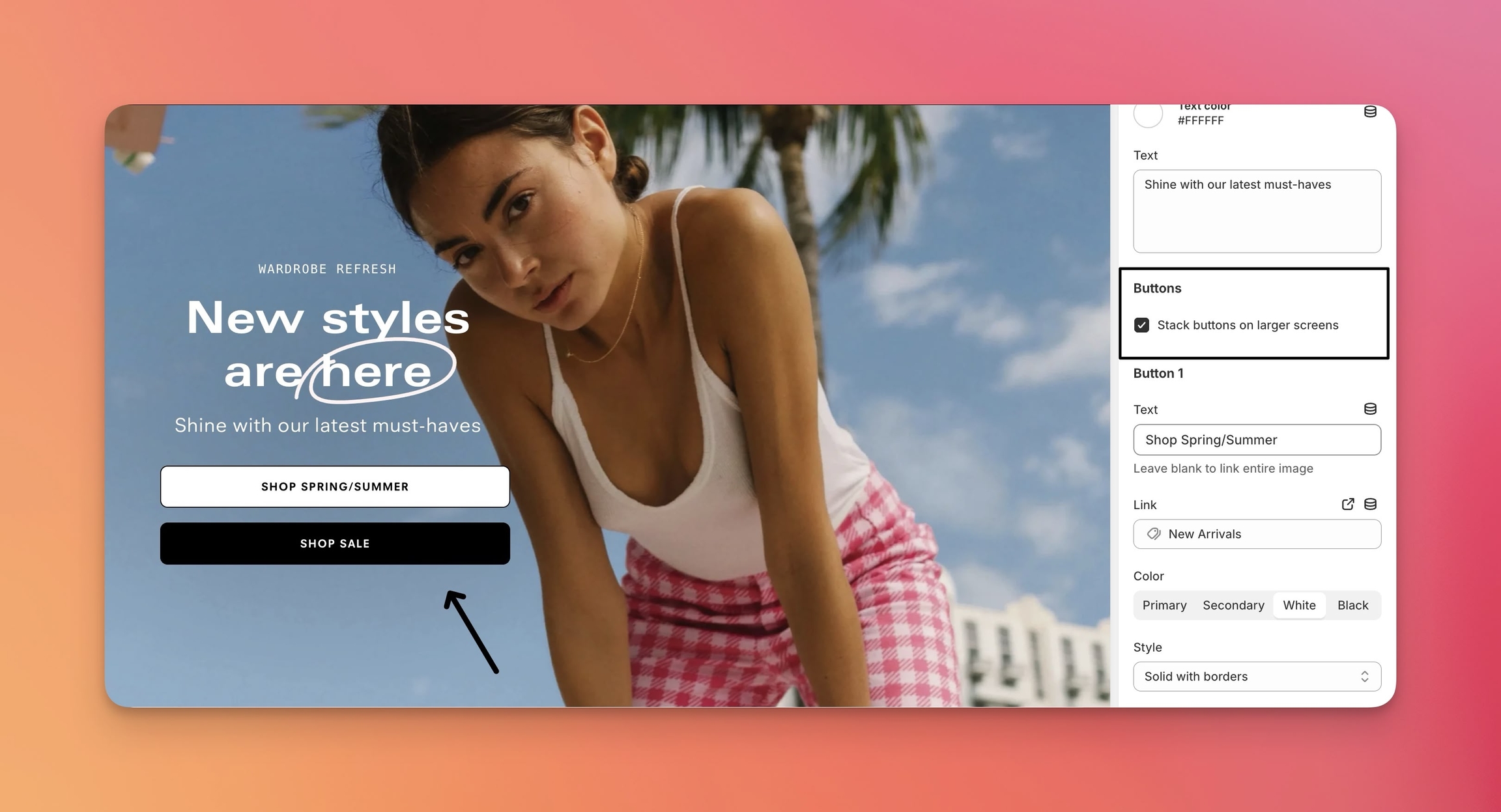
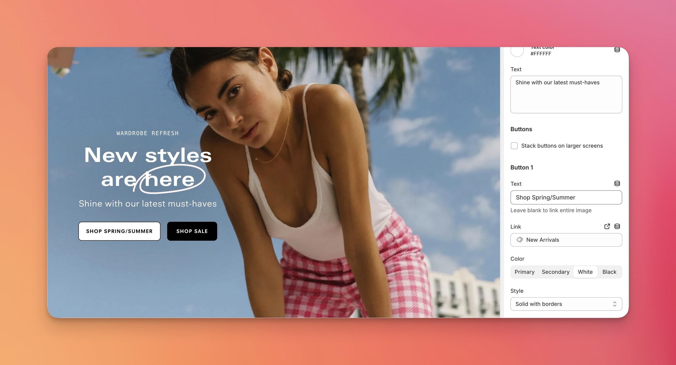
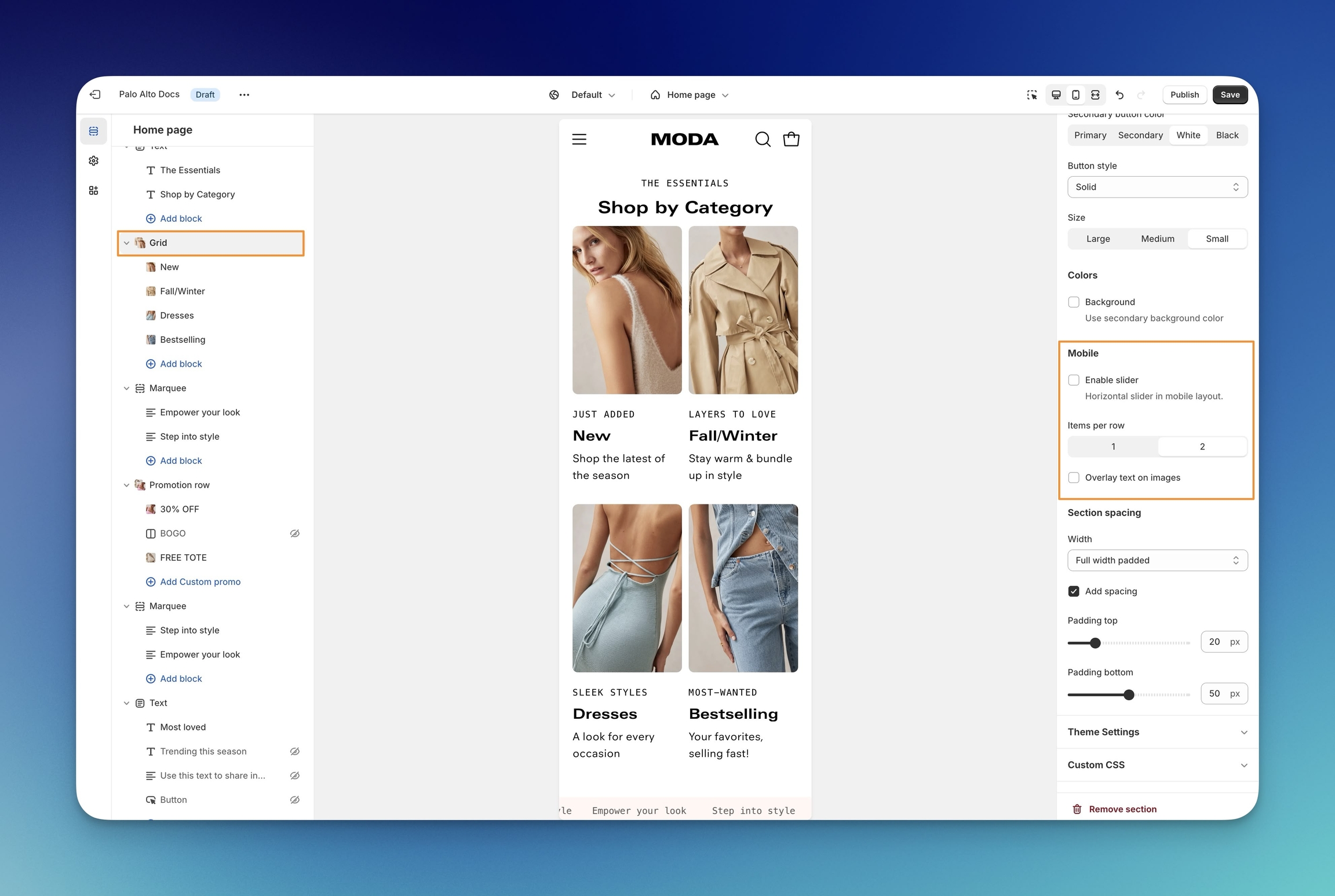
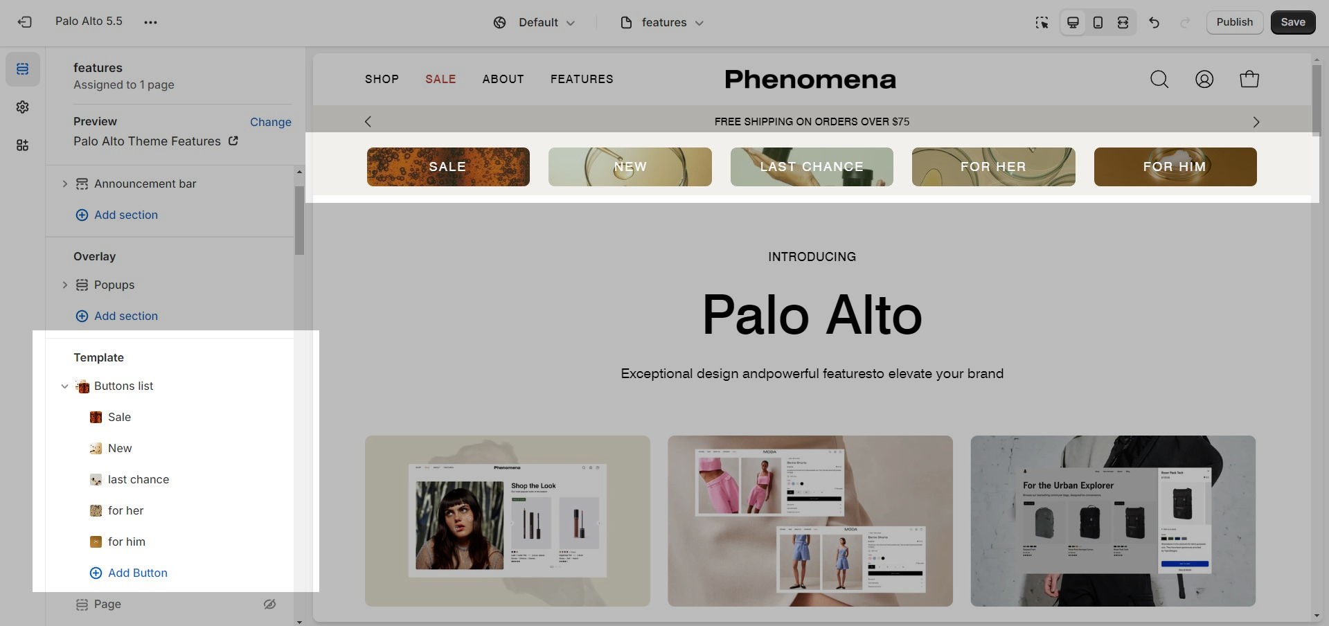
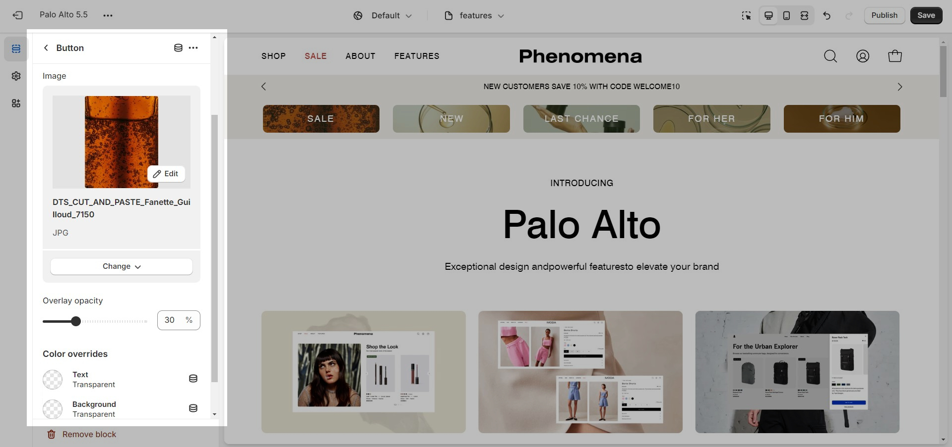
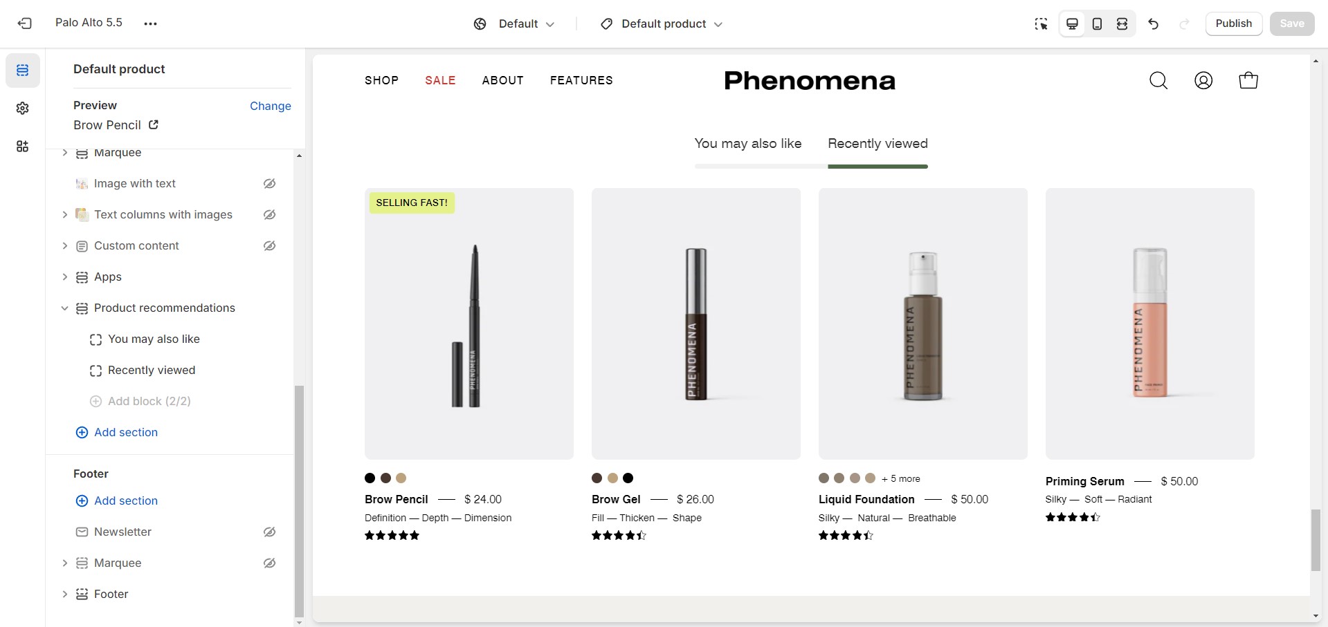
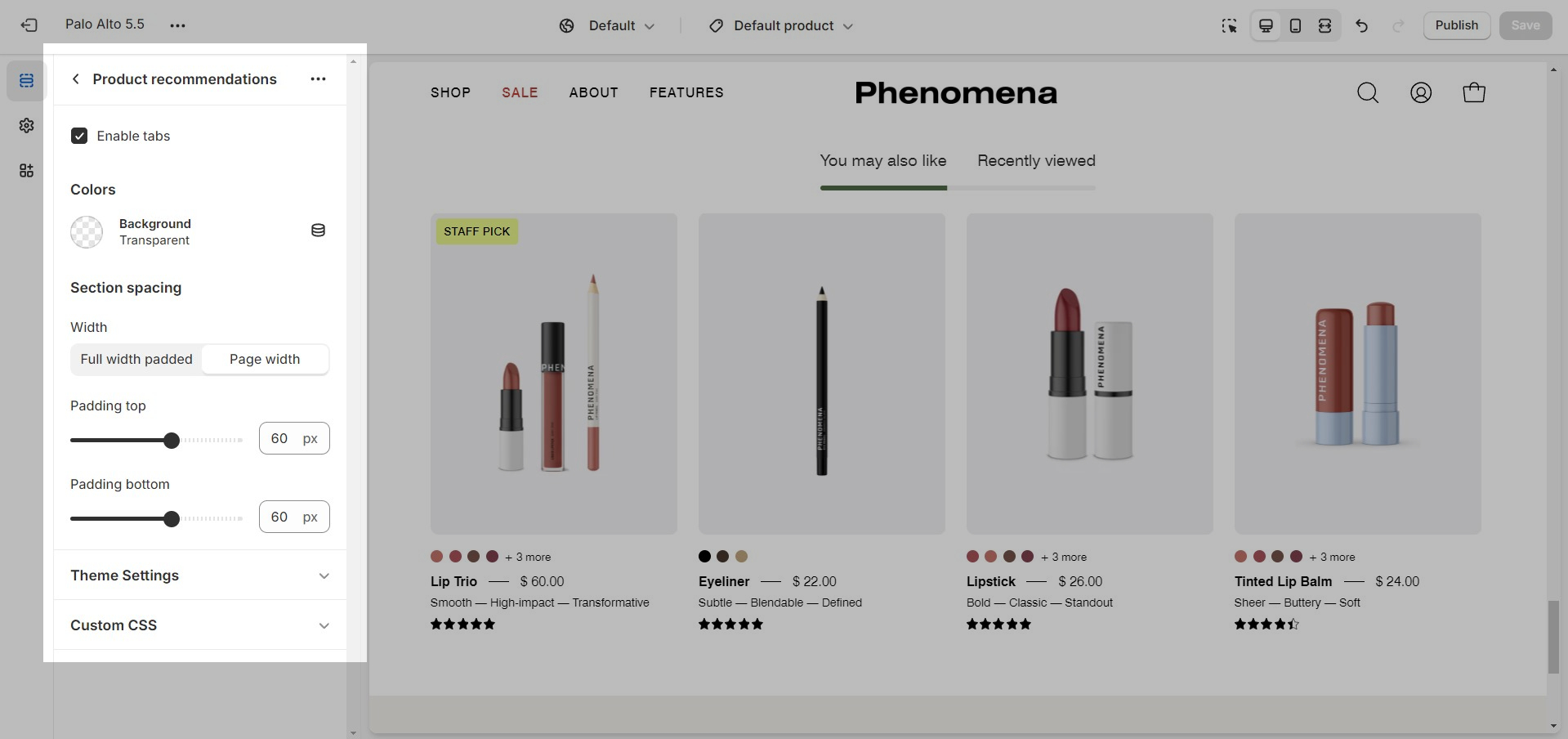
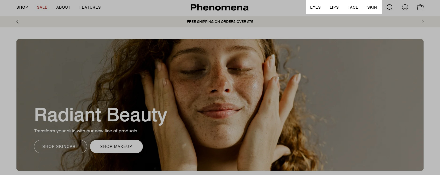
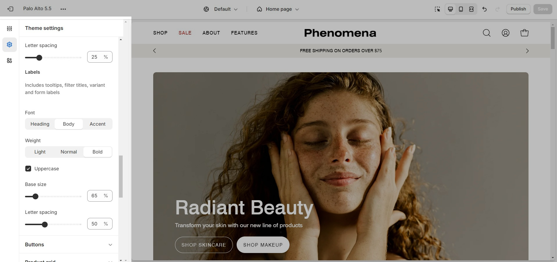
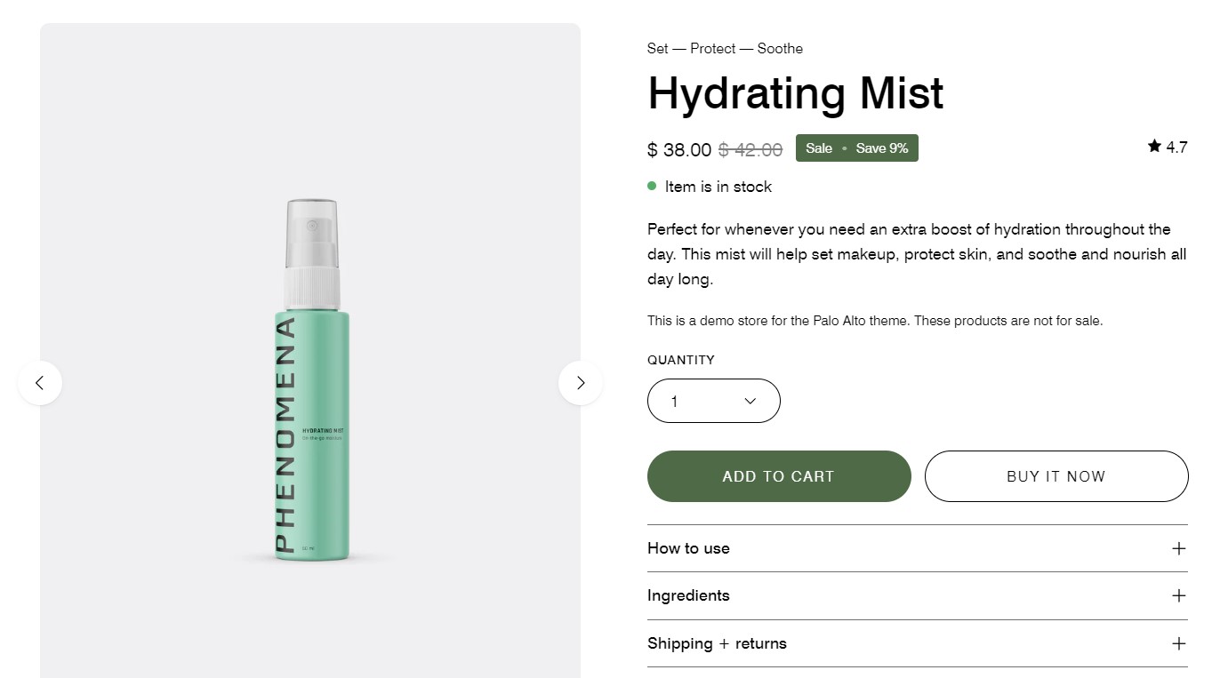
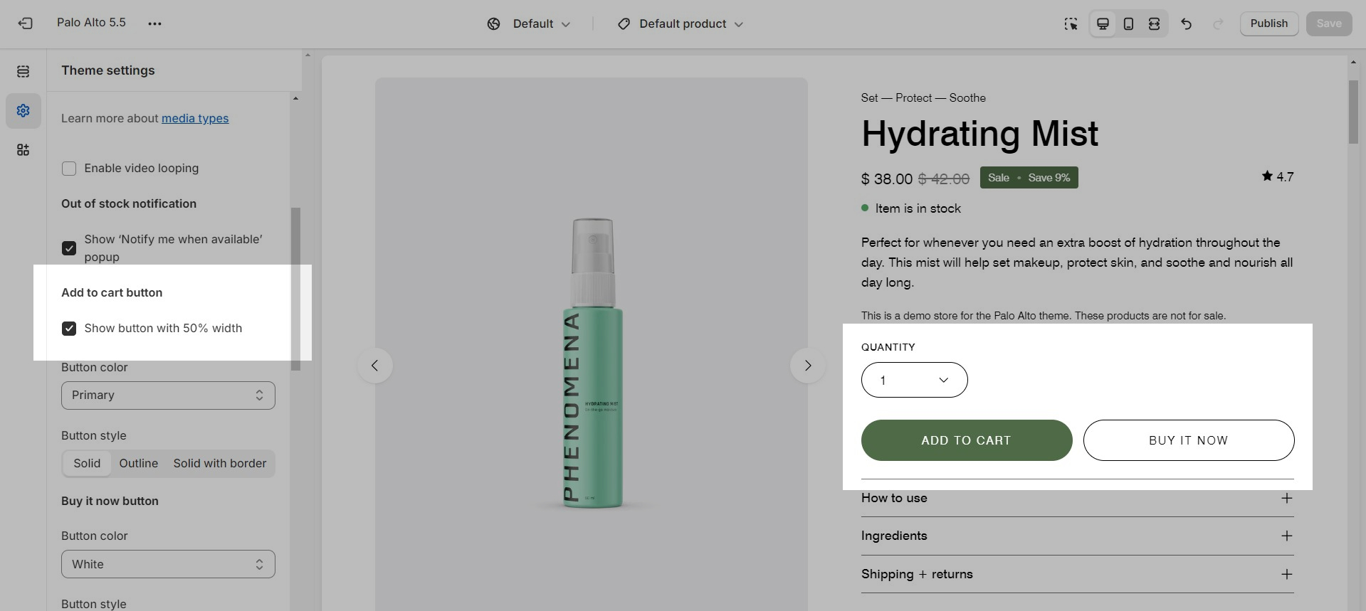
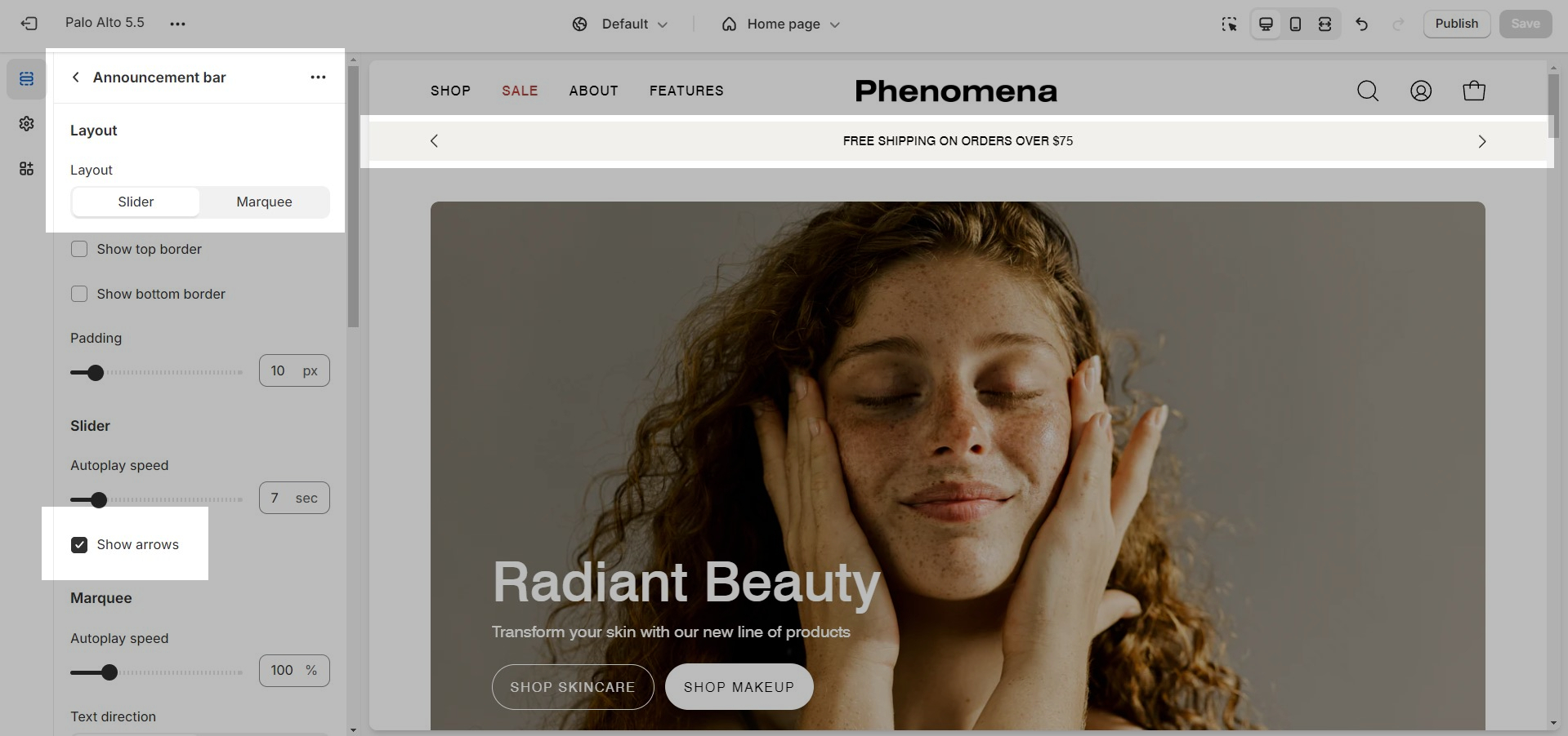
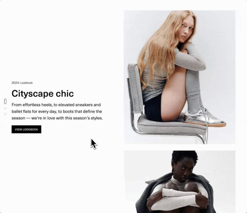
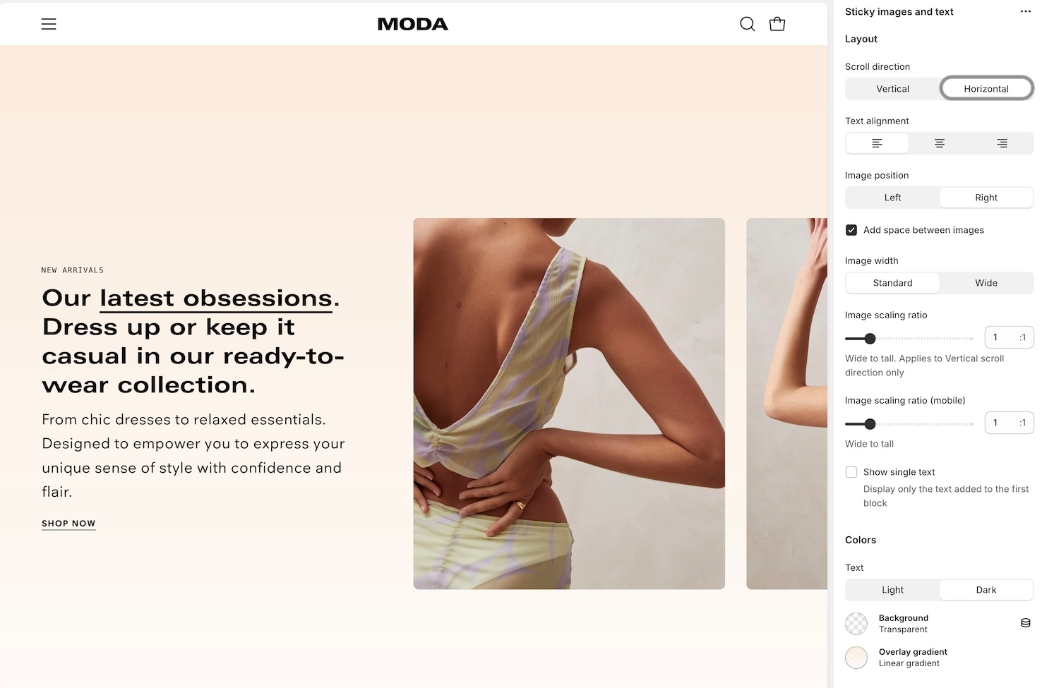
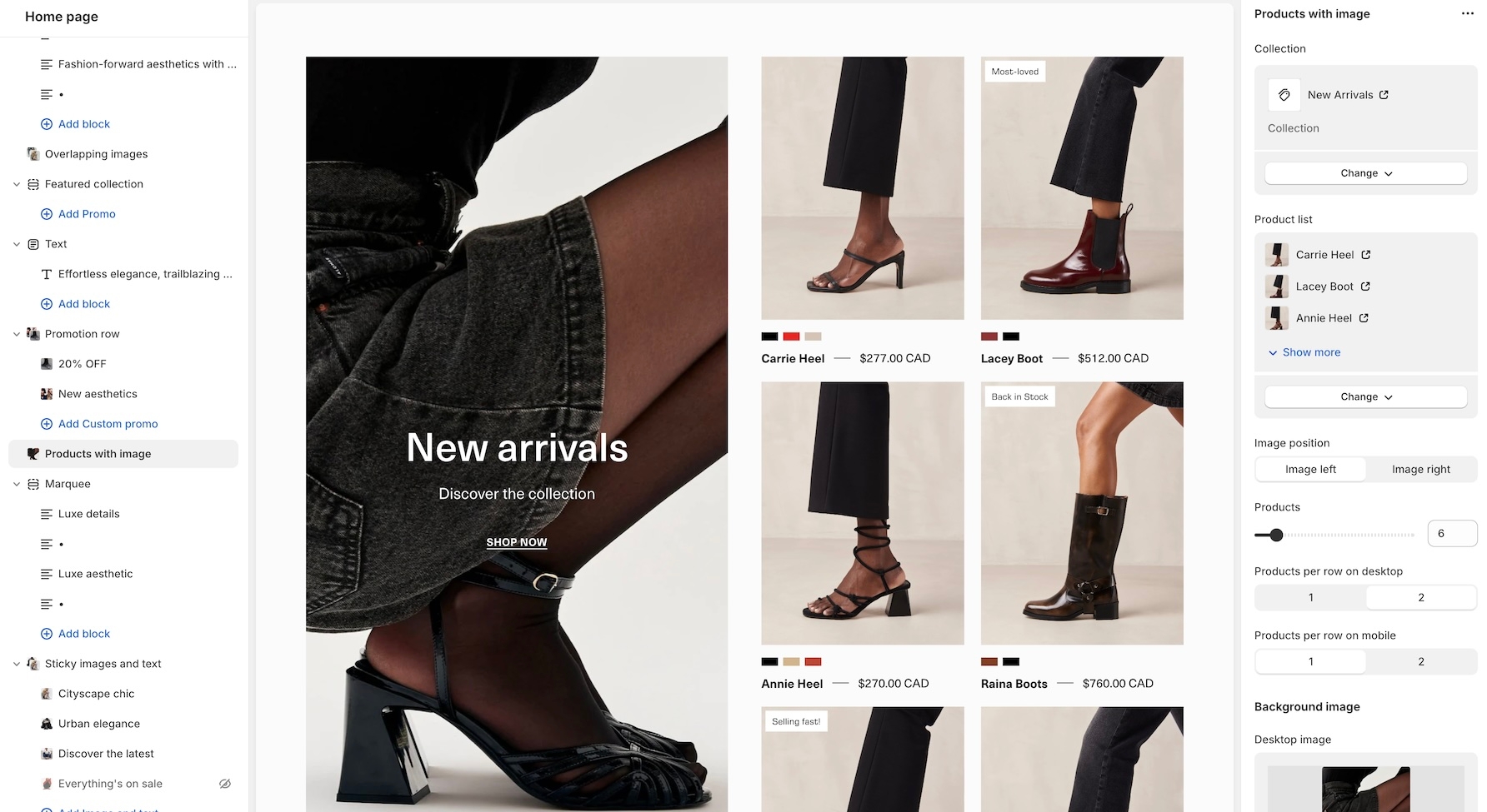
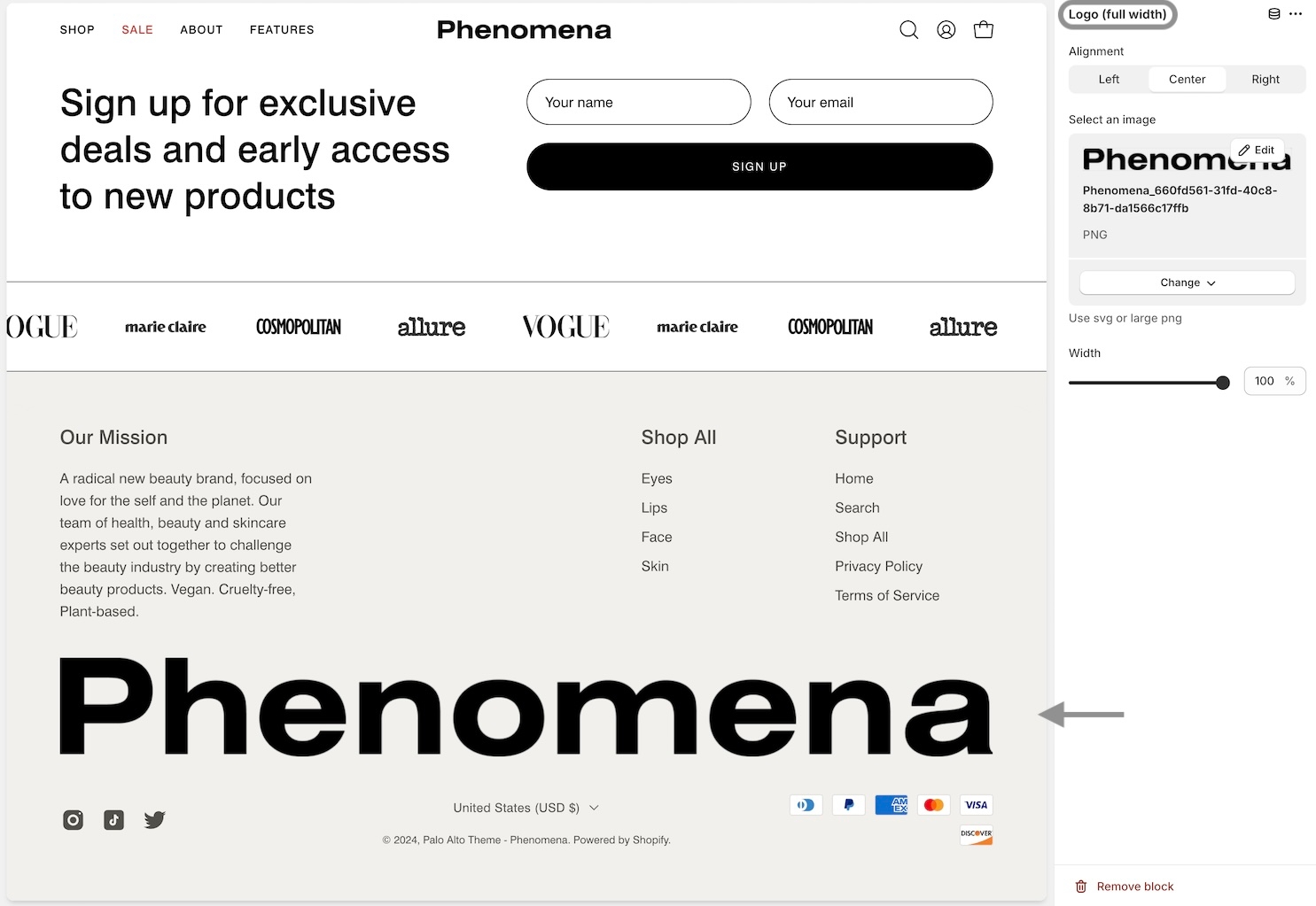
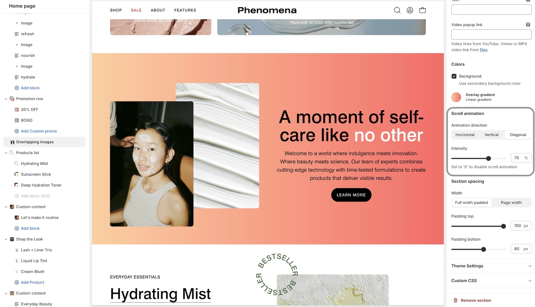
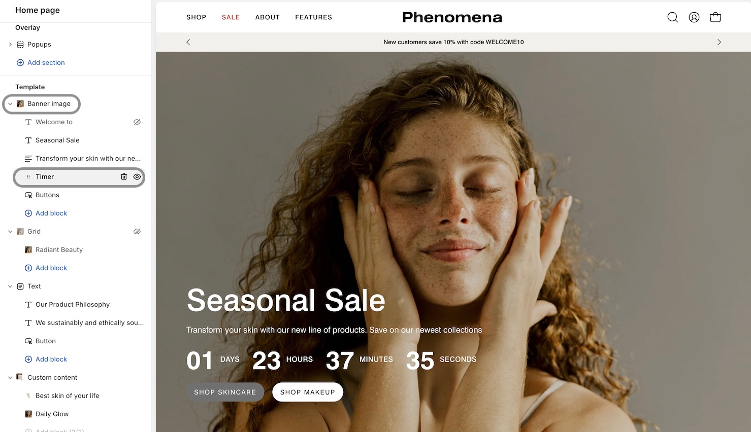
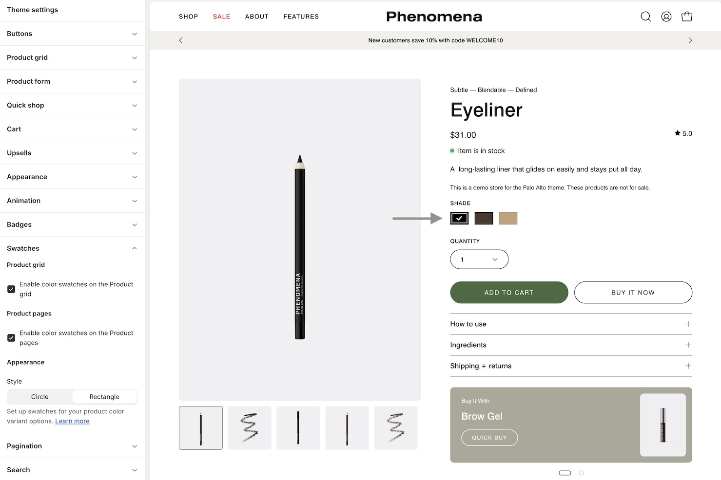
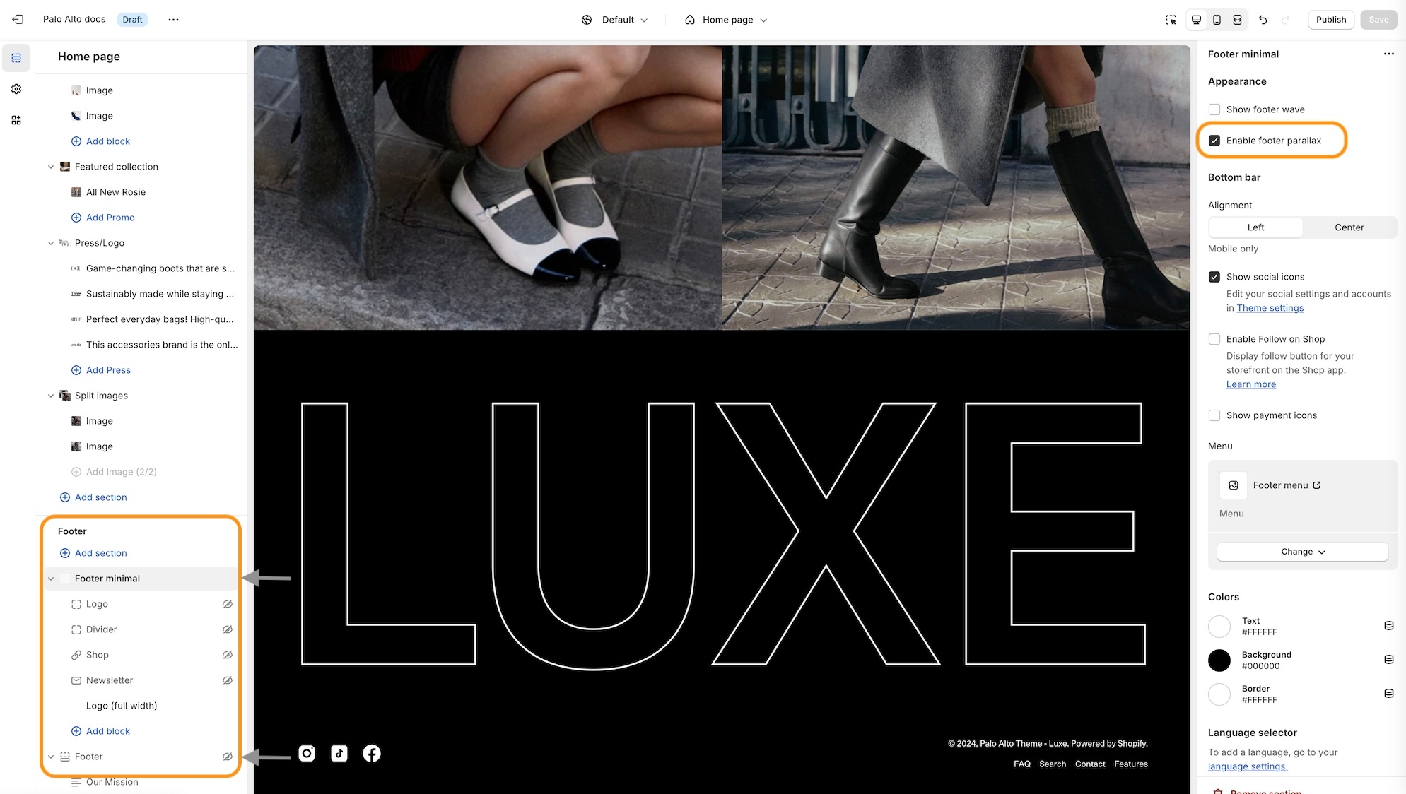
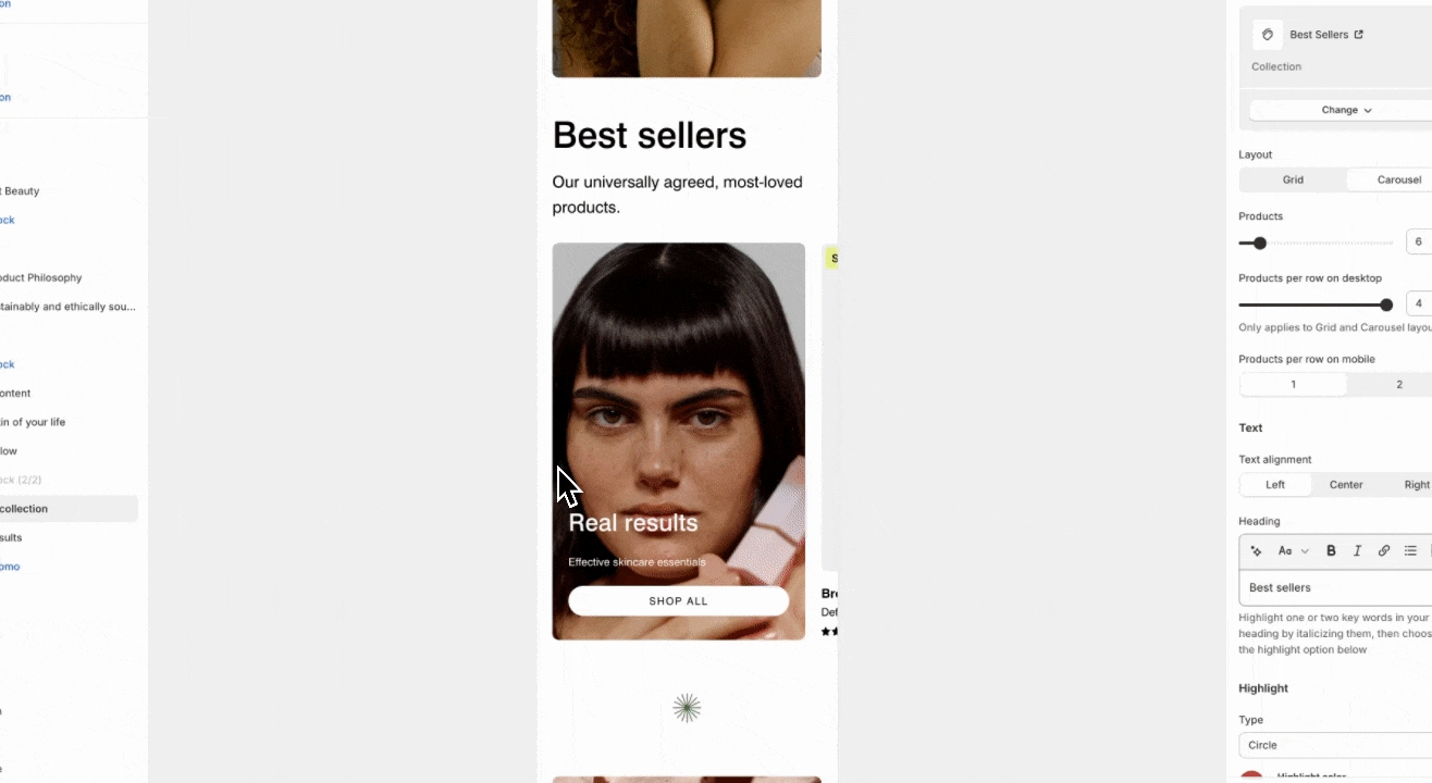
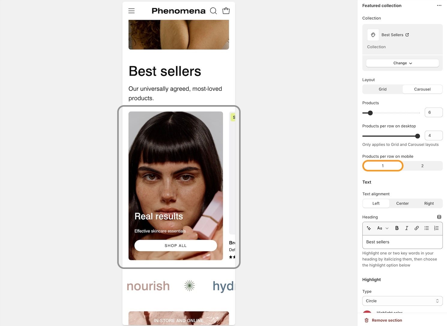
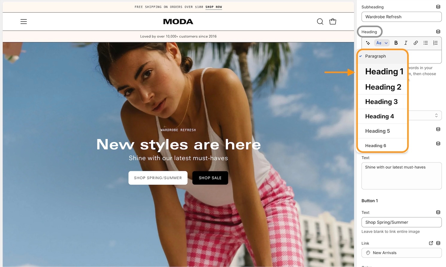
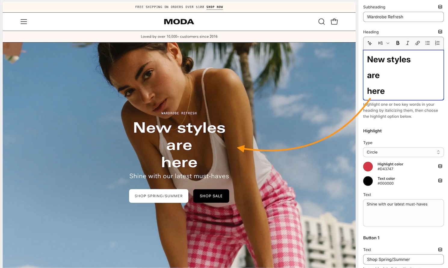
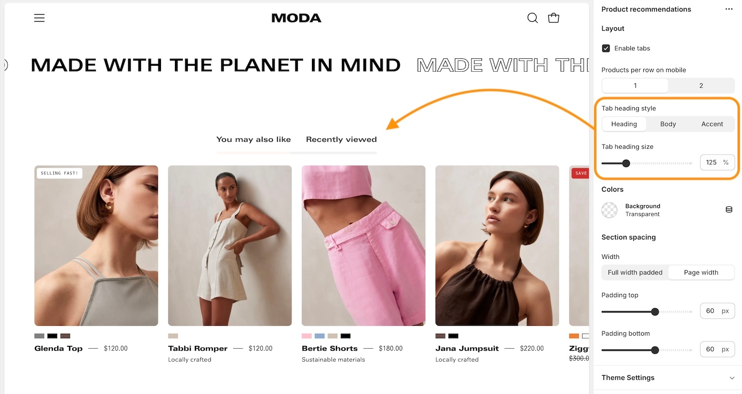
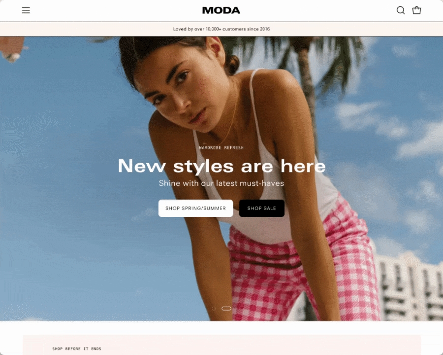
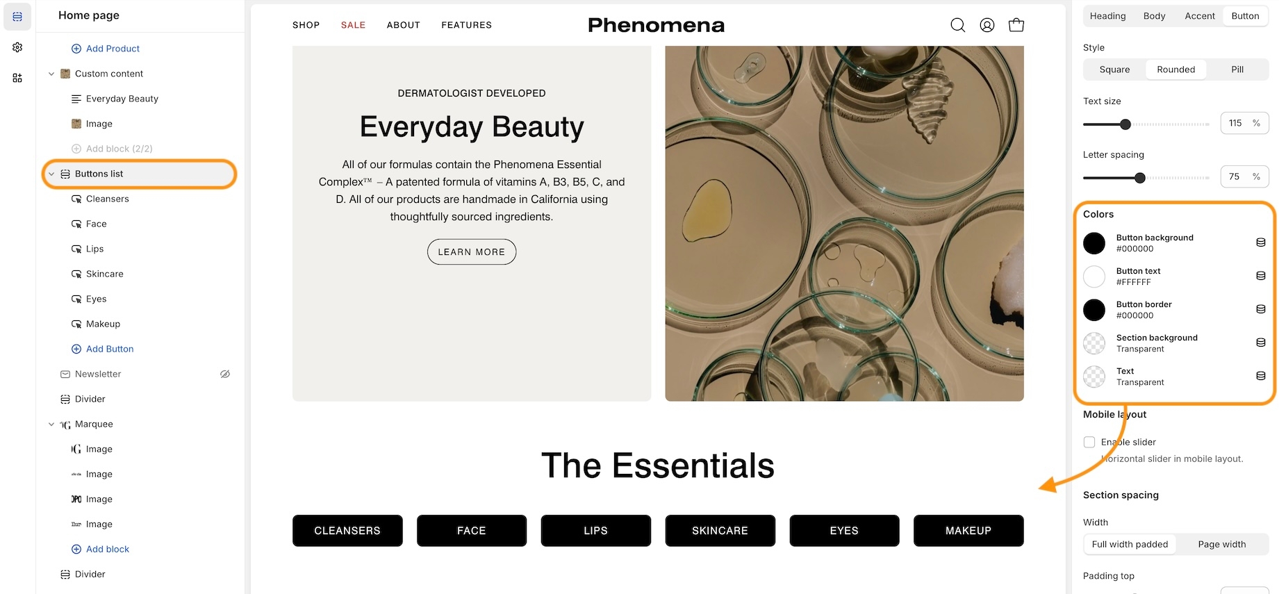
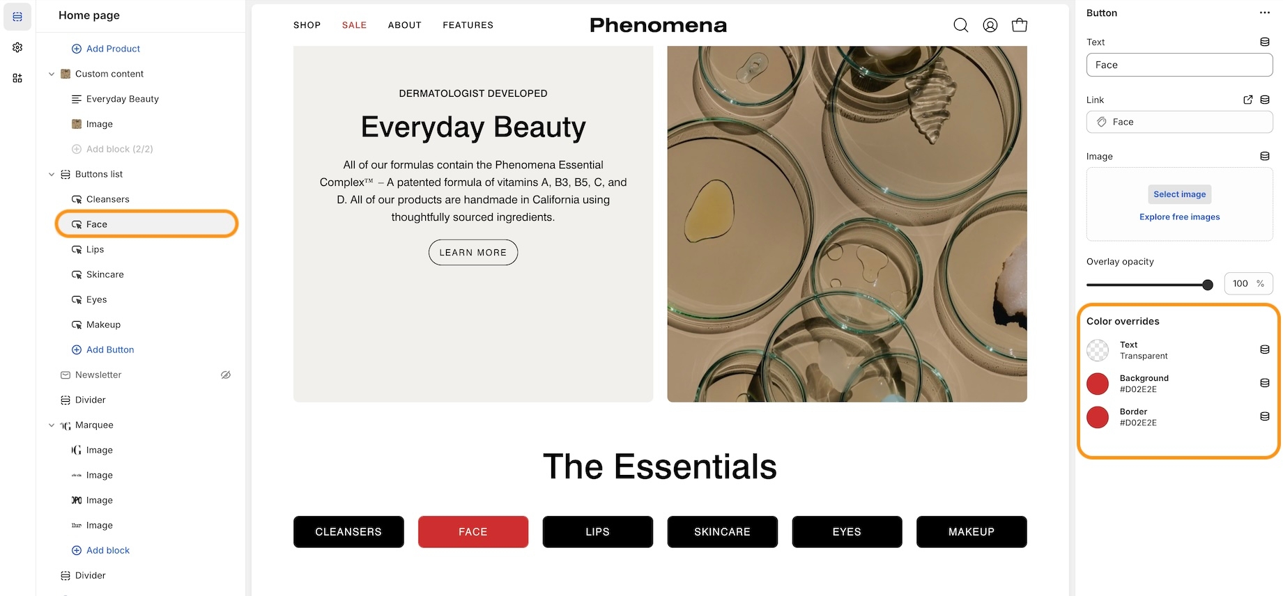
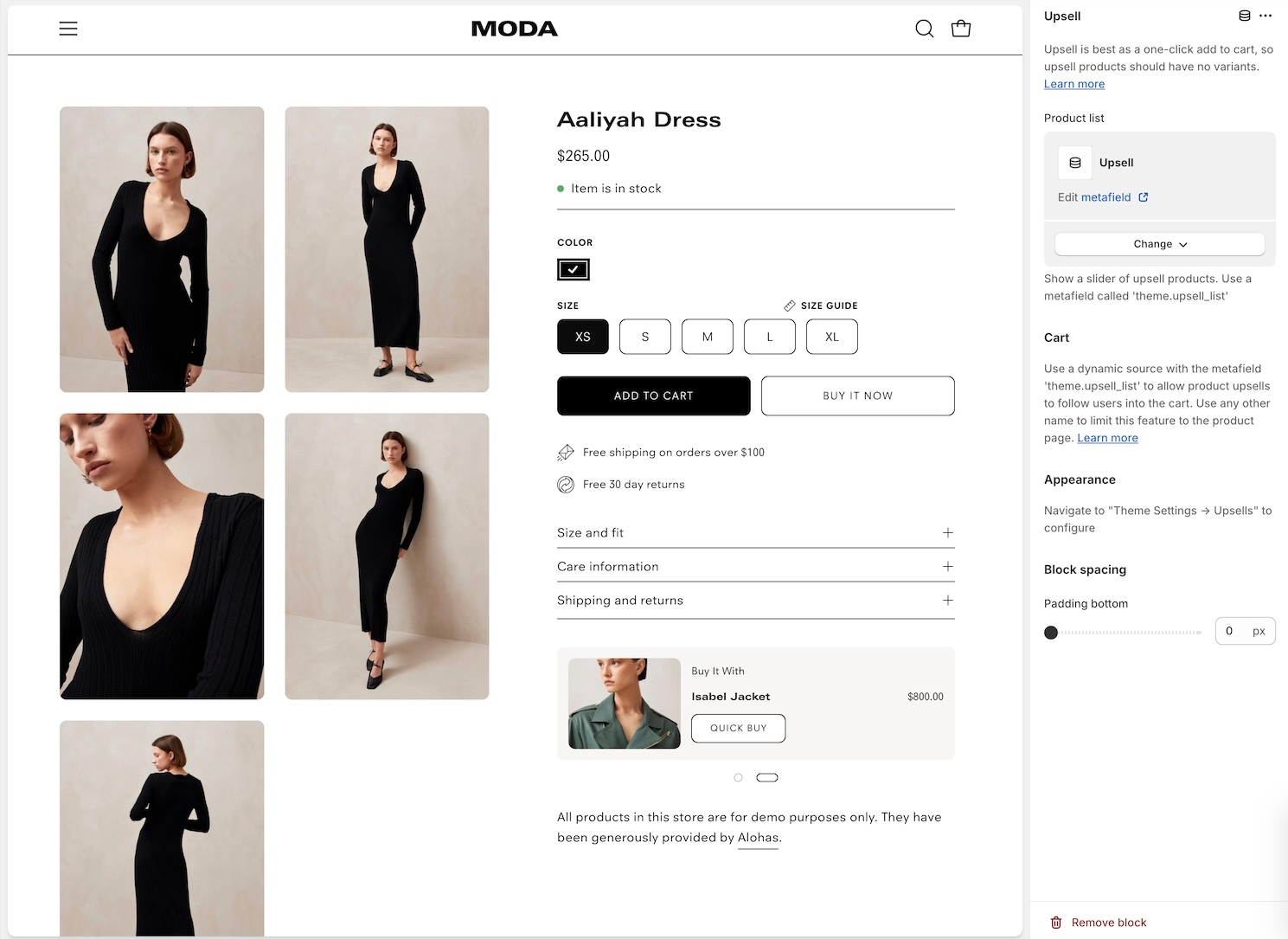
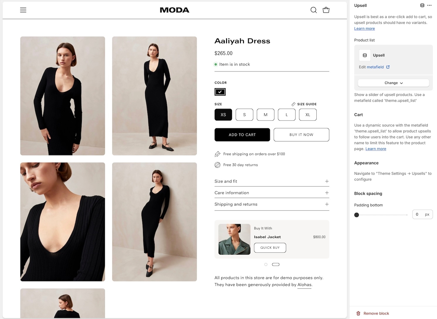
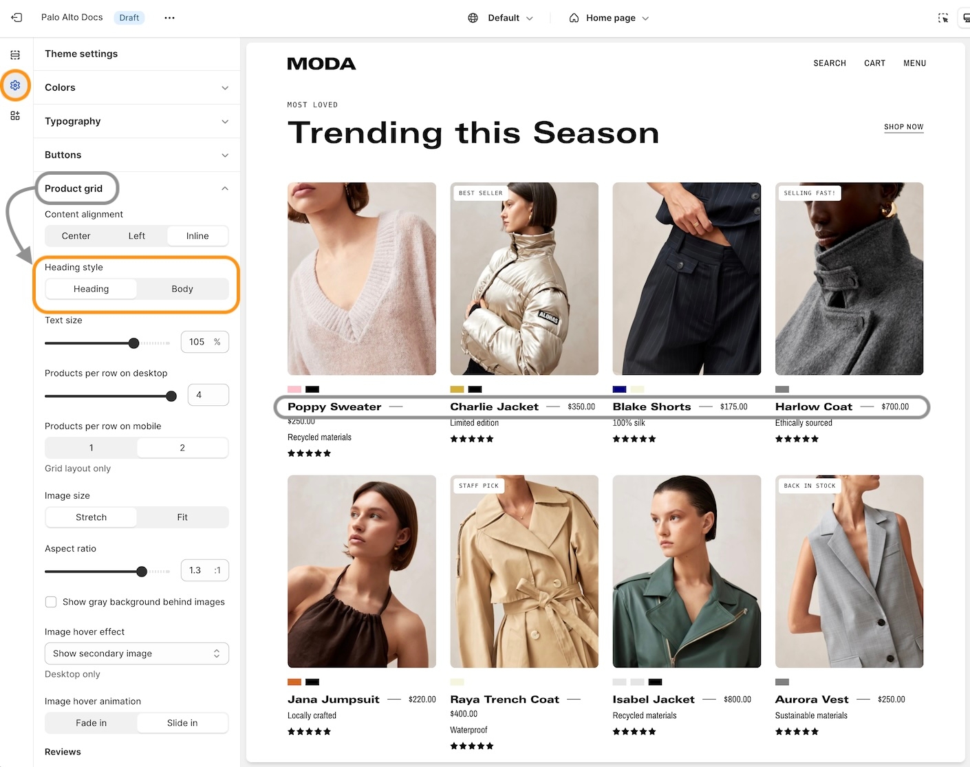
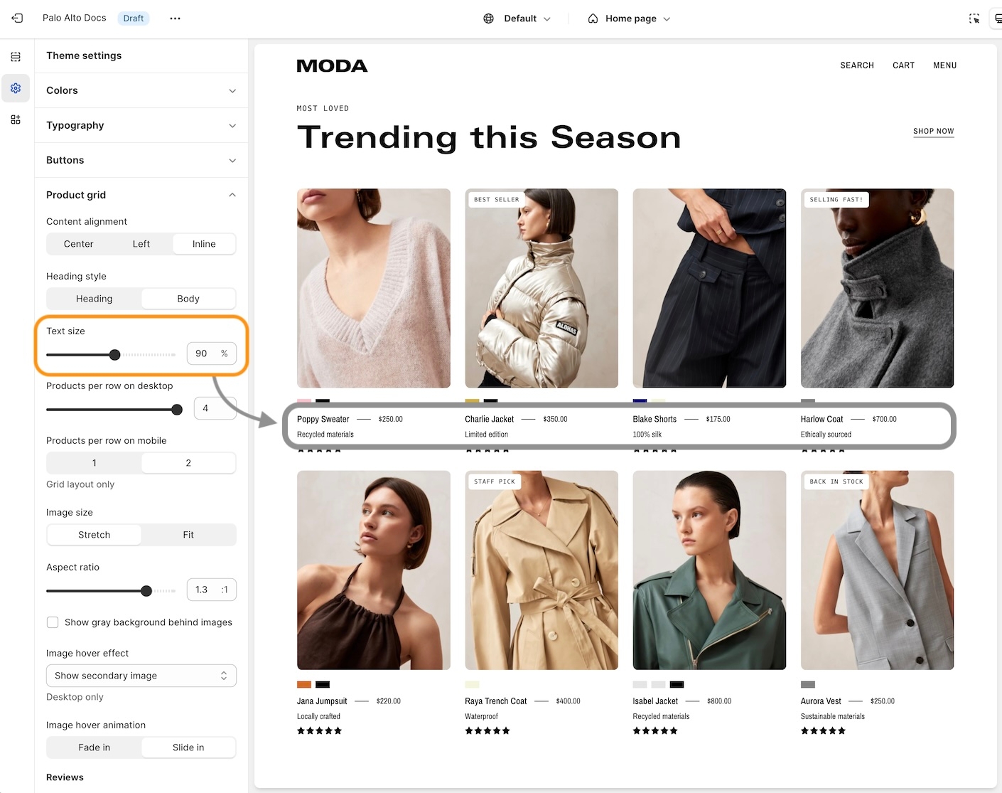
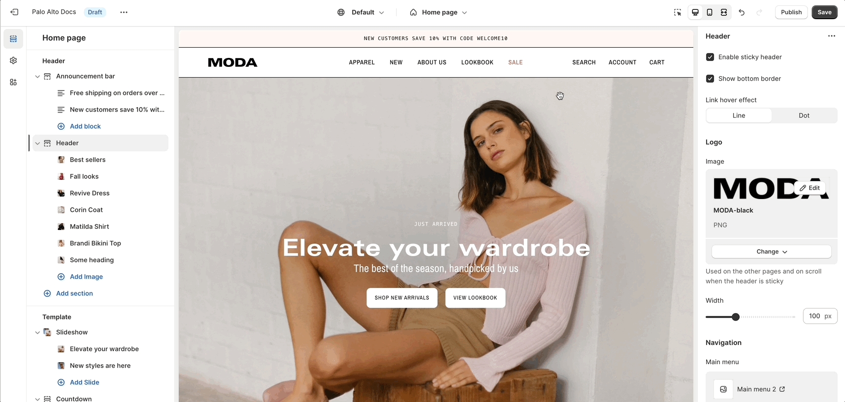
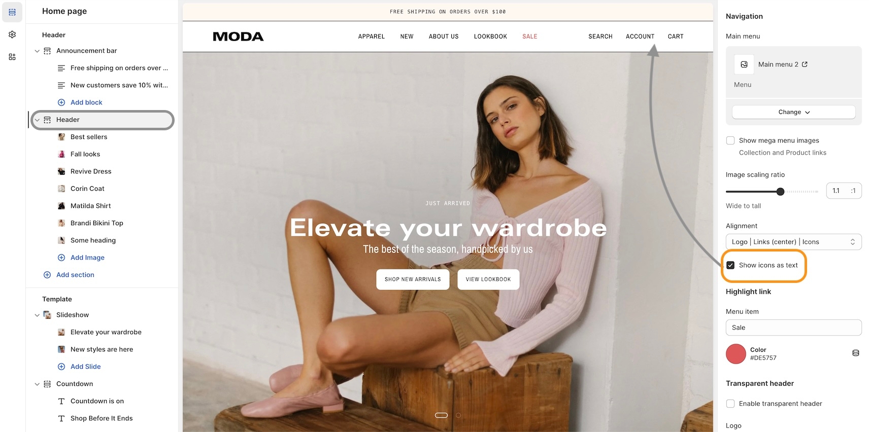
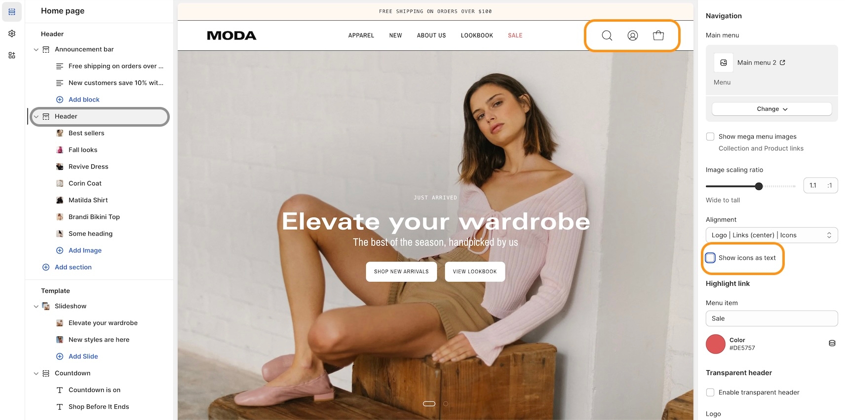
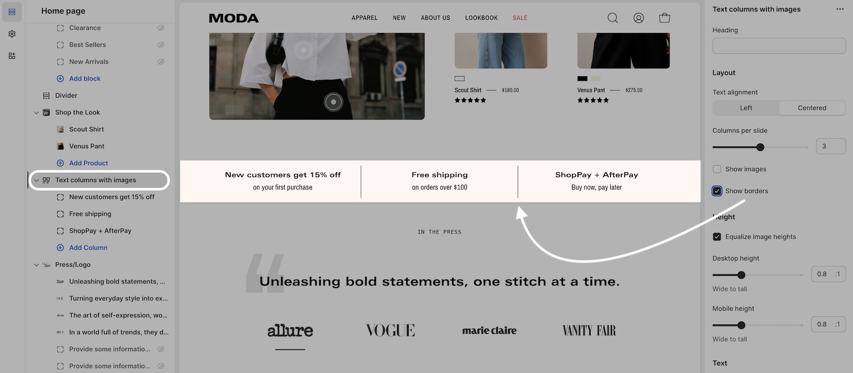
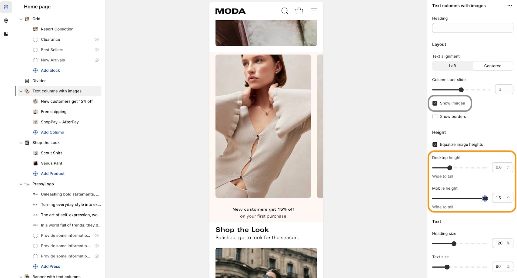
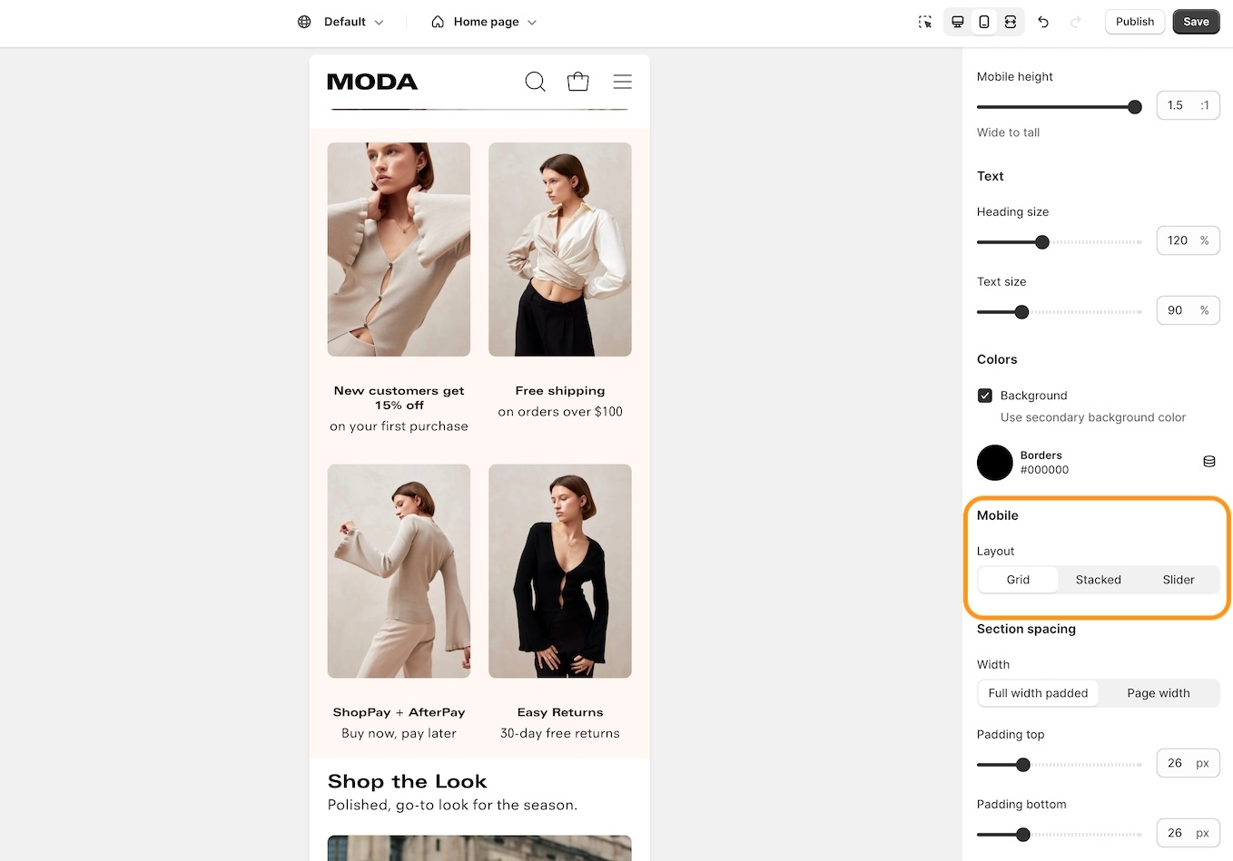
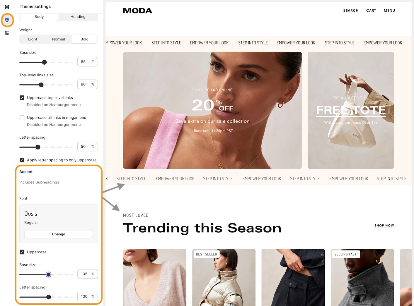
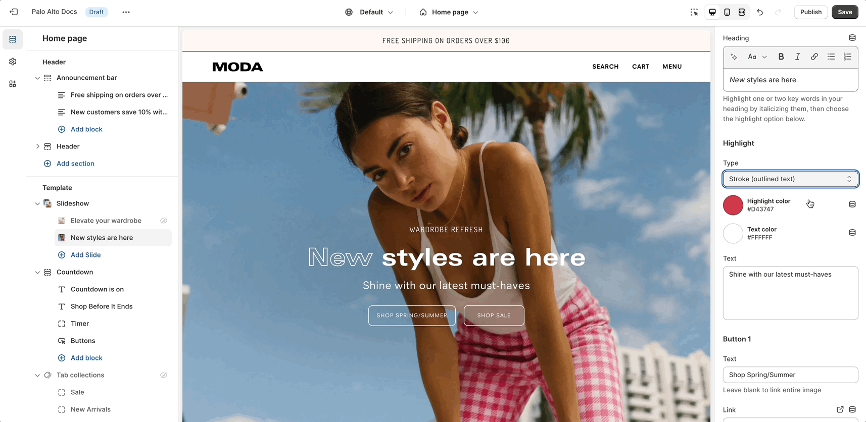
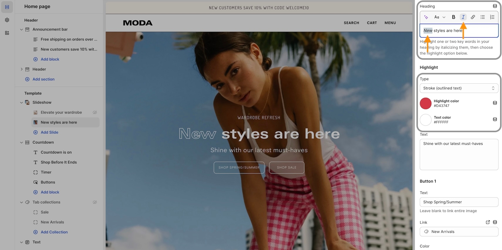
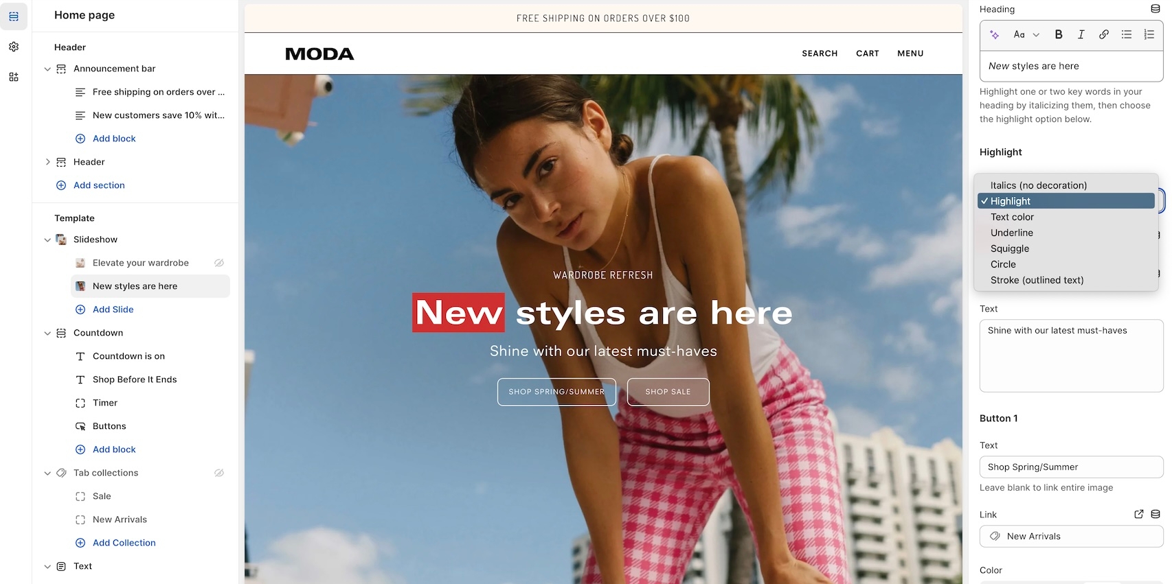
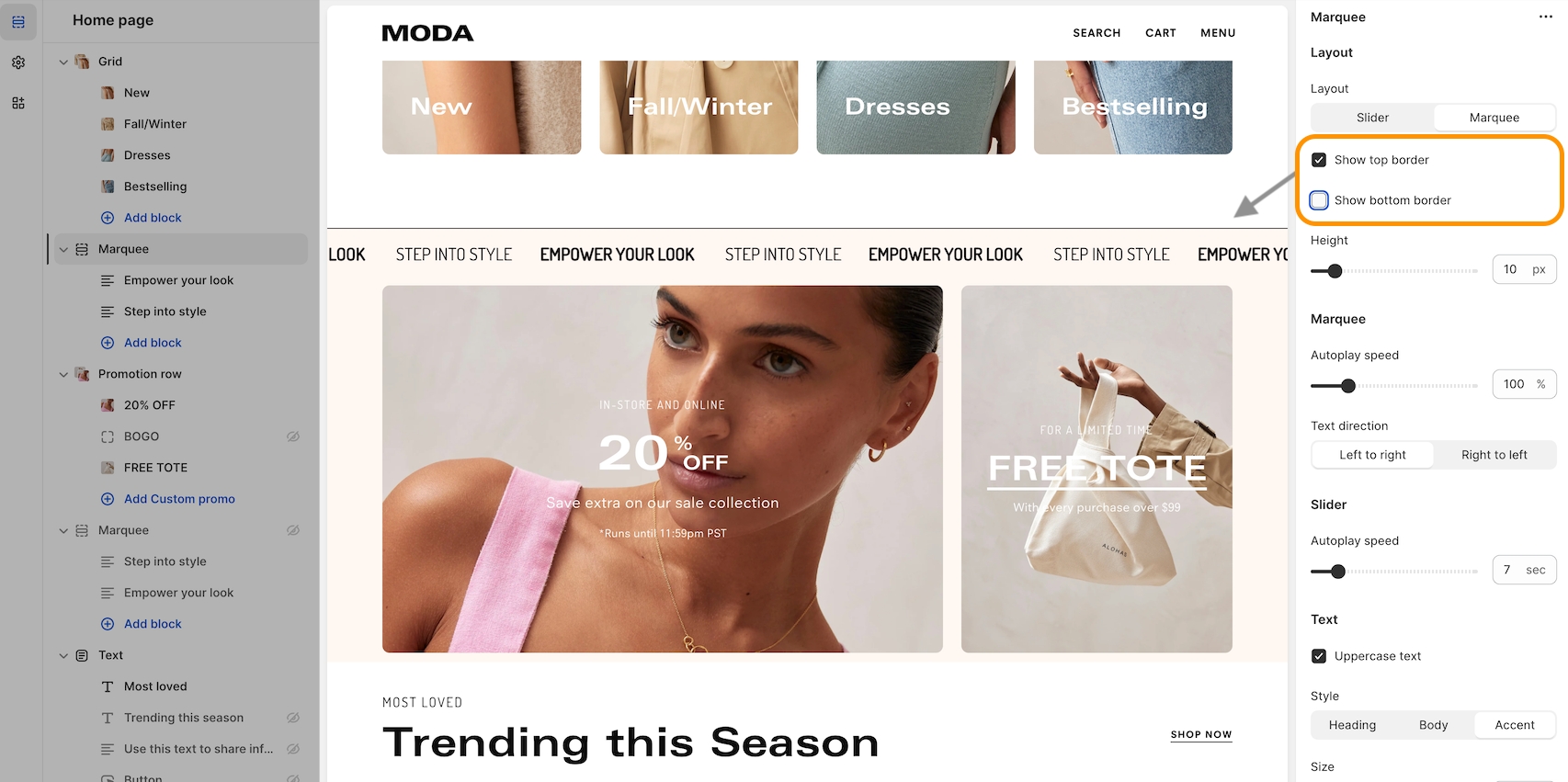
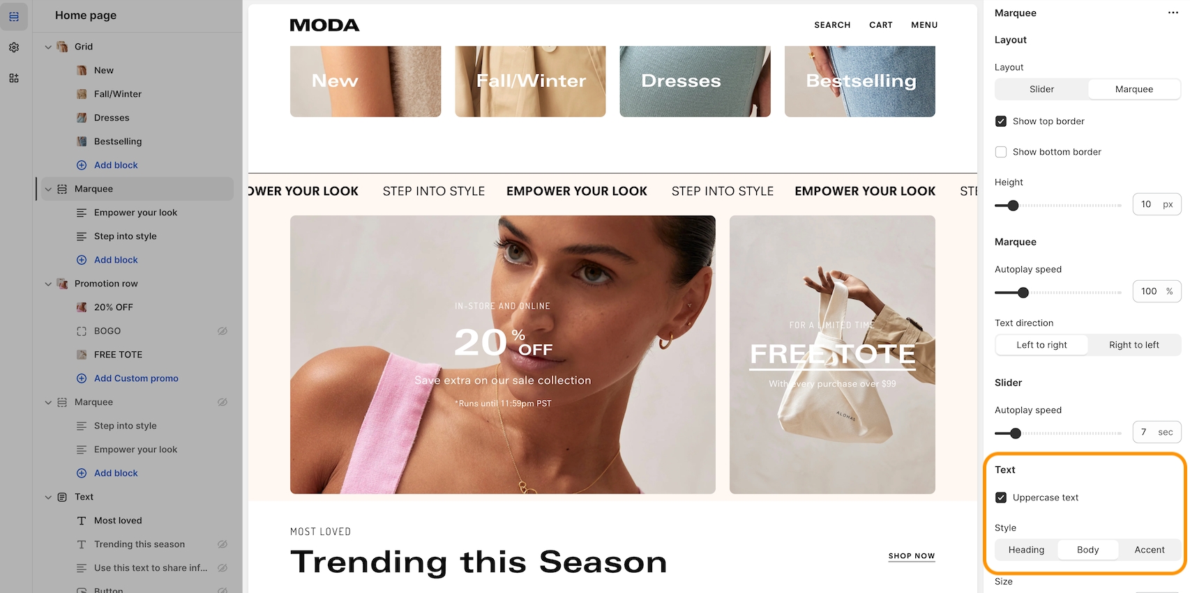
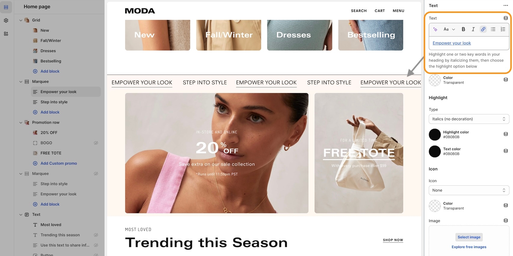
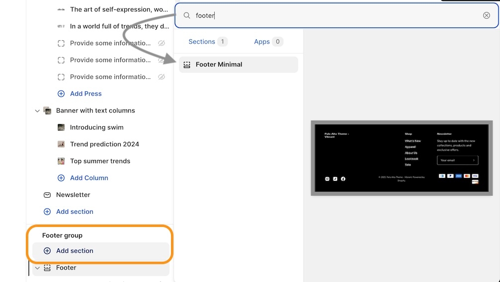
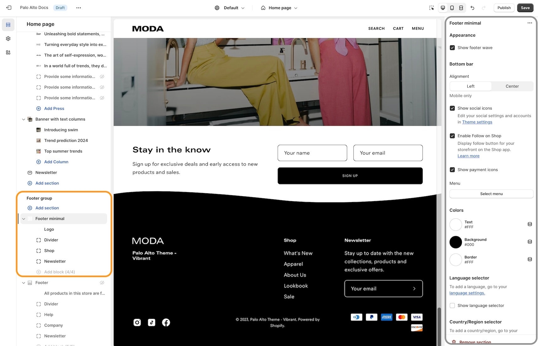
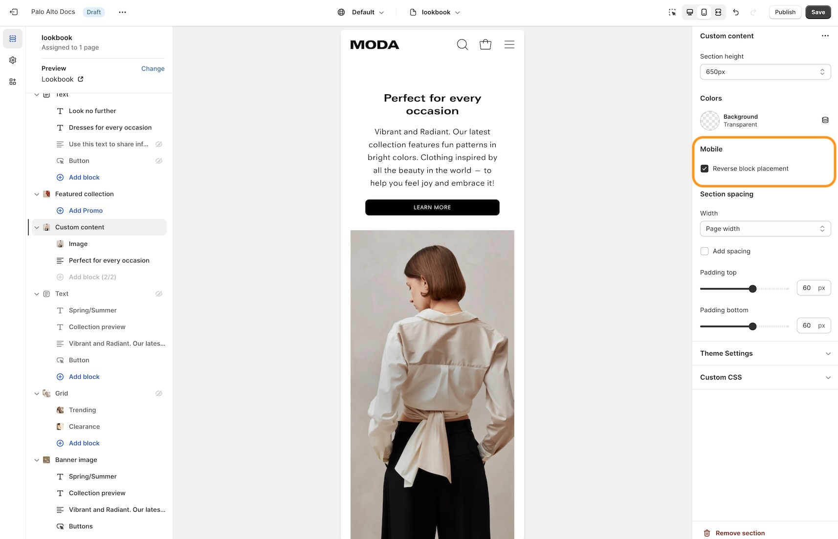
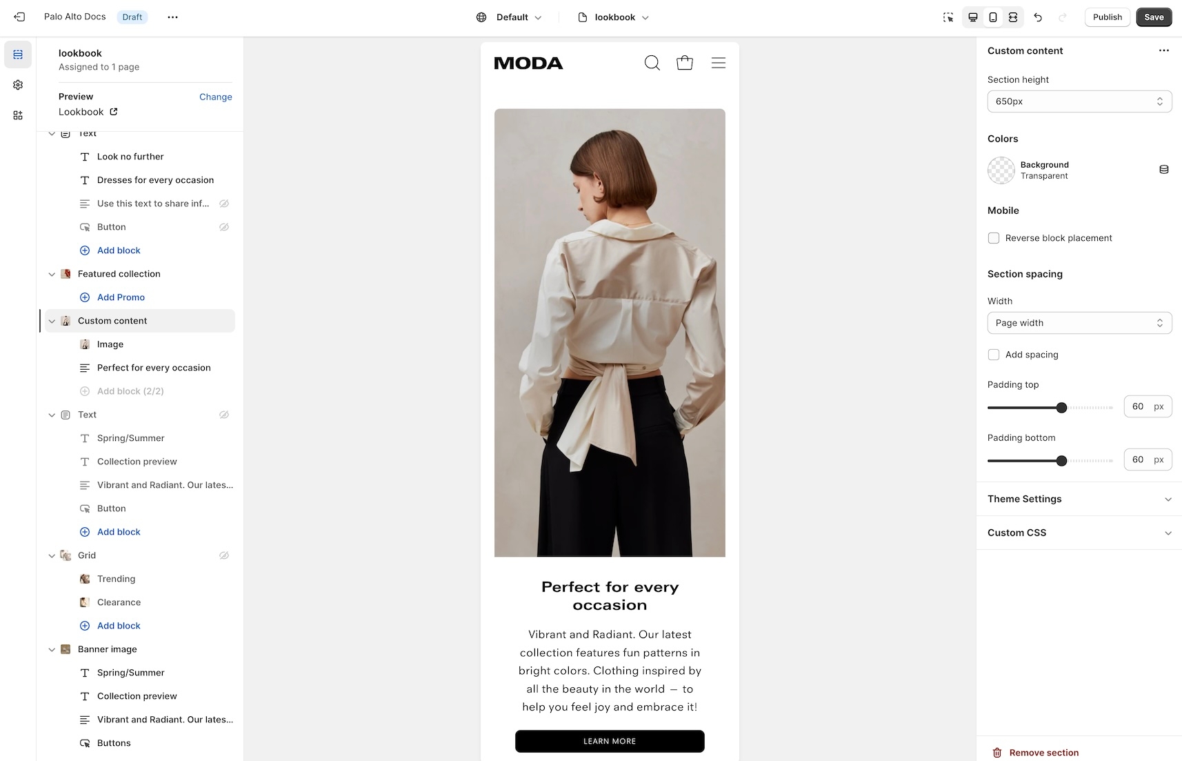
This tab holds miscellaneous settings that can affect small details in your store.
Under layout, you can enable spacer lines, rounded corners, and text shadow.
In the mobile menu, you can select to have drop-down items open the menu or to be their own link.
The quick shop feature in Palo Alto allows customers to add products to their cart without leaving the page they are on.
When one-click is enabled, the customer purchases the product (or the first available variant) immediately.
If the product contains variants, we recommend using quick view instead. This will take the customer through the process of choosing variants.
In Palo Alto, you have the option to show up to three upsell buttons when the cart is empty.
To set this up you need to first create a new navigation menu. Start by heading over to your online store > navigation and clicking on 'add menu':
You can give it any name you want, we will call ours 'cart menu'.
Lastly, you need to open up the theme editor and access the cart tab under theme settings.
Dynamic message to encourage increased items per transaction.
Add a free shipping message in the cart drawer to help your customers know how close they are to free shipping. The value fills up and changes as items are added to the cart.
Use to encourage add-on sales and increased quantities
Enable the 'free shipping message' from the theme settings -> cart tab and set the value from the 'minimum spend for free shipping' field.
Modify the message text as needed. Keep the || amount || custom short-code to reference your set value from the cart settings.
Once the required amount is reached a message will show up too.
Use a custom cart message to broadcast important information to your customers.
To set up a new custom cart message you can open the theme editor and click on theme settings > cart. The options for this are under the 'message' headline:
The custom cart message is shown in the cart drawer (like in the example above) and the cart page.
The cart terms and conditions allow you to add a checkbox to stop users from checking out before accepting the terms and conditions of your store.
To enable this option you can go into your cart tab in your theme settings menu.
Under badges, you can toggle the sale, custom, sold out, and savings badges. There is also the option to show savings in cash or as a percentage.
Note: the message itself does not generate a promo code. If you plan on using this message in a similar way be sure to set up a promo code first. to learn more about Shopify promo codes and discounts.


A quick and easy way to toggle scroll animations for all theme elements.
Customize the color and style from the theme settings. Create custom metafield definitions in product setup to display paired products or specific paired product variants. .


Under swatches, you can toggle color swatches and enable them to be shown on hover (on desktop only).
Learn more about using custom color swatches in Palo Alto here:

Include links to your social media pages.
These links will be shown as icons if the option is enabled:

Palo Alto uses pagination to segment long collection pages and load products as the user scrolls through the page.
In Shopify, this is referred to as an 'endless scroll', in the theme settings we refer to it as 'infinity scroll'.

A quick way to help you toggle currency code on all theme elements.
The loading overlay is a UI component designed to visually indicate that something is loading or in progress on the page - such as the content being fetched, a page transition, or a background process. In this implementation, it’s a reusable block that can:
Display a custom loading image defined in the theme settings.
Fall back to a simple animated placeholder if no image is provided.
Be conditionally shown or hidden based on a setting loading appearance.
This loading overlay is built using Liquid (Shopify's templating language) and rendered in HTML.
The following values come from your theme settings:
Image: A custom image used as the loader.
Image width: Sets the display width of the image.
Appearance: Controls when or whether the loader should appear.

Search settings will allow you to show different types of results (products, pages, articles) as well as to set a number of results.
Search suggestions are small popups that will come up as your customers type in their search terms. Adjust their settings from the same tab.
The size chart provides clear and concise information about product sizes, helping customers make informed purchasing decisions based on accurate measurements.
Use a dynamic source with the metafield 'theme.size_chart' to connect your size chart with a specific product page.
The simplest method is to select and display one page with all your products. This approach works well for stores with a limited product range. For stores with more extensive product options, you can use Shopify's custom data feature with metafields to individually map a particular size chart to a product.
Learn more:
For multiple size-charts in tabs:

Favicon is the small icon that is shown in the web browser tab. You can add one for your store from this theme setting block:
A very important note to make is that these settings are purely visual and aesthetic. Palo Alto does not have any options to change the functionality of your checkout page.
The checkout page is generated entirely from the Shopify core code so for any issues, at checkout, we highly recommend reaching out to Shopify support.
The options here are predetermined and similar to most other themes.
Custom CSS is a new block added by Shopify for all themes. Use it to add your own CSS without the need to access the theme code.
Flexible announcement message bar with targeting options
Add single or multiple text announcement bars with links to promote your offers:

Theme styles on their own do not make your store have fewer or more sections. They do not have any significant impact on performance or functionality. Mostly, these are predetermined colors and font settings.

Announcement bar settings and layout
In the Header group, click on the announcement bar section to reveal the section settings.
These settings will allow you to change the background and text colors of your announcement bar section, layout style, and autoplay speed.
You can also click on the small arrow next to this section to expand it and show its blocks. This will allow you to access each block to change its text and link.
You can also add new blocks by clicking the 'add block' button.


Use HTML to build custom announcement messages with targeting options
Build custom announcement messages and use targeting options to provide complete customization for your promotions.

Dynamic message to encourage increased items per transaction
Use this block to encourage add-on sales and increased quantities.
Modify the message text as needed. Keep the || amount || custom short code to reference your set value from the cart settings.

Display custom announcement messages to your customers only when the customer is browsing a certain page, product, collection, or blog post on your site.
Target your message based on where customers are browsing your site:
Create a different announcement bar with custom messages for various pages of your site.
Target a specific audience by using a target referrer. Your announcement bar will only appear when the customer arrives at your site from a certain path or location.
Enable when running a promotion on another site. Use to provide a custom message related to the source promotion.
Target only certain devices or create a custom announcement bar message for mobile devices and another for desktop browsers.
Enable custom announcement messages for mobile and desktop.


Select and configure an image with specific attributes such as a link and customizable width. It is primarily enabled for use within the header section.
Image: Select an image from the library.
Link: Optional URL field to make the image clickable.
Width: Set the width of the image within a range of 20px to 180px.


You can upload a logo in place of your store name by opening the header section settings and uploading a custom logo:
A separate option is available to help provide better contrast when transparency is used. This is an optional but helpful feature.
Setting up a mega menu for your header
A mega menu is a stylized submenu that allows you to also add an image to your navigation. It can be used to put more links together and group them in a form of subcategories.
The mega menu in Palo Alto 5.0 works automatically based on two criteria:
1 - If there is an image selected for the submenu, the mega menu is enabled.
2 - If there are third-level links, the mega menu is enabled.
Note: The mega menu is automatically disabled when the hamburger navigation is enabled.
To add a new mega menu you need to click on the header section arrow to expand it after which click on 'add image'.
Setting up the mega menu can be done by accessing the block settings.
Here you will find the option to add it under any first-level link in your header as well as the options to add the image.
To get a list of links like the one from our demo you'll need to simply set them up from your navigation menu as standard drop-down menus.
You can learn more about this in Shopify's great articles on the topic.


The header section has a small group of settings called a 'highlight link'.
Inside the header section settings is where you will find the options to set the target text and the color of the text: