Palo Alto Doumentation
NewSupport
Latest version
Latest version
  • Palo Alto theme documentation
  • Updates
    • What's new in Palo Alto
      • Release notes
      • About 6.2 Release
      • About 6.1 Release
      • About 6.0 Release
      • About 5.9 Release
      • About 5.8 Release
      • About 5.7 Release
      • About 5.6 Release
      • About 5.5 Release
      • About 5.4 Release
      • About 5.3 Release
  • Sections
    • Palo Alto sections
      • Explore the sections
      • Accordions
        • Text block
        • Page block
      • Accordions with images
        • Text block
        • Page block
      • Banner image
        • Subheading block
        • Heading block
        • Text block
        • Timer block
        • Buttons block
        • Video button block
      • Banner with text columns
        • Column block
      • Blog posts
      • Buttons list
        • Button block
      • Collection list
        • Collection block
      • Contact form
        • Form heading block
        • Email block
        • Message block
        • Text line block
        • Telephone block
        • Divider block
        • Single checkbox block
        • Select dropdown block
        • Radio buttons block
      • Countdown
        • Subheading block
        • Heading block
        • Text block
        • Timer block
        • Buttons block
        • Video button block
      • Custom code
      • Custom content
        • Image block
        • Text block
        • Newsletter block
        • Testimonial block
        • Product block
        • Video block
        • Collection block
      • Divider
      • Featured collection
        • Promo block
      • Featured product
      • Grid
      • Icons row
      • Image
      • Image accordions
      • Image with scrolling text
      • Image with text
      • Locations
      • Marquee
      • Multi column
      • Newsletter
      • Overlapping images
      • Press/Logo
      • Products list
      • Products with image
      • Promotion row
      • Recently viewed products
      • Shop the look banner
      • Shop the look grid
      • Shoppable blog posts
      • Slideshow
      • Social gallery
      • Split images
      • Sticky image cards
      • Sticky images and text
        • Sticky images and text: Horizontal
      • Tab collections
      • Testimonials
      • Testimonials with images
      • Text
      • Text columns with images
      • Video
  • Theme Settings
    • Theme settings
      • How to make changes
      • Colors
      • Typography
      • Buttons
      • Product grid
      • Product form
      • Quick shop
      • Cart
      • Upsells
      • Loading overlay
      • Appearance
      • Animation
      • Badges
      • Swatches
      • Pagination
      • Search
      • Social media
      • Currency
      • Favicon
      • Size chart
      • Custom CSS
      • Theme style
  • Header
    • Announcement bar
      • Settings and blocks
      • Text
      • Free shipping message
      • Custom HTML
      • Target settings
      • Image
    • Header
      • Header settings
      • Mega menu
      • Logo
      • Highlighted link
      • Transparent header
    • Mobile menu
      • Menu
  • Footer
    • Footer
      • Settings and blocks
      • Logo
      • Text
      • Link list
      • Newsletter
      • Blog
  • Products
    • Product pages
      • Variant images
      • Settings and layout
      • Size chart tabs
      • Size chart metafields
      • Custom color swatches
      • Pre-order
      • Gift card product
      • Out of stock notification
      • Metaobjects
      • Creating new product page templates
    • Blocks
      • Product blocks
      • Title and price
      • Form
      • Product description
      • Cutline
      • Accordion
      • Upsell
      • Share button
      • Pickup availability
      • Custom code
      • Text
      • Icon
      • Icon row
      • Siblings
      • Inventory countdown
      • Popup text
      • Line item property
      • Divider
      • Feature
      • Complementary products
      • Badges
      • Timer
      • Fit guide
  • Collections
    • Collection pages
      • Filtering options
      • Custom product badges
      • Cutline
      • Catalog banner images
      • Collection pages promo
  • Cart
    • Palo Alto Cart
      • Cart types
      • Empty cart buttons
      • Free shipping message
      • Custom message
      • Terms and conditions
      • Upsell promotion
  • Pages
    • Page templates
  • Blogs
    • Blogs and articles
      • Settings and layout
      • Recommended posts
      • Creating blog page templates
  • Overlay
    • Popups
      • Popup with image
      • Popup small
      • Cookie consent
      • Popup behavior
  • Promotions
    • Upselling
      • Upsell promotions
  • Siblings
    • Product siblings
      • About product siblings
      • How to setup siblings
      • Define a metaobject
      • Add product list entries
      • Activate using a metafield
      • Bulk update sibling products
      • Siblings block
  • FAQ
    • Frequently asked questions
      • Updating your theme
      • Highlight words
      • Image aspect ratio
      • Recommended image sizes
      • Adding a section
      • Reordering sections
      • Sharing a preview link
      • Check your theme version
      • How to add custom fonts
      • Remove 'Powered by Shopify'
      • CSS customizations
  • License
    • Theme license
  • Support
    • Contacting support
    • Shopify Experts
Powered by GitBook
On this page
Export as PDF
  1. Theme Settings
  2. Theme settings

Product form

PreviousProduct gridNextQuick shop

Last updated 2 days ago

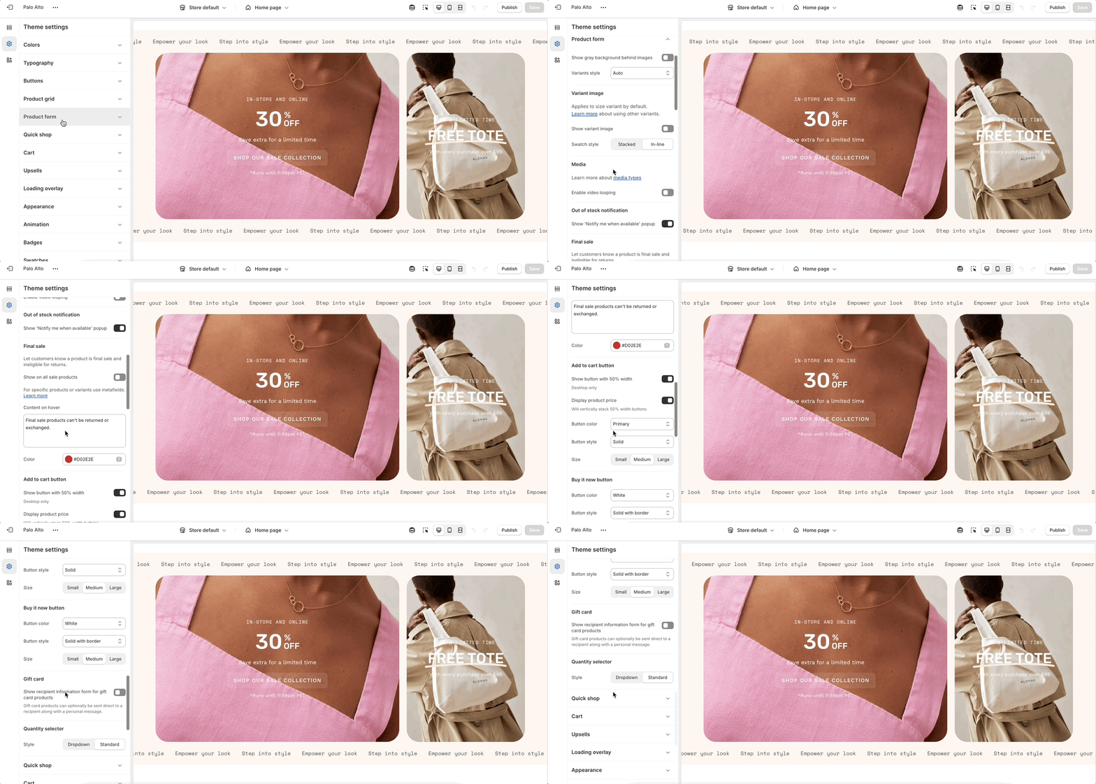
Adjust the style and functionality of your variant selectors and 'add to cart' buttons.

Overview

Settings
Type
Description

Show gray background behind images

checkbox

Adds a gray background behind product images.

Variants style

select

Choose how the variant options display: Auto, Boxes, or Dropdowns.

Variant image

Show variant image

checkbox

Displays images linked to variant selection.

Swatch style

select

Layout style for variant images: Stacked or In-line.

Media

Enable video looping

checkbox

Loops any product video media.

Out of stock notification

Show ‘Notify me when available’ popup

checkbox

Displays a newsletter-style popup on out-of-stock items.

Final sale

Show on all sale products

checkbox

Globally show disclaimer on all sale products.

Content on hover

text

Tooltip message (hover text).

Color

color

Color of the final sale label.

Add to cart button

Show button with 50% width

checkbox

Displays button at half width (desktop only).

Display product price

checkbox

Adds price to the button (stacks if 50% width is active).

Button color

select

Choose from: Primary, Secondary, White, Black.

Button style

select

Options: Solid, Outline, Solid with border, Soft.

Size

select

Options: Small, Medium, Large.

Gift card

Show recipient information form for gift card products

checkbox

Displays an optional form to email gift cards directly to a recipient.

Quantity selector

Style

select

Choose from: Dropdown or Standard.