Loading...
Loading...
Loading...
Loading...
Loading...
Loading...
Loading...
Loading...
Loading...
Loading...
Set three or four main colors that will represent your brand.
Try to use colors that are high in contrast. It will make your text easier to read. Here is a great contrast checker:
Note: Some sections have color settings. Section settings will overwrite Theme Setting.
Set two main fonts.
Font stacks in the Theme Settings are predetermined. You can not remove or add fonts to this list. To use Custom fonts, checkout our documentation post on the topic below:
Other options include:
Selecting a font for your navigation menu
Selecting a font for your buttons
Selecting a font for your subheadings
Setting different sizes
Setting different letter spacing
Letter capitalization (ALL CAPS)
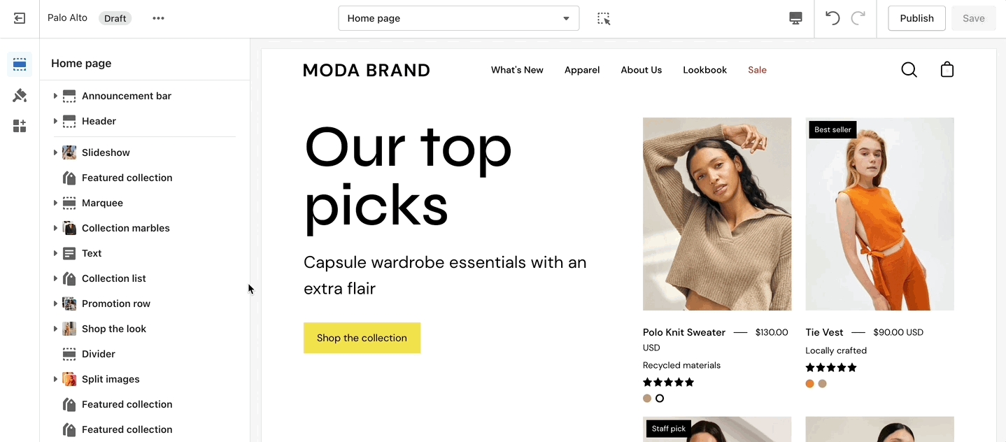
Global theme settings that can affect all pages
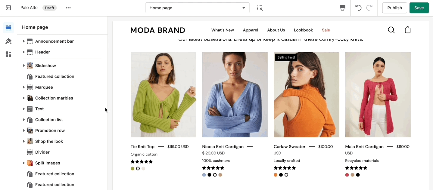
The 'Theme Settings' tab is set off to the left side in the Theme Editor. This tab contains a bundle of all global settings in Palo Alto.
Please note that global settings can affect multiple sections and multiple pages.
Product Form
Social media
Currency
Favicon
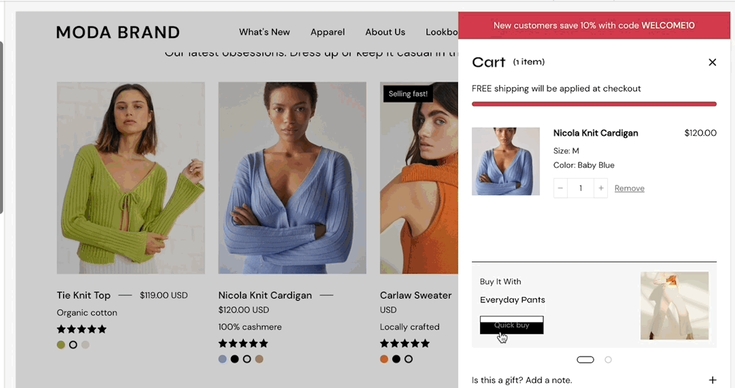
The Quick shop feature in Palo Alto allows customers to add products to their cart without leaving the page they are on.
When One-click is enabled, the customer purchases the product (or the first available variant) immediately.
If the product contains variants, we recommend using Quick view instead. This will take the customer through the process of choosing variants.
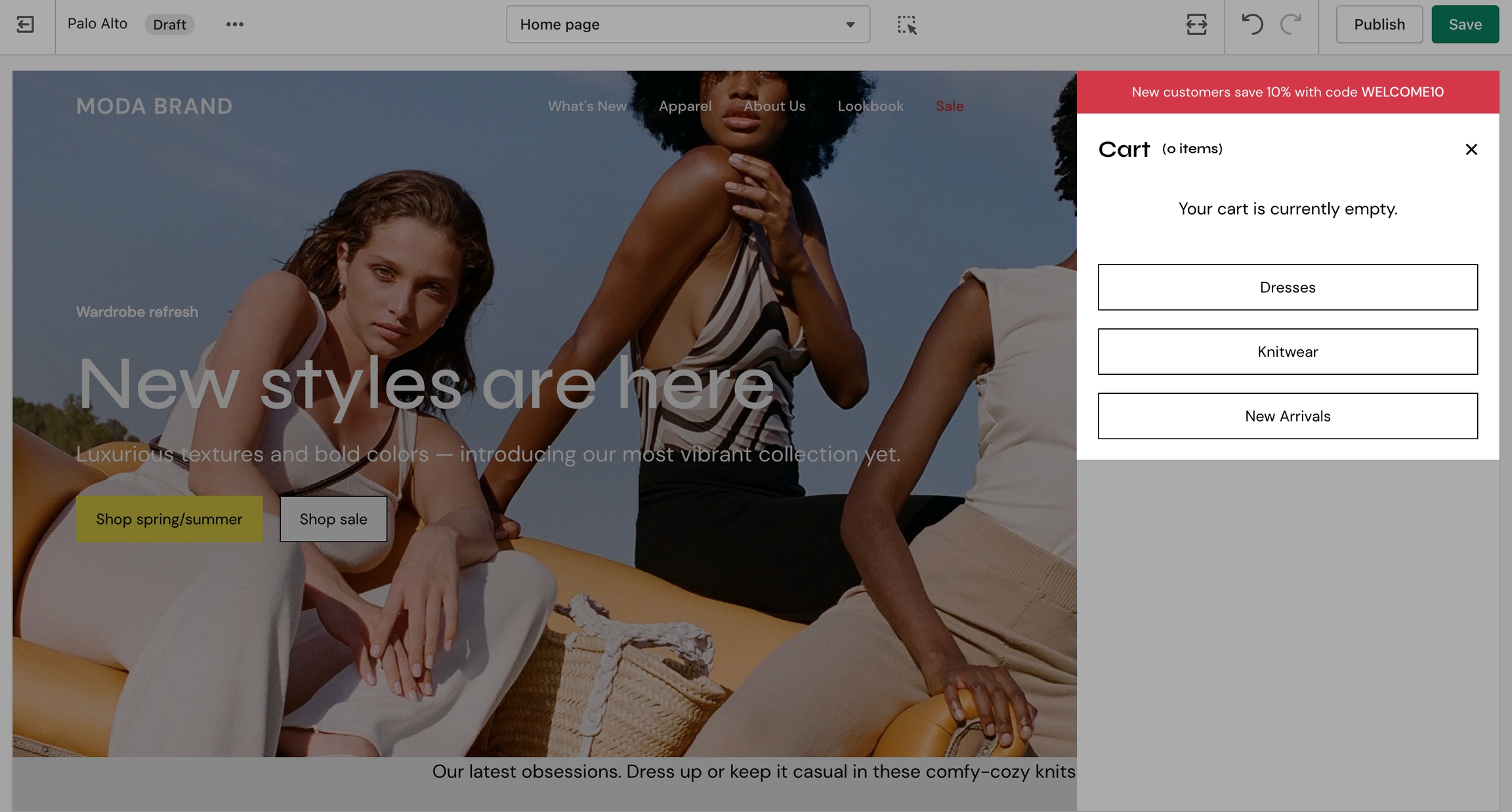
In Palo Alto, you have the option to show up to three upsell buttons when the cart is empty.
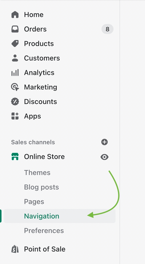
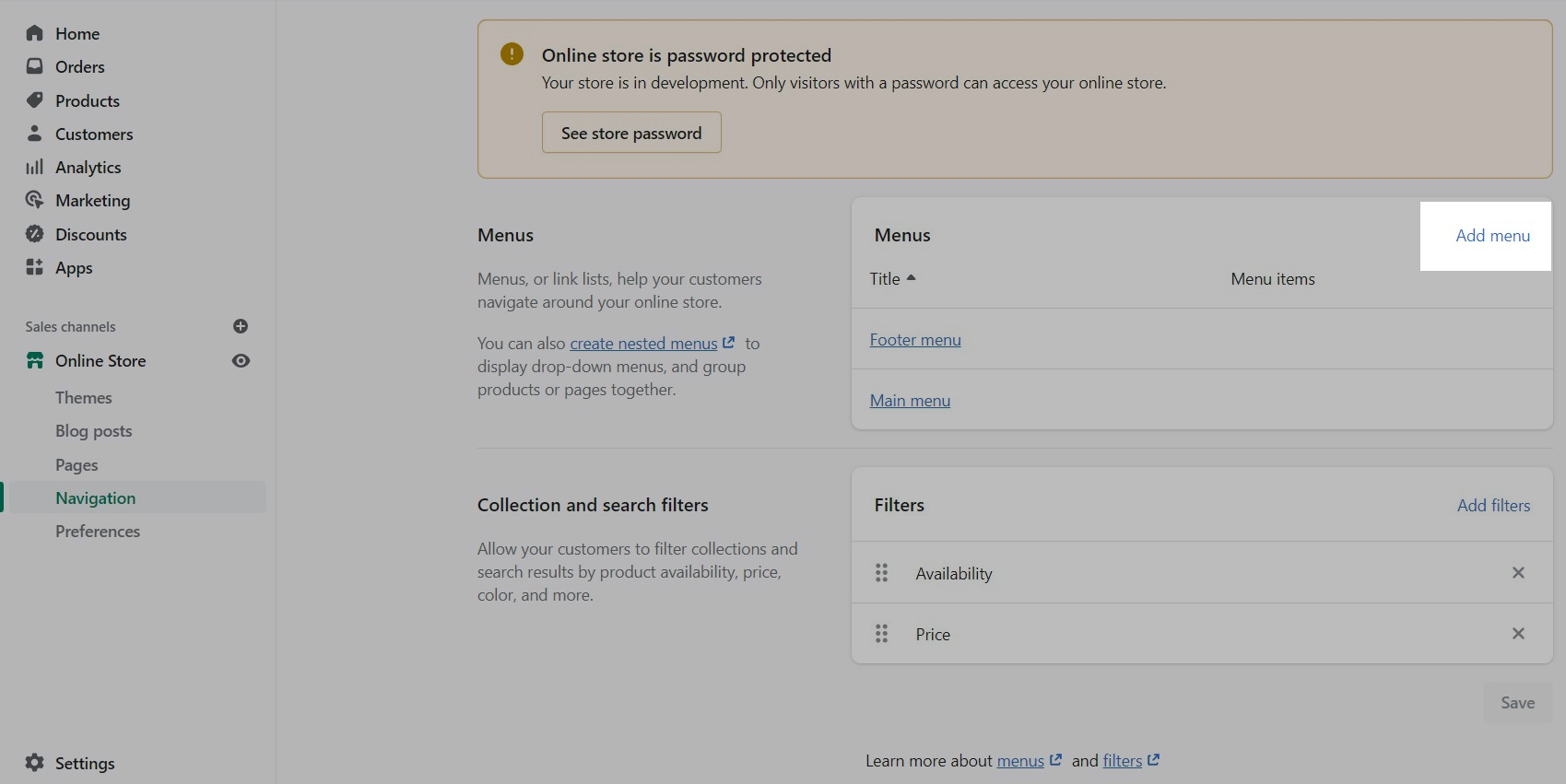
To set this up you need to first create a new navigation menu. Start by heading over to your Online Store > Navigation and clicking on 'Add menu':
You can give it any name you want, we will call ours 'Cart menu'.
Note: You can only show up to three buttons so you should only add up to three links in your menu.
Lastly, you need to open up the Theme Editor and click on Theme Settings > Cart.
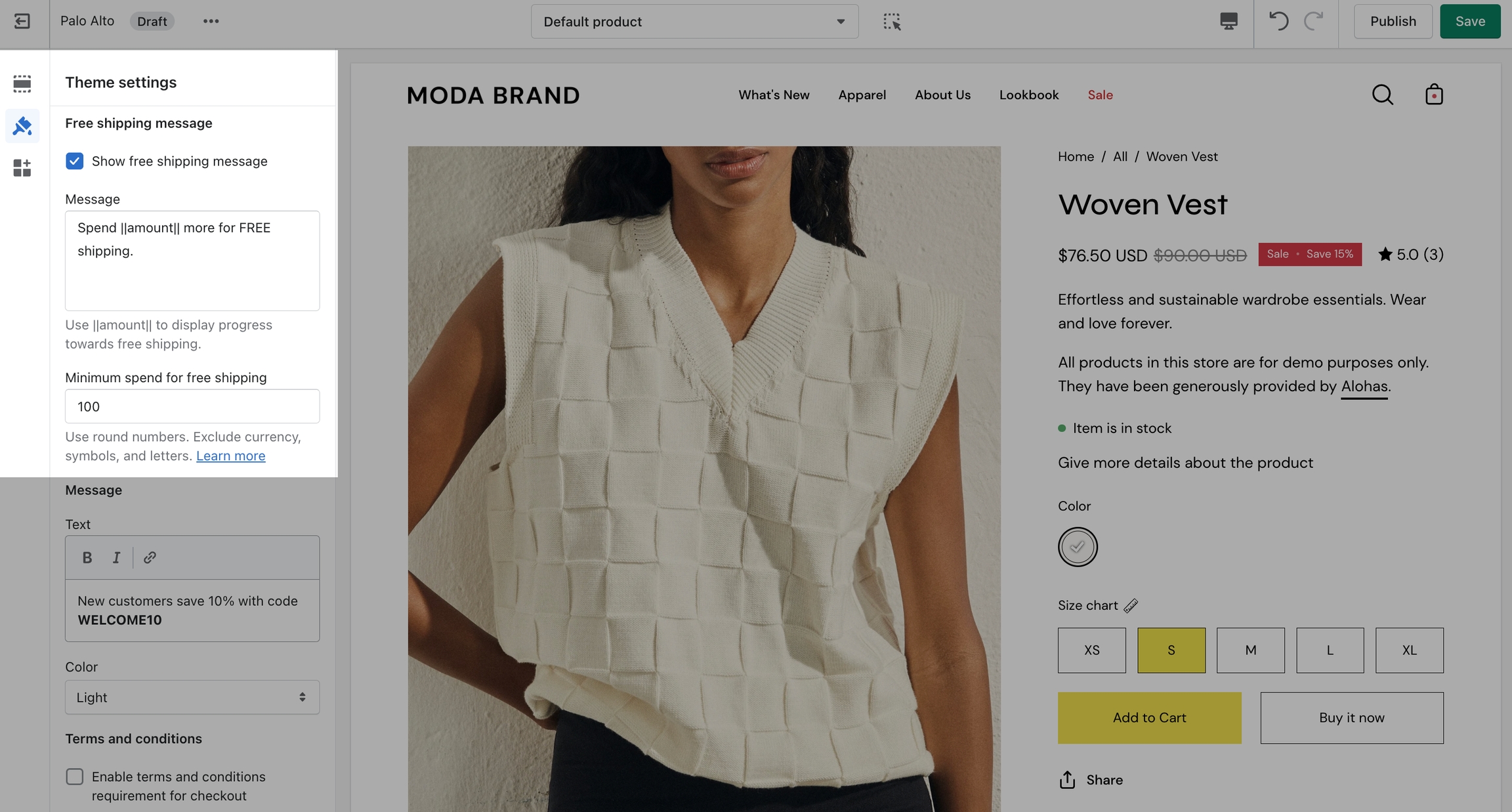
Dynamic message to encourage increased items per transaction.
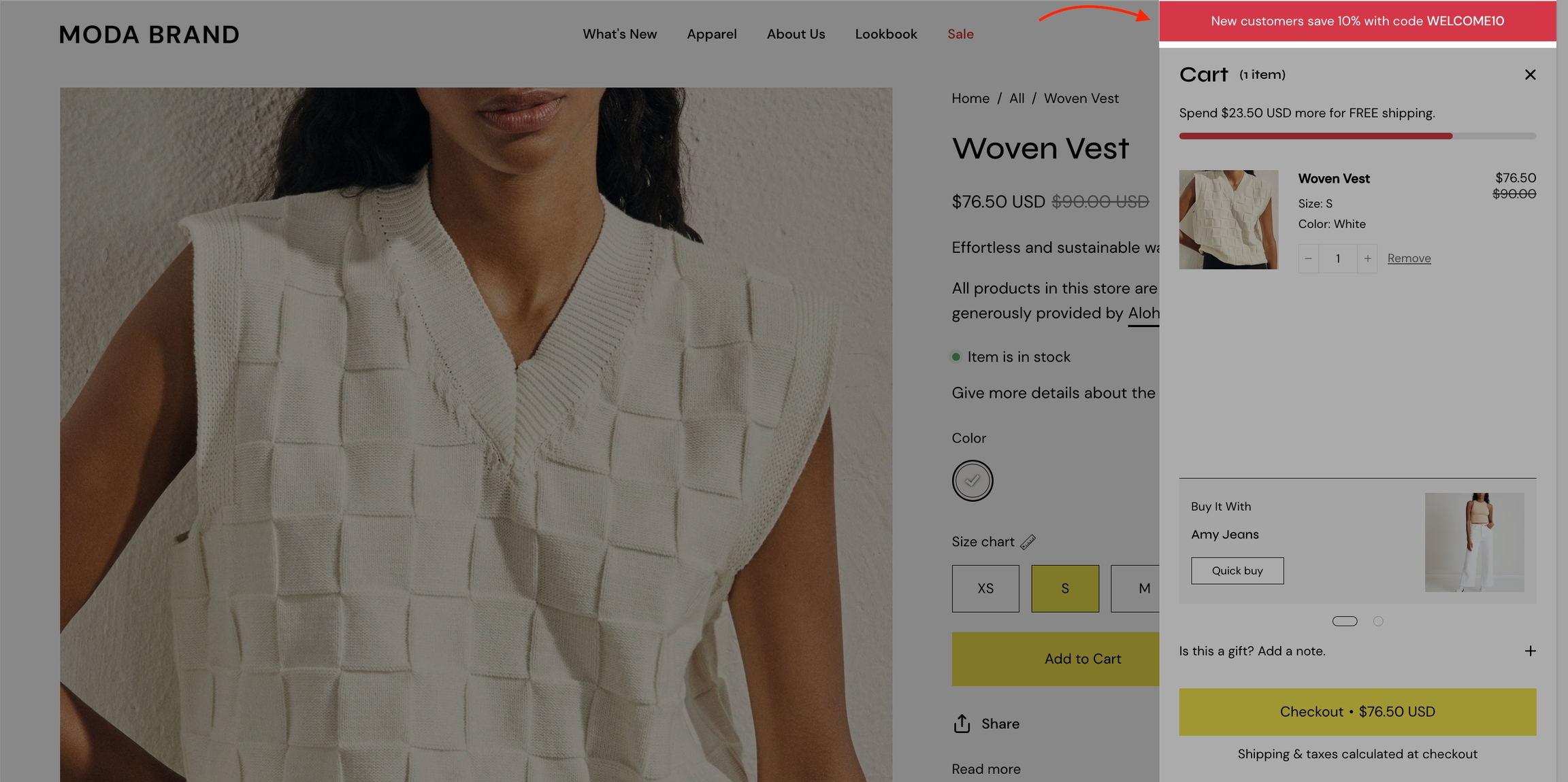
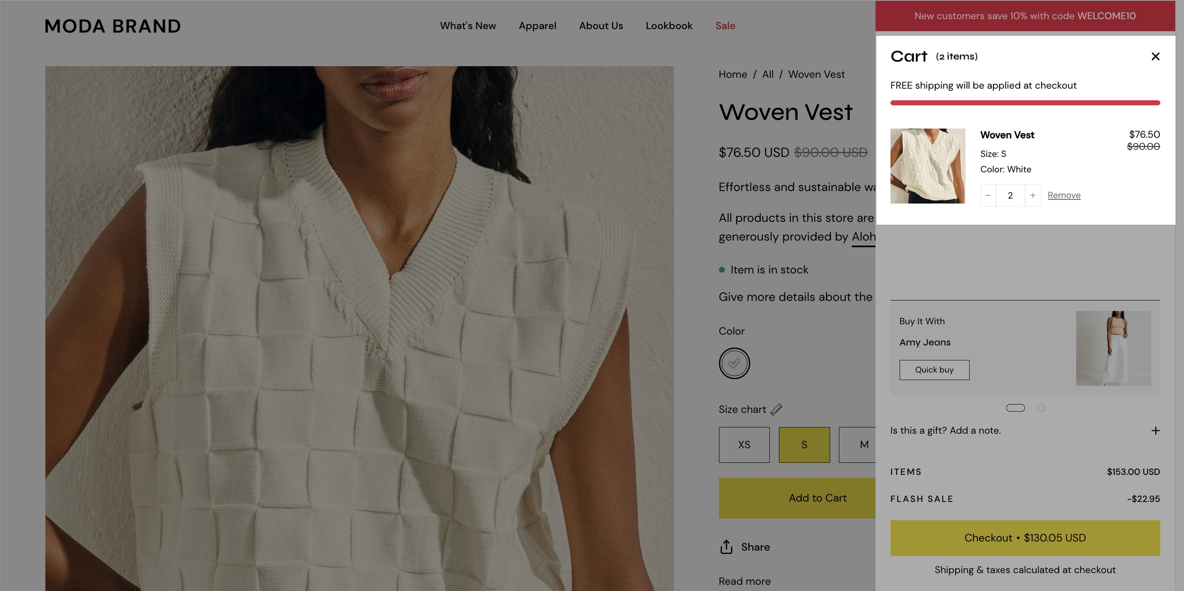
Add a free shipping message in the cart drawer to help your customers know how close they are to free shipping. The value fills up and changes as items are added to the cart.
Use to encourage add-on sales and increased quantities
Enable the 'Free shipping message' from the Theme Settings -> Cart tab and set the value from the 'Minimum spend for free shipping' field.
Modify the message text as needed. Keep the || amount || custom short-code to reference your set value from the Cart settings.
Once the required amount is reached a message will show up too:
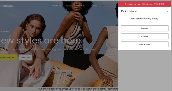
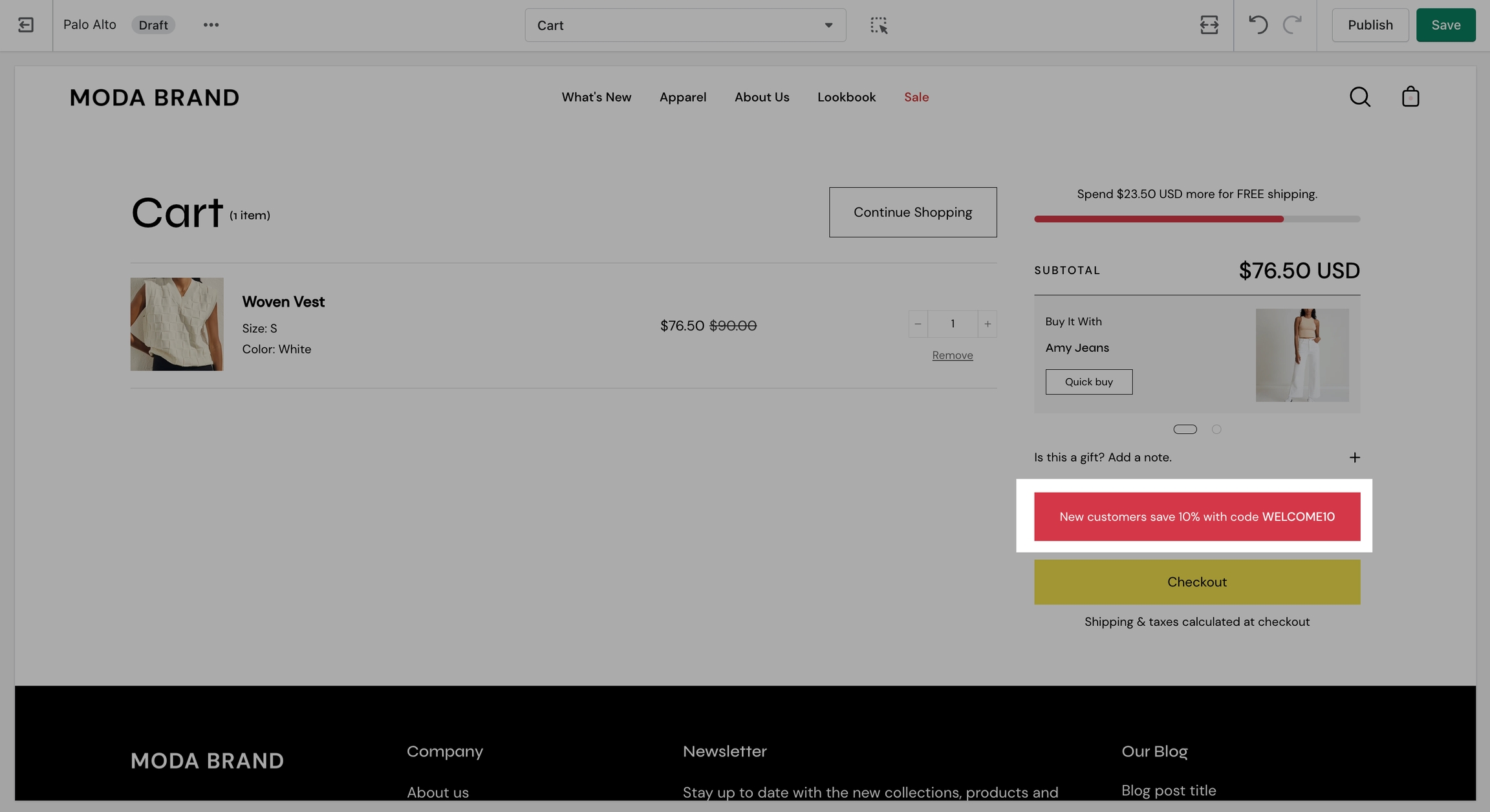
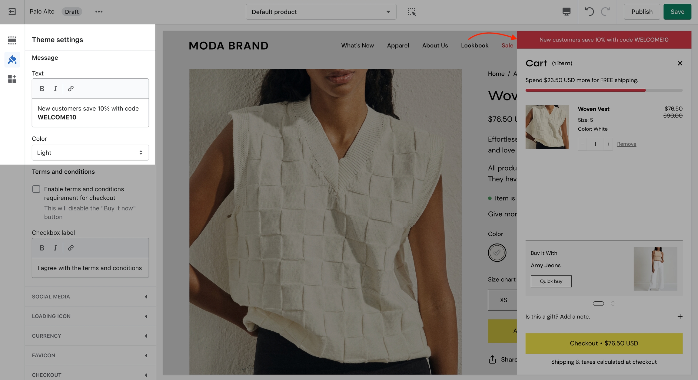
Use a Custom Cart Message to broadcast important information to your customers.
To set up a new Custom Cart Message you can open the Theme Editor and click on Theme Settings > Cart. The options for this are under the 'Message' headline:
Note: The Message itself does not generate a promo code. If you plan on using this message in a similar way be sure to set up a promo code first. Click here to learn more about Shopify Promo Codes and Discounts.
The Custom Cart Message is shown in the cart drawer (like in the example above) and in the cart page.
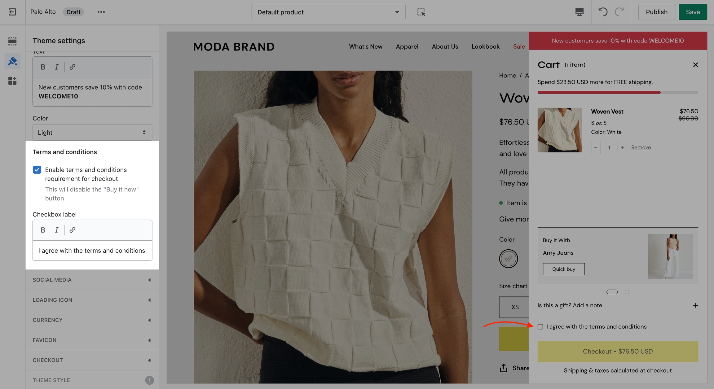
The cart terms and conditions allow you to add a checkbox to stop users from checking out before accepting the terms and conditions of your store.
To enable this option you can go into your Theme Editor and click on Theme Settings > Cart.
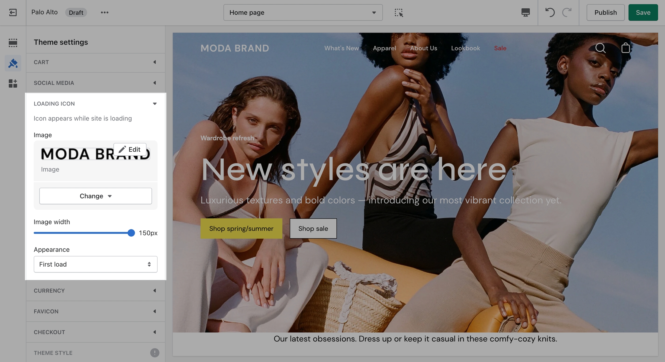
A custom loading icon helps you to keep brand consistency and display an animation as a loading indicator for your visitors.
The settings for the custom loading icon can be found inside the Theme Editor under Theme Settings > Loading Icon:
From the available settings, you can make the image bigger. You can also set it to appear on the very first load only or to also appear between page loads.
A very important note to make is that these settings are purely visual and aesthetic. Palo Alto does not have any options to change the functionality of your Checkout page.
The Checkout page is generated entirely from the Shopify core code so for any issues, at Checkout we highly recommend reaching out to Shopify Support.
The options here are predetermined and similar to most other themes.
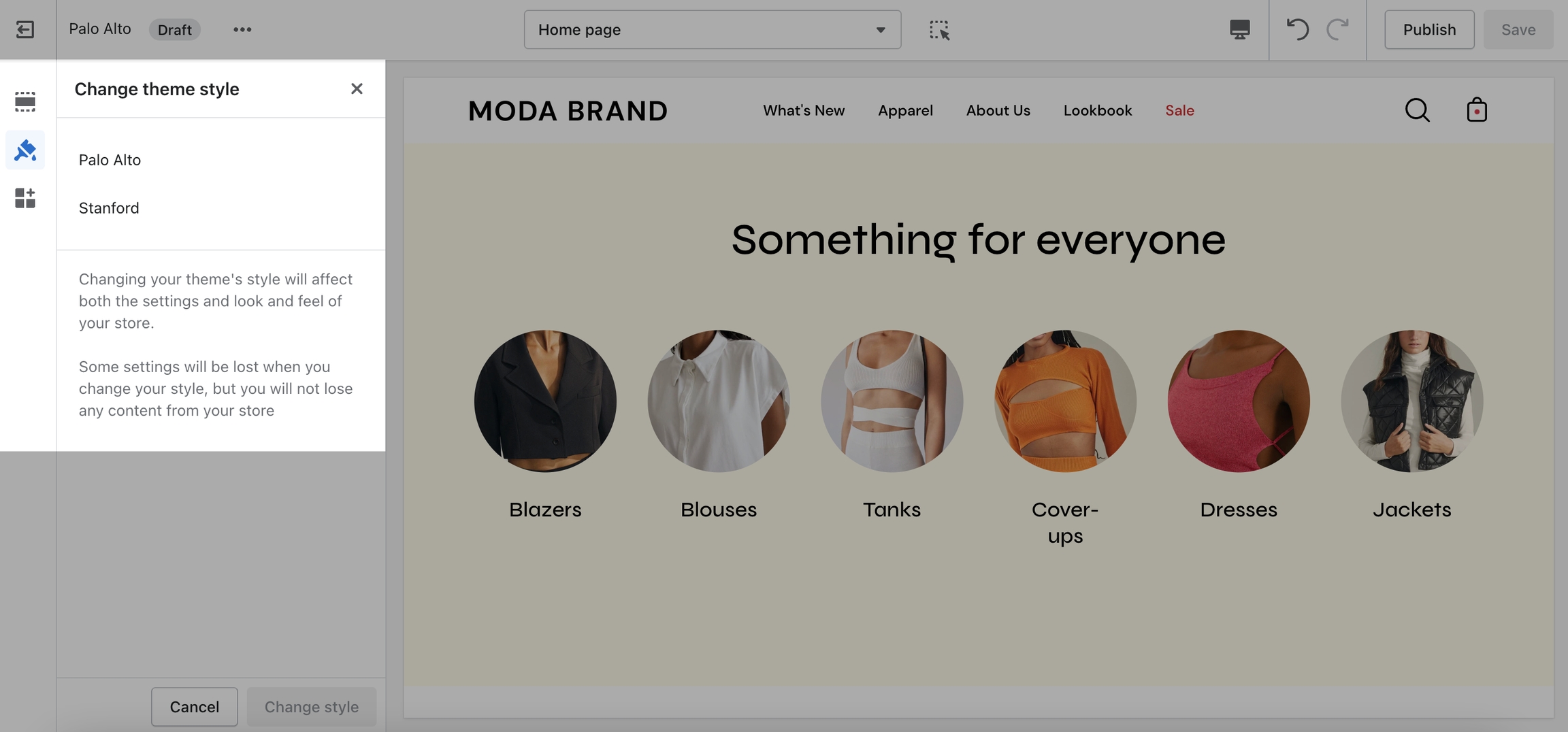
Theme Styles on their own do not make your store have fewer or more sections. They do not have any significant impact on performance or functionality. Mostly, these are predetermined colors and font settings.
Theme styles can NOT overwrite your manually set options so you might not even notice the change if you've already set up your sections.
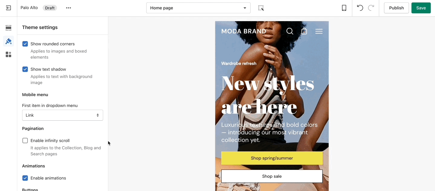
This tab holds miscellaneous settings that can affect small details in your store.
Under Layout, you can enable spacer lines, rounded corners, and text shadow.
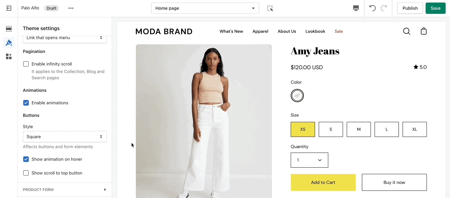
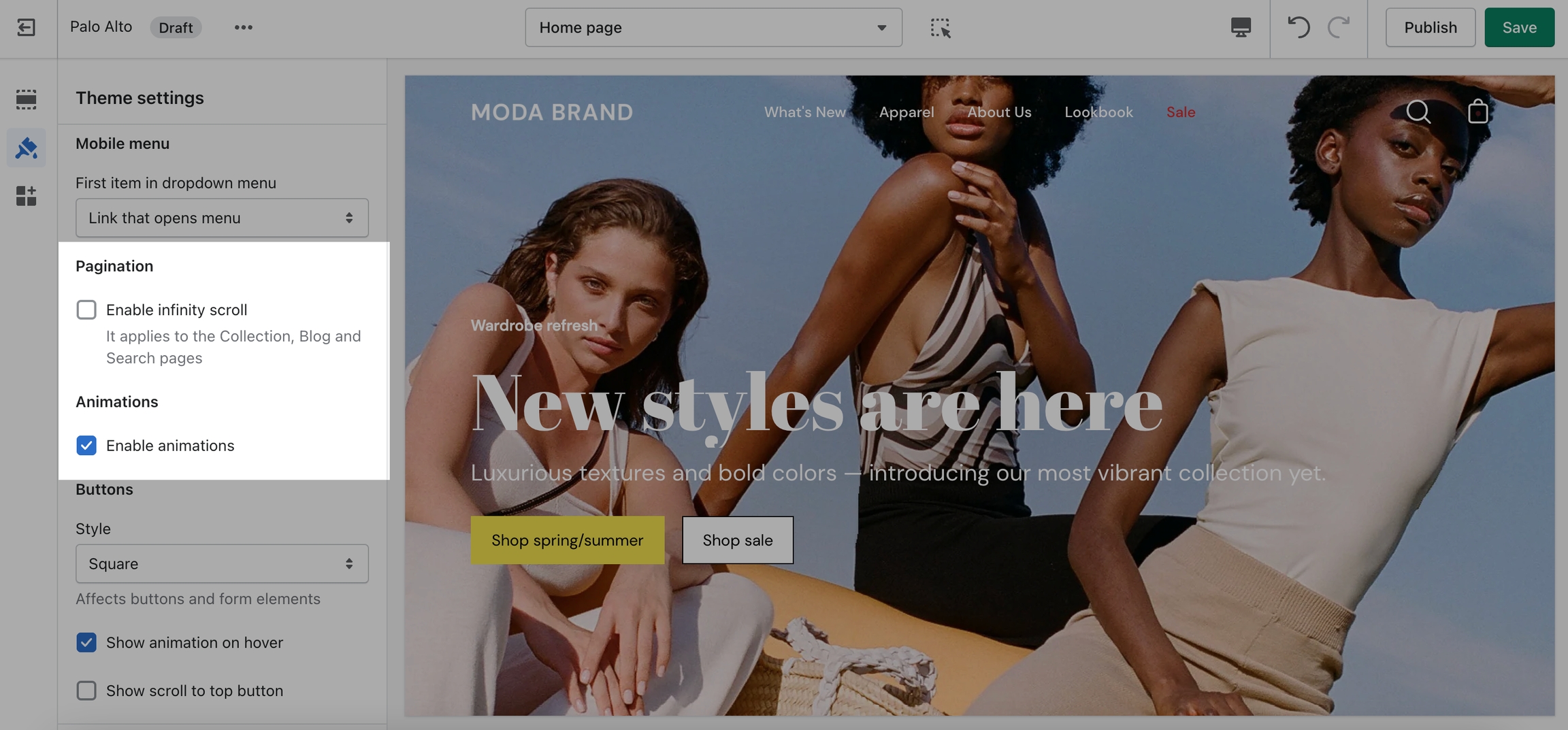
In the Mobile menu, you can select to have drop-down items open the menu or to be their own link.
You can toggle Pagination and Animations.
Under Buttons, you can change the style, toggle on-hover animations, and toggle the 'Scroll to top' button.
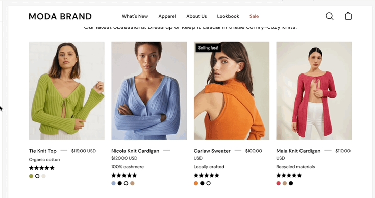
The main Product grid settings can be used to make the best fit for your images.
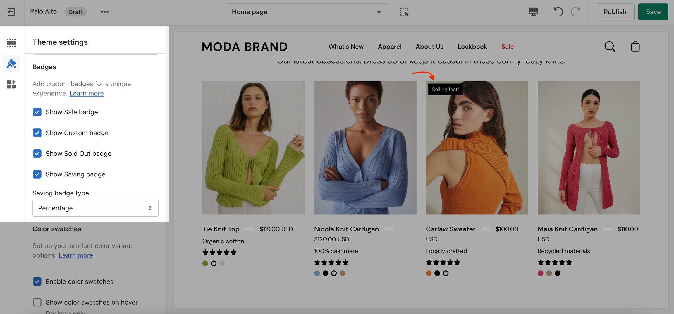
Under Badges, you can toggle the Sale, Custom, Sold out, and Savings badges. There is also the option to show savings in cash or as a percentage.
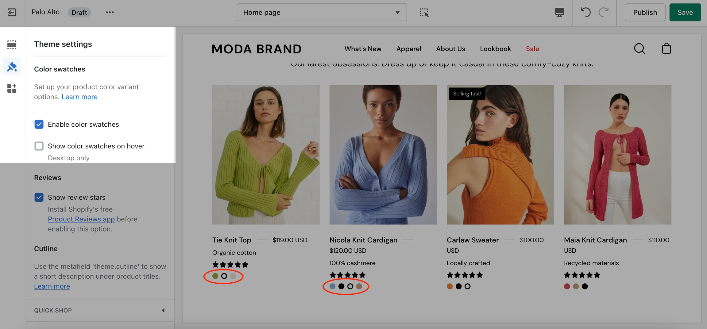
Under Swatches, you can toggle color swatches and enable them to be shown on hover (on Desktop only).
Learn more about using Custom Color Swatches in Palo Alto here: