Loading...
Loading...
Loading...
Loading...
Loading...
Loading...
Loading...
Loading...
Loading...
Loading...
Loading...
Loading...
Loading...
Loading...
Loading...
Loading...
Loading...
Loading...
Loading...
Loading...
Loading...
Loading...
Loading...
Loading...
Loading...
Loading...
Loading...
Loading...
Loading...
Loading...
Loading...
Loading...
Loading...
Loading...
Loading...
Loading...
Loading...
Loading...
Loading...
Loading...
Loading...
Loading...
Loading...
Loading...
Loading...
Loading...
Loading...
Loading...
Loading...
Loading...
Loading...
Loading...
Loading...
Theme Styles on their own do not make your store have fewer or more sections. They do not have any significant impact on performance or functionality. Mostly, these are predetermined colors and font settings.
Theme styles can NOT overwrite your manually set options so you might not even notice the change if you've already set up your sections.
Welcome to Online Store 2.0!
Palo Alto is built to use Shopify's Online Store 2.0 (OS2) which allows you to use all of Palo Alto's 20+ sections everywhere including the Homepage, Product pages, Collections, Pages, Blogs, Cart page, Search page, and more. Endless flexibility options for your store.
Shopify's Online Store 2.0 also includes Collection filtering tools, unique content using Metafields (dynamic source), easy to create custom templates, improved storefront performance. Palo Alto uses all the features included in Shopify's new modern platform.
Shopify's platform change completely remodels how you can use your store. Start with learning the features and changes Shopify has introduced:
A very important note to make is that these settings are purely visual and aesthetic. Palo Alto does not have any options to change the functionality of your Checkout page.
The Checkout page is generated entirely from the Shopify core code so for any issues, at Checkout we highly recommend reaching out to Shopify Support.
The options here are predetermined and similar to most other themes.
A custom loading icon helps you to keep brand consistency and display an animation as a loading indicator for your visitors.
The settings for the custom loading icon can be found inside the Theme Editor under Theme Settings > Loading Icon:
From the available settings, you can make the image bigger. You can also set it to appear on the very first load only or to also appear between page loads.
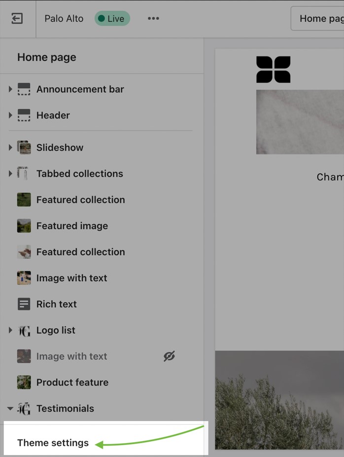
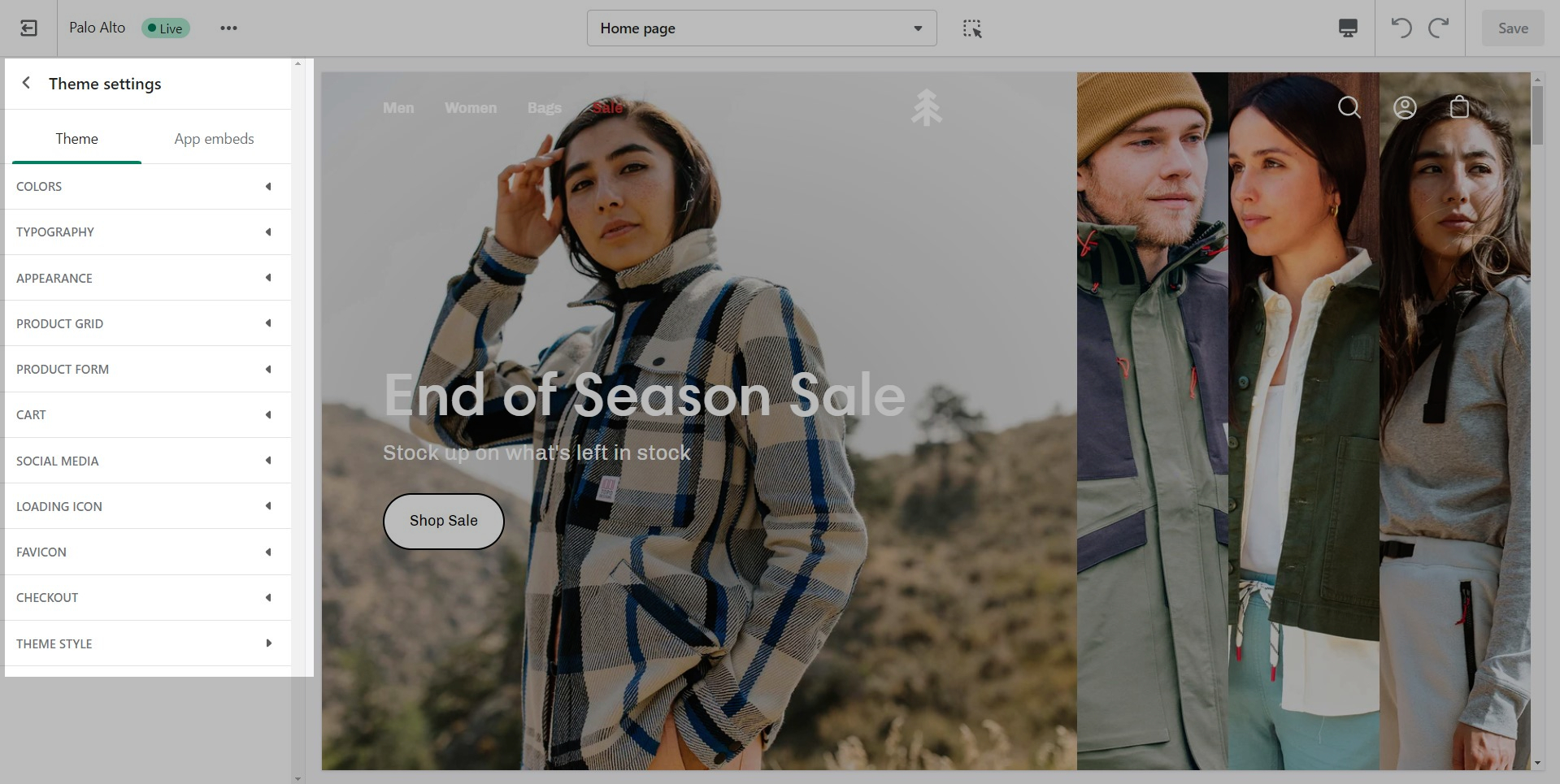
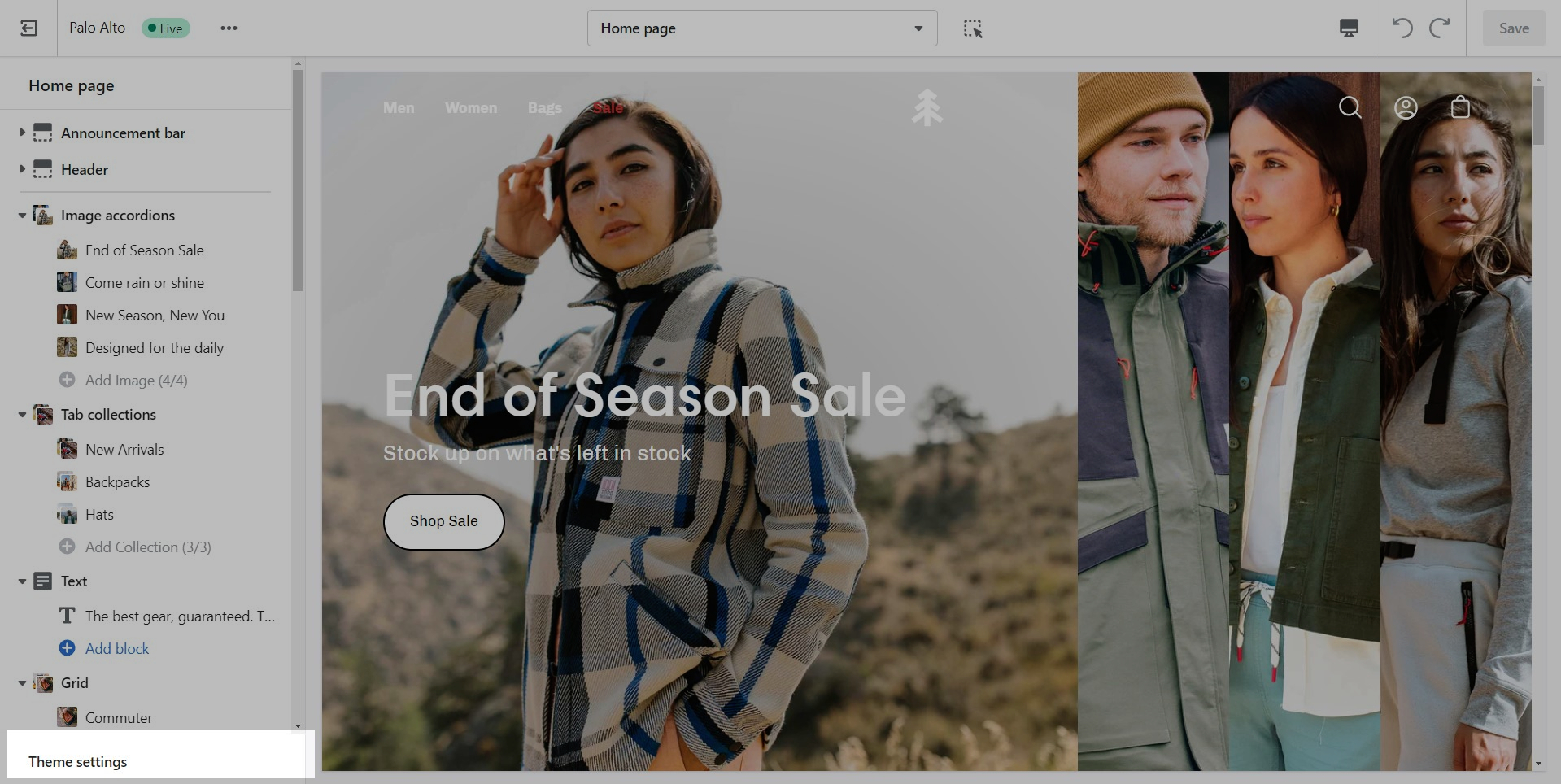
Global theme settings that can affect all pages
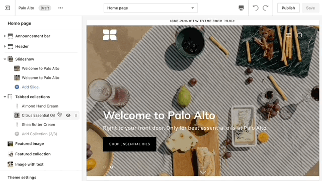
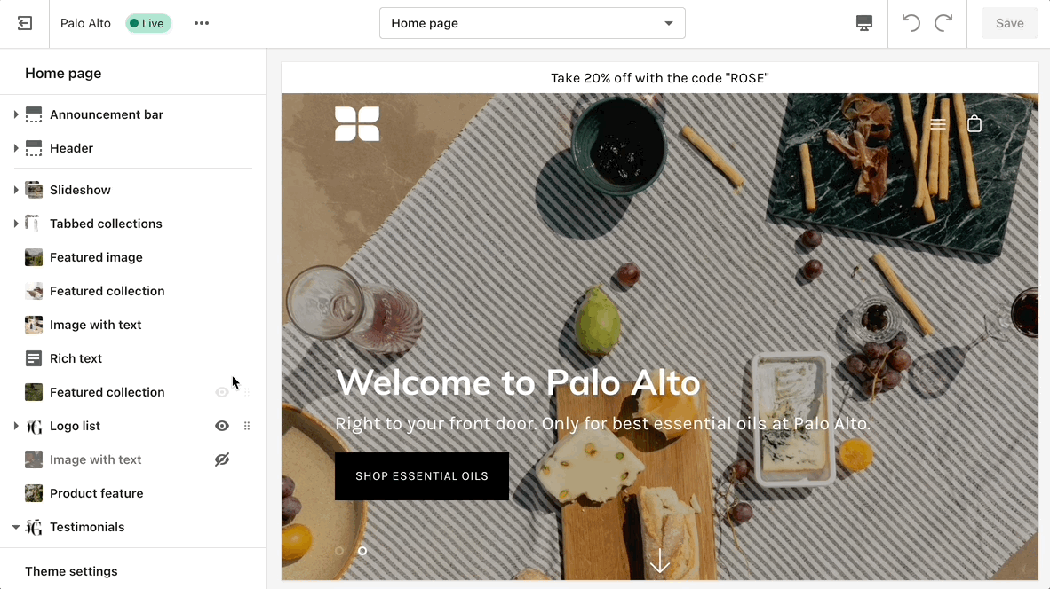
The 'Theme Settings' tab is located under all sections in the Theme Editor. This tab contains a bundle of all global settings in Palo Alto.
Please note that global settings can affect multiple sections and multiple pages.
Set three of four main colors that will represent your brand.
Try to use colors that are high in contrast. It will make your text easier to read. Here is a great contrast checker:
Note: Some sections have color settings. Section settings will overwrite Theme Setting.
Set two main fonts.
Font stacks in the Theme Settings are predetermined. You can not remove or add fonts to this list. To use Custom fonts, checkout our documentation post on the topic below:
How to add Custom FontsOther options include:
Selecting a font for your navigation menu
Selecting a font for your buttons
Selecting a font for your subheadings
Setting different sizes
Setting different letter spacing
Letter capitalization (ALL CAPS)
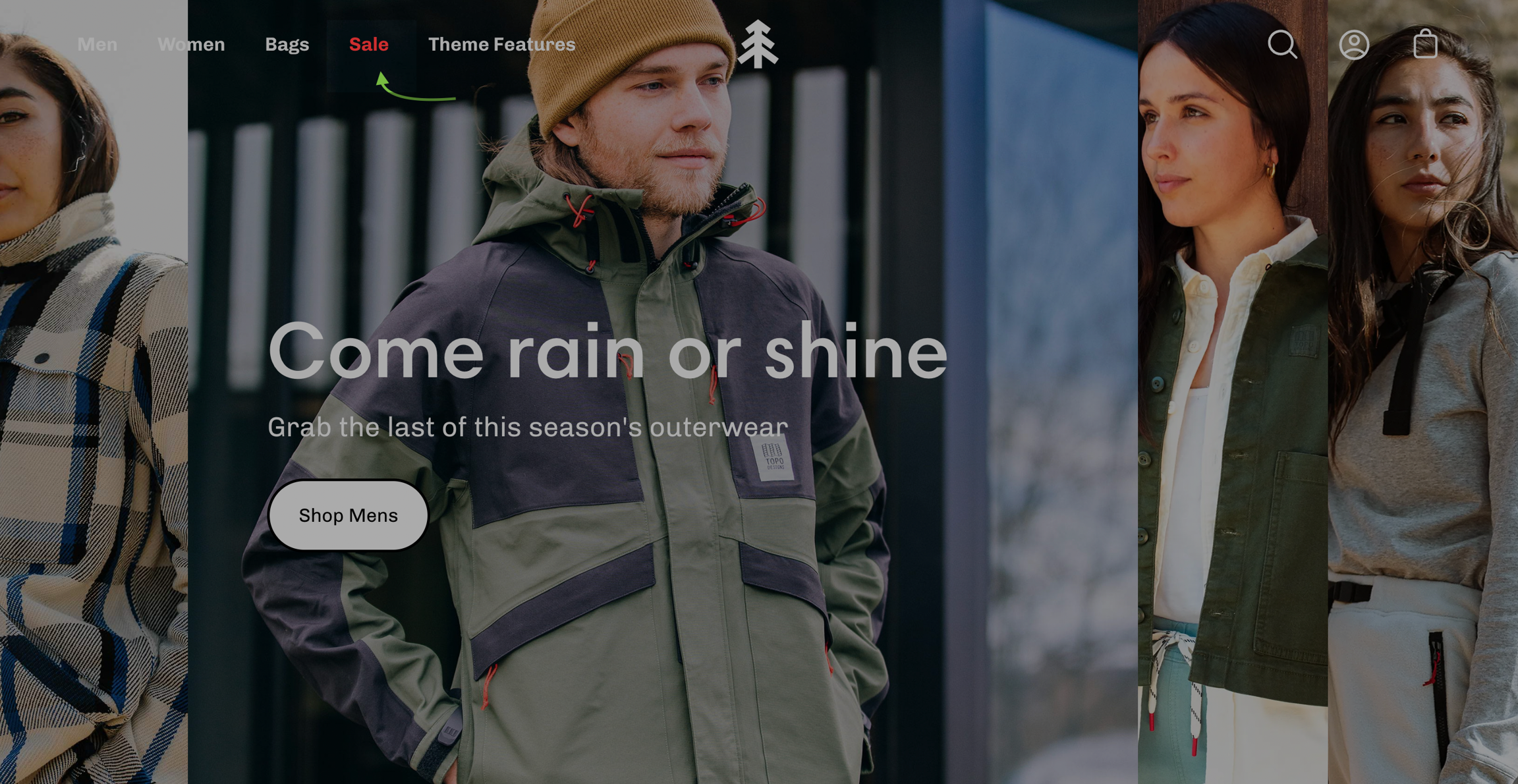
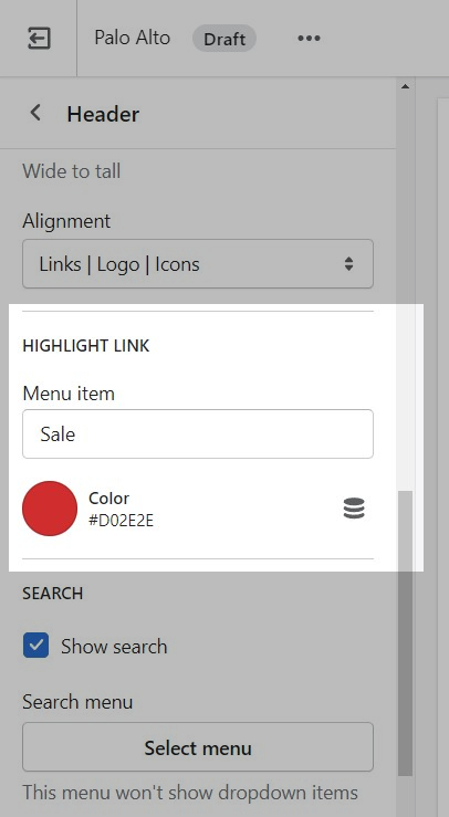
The header section has a small group of settings called a 'Highlight link'.
Inside the Header section settings is where you will find the options to set the target text and the color of the text:
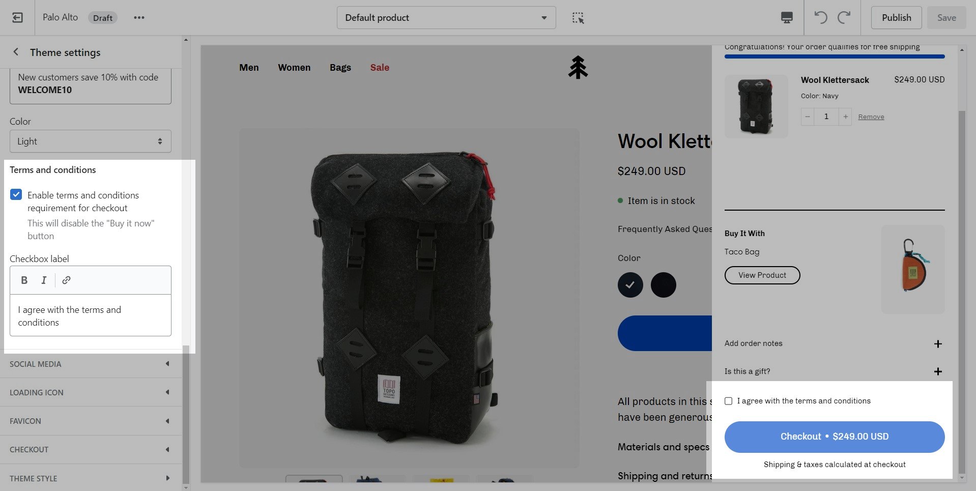
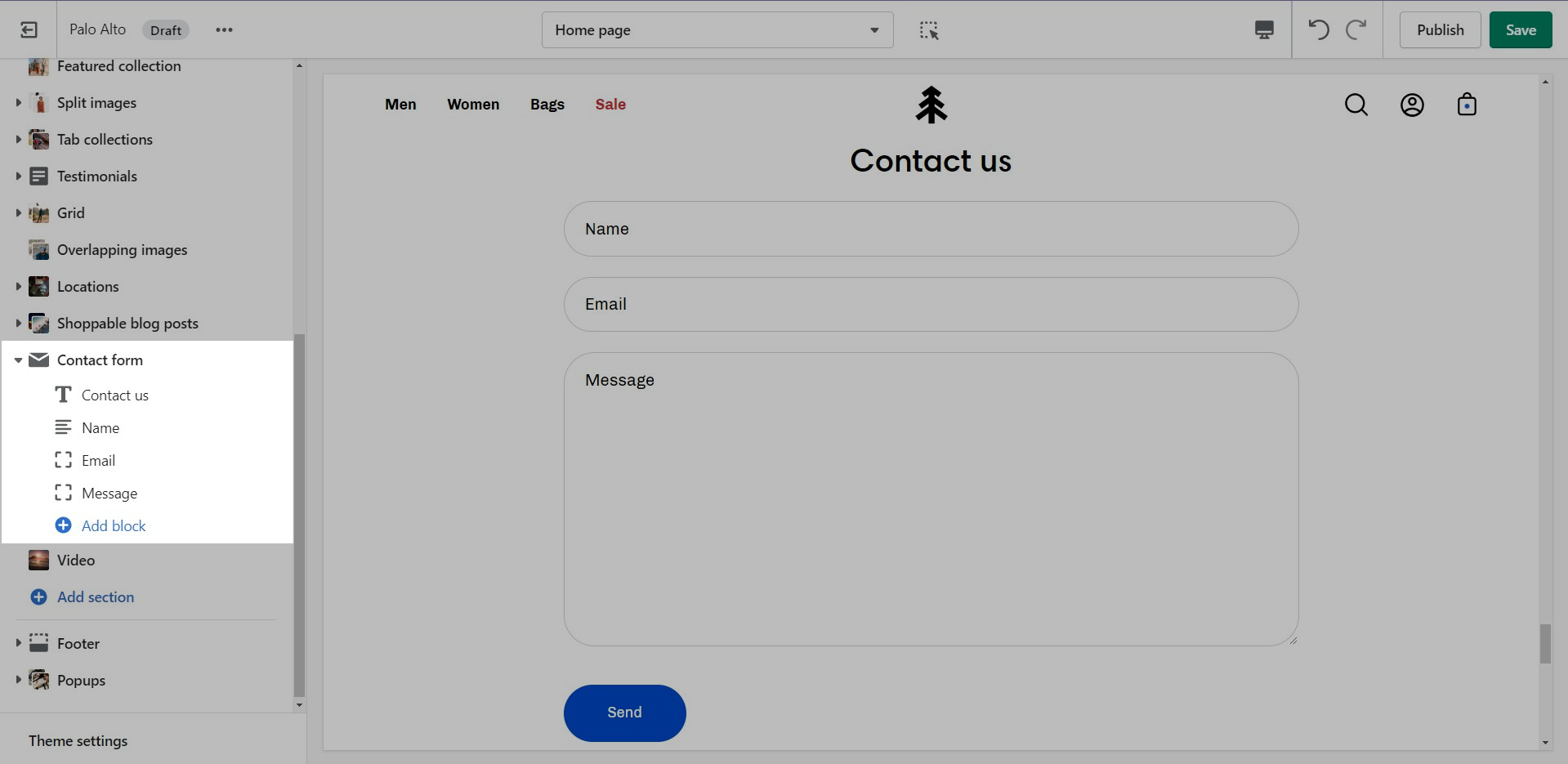
The cart terms and conditions allow you to add a checkbox to stop users from checking out before accepting the terms and conditions of your store.
To enable this option you can go into your Theme Editor and click on Theme Settings > Cart.
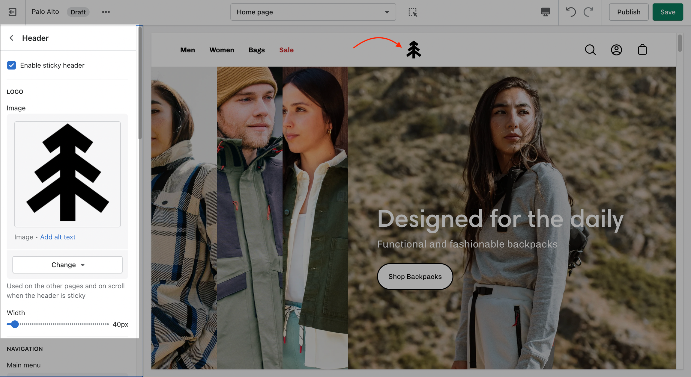
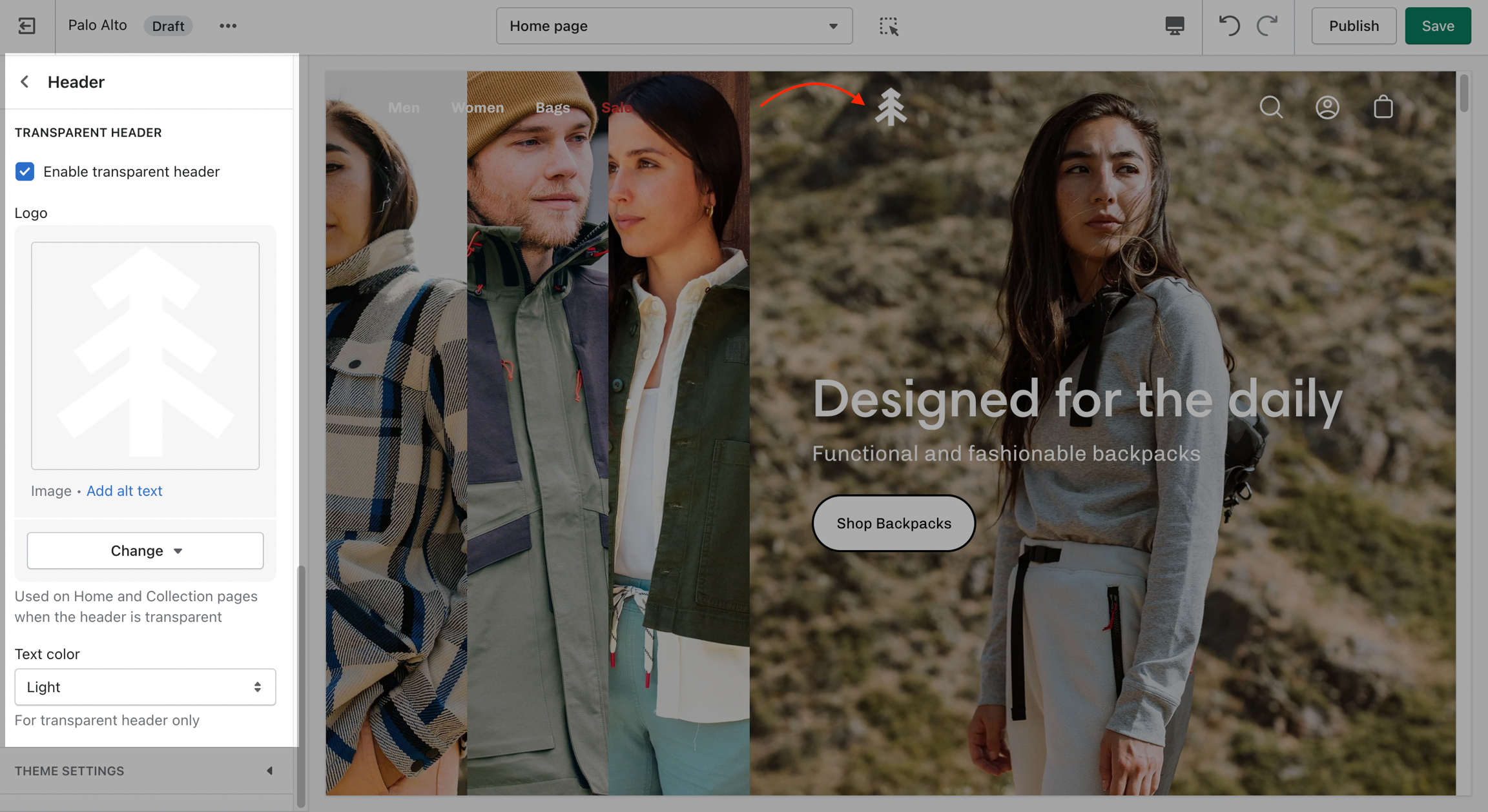
Change the opacity to blend the header with a background image (or video)
Palo Alto can display a transparent header on the homepage, collection pages, and any customized pages that include a fullwidth background image (or video) section.
When using a transparent header, you may include a second logo to provide contrast with your main homepage asset.
Open the 'footer-copyright.liquid' file from the Snippets folder.
Place an opening ({% comment %}) comment tag before the powered_by_link span.
Place a closing ({% endcomment %}) comment tag after the powered_by_link span.
Save the changes.
To enable the Transparent header you will need to first open the Header section settings. From here, simply check the 'Enable transparent header' checkbox and save the changes:
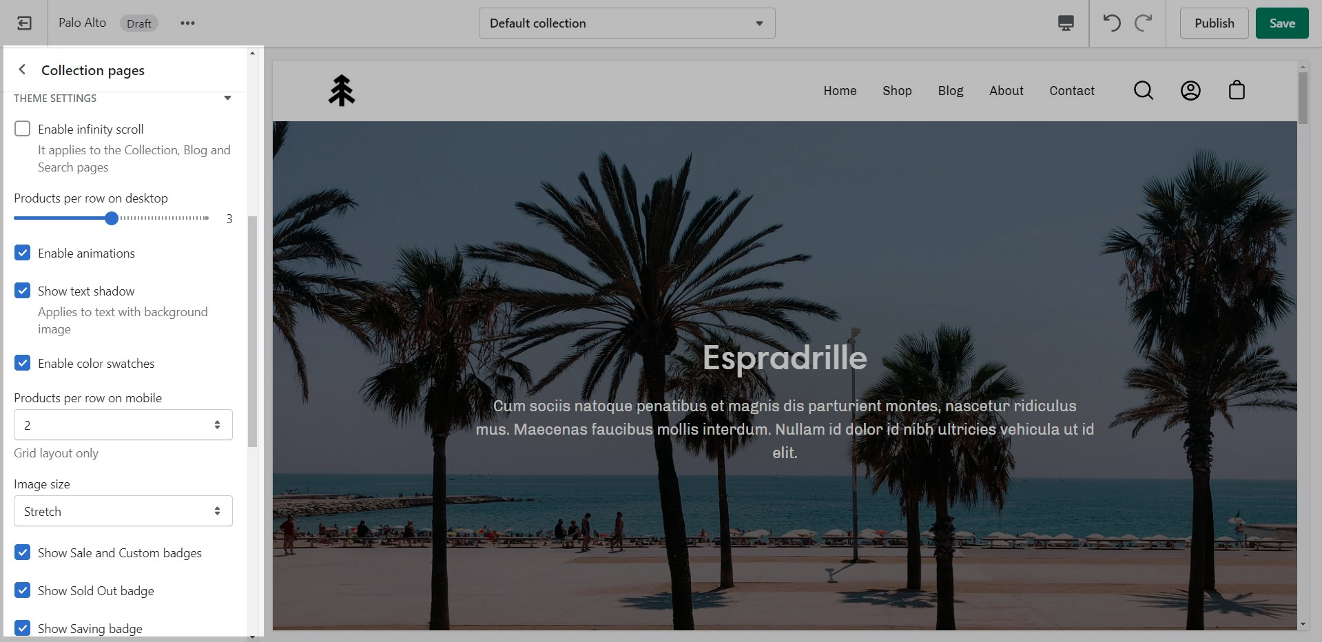
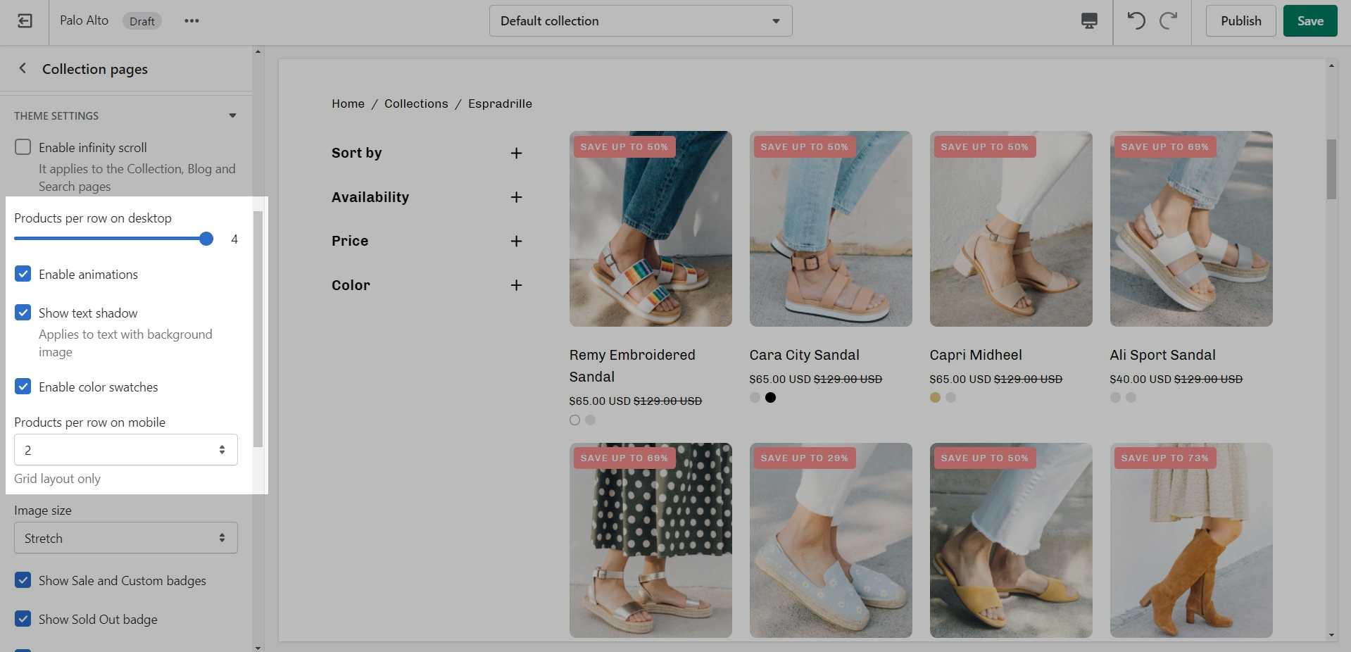
Use the Product Grid options to customize how many products per row are displayed on desktop and mobile.
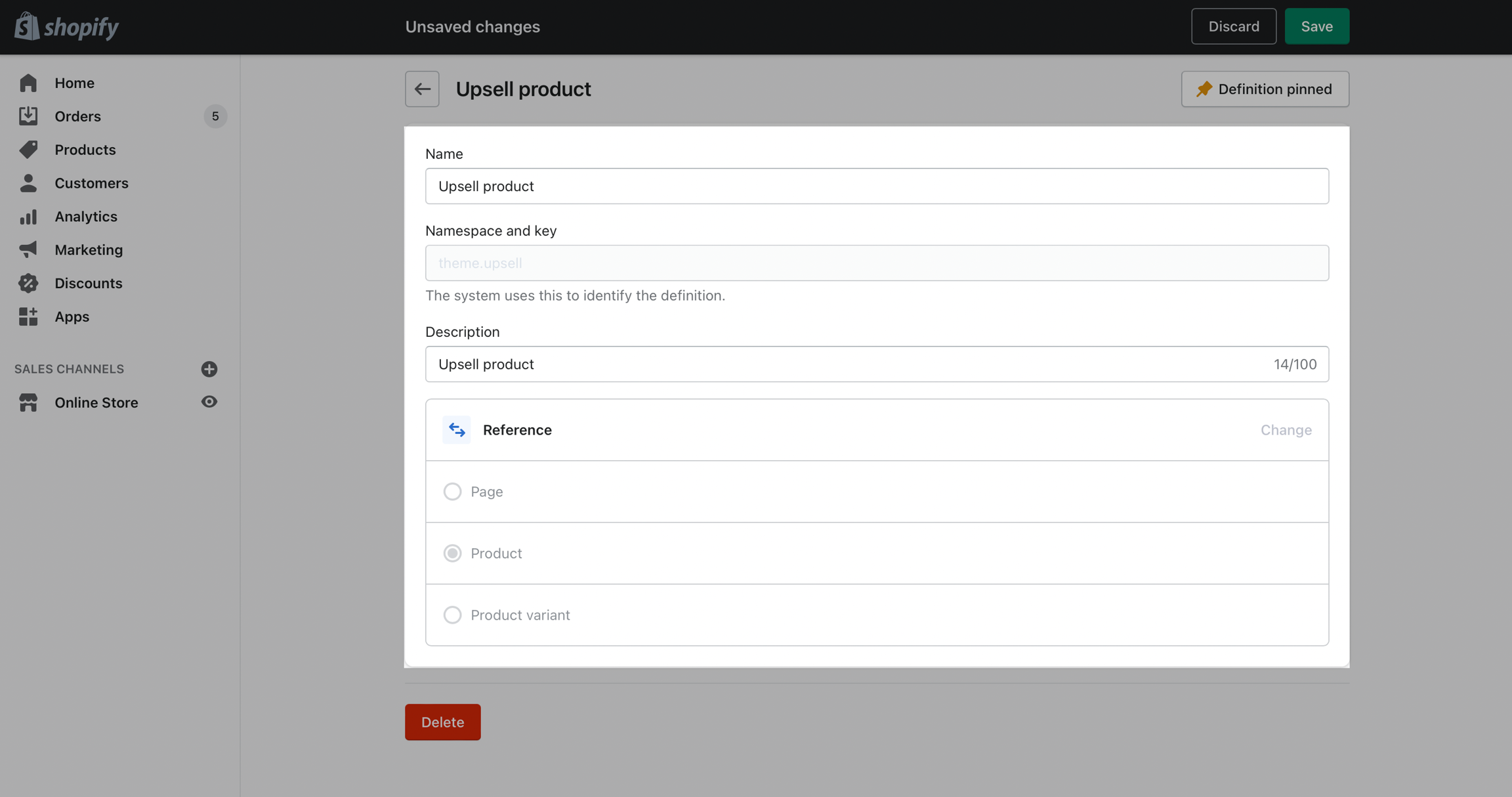
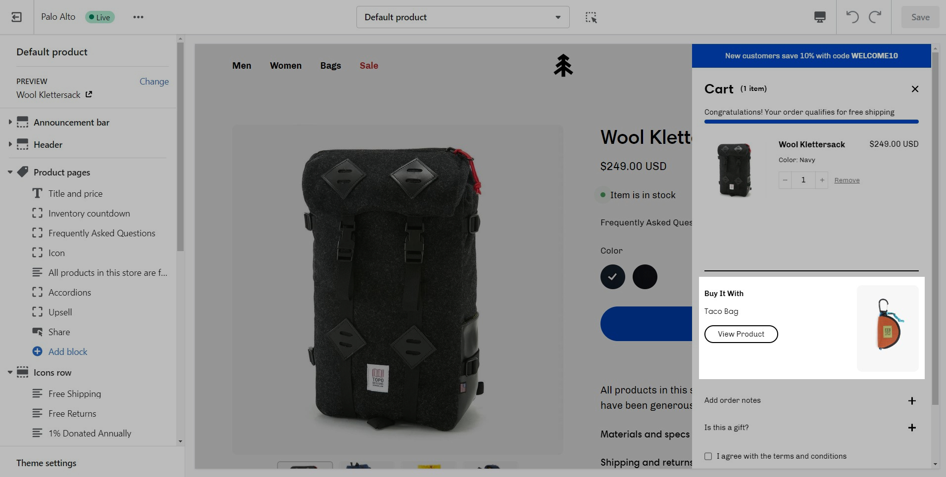
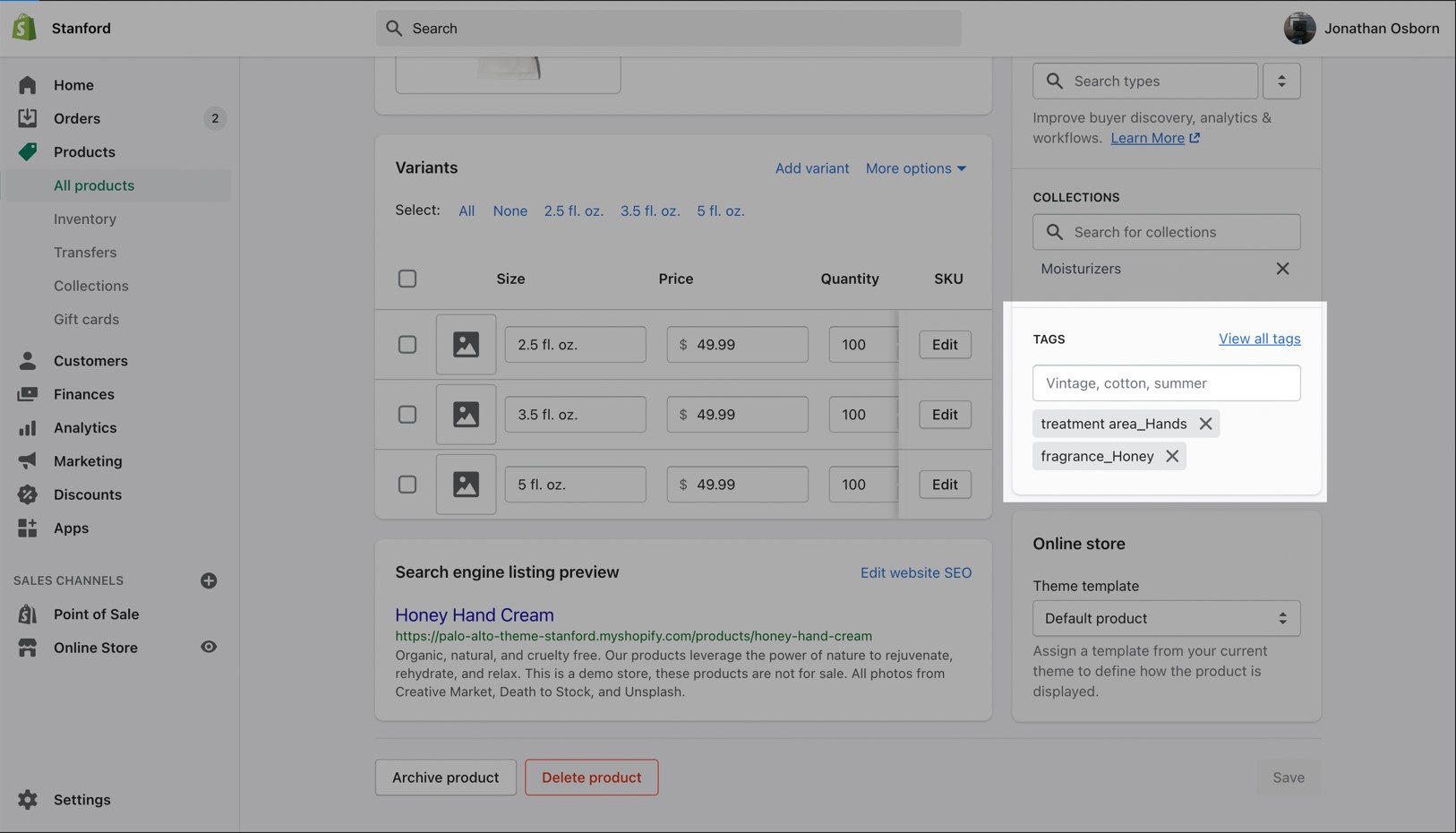
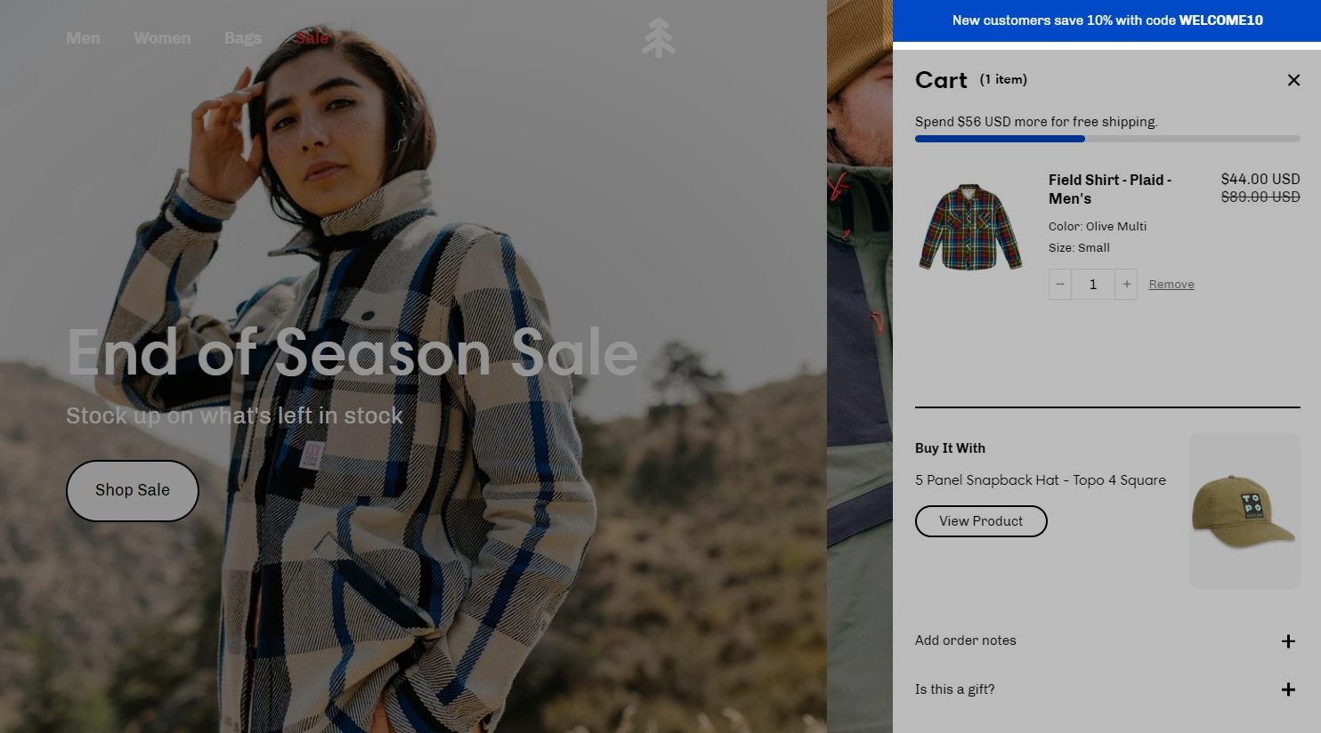
Upsell a product in the cart drawer (and the cart page) using a custom metafield definition. You can set different combinations for different products.
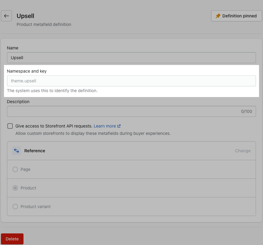
This feature uses metafields so our first step is to create a new metafield definiton. The most important part is to use this namespace and key: theme.upsell
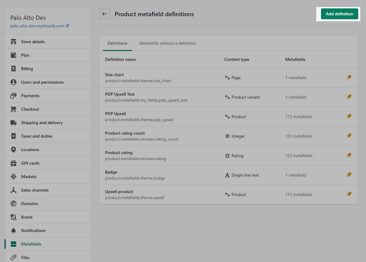
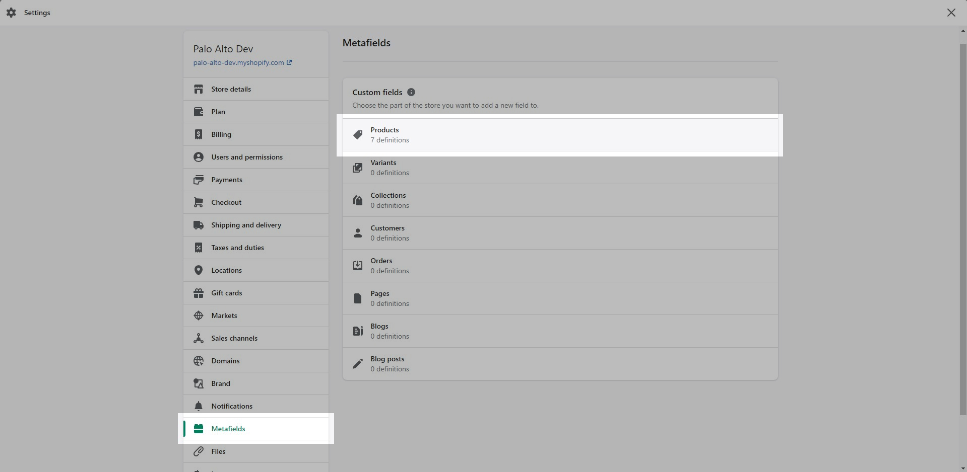
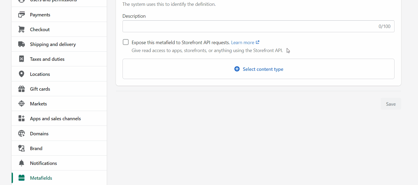
To start, navigate to your Shopify Admin -> Settings and choose Metafields from the left panel. Next, click on Products (click images to zoom):
Click the Add definition button to begin. Choose a name, we'll use 'upsell'. Next, we will use a custom namespace. This is required.
A crucial step here is to change the default namespace (usually called 'my_fields') to theme
Add a description (this is optional) then choose Select content type. Here, choose the Product type and Save your new definitions.
Now that our custom metafield has been defined, the final step is to edit any of your products in the Shopify Admin -> Products and update the new upsell metafield.
All you need to do is scroll to the bottom of the product setup page and fill them in:
Don't forget to Save your product and preview it on the cart drawer (or cart page).
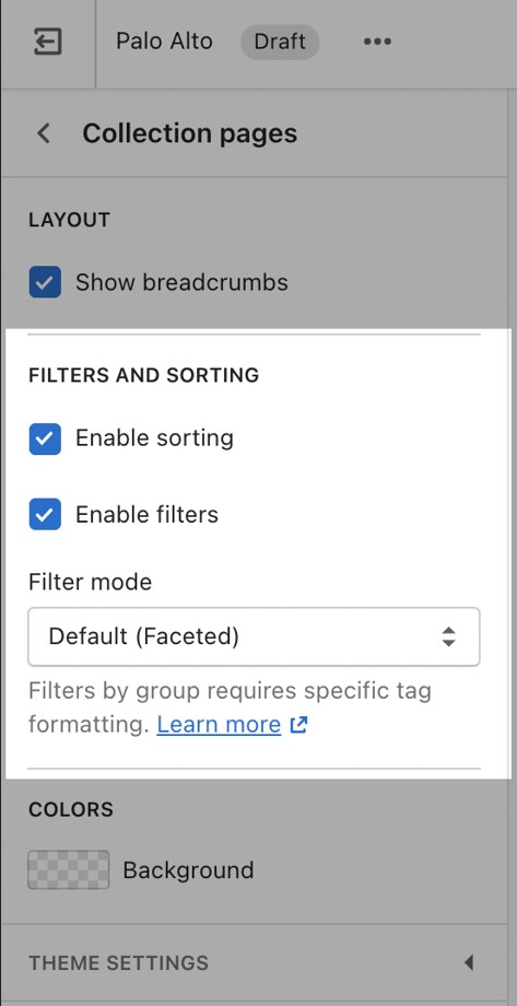
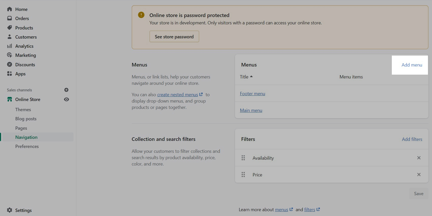
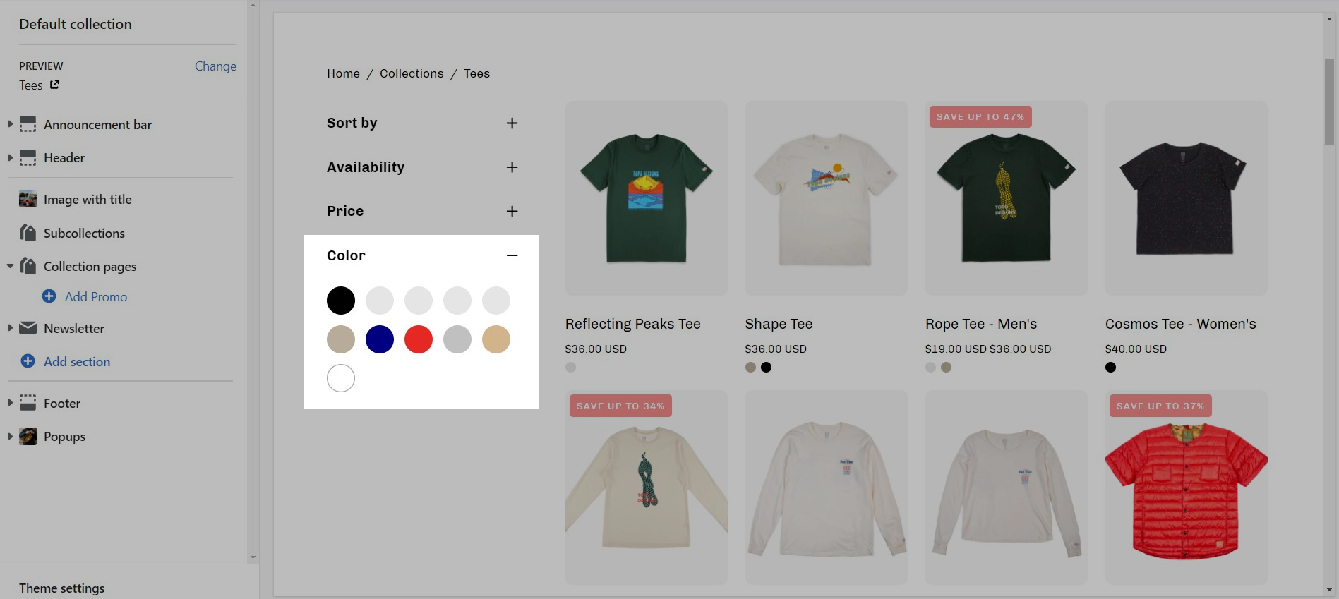
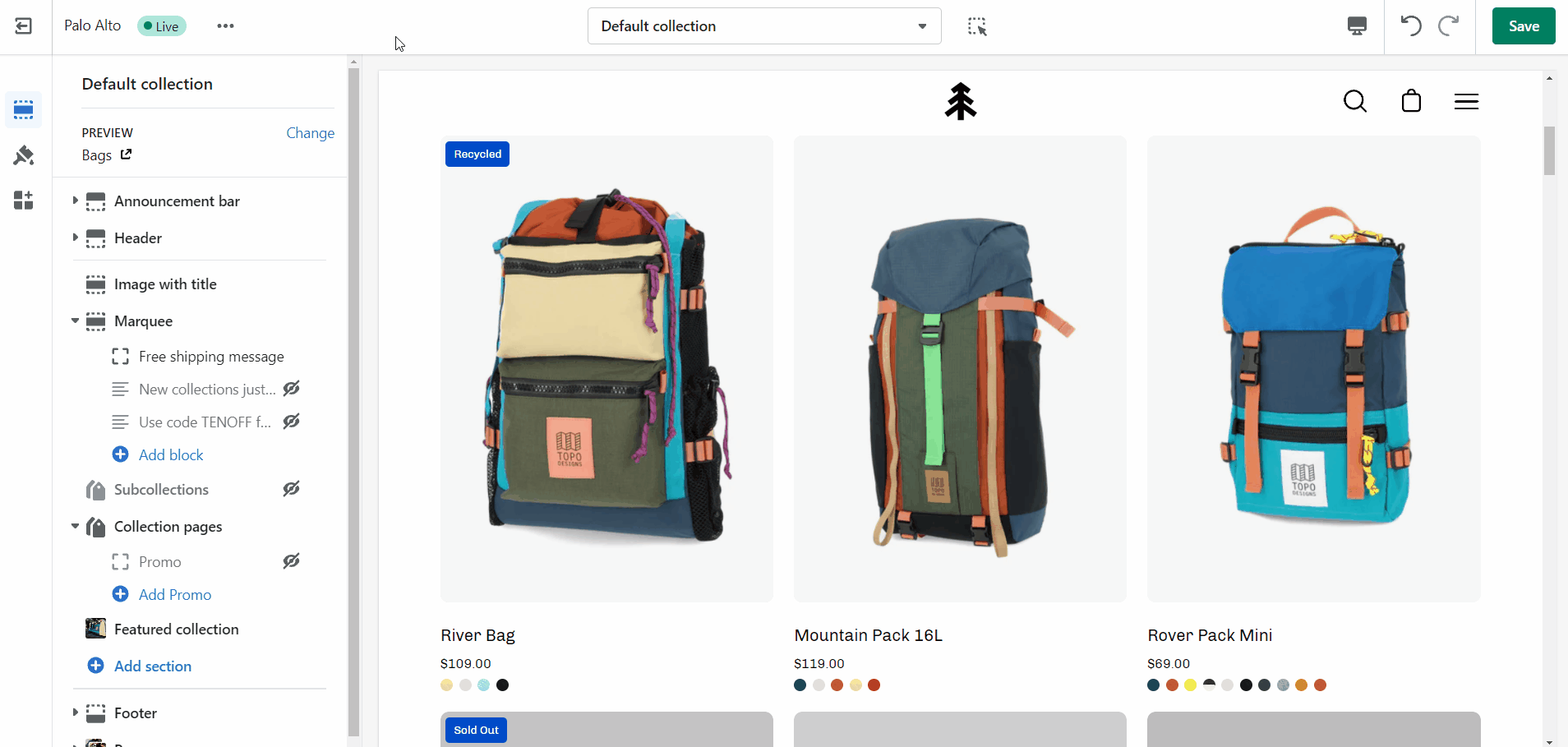
Filtering menus for your collection pages
Palo Alto has three filtering methods to choose from. They can be found under the Collection products section settings.
The default method is a new feature introduced with Online Store 2.0. This feature is automatically generated based on your product information such as variant price, availability, product type, brand, and vendor.
Filtering by tag method simply takes all of the unique tags applied to each product of the collection and lists them inside the filters menu.
This is the most simple method of all and as such, the fastest. If your priority is speed, we definitely recommend giving this method a try.
The filter by group method has been a staple in our theme for years and we are happy to include this in this version too. While this method is similar to the filter by tag method, as they both use product tags, it is a lot more advanced.
Setting this method up requires the use of product tags with a specific pattern. For each of your products, you need to specify tags that consist of a combination between the group name and the option name.
The group and option need to be separated with an underscore but they can contain spaces if they need to.
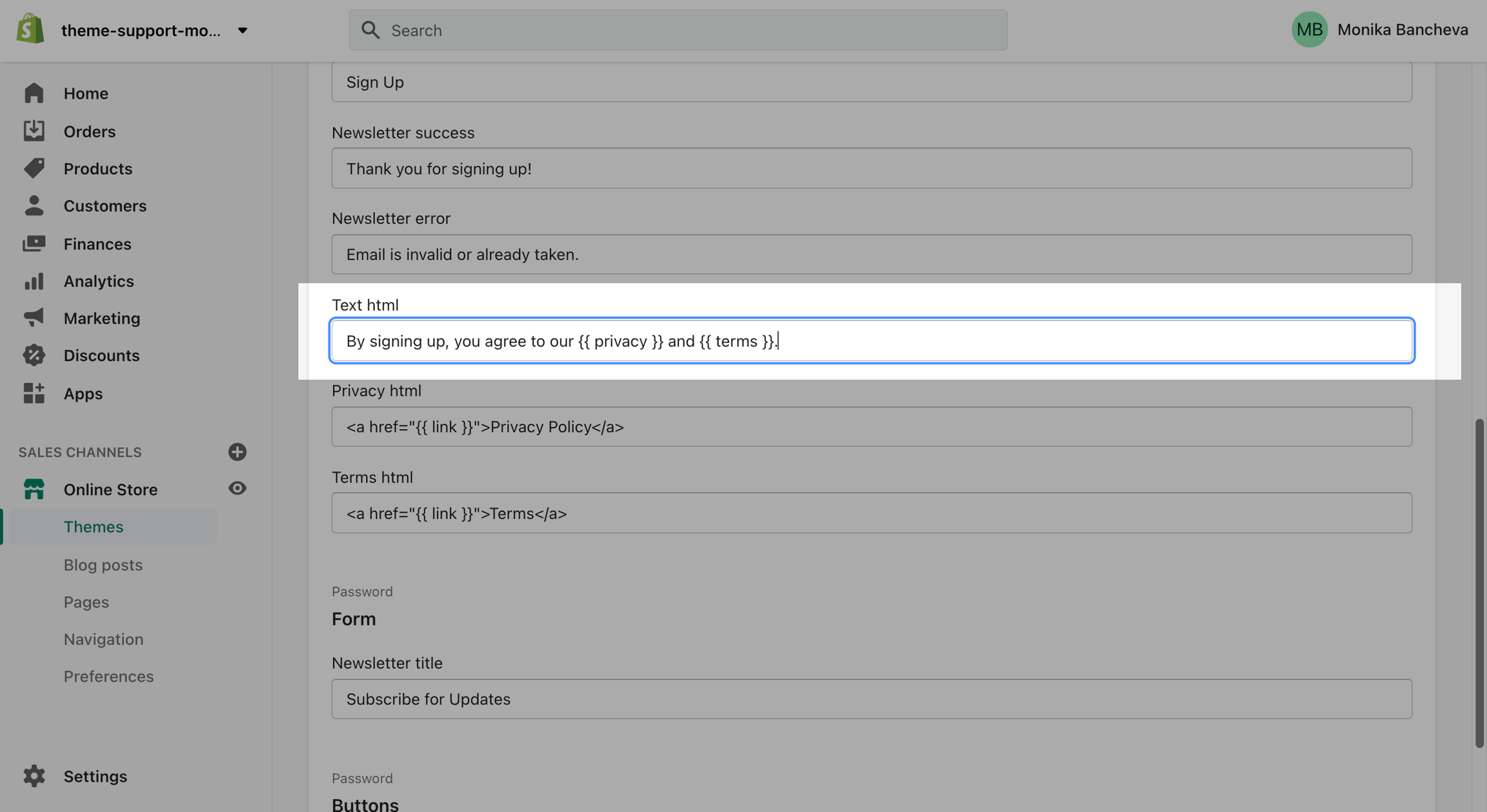
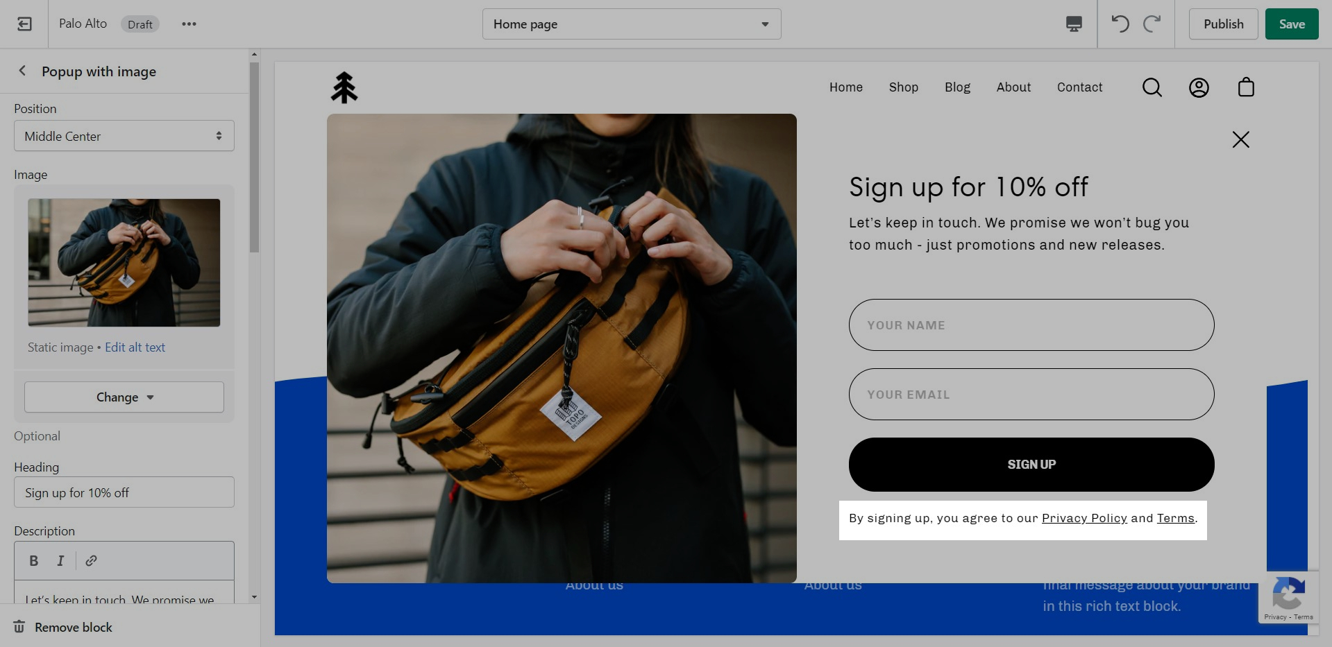
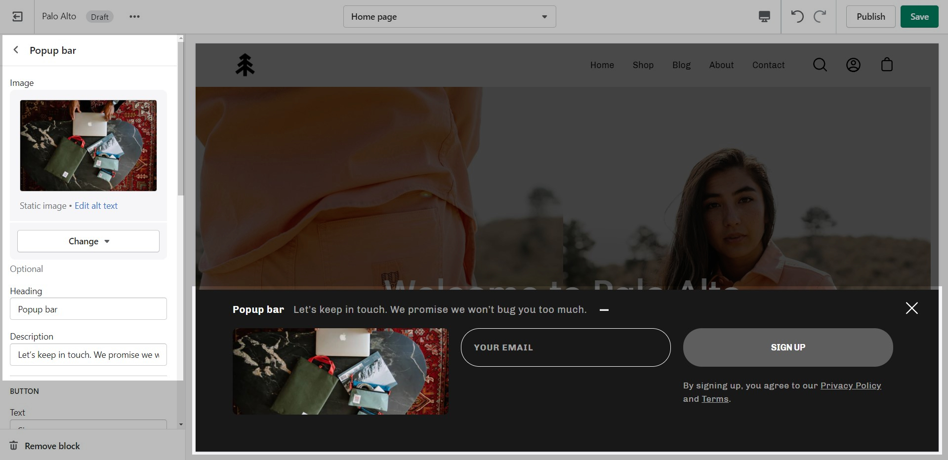
The "By signing up, you agree to our Privacy Policy and Terms." text is there to show your customers quick links to some of your legal pages:
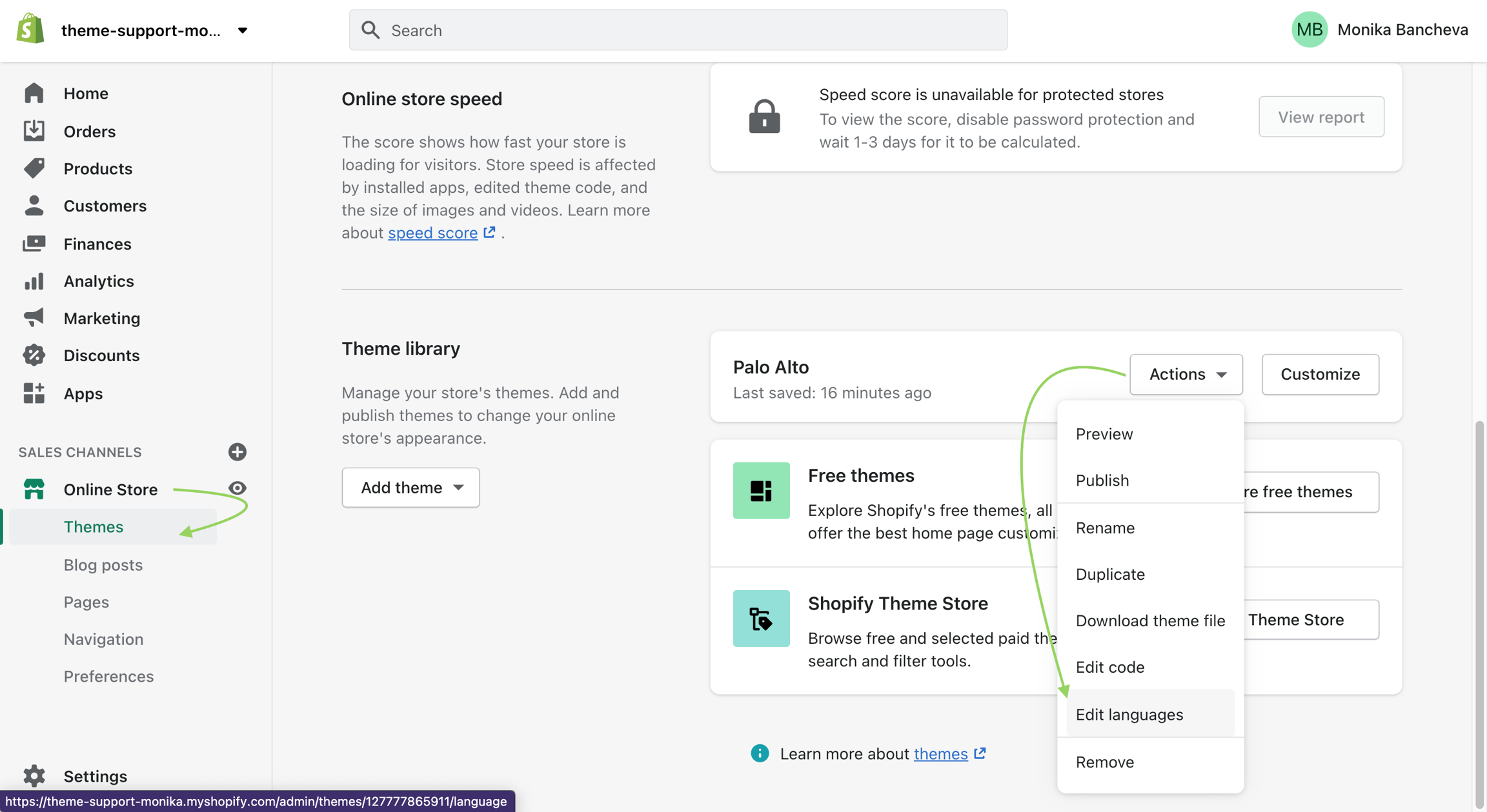
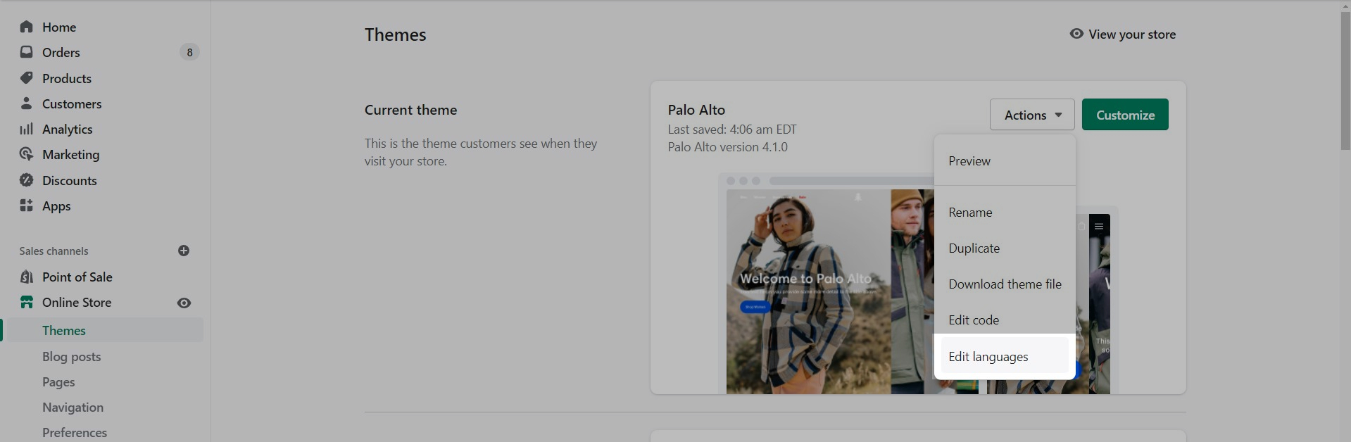
To change the text you need to access the Language Editor under Online Store > Themes > Actions > Edit Languages
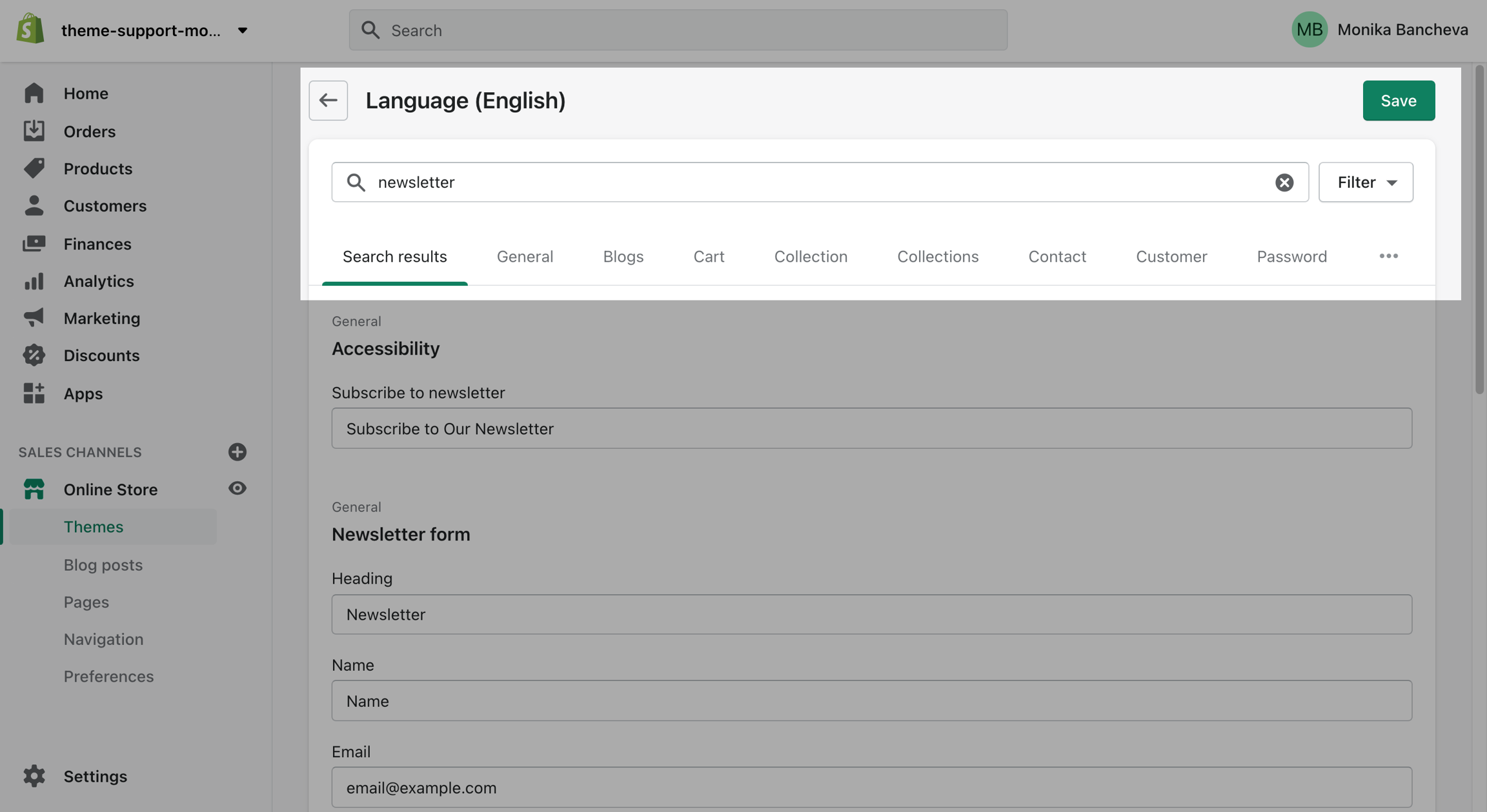
Type "newsletter" into the search bar and edit all of the text related to this block:
Finally, scroll down and change the text:
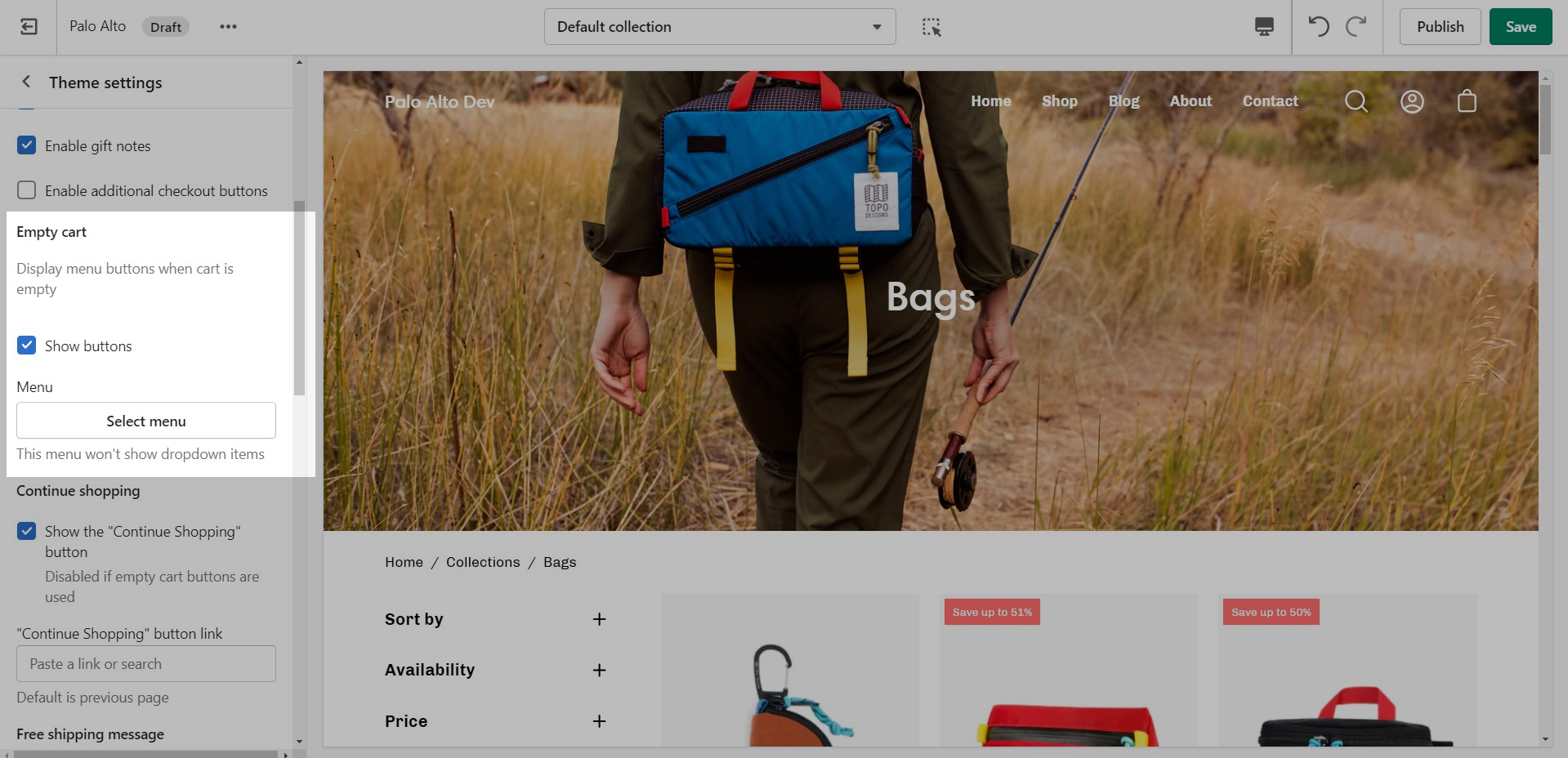
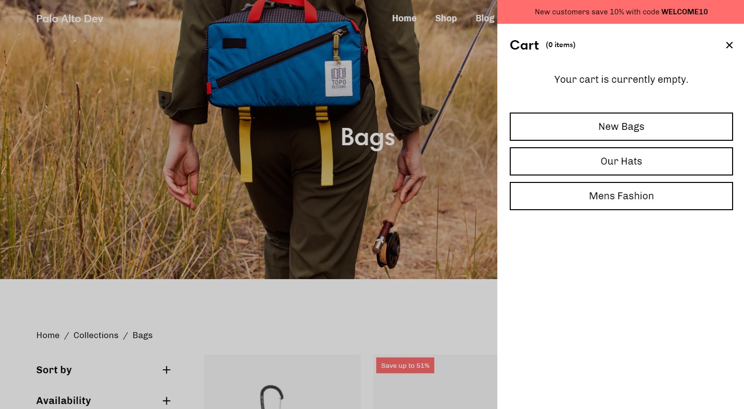
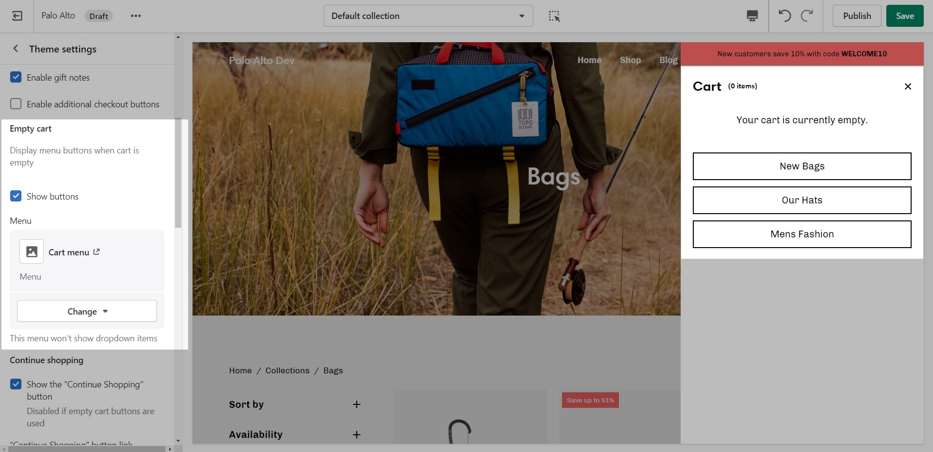
In Palo Alto, you have the option to show up to three upsell buttons when the cart is empty.
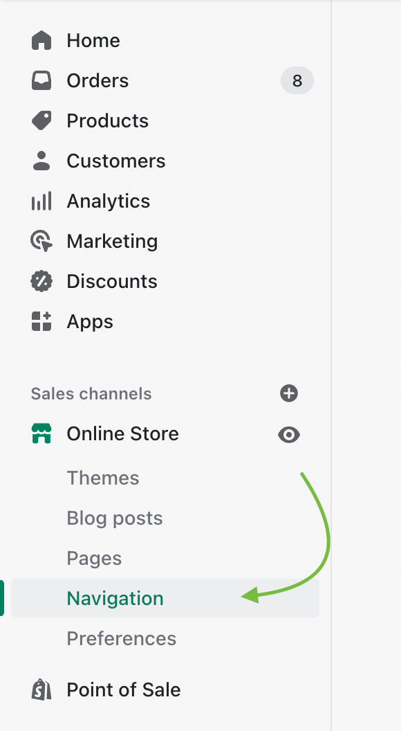
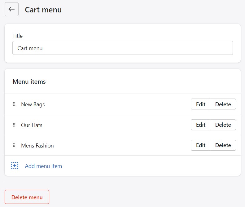
To set this up you need to first create a new navigation menu. Start by heading over to your Online Store > Navigation and clicking on 'Add menu':
You can give it any name you want, we will call ours 'Cart menu':
Note: You can only show up to three buttons so you should only add up to three links in your menu.
Lastly, you need to open up the Theme Editor and click on Theme Settings > Cart:
Under Empty cart click on 'Select menu' and choose the menu you just created:
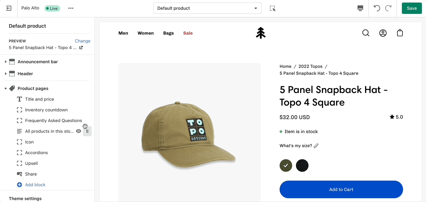
Settings and layout options for Product pages
The new Product page sections in our Palo Alto theme are built from the ground up with the new features introduced in Online Store 2.0 in mind. The use of JSON templates allows for dynamic sections to be used to truly customize your product pages to your style.
Accessing the Product pages can be done by opening your Theme Editor and clicking on Products. This will show all of the available product pages in the specific theme copy you are editing.
A big part of the settings can be accessed from the section blocks. They can also be moved around if you're looking to customize the look. You can move blocks the same way you move sections.
Each block has six small dots that you can click and hold to drag and drop them between one another.
Learn more about the individual 'Product pages' section blocks .
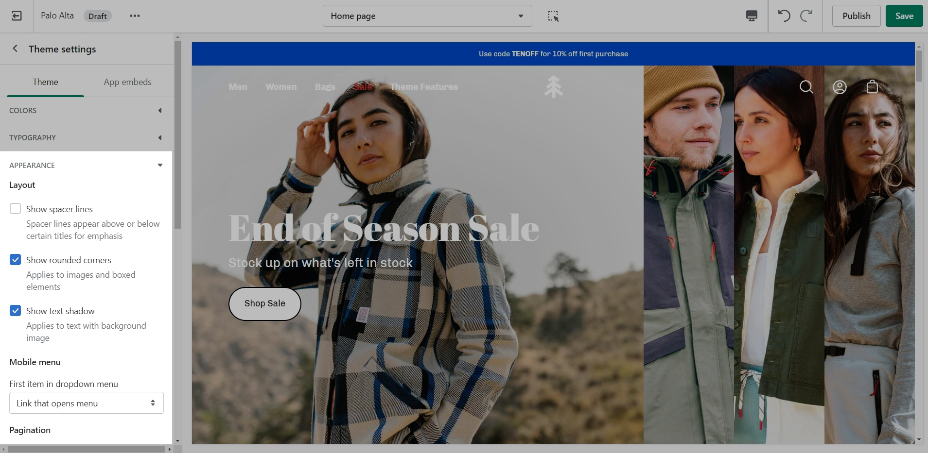
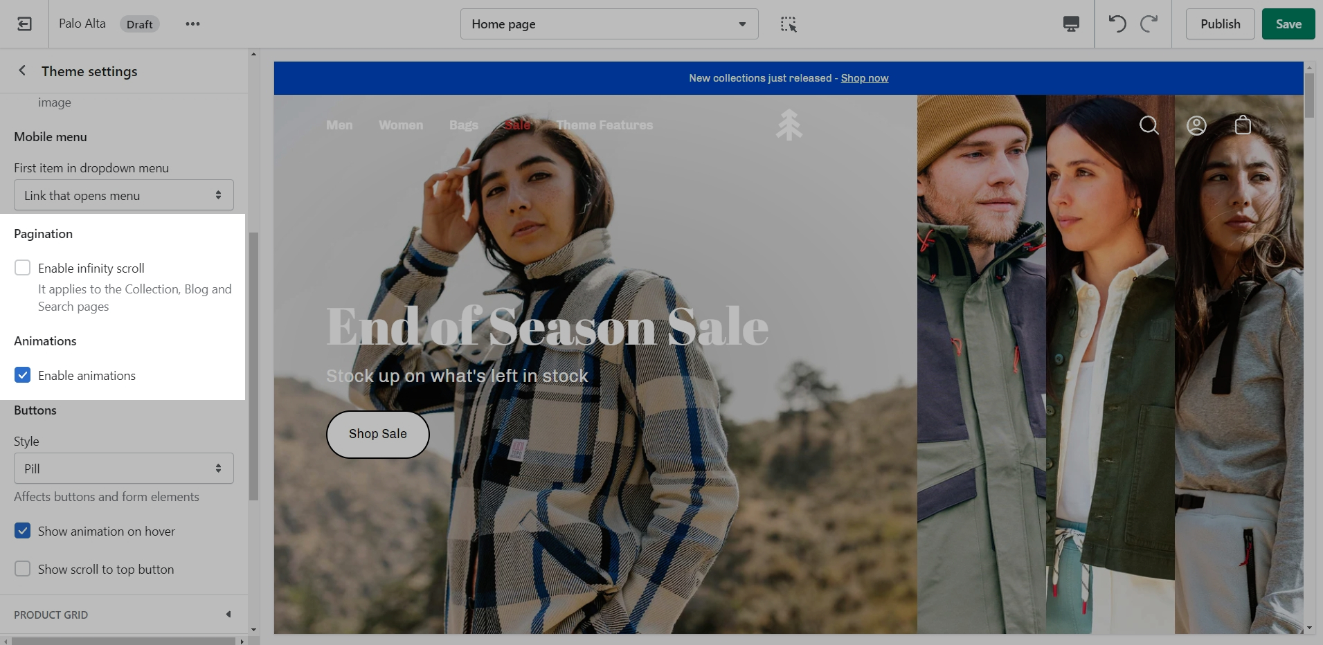
This tab holds miscellaneous settings that can affect small details in your store.
Under Layout, you can enable spacer lines, rounded corners, and text shadow.
In the Mobile menu, you can select to have drop-down items open the menu or to be their own link.
You can toggle Pagination and Animations.
Under Buttons, you can change the style, toggle on-hover animations, and toggle the 'Scroll to top' button.
Documentation for Palo Alto 4.1 and earlier. For the latest version, click here
Introducing Palo Alto, a contemporary designed theme that gives you space to tell your story. Palo Alto is built to support Shopify's Online Store 2.0 and comes complete with easy-to-use sections, plus powerful search capabilities, and quick buying features for mobile and desktop customers.
Discover and learn about Palo Alto with our theme documentation and demo stores. Tell your story, and showcase your brand with our simple-to-use and creative tools.
You can try Palo Alto for free as a draft theme:
If you have questions or need additional assistance with using our Palo Alto theme, our support staff is here to help you by email. Reach us by sending a message to [email protected]
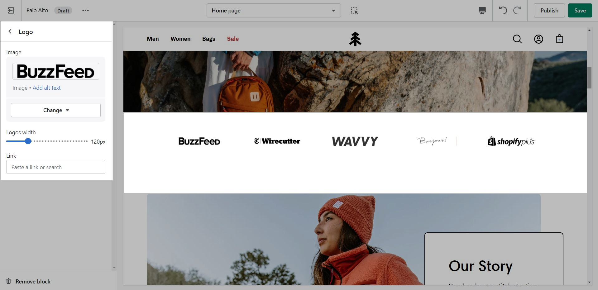
You can upload a logo in place of your store name by opening the Header section settings and uploading a Custom logo:
A separate option is available to help provide better contrast when transparency is used. This is an optional but helpful feature.
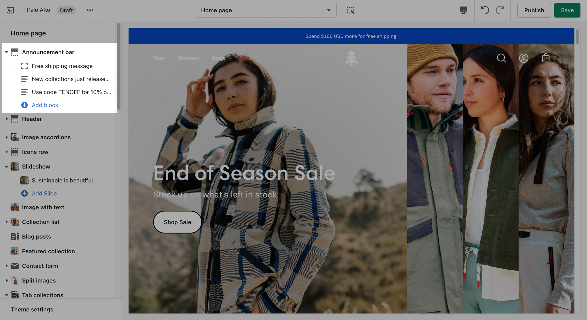
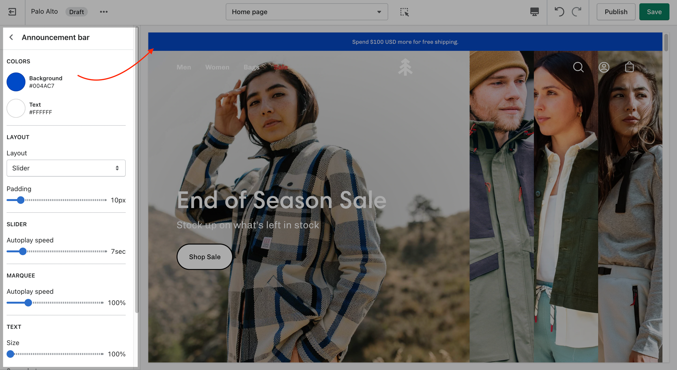
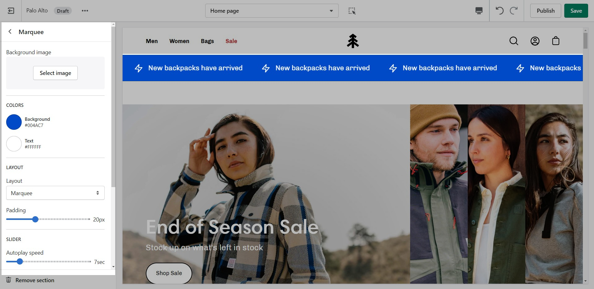
Announcement Bar settings and layout
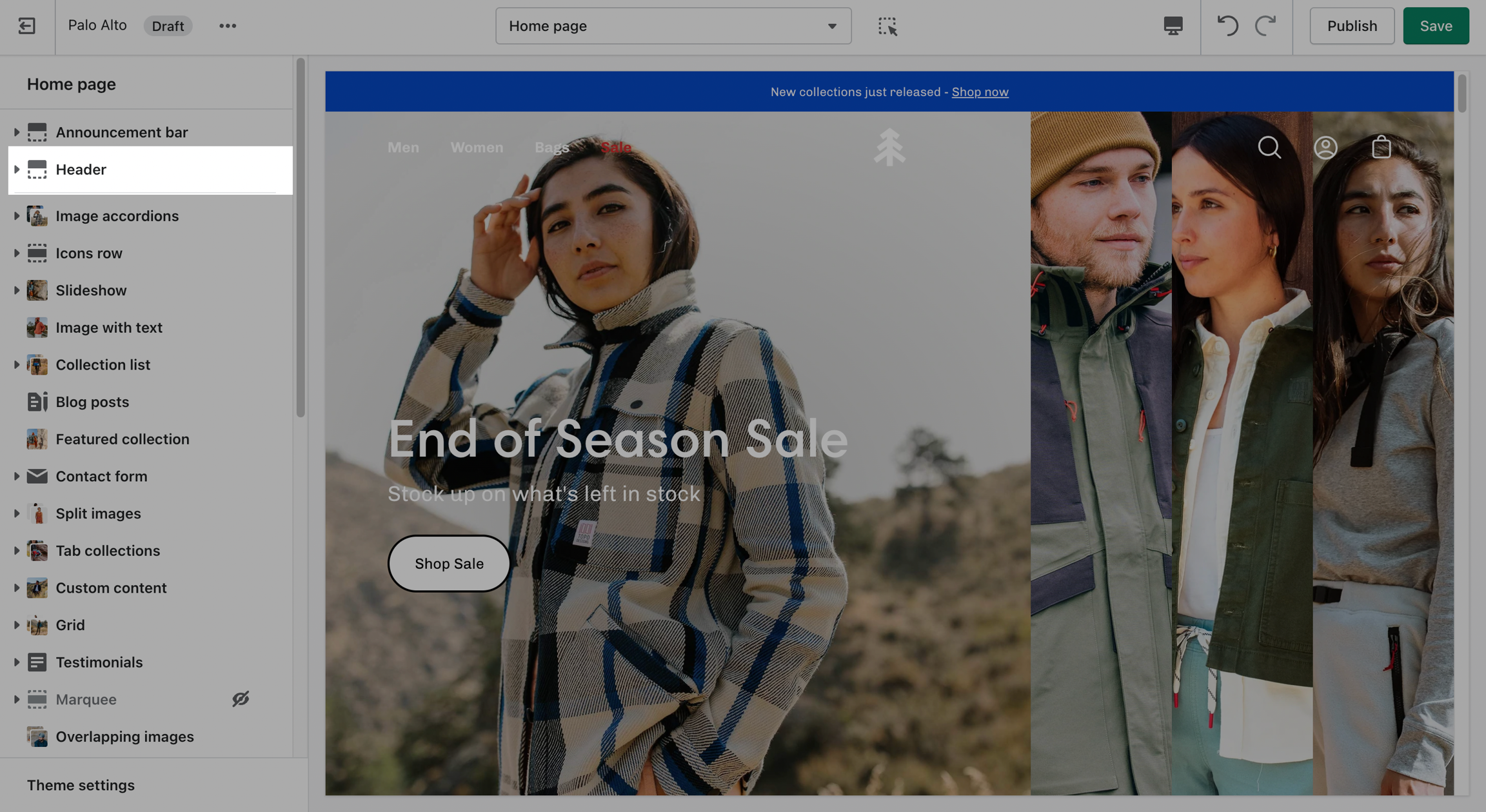
Click on the Announcement bar section to reveal the section settings.
These settings will allow you to change the background and text colors of your Announcement bar section, layout style, and autoplay speed.
Block types:
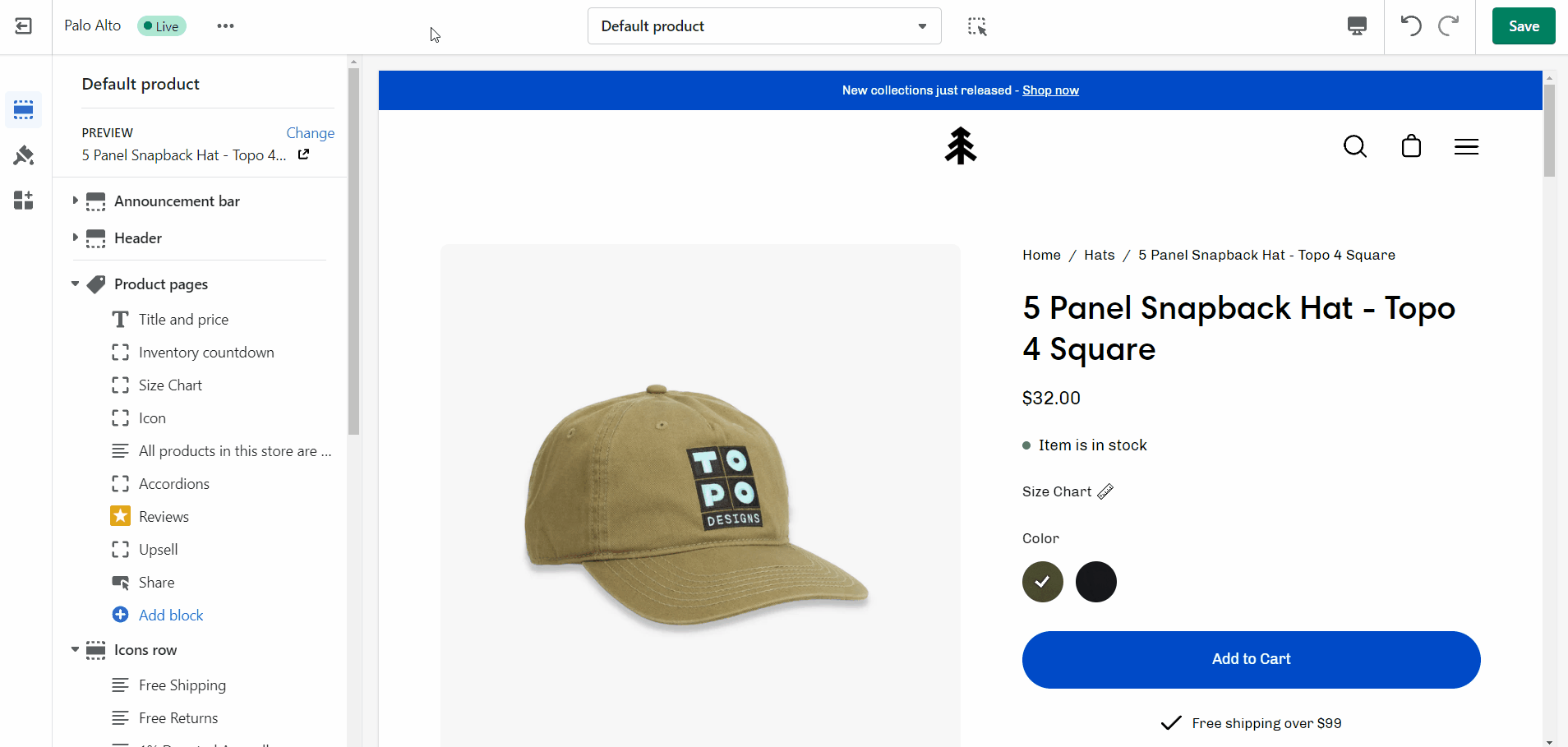
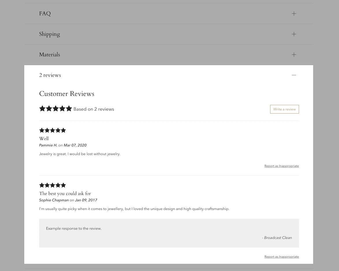
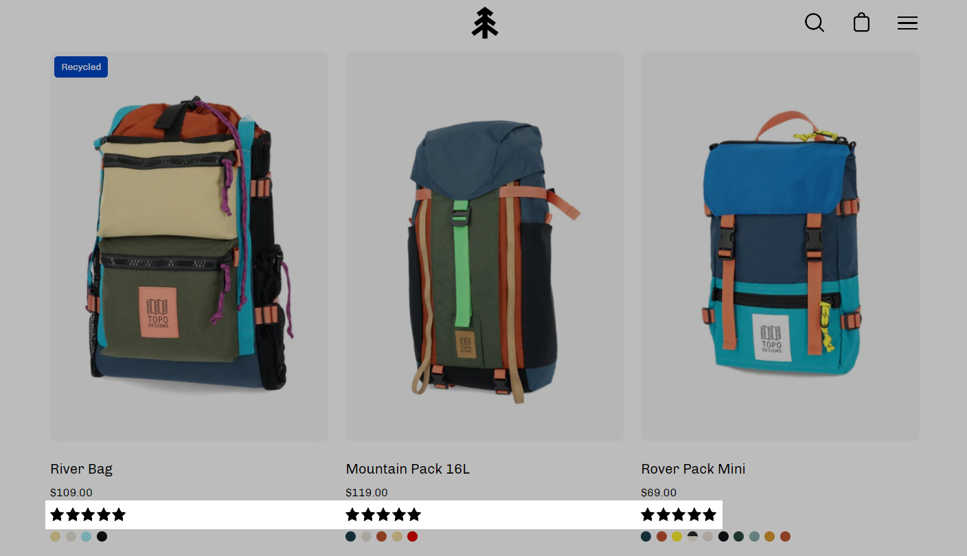
Display options for Product Reviews app within Palo Alto
Palo Alto has built-in support for Shopify's Product Reviews app. Star ratings can be shown throughout the theme. Here are some examples:
Product Detail page
Star and average rating value next to product name:
Individual reviews and forms to add a new review can be shown with Palo Alto's accordions or separate below the product description:
Collection page and Product Grid sections
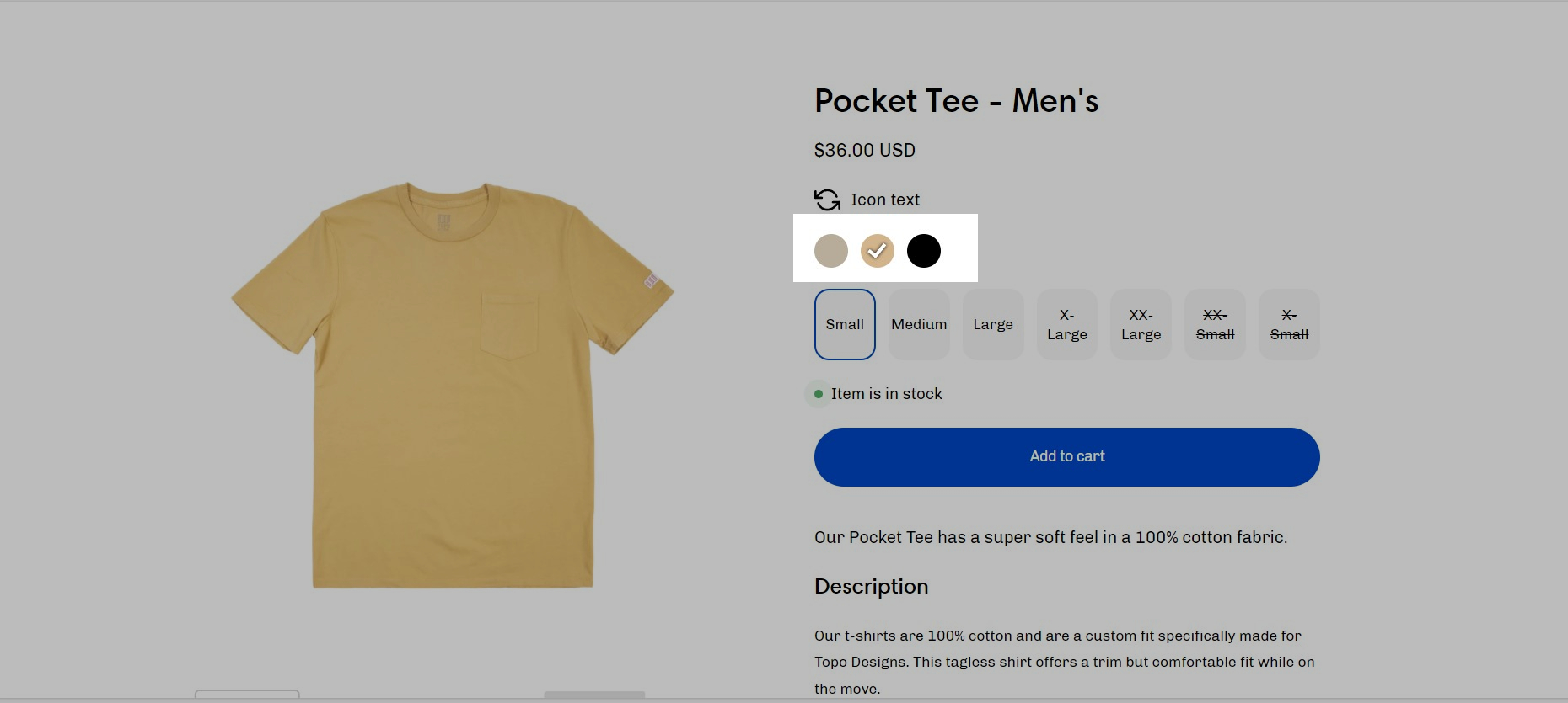
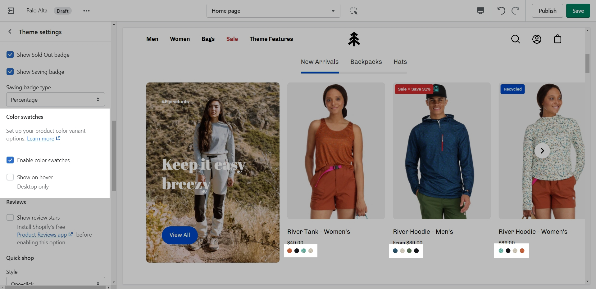
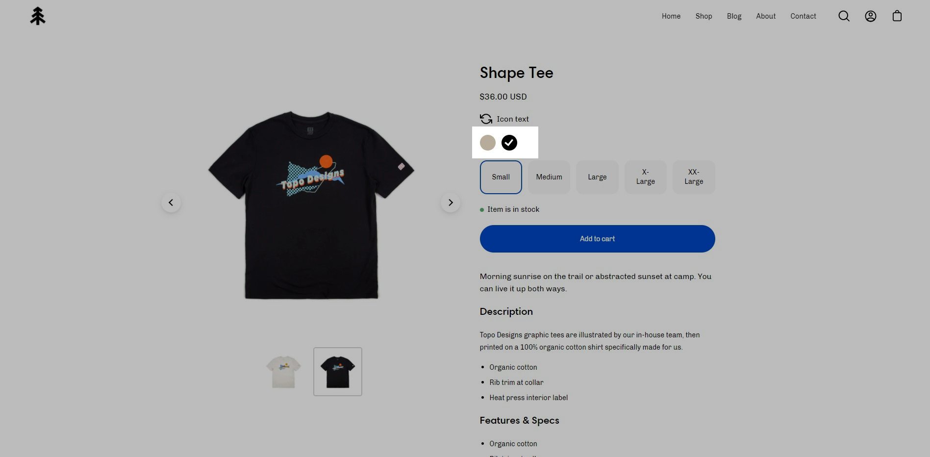
Palo Alto will display swatches for color variants in collection filtering and the product form on product pages.
Palo Alto will detect if your variant label is Color or Colour and automatically display swatches
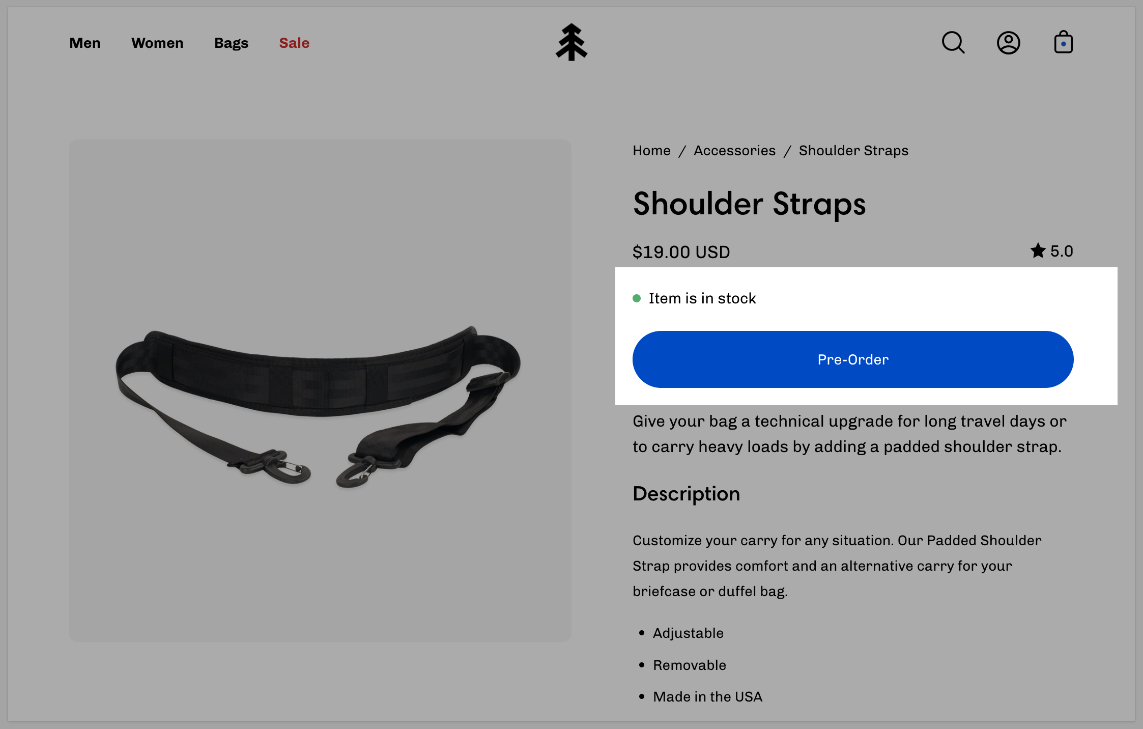
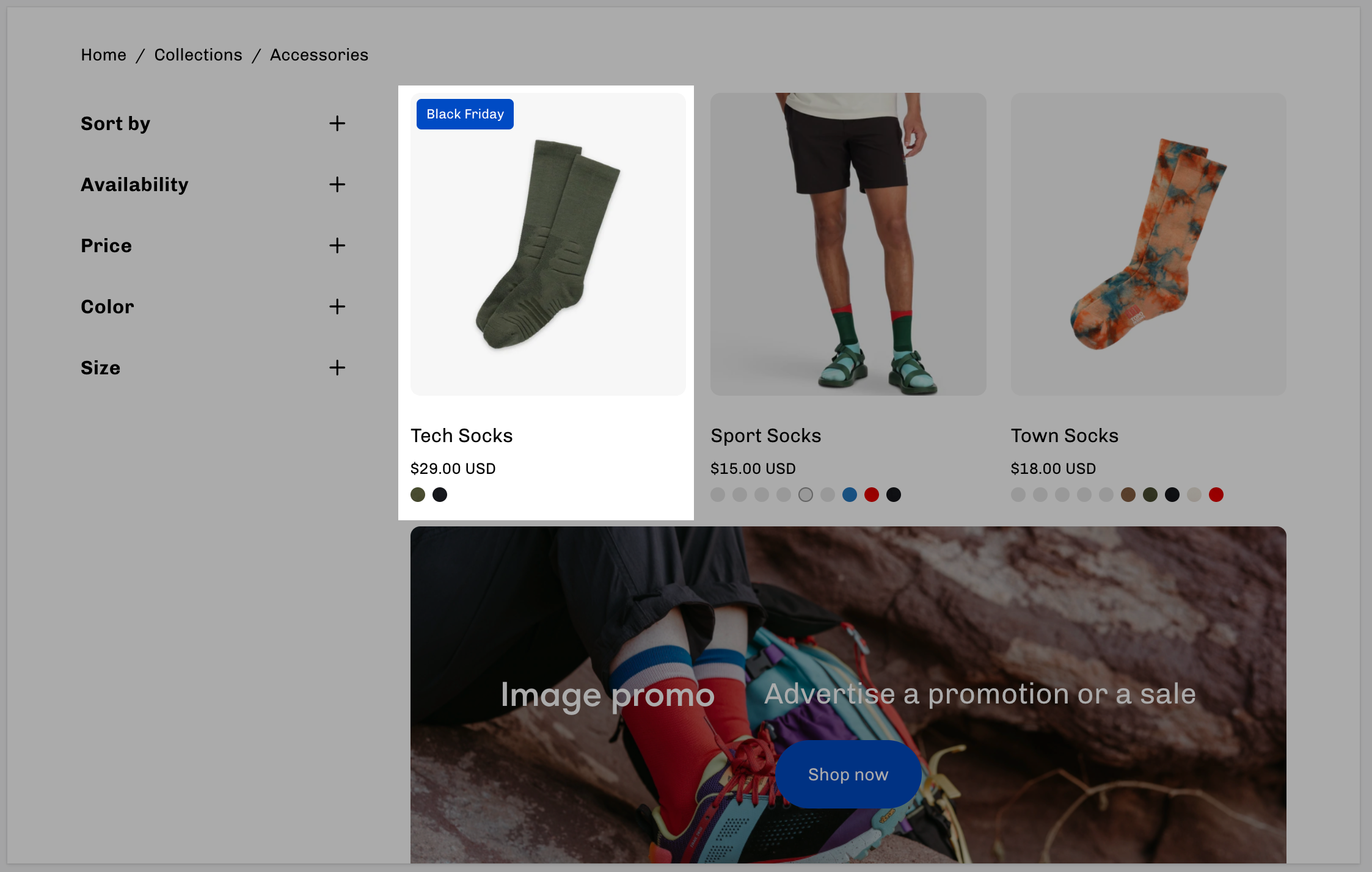
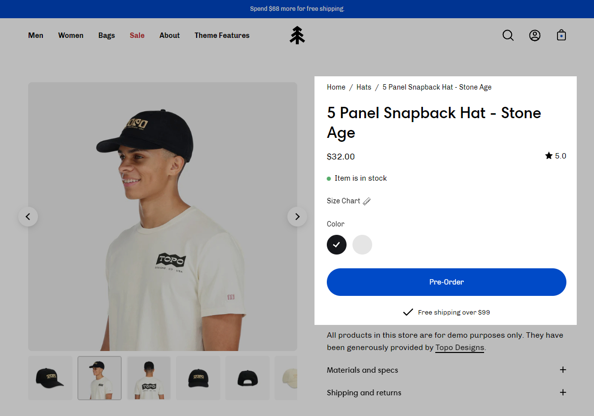
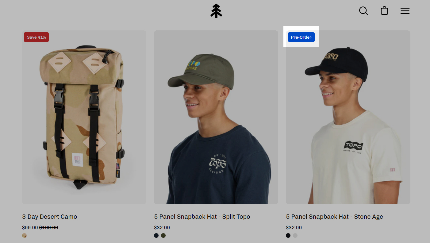
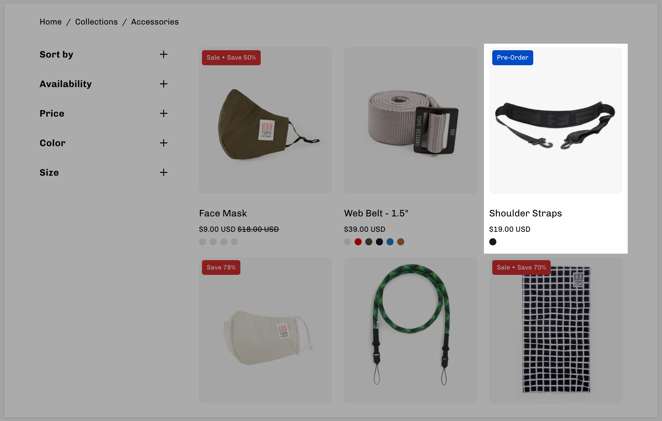
Replace the 'Add to Cart' button with a 'Pre-Order' button using metafields
Palo Alto supports metafields for creating pre-order products. When you define a preorder metafield, you can easily toggle on or off the preorder feature which converts the 'Add to Cart' button to a 'Pre-Order' button.
On the main product page, the Add to Cart button is replaced with a Pre-order button:
When viewing a collection page or any product grid-style section, a 'Pre-Order' badge is added to the product:
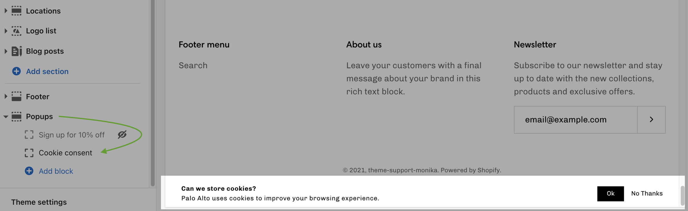
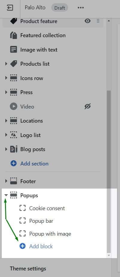
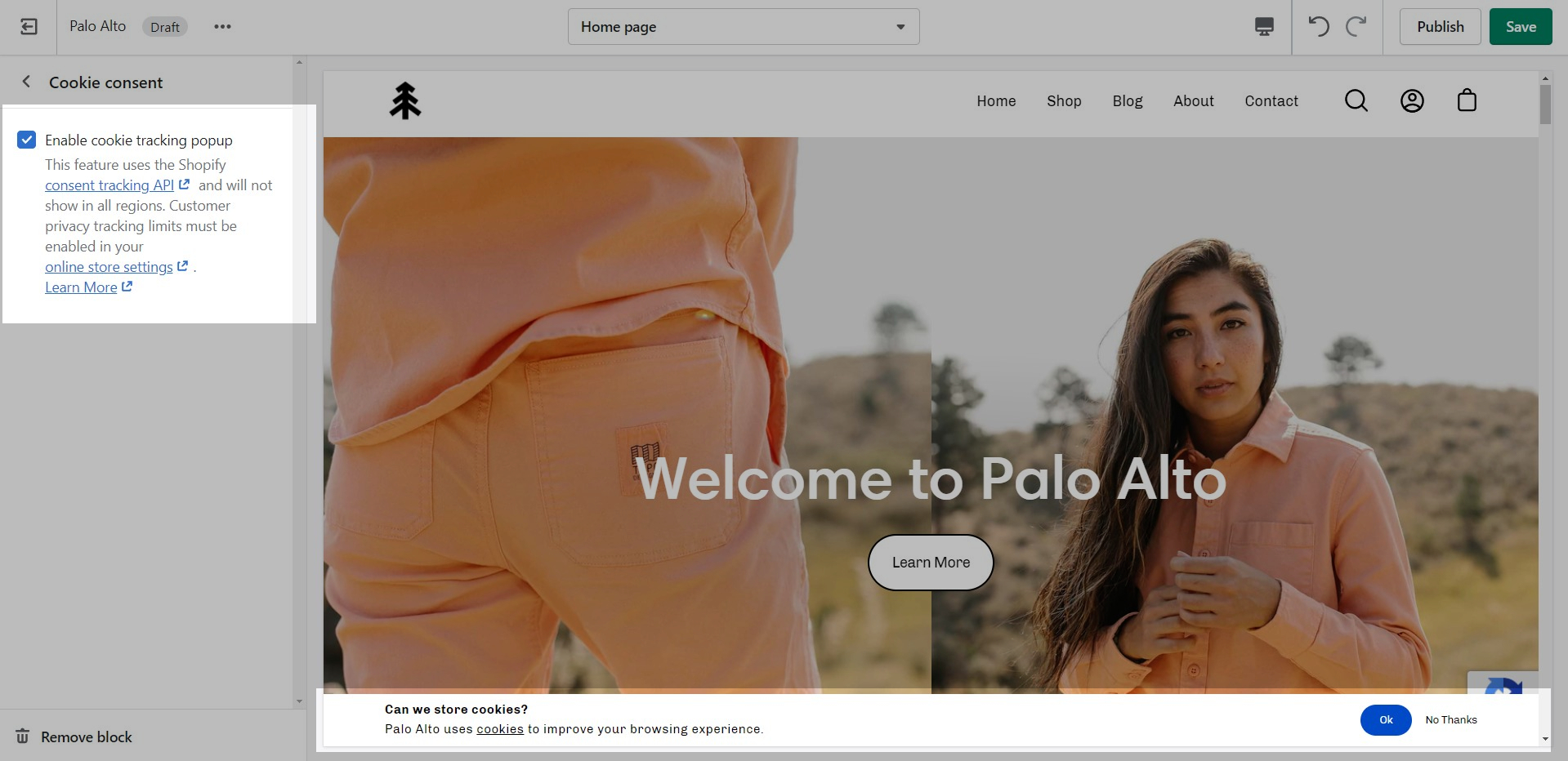
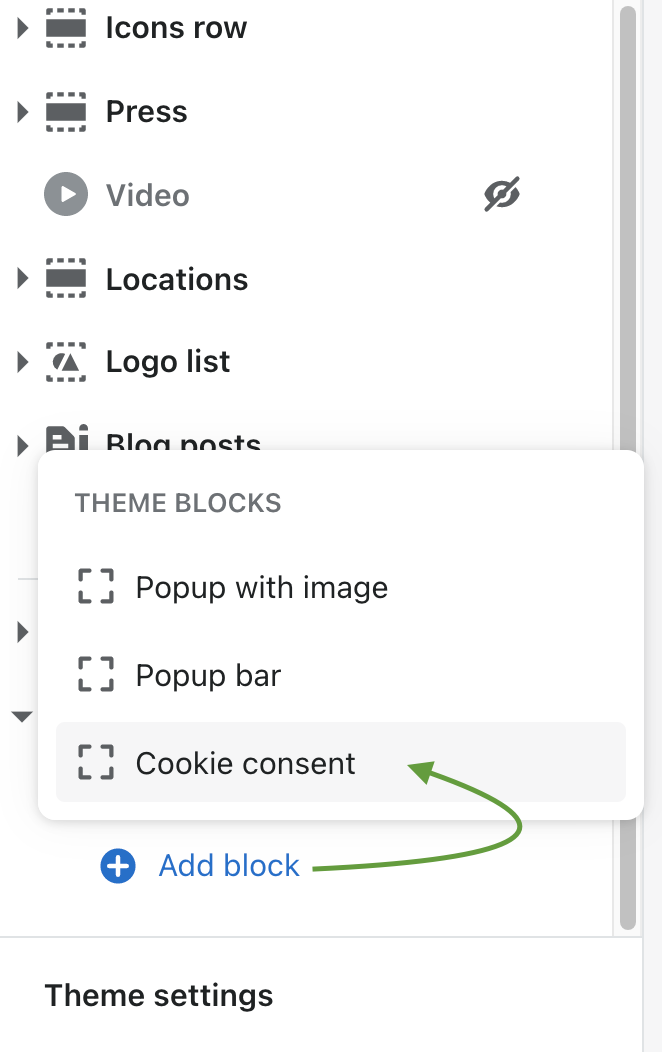
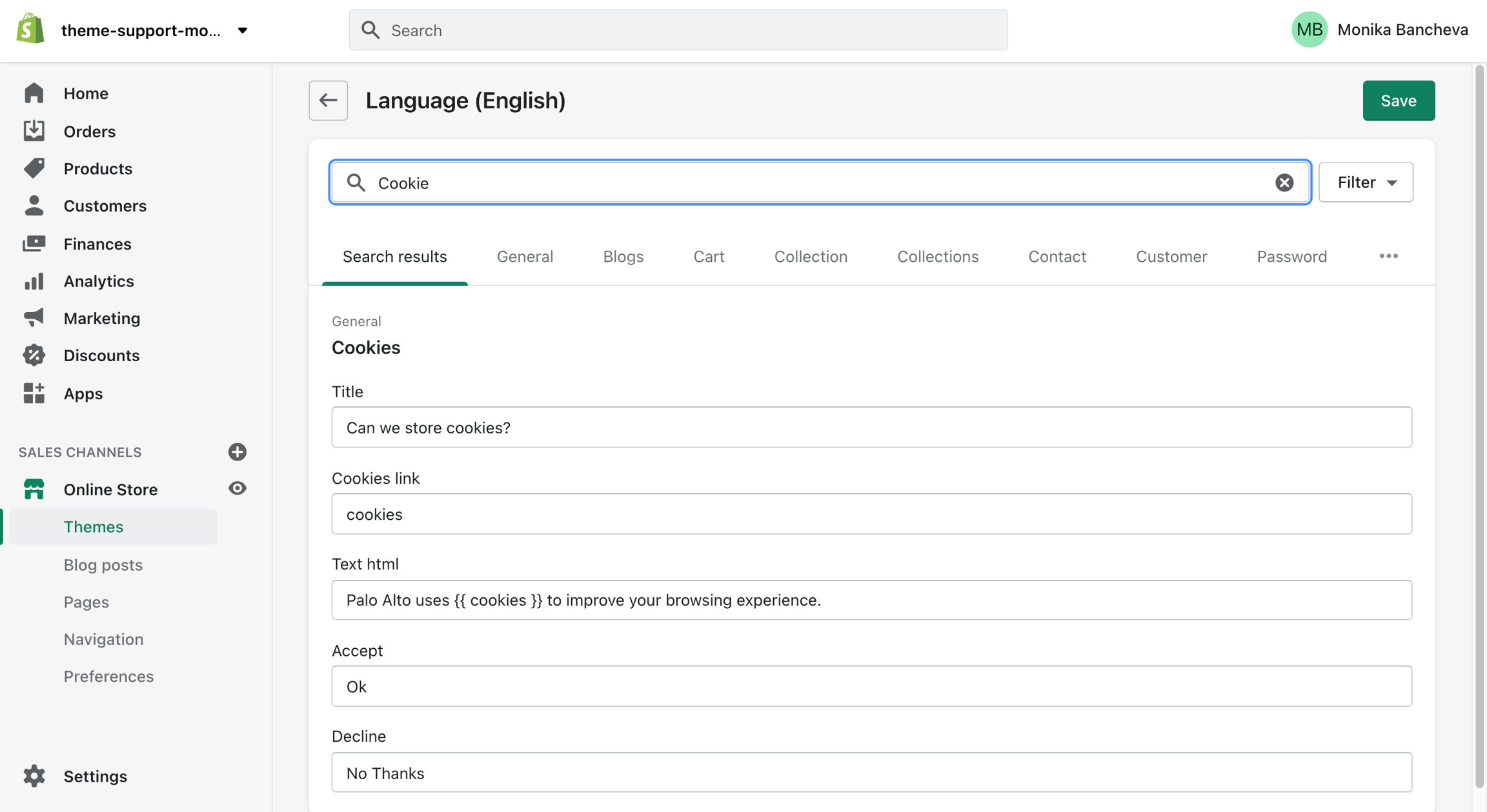
The "Cookie consent" popup is the perfect way to add a cookies popup notification to your storefront. It contains the options to include a header, message, link to your privacy page and an accept button.
Please note: Presidio Creative cannot guarantee compliance with GDPR, or compliance with any other regulations related to cookies.
Blog pages are meant to be a simple assortment of articles but who's to say you shouldn't customize them?
The blog pages section holds a handful of settings but they can be quite important. These settings can be accessed by first navigating to the blog page you're looking to edit.
Palo Alto displays a rich grid of all your blog post articles. Click on
Setting up a Mega Menu for your header
A Mega Menu is a stylized submenu that allows you to also add an image to your navigation. It can be used to put more links together and group them in a form of subcategories.
The Mega Menu in Palo Alto 4.1.0 works automatically based on two criteria:
1 - If there is an Image
How to check the current version of your Palo Alto theme copy
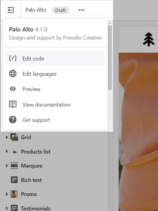
To check the version of your current copy of the Palo Alto theme, click on the ellipses (three dots) icon at the top of the Theme Editor to view theme actions including the version number.
You can also click on the small arrow next to this section to expand it and show its blocks. This will allow you to access each block to change its text and link.
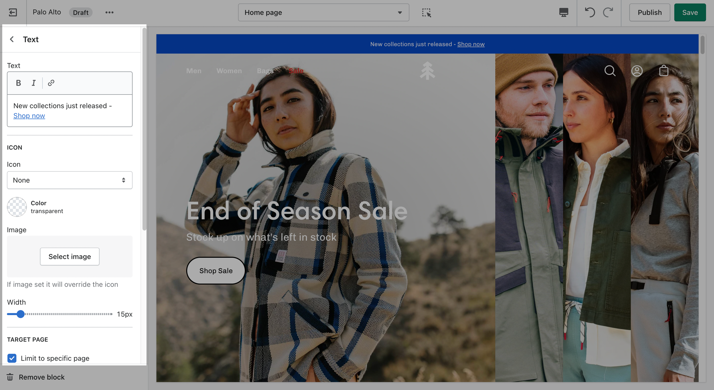
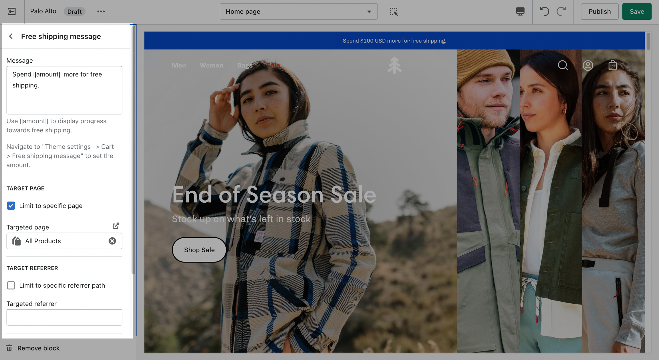
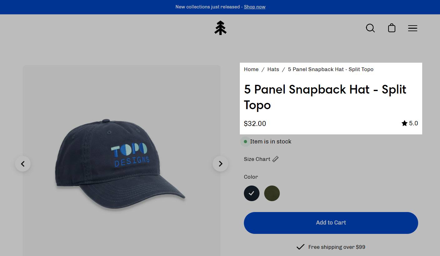
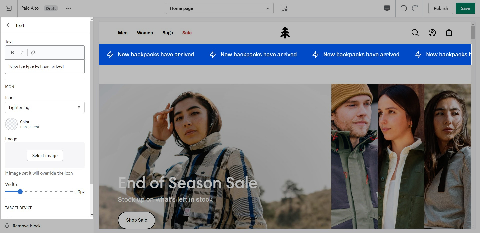
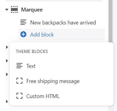
Add single or multiple text announcement bars with links to promote your offers:
Use this block to encourage add-on sales and increased quantities.
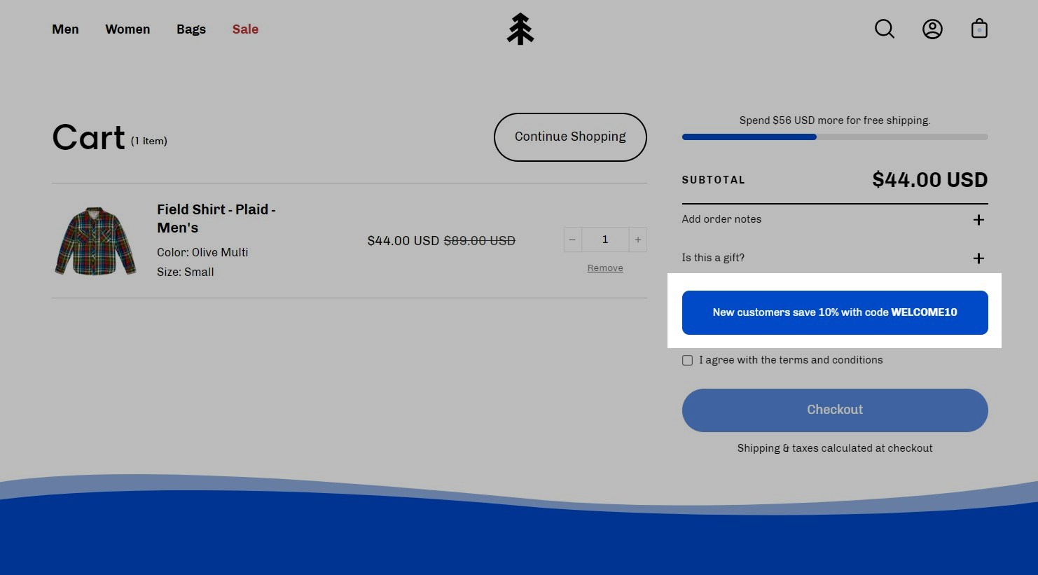
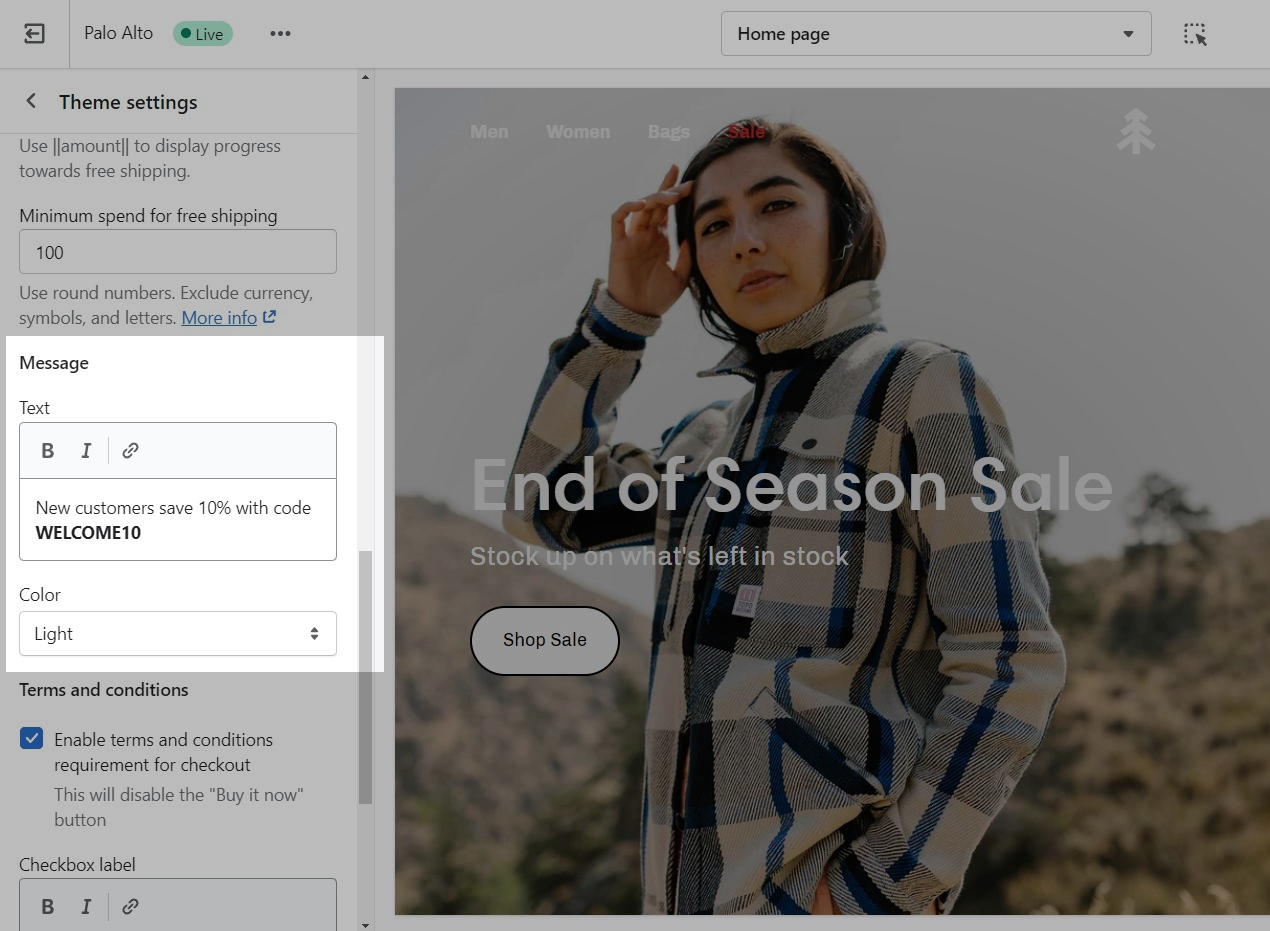
Modify the message text as needed. Keep the || amount || custom short-code to reference your set value from the Cart settings.
Build custom announcement messages and use targeting options to provide complete customization for your promotions.
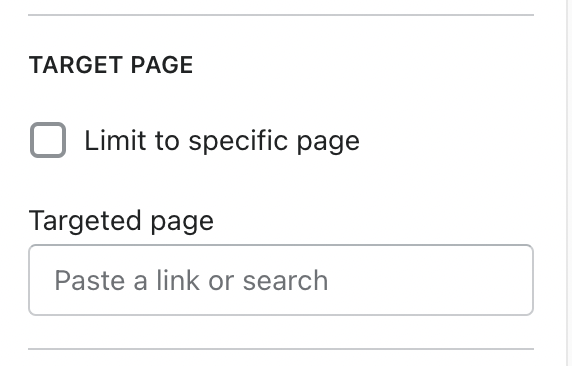
Display custom announcement messages to your customers only when the customer is browsing a certain page, product, collection, or blog post on your site. Target your message based on where customers are browsing on your site:
Create a different announcement bar with custom messages for various pages of your site.
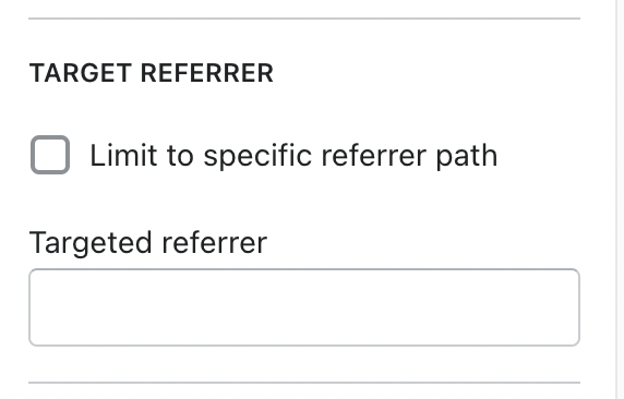
Target a specific audience by using Target Referrer. Your announcement bar will only appear when the customer arrives at your site from a certain path or location.
Enable when running a promotion on another site.
Use to provide a custom message related to the source promotion
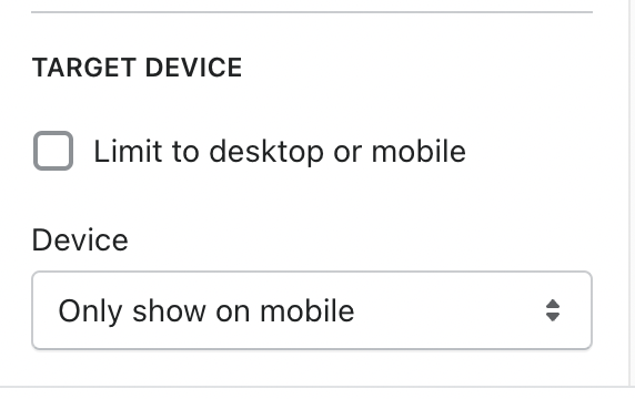
Target only certain devices or create a custom announcement bar message for mobile devices and another for desktop browsers.
Enable custom announcement messages for mobile and desktop.
The option to enable this can be found in the Collection pages section under the Theme Settings Tab.
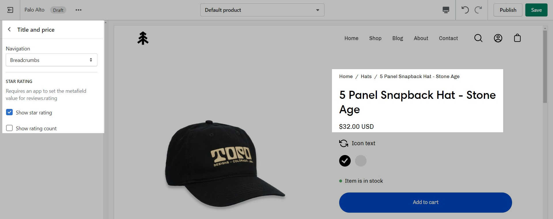
Palo Alto includes quick and easy settings in the Theme Editor to display ratings. The main requirement is that you have the Shopify Reviews app installed:
If you don't have the app installed, use this link to download it.
For the Product Detail page, you can easily add the rating value, star, and the number of ratings from the Title and price block under the Product pages section:
There are checkboxes for the following:
Show star rating - Adds a star icon next to the rating number.
Show rating count - Displays the number of reviews for the current product.
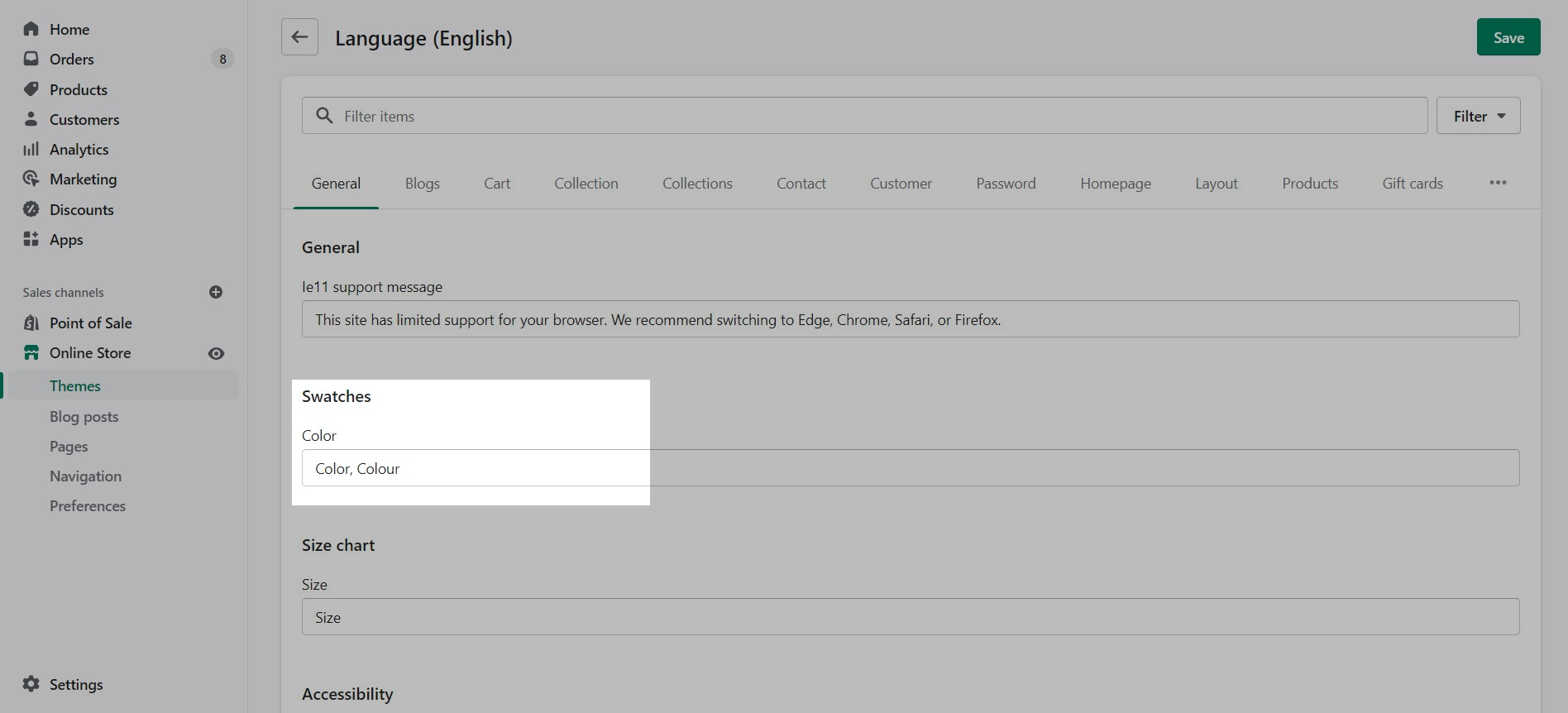
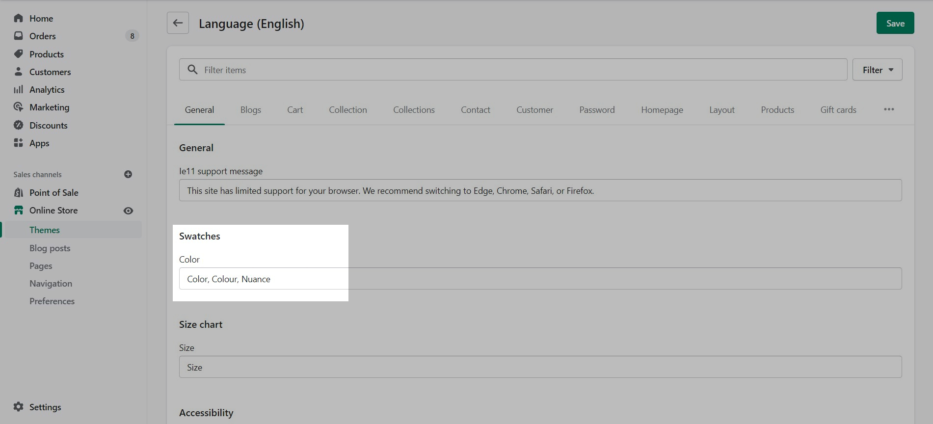
To customize the trigger words which activate swatches, use the Language Editor (Edit languages) and add or modify the values:
You can add more trigger words that will help use swatches for other options.
The result is the same and you can use different custom swatches as well.
Palo Alto can easily detect simple color names and convert them to swatches. There are a total of 140 color names Palo Alto can detect, all other more complex names will be represented by a default grey color swatch. You can upload your own custom color names and graphics as described below. Here is a full list of color names that will automatically be converted to swatches: Color names list
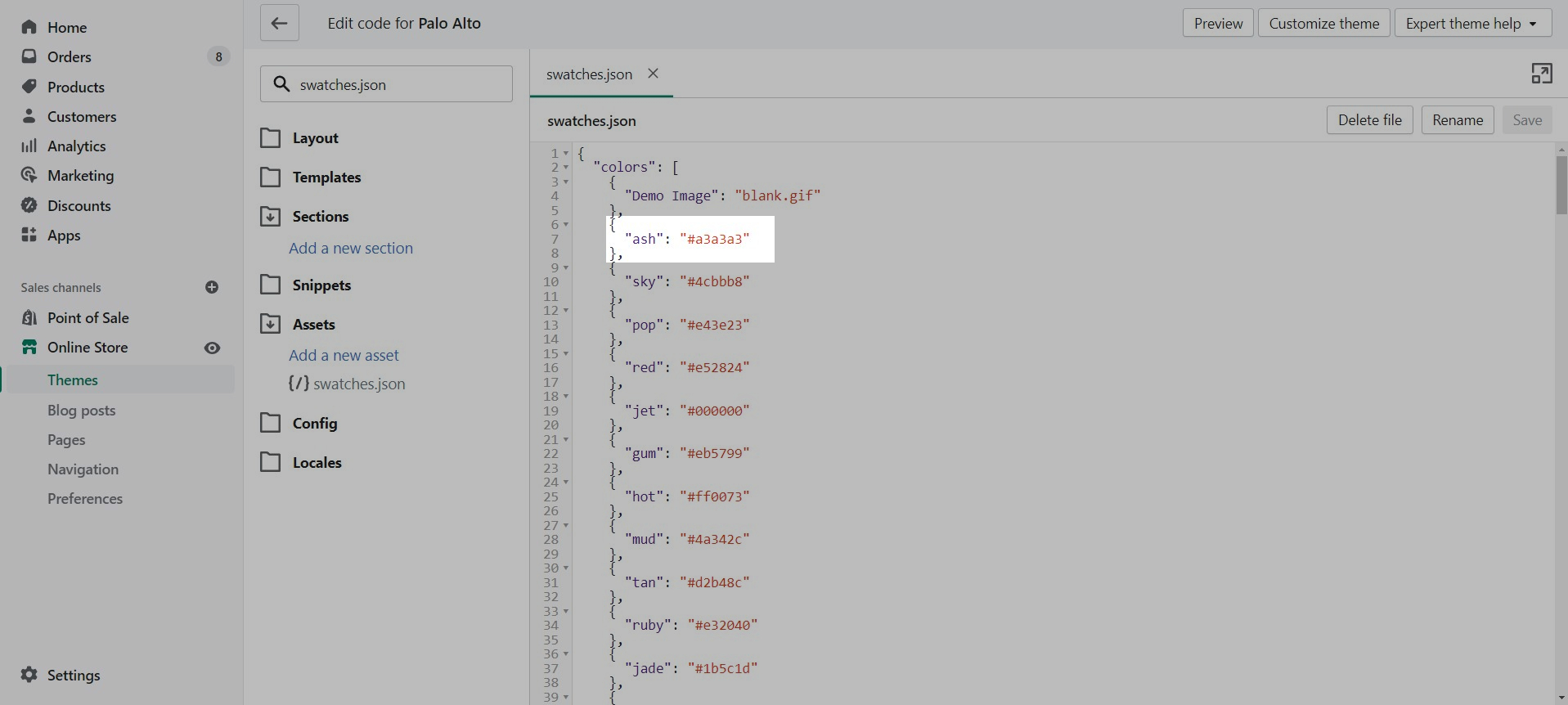
If your products have color names other than the listed colors in the Color names list, you can add your own color names and values or upload images to the Assets folder:
Use the swatches.json file located in the Assets folder to add your own custom names and HEX color values:
To find additional HEX color codes, visit: https://colorhunt.co
With Palo Alto, you can upload your own custom swatch images and display them on product and collection pages:
How to:
Create a small square image (60x60 or 100x100 for best results)
Upload to the Assets folder
Modify swatches.json to include your color name and image
Swatches can be toggled on and off in the Theme settings under Product Grid:
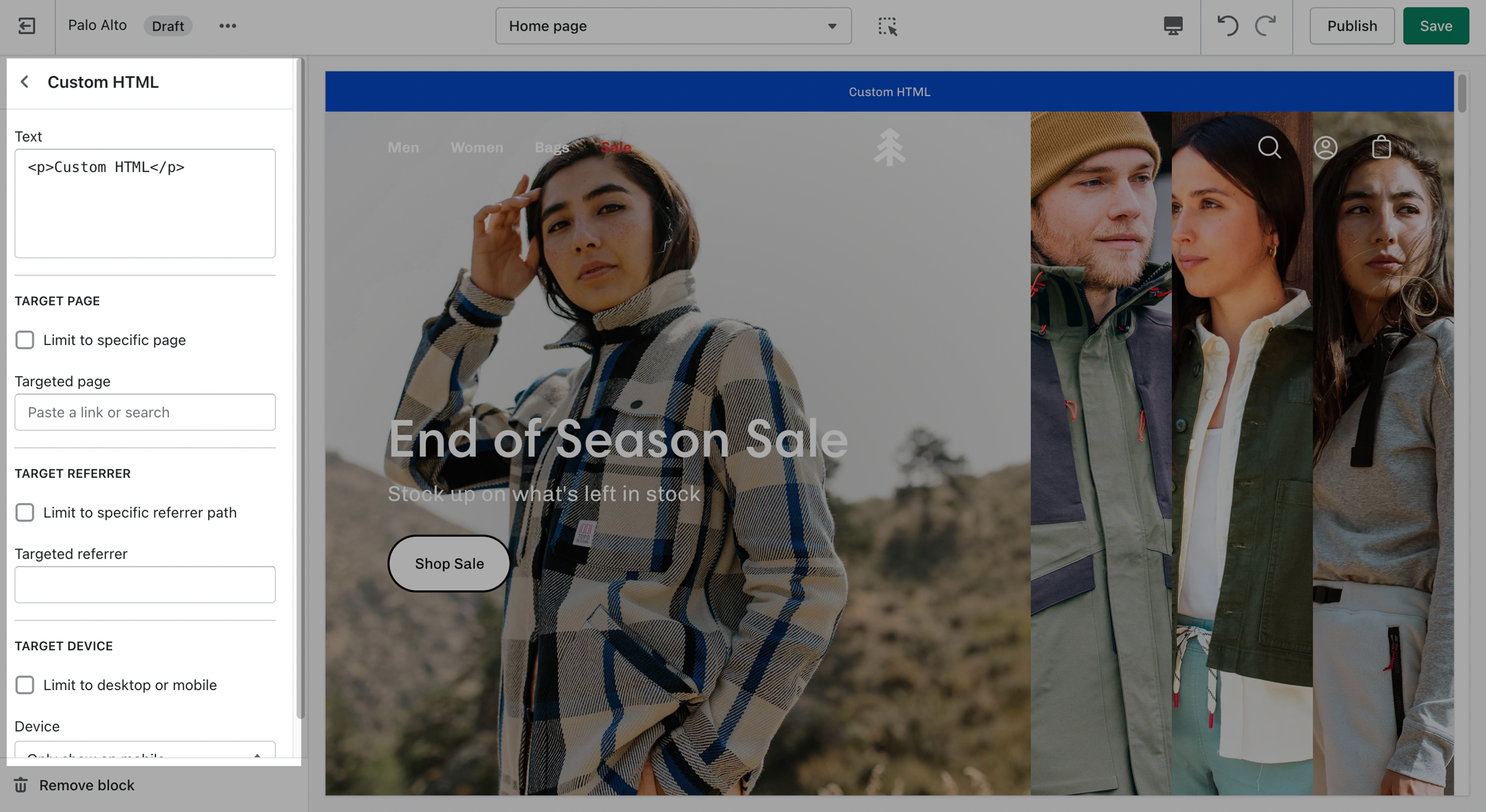
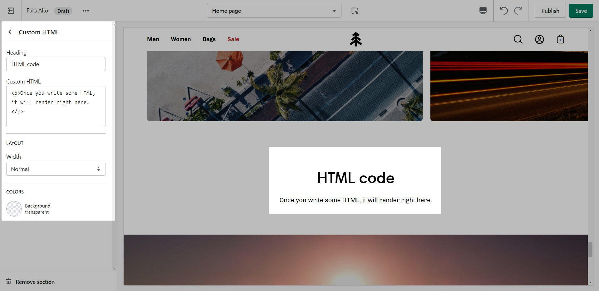
Include custom HTML snippets to create a unique look. Add partner badges via HTML snippets easily to any of your store pages.
Write liquid directly into your store pages without accessing the theme code. This is best used for short liquid snippets.
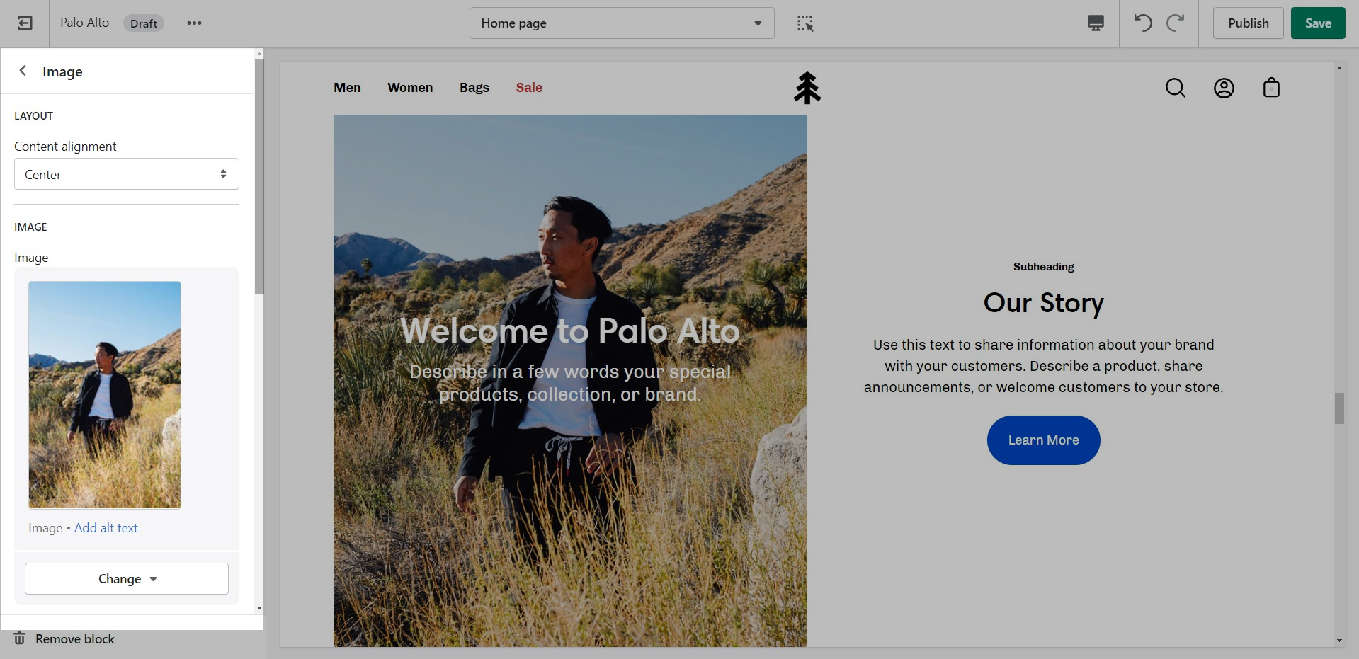
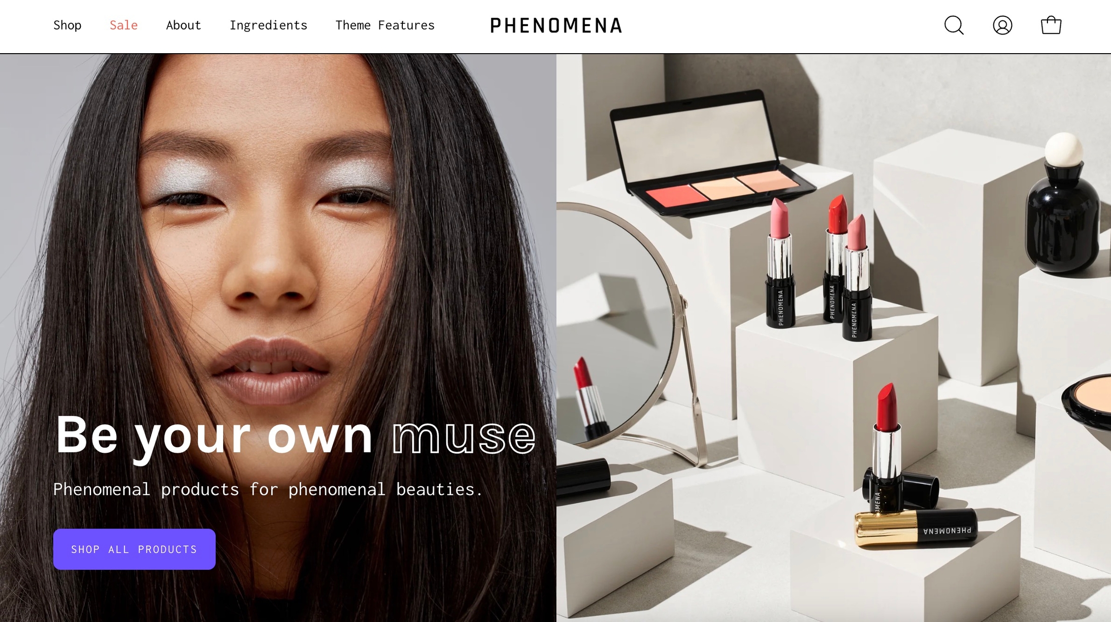
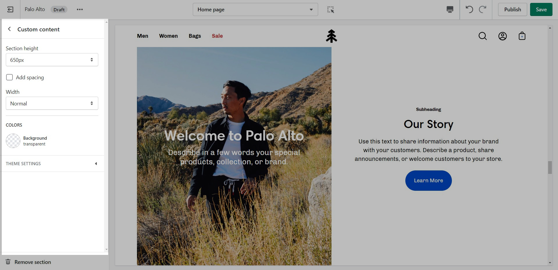
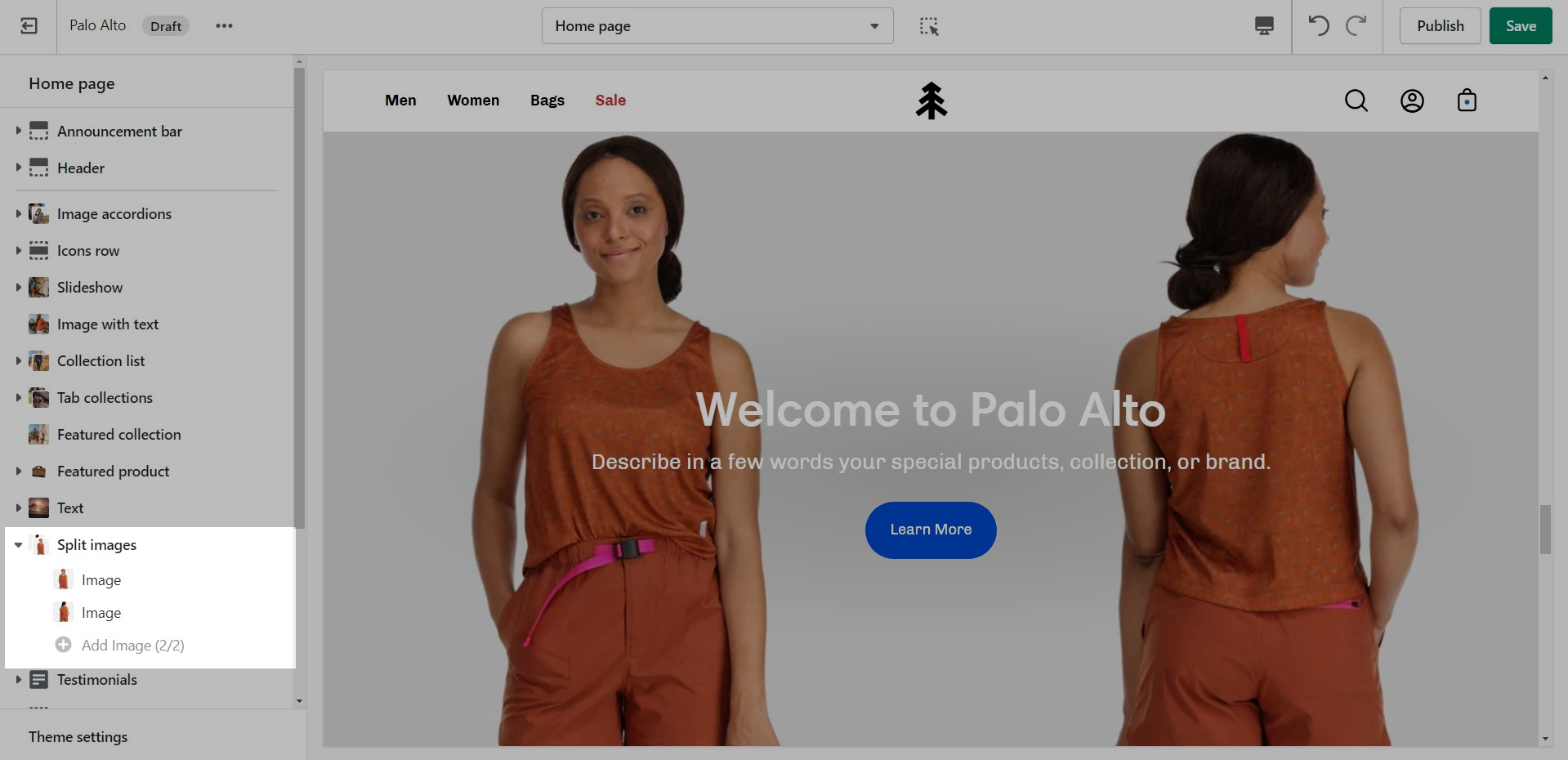
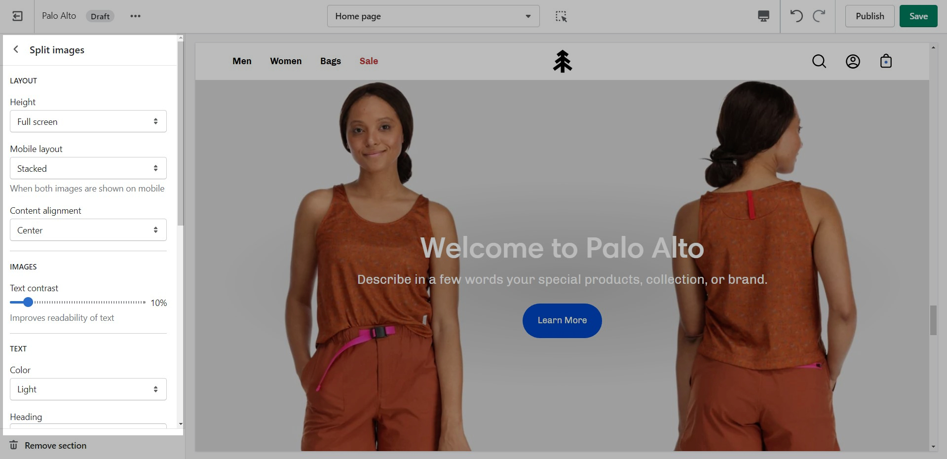
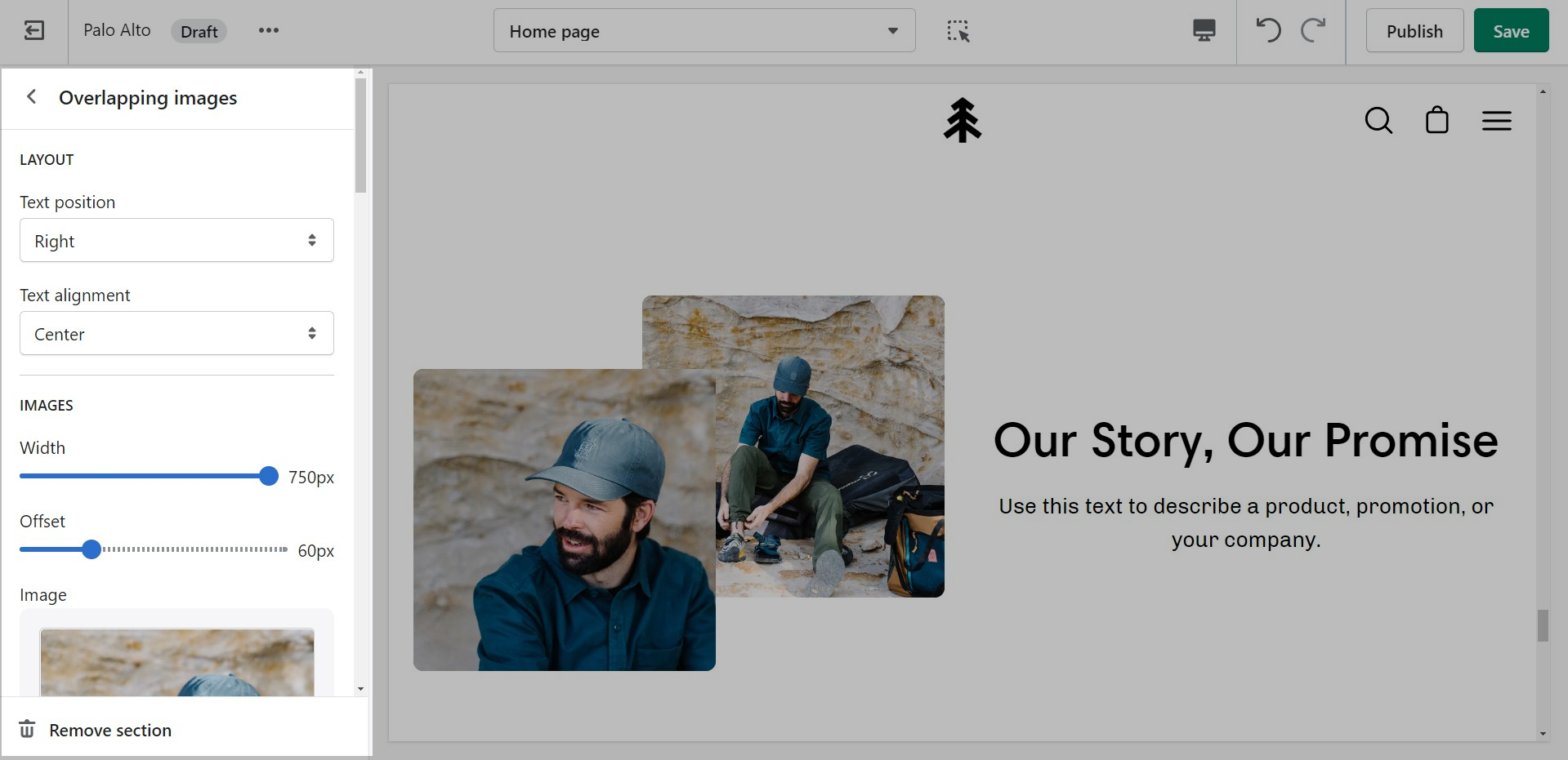
A powerful section that allows for a split view of two unique blocks.
Set the height and color for this section.
This section allows the use of up to two blocks. Add more sections to use more blocks.
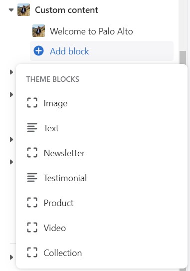
Select two different block types to create a unique layout. The block types are Image, Text, Newsletter, Testimonial, Product, Video, and Collection.
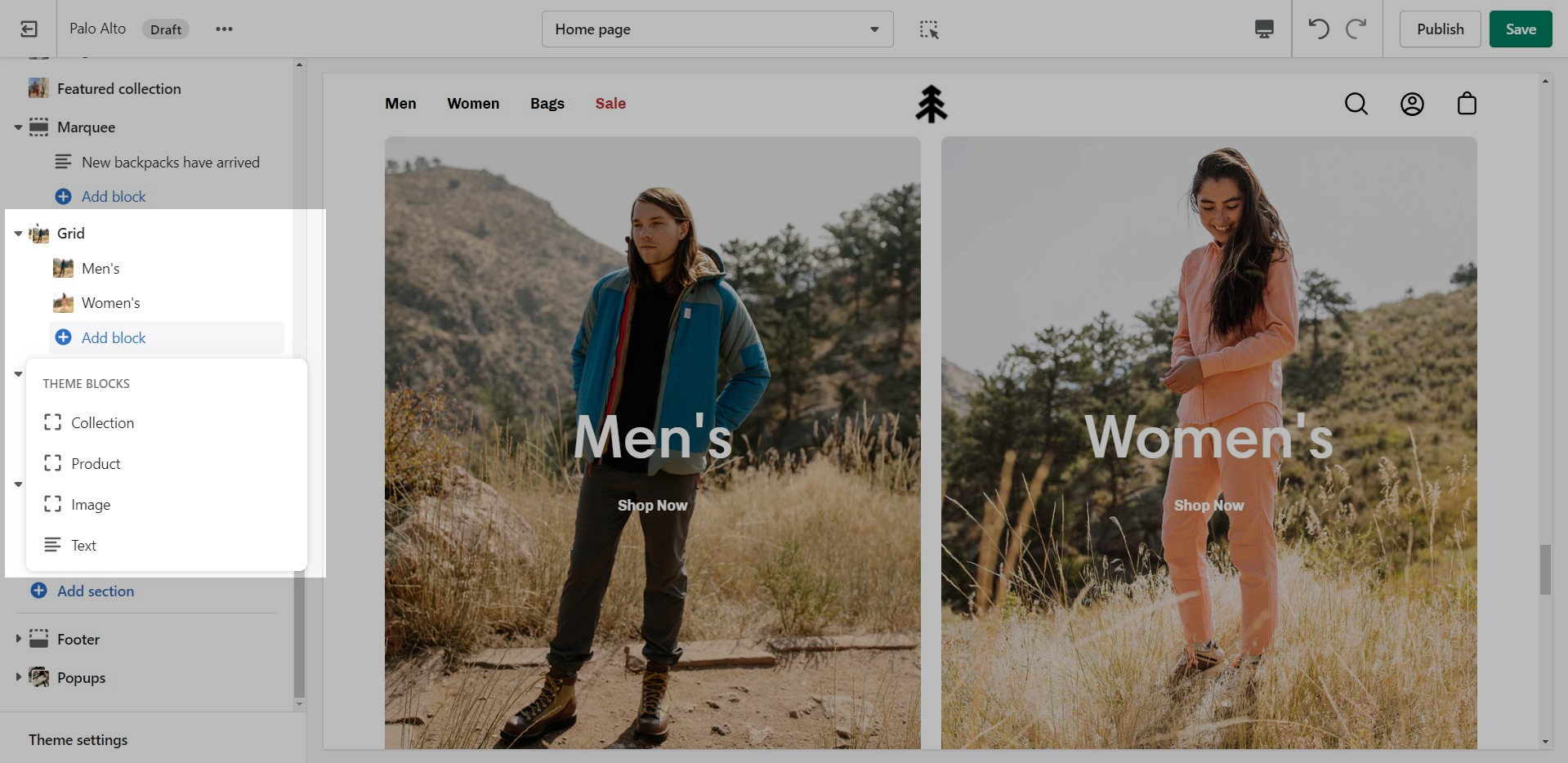
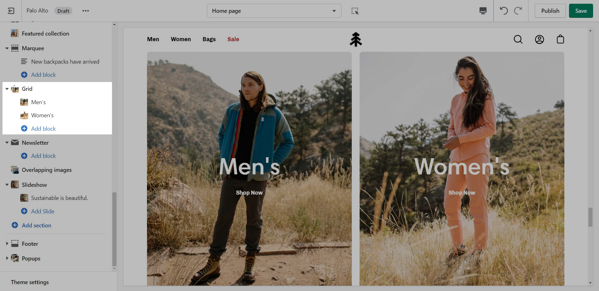
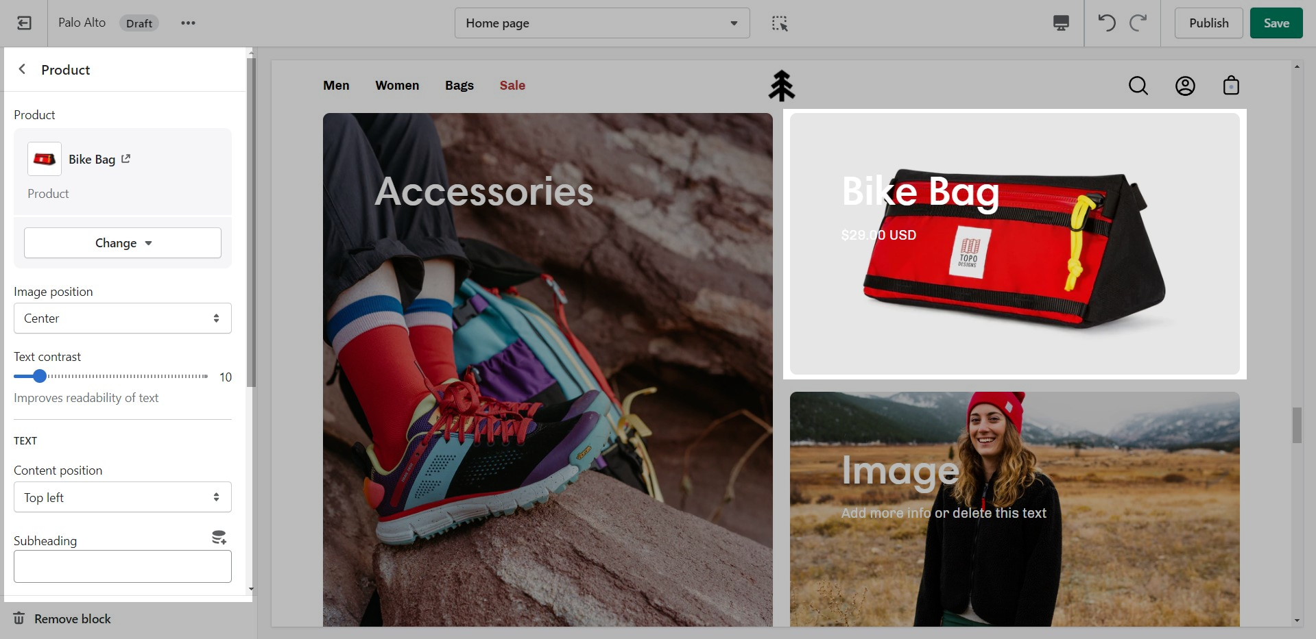
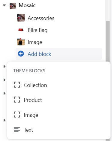
The 'Grid' section allows you to bundle different blocks together to create your own layout. You can add a mix of collections, products, images, and text to make this section your own.
Add blocks by clicking on the small arrow next to the section then clicking 'Add block'.
Note: The Message itself does not generate a promo code. If you plan on using this message in a similar way be sure to set up a promo code first. Click here to learn more about Shopify Promo Codes and Discounts.
The Custom Cart Message is shown in the cart drawer (like in the example above) and in the cart page.
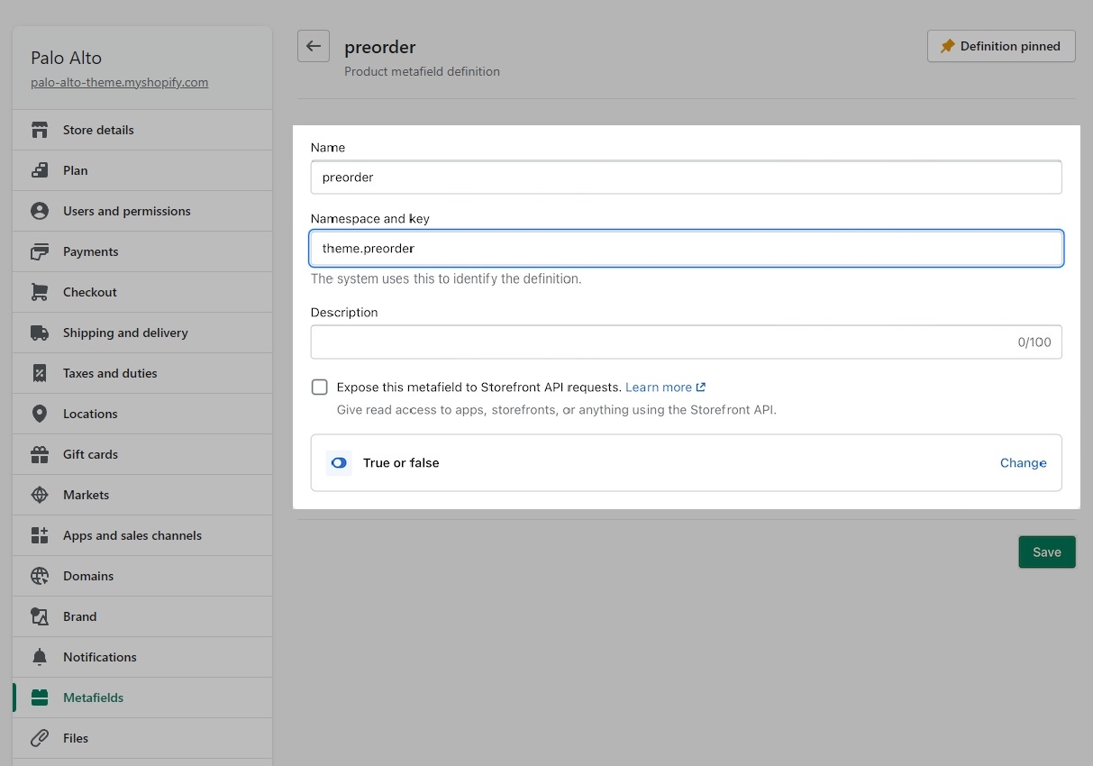
Setting up a preorder metafield is very simple and can be done right in your Shopify Admin.
Create a product metafield with the namespace and key set to theme.preorder. Set the content type to True or false.
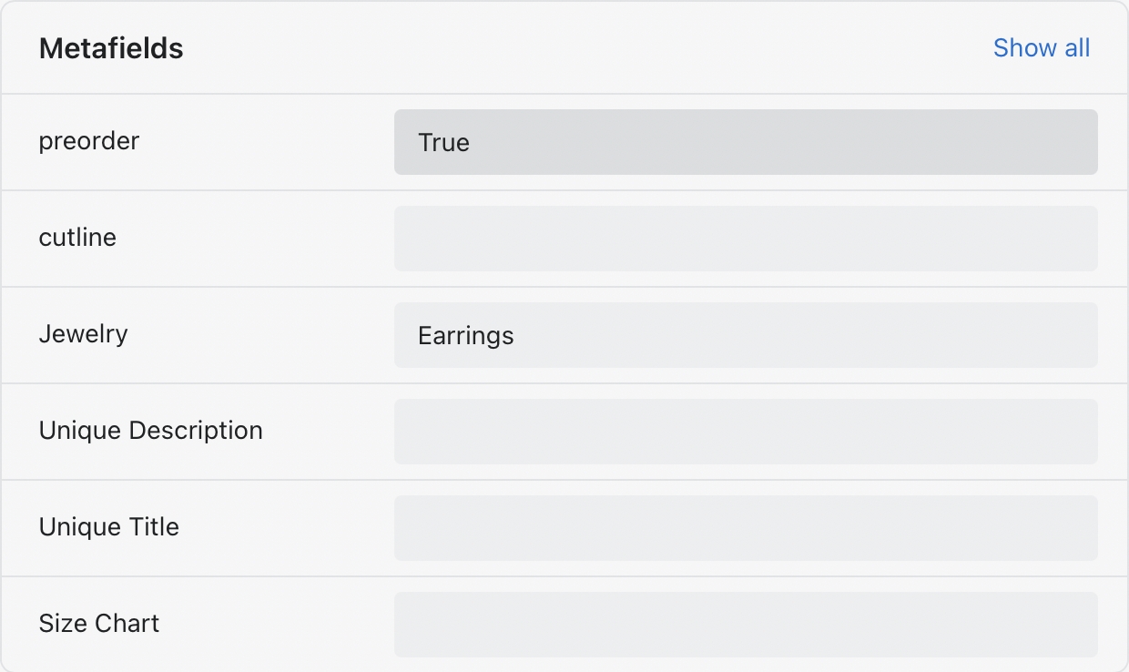
In the Metafields section of any product that you'd like to use the feature, change the preorder value to True:
To remove the Buy it now button, you can create a preorder product template and uncheck 'Show dynamic checkout buttons' under the Form block.
Use the Popups section to enable the "Cookie consent". This is available in the Customizer under Online Store > Themes > Customize > Popups > Cookie consent.
You can also toggle it from the block settings:
To change the text you need to access the Language Editor under Online Store > Themes > Actions > Edit Languages
Type "Cookie" into the search bar and edit all of the text related to this block:
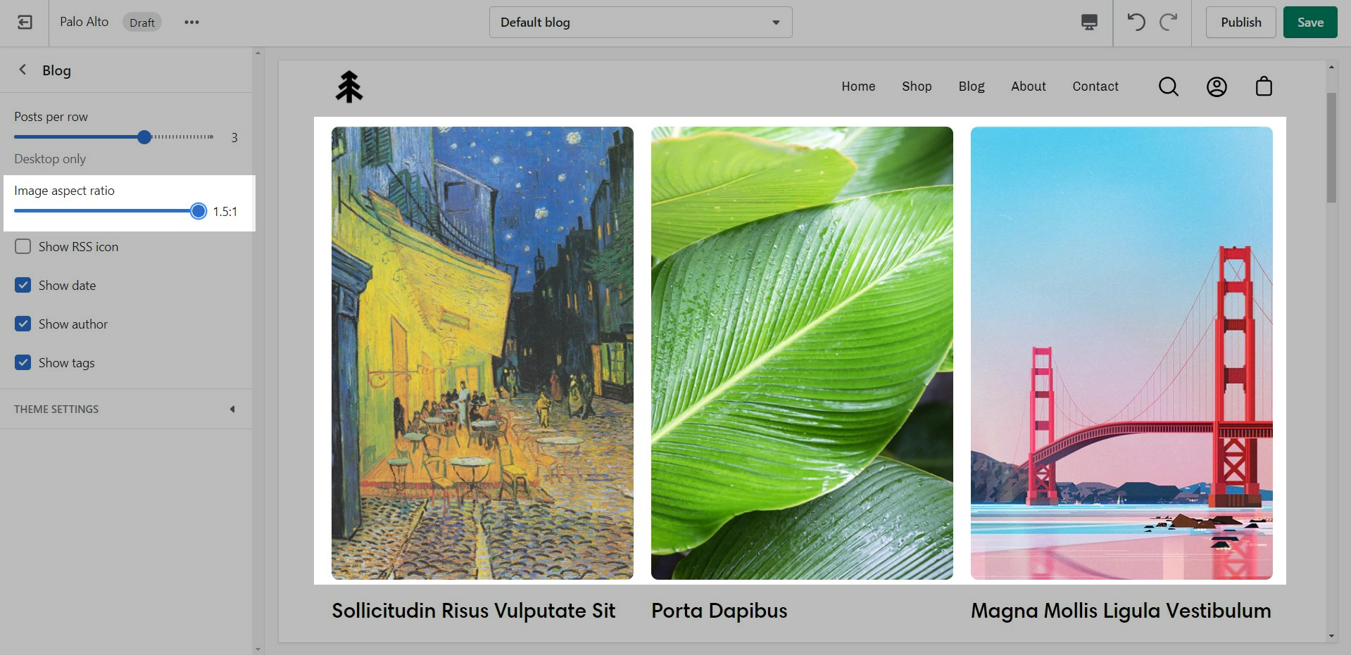
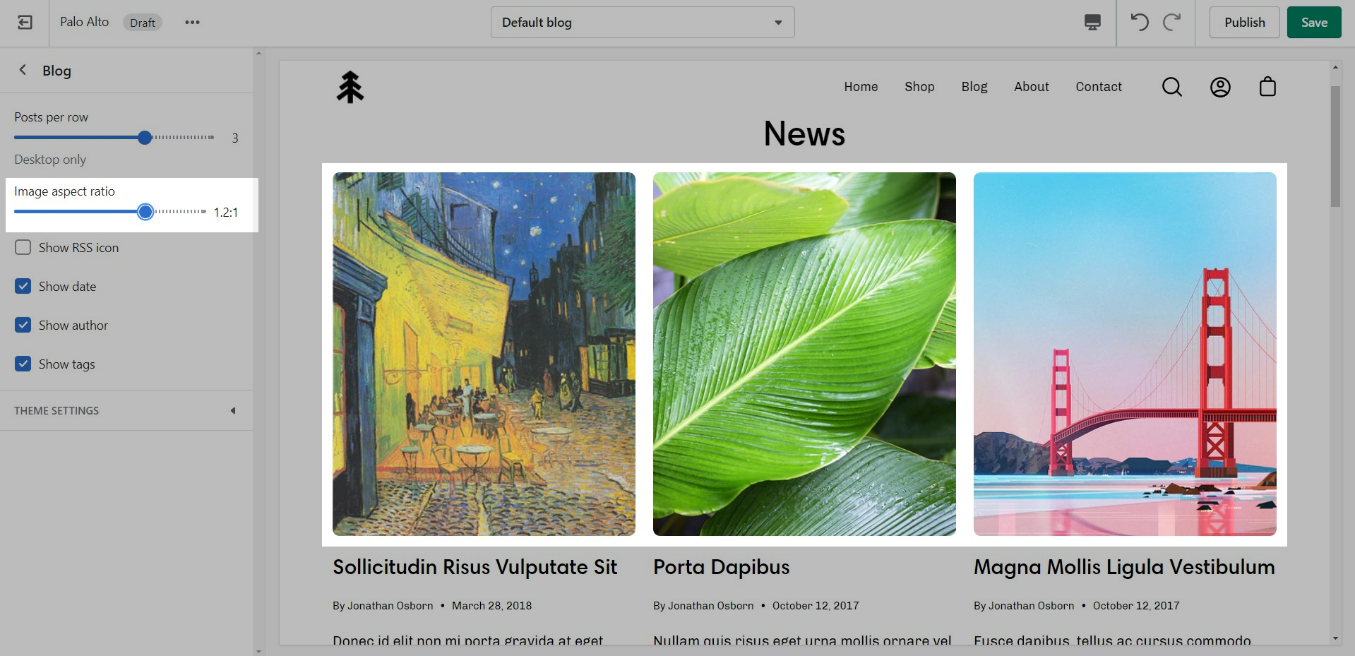
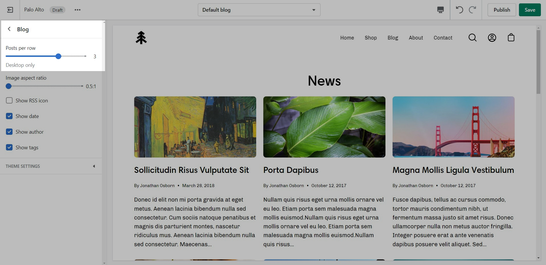
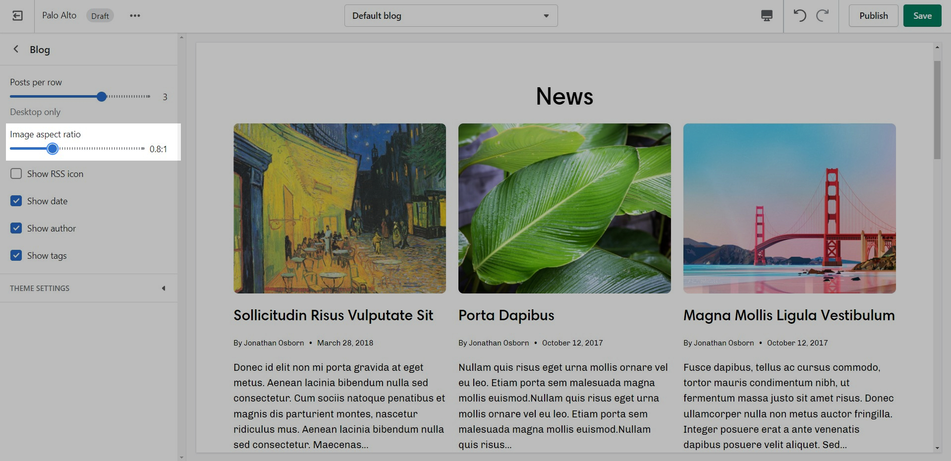
Controls to customize the layout of your blog index page:
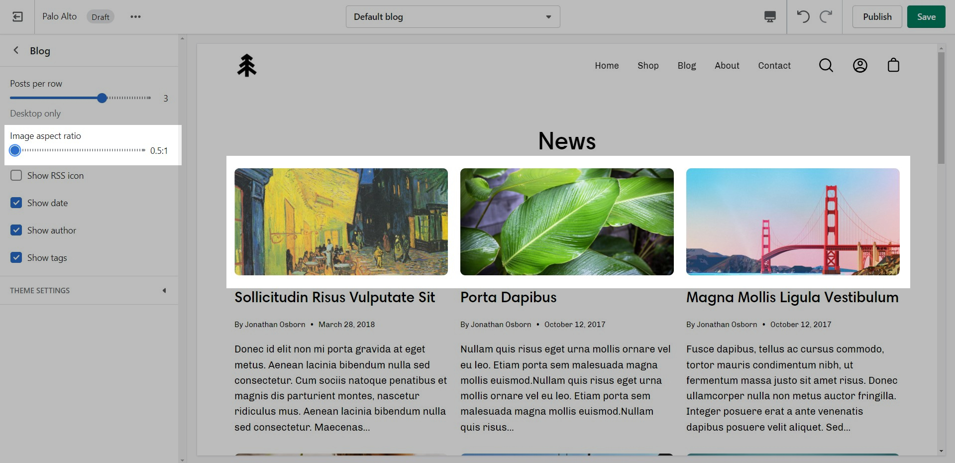
TIP - Use Show tags to display the navigation tabs which allows readers to filter though your articles
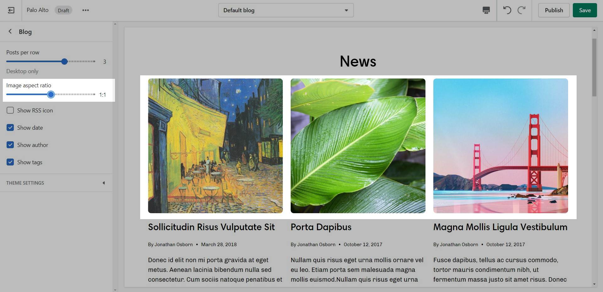
You can adjust the image aspect ratio with the range slider.
2 - If there are third-level links, the Mega Menu is enabled.
Note: The Mega Menu is automatically disabled when the Hamburger navigation is enabled.
To add a new Mega Menu you need to click on the Header section arrow to expand it after which click on 'Add image'.
Setting up the Mega Menu can be done by accessing the block settings. Here you will find the option to add it under any first-level link in your header as well as the options to add the image.
To get a list of links like the one from our demo you'll need to simply set them up from your navigation menu as standard drop-down menus. You can learn more about this in Shopify's great articles on the topic.
Under Swatches, you can toggle color swatches and enable them to be shown on hover (on Desktop only).
The Quick shop feature in Palo Alto allows customers to add products to their cart without leaving the page they are on.
When One-click is enabled, the customer purchases the product (or the first available variant) immediately.
If the product contains variants, we recommend using Quick view instead. This will take the customer through the process of choosing variants.
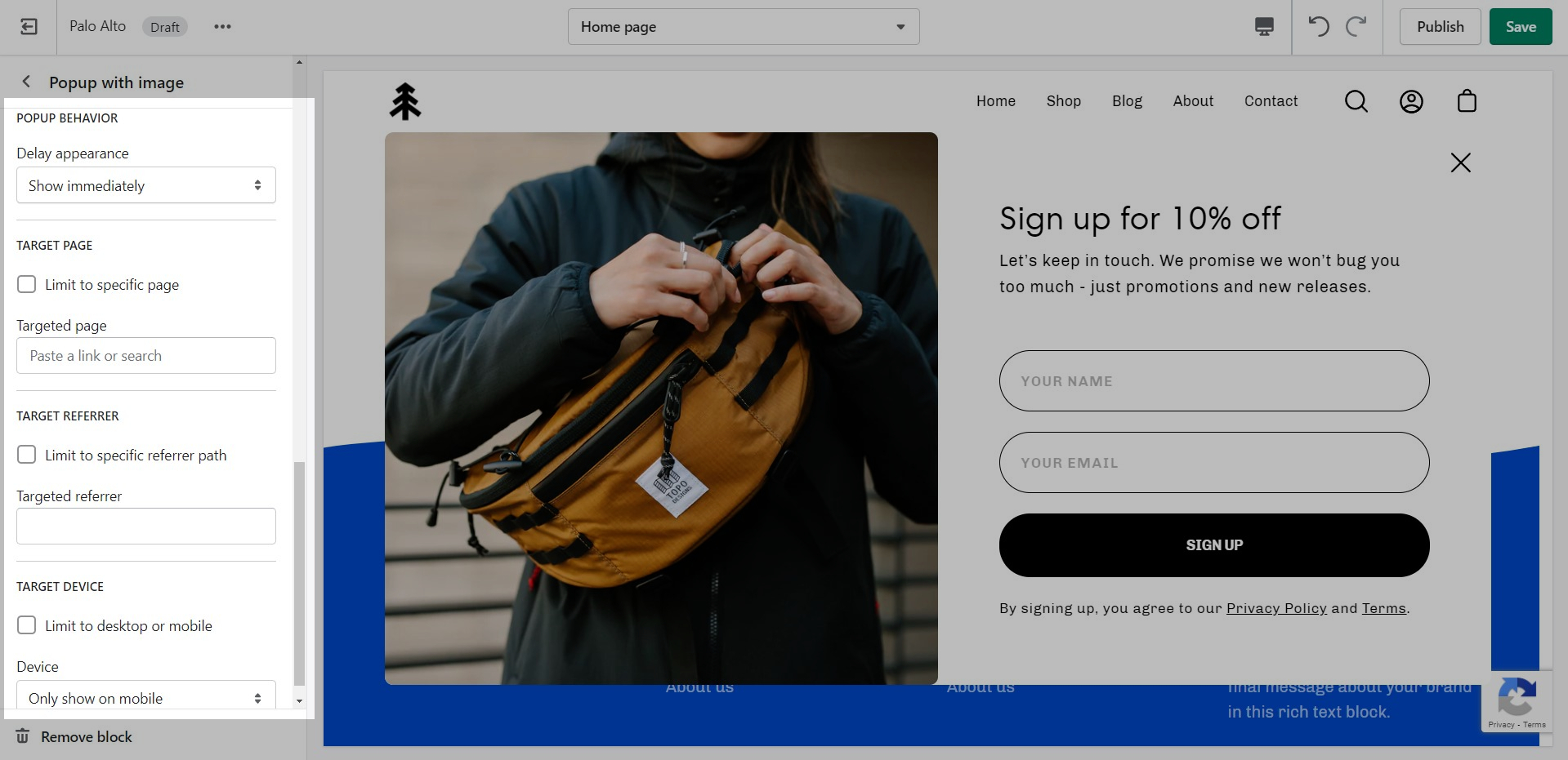
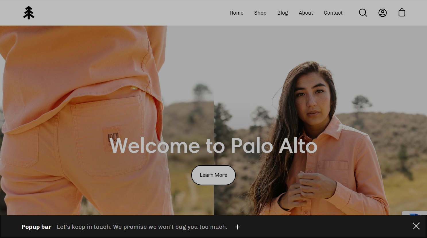
The popup section in Palo Alto can be used as a newsletter popup or as a sales promotion tool to display custom messages and promo codes based on where the customer arrives from, is viewing, and how they are interacting with your site.
There are three different section blocks:
We go into more details about each block in their own posts linked above.
There are four behavior options that you can control from the block settings:
Display a custom popup to your customers only when the customer is browsing a certain page, product, collection, or blog post on your site. Target your message based on where customers are browsing on your site:
Create different popups and messages for various pages of your site.
Target a specific audience by using Target Referrer. Your popup will only appear when the customer arrives at your site from a certain path or location.
Enable when running a promotion on another site. Customize message based on the source.
Use to provide a custom discount code to your customers when they arrive from a social media or other paid promotion.
Create a custom popup for mobile devices and another popup for desktop browsers with Target Device. Each popup can be customized with different assets and messaging.
Enable custom popups for mobile and desktop.
Use 'Delay appearance' to delay the popup from showing on the page. There are four different delay options:
Displays the popup as soon as the page is loaded.
Displays the popup ten seconds after the page is loaded.
Displays the popup after the user scrolls to the bottom of the page.
Displays the popup after the user has been idle for one minute.
All notable changes to Palo Alto are documented in this post.
Version 4.1.1 fixes a few small bugs
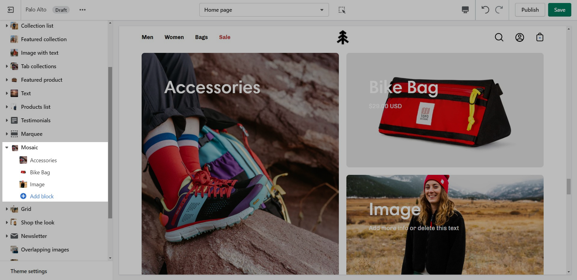
Created a Mosaic section to showcase products, collections, and more
Ability to add a promotional message in the cart and cart drawer
Block features added to the product page including a size chart, popup text, and icons
Improved upsell functionality to work with metafields
Recommended products grid was updated to ensure products per row remain responsive
Recommended products heading setting now corresponds with inputted text
Product tabs to work on duplicated product templates
Announcement bar functionality updated
Ajax search - input border removed
Header icons size increased on mobile
Popup newsletter success/error message
Creating new JSON templates for your products
When creating new JSON templates, you need to have at least one template to use as a base. The new Shopify Theme Editor is powerful and can create new templates without you ever needing to go into the theme code.
To create a new Product template you need to click on the top drop-down menu and select the Product tab. From here, click on 'Create template' after which give your new template a name, and choose a template to base it on.
After the new template is created, you will find it under the same Product tab in the drop-down menu. You will be able to set up each product page individually and create truly unique pages using this method.
Finally, after your product page is ready and customized all that's left to do is assign it to the product it was meant for. You can do this by going into your admin panel and clicking on Products. After you locate the product you're looking for, simply scroll down to the 'Theme template' tab and select the appropriate page template.
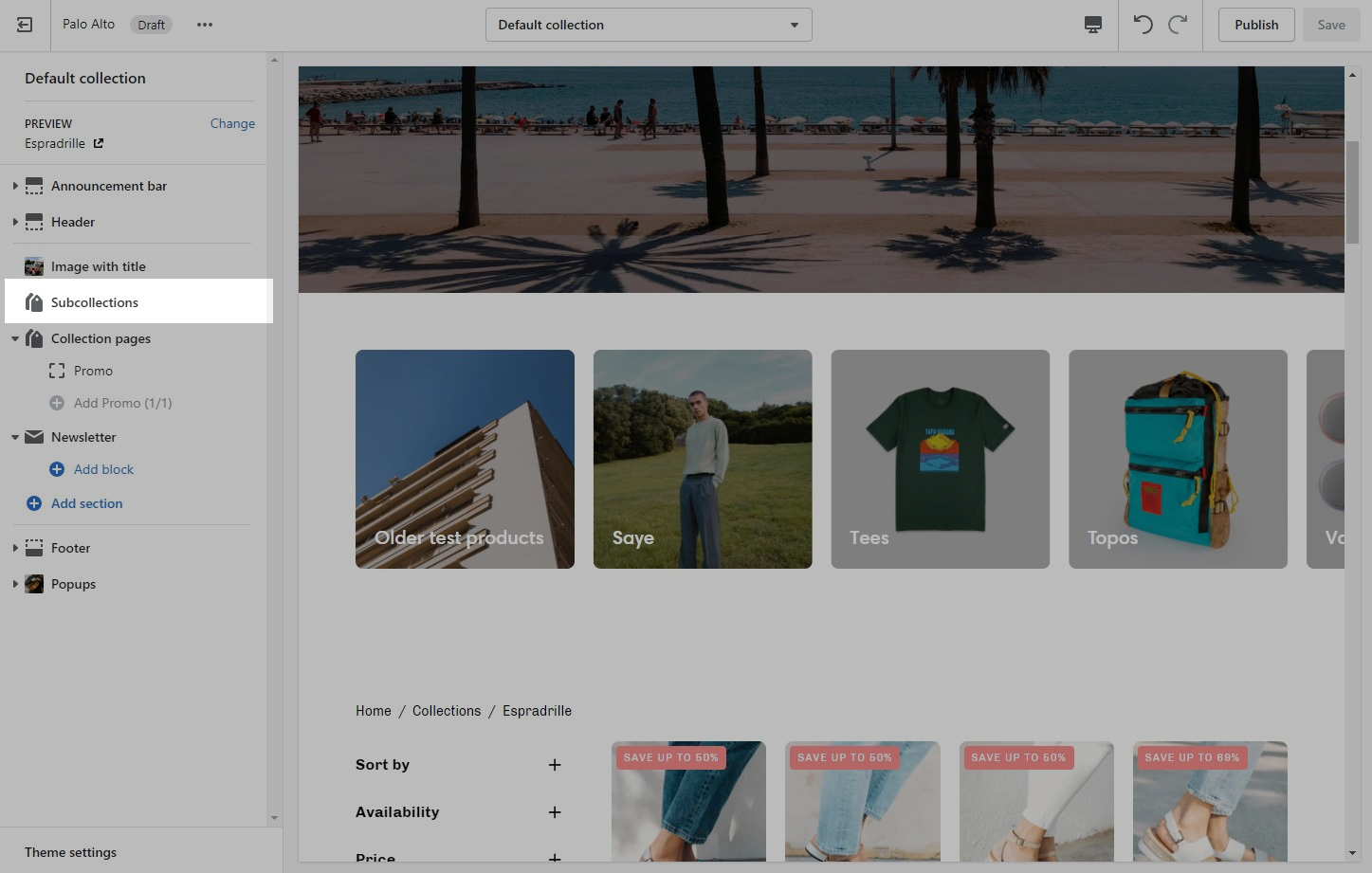
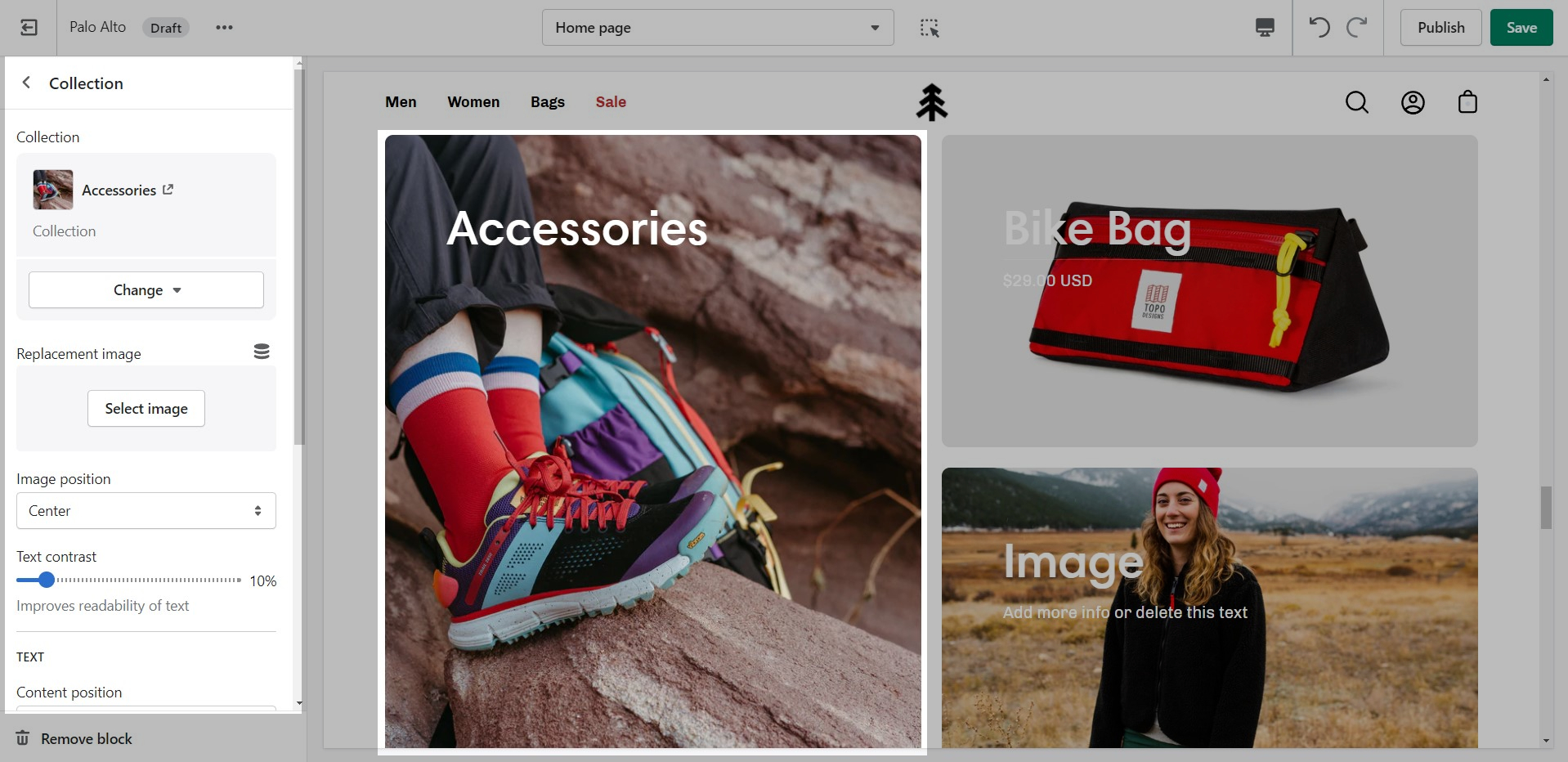
Promote related collections on any collection page
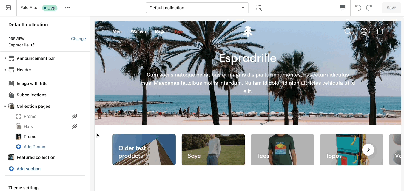
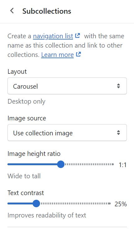
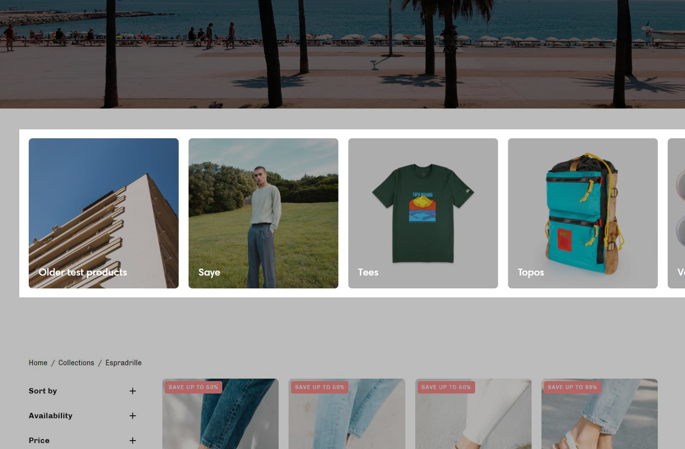
Cross-promote other collections with subcollections. Display a carousel or grid of links to related or similar collections onto any collection page:
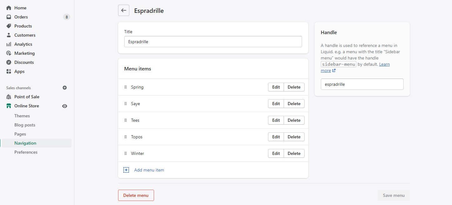
Palo Alto uses Shopify's Navigation menu system to bring custom menu items into any collection page and displays them as subcollections with a graphical image, collection name, description, and link.
Subcollections are already included with the default collection template, listed as a section called subcollection:
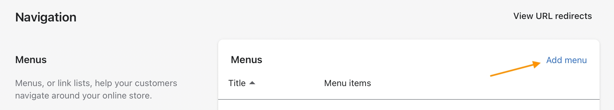
Use the link in the settings to create a navigation list, the rest is done right in your Shopify Admin under Navigation. Choose Add menu to create a new menu:
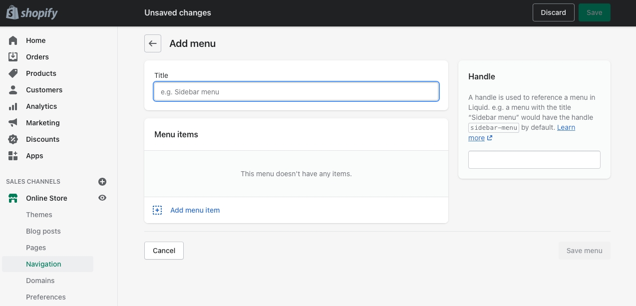
Create a new menu with the same name as your collection:
For our example, we will be adding subcollections to our 'Espradrille' collection, our menu will be called Espradrille ,and the handle in lowercase: espradrille
Next, we'll add menu items, these will be the subcollection links that are displayed in the subcollection carousel or grid:
Create a new menu item for each collection that be listed as a subcollection.
Save your menu and your subcollections are ready to use.
Links and helpful tips on updating your theme
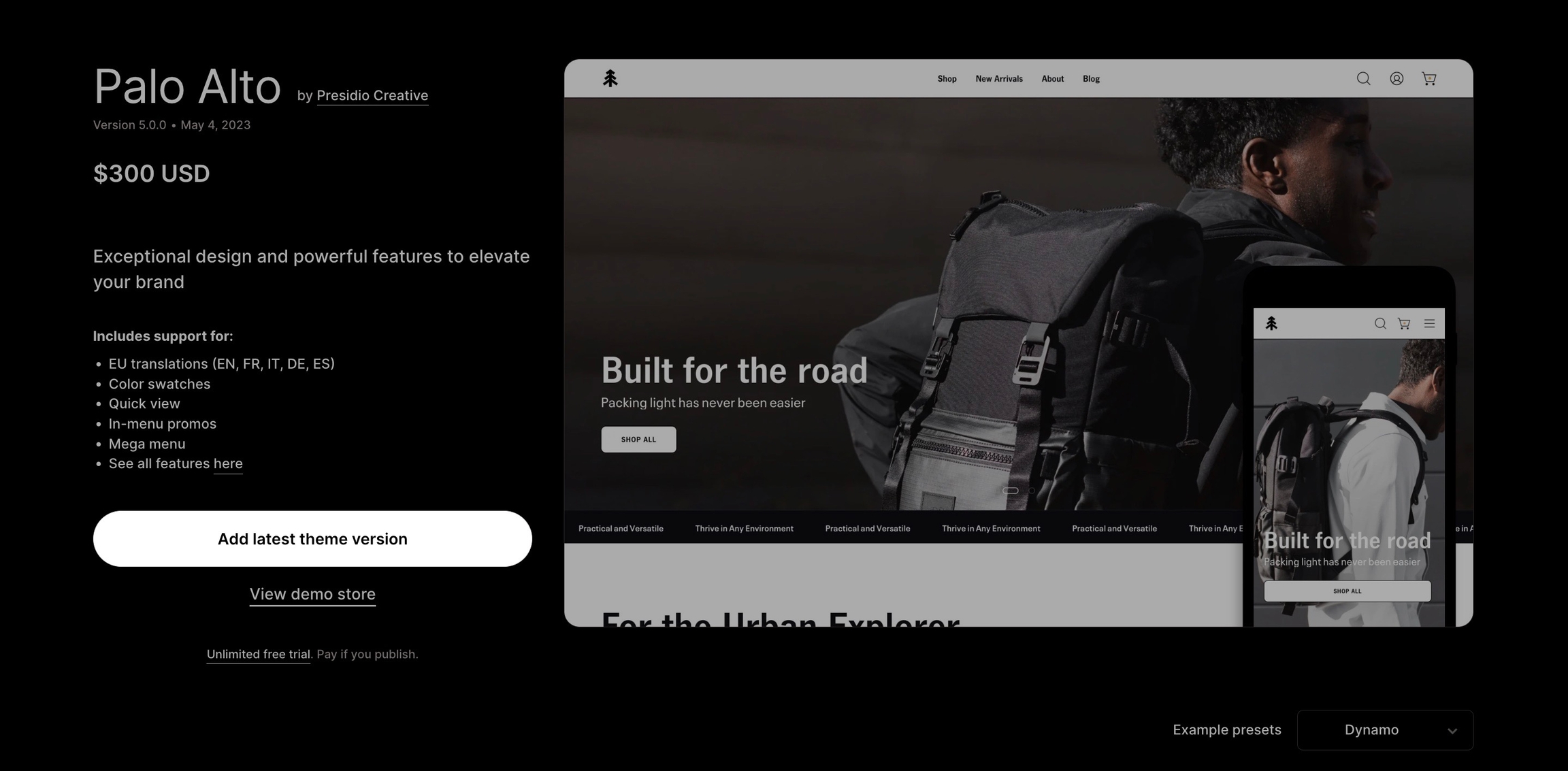
When you download the latest version of Palo Alto, the new theme will be added to the drafts section of your store and is completely separate from the live theme running in your store.
Your current live theme is not affected by downloading the latest version of Palo Alto.
The new theme is in 'Draft' mode which allows you to set up and configure it, while your store continues to operate with the current theme.
Create a backup of your existing theme. This will be used to copy settings and to keep the live theme running without interruption.
Visit the Shopify Theme Store and login in. For paid themes, it is important to log in to the account that you used to buy the theme. This will prevent you from being asked to buy the theme again.
Download the latest version of Palo Alto - .
Tip: You must be logged into the account that purchased the original theme.
If you see 'Try theme' or 'Buy theme' as the option, log out and log in again with the account that purchased the theme. Be sure that the main button has 'Add latest theme version'.
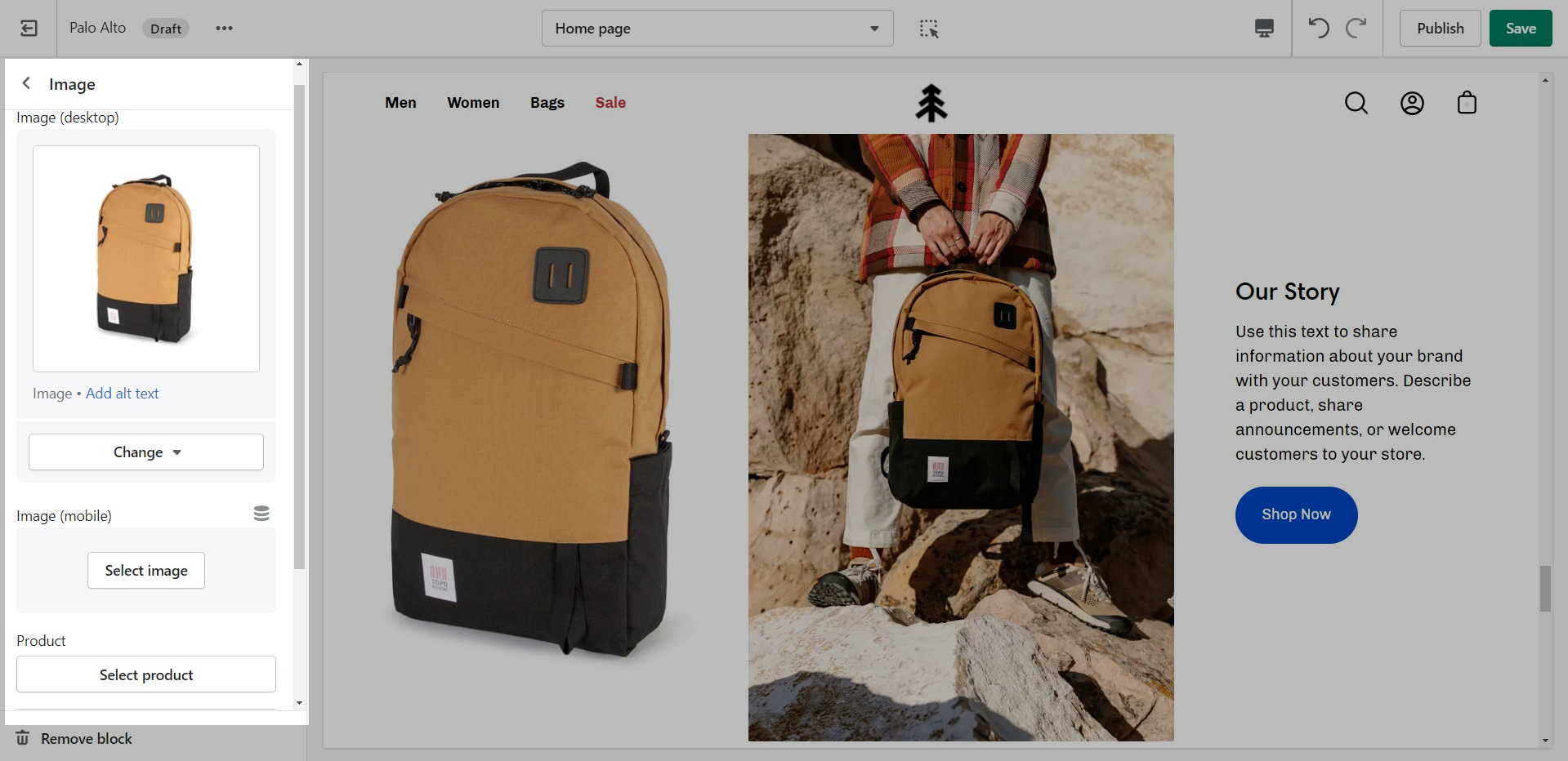
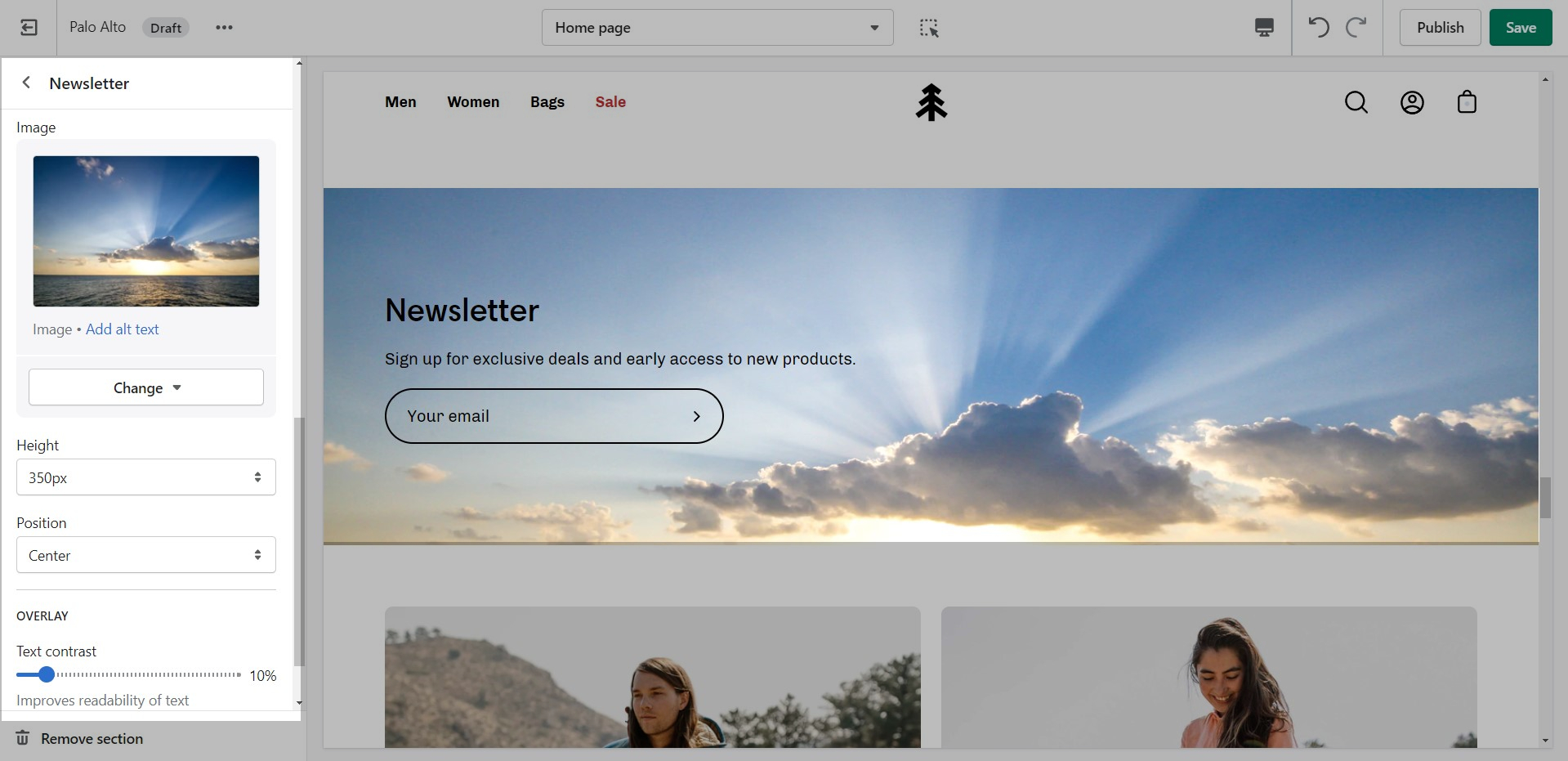
Image Size Recommendations in Palo Alto
Here we will cover recommended image sizes you can use within various sections in Palo Alto. These include the slideshow section, collection banners, blog post featured images, logo, product images, and product feature section images.
The key across all image sections is to keep the focal point of the image in the center. For example, if you're adding text or graphics on top of the image they can easily be cropped out of view.
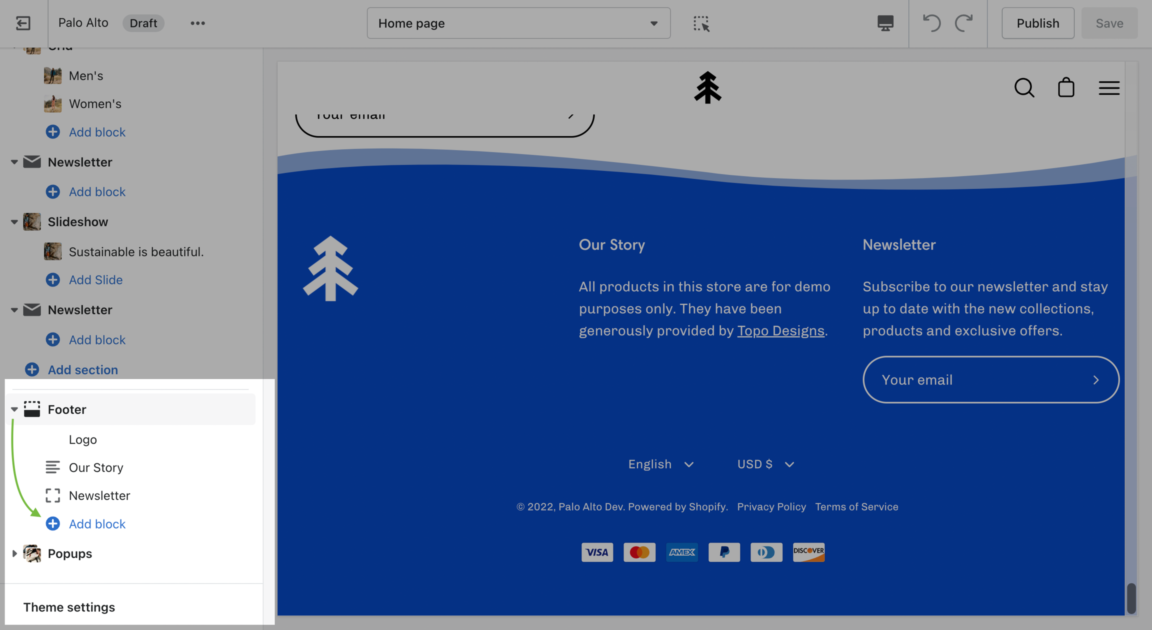
The Footer in Palo Alto has a lot of customizable elements in the form of section blocks. You can add in blocks by clicking the small arrow icon next to the Footer section then clicking the 'Add block' buttons:
While there are a good number of different blocks, you can only use four blocks here. Be sure to use the ones you need the most.
Adding your own custom styles and CSS overrides to the theme
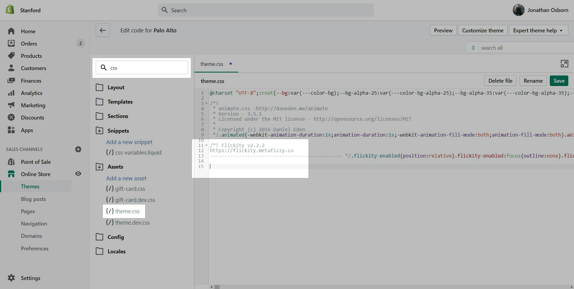
For developers and to make minor CSS style modifications, use the Code Editor and add your custom CSS overrides at the bottom of theme.css located in the Assets folder.
Click on the ellipses (three dots) icon at the top of the Theme Editor to view theme actions, choose Edit code.
An optional wave design in the footer
Option to highlight one of your main menu navigation to a color of your choice, best used to change "Sale" to red
Collection promo blocks to place advertisements throughout your collection templates
A loading icon setting to show an image while the site is loading
Ability to add a navigation list to an empty cart or cart drawer
Default image overlay set to 10%
Product grid items set to 4 per row by default
Footer logo moved to a block
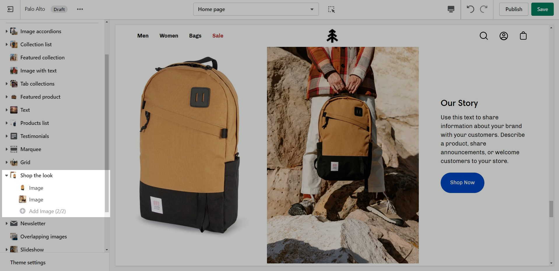
"Image columns" section renamed to "Shop the look"
Buttons text capitalization

Click on 'Add latest theme version':
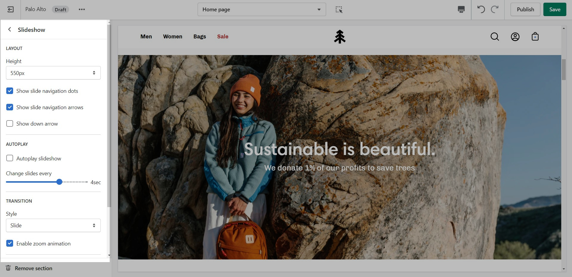
The Slideshow section allows you to specify desktop and mobile images as well as specify the slide height.
Desktop: We recommend using images 1920px in width.
Mobile: We recommend using images 1080px in width.
Remember: Mobile devices are tall. You need to use an image that has a bigger height than it does width in order to fill the vertical aspect ratio.
Palo Alto provides an option to specify various slide height sizes: Full Screen Height, Image Height, 750px, 650px, 550px,450px.
Static sizes: If you want to use a static slide height (750px, 650px, 550px or 450px), make sure your image height is around that size.
For example, if you'd like to use a slide image height of 750px, you'll want to save your image around this same size. This will prevent image cropping both towards the top and bottom. This applies to the other slide height sizes (650px, 550px and 450px).
Note: Because these settings keep the height static across all devices, the width will change. Your images may be cut off from the side so make sure that the focal point is in the center.
Full-screen height: This option will fit the images to the entire height of the browser window. This option is recommended for images with medium height sizes and not for images with large height sizes, as these will be cropped at the bottom of the image.
Image height: Setting this option will have the images displayed in the original height as uploaded. This option is quite useful if you want to have the full image displayed as there will be no cropping of the images.
Note: It's important to use equal-sized images in terms of height for this option to maintain consistency in the slide height as the slideshow advances.
We recommend using images at a ratio of one to one and sizes around 1024 by 1024 pixels or smaller images of about 600 by 600 pixels.
Using higher resolution images will make them sharper but slow down your load times
Palo Alto provides an option to adjust image aspect ratios for the blog page.
This is the standard setting that works well with square-shaped images. We recommend this square ratio because the images will be cropped square on the blog overview page and they'll display in their uploaded ratio on the individual blog post page.
This ratio will result in taller images or portrait images.
This ratio can be used to display wider images. We recommend it for landscape images.
This is the page with the "/collections/all" URL that lists all of the visible products in the store. By default, products on the catalog page are shown in alphabetic order.
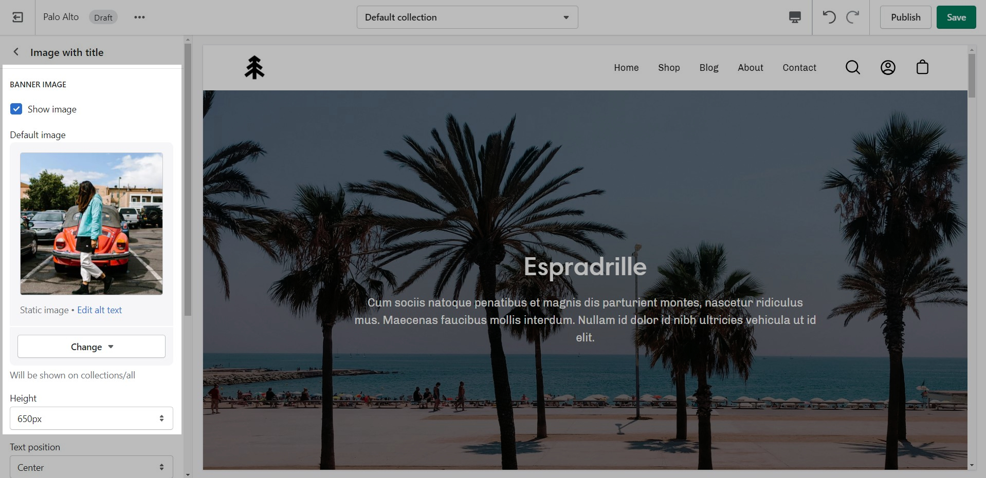
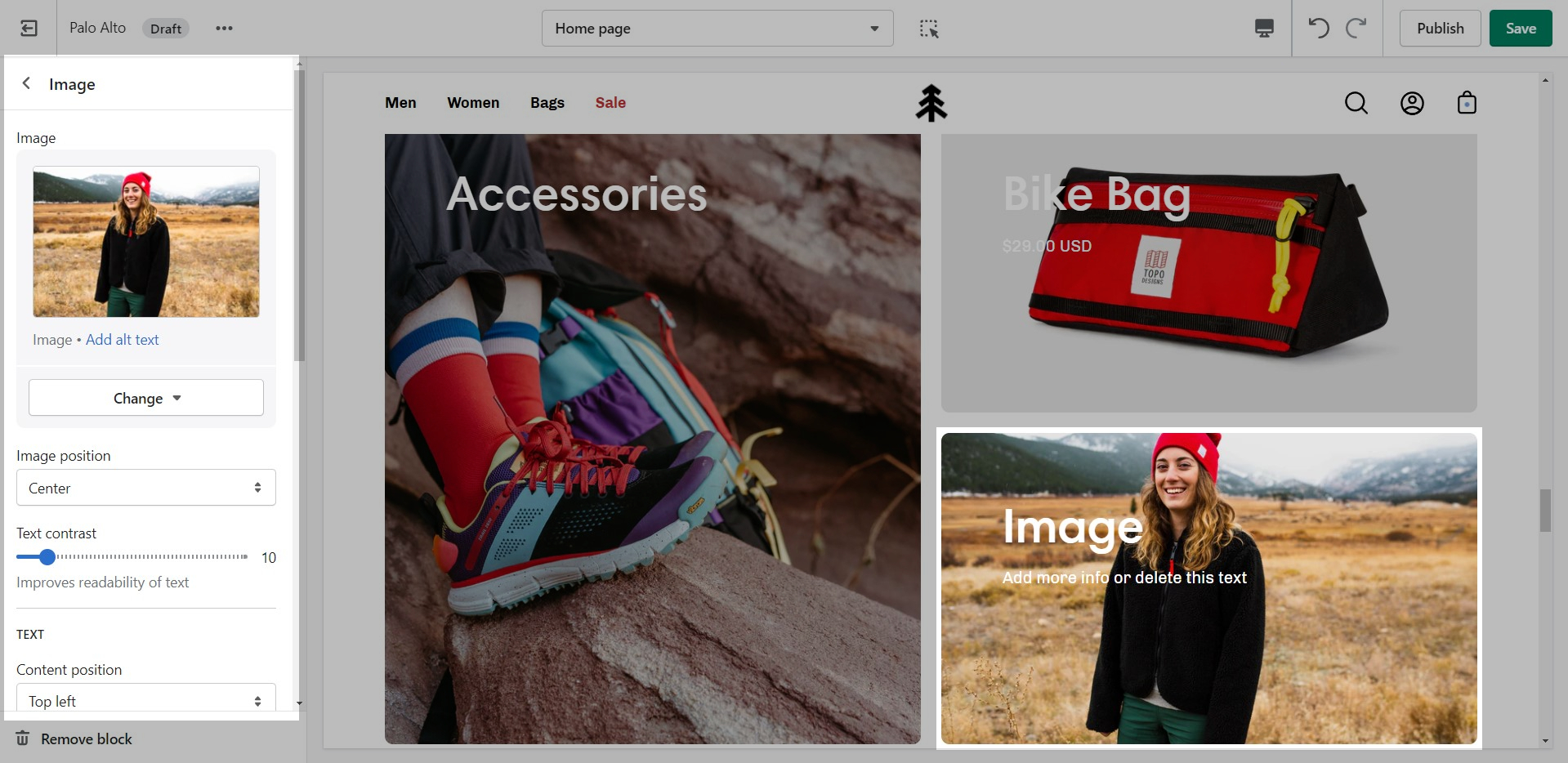
Palo Alto provides an option to specify this image within the Image with Title section settings.
We recommend using image sizes around 1400px in width.
Palo Alto provides you with options to specify the banner height. These include: Full Screen, Image Height, 750px, 650px, 550px.
These options are applied the same as with the slideshow section images definitions discussed above.
We recommend using logo images at a width of around 440px.
The maximum logo height applied is 100px therefore it is ideal to have a logo with a height around this size or lower.
For our Popup section, we recommend using an image with at least 600 pixels in its lower dimension. The default aspect ratio here is 8 by 7.
In pixels that should translate to 690 by 600 pixels or 1380 by 1200 pixels if you're looking to create a retina image.
A retina image is an image twice as big as its block or recommended size. This ensures that the final image is sharp even if rendered on an unusually bigger device.
There are also triple retina images which are three times the recommended size.
The logo block allows you to add an image (logo) and set its size. The image can be linked through a dynamic source to be shown differently on some pages (product pages, collection pages)
There is also the option to show or hide the store name under the logo image.
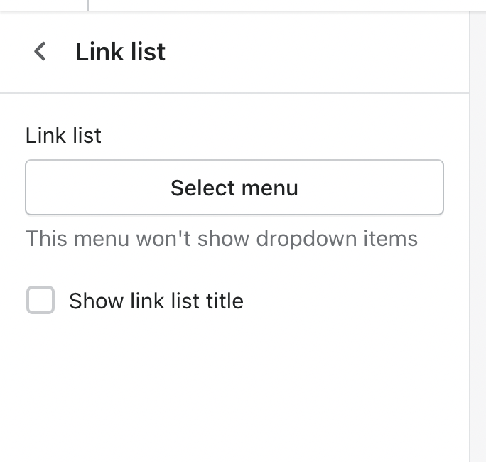
The link list block allows you to add a navigation menu. You have the option to show or hide the title of the menu as a heading.
Note: The navigation menu here is different from the Header. It can not show dropdown items.
Only first-level links will be displayed.
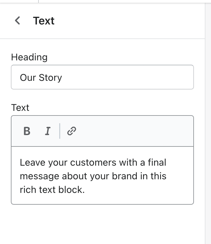
A text block does as a text block sounds. You can add a short message with a heading to give information about your brand or current promotions.
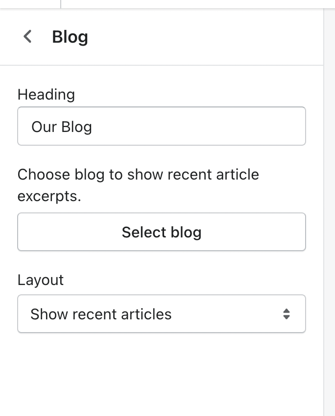
Using a Blog link, Palo Alto introduces a navigation menu to its three latest posts.
The 'Layout' setting here allows you to switch between showing blogs or showing tags. The tags will lead to pre-filtered pages that display all blog posts matching the tag (from the selected blog).
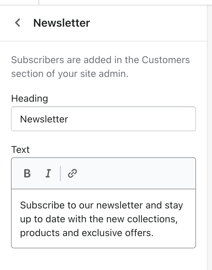
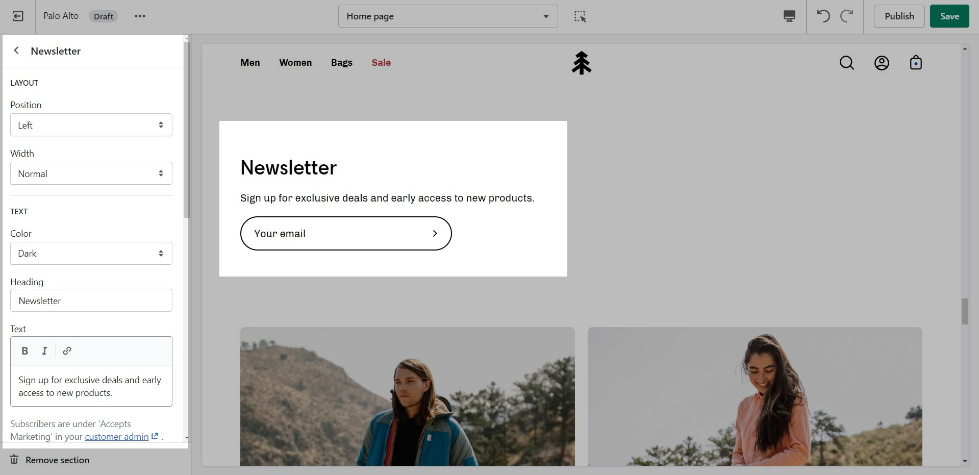
A Newsletter block comes with an automatic newsletter subscription box. There are also settings to add a heading and text.
Note: The newsletter blocks in Palo Alto can only create a new Customer in your Shopify admin with the qualities of a Subscriber (agreed to receive marketing emails).
If you want to create more custom and more detailed mailing lists we highly recommend using third-party apps to manage them.
Other than the individual blocks, the Footer section also has a number of settings itself. You can set the background and text color, disable the footer wave style or set a different color for it.
There is also the option to show payment icons, currency and language selectors, as well as a short menu in the Bottom bar.
Note: There is no option to remove the 'Powered by Shopify' text in the section settings. To remove it, please check out our next post.
As you have probably noticed, "theme.css" is minified and you won't be able to easily change the styles. This is where the "theme.dev.css" file comes in handy.
This file is not minified and holds the exact same code but in a much more user-friendly layout. While you can certainly change the styles in it, these changes won't take effect on your live store. The reason for this is that this file is not read by default.
To activate it, you need to access the "theme.liquid" file and replace the instances of "theme.css" on lines 9 and 44 with "theme.dev.css".
Note: Minified CSS is slightly faster so using "theme.css" is also slightly faster.
Find your new template by going into the same Blogs tab in the top drop-down menu and select the template you just created. You are now able to add sections to it without affecting any other blog template.
The last step is to assign the new template to one of your blogs so that it can take the new style you've created. This is done by going into your Online Store > Blog posts and clicking on Manage blogs. Once you've found the blog you're looking to change, simply change the template name from the 'Theme template' tab.
Information about updating to the newest version of the Palo Alto theme
Palo Alto 4.1.0 has built-in integration of Online Store 2.0 features. This is a major change. We recommend that you download the new theme and build a fresh version of your store using the new tools included in the platform. There is no simple migration from earlier versions. This applies to all themes that have been built for Online Store 2.0.
Migrating settings is not recommend. Due to the many performance improvements including with Online Store 2.0, legacy settings files will slow down your store load times. A fresh theme build is recommended for Online Store 2.0. Consult a Shopify Expert if you require assistance with moving your store from an earlier version to Online Store 2.0.
Future releases based on Online Store 2.0 will be easier to migrate settings.
Coming from Palo Alto 4.0.0 (or 4.0.1) you are using the new structure of JSON templates. There might be a chance for you to transfer over some of the settings in your edited page templates.
To start, you will need to first download a fresh copy of our latest version of Palo Alto from the .
Next, you can open the code editor of your current copy by going into your Online Store > Themes and clicking on Actions > Edit code.
Here, you should find the edited page templates with a small grey dot as an indication that they are changed.
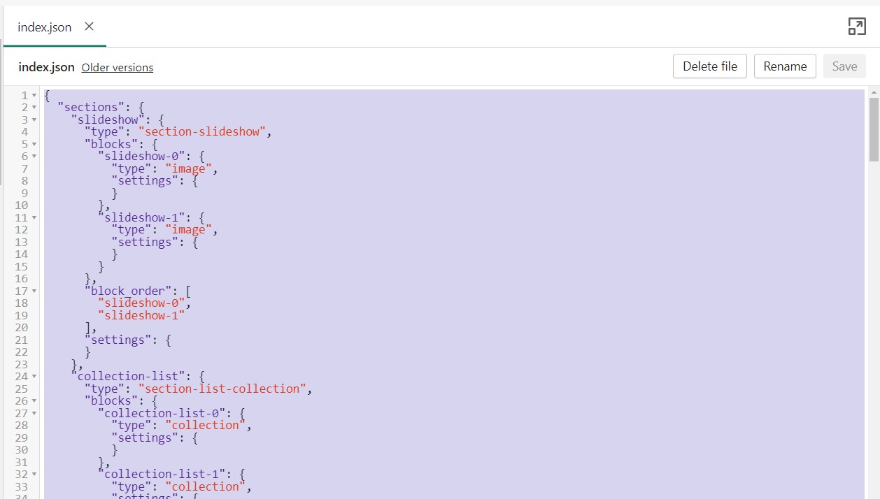
What you can do here is to open up the edited page templates, we'll use index.json for our example, and copy the content to paste in the new theme.
To help select and copy all of the code here you can use Command + A followed by Command + V (or CTRL + A, CTRL + V for Windows).
The last step is to open the code editor for the new copy, open up the same file, in our case index.json, and paste in all of the code.
Note: You have to also delete all of the predefined code. Use Command + A again to select it all and click Delete.
Lastly, all that's left is to save the changes. If no build errors pop up, you have successfully transferred all of the settings that are still compatible with the new version.
Please note that it's possible not all settings will be compatible in which case you could run into a build error or just have missing sections. Always check your progress through the Theme Editor and add in the missing sections before publishing the new copy.
Repeat this process for all templates.
If you run into a lot of build errors, then the best thing to do would be to manually redo all sections from the Theme Editor for the template.
The Palo Alto Icons Row section comes with predefined Icons to choose from. You can also add your own Custom Icons in the form of Images.
However, if you want to use the SVG format for its higher quality and already have images in mind, here's how to add them in.
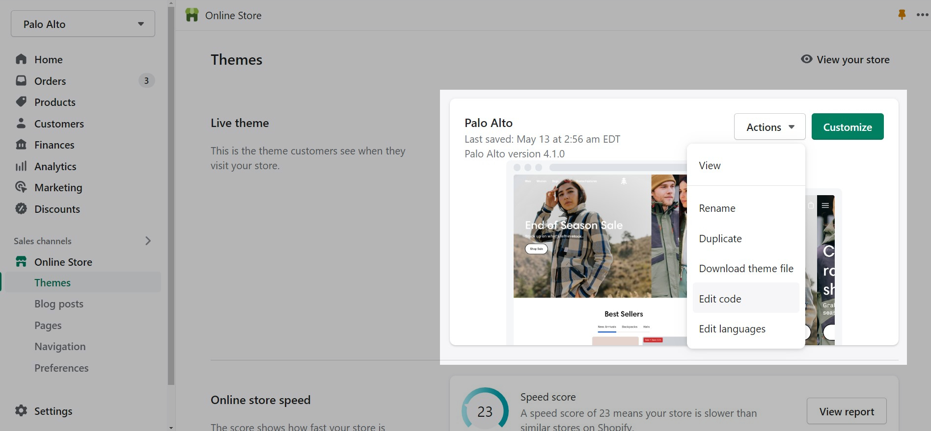
The first order of business is to upload your SVG files into the Theme Code. From your Shopify admin page, go into your Online Store > Themes and click on Actions > Edit code:
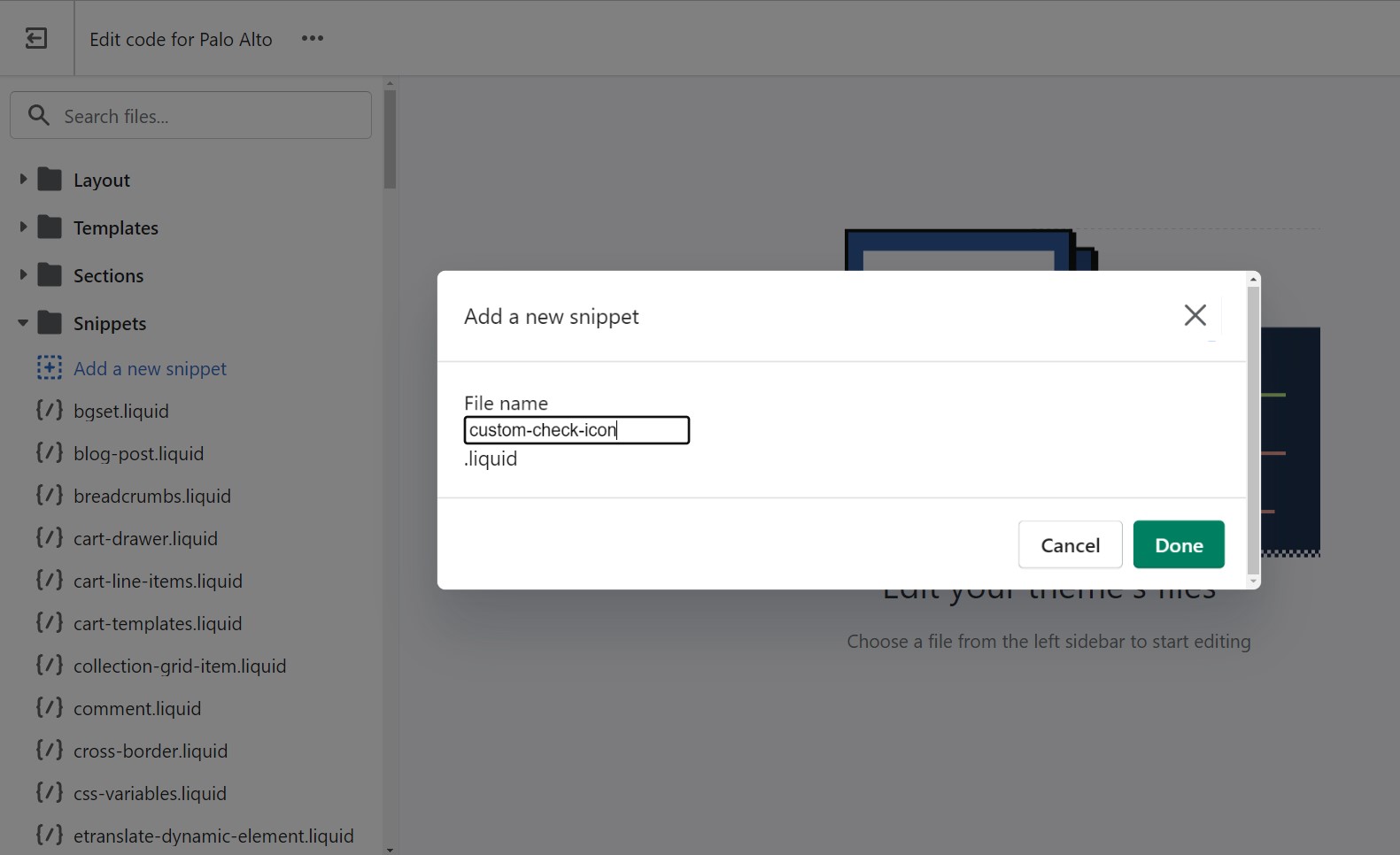
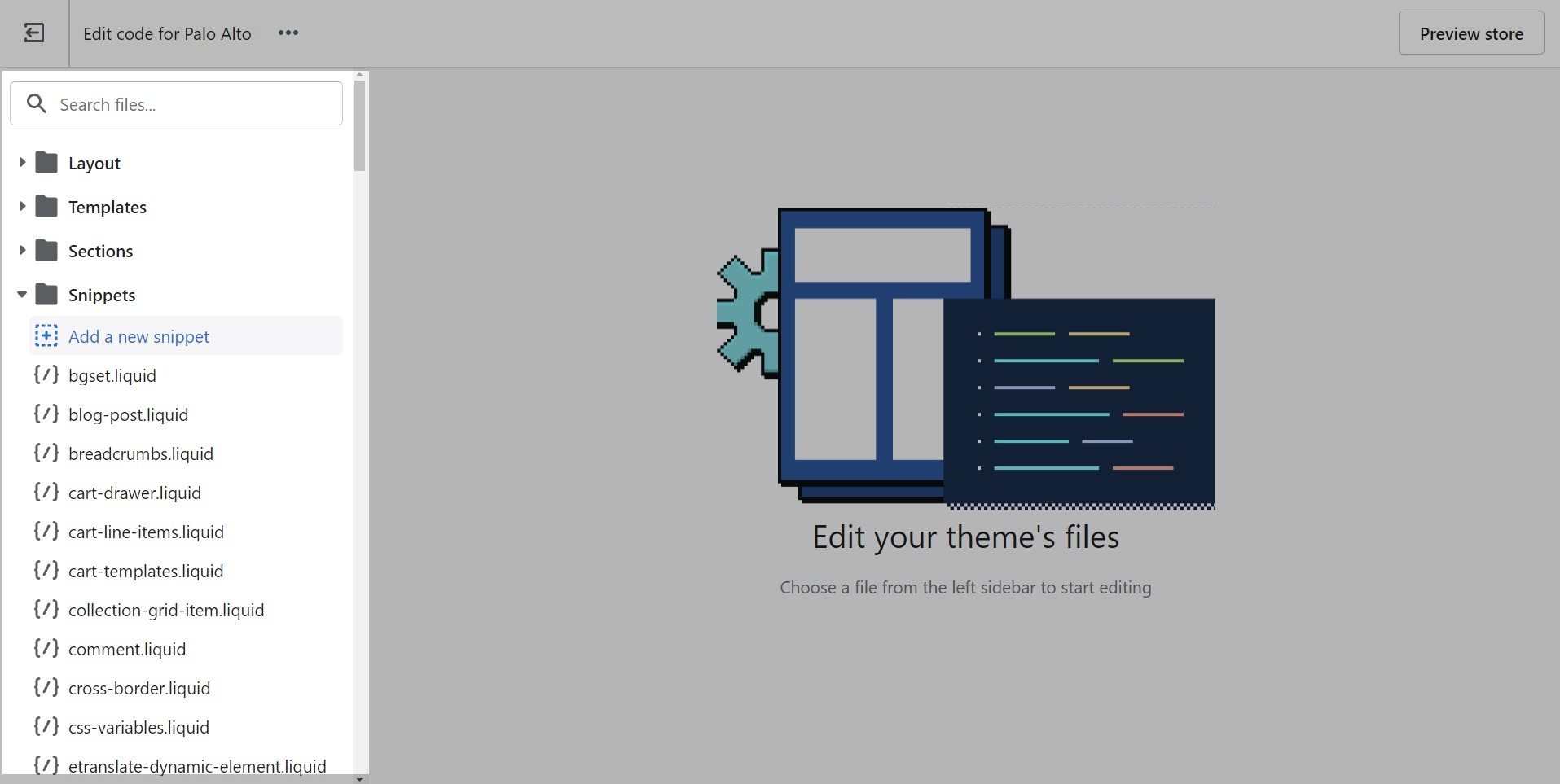
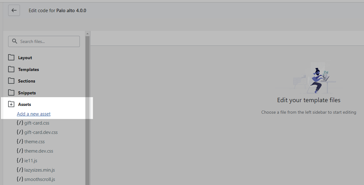
Next, open up the Snippets folder and choose to Add a new snippet.
You will be prompted to give the new file a name. A common practice is to use lower case letters only with dashes instead of spaces (we call this 'kebab case'). We'll call our example 'custom-check-icon' which will automatically be converted to custom-check-icon.liquid by Shopify.
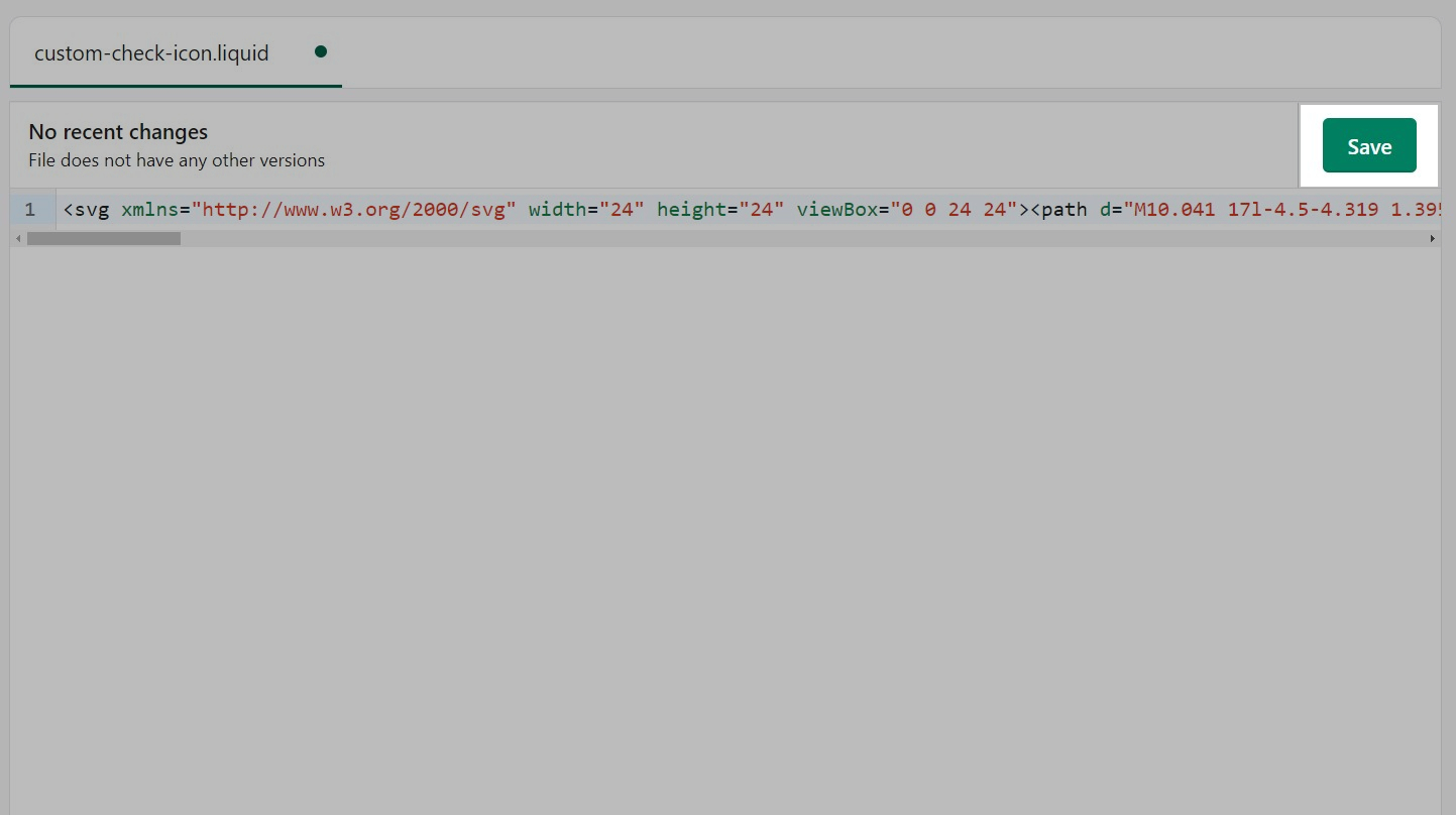
Now you will have a blank file. You can simply paste in your SVG code for your icon. Usually, this pastes all in one line.
Don't forget to Save the changes once you're done.
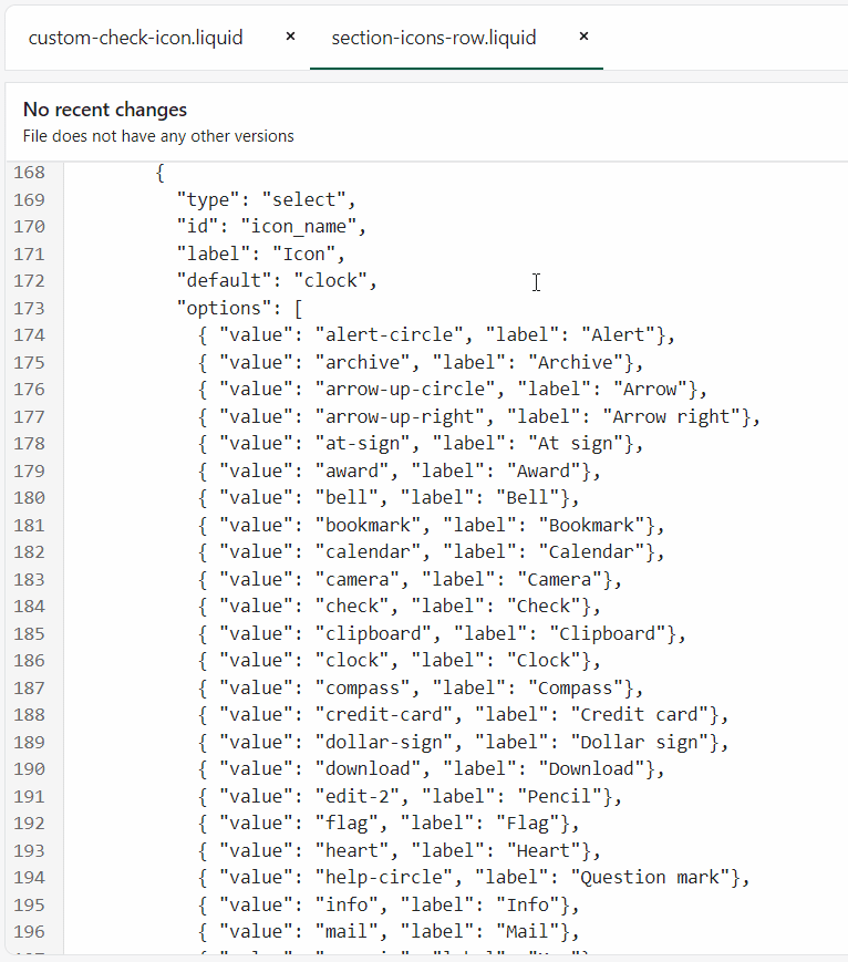
Now that we have our custom icon ready to go, it's time to add it to the list of available icons. To do this, we have to open the section-icons-row.liquid file from the Sections folder.
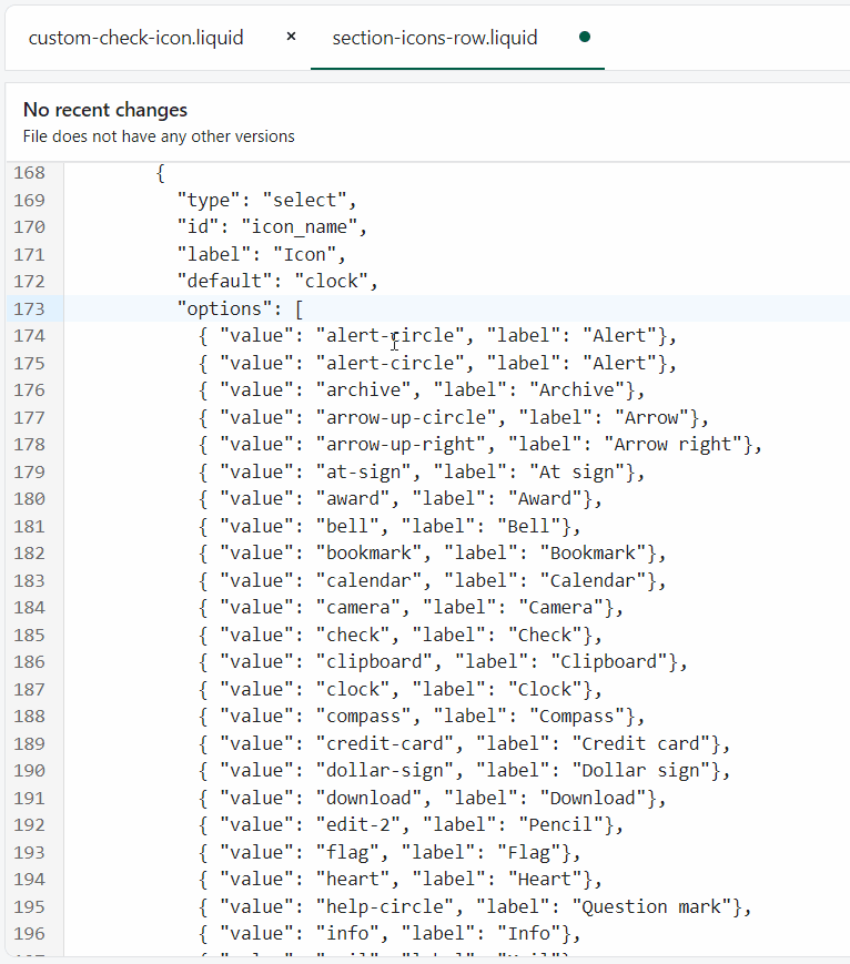
Here, we can use Command + F (or CTRL + F on Windows) to find the icon_name in the section schema settings.
Simply copy and paste the first value of this schema above itself and this will create a new option in the drop-down.
Next up, rename the value and label to something that matches the name of the custom icon.
The final step is to open up the icons.liquid file from the Snippets folder and add in a new option in the case.
The easiest thing to do is to copy and paste lines 2 and 3 any place before a when tag. Once that's done, simply rename the text in the tags to match your custom icon name.
Don't forget to Save the changes.
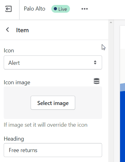
Your new option will now appear in the Icons Row block selection menu:
To reach us with questions or additional assistance with using Palo Alto, our support staff is here to help you by email. To better support all our customers, we handle all our support via email. This helps us manage support across multiple time zones in a timely manner.
We respond to requests in the order they are received, typically within 48 business hours (excluding weekends and holidays).
Reach us via our contact form:
Shopify provides 24/7 support to all its customers. Shopify Support covers any platform questions or issues. For example, if you need assistance with using the Shopify Admin tools like product setup or your store settings. Shopify Support also handles all Checkout support.
For checkout page issues, contact Shopify Support directly.
The checkout page and theme are separate systems. Checkout is a function of Shopify and can’t be controlled by the theme.
Shopify Support:
For all app-related issues or questions, Shopify's policy requires app developers to be responsible for ensuring compatibility with themes in the Theme Store. It's best if you reach out to each individual app developer when requiring assistance with their app, functionality, or conflicts.
We can only support the code we write which is the code of the Palo Alto theme. Integrations with apps are handled by app developers directly. Each app developer has their own support system in place and can help you with issues regarding their app.
For any custom code requests or theme customizations, we recommend that you reach out to a Shopify Expert. Shopify Experts are advanced developers that provide many custom solutions for your store and also quick task-based solutions. They can provide full support for their work.
Presidio Creative does not provide any custom coding services.
Some Shopify Experts with Palo Alto experience include:
they are the best fit for larger projects
they are the best fit for larger projects
has experience working with Shopify and accepts small contracts


Blackbelt has experience with Palo Alto and a great portfolio
Shophelper is a large and experienced Shopify agency that does work in Palo Alto
Voltage is great - they also do plenty of Palo Alto work.
In the Theme Editor, click on the ellipses (three dots) icon at the top of the Theme Editor to view theme actions.
Choose Preview.
When the new preview window appears, choose the green Share preview button at the bottom of your browser.
Click the Copy link button to copy the address to your clipboard.
Send us that link, pasted from your clipboard.

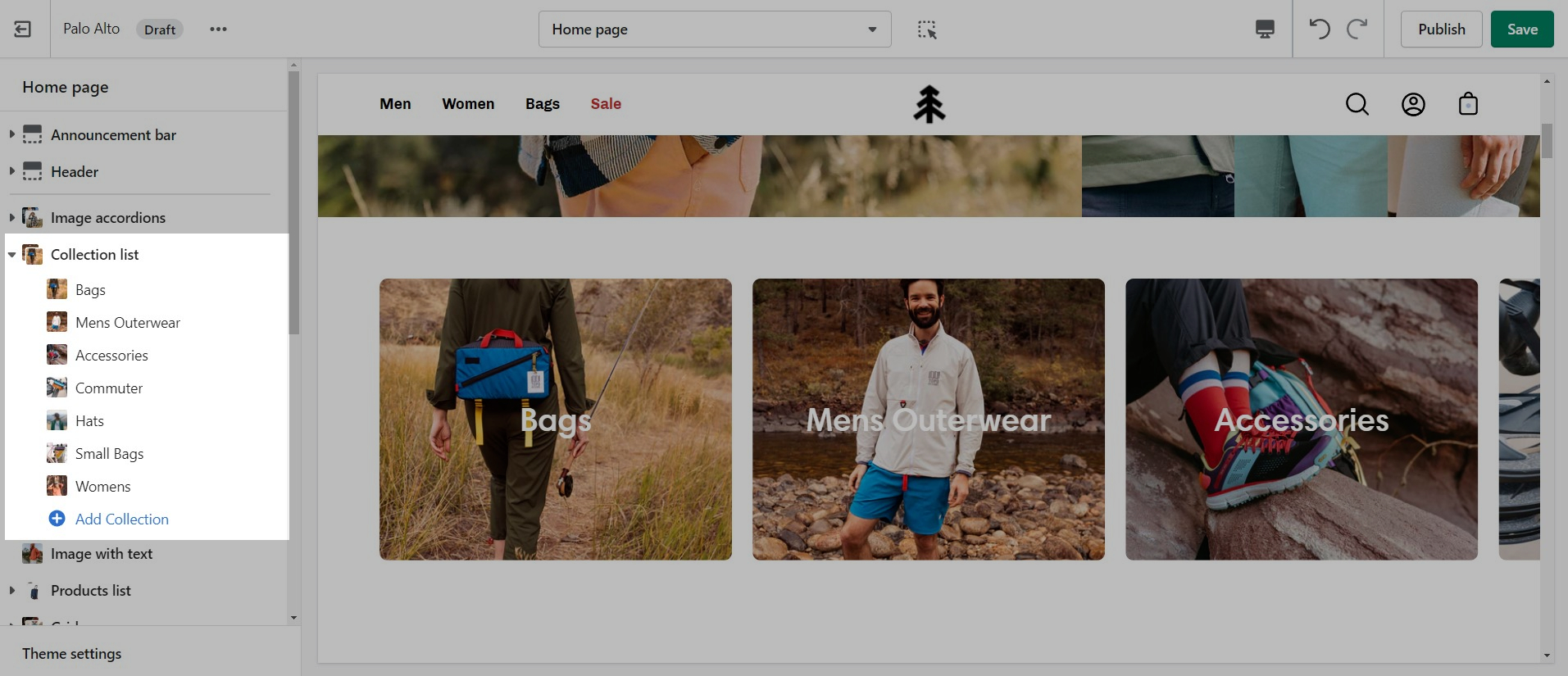
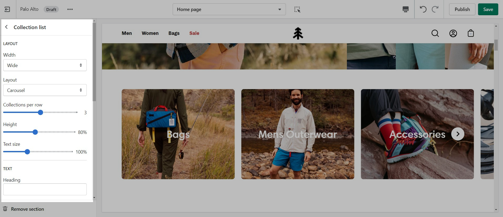
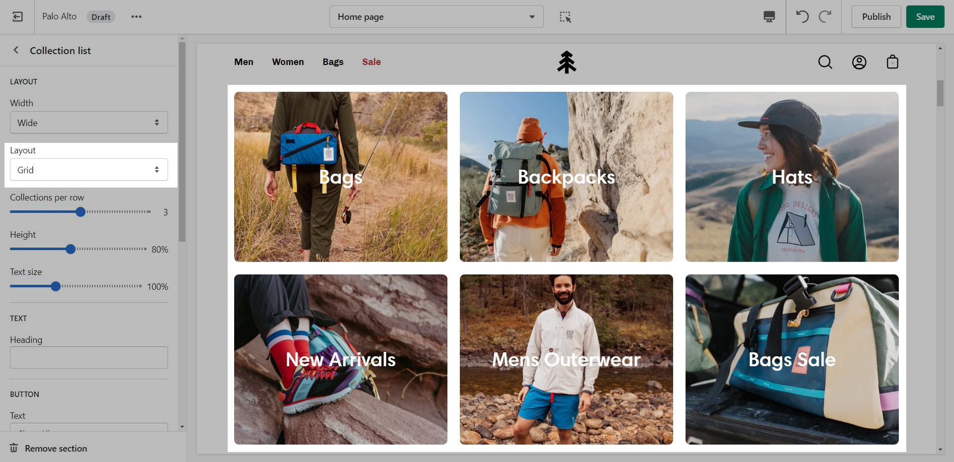
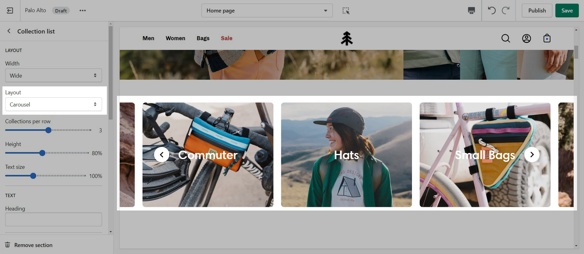
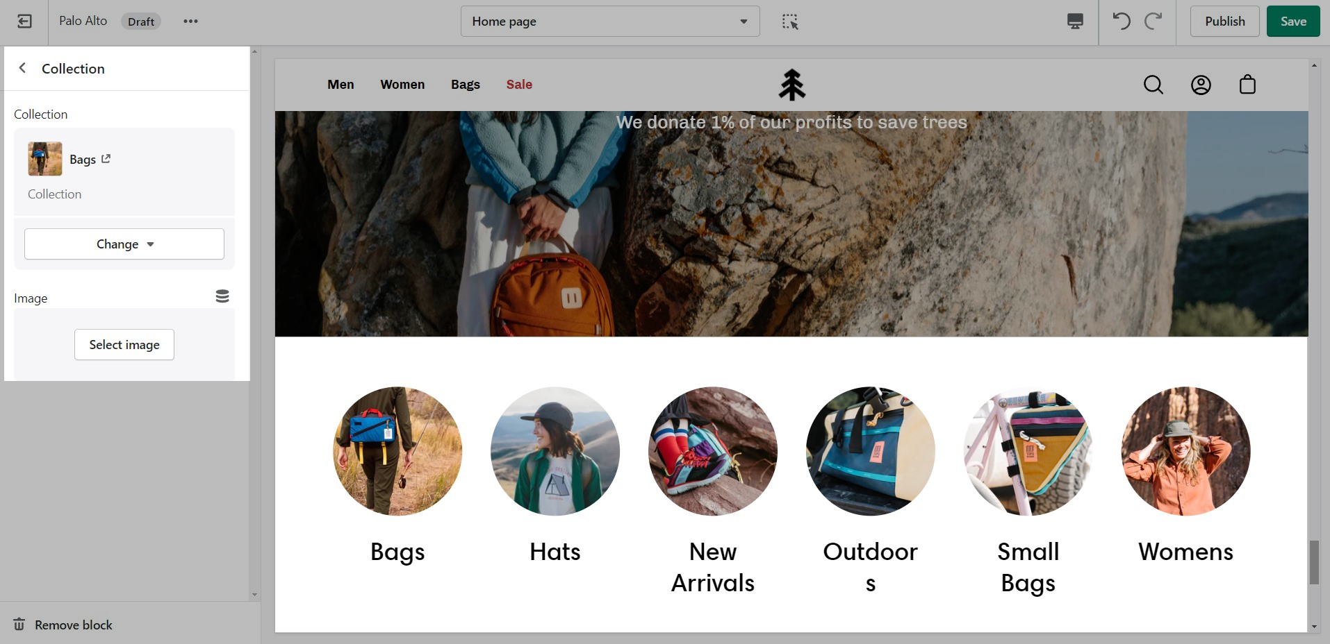
The 'Collection list' section is here to help you add links to collections you want to highlight on your store pages. This is a quick and easy way to run promotions or let your customers know about new collections.
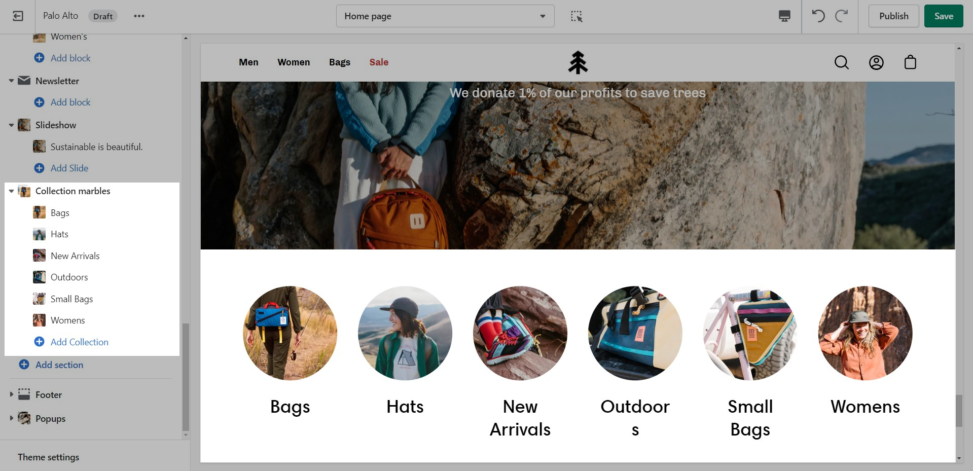
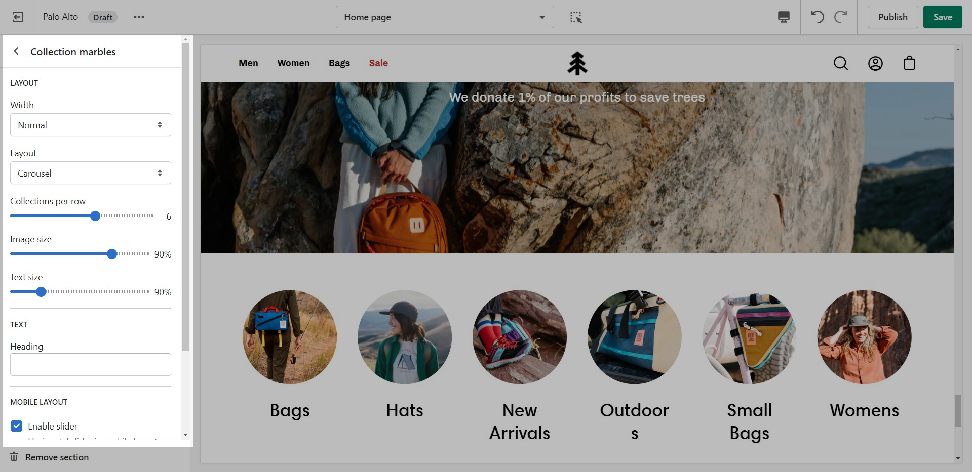
A stylish new section to help showcase your most recent or most popular collections with small icons.
Set the layout, main heading, and sizes for the section.
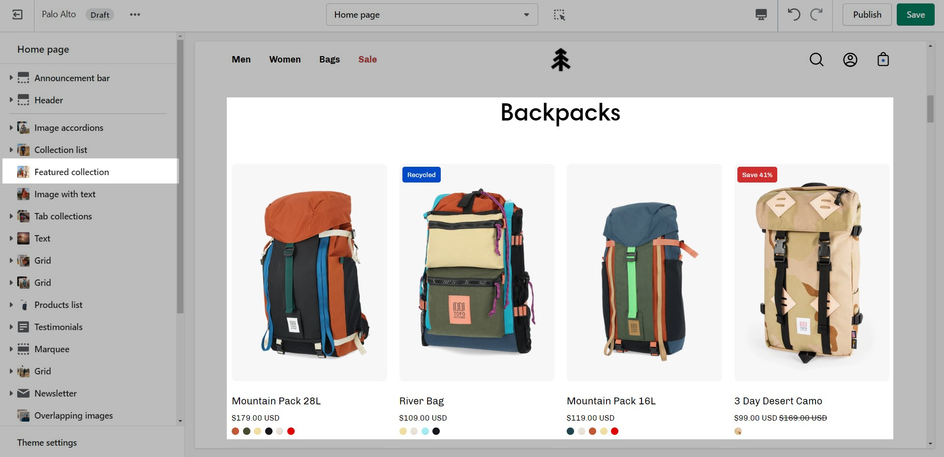
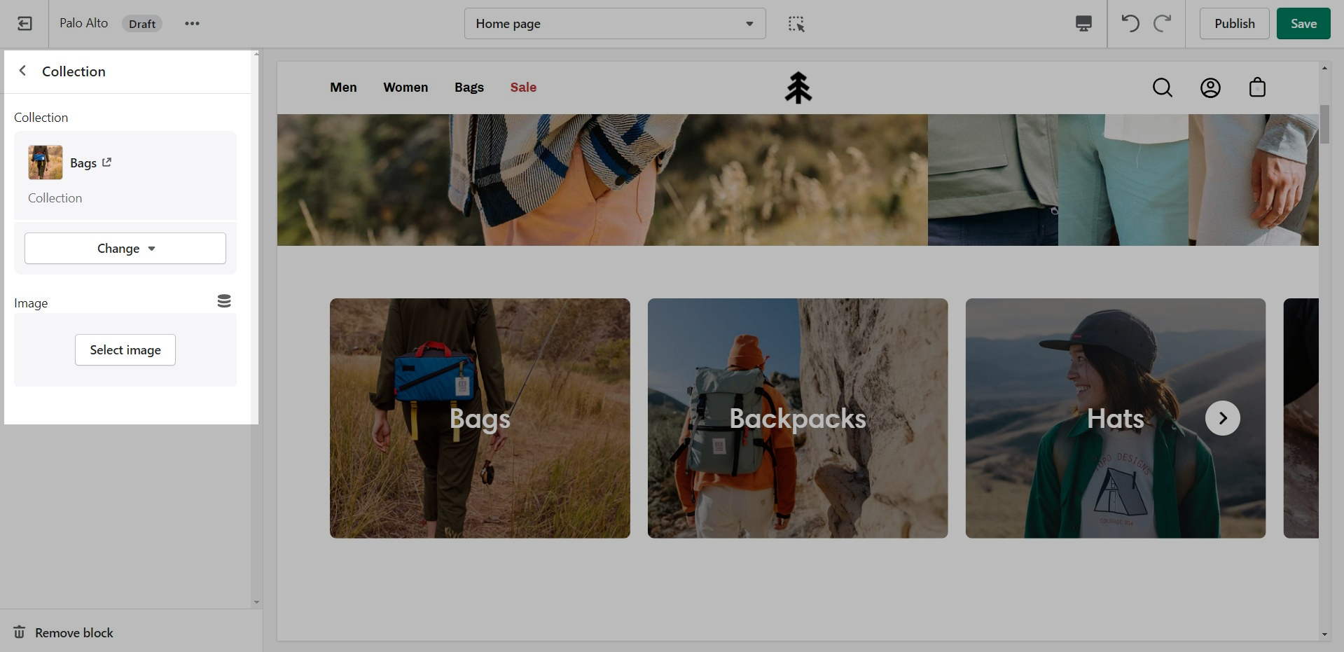
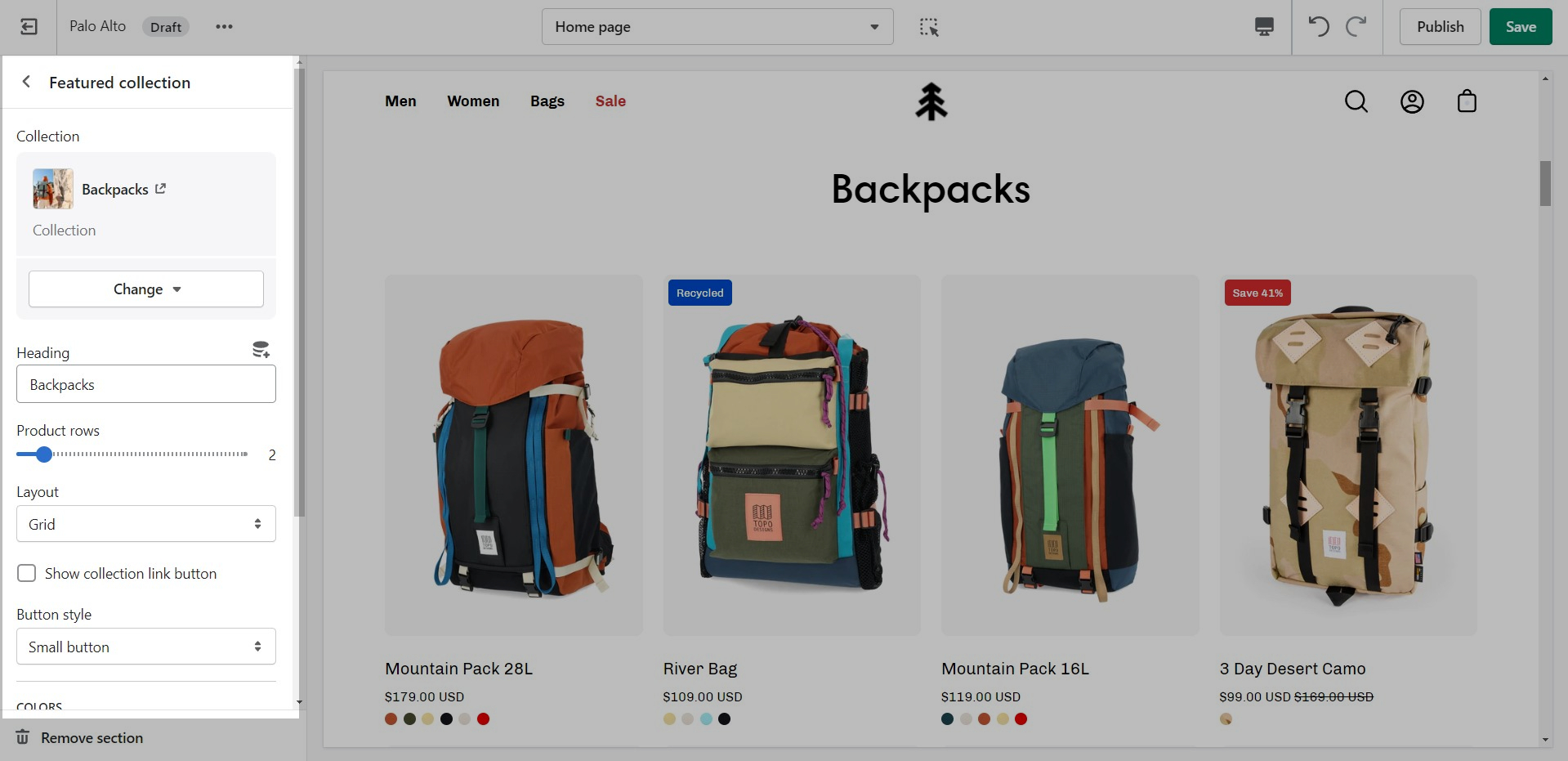
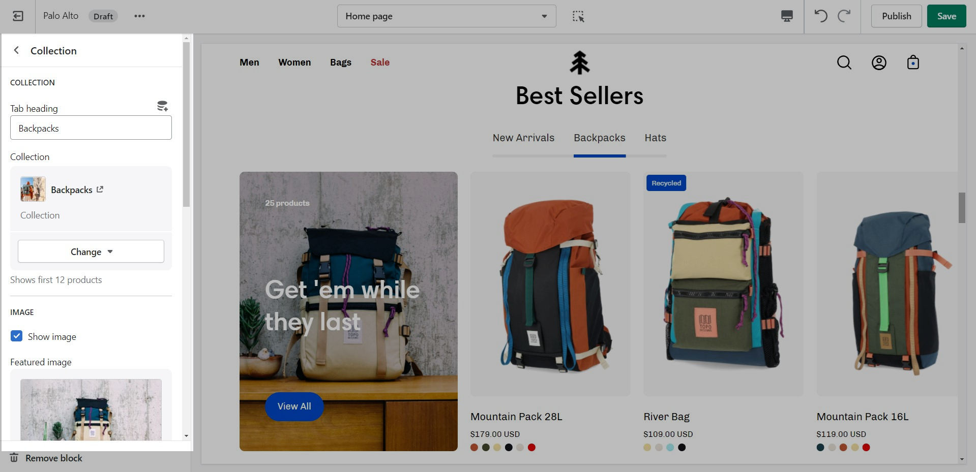
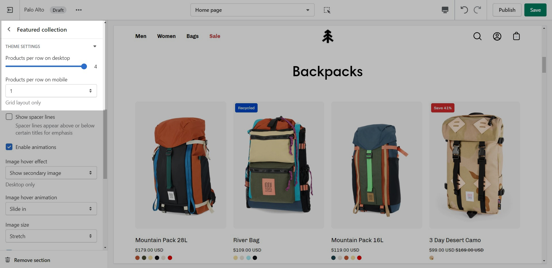
The 'Featured collection' section allows you to highlight a specific collection of products on your store pages. This section generates blocks with links to each product page.
From the settings of this section, you can control which collection to display, the number of rows, as well as a handful of other settings.
At the bottom of all the section settings, you can find a tab with some more features.
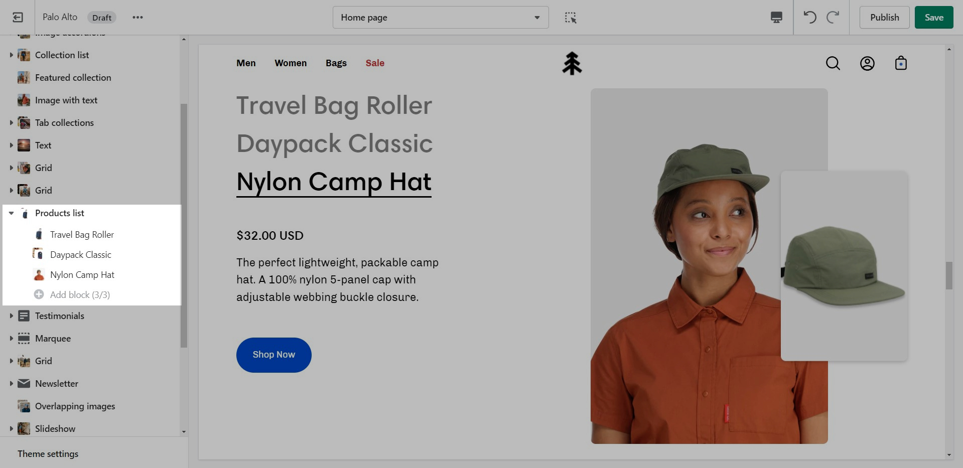
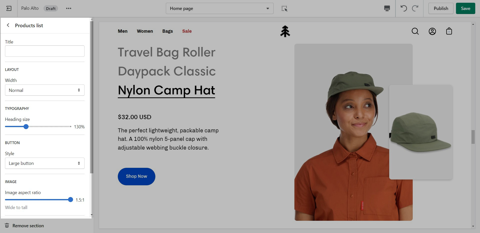
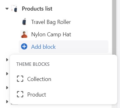
The 'Products list' section creates a split view of text and images. This section can show products or collections.
Add blocks by clicking on the small arrow next to the section then clicking 'Add block'
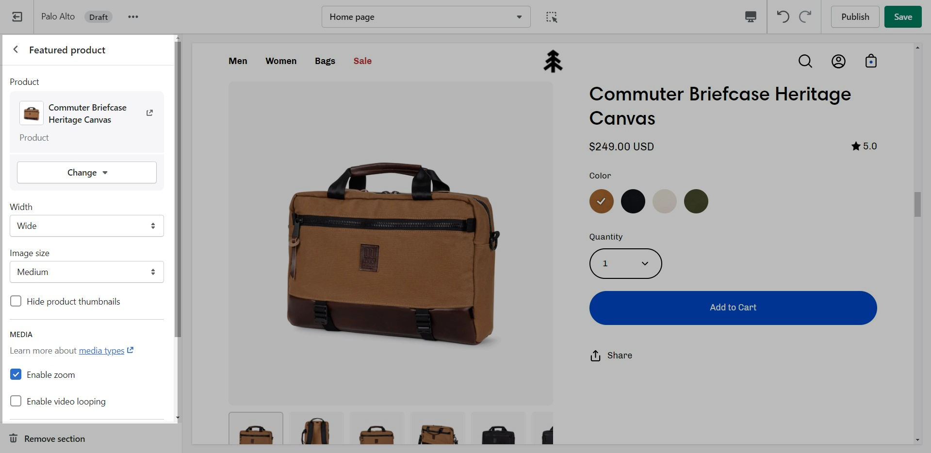
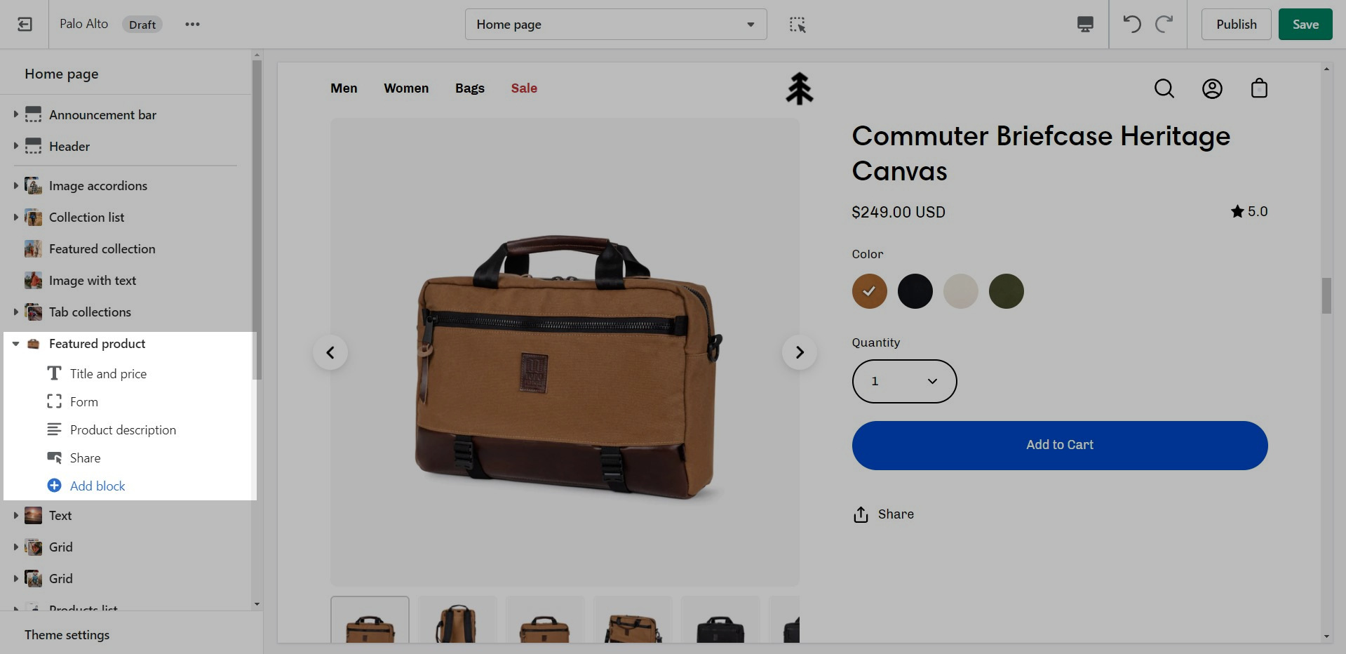
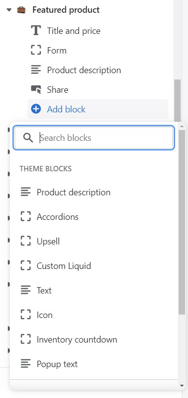
Use the 'Featured product' section to bring a product gallery and form to your store pages.
Add blocks by clicking on the small arrow next to the section then clicking 'Add block'.
Showcase up to three collections on your store pages.
Change the width and the heading of this section from the Section settings.
Add blocks by clicking on the small arrow next to the section then clicking 'Add block'.
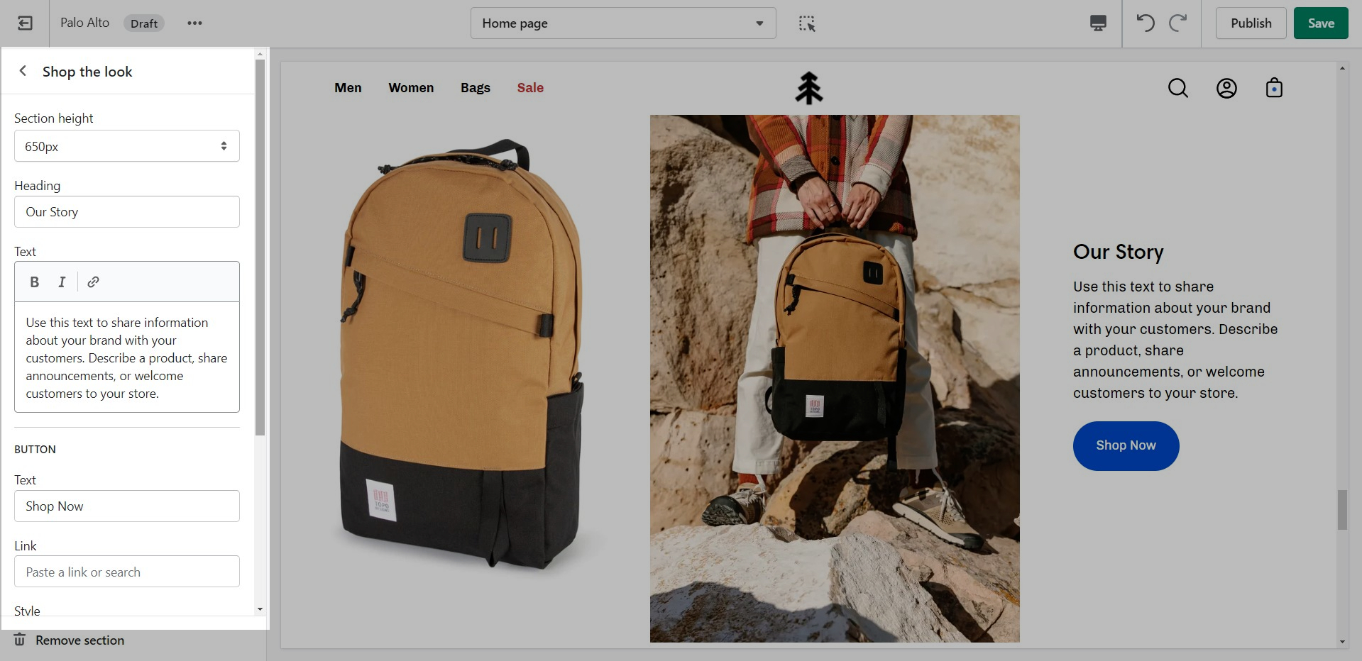
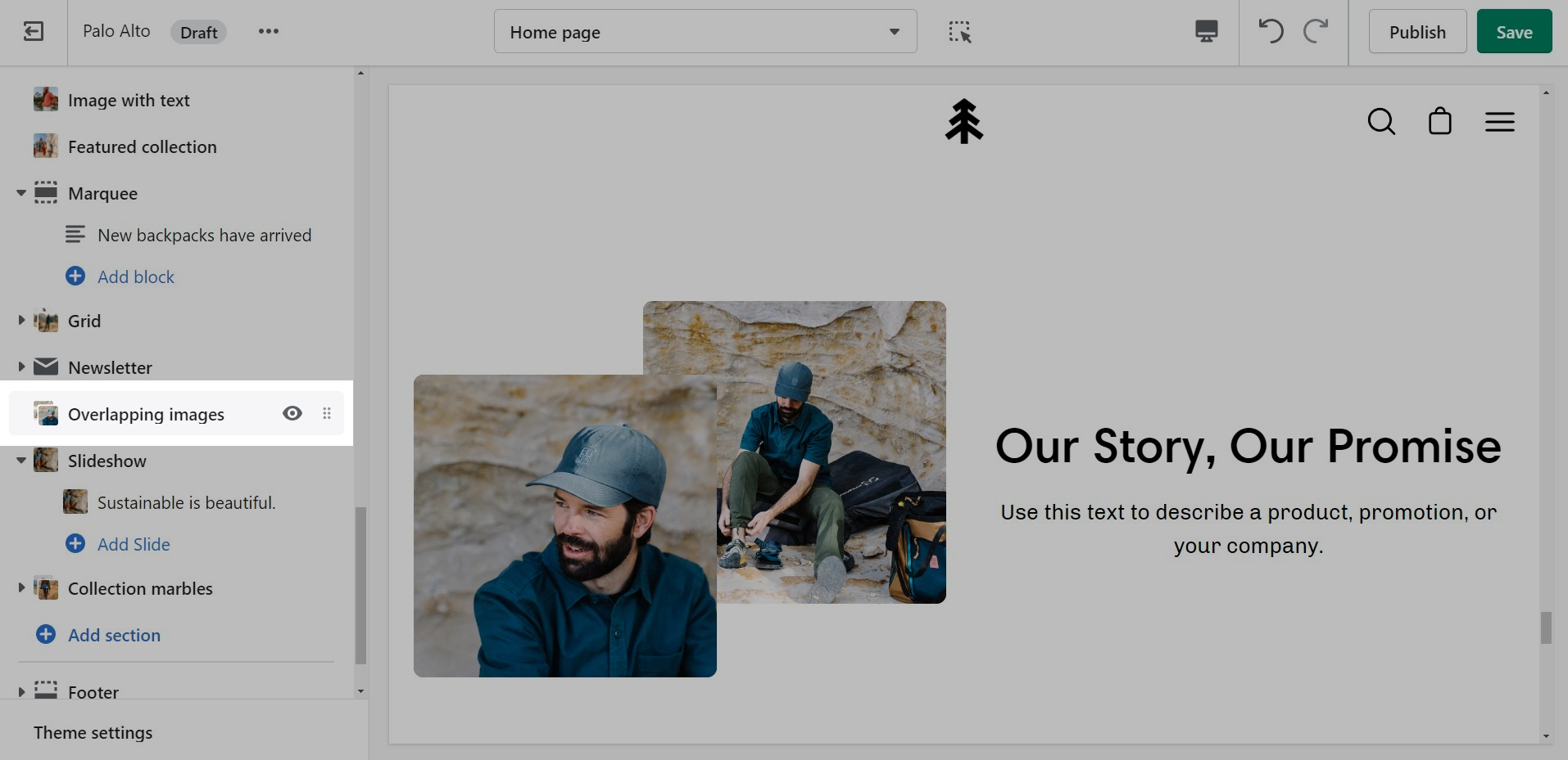
'Shop the look' allows you to use images and dots to highlight specific points of your products. Use this section to create a unique way of getting your customer's attention!
Add blocks by clicking on the small arrow next to the section then clicking 'Add block'.
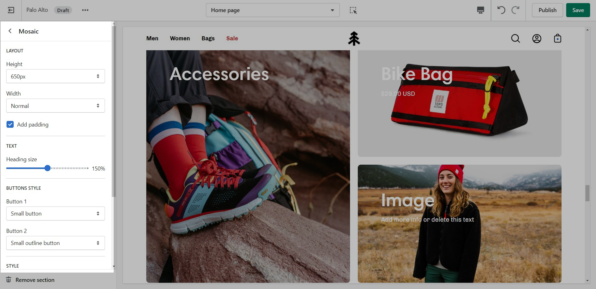
Create a unique view to showcase your products and collections.
Set the height and text style for the section.
Add blocks by clicking on the small arrow next to the section then clicking 'Add block'.


Choose the collection link and image for each block.
Theme Settings is a tab that allows you quick access to the global options. These options may affect areas of your store that you do not see on the current page.
A common example here is the 'products per row' option. This option allows you to set the number of products per row but also affects the look of your collection pages.
At the bottom of all the section settings, you can find a tab with some more features.
Theme Settings is a tab that allows you quick access to the global options. These options may affect areas of your store that you do not see on the current page.
Set the individual block links, images, text, and overlay.
The individual blocks of this section are images. From their own settings, you can gain access to add different images as well as move the dots to different places.
Add blocks by clicking on the small arrow next to the section then clicking 'Add block'.
Individually adjust the icon style and text for each block.
Add up to 6 blocks.
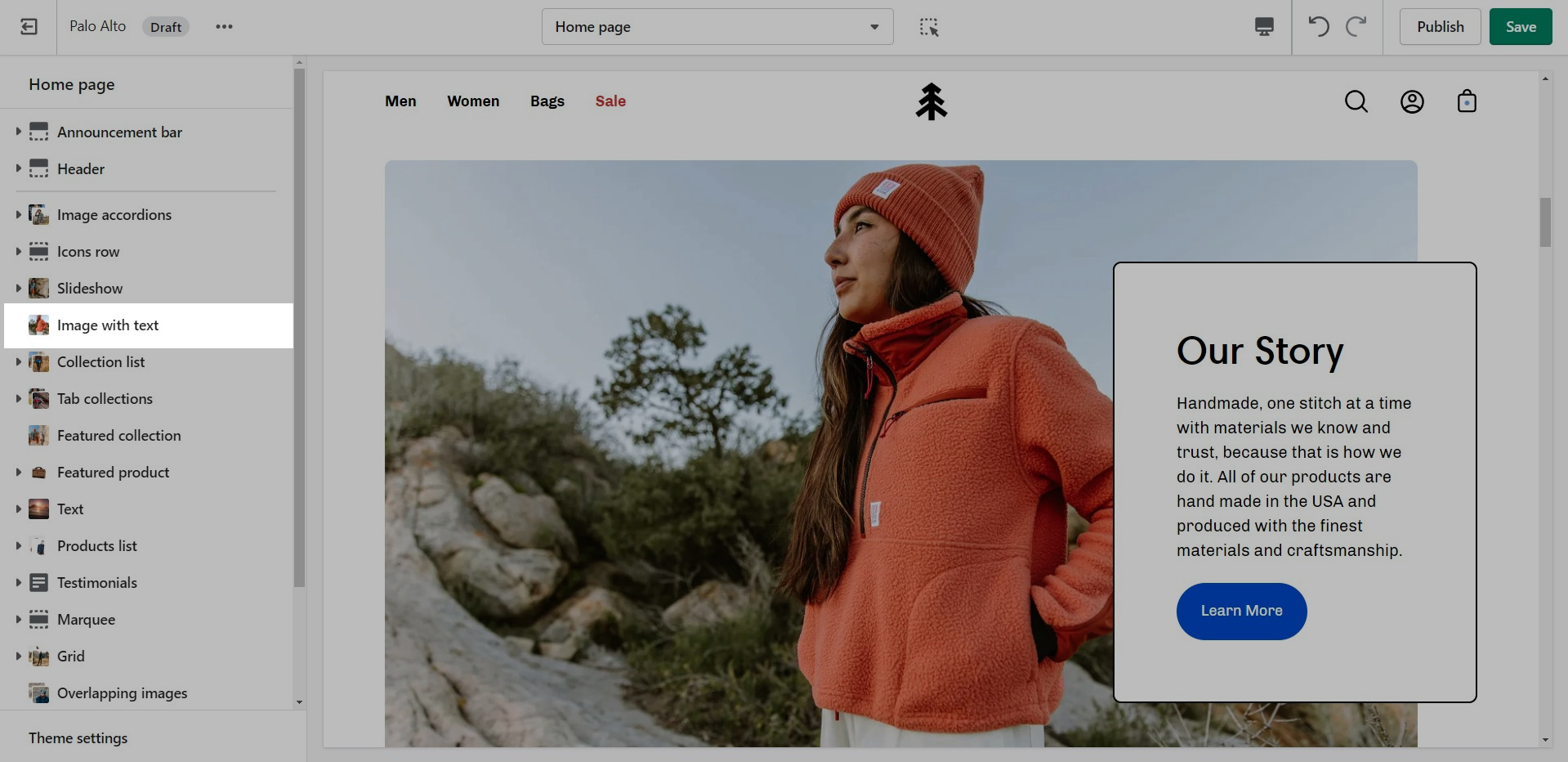
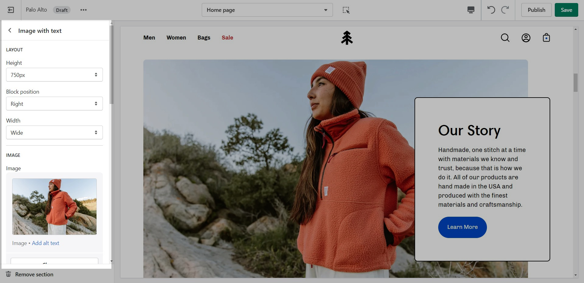
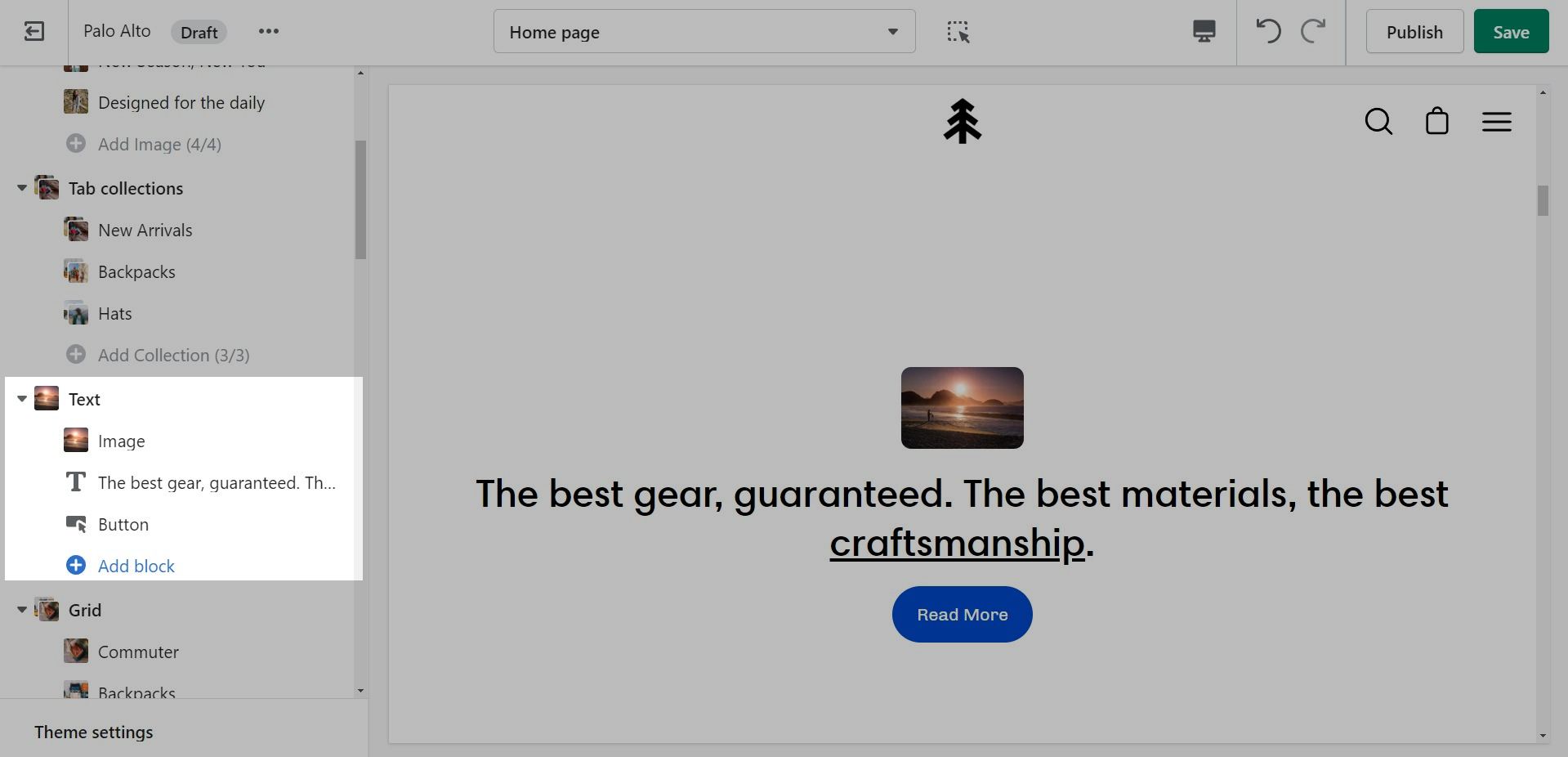
'Image with text' uses a solid color block to make the text stand out over the image. Use this more striking design to grab your customer's attention.
Set up your image, text, positions, and buttons by using these section settings.
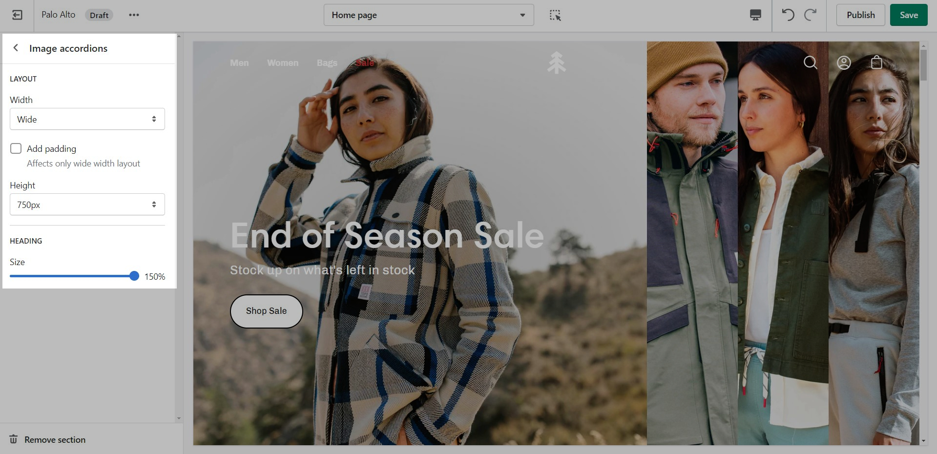
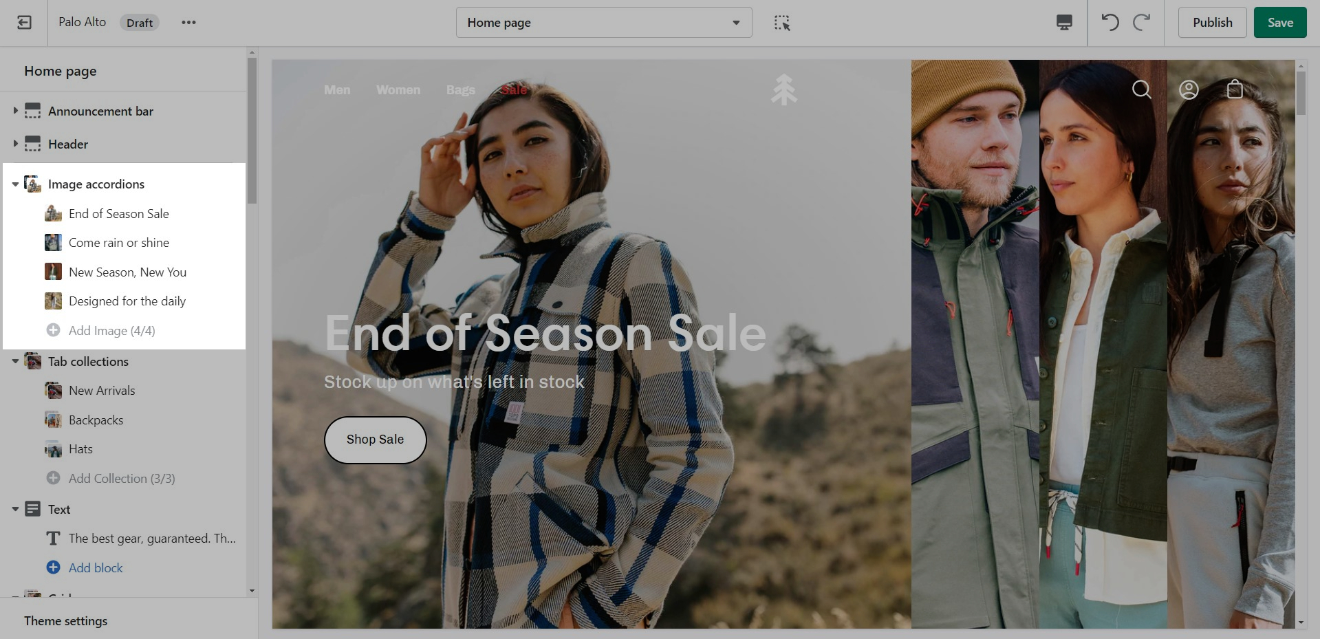
One of our newest sections, Image accordions, allows you to set a unique look and showcase multiple images that reveal more information as you hover over them.
Set a style and height for the section.
Add blocks by clicking on the small arrow next to the section then clicking 'Add block'.
Set the image, text, and button settings for each block.
A small section perfect for a brief summary with the ability to use images and showcase your products.
The settings for this section allow you to set two images, links for each image, headings, buttons, text, and a small video link.
The video opens up in a popup box.
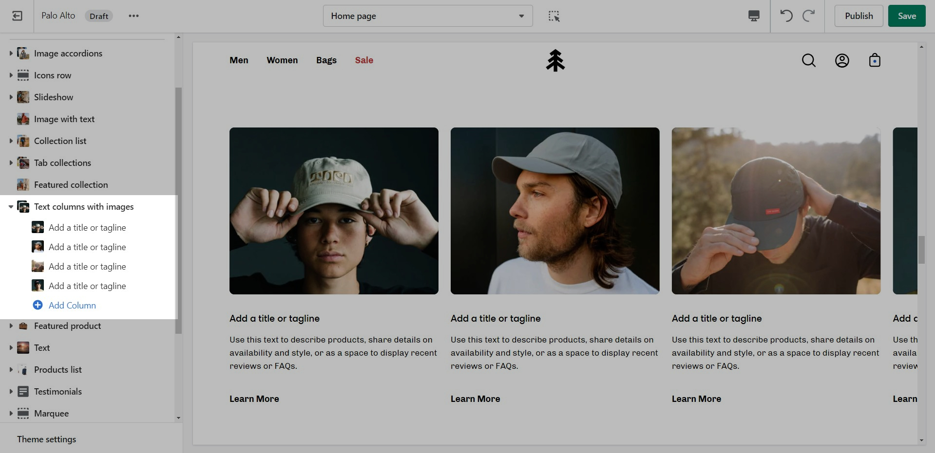
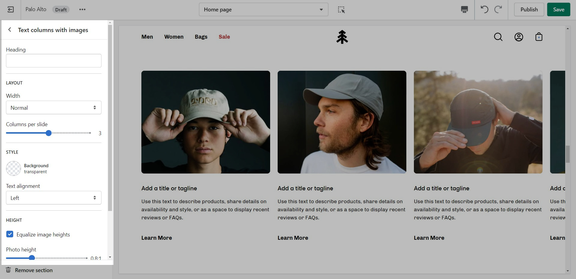
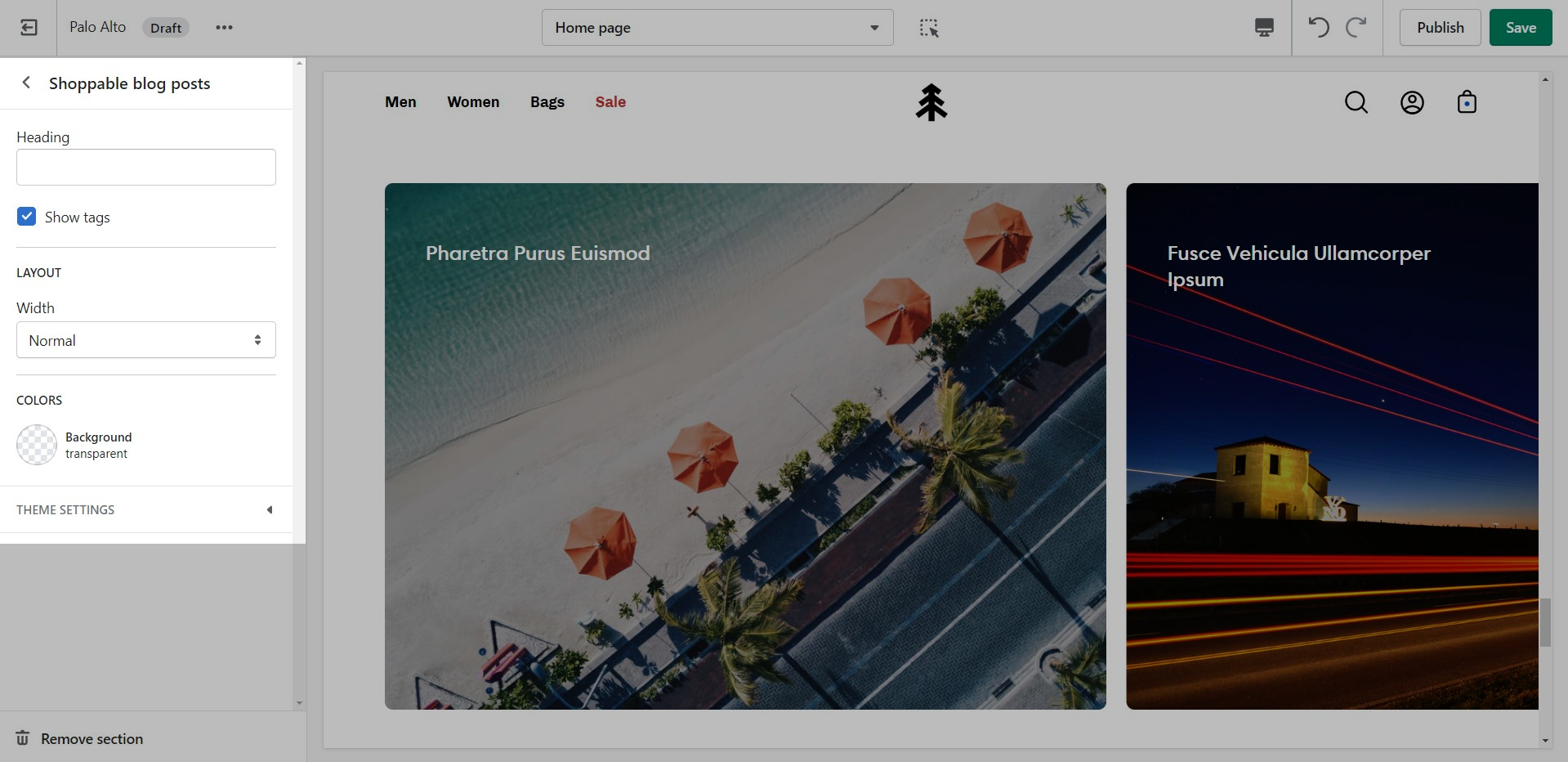
Inspired by the blog posts section, 'Text collums' allows you to create your own highlights from the theme editor without having the need to create blog posts.
Adjust the heading, colors, and general settings of the section
Add blocks by clicking on the small arrow next to the section then clicking 'Add block'.
Adjust the individual blocks text, buttons, links, images, video popup, and more.
Create a split view to showcase your products or product images.
Set the section height, alignment, and text settings.
Add blocks by clicking on the small arrow next to the section then clicking 'Add block'.
Set the individual images.
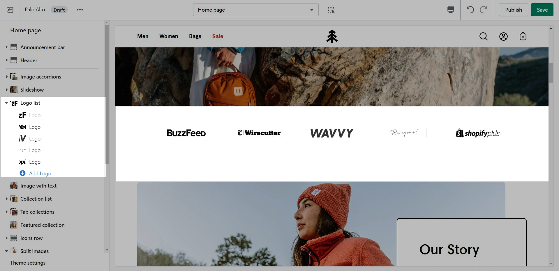
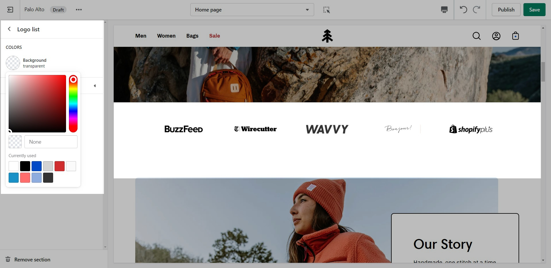
'Logo List' creates a carousel view that you can use to showcase your brand or partnered brand logos.
Add the logos with their respective links. Also, the background color can be changed.
Add blocks by clicking on the small arrow next to the section then clicking 'Add block'.
Set the individual images and sizes for your logo blocks.
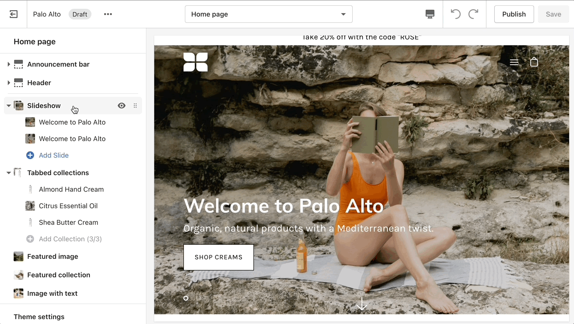
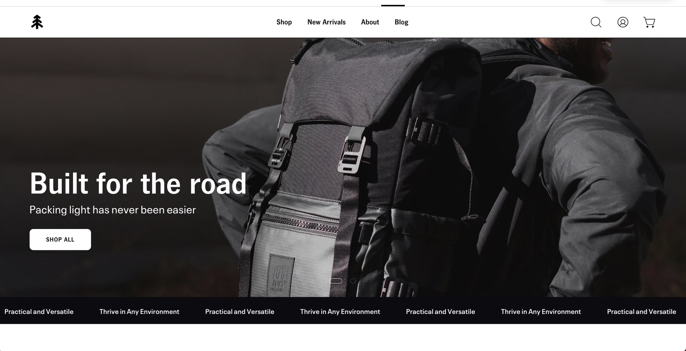
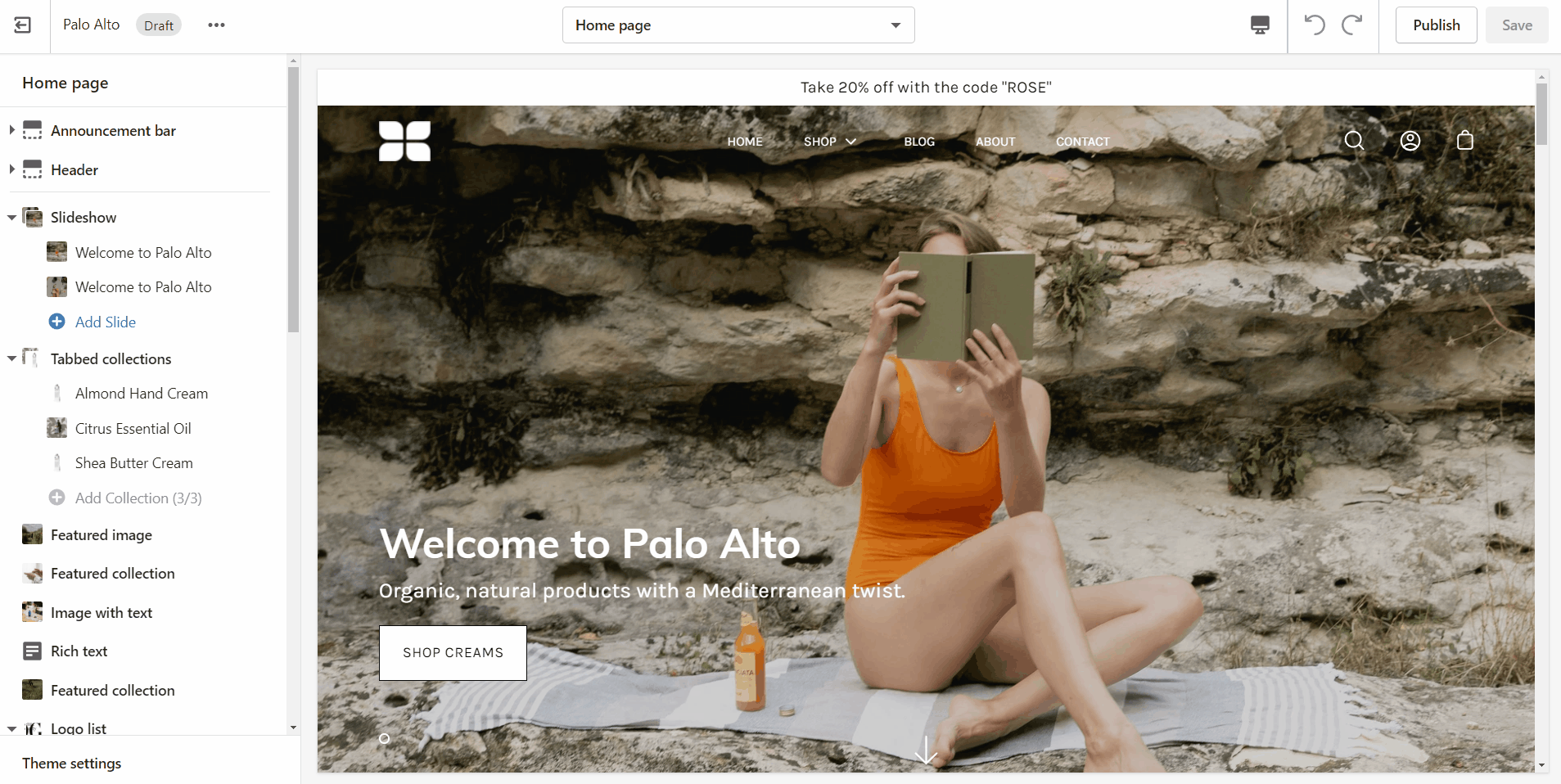
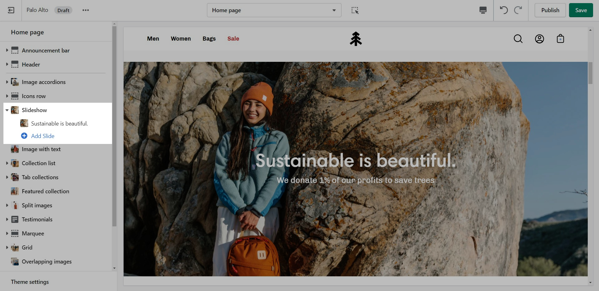
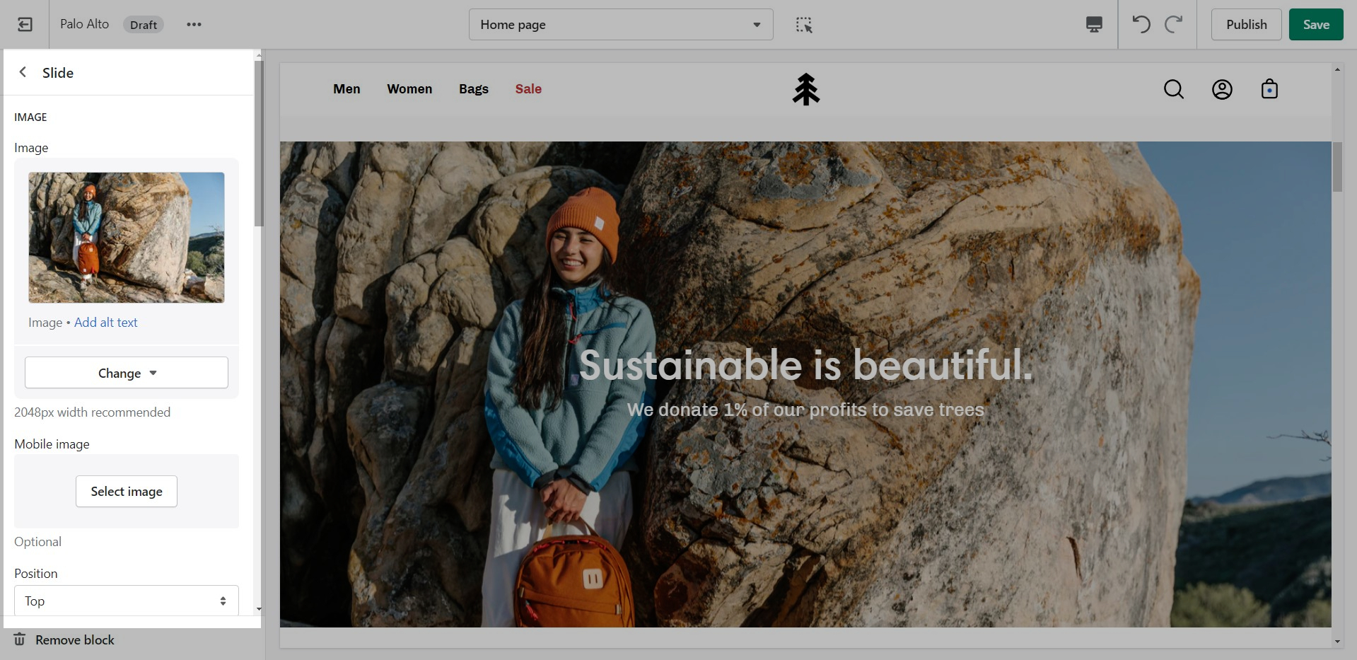
This is the perfect hero section for most stores. Use the Slideshow to create a home page banner with incredible customizability.
Adjust the general settings of the section.
Add blocks by clicking on the small arrow next to the section then clicking 'Add block'.
Adjust the individual block settings of this section.
If the button text is empty, the whole slide becomes the link.
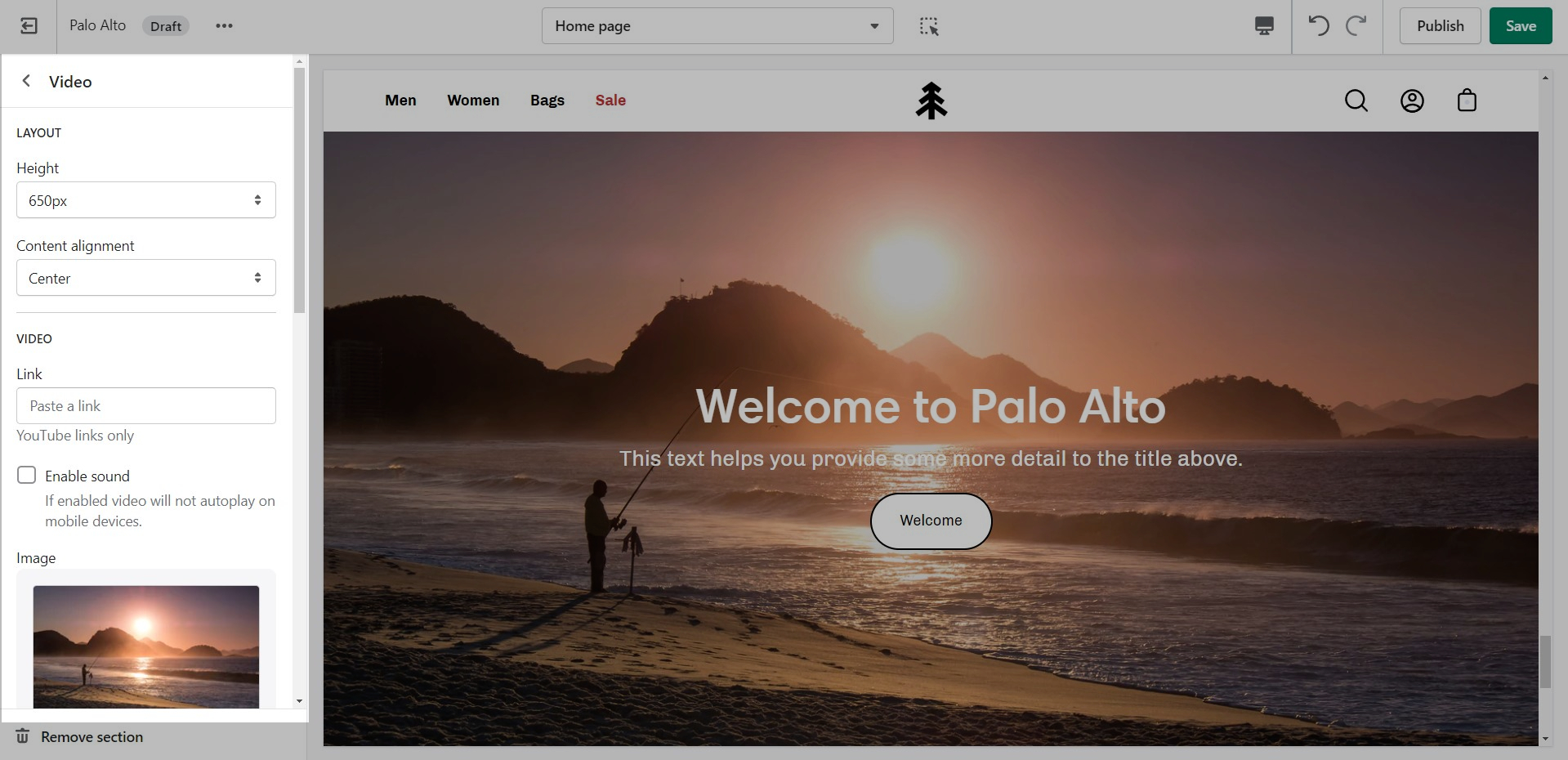
Add a video to your store pages that will autoplay as a background over text.
Set a YouTube or Vimeo link and regulate the size of your video section.
Shopify only supports YouTube and Vimeo. For any further customizations, we recommend using a third-party app.

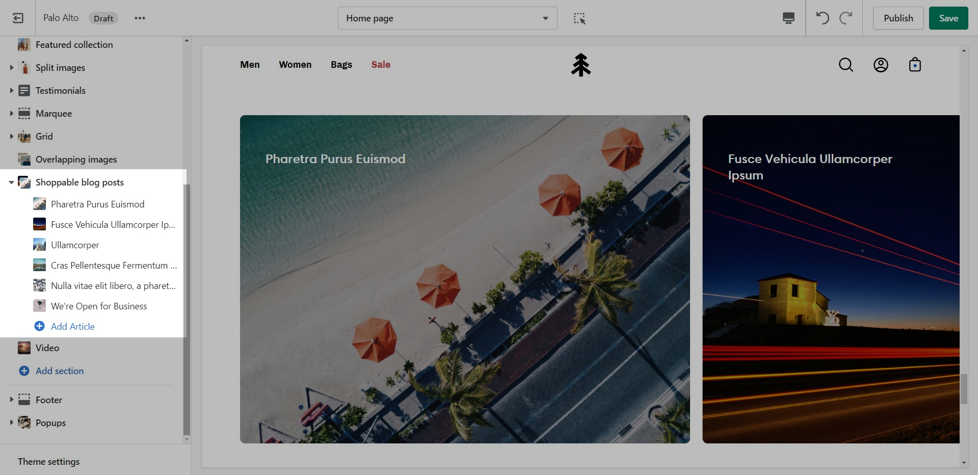
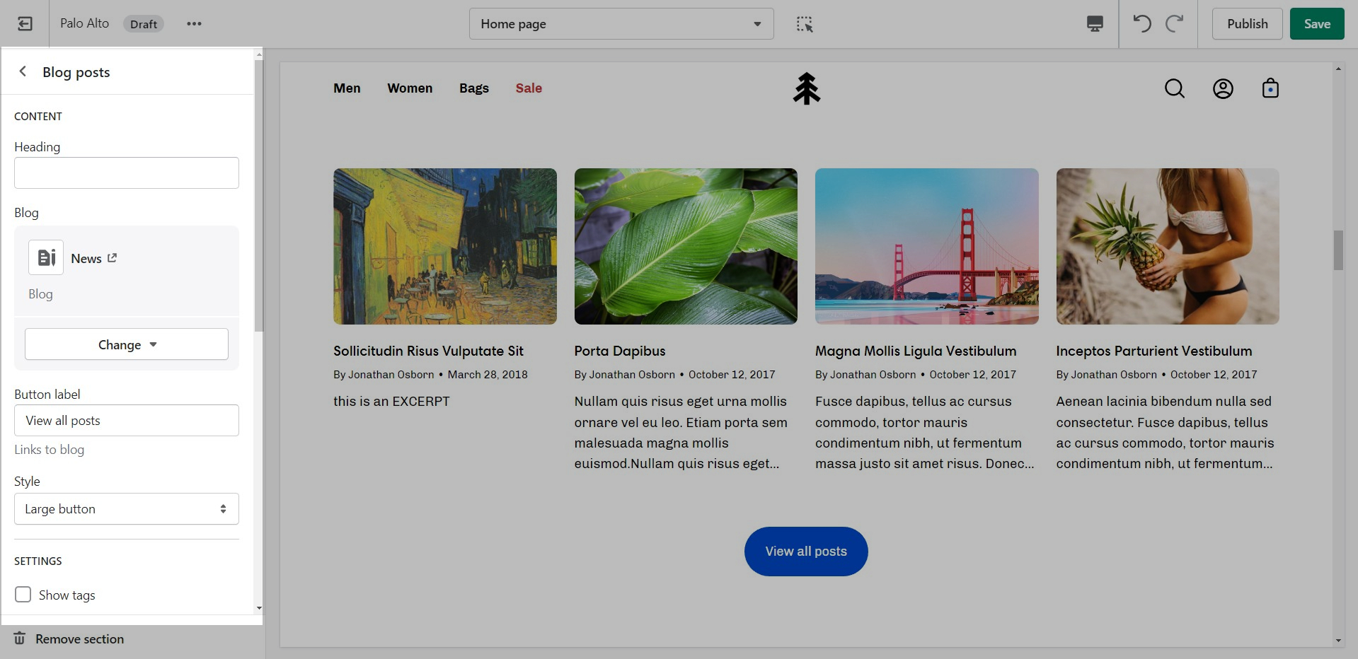
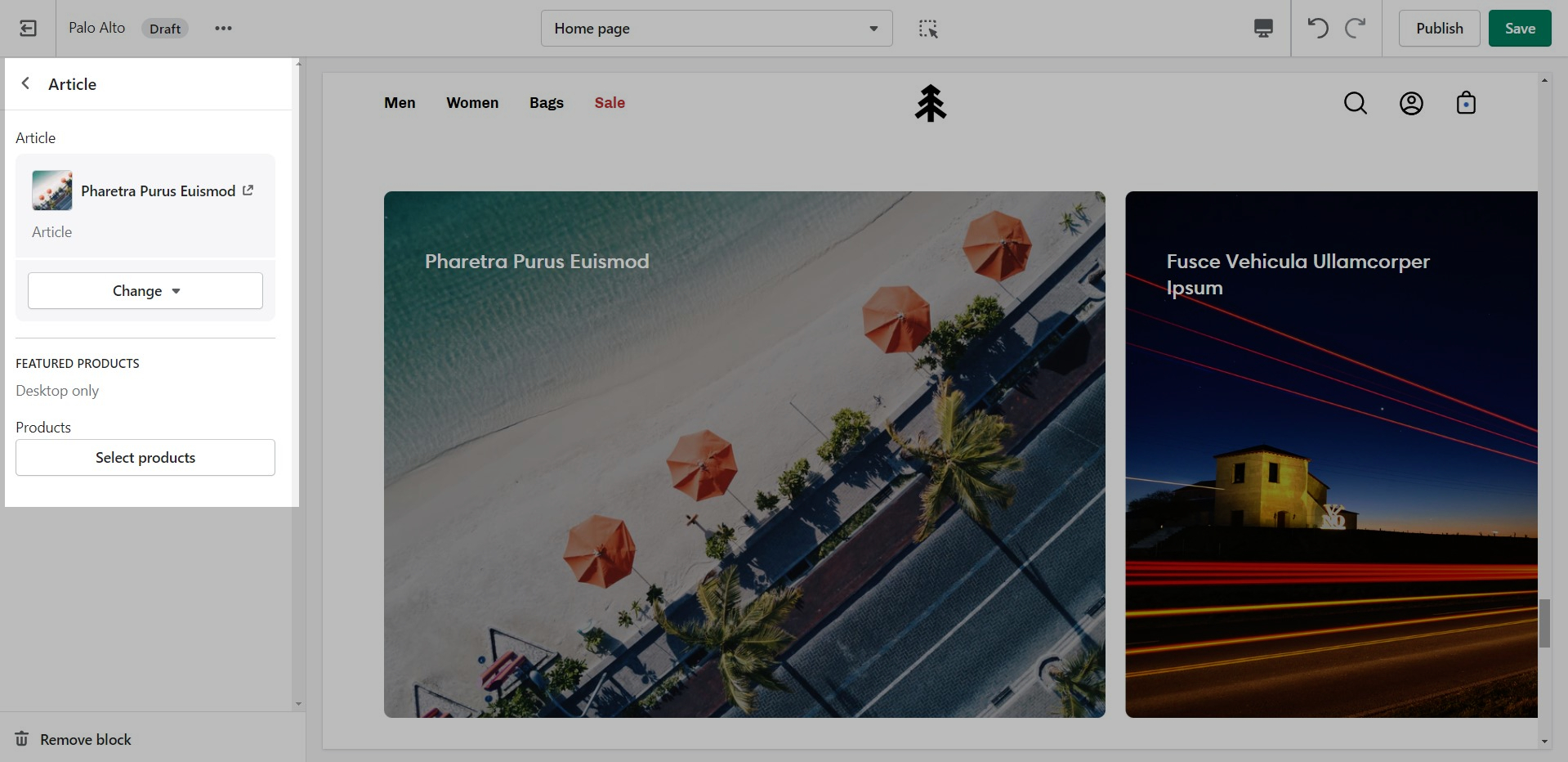
Highlight your latest and greatest blog posts. Use this section to generate traction and bring exposure to your blogs on any store page.
Set the heading and background color for the section.
Add blocks by clicking on the small arrow next to the section then clicking 'Add block'.
Set the individual block settings for each article added.
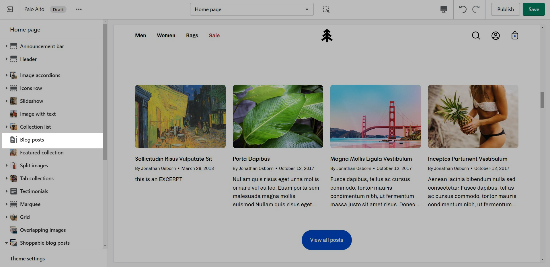
Showcase the latest posts from one of your blogs on your store pages.
Set background color and control the details of the section.
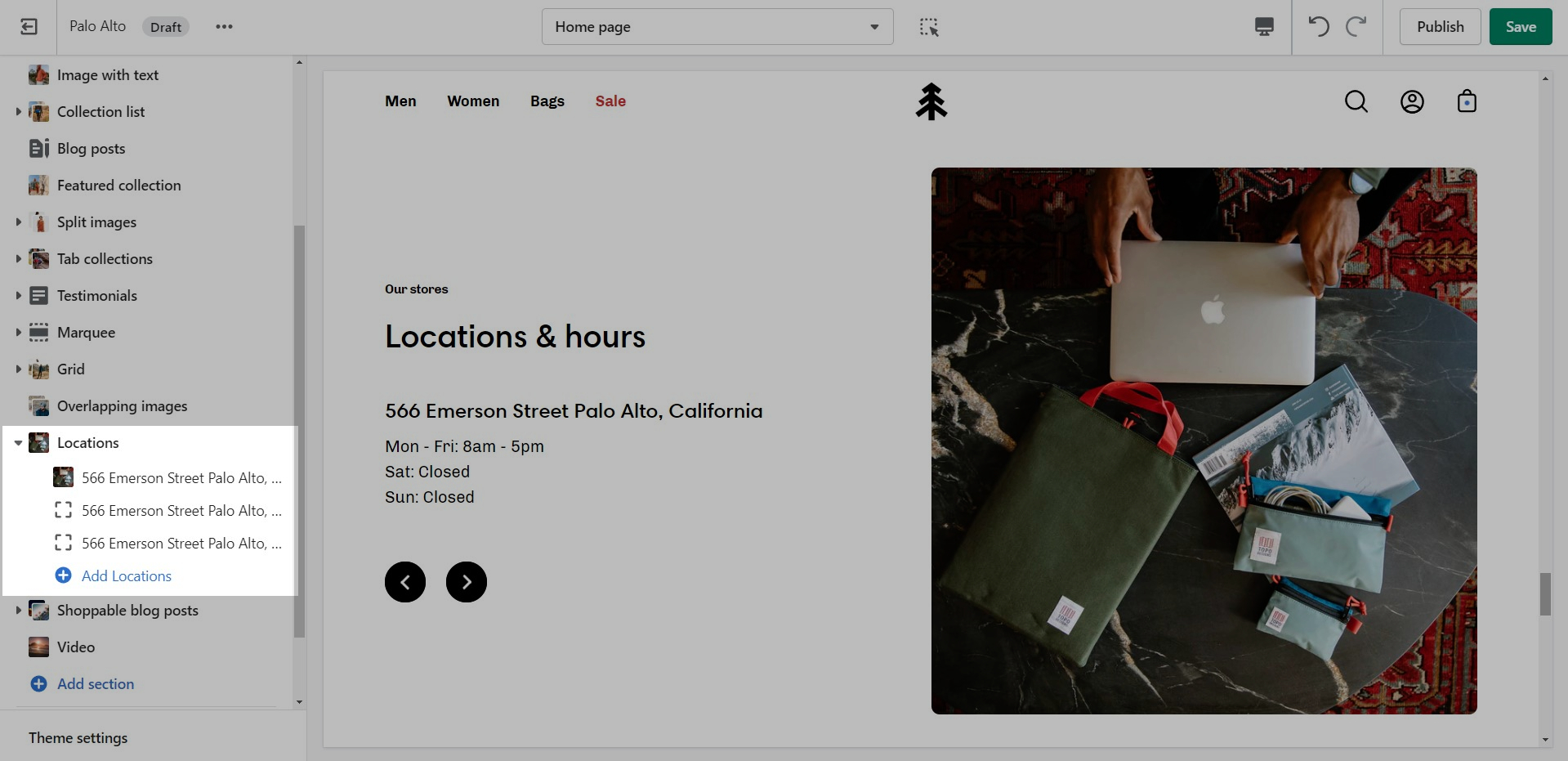
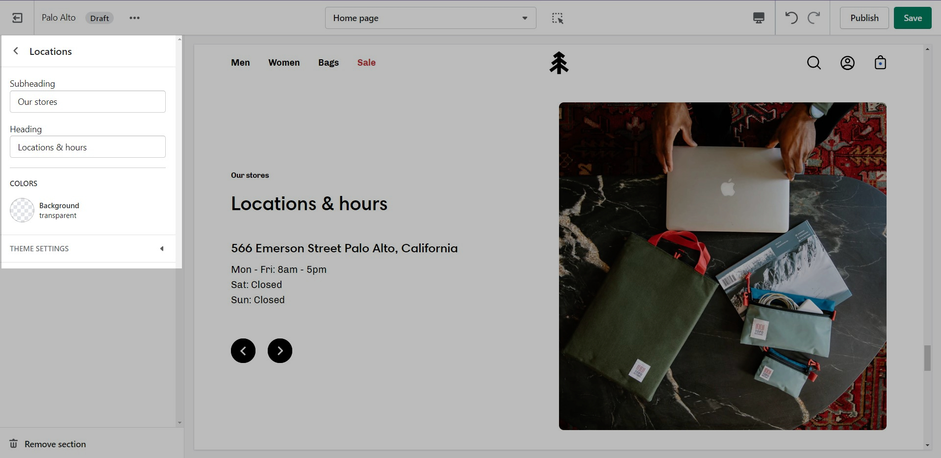
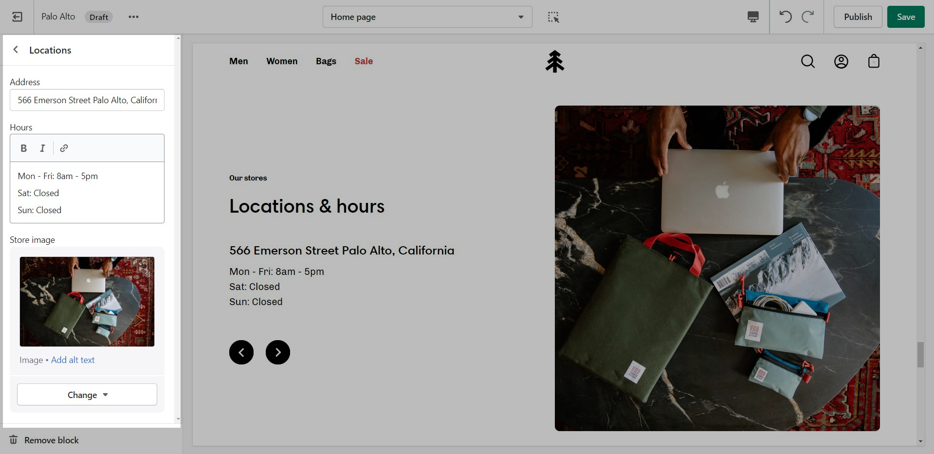
Let your customers know about your store locations. You can add more than one block if you have multiple stores.
Set the general headings and colors of the section.
Display a small-sized newsletter signup message.
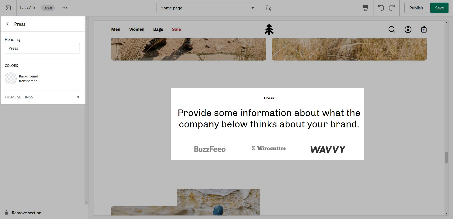
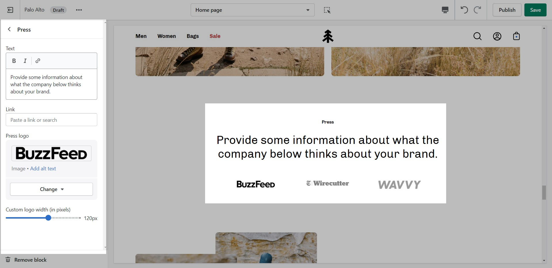
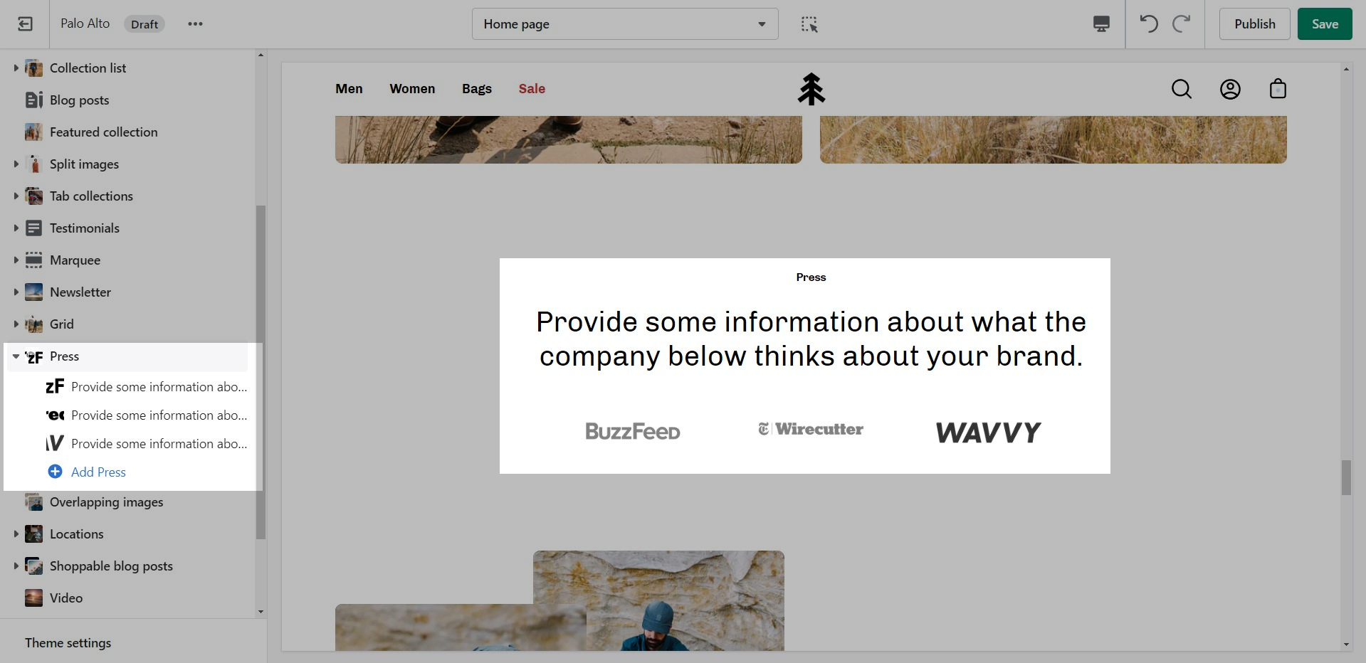
The 'Press' section can be used to present short bursts of information to your customers.
Add blocks by clicking on the small arrow next to the section then clicking 'Add block'.
A commonly used section to break apart image-heavy setups.
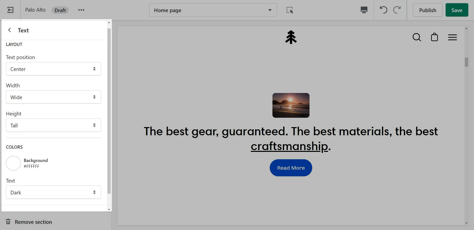
The 'Text' section allows for a ton of customization. Use this section to tell a story to your customers.
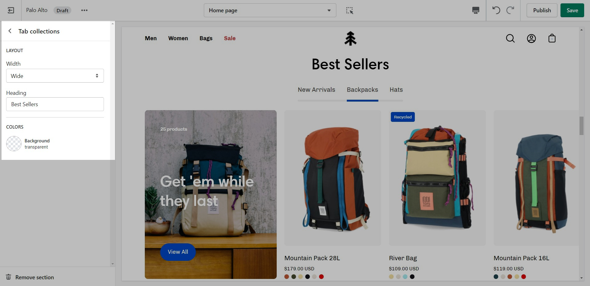
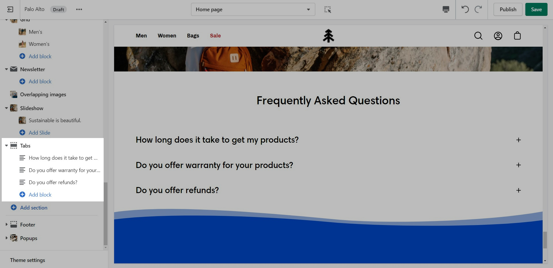
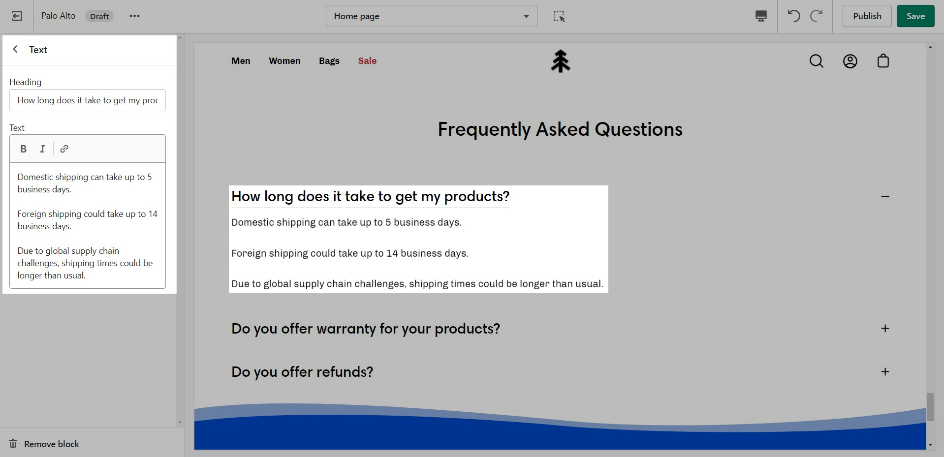
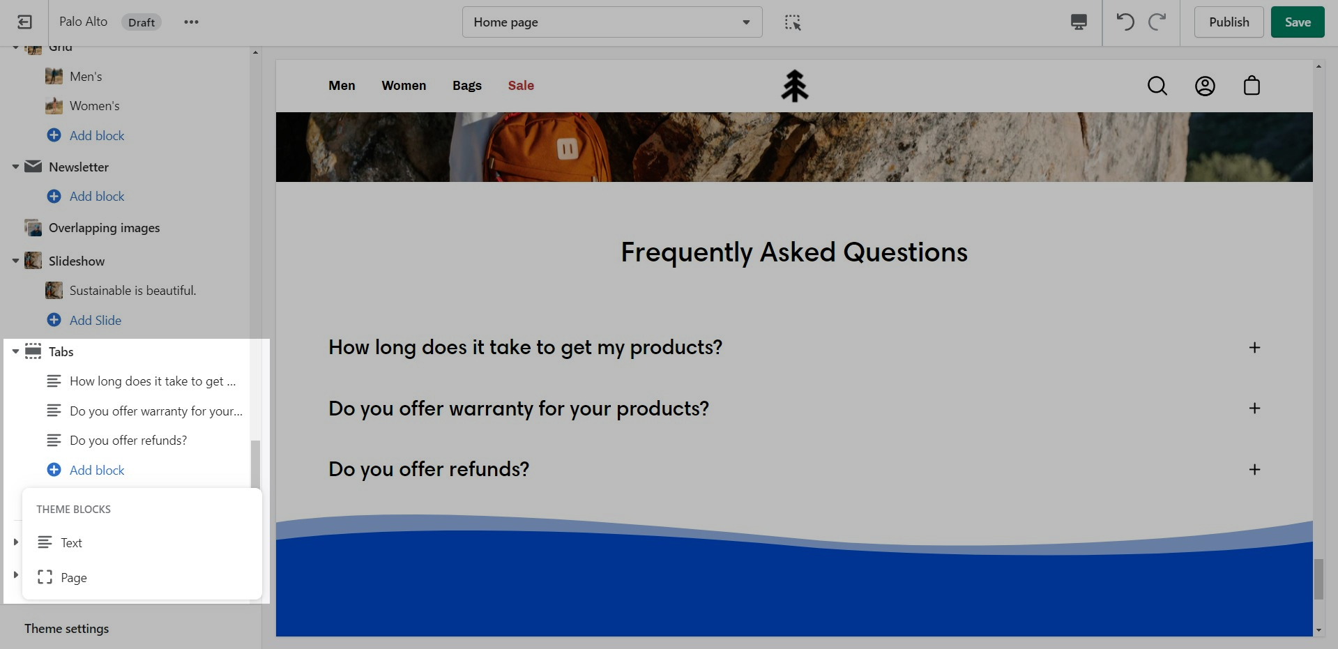
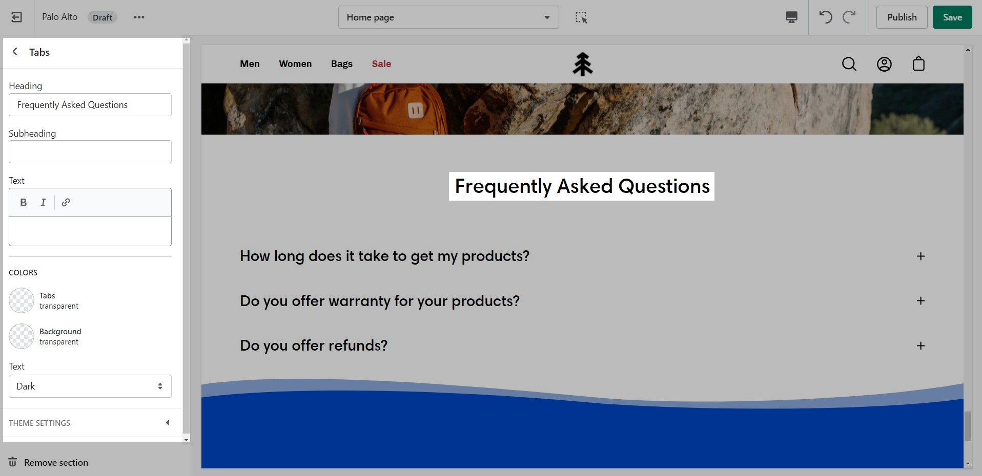
Palo Alto includes a 'Tabs' section to help you provide frequently asked questions. A place to promote your services, and brand strengths and also include product reviews.
Add blocks by clicking on the small arrow next to the section then clicking 'Add block'.
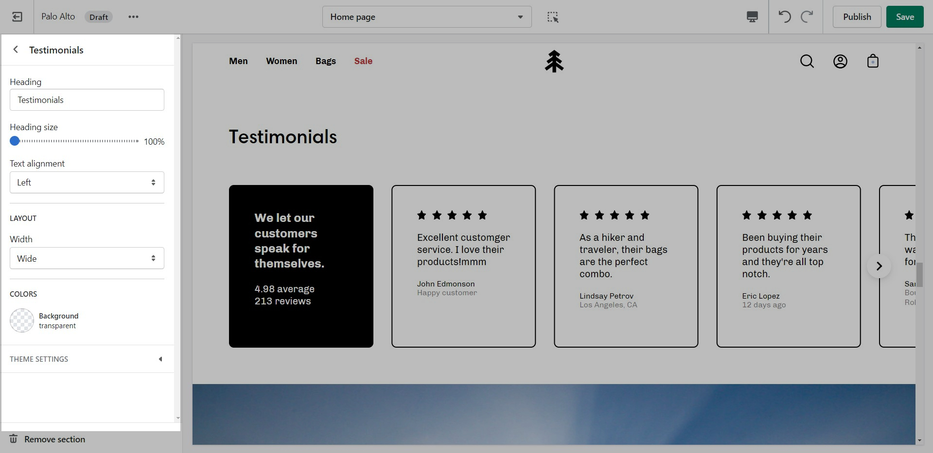
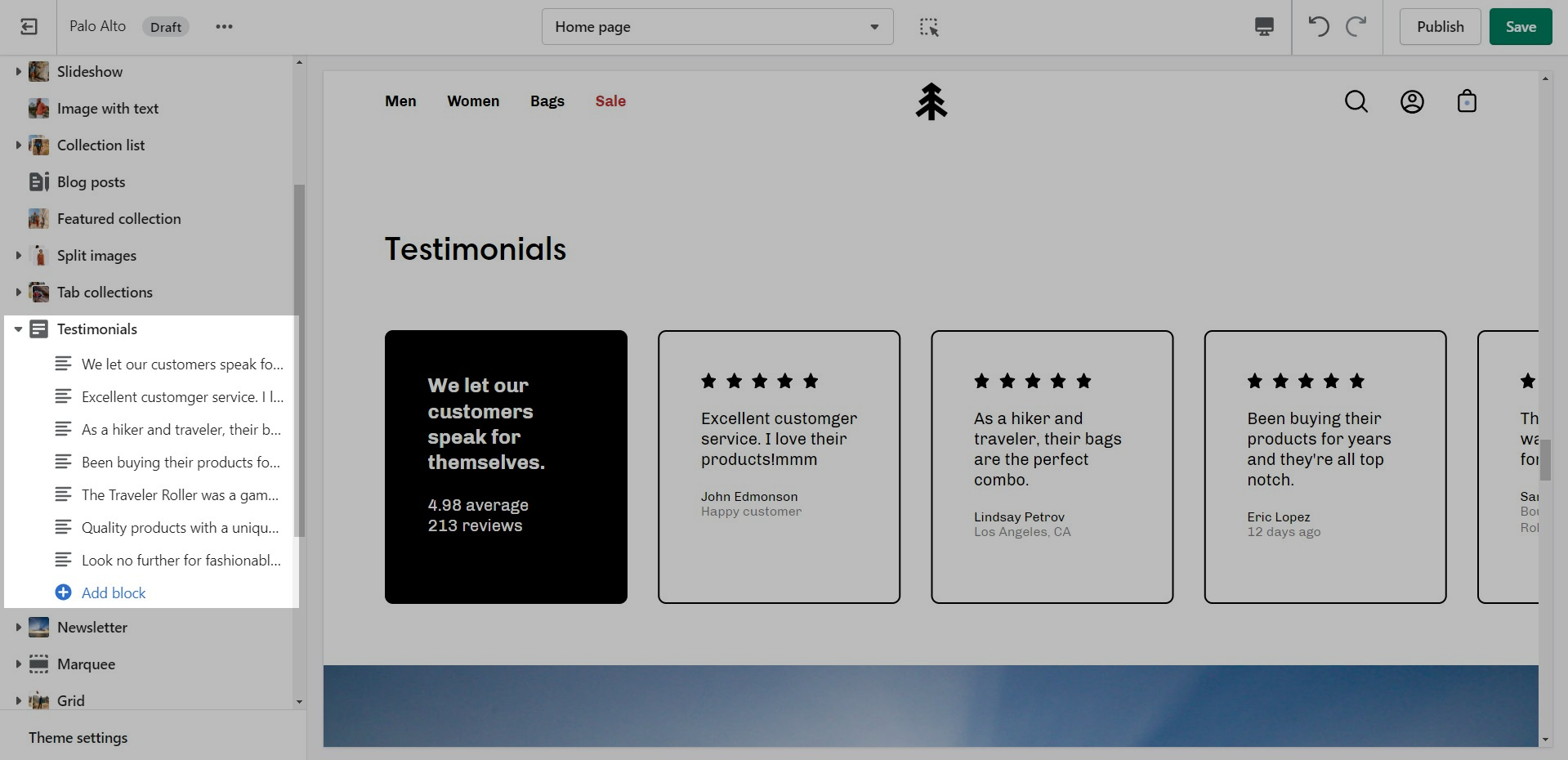
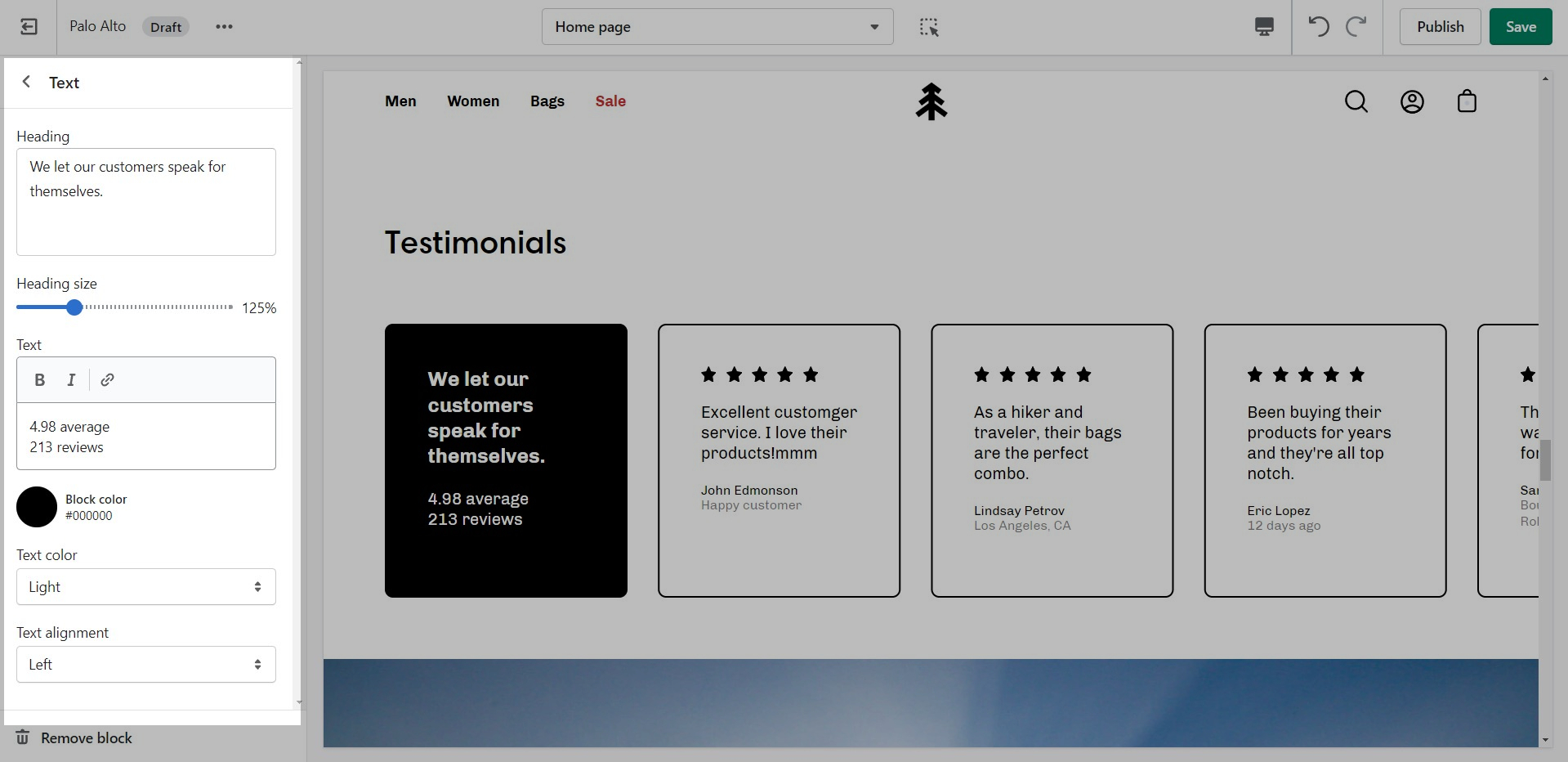
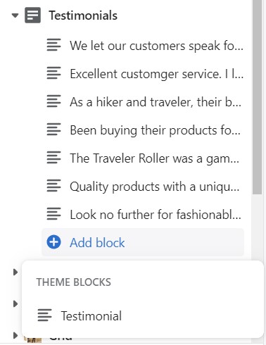
Add quotes from business partners and client testimonials to your store pages.
Add a heading and set the colors, alignment, and navigation style of this section.
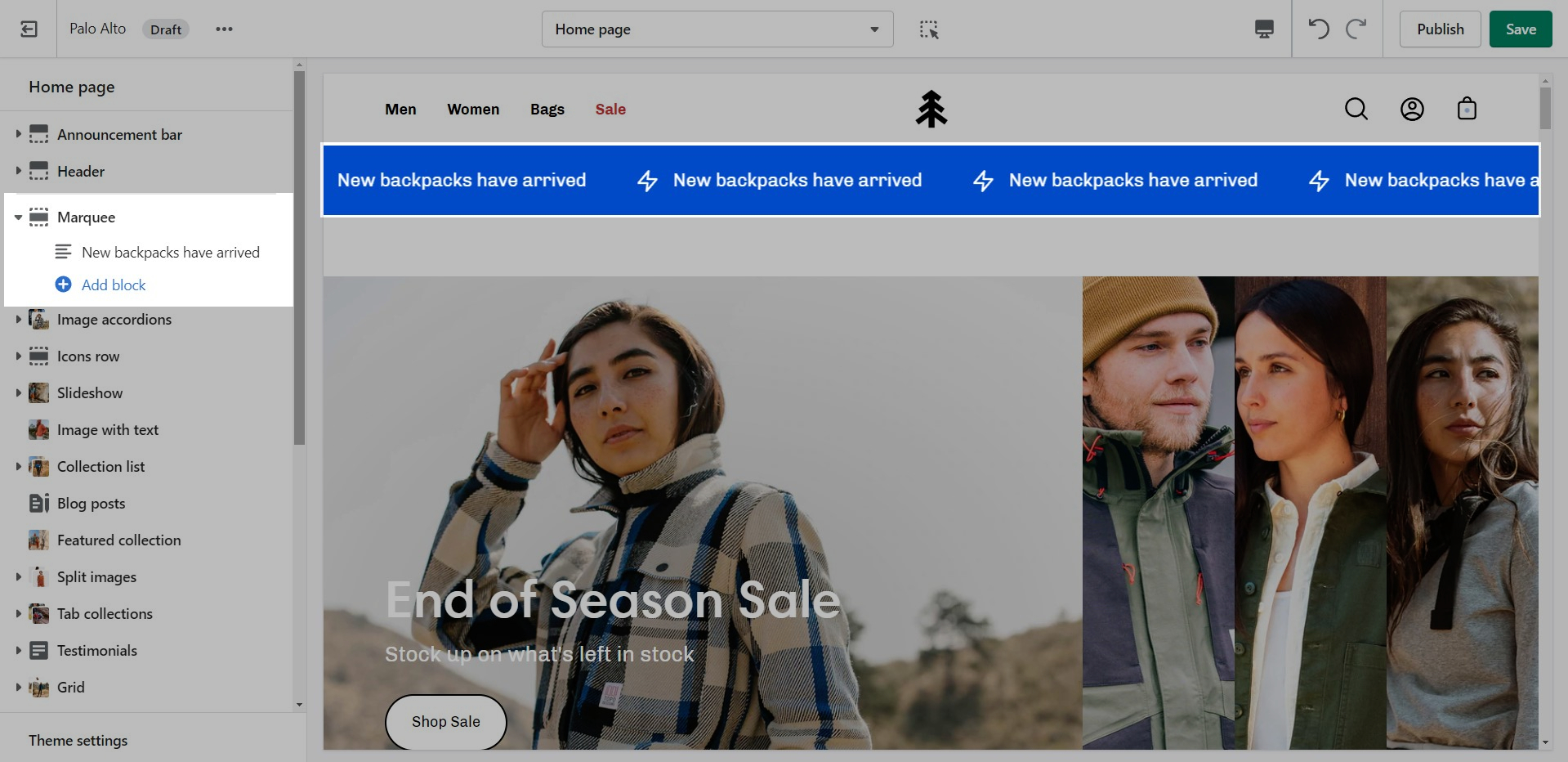
Add an animated promotion line to your store pages.
Set the background and colors for this section. Control the spacing and speed.
Add blocks by clicking on the small arrow next to the section then clicking 'Add block'.
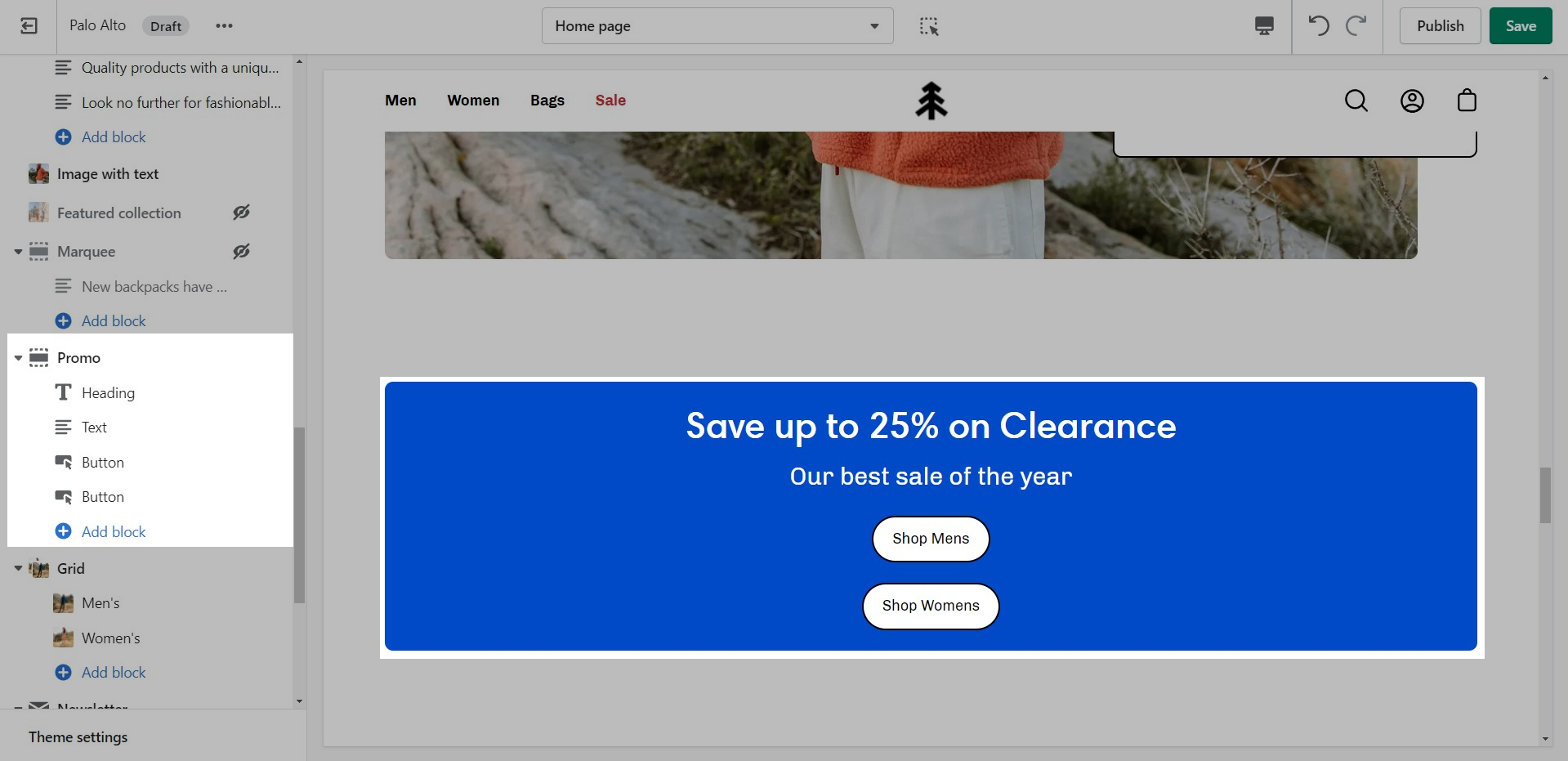
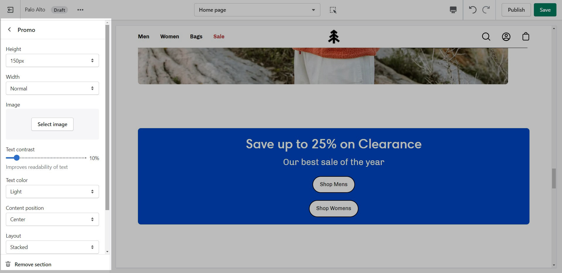
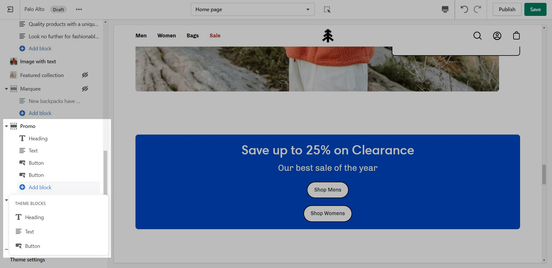
Use the 'Promo' section to add a simple banner image with text and promote to customers as they scroll along the page.
Add blocks by clicking on the small arrow next to the section then clicking 'Add block'.


Set different options for different blocks such as different working hours, images, or addresses.
Out of the box, there aren't any blocks for this section. It solely relies on blocks from third-party mailing apps to create a link between the newsletter subscribers and the mailing lists.
The blocks in this section help to create the individual tabs. Here you can add the heading and text for each question and answer:
Add individual testimonial blocks to the section.
Set the individual block settings.
Add, arrange and customize Product page theme blocks
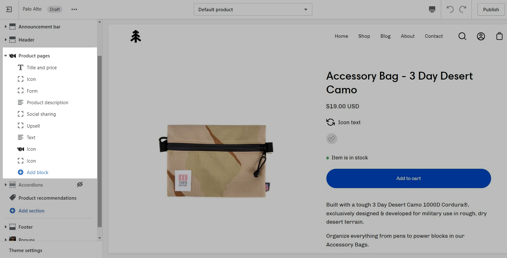
The Palo Alto 'Product pages' section blocks help you customize the primary or core content for your product pages and product templates. Adding sections further enhances your merchandising.
Palo Alto includes the following theme blocks for product pages/templates:
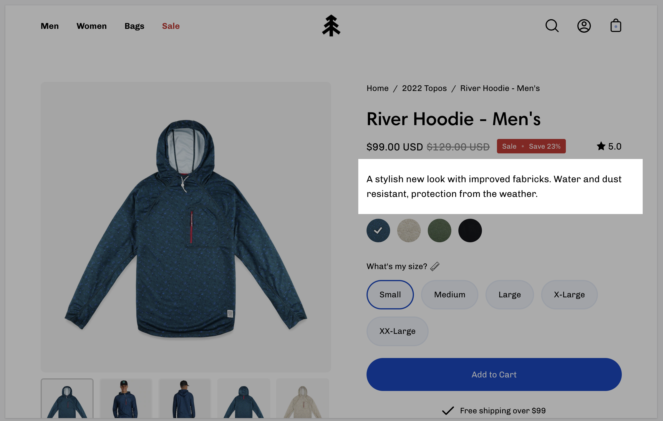
Displays product price, title, and star rating when using the Shopify Ratings app. Includes an option to display Navigation breadcrumb above the title (including vendor option, see settings)
Navigation options
None
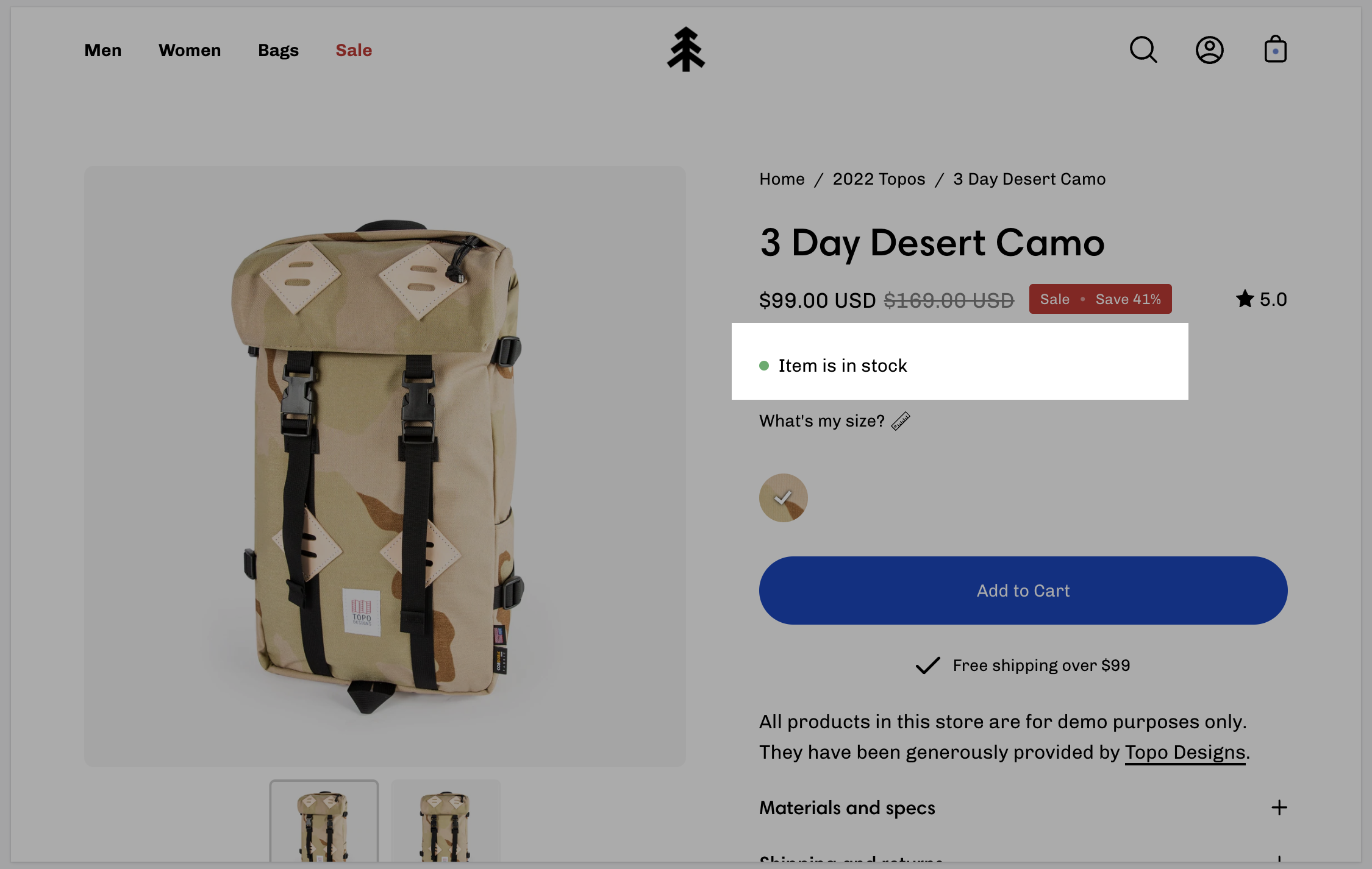
Display a notification about the current inventory quantity. If there are less than 10 products available this block will show how many are left.
No customizable settings.
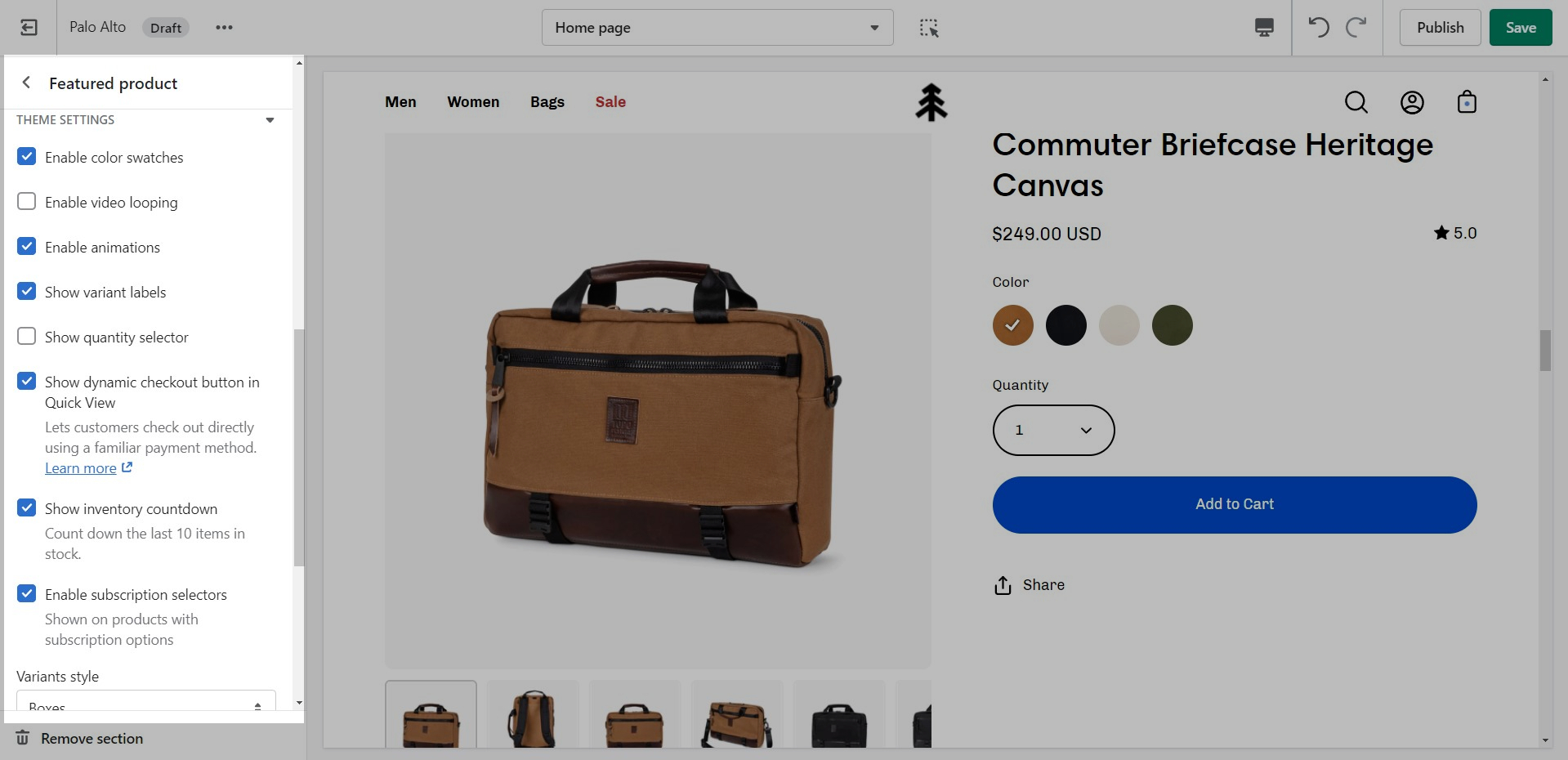
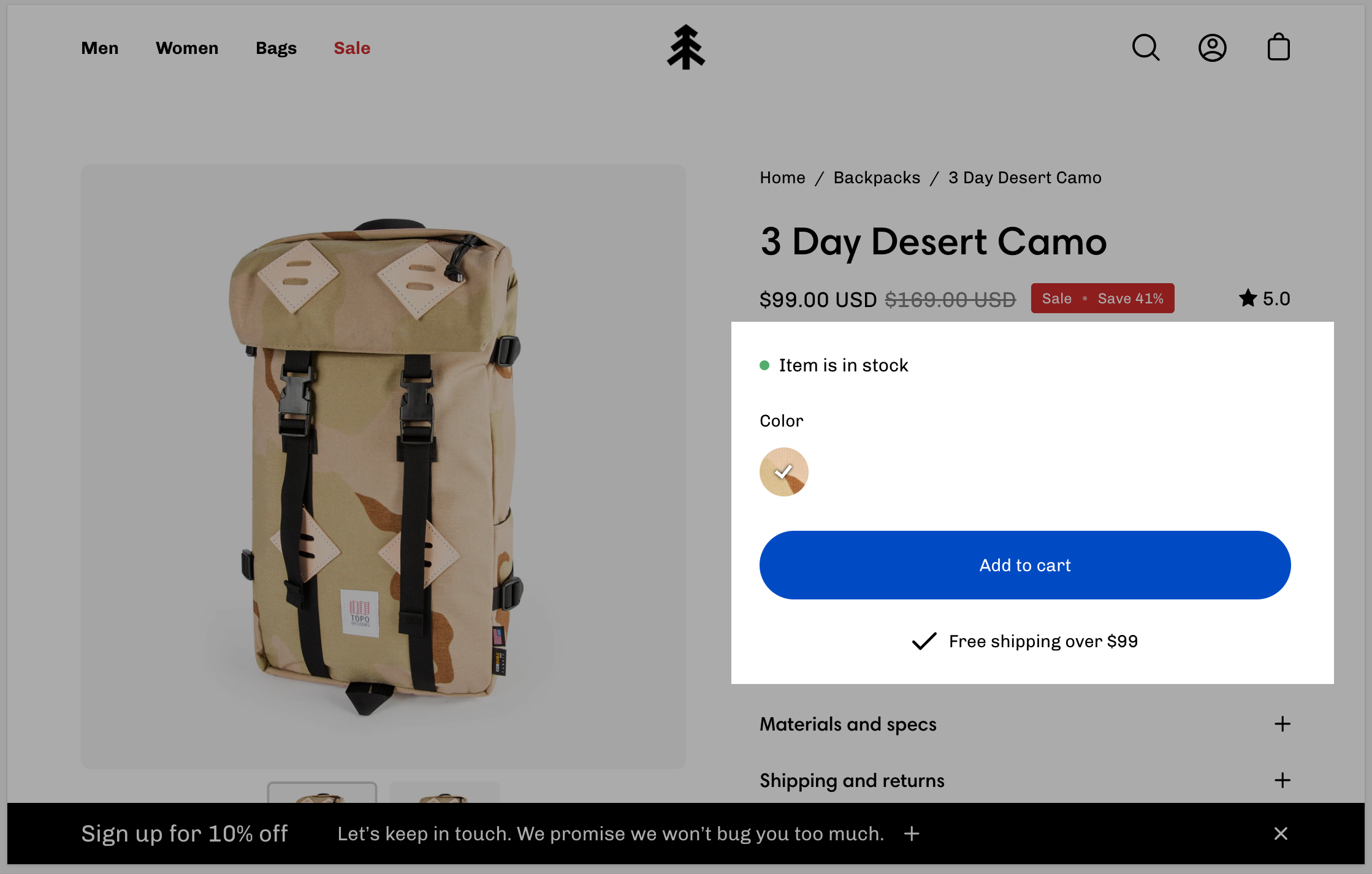
Displays all buying-related elements including product variants and swatches, quantity selector, the add to cart button, and the buy it now button. Optional size chart link is placed above variant options.
Size chart - Dynamic source supported
Show variant labels
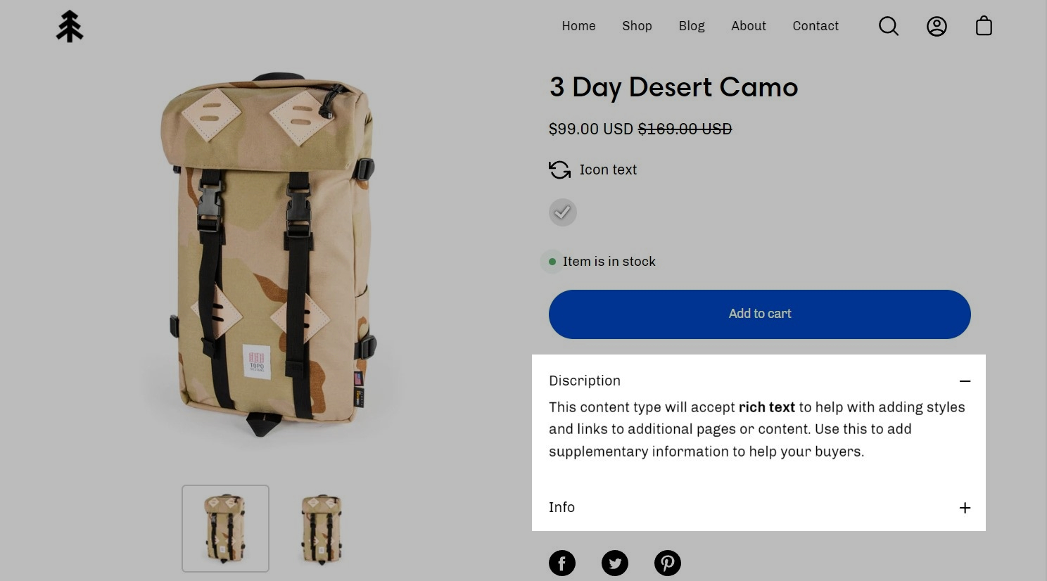
Show the product description text onto the product pages.
No customizable settings.
Displays accordions separately from your product description.
Tab heading - Dynamic source supported
Tab content - Dynamic source supported
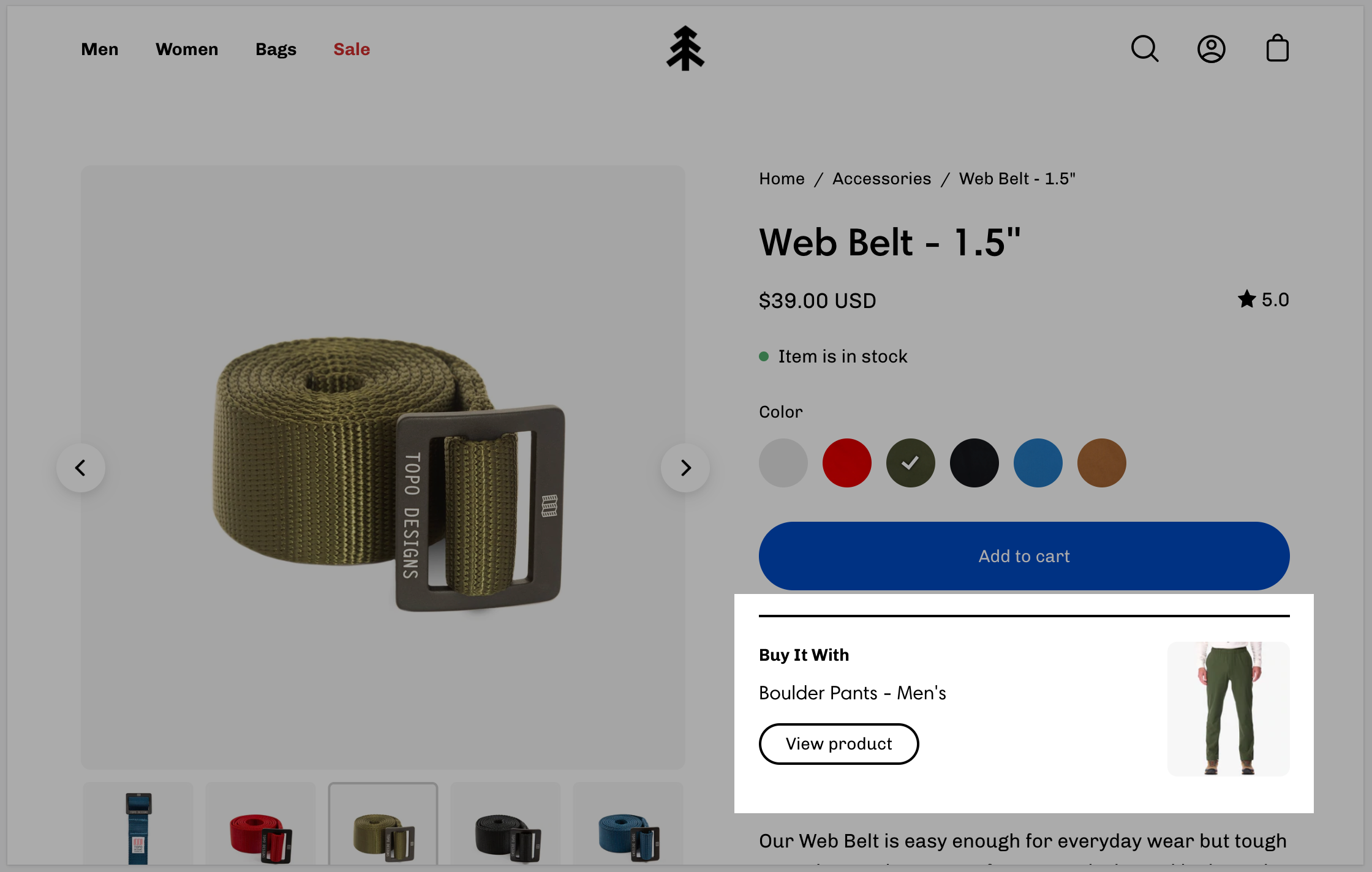
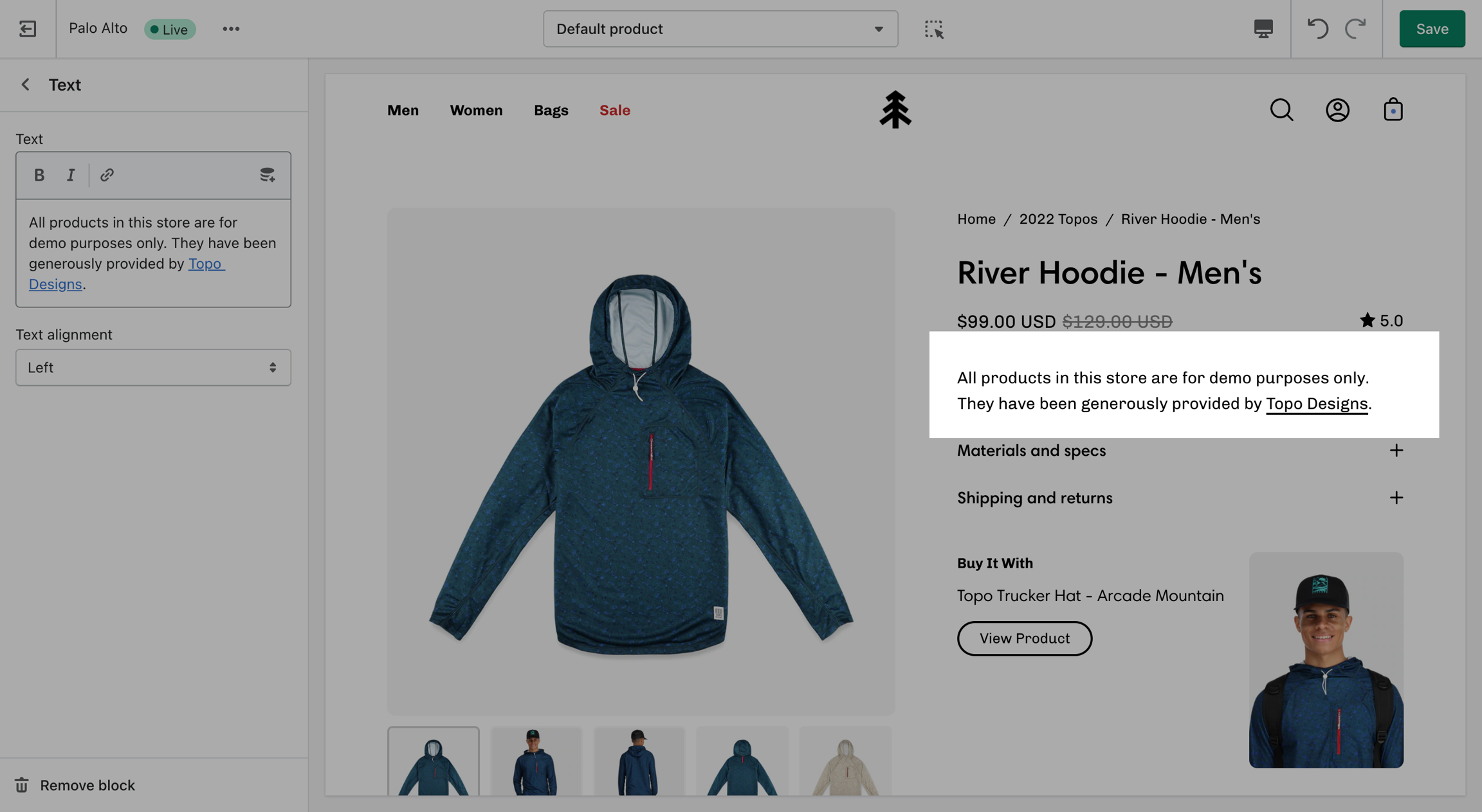
Display an upsell product on your page and in the cart.
When selecting a product for the 'Buy it with' promotion, we recommend you choose products with one variant.
Select the upsell product. It will only be displayed in the product page.
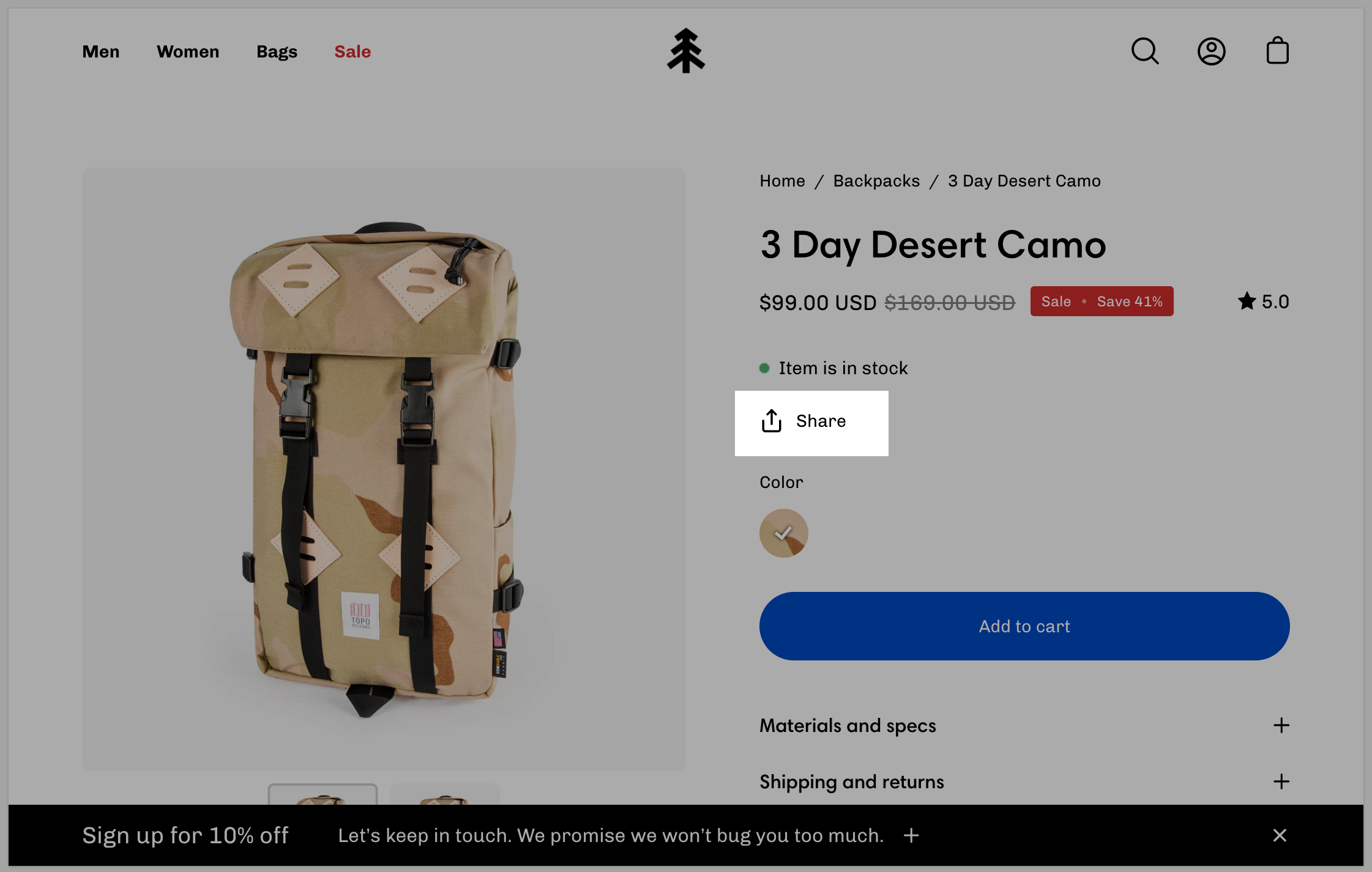
Displays a share icon for sharing current product page on social platforms or link to send.
Set the text for the 'Share' button.
Displays where customers can pick up the product.
No customizable settings. .
Add your own 'liquid' code to implement custom features or app functionality.
Single text field to copy and paste liquid code.
Please note that this field doesn't have any debugging capabilities. Make sure that your code is correct before pasting it to avoid any errors.
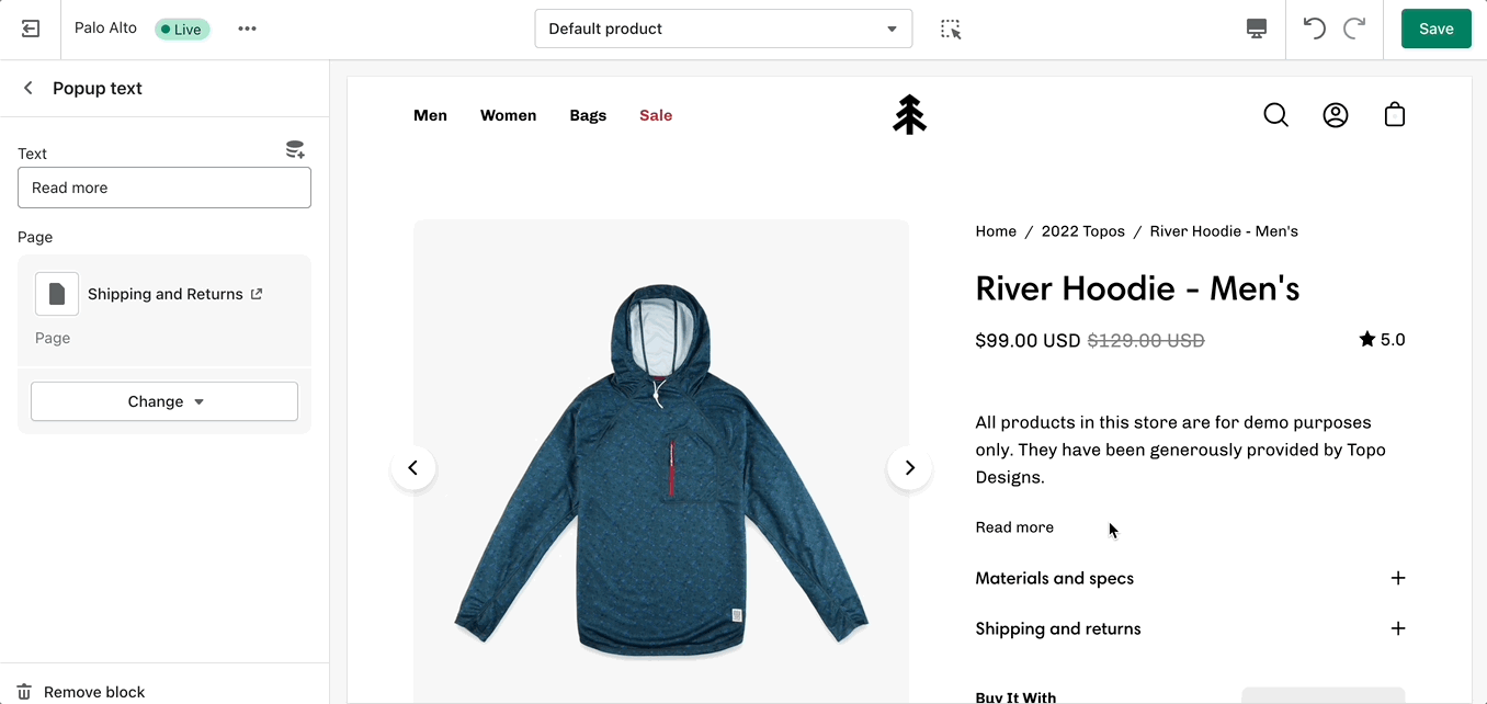
Create a slide-out block with extra text. Perfect to showcase policies or a chart with extra information.
Button text - Dynamic source supported
Page link - Dynamic source supported
Add more details about your products.
Text field - Dynamic source supported
Text alignment selector
Add bits of information with icons to your product description pages.


Collection
Vendor
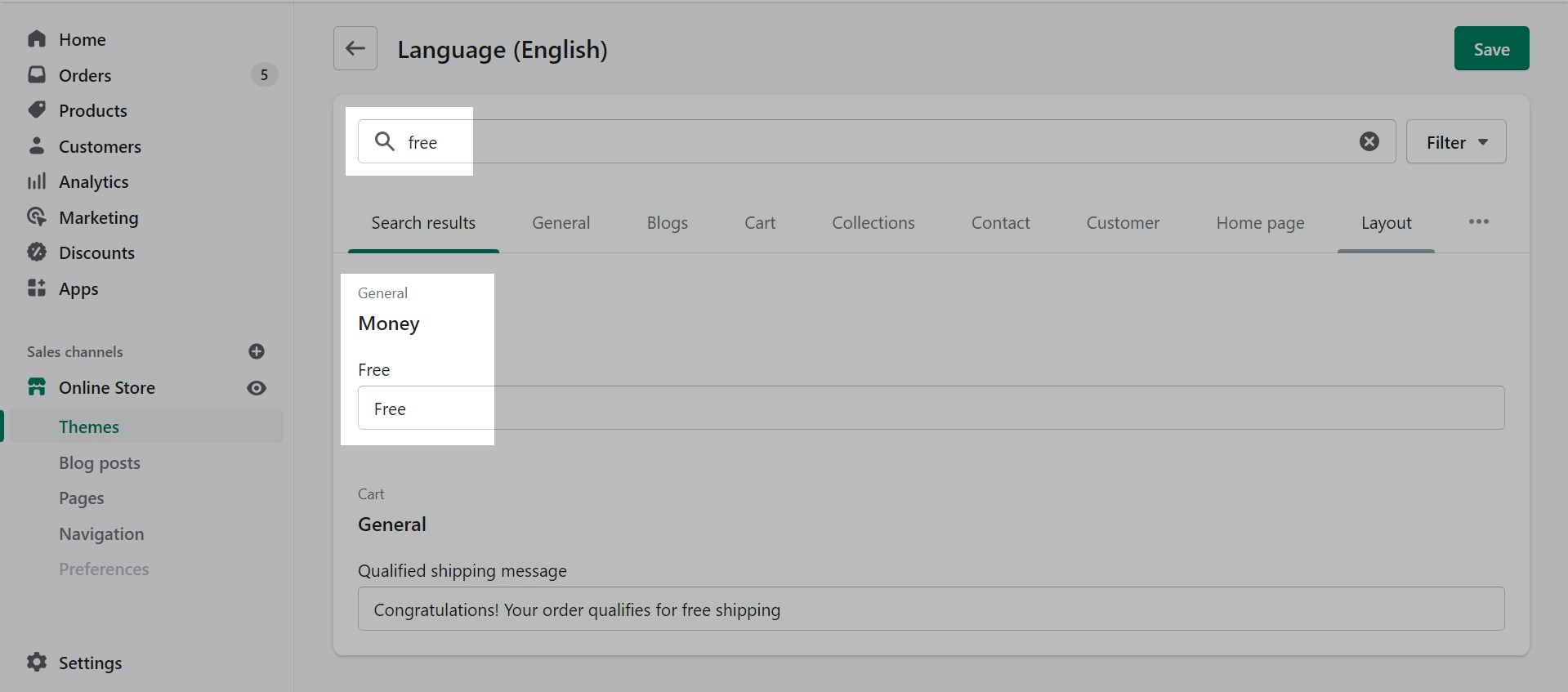
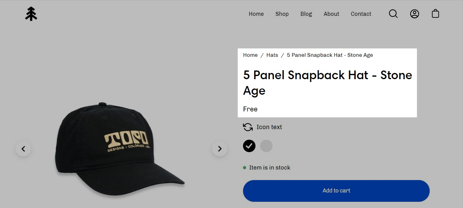
If the product price is set to $0, it's replaced by a translatable string - 'Free'.
If you want to change this text you can go into your Online Store > Themes and click on Actions > Edit Languages:
Search for free in the Filter bar and edit the field under General > Money > Free:
Show quantity selector
Show dynamic checkout buttons
Subscription selectors (with supported app)
Icon with text
Learn more about our cart Upsell feature here.
Icon color - Dynamic source supported
Replacement Image - Dynamic source supported
Width (Icon size)
Heading - Dynamic source supported
Size (text size)
Width
Alignment
Background color - Dynamic source supported
Padding toggle


Adding custom fonts for your menu, buttons, headings, and body text.
In order to use your own custom fonts, you will first need to upload the font files. To do this, you'll need to head on over to your Online Store > Themes and click on Actions > Edit code.
From here, open the Assets folder and upload your font files into it:
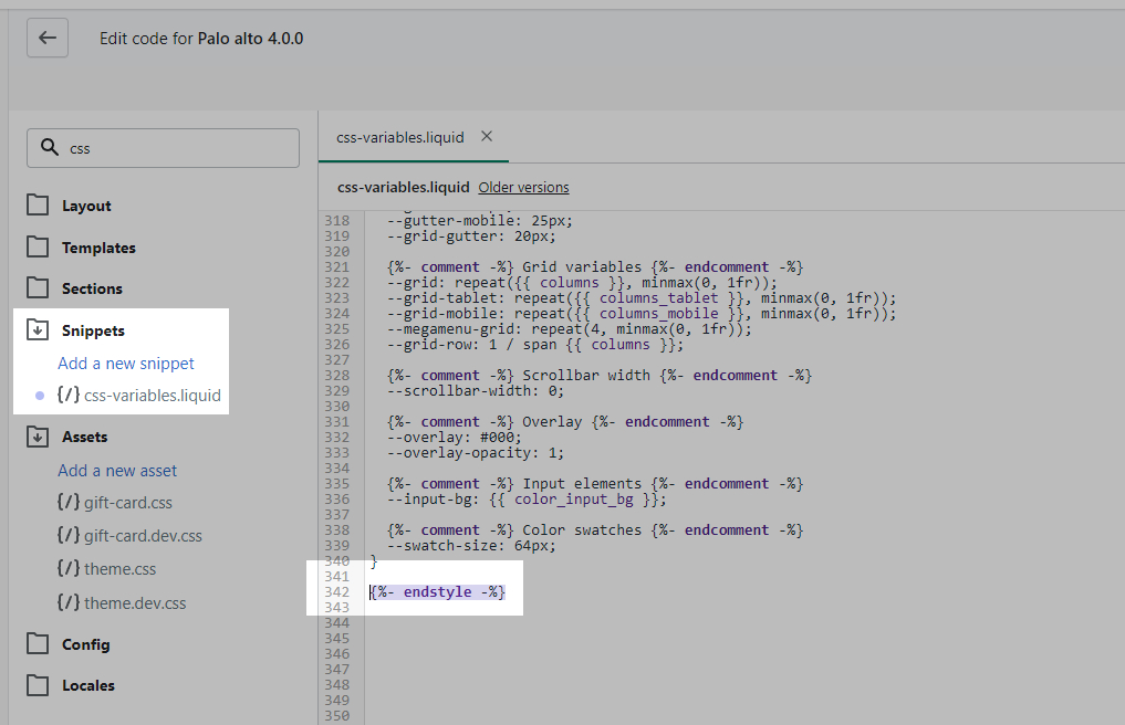
Now that we have the assets sorted out we can head on over to the 'css-variables.liquid' file. It's located inside the Snippets folder. Here you need to scroll all the way to the bottom and add a bit of code before the closing style tag (' {%- endstyle -%} '):
This is the place where you need to add this code snippet:
In this code snippet, you need to replace all references of 'Gorham' with your own font name and font files names.
If you have to upload more than one font, you need to declare each one individually and use multiple instances of this code snippet.
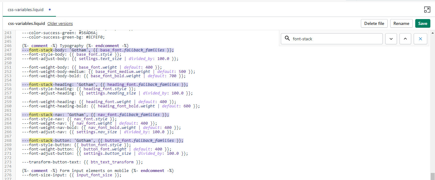
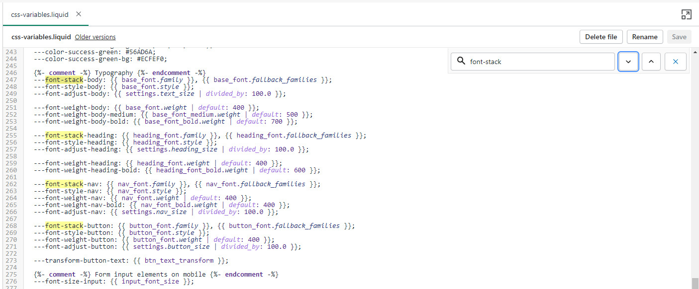
Finally, all we need to do is assign the new fonts to be used. There are four global font variables that control the fonts for the headings, body text, buttons, and navigation menu. You can easily find all of them by using CTRL + F (or Command + F) and searching for 'font-stack':
All you need to do here is to replace the first value assigned to the variables you're looking to change, we'll continue to use 'Gotham' in our example to keep it consistent but this is also a place where you input your custom font name:
That's it, you're all set and ready to go. Just don't forget to Save the changes.
Palo Alto includes ready-to-use page templates for your store including:
About
Contact
Default page
These templates make it easy for you to quickly add content and build out pages that add value to your customer experience and company branding.
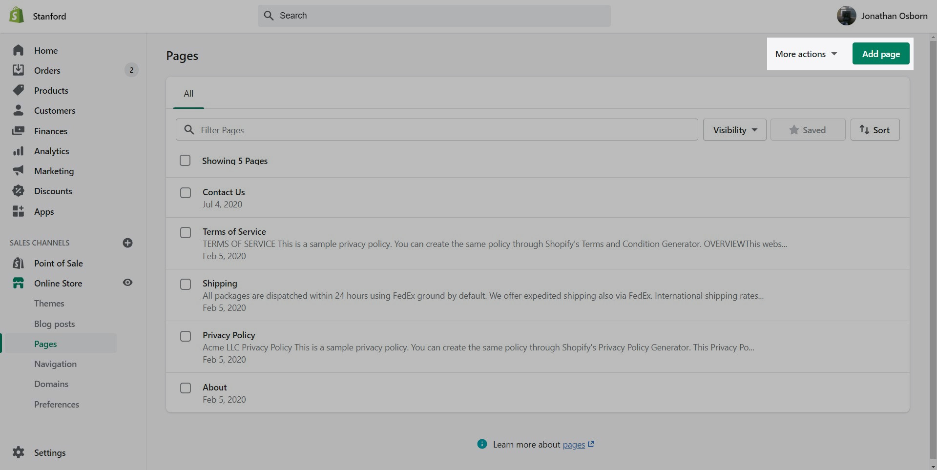
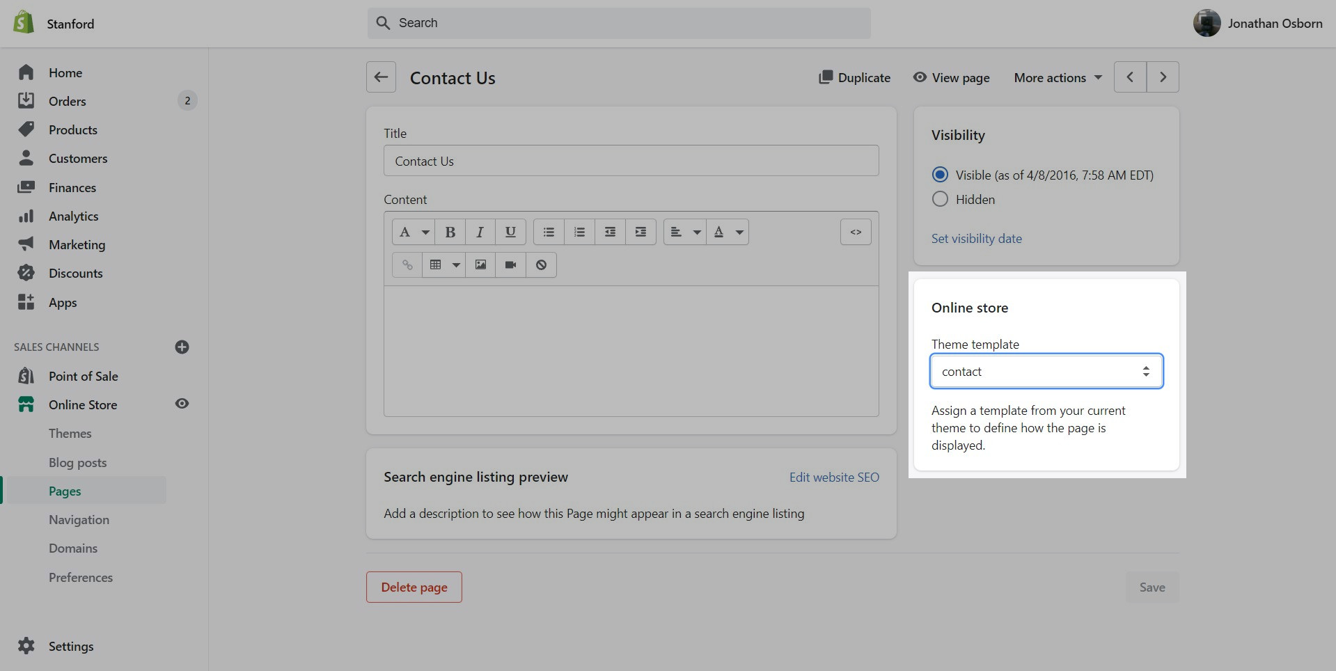
Pages are created in your Shopify Admin under Pages. Choose Add page to create a new page:
Give your page a title (required), the content is optional. Next, choose a Theme template to be used, also known as Page template:
Using the Theme Editor, you can customize the template that's been assigned to your page:
You can start customizing the page with the pre-defined sections included in Palo Alto. You can hide, reorder, remove sections that are included and also add any new selection from Palo Alto's list of over 25+ sections.
Learn more about using sections and blocks in Palo Alto:
From the top drop-down menu select Pages and click on Create template. Give your new template a name and a template to base it on. This will make it so that there are one or two sections predefined but they can be removed or hidden later.
/* -- code to use Gotham font-family in theme -- */
 @font-face {
    font-family: 'Gotham';
          src: 	url('{{ "Gotham.eot" | asset_url }}');
          src: 	url('{{ "Gotham.eot" | asset_url }}#iefix') format("embedded-opentype"),
        	url('{{ "Gotham.woff" | asset_url }}') format("woff"),
        	url('{{ "Gotham.woff2" | asset_url }}') format("woff2"),
         	url('{{ "Gotham.svg" | asset_url }}#GothamBold') format("svg");
         font-weight: normal;
         font-style: normal;
 } /* - end - */


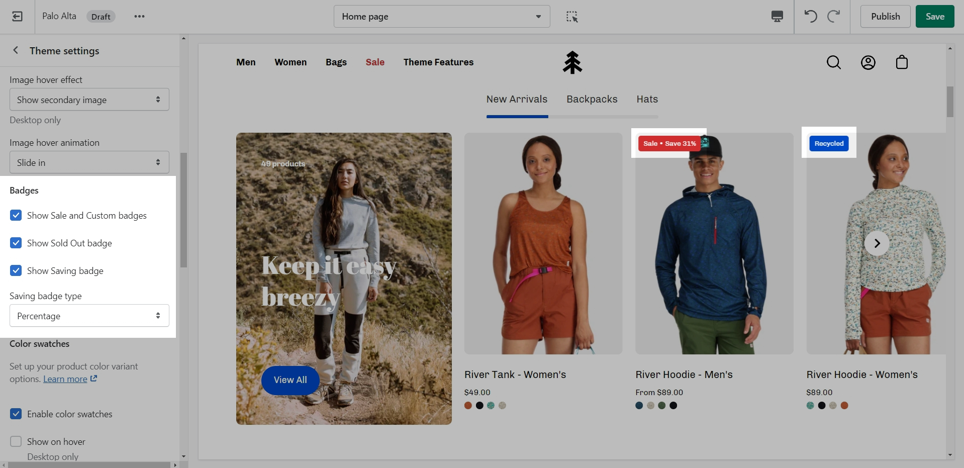
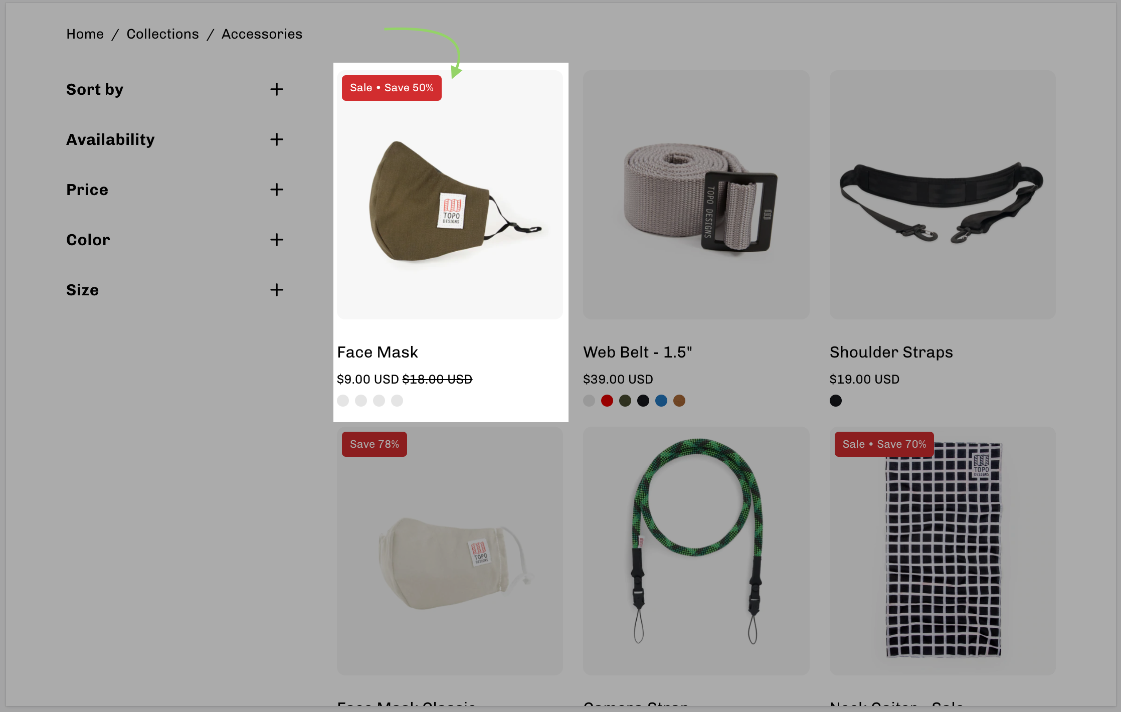
Add badges or 'stickers' to your individual products
Custom product badges in Palo Alto allow you to create any type of badge for each of your products.
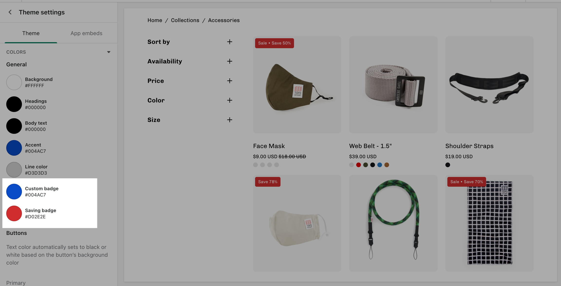
Use the Palo Alto Theme Settings to modify the background colors for Saving badges and Custom product badges:
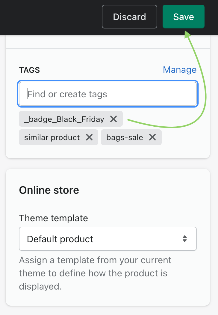
Custom badges are easy to create and all done in your Product setup. You simply add a tag to any of your products with a custom prefix. When Palo Alto sees the custom tag, it sticks the badge right onto the product in any grid view like collections, search, recommendations, and more.
When Palo Alto sees a product that has a tag beginning with _badge_, it will take the following portion and apply that as the custom badge.
Example: _badge_Black_Friday
Displayed as:
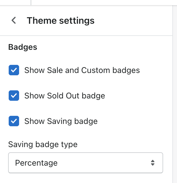
Palo Alto also includes automated 'Sale' and 'Sold Out' badges. As shown above, some badges can be mixed together like the 'Sale' and 'Savings' badges.
The settings to enable or disable certain badges can be found under Theme Settings > Product Grid:
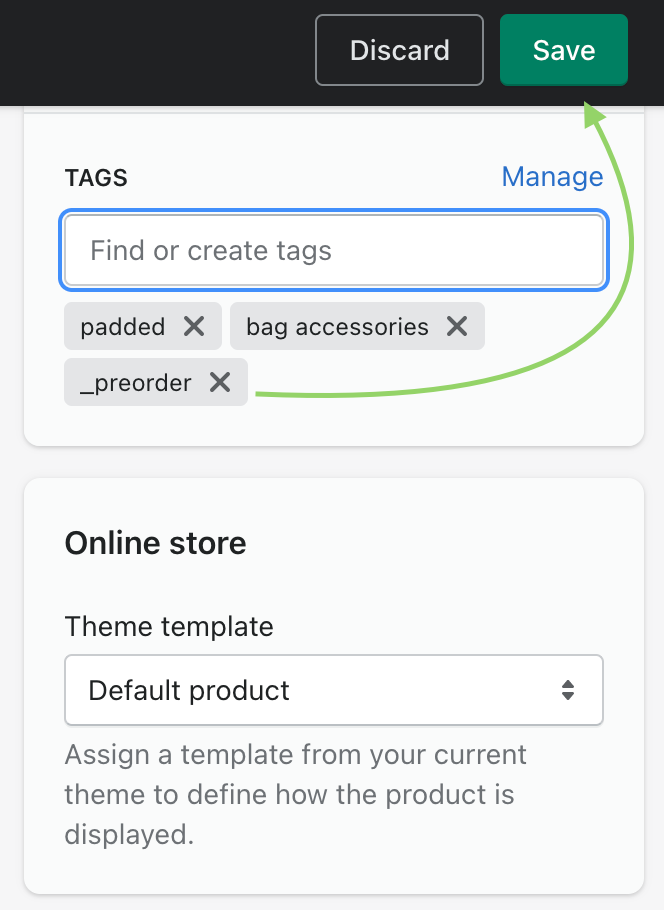
The final badge in Palo Alto is the 'Preorder' badge. It's enabled individually for each product by adding a _preorder tag to the product.
Effect on the Collection page:
Effect on the Product page:
Some badges can disable or overwrite others. For example, if a product is sold out, it can't be shown as on sale.
Custom badges have the highest priority. They will appear alongside other badges to give more information to your customers.
The Preorder badge will not appear if the product is Sold Out. Make sure that you have quantity for your preorder products.

Customize your store using these Palo Alto sections
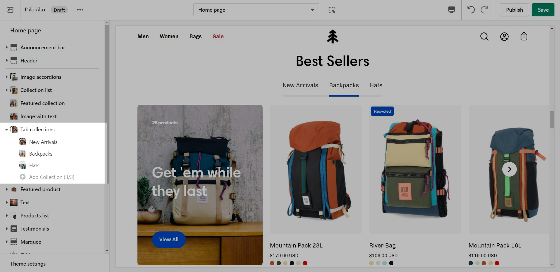
Palo Alto comes complete with 20+ professional theme sections to help you merchandise your online store. Sections can be added to any page on your store.
Discover the complete range of sections and their settings. Experiment by adding different types of sections and section blocks to the homepage and the other pages within your store.
These sections can be placed on any page including:
Homepage
To find the primary settings for each section, click on the section name to view the settings panel. These settings control the elements of the section.
Wider desktop screens will display the settings panel on the right side of your screen.
Scroll towards the bottom, above Footer and Popups. Choose Add section:
Navigate to any product page or choose the default product template. Use Add section located above Footer and Popups:
Note: Newly added sections adding appear at the bottom of your section list.
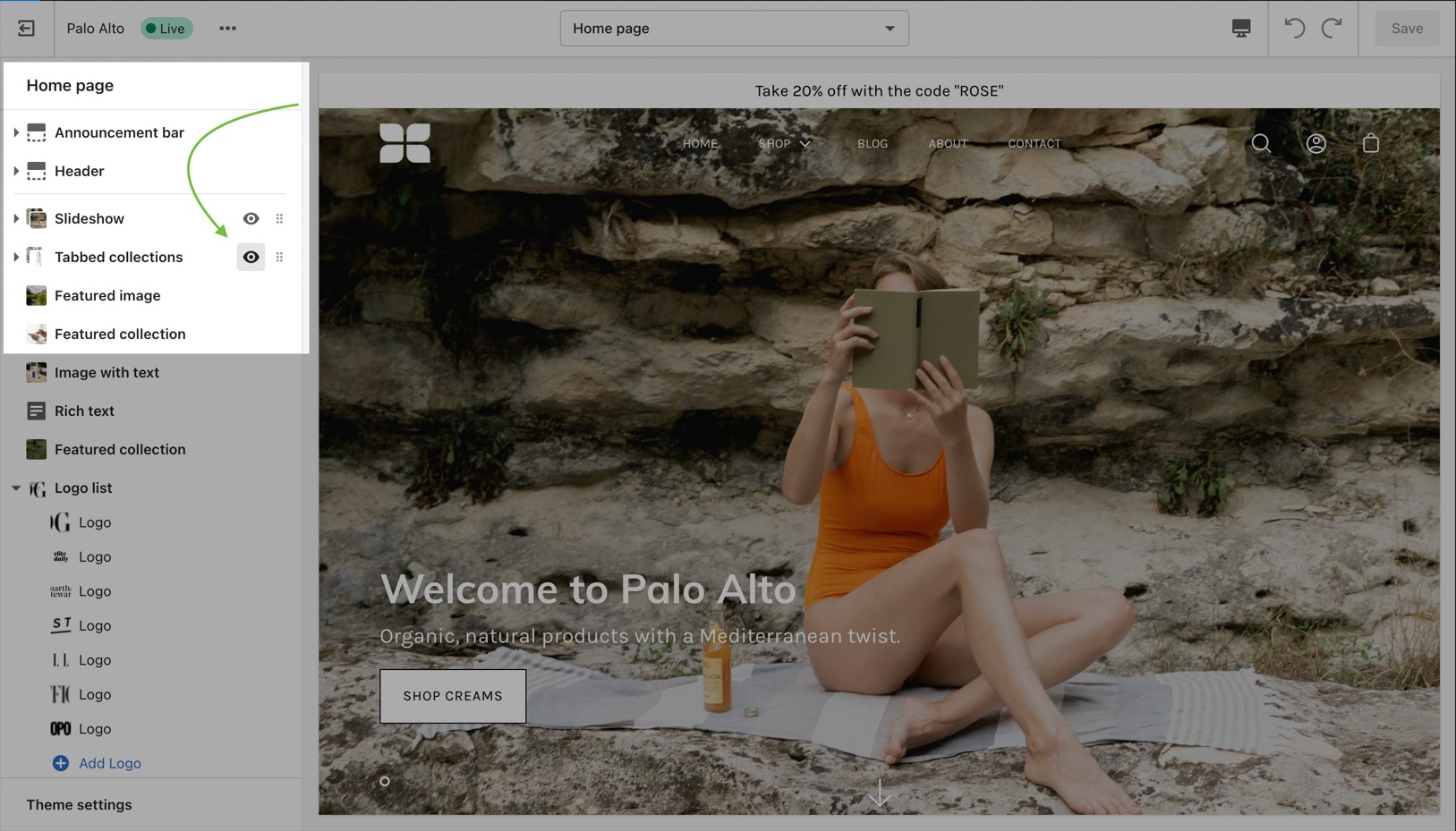
Use the eye icon next to the section title to toggle the display of the entire section:
Tip - Blocks have their own eye icon, be sure to select the section eye icon to toggle display of the entire section.
Use the handle icon which is located next to the eye icon to drag a section and drop it in a new position:
Sections contain content and settings. Experiment with different section types to add rich content on the homepage and all pages within your site. Use the settings to adjust behavior and layout.
Helpful tip, when adding new sections as they appear at the bottom of your section list.
Under each section settings (as well as under all sections inside the Theme Editor) you will find a button to the Theme Settings. These are a number of global settings grouped together for ease of use. Some section settings are also placed under the Theme Settings so if you're looking for a setting you feel are not finding, it might be under this little tab:
Collection pages and Collection list
Blog index and Blog posts
Shopify pages
404 error page, Search page, Password page
Cart page
To provide unique content for certain products, create a new template and assign a product to that template. All products using that template will have the same section content but will be different from the default template. Always create new templates on the live published theme in order for them to appear as options in your product setup.
Another method is to use Shopify's insert dynamic source option (metafields) to blocks and then customize content for each product in your product setup.
Navigate to any page on your site or choose any template from the top drop-down. Choose Add section, which is located above Footer and Popups on the left panel:
When adding a section to a certain template. The same content will appear on all pages that are also using that template.
You can create additional templates such as a new page template or collection template and then assign a page or collection to that new template. This will allow you to create multiple pages with different content.
Experiment with creating and customizing new templates in the Theme Editor. As a second step, remember to assign that template to a certain page or collection.
For example, create a new collection template to display a different layout and include different sections. Then in the Shopify Admin under Products -> Collections, choose your collection and assign the newly created template to that collection.
🚨 Important tip: New templates must be created on the published theme. They will not appear as a template option for assignments if created in a draft theme. This is a Shopify Platform restriction. Always make new templates on the live published theme.
