Loading...
Loading...
Loading...
Loading...
Loading...
Loading...
Loading...
Loading...
Loading...
Loading...
Loading...
Loading...
Loading...
Loading...
Loading...
Loading...
Loading...
Loading...
Loading...
Loading...
Loading...
Loading...
Loading...
Loading...
Loading...
Loading...
Loading...
Loading...
Loading...
Loading...
Loading...
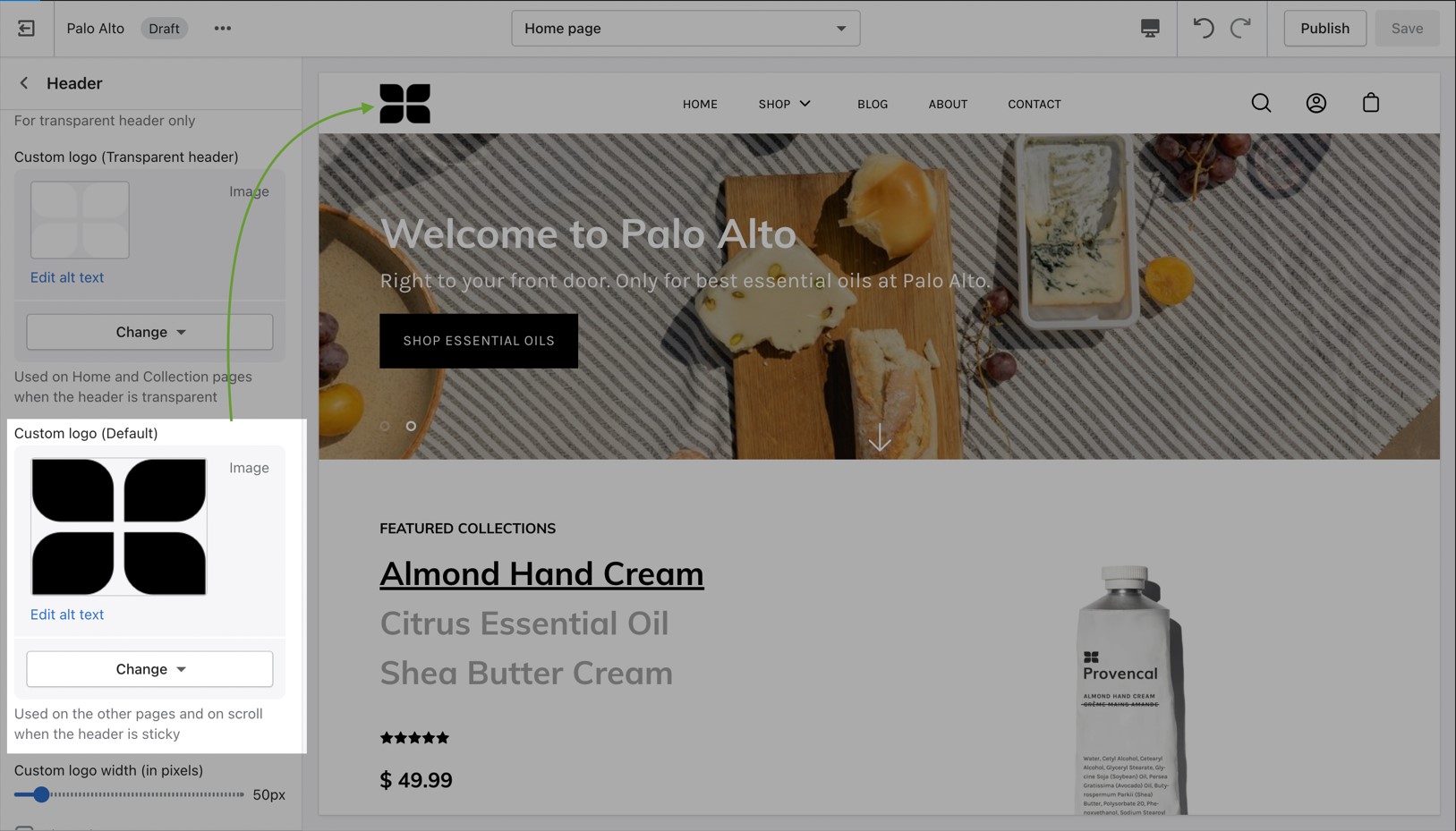
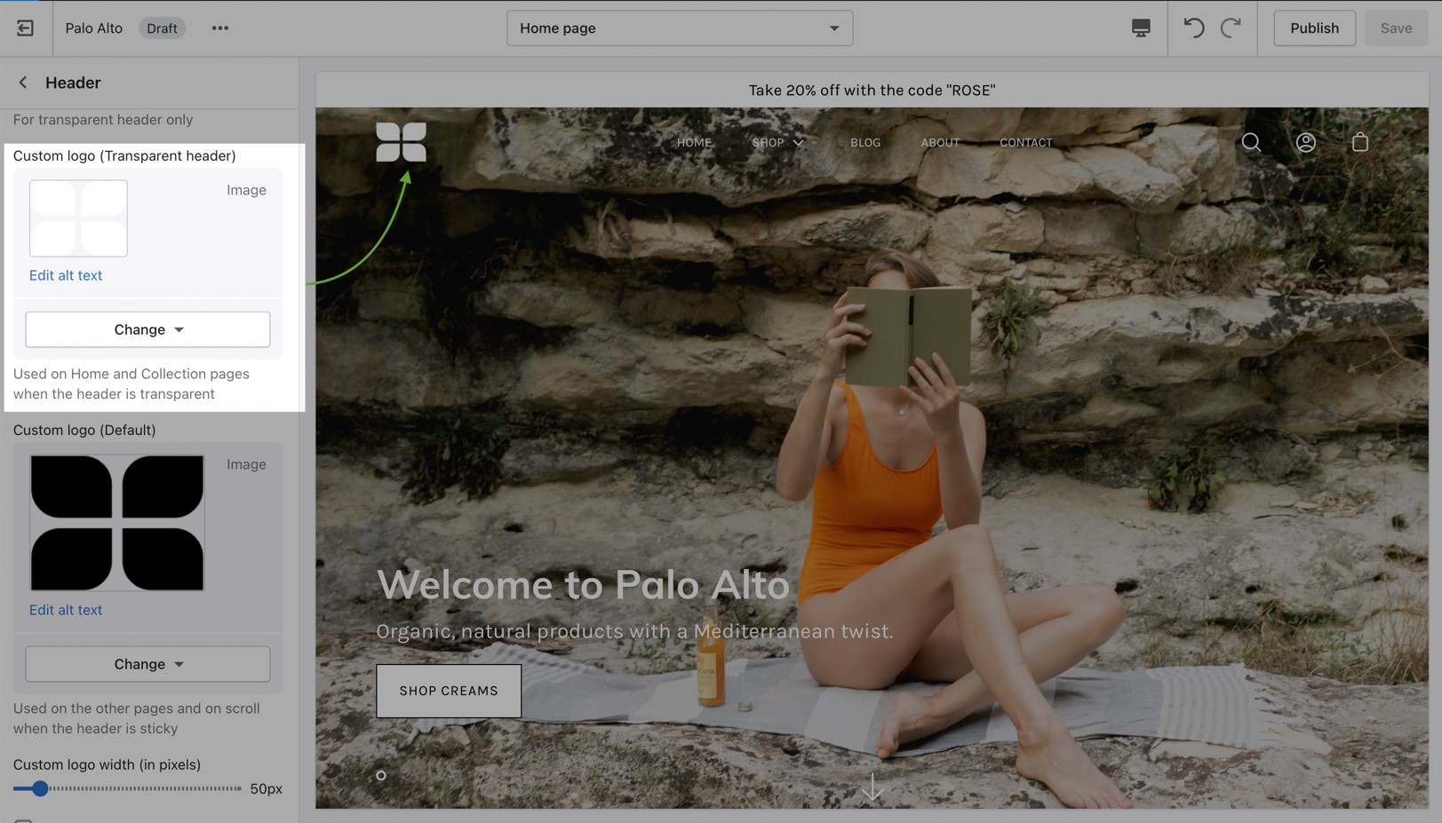
Change the opacity to blend the header with a background image (or video)
Palo Alto can display a transparent header on the homepage, collection pages, and any customized pages that include a fullwidth background image (or video) section:
When using a transparent header, you may include a second logo to provide contrast with your main homepage asset.
To enable the Transparent header you will need to first open the Header section settings. From here, simply check the 'Enable transparent header' checkbox and save the changes:
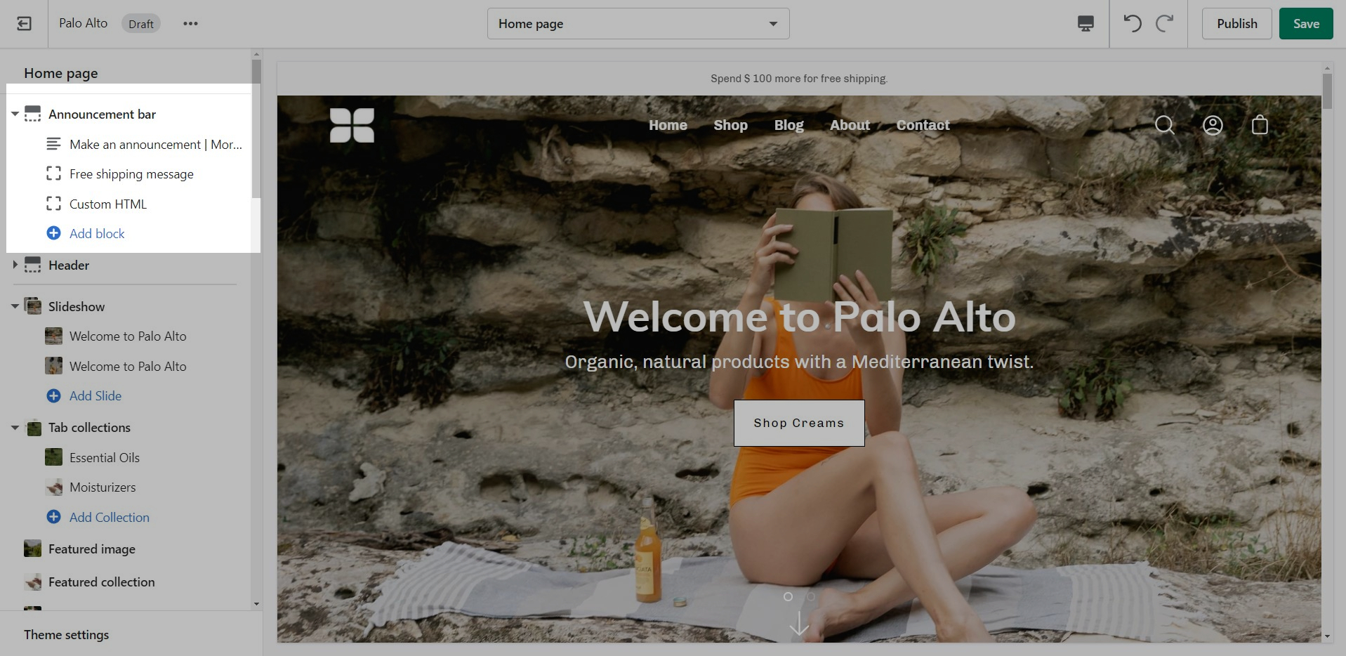
Announcement Bar settings and layout
Click on the Announcement bar section to reveal the section settings.
These settings will allow you to change the background and text colors of your Announcement bar section, layout style, and autoplay speed.
Block types:
You can also click on the small arrow next to this section to expand it and show its blocks. This will allow you to access each block to change its text and link.
You can also add new blocks by clicking the 'Add block' button.
Add single or multiple text announcement bars with links to promote your offers:
Use this block to encourage add-on sales and increased quantities.
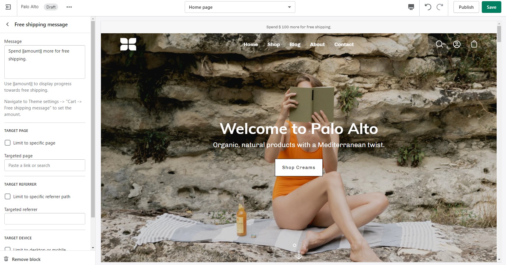
Modify the message text as needed. Keep the || amount || custom short-code to reference your set value from the Cart settings.
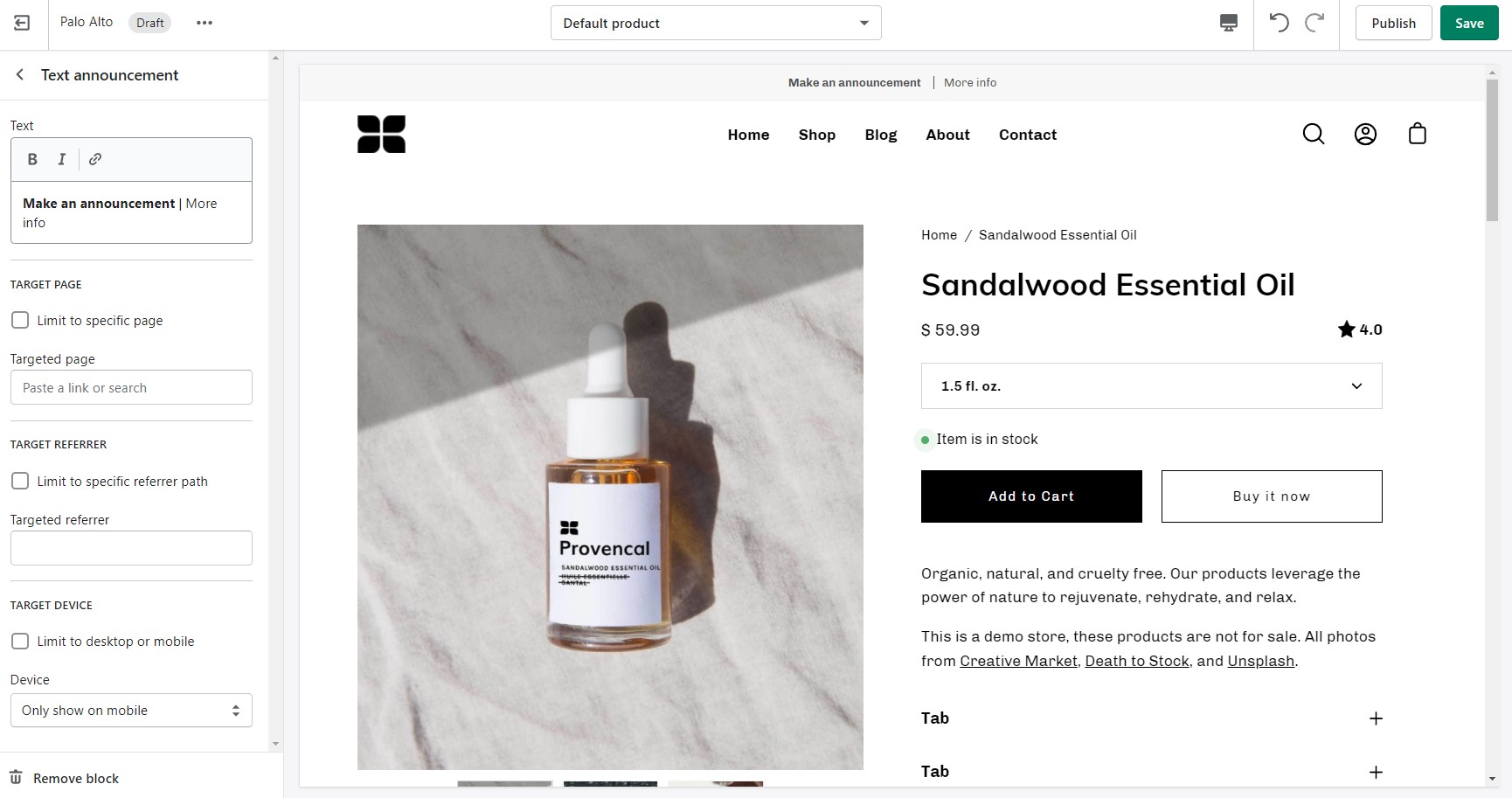
Build custom announcement messages and use targeting options to provide complete customization for your promotions.
Display custom announcement messages to your customers only when the customer is browsing a certain page, product, collection, or blog post on your site. Target your message based on where customers are browsing on your site:
Create a different announcement bar with custom messages for various pages of your site.
Target a specific audience by using Target Referrer. Your announcement bar will only appear when the customer arrives at your site from a certain path or location.
Enable when running a promotion on another site.
Use to provide a custom message related to the source promotion
Target only certain devices or create a custom announcement bar message for mobile devices and another for desktop browsers.
Enable custom announcement messages for mobile and desktop.
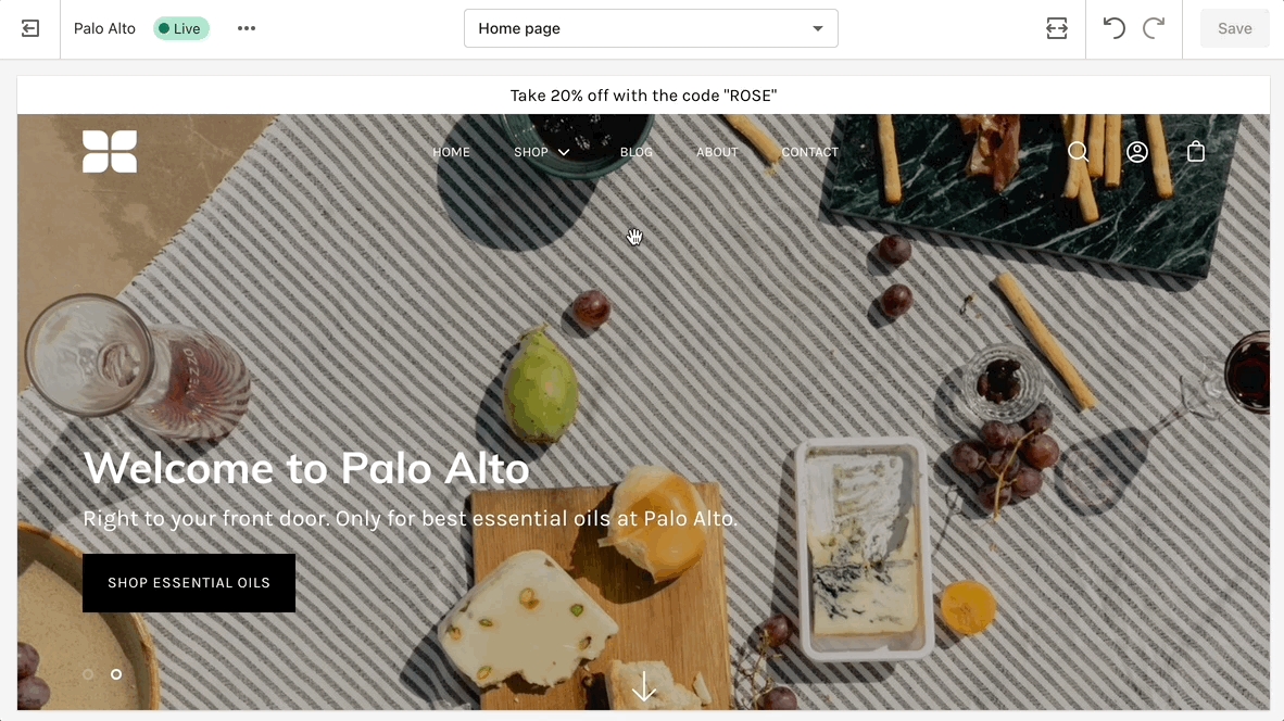
Introducing Palo Alto, a contemporary designed theme that gives you space to tell your story. Palo Alto is built to support Shopify's Online Store 2.0 and comes complete with easy-to-use sections, plus powerful search capabilities, and quick buying features for mobile and desktop customers.
Discover and learn about Palo Alto with our theme documentation and demo stores. Tell your story, and showcase your brand with our simple-to-use and creative tools.
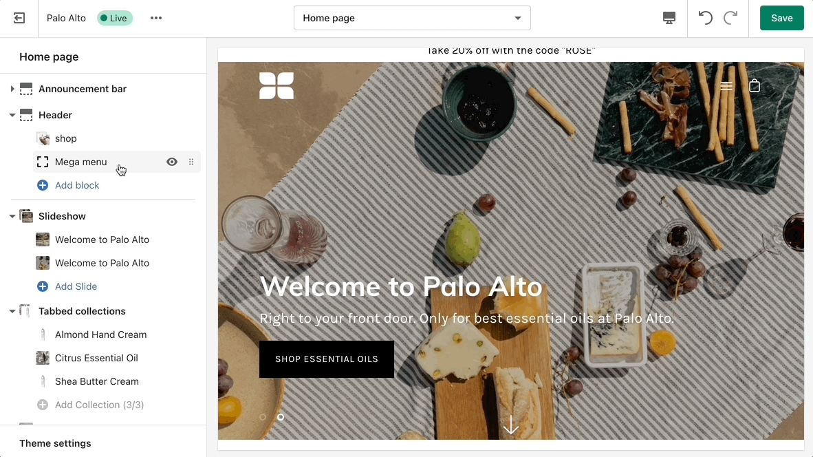
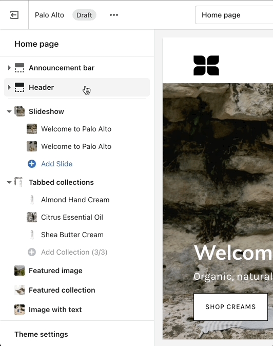
Setting up a Mega Menu for your header
A Mega Menu is a stylized submenu that allows you to also add an image and highlight a portion of your navigation. It can be used to put more links together and group them in a form of subcategories.
To add a new Mega Menu you need to click on the Header section arrow to expand it after which click on 'add block' and choose to add a Mega Menu.
Setting up the Mega Menu can be done by accessing the block settings. Here you will find the option to add it under any first-level link in your header as well as the options to add images (as well as headings and links for the images).
To get a list of links like the one from our demo you'll need to simply set them up from your navigation menu as standard drop-down menus. You can learn more about this in Shopify's great articles on the topic.
You can try Palo Alto for free as a draft theme:
If you have questions or need additional assistance with using our Palo Alto theme, our support staff is here to help you by email. Reach us by sending a message to [email protected]
A separate option is available to help provide better contrast when transparency is used. This is an optional but helpful feature.
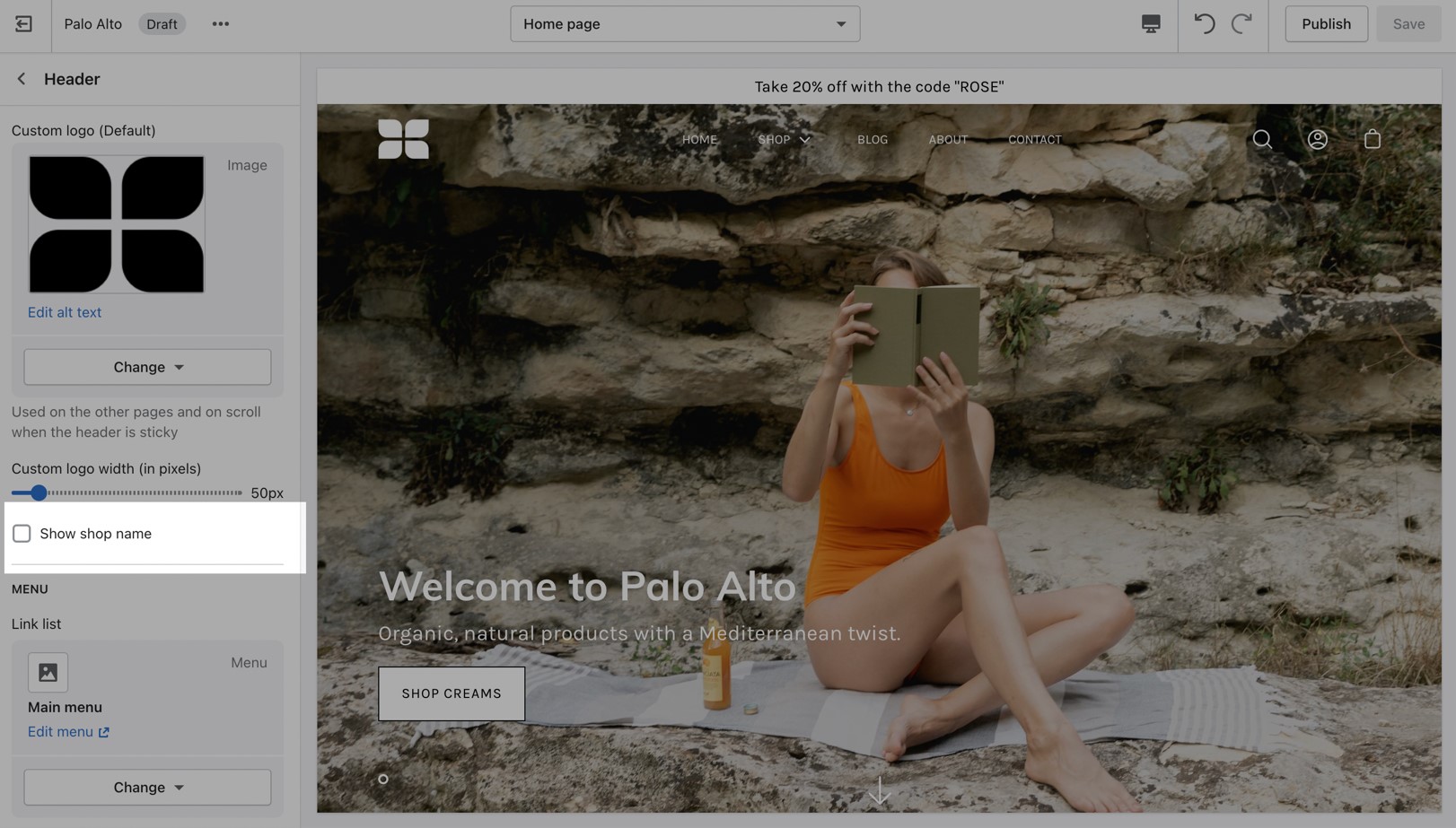
Hiding your store name can also be done from the Header section settings. All you need to do is scroll past the logo options and uncheck the 'Show site name' checkbox:
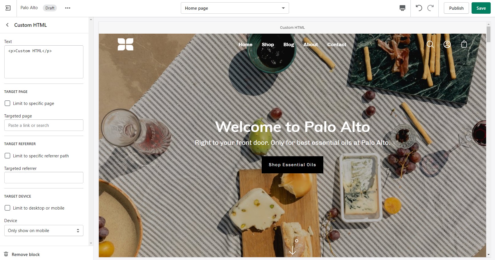
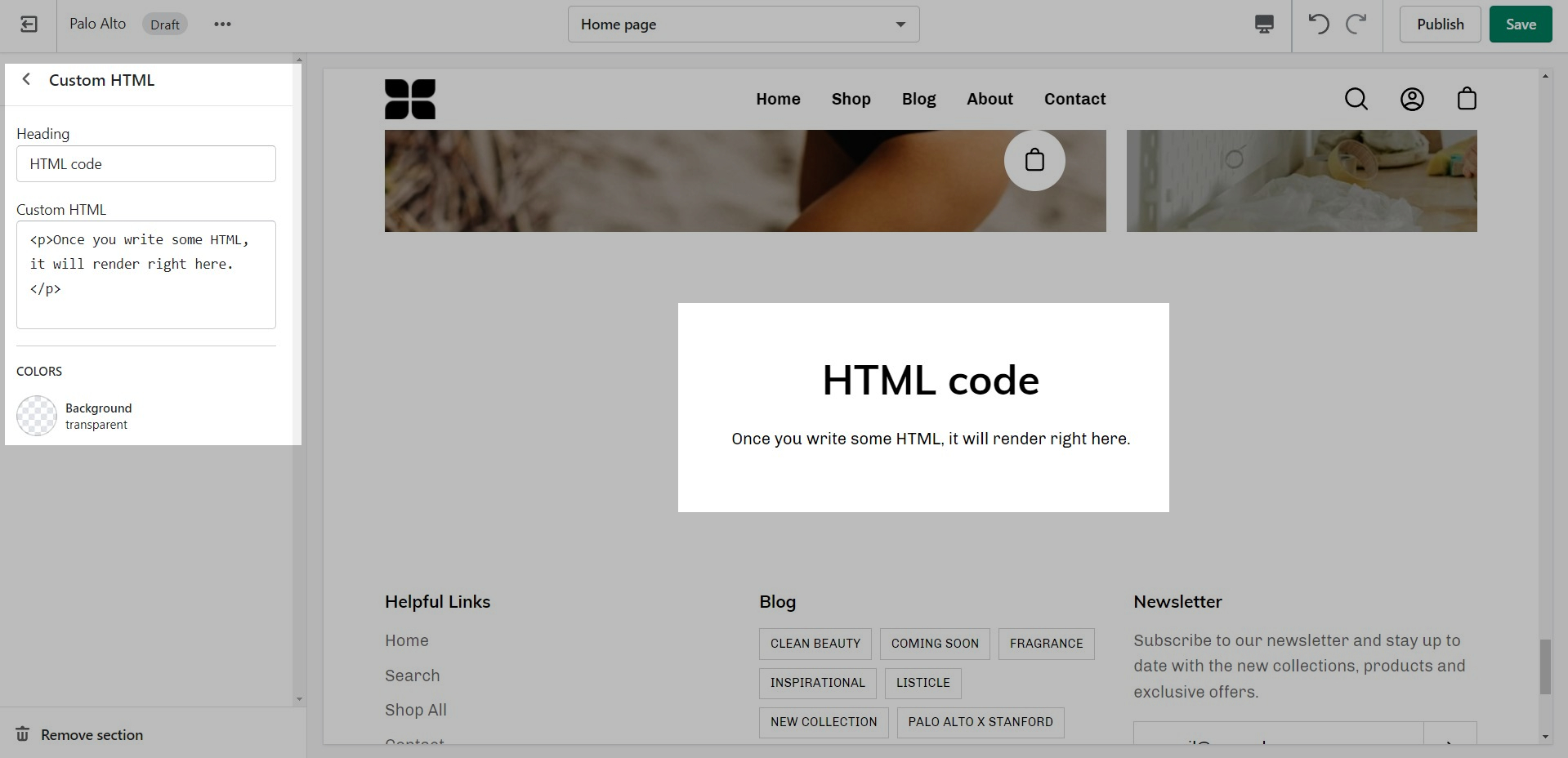
Include custom HTML snippets to create a unique look. Add partner badges via HTML snippets easily to any of your store pages.
Write liquid directly into your store pages without accessing the theme code. This is best used for short liquid snippets.
Palo Alto includes ready-to-use page templates for your store including:
About
Contact
FAQ
Default page
These templates make it easy for you to quickly add content and build out pages that add value to your customer experience and company branding.
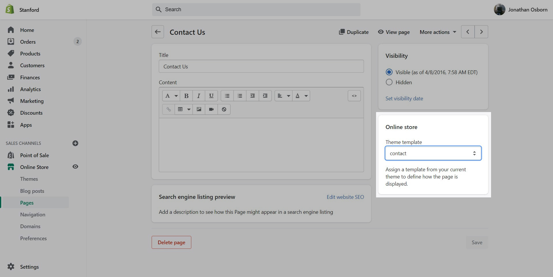
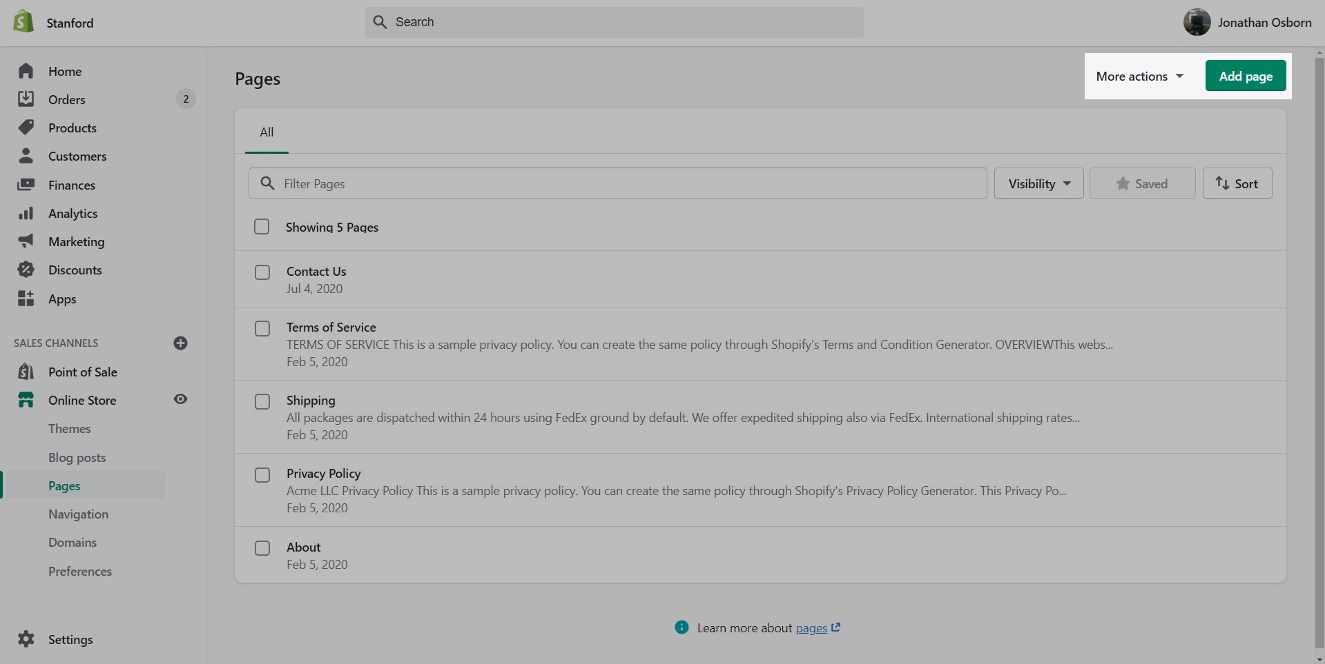
Pages are created in your Shopify Admin under Pages. Choose Add page to create a new page:
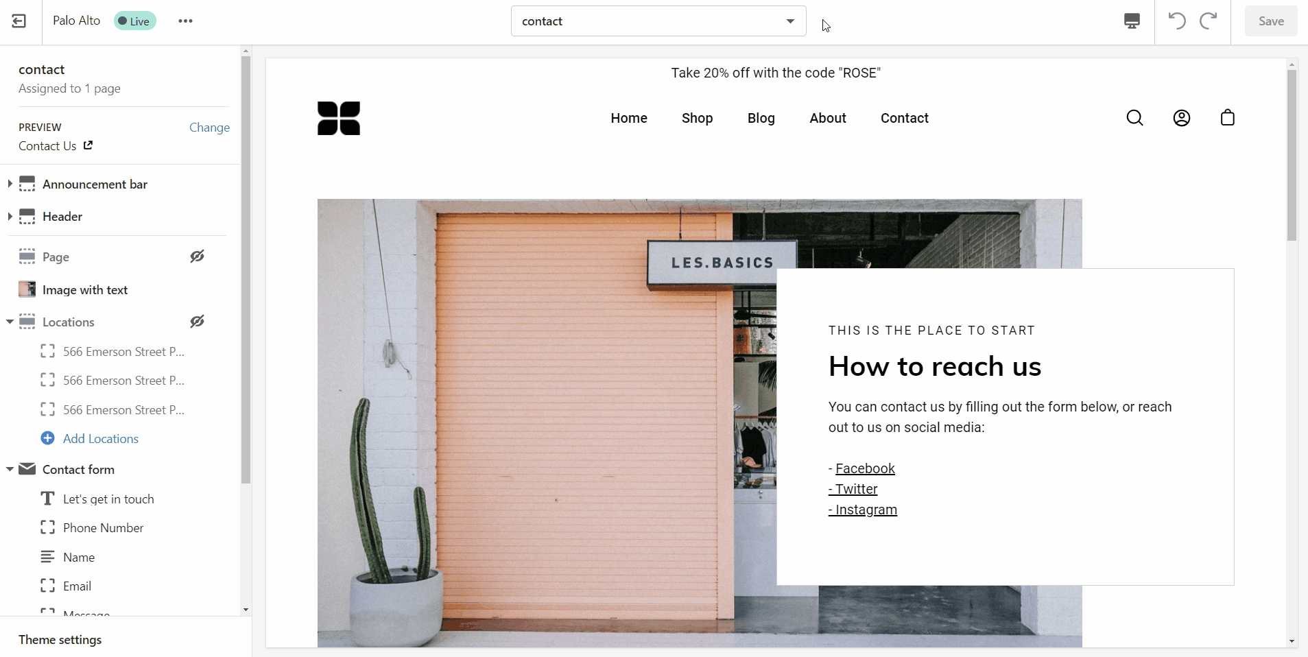
Give your page a title (required), the content is optional. Next, choose a Theme template to be used, also known as Page template:
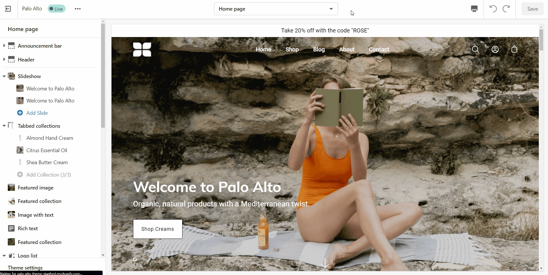
Using the Theme Editor, you can customize the template that's been assigned to your page:
You can start customizing the page with the pre-defined sections included in Palo Alto. You can hide, reorder, remove sections that are included and also add any new selection from Palo Alto's list of over 25+ sections.
Learn more about using sections and blocks in Palo Alto:
From the top drop-down menu select Pages and click on Create template. Give your new template a name and a template to base it on. This will make it so that there are one or two sections predefined but they can be removed or hidden later.
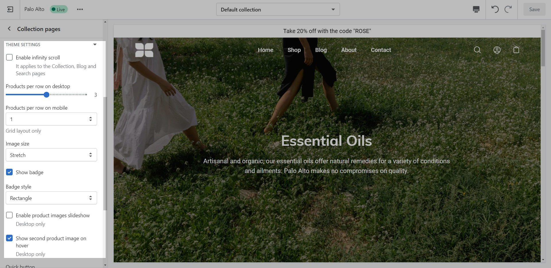
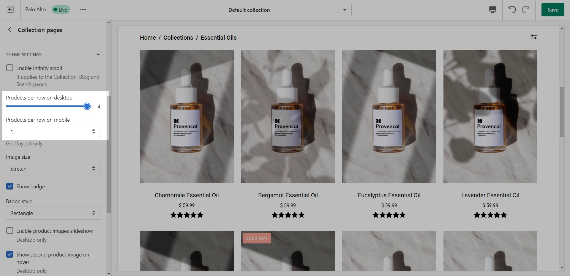
Collection and Product grid settings and configuration options
The new Collection page template introduces infinite customization options that you never knew you needed!
Click on Collection products to view settings for Collection pages:
Expand the Theme Settings panel to view additional settings related to the product grid:
Use the Product Grid options to customize how many products per row are displayed on desktop and mobile.
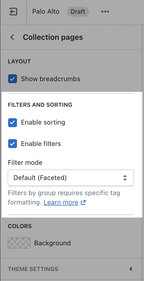
Filtering menus for your collection pages
Palo Alto has three filtering methods to choose from. They can be found under the Collection products section settings.
The default method is a new feature introduced with Online Store 2.0. This feature is automatically generated based on your product information such as variant price, availability, product type, brand, and vendor.
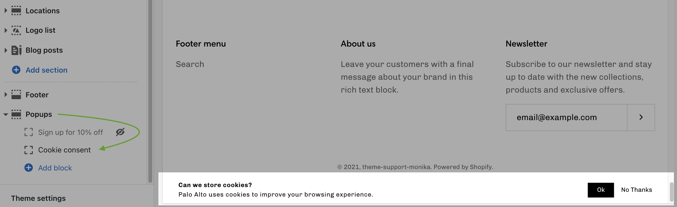
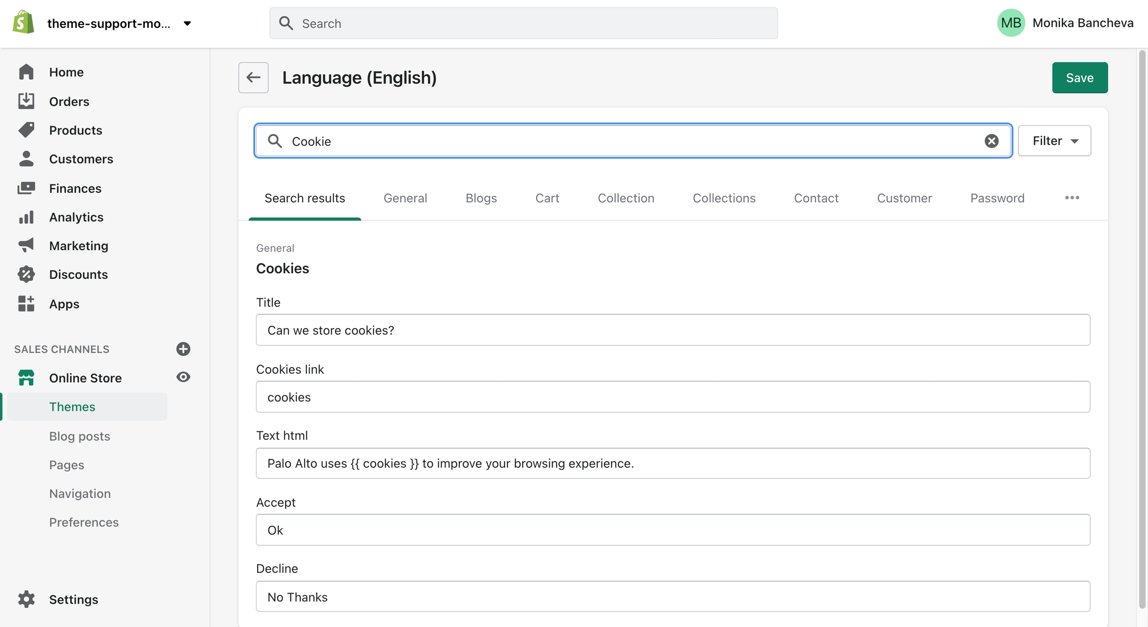
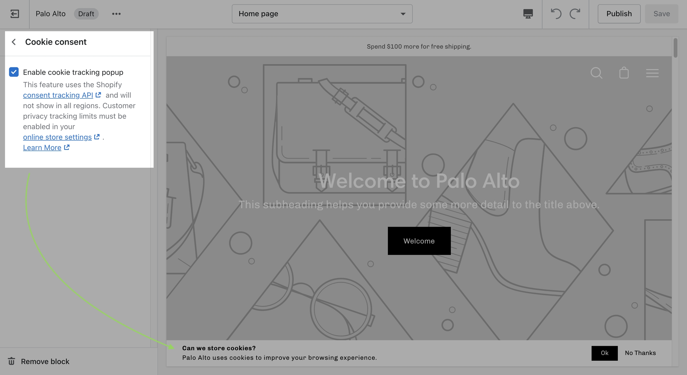
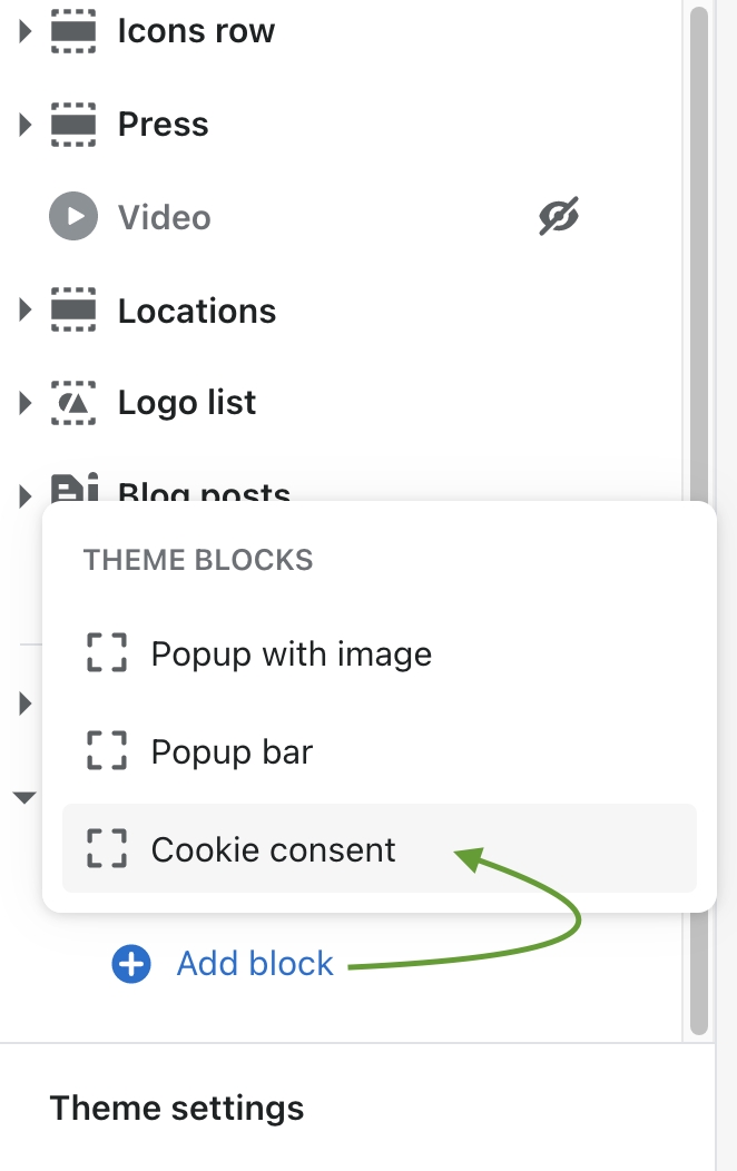
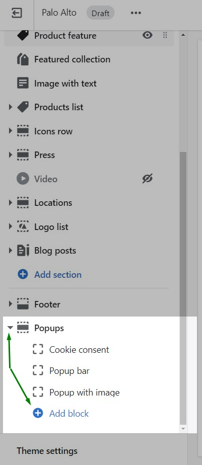
The "Cookie consent" popup is the perfect way to add a cookies popup notification to your storefront. It contains the options to include a header, message, link to your privacy page and an accept button.
Please note: Presidio Creative cannot guarantee compliance with GDPR, or compliance with any other regulations related to cookies.
Use the Popups section to enable the "Cookie consent". This is available in the Customizer under
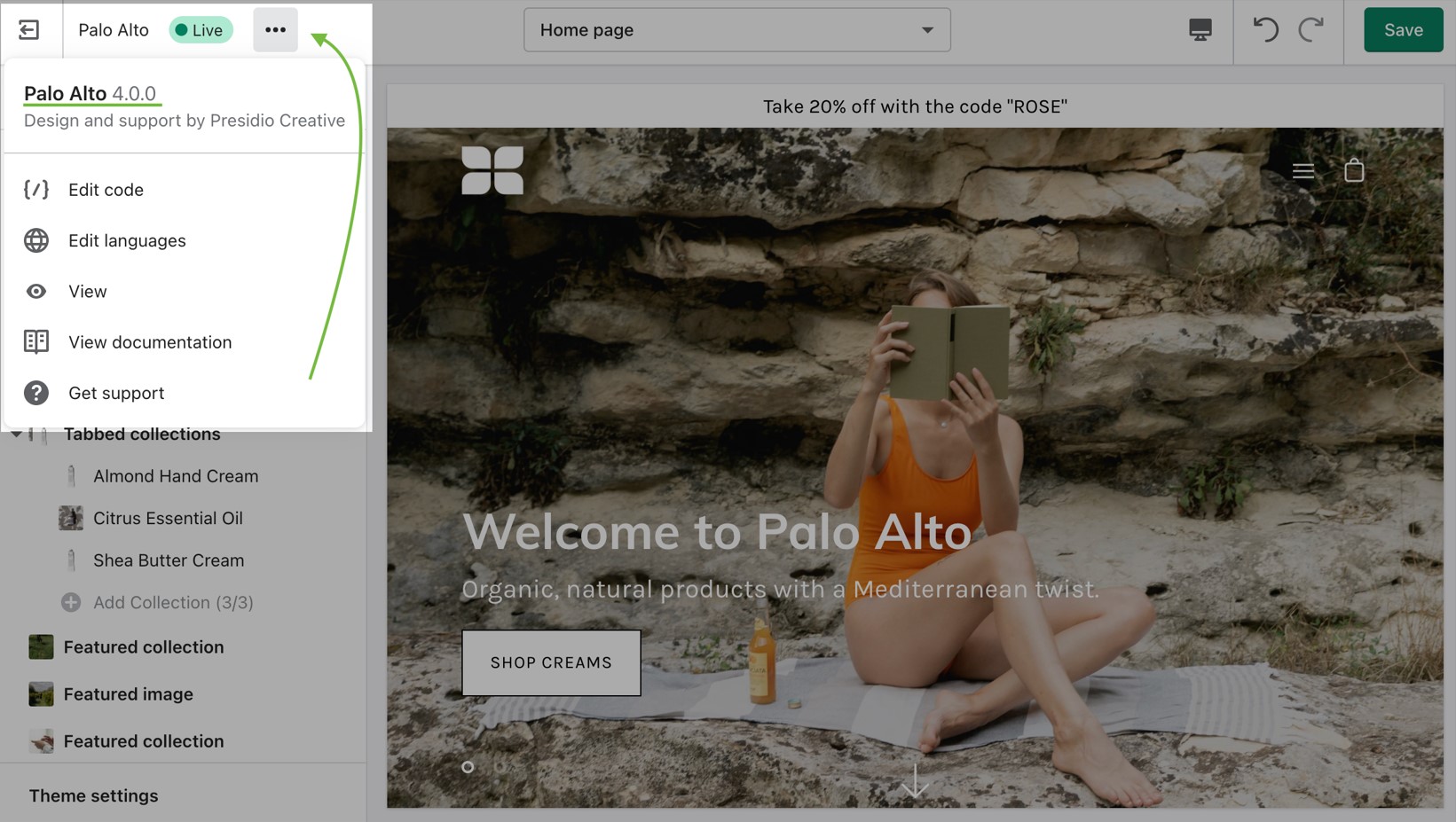
How to check the current version of your Palo Alto theme copy
To check the version of your current copy of the Palo Alto theme, click on the ellipses (three dots) icon at the top of the Theme Editor to view theme actions including the version number.
Filtering by tag method simply takes all of the unique tags applied to each product of the collection and lists them inside the filters menu.
This is the most simple method of all and as such, the fastest. If your priority is speed, we definitely recommend giving this method a try.
The filter by group method has been a staple in our theme for years and we are happy to include this in this version too. While this method is similar to the filter by tag method, as they both use product tags, it is a lot more advanced.
Setting this method up requires the use of product tags with a specific pattern. For each of your products, you need to specify tags that consist of a combination between the group name and the option name.
The group and option need to be separated with an underscore but they can contain spaces if they need to.
You can also toggle it from the block settings:
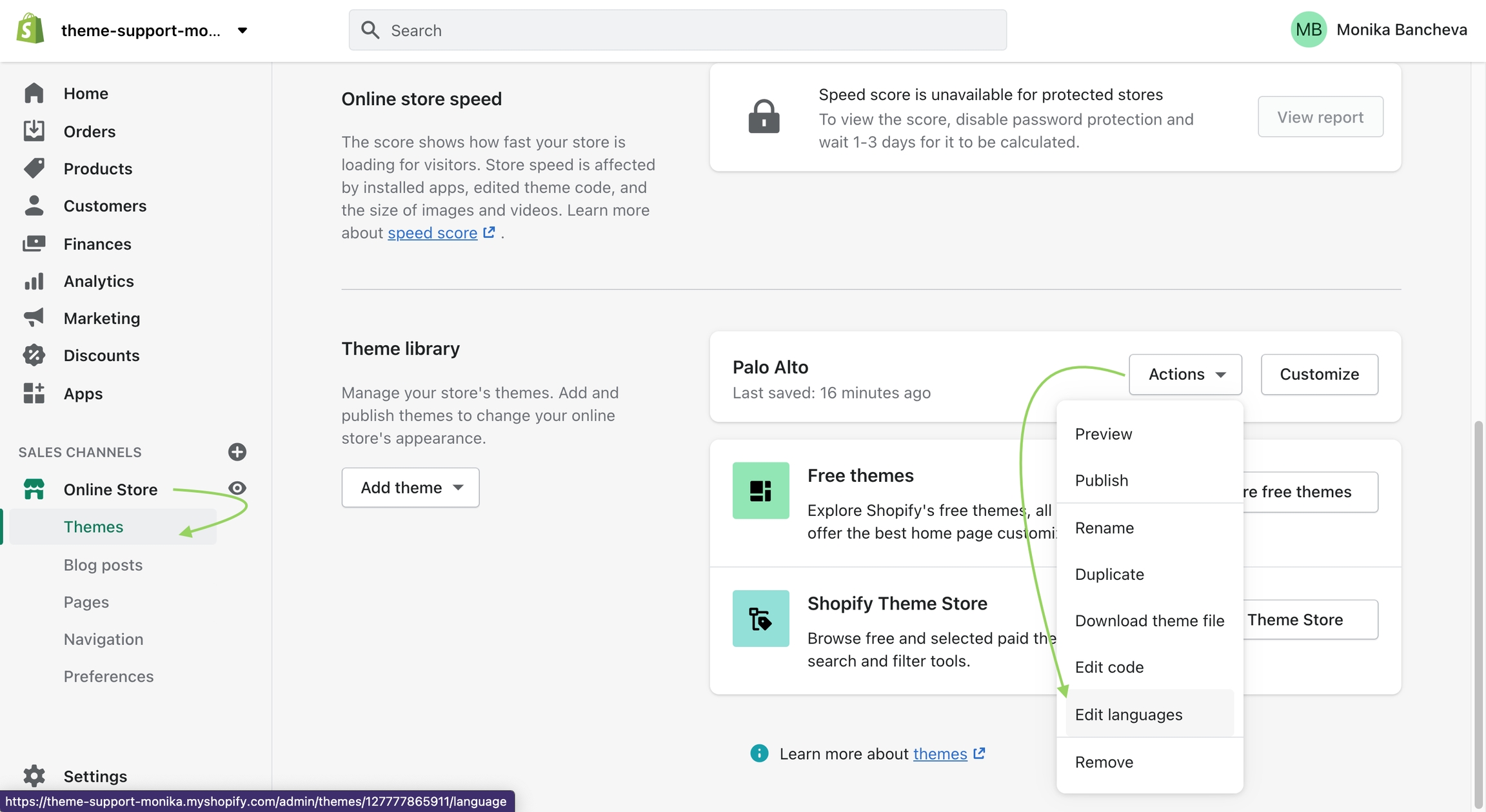
To change the text you need to access the Language Editor under Online Store > Themes > Actions > Edit Languages
Type "Cookie" into the search bar and edit all of the text related to this block:
Find your new template by going into the same Blogs tab in the top drop-down menu and select the template you just created. You are now able to add sections to it without affecting any other blog template.
The last step is to assign the new template to one of your blogs so that it can take the new style you've created. This is done by going into your Online Store > Blog posts and clicking on Manage blogs. Once you've found the blog you're looking to change, simply change the template name from the 'Theme template' tab.
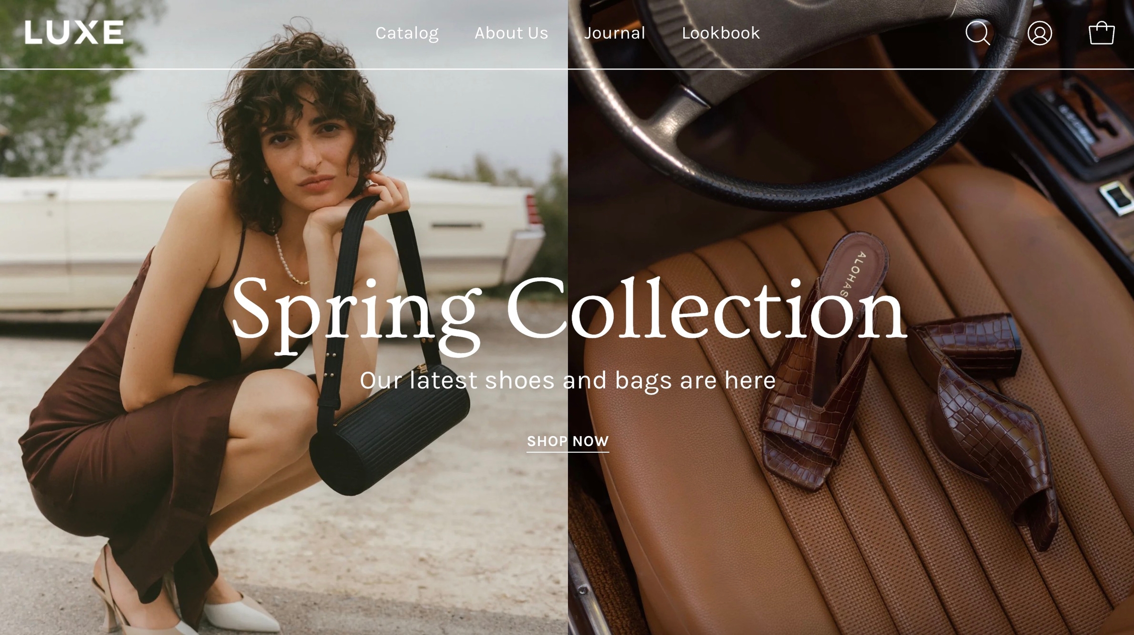
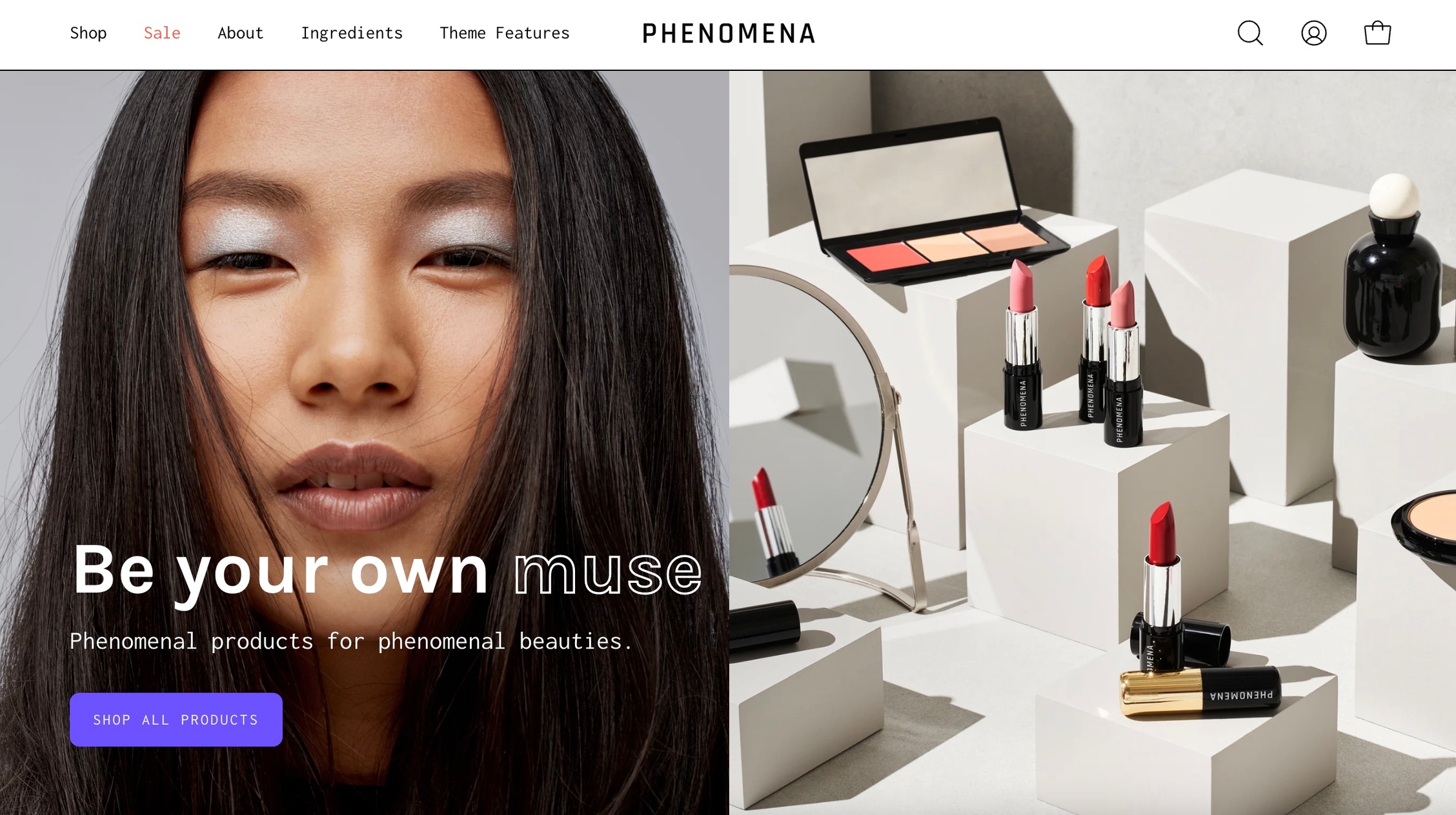
Dynamo
Vibrant
Luxe
Phenomena
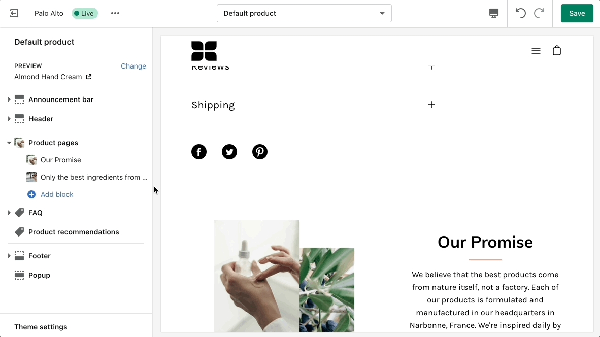
Settings and layout options for Product pages
The new Product page sections in our Palo Alto theme are built from the ground up with the new features introduced in Online Store 2.0 in mind. The use of JSON templates allows for dynamic sections to be used to truly customize your product pages to your style.
Accessing the Product pages can be done by opening your Theme Editor and clicking on Products. This will show all of the available product pages in the specific theme copy you are editing.
A big part of the settings can be accessed from the section blocks. They can also be moved around if you're looking to customize the look. You can move blocks the same way can sections. Each block has six small dots that you can click and hold to drag and drop them between one another.
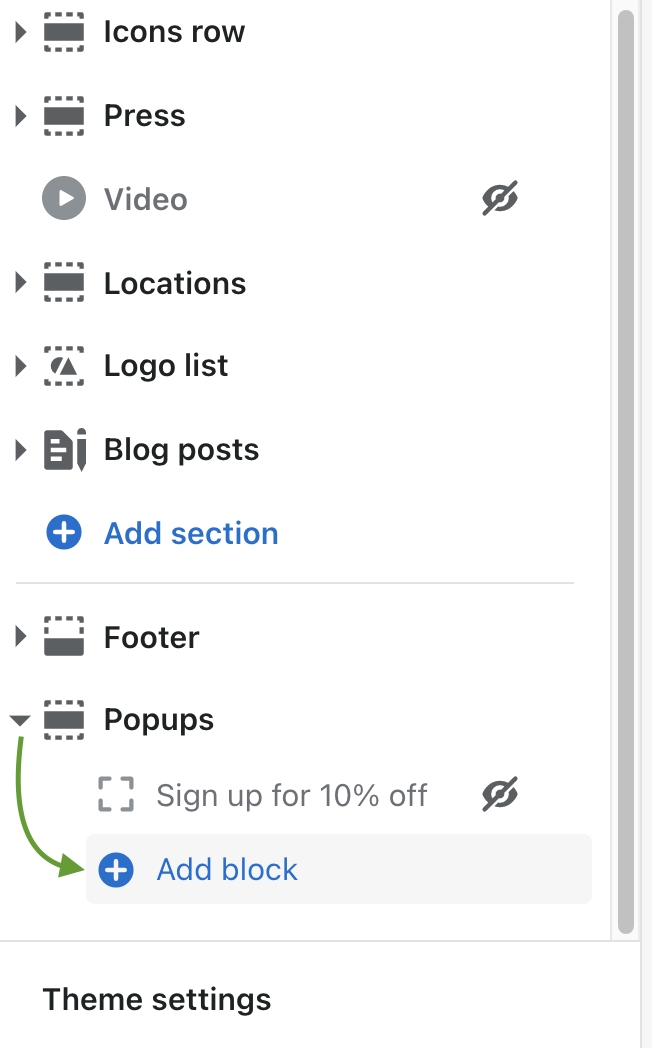
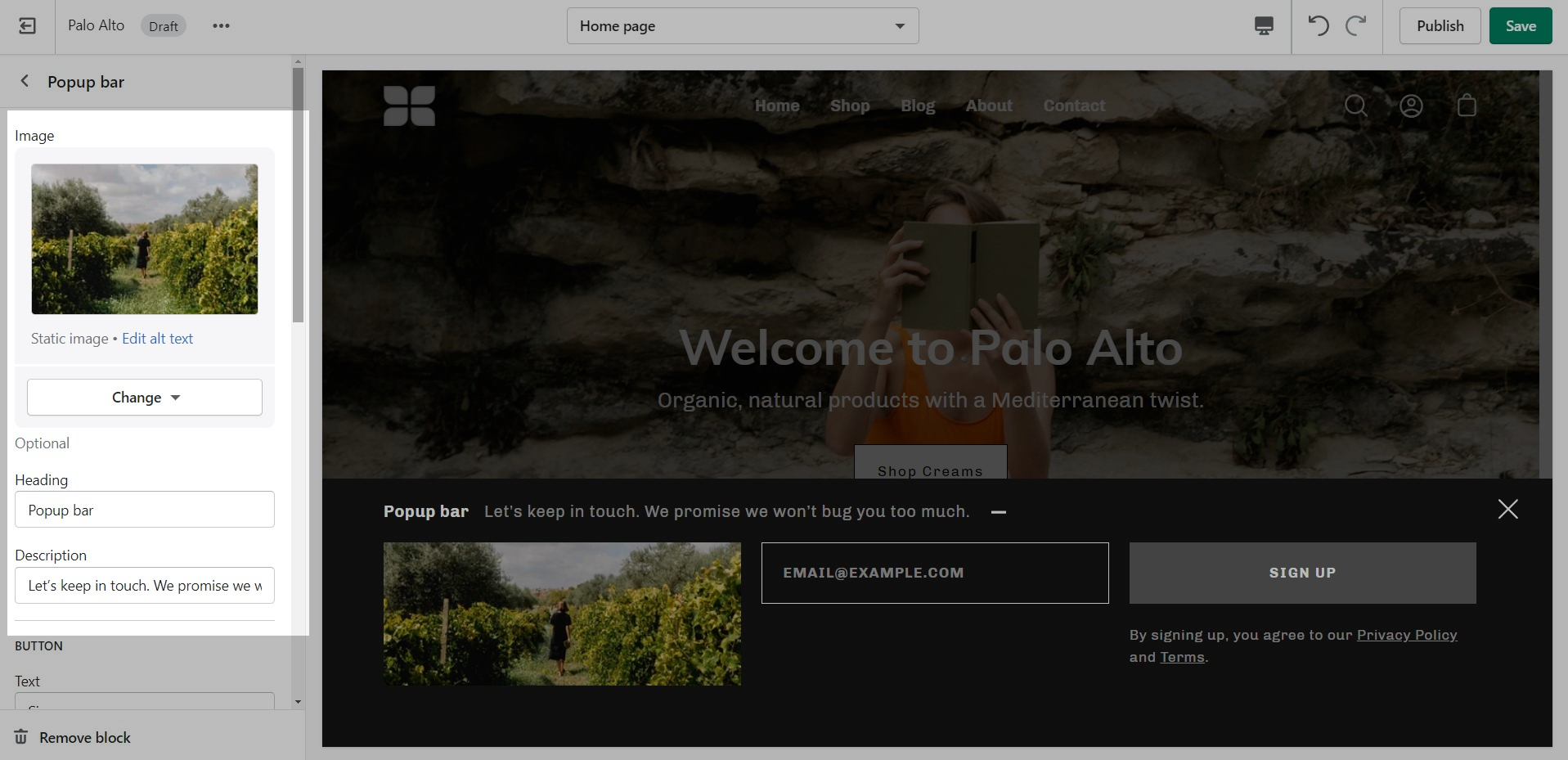
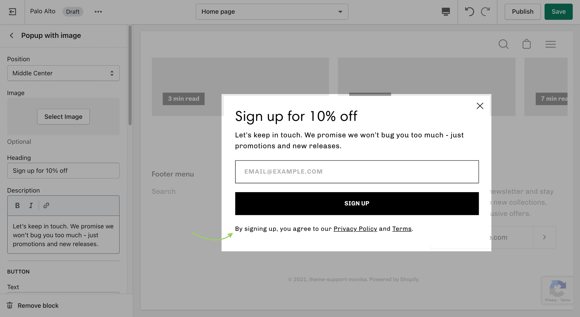
The popup section in Palo Alto can be used as a newsletter popup or as a sales promotion tool to display custom messages and promo codes based on where the customer arrives from, is viewing, and how they are interacting with your site.
There are three different section blocks:
Adding custom fonts for your menu, buttons, headings, and body text.
Adding your own custom styles and CSS overrides to the theme
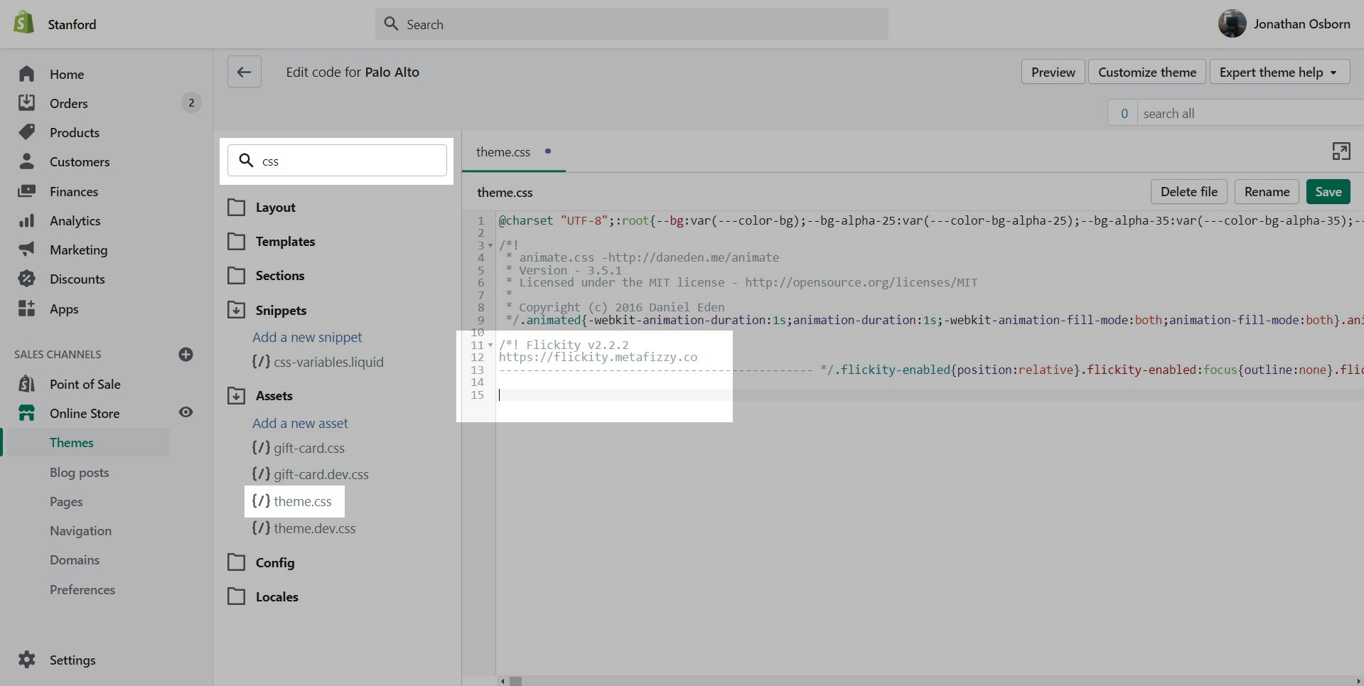
For developers and to make minor CSS style modifications, use the Code Editor and add your custom CSS overrides at the bottom of theme.css located in the Assets folder.
Click on the ellipses (three dots) icon at the top of the Theme Editor to view theme actions, choose Edit code.
Information about updating to the newest version of the Palo Alto theme
We will provide migration tips on how to copy your settings and sections when updating to a newer version of Palo Alto using Online Store 2.0.
Online Store 2.0 uses JSON files to store all your settings and sections. There are several JSON files that will hold this information. Currently, the best method to migrate or copy your settings is to copy the content from these files to the new theme version. Shopify may introduce tools in the future to help with this process. We will document a manual method to help our merchants have the ability to migrate their settings when updating beyond Palo Alto 4.0.0.
We go into more details about each block in their own posts linked above.
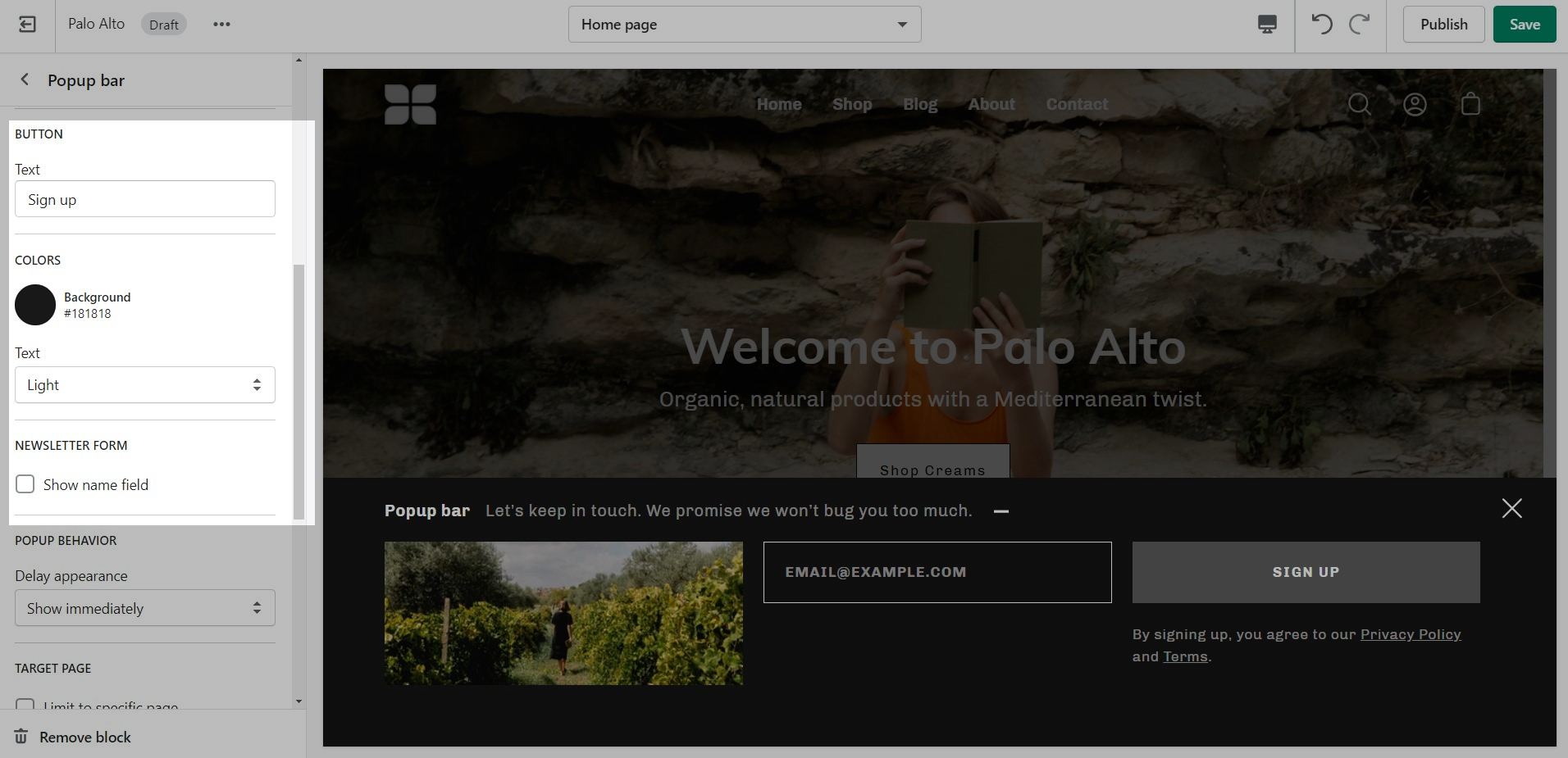
There are four behavior options that you can control from the block settings:
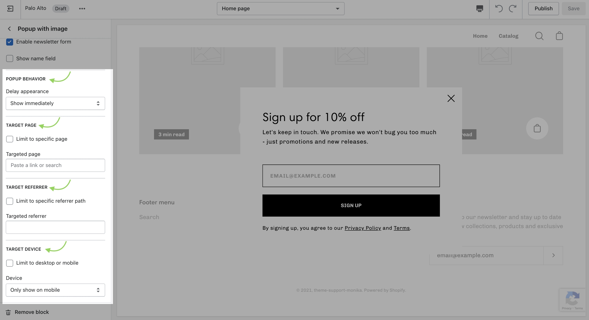
Display a custom popup to your customers only when the customer is browsing a certain page, product, collection, or blog post on your site. Target your message based on where customers are browsing on your site:
Create different popups and messages for various pages of your site.
Target a specific audience by using Target Referrer. Your popup will only appear when the customer arrives at your site from a certain path or location.
Enable when running a promotion on another site. Customize message based on the source.
Use to provide a custom discount code to your customers when they arrive from a social media or other paid promotion.
Create a custom popup for mobile devices and another popup for desktop browsers with Target Device. Each popup can be customized with different assets and messaging.
Enable custom popups for mobile and desktop.
Use 'Delay appearance' to delay the popup from showing on the page. There are four different delay options:
Displays the popup as soon as the page is loaded.
Displays the popup ten seconds after the page is loaded.
Displays the popup after the user scrolls to the bottom of the page.
Displays the popup after the user has been idle for one minute.
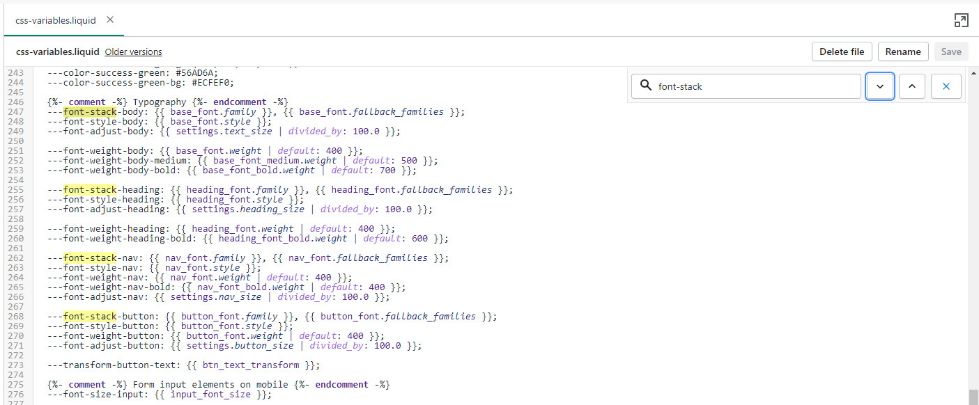
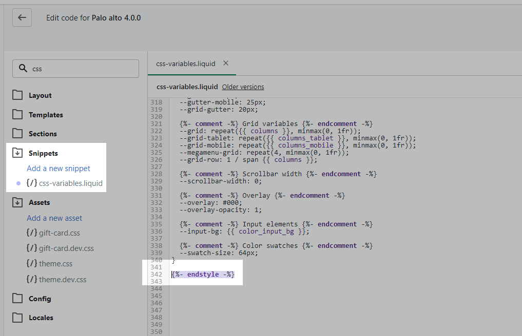
Now that we have the assets sorted out we can head on over to the 'css-variables.liquid' file. It's located inside the Snippets folder. Here you need to scroll all the way to the bottom and add a bit of code before the closing style tag (' {%- endstyle -%} '):
This is the place where you need to add this code snippet:
In this code snippet, you need to replace all references of 'Gorham' with your own font name and font files names.
If you have to upload more than one font, you need to declare each one individually and use multiple instances of this code snippet.
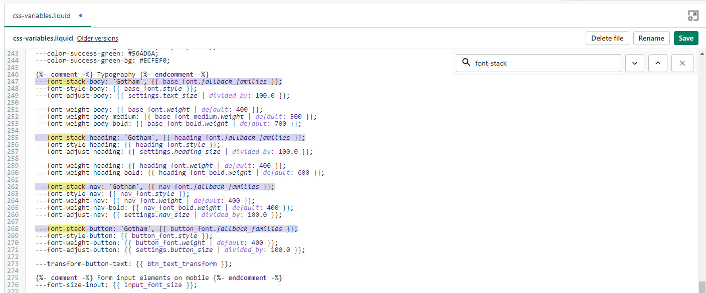
Finally, all we need to do is assign the new fonts to be used. There are four global font variables that control the fonts for the headings, body text, buttons, and navigation menu. You can easily find all of them by using CTRL + F (or Command + F) and searching for 'font-stack':
All you need to do here is to replace the first value assigned to the variables you're looking to change, we'll continue to use 'Gotham' in our example to keep it consistent but this is also a place where you input your custom font name:
That's it, you're all set and ready to go. Just don't forget to Save the changes.
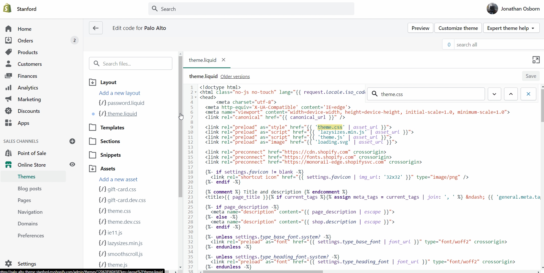
As you have probably noticed, "theme.css" is minified and you won't be able to easily change the styles. This is where the "theme.dev.css" file comes in handy.
This file is not minified and holds the exact same code but in a much more user-friendly layout. While you can certainly change the styles in it, these changes won't take effect on your live store. The reason for this is that this file is not read by default.
To activate it, you need to access the "theme.liquid" file and replace the instances of "theme.css" on lines 9 and 44 with "theme.dev.css".
Palo Alto matches any valid CSS color names with a color swatch automatically. This feature relies on the CSS coding language, which has color keywords built-in but is entirely in English.
Documentation page coming soon
Below is a reference of CSS colors names:
Let's take the custom color name “Rose Red” as an example. It isn't an actual CSS Color, so the swatch that's displayed is almost the same as red.
To do so, you will need to generate a png image to display a custom swatch color for Rose Red. You can crop part of an actual product image if you like to show texture or the exact color.
In our case here, the png image will be:
The file will be named "rose-red.png". There are two things to watch out for with the file name here:
1. Please ensure that you add a dash between the words. Shopify needs you to add a dash when you have space or special characters.
2. Ensure that you use lowercase characters only (the file extension needs to be in lowercase too).
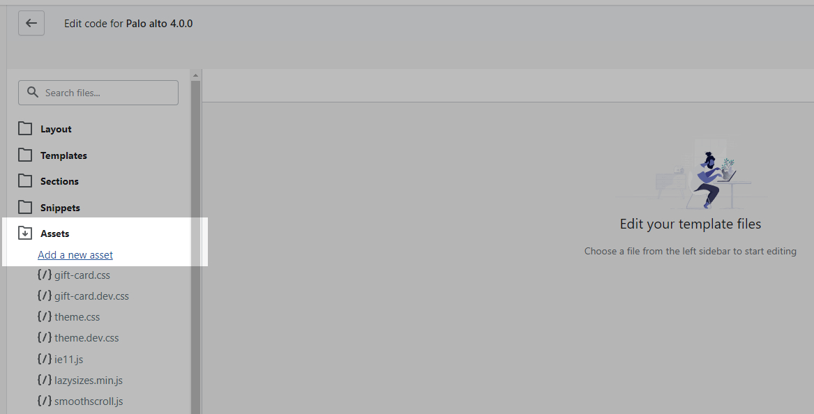
Navigate to your Online Store > Themes and click on Actions > Edit Code
Scroll down to the Assets Folder
Click the Add a new asset link and upload the "rose-red.png" image file
The final step is to make sure swatches are enabled in your settings. To do this, you'll need to open your Theme Editor and click on Theme Settings near the bottom.
From here, open the Products tab and scroll down to the "Enable color swatches" checkbox.
Links and helpful tips on updating your theme
When you download the latest version of Palo Alto, the new theme will be added to the drafts section of your store and is completely separate from the live theme running in your store.
Your current live theme is not affected by downloading the latest version of Palo Alto.
The new theme is in 'Draft' mode which allows you to set up and configure it, while your store continues to operate with the current theme.
Create a backup of your existing theme. This will be used to copy settings and to keep the live theme running without interruption.
Visit the Shopify Theme Store and login in. For paid themes, it is important to log in to the account that you used to buy the theme. This will prevent you from being asked to buy the theme again.
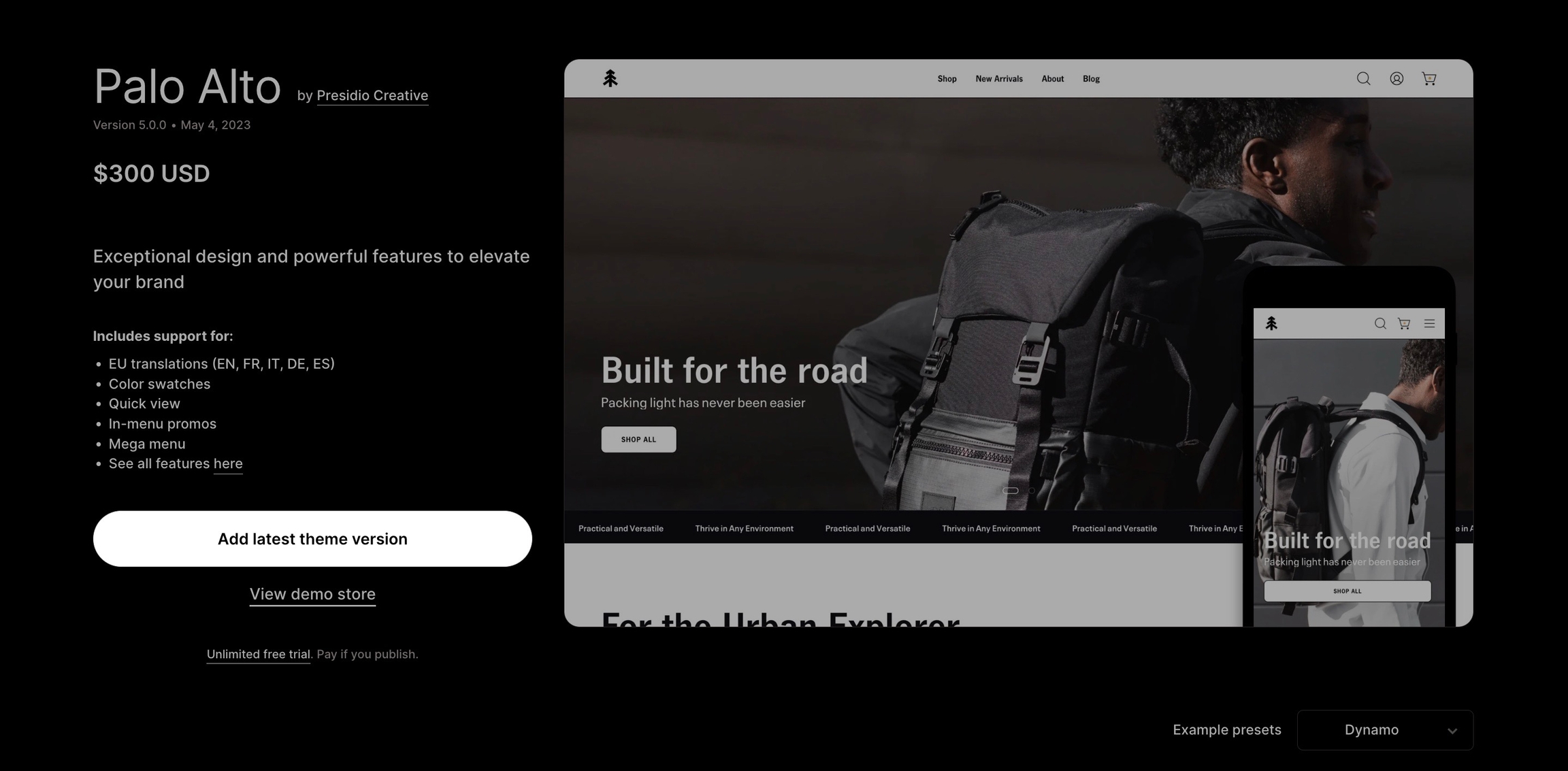
Download the latest version of Palo Alto - .
Tip: You must be logged into the account that purchased the original theme.
If you see 'Try theme' or 'Buy theme' as the option, log out and log in again with the account that purchased the theme. Be sure that the main button has 'Add latest theme version'.
Blog pages are meant to be a simple assortment of articles but who's to say you shouldn't customize them?
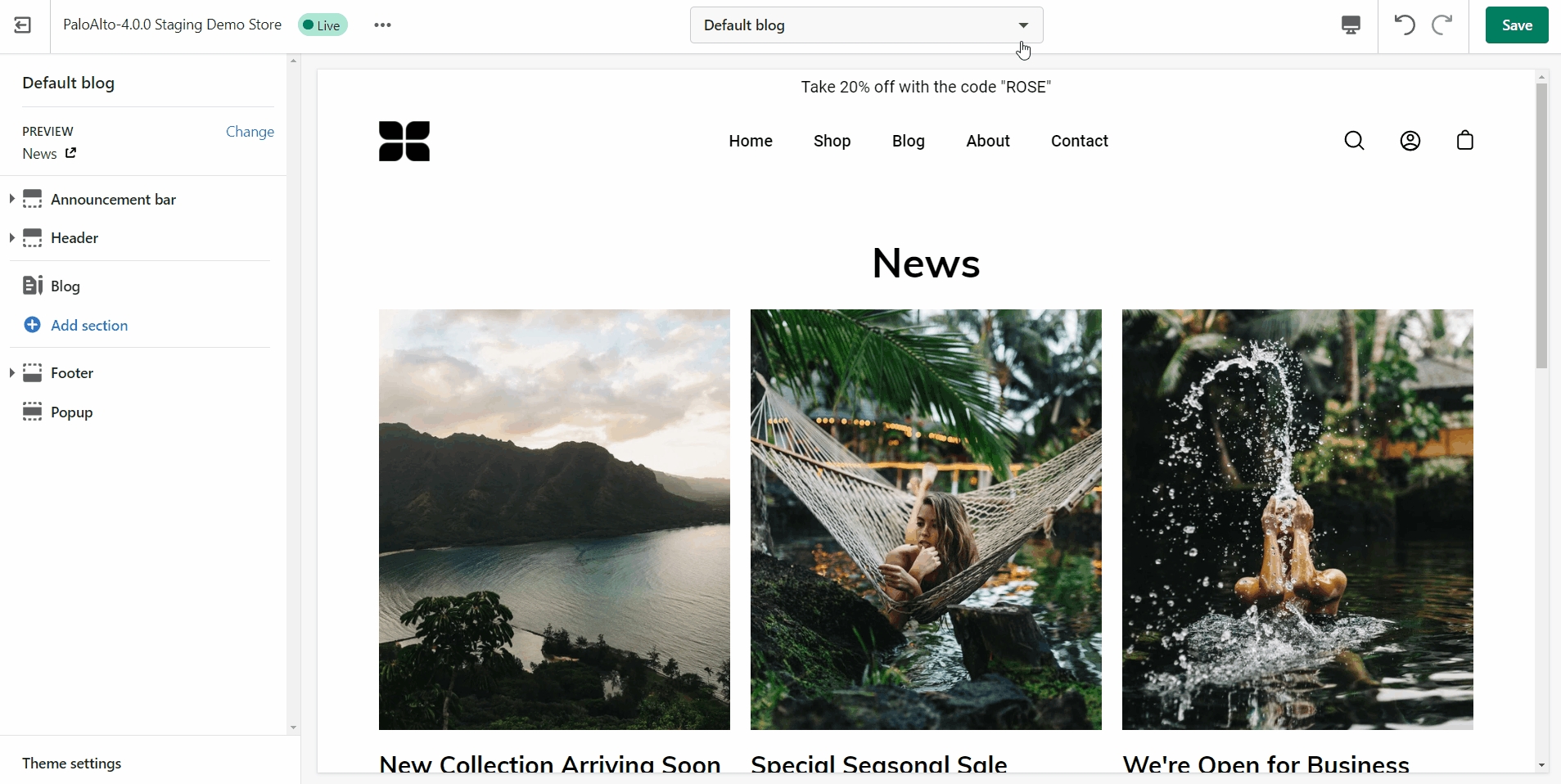
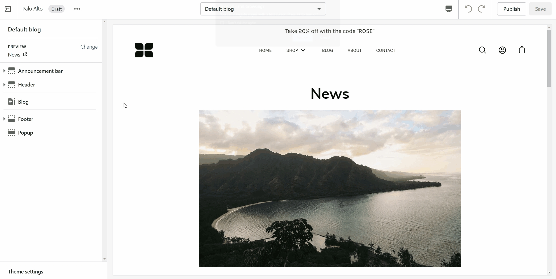
The blog pages section holds a handful of settings but they can be quite important. These settings can be accessed by first navigating to the blog page you're looking to edit.
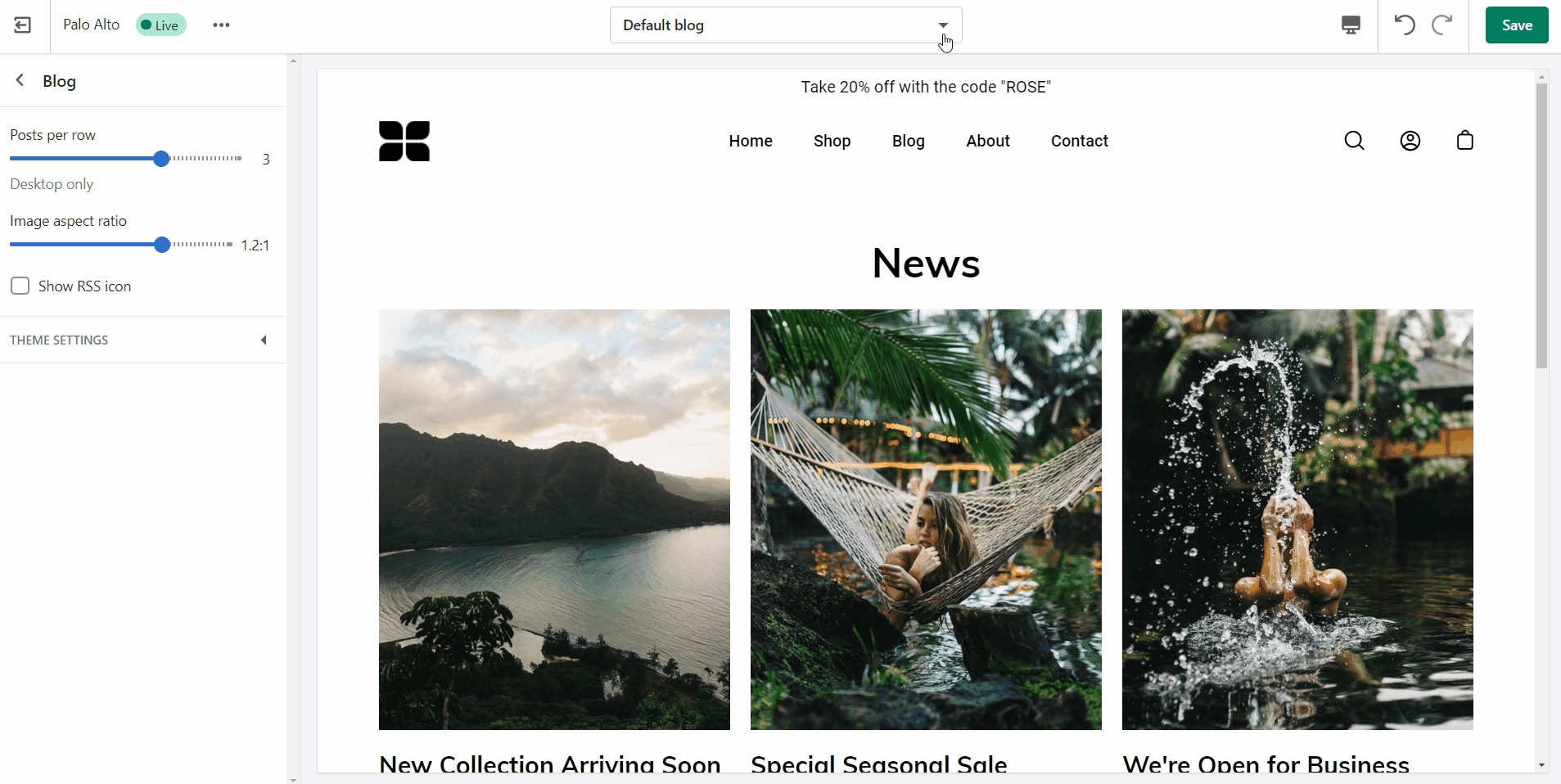
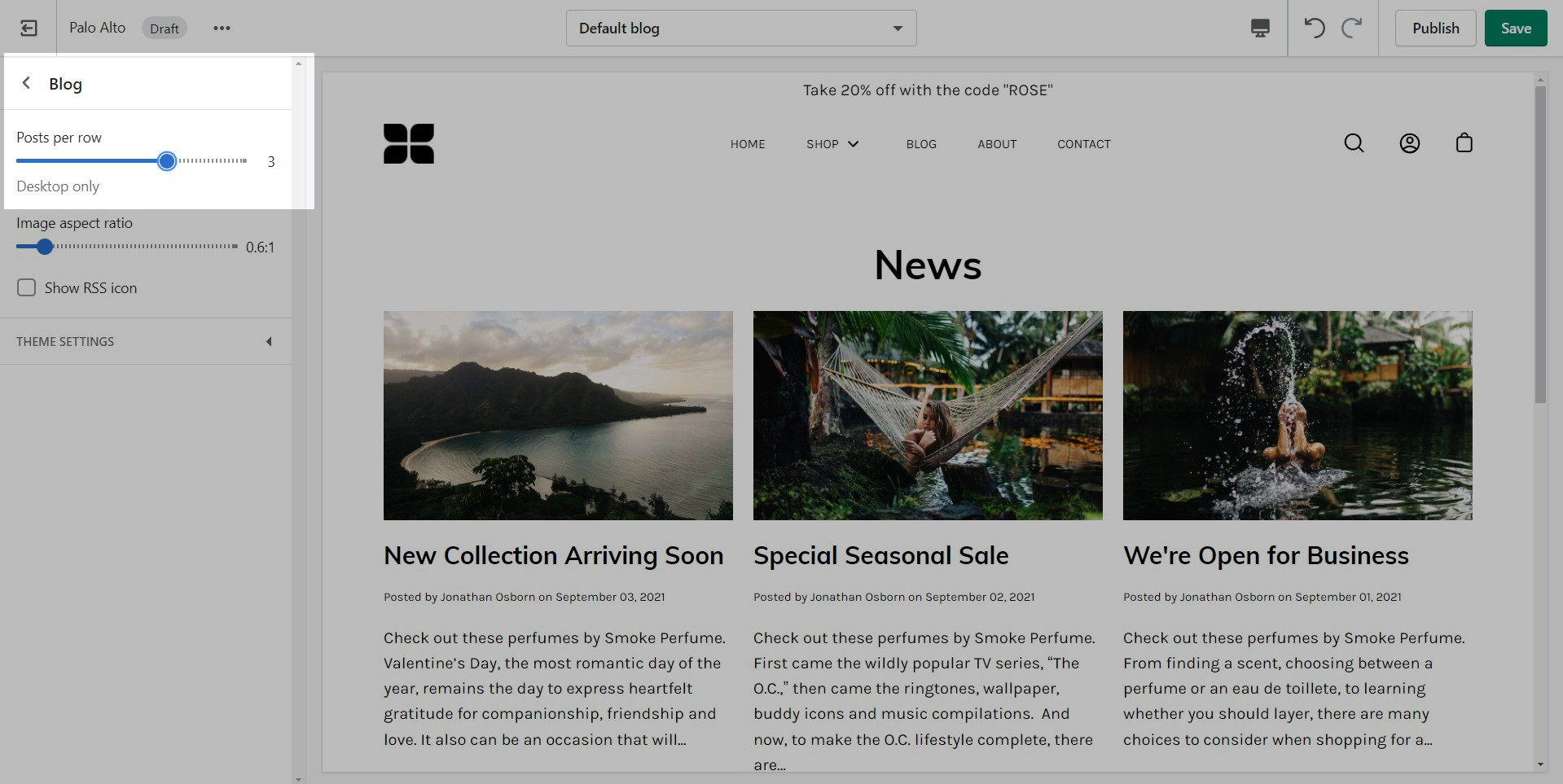
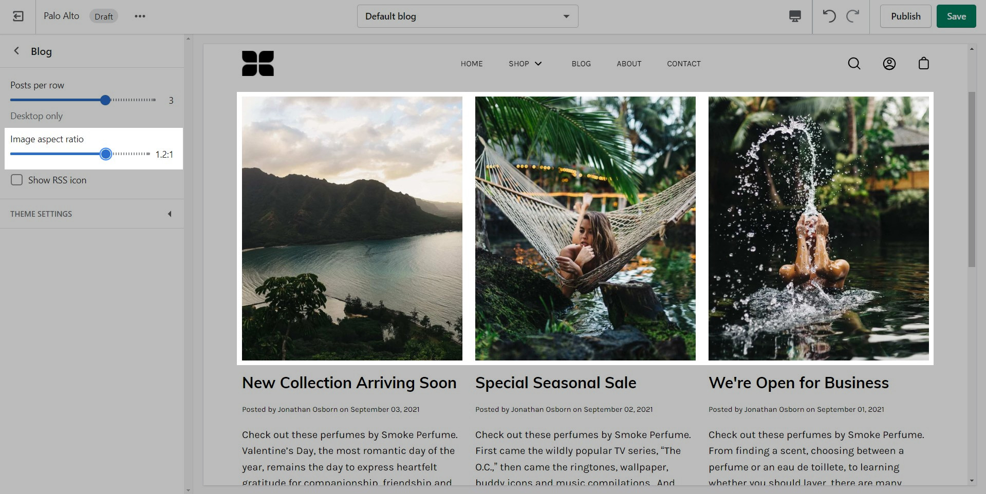
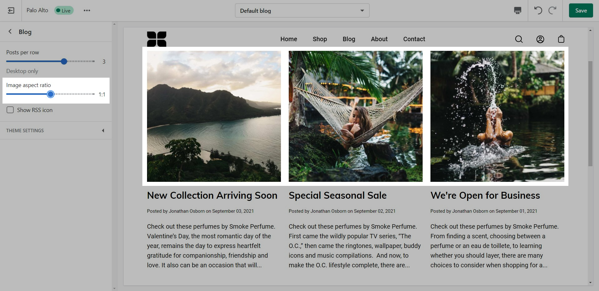
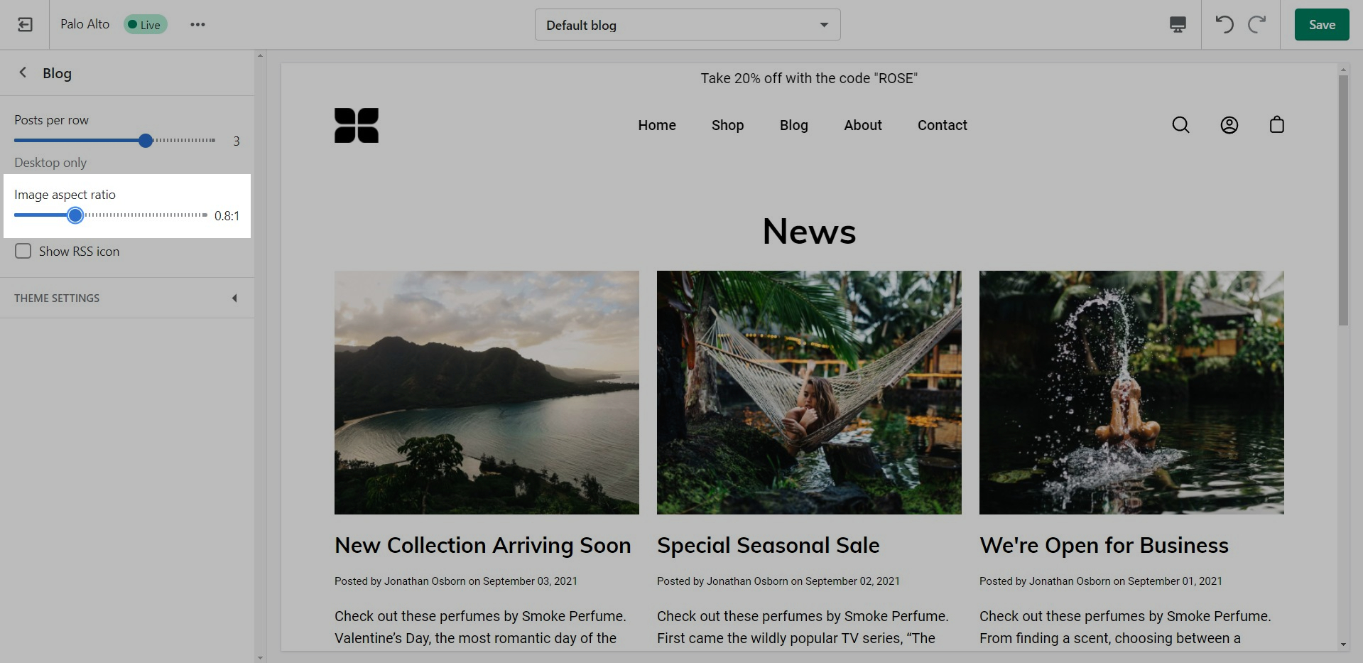
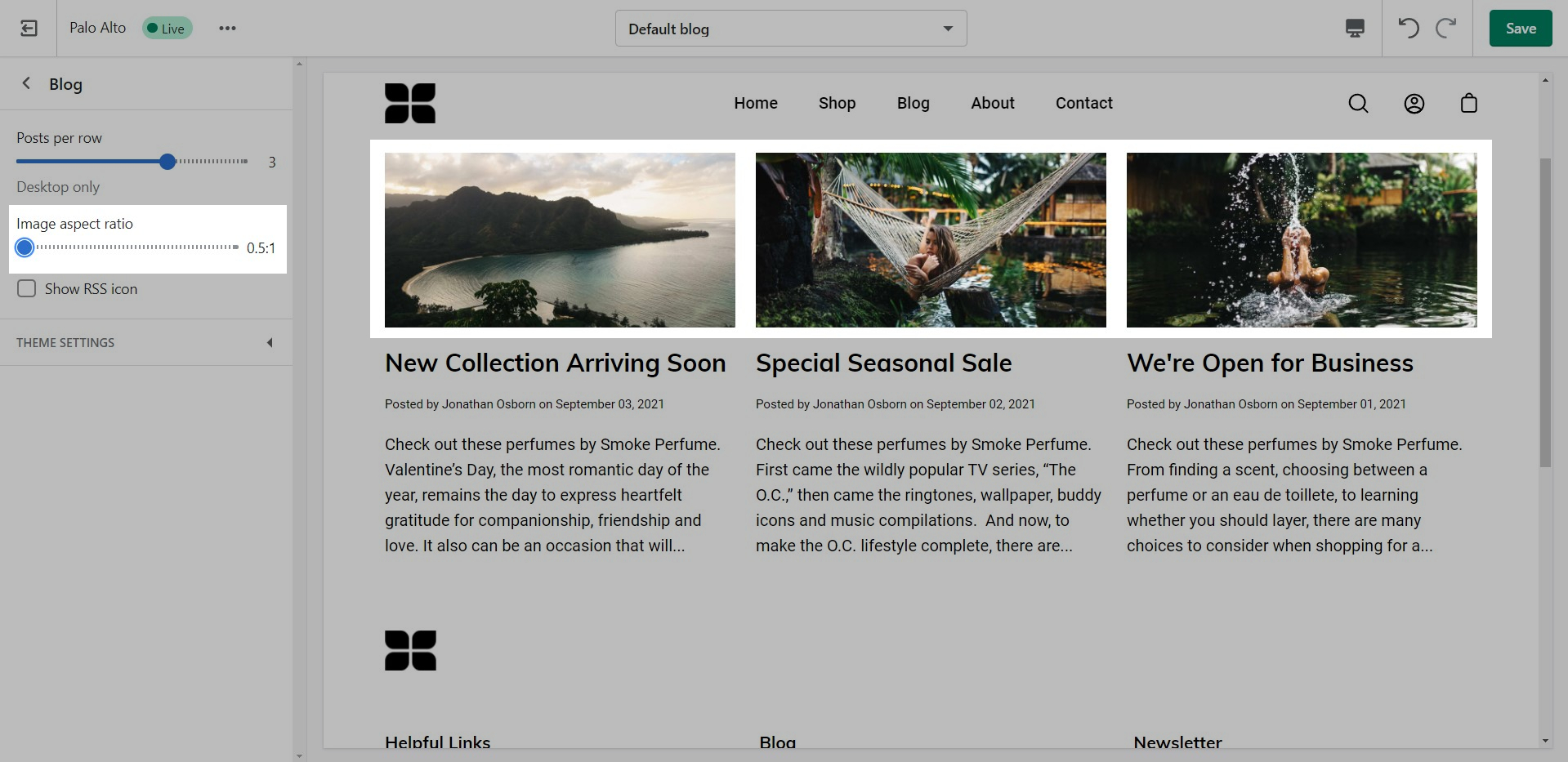
Palo Alto displays a rich grid of all your blog post articles. Click on Blog pages to configure the layout of your blog index page.
Controls to customize the layout of your blog index page:
TIP - Your article tags will automatically display as navigation that allows readers to filter though your articles
You can adjust the image aspect ratio with the range slider.
To reach us with questions or additional assistance with using Palo Alto, our support staff is here to help you by email. To better support all our customers, we handle all our support via email. This helps us manage support across multiple time zones in a timely manner.
We respond to requests in the order they are received, typically within 48 business hours (excluding weekends and holidays).
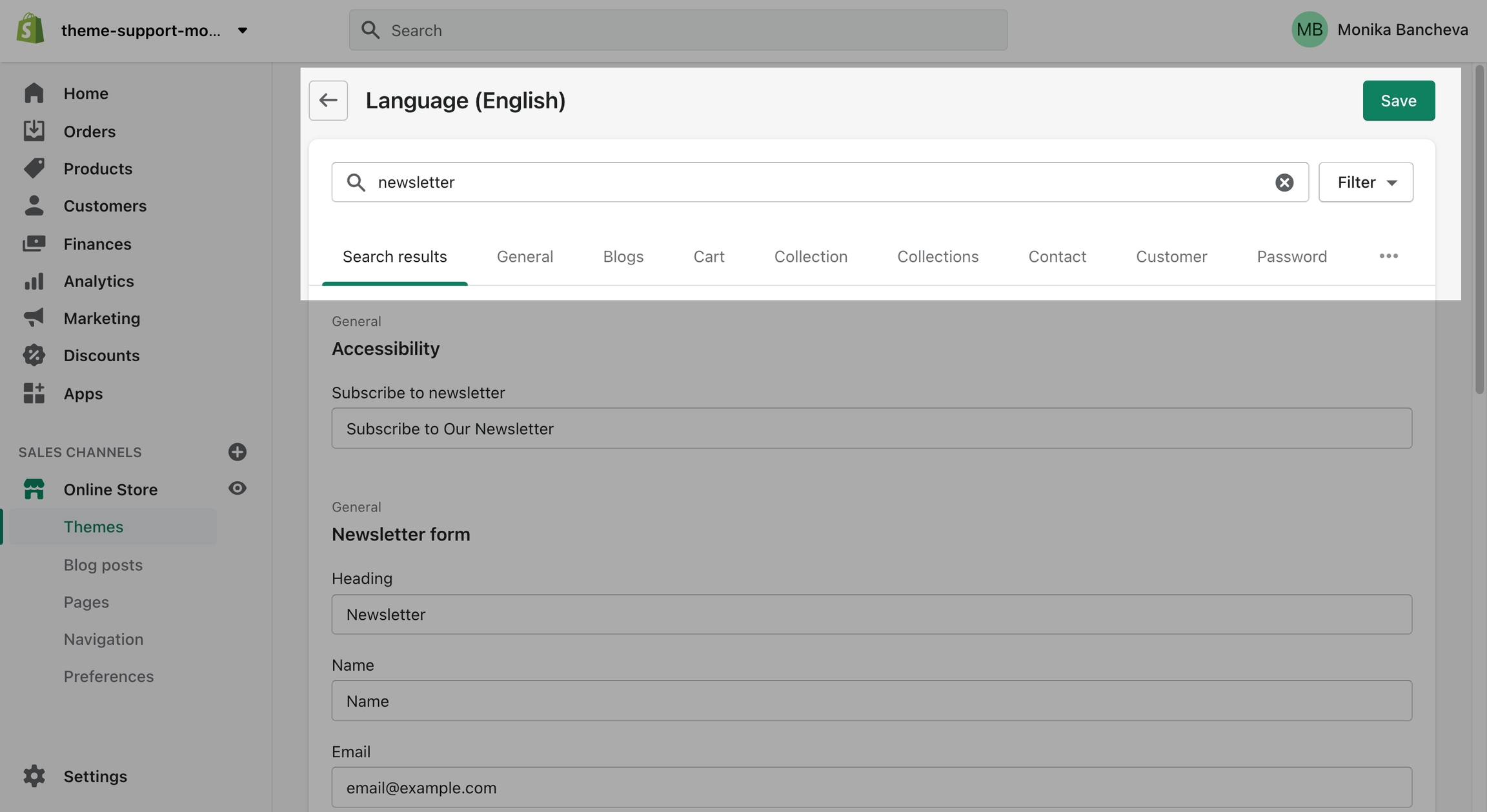
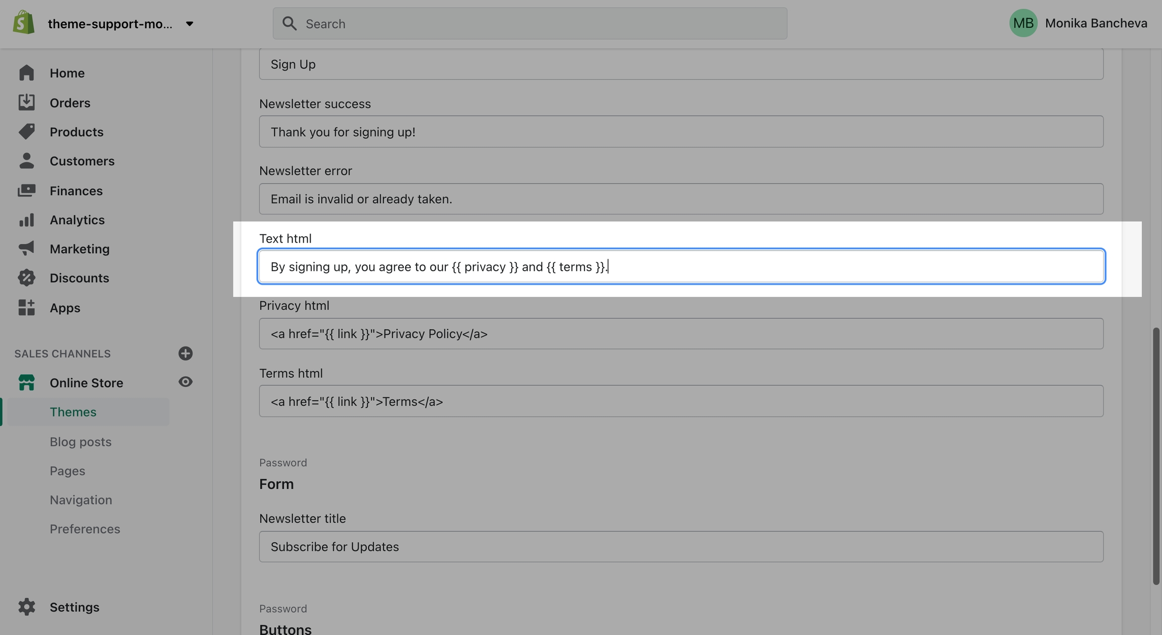
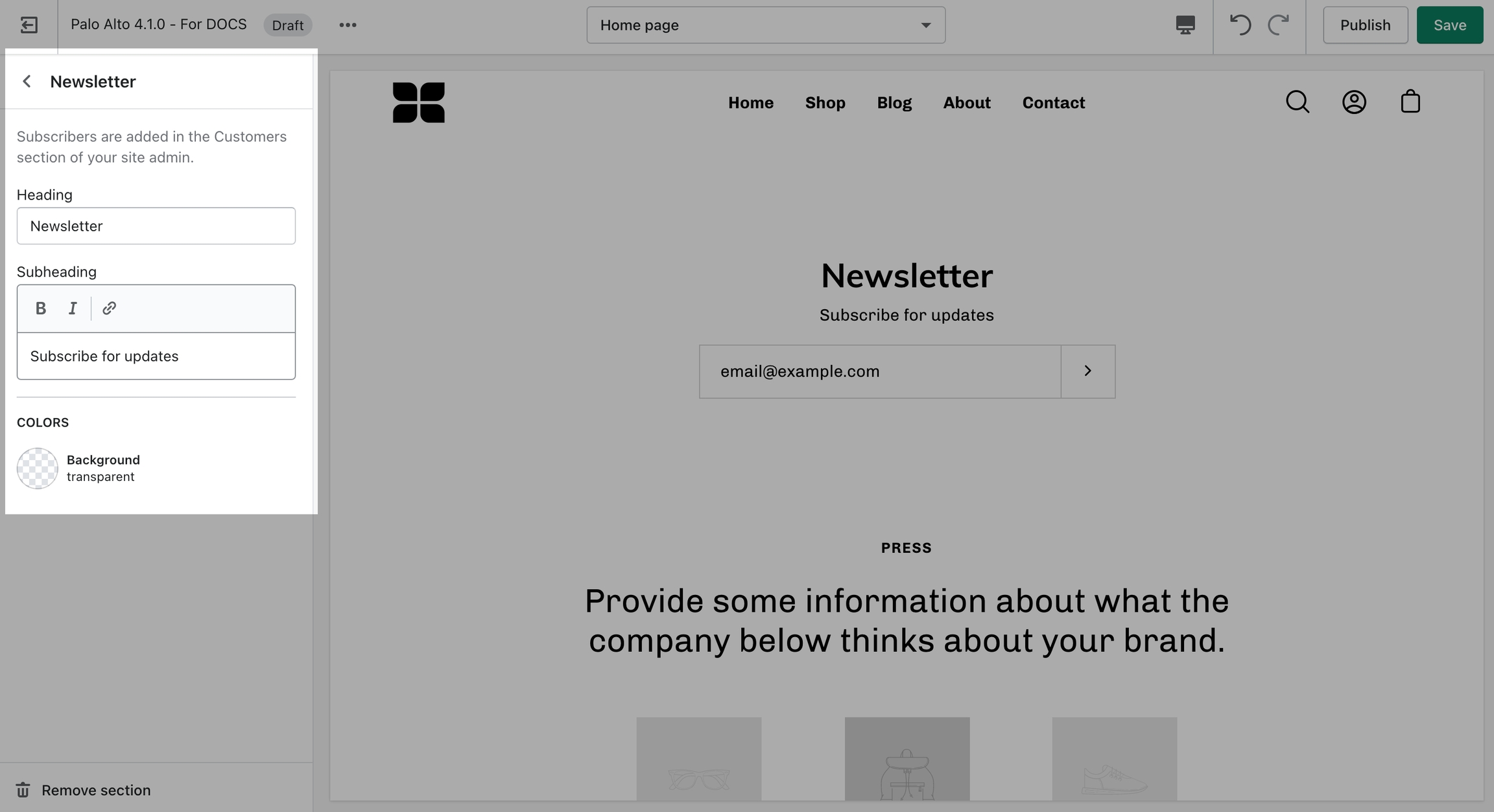
The "By signing up, you agree to our Privacy Policy and Terms." text is there to show your customers quick links to some of your legal pages:
To change the text you need to access the Language Editor under Online Store > Themes > Actions > Edit Languages
Type "newsletter" into the search bar and edit all of the text related to this block:
Finally, scroll down and change the text:
/* -- code to use Gotham font-family in theme -- */
 @font-face {
    font-family: 'Gotham';
          src: 	url('{{ "Gotham.eot" | asset_url }}');
          src: 	url('{{ "Gotham.eot" | asset_url }}#iefix') format("embedded-opentype"),
        	url('{{ "Gotham.woff" | asset_url }}') format("woff"),
        	url('{{ "Gotham.woff2" | asset_url }}') format("woff2"),
         	url('{{ "Gotham.svg" | asset_url }}#GothamBold') format("svg");
         font-weight: normal;
         font-style: normal;
 } /* - end - */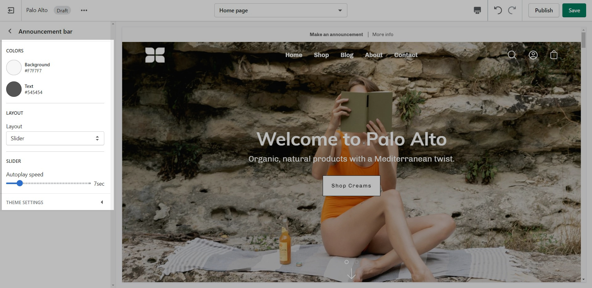
Set the heading and background color for the section.
Add blocks by clicking on the small arrow next to the section then clicking 'Add block'.
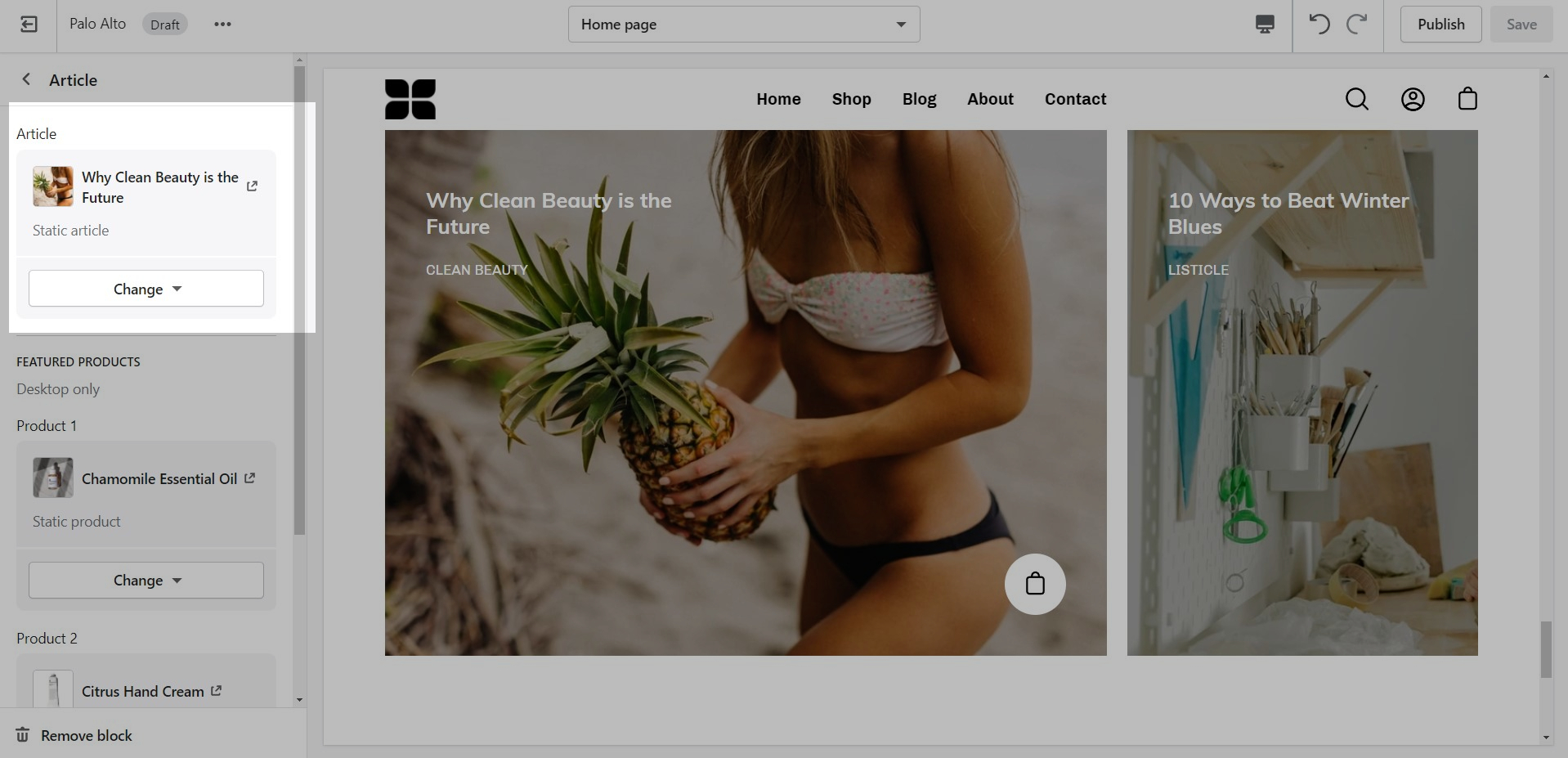
Set the individual block settings for each article added.
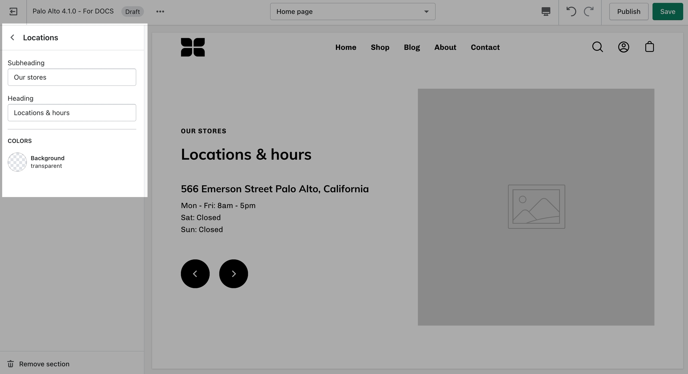
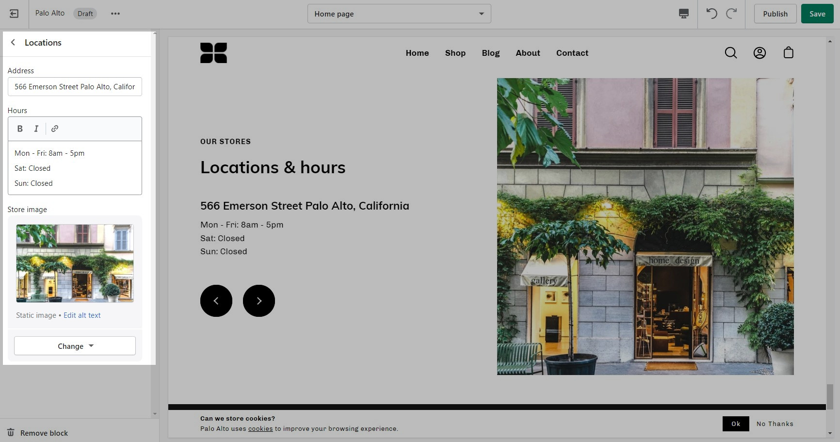
Let your customers know about your store locations. You can add more than one block if you have multiple stores.
Set the general headings and colors of the section.
Add blocks by clicking on the small arrow next to the section then clicking 'Add block'.
Set different options for different blocks such as different working hours, images, or addresses.
Display a small-sized newsletter signup message.
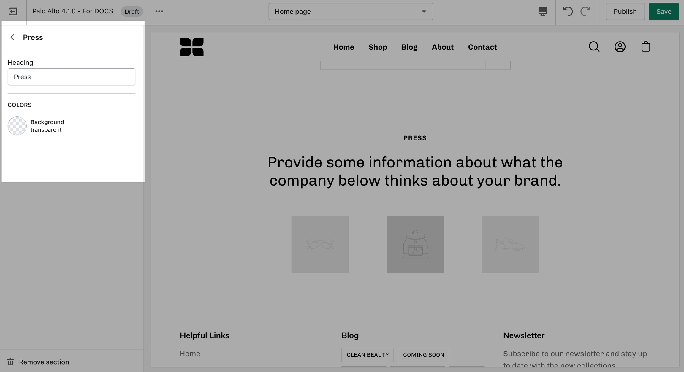
The 'Press' section can be used to present short bursts of information to your customers.
A commonly used section to break apart image-heavy setups.
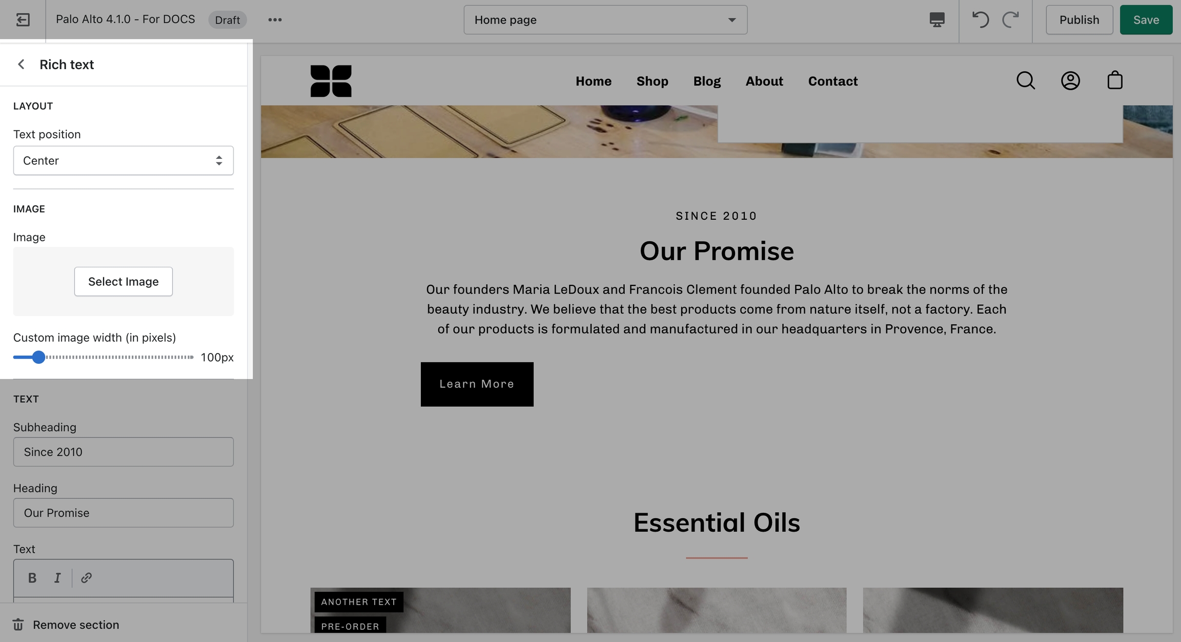
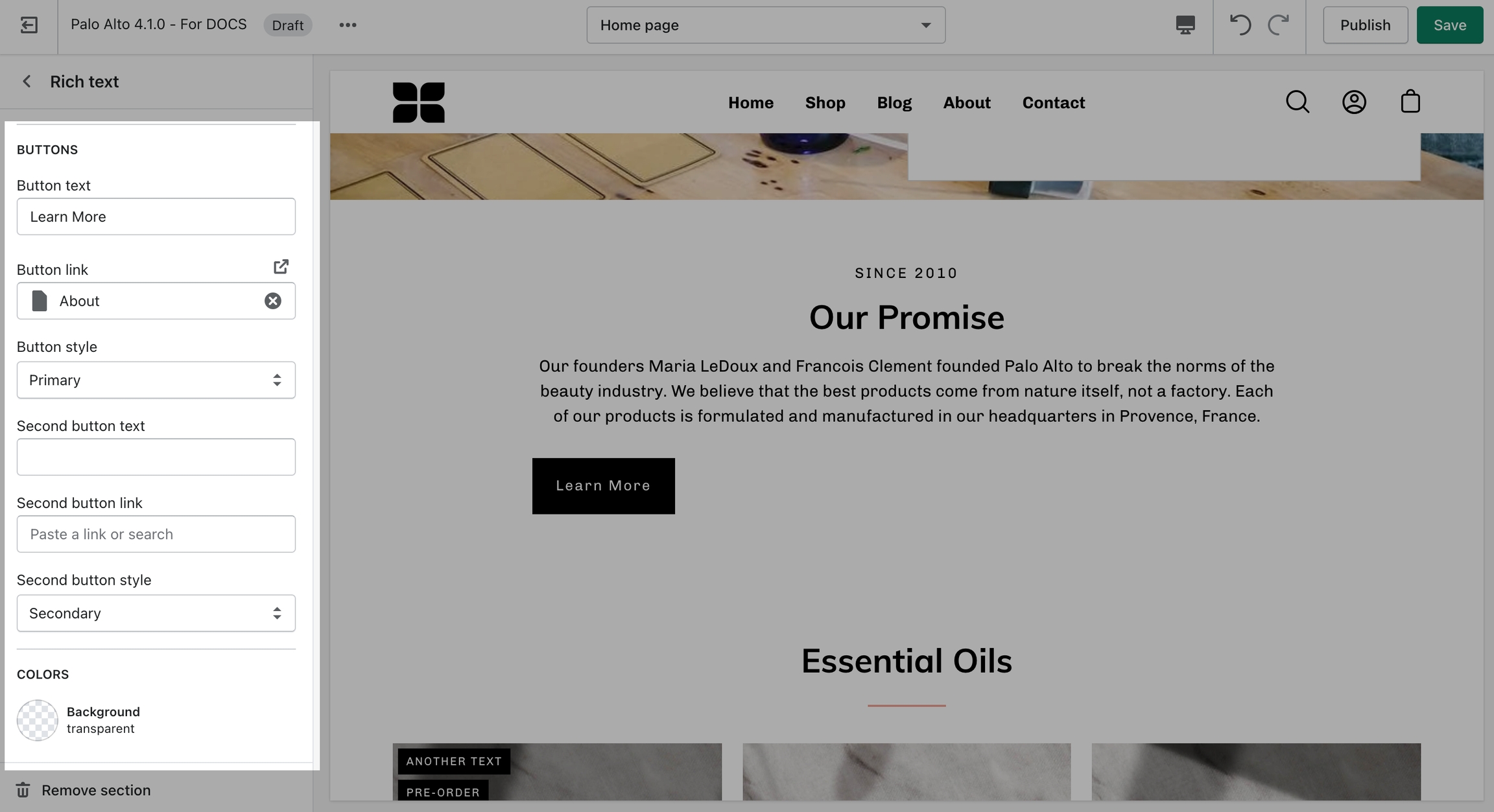
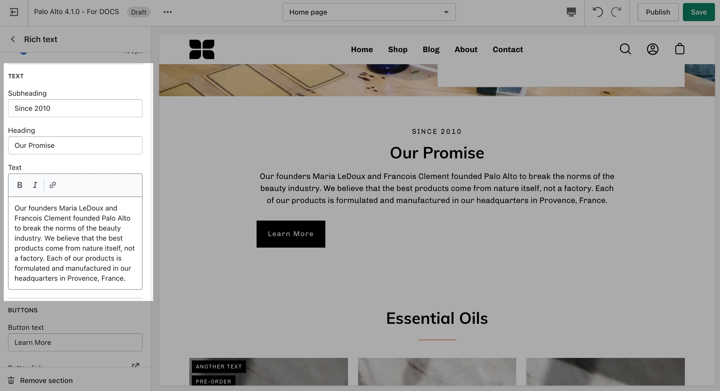
'Rich text' allows for a ton of customization. Use this section to tell a story to your customers.
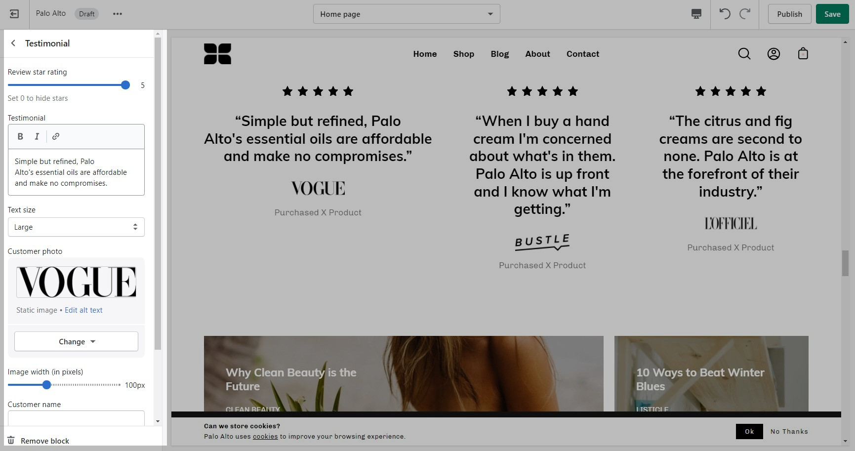
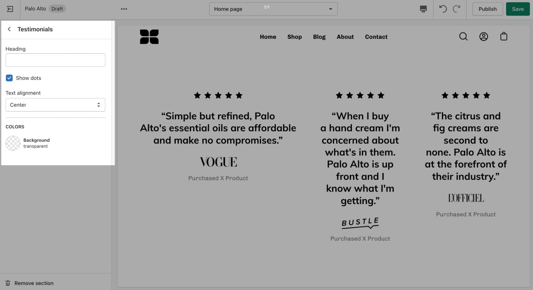
Add quotes from business partners and client testimonials to your store pages.
Add a heading and set the colors, alignment, and navigation style of this section.
Add blocks by clicking on the small arrow next to the section then clicking 'Add block'.
Add individual testimonial blocks to the section.
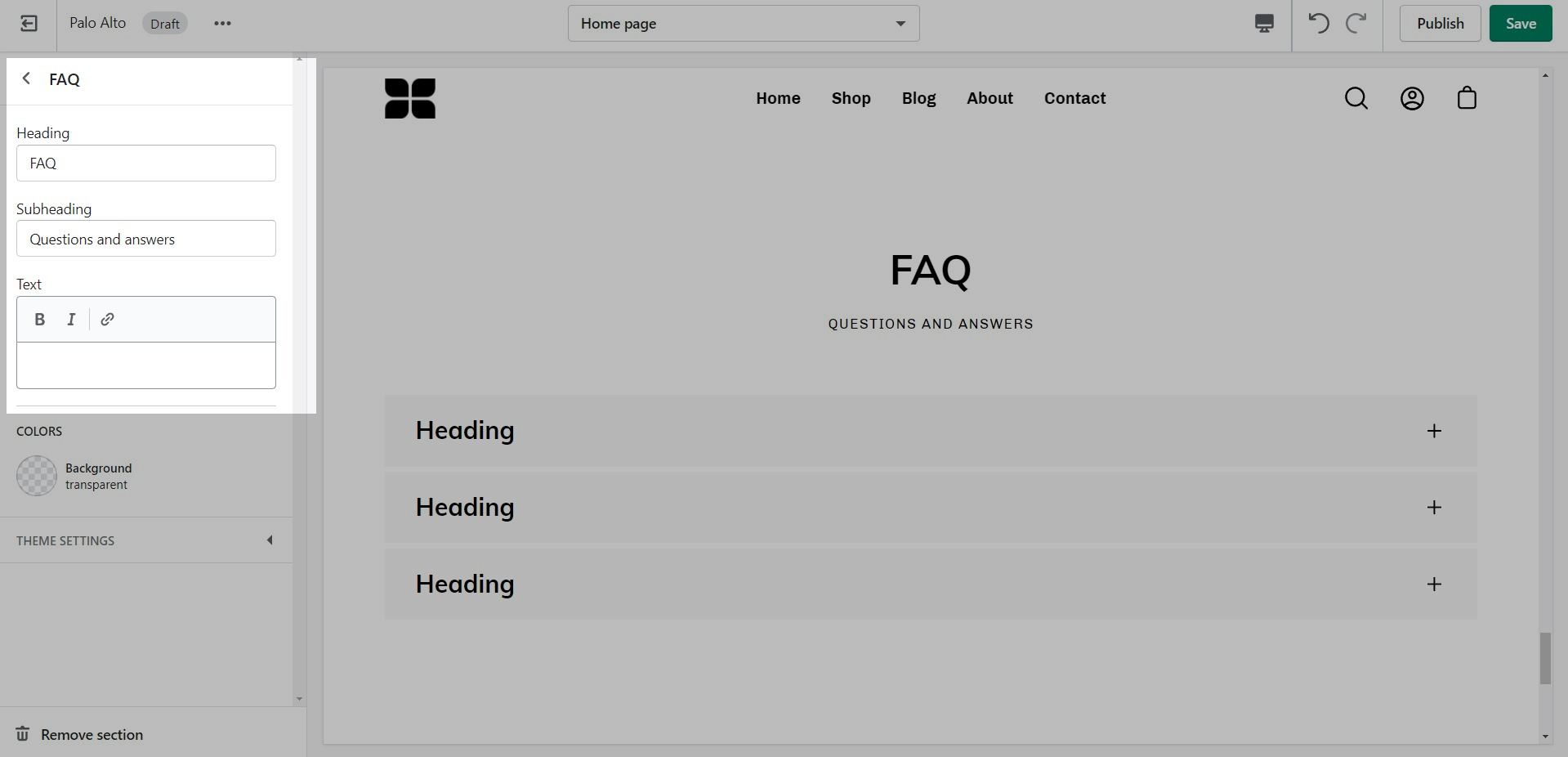
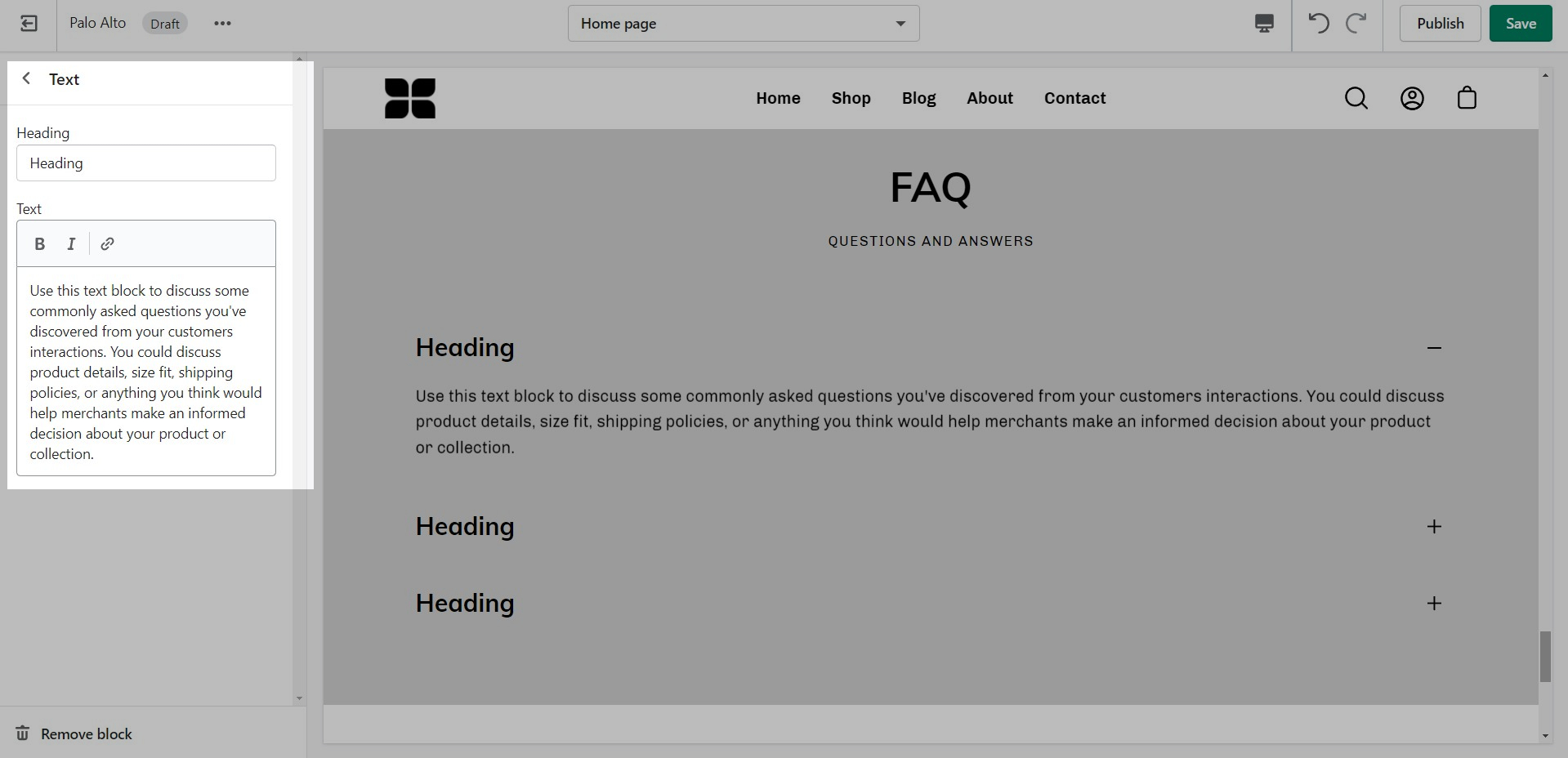
Palo Alto includes an accordion section to help you provide frequently asked questions. A place to promote your services, brand strengths and also include product reviews.
The blocks in this section help to create the individual tabs. Here you can add the heading and text for each question and answer:
Reach us via our contact form:
Shopify provides 24/7 support to all its customers. Shopify Support covers any platform questions or issues. For example, if you need assistance with using the Shopify Admin tools like product setup or your store settings. Shopify Support also handles all Checkout support.
For checkout page issues, contact Shopify Support directly.
The checkout page and theme are separate systems. Checkout is a function of Shopify and can’t be controlled by the theme.
Shopify Support: https://help.shopify.com/questions
For all app-related issues or questions, Shopify's policy requires app developers to be responsible for ensuring compatibility with themes in the Theme Store. It's best if you reach out to each individual app developer when requiring assistance with their app, functionality, or conflicts.
We can only support the code we write which is the code of the Palo Alto theme. Integrations with apps are handled by app developers directly. Each app developer has their own support system in place and can help you with issues regarding their app.
For any custom code requests or theme customizations, we recommend that you reach out to a Shopify Expert. Shopify Experts are advanced developers that provide many custom solutions for your store and also quick task-based solutions. They can provide full support for their work.
Presidio Creative does not provide any custom coding services.
Some Shopify Experts with Palo Alto experience include:
Sunbowl they are the best fit for larger projects
Sunbowl they are the best fit for larger projects
Pixelsupply has experience working with Shopify and accepts small contracts
has experience with Palo Alto and a great portfolio
is a large and experienced Shopify agency that does work in Palo Alto
is great - they also do plenty of Palo Alto work.
In the Theme Editor, click on the ellipses (three dots) icon at the top of the Theme Editor to view theme actions.
Choose Preview.
When the new preview window appears, choose the green Share preview button at the bottom of your browser.
Click the Copy link button to copy the address to your clipboard.
Send us that link, pasted from your clipboard.
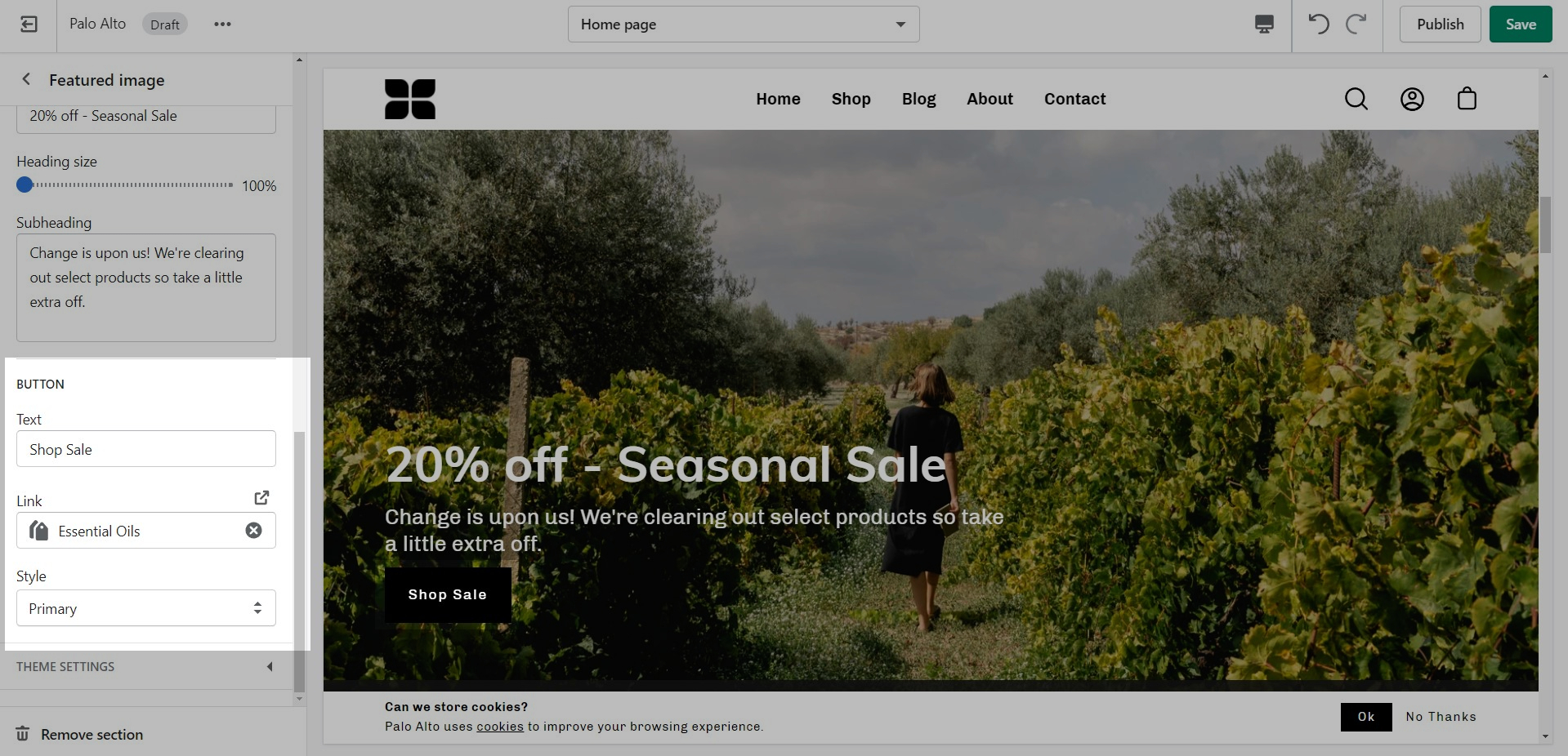
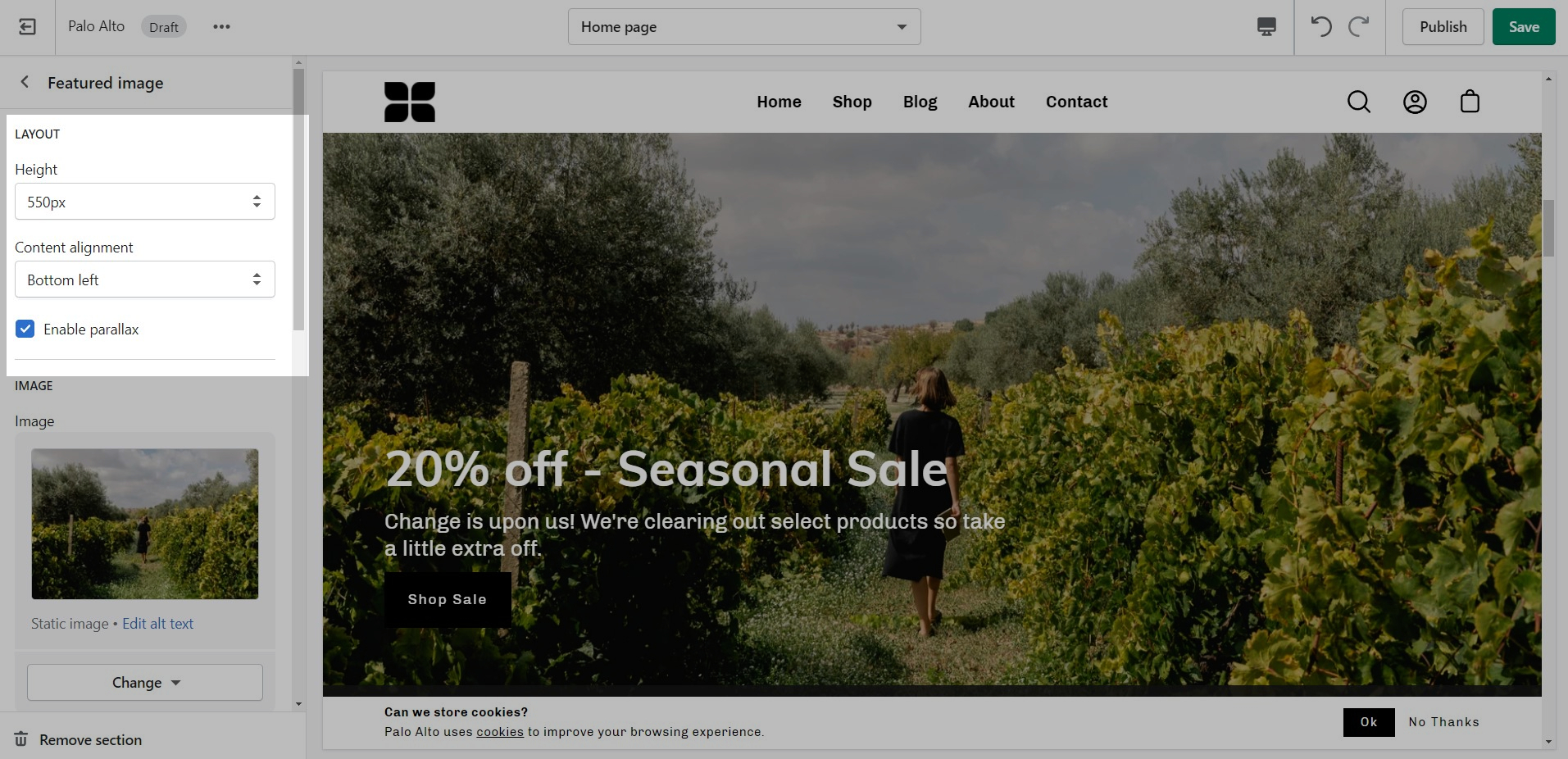
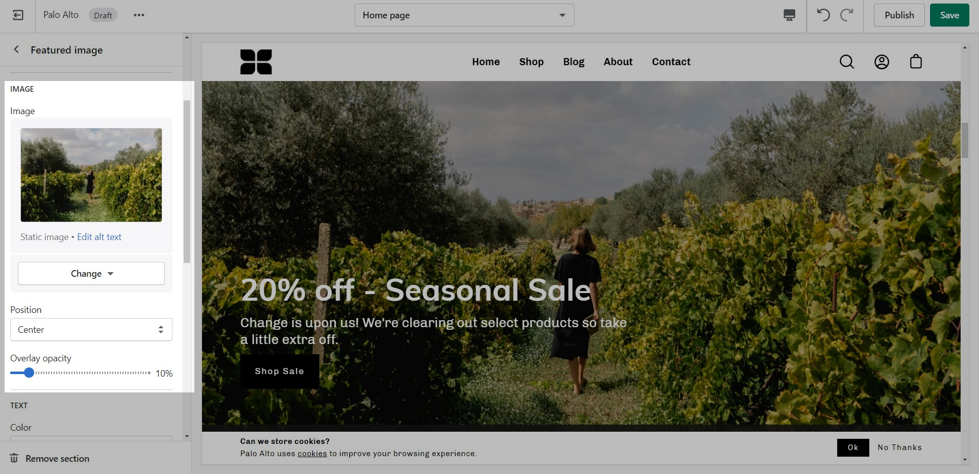
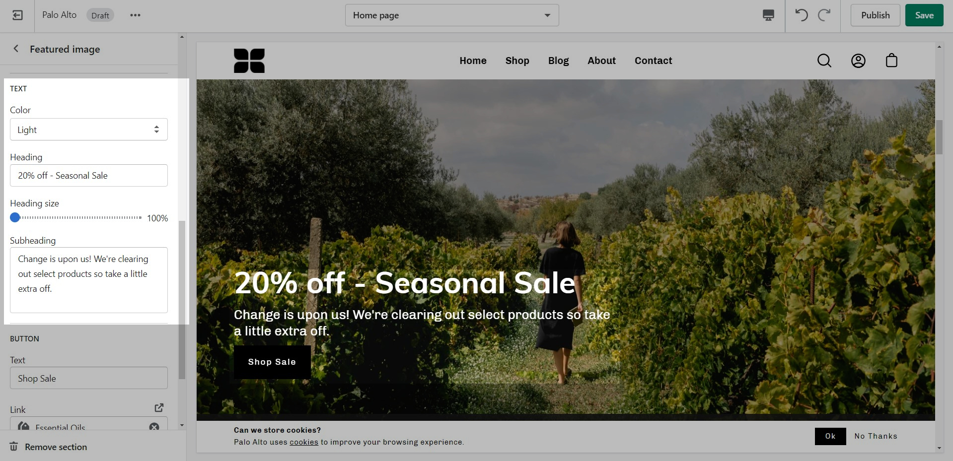
The 'Featured image' section can be used in a number of ways. The stand-out feature of this section is the parallax effect.
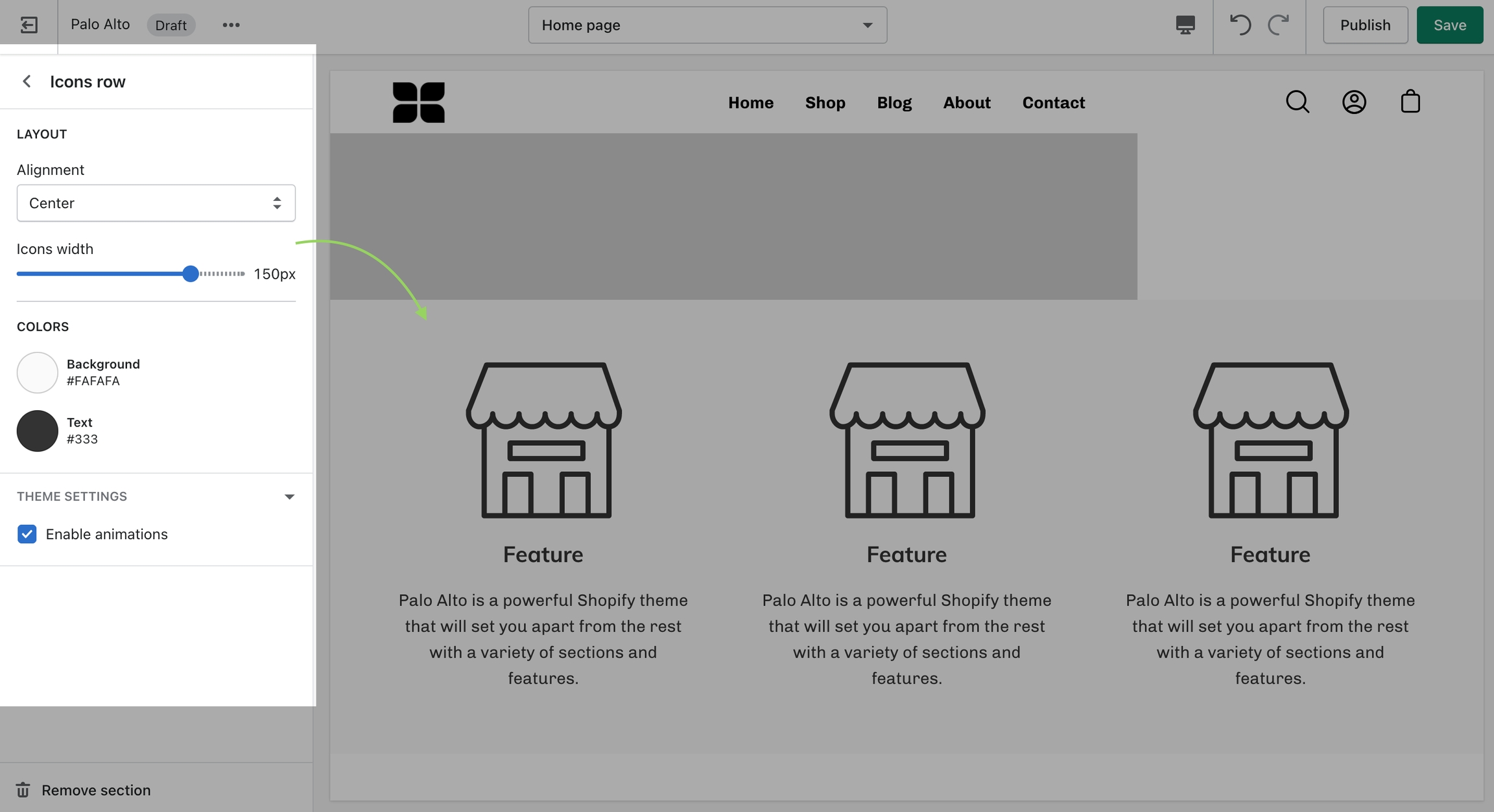
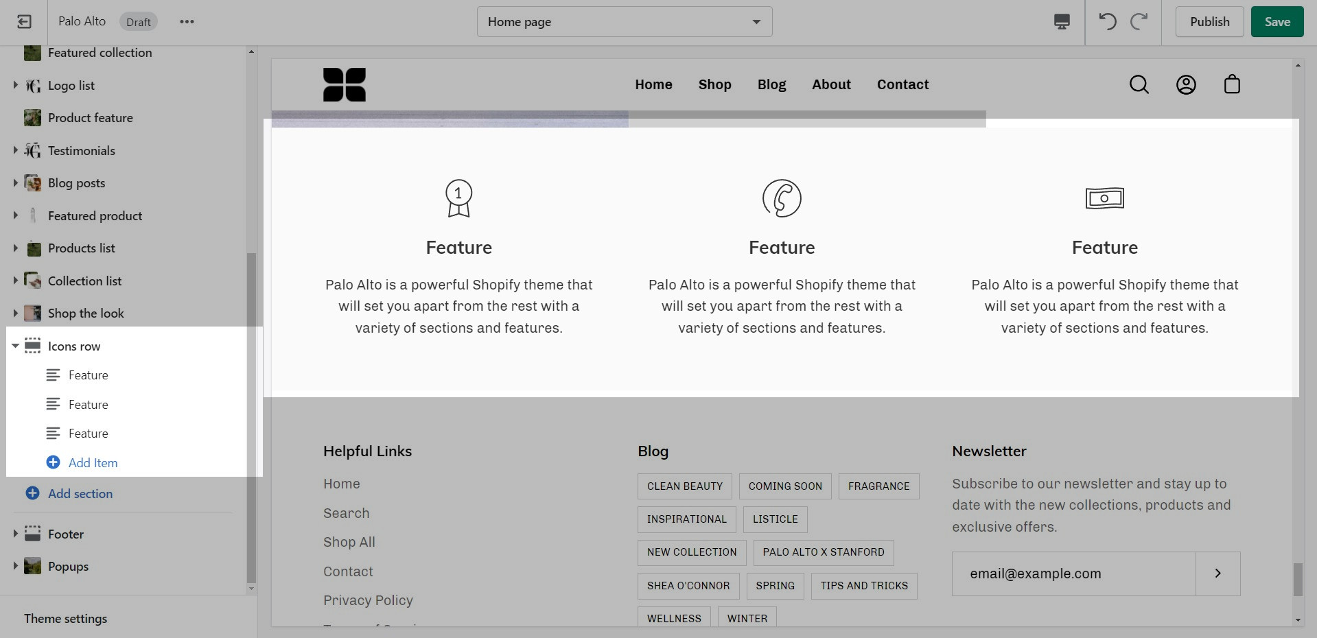
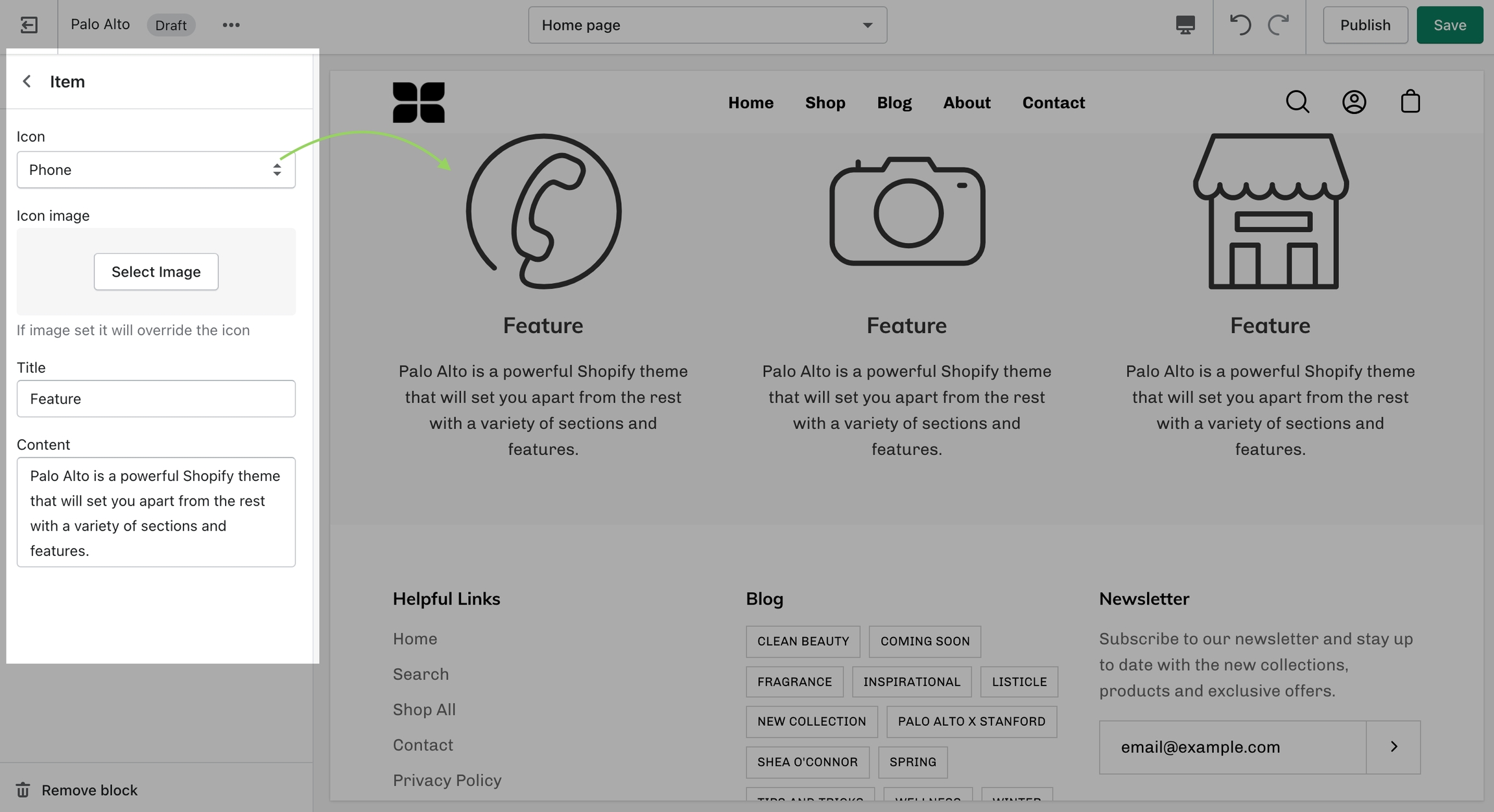
The 'Icons Row' section can be used to present short bursts of information to your customers. Use them in combination with predefined icons or with your own images.
Add blocks by clicking on the small arrow next to the section then clicking 'Add block'.
Adjust the icon's width and color of this section.
Individually adjust the icon style and text for each block.
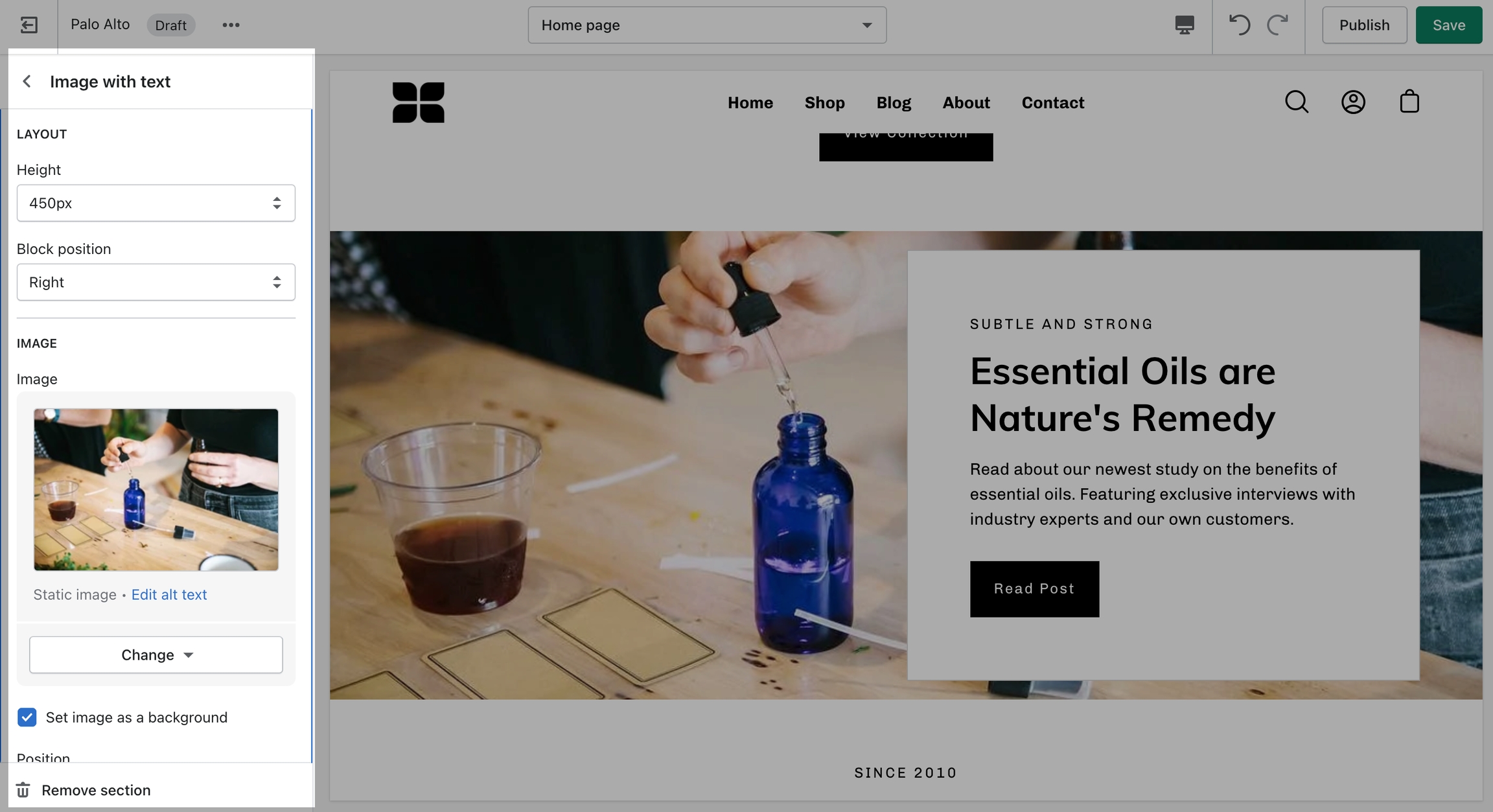
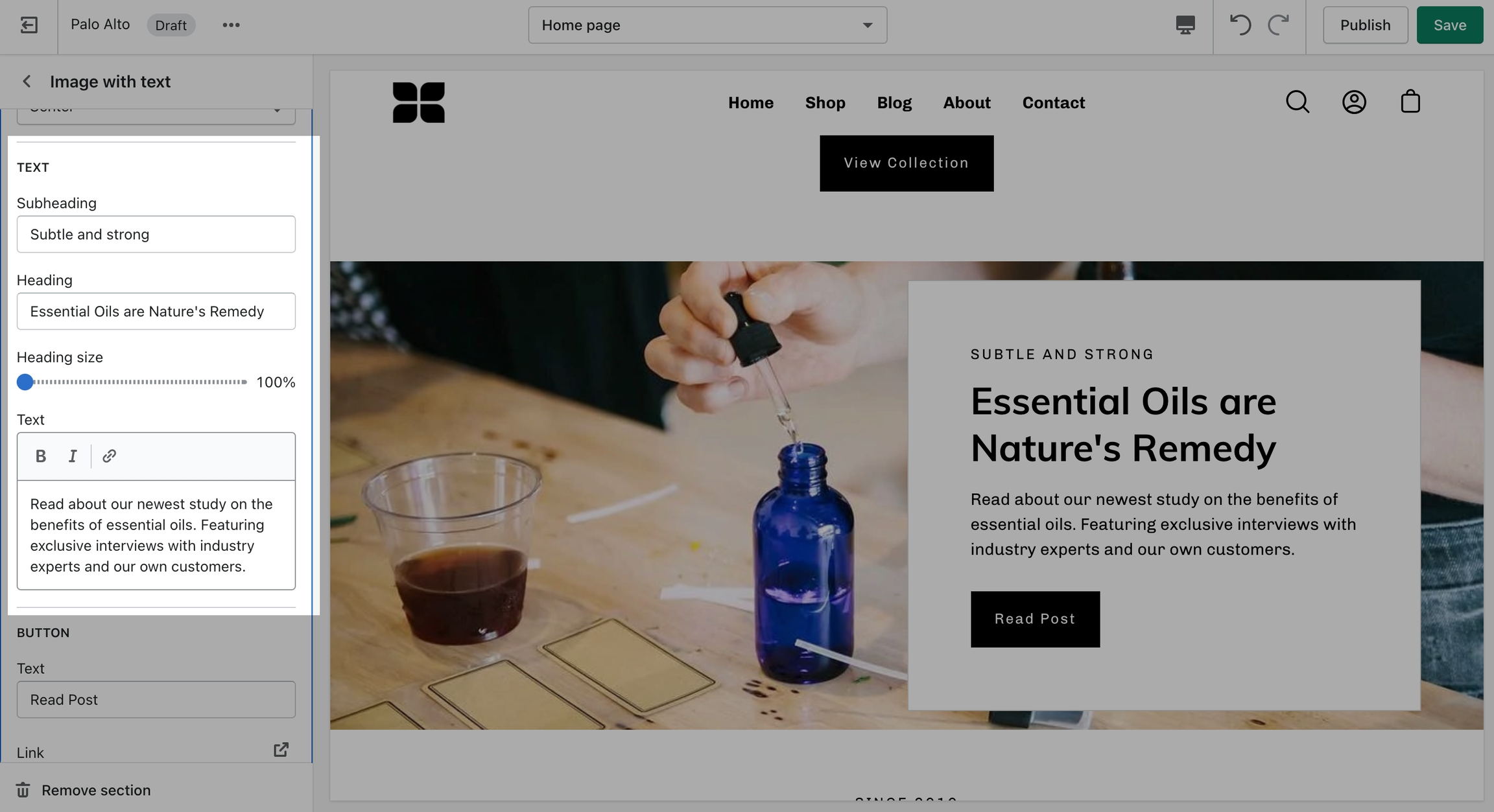
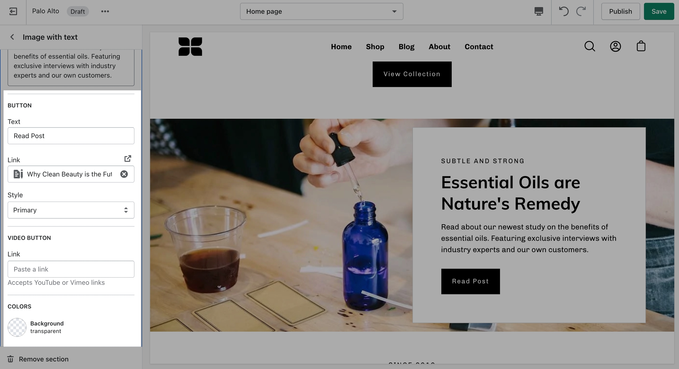
'Image with text' uses a solid color block to make the text stand out over the image. Use this more striking design to grab your customer's attention.
Set up your image, text, positions, and buttons by using these section settings.
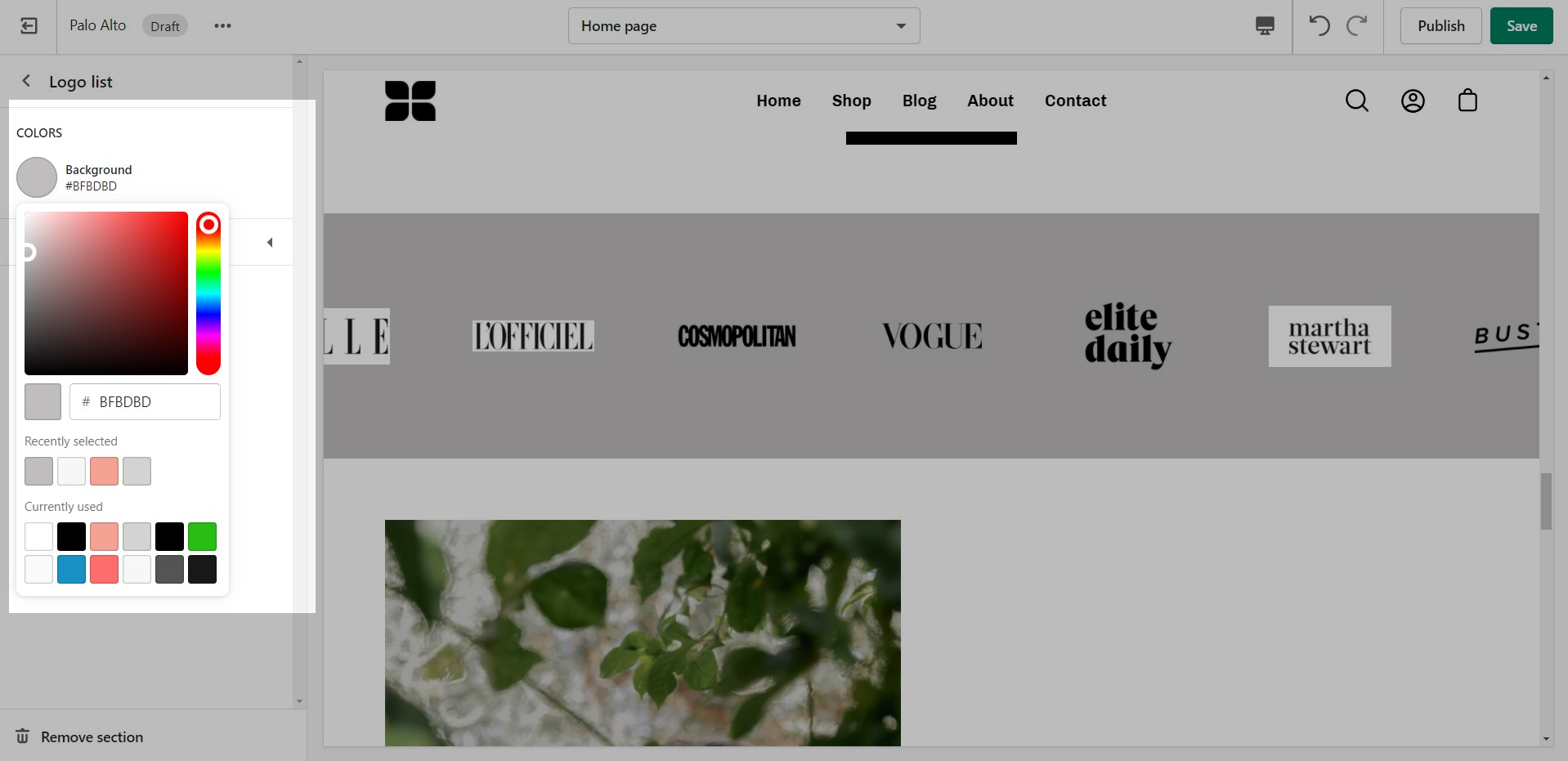
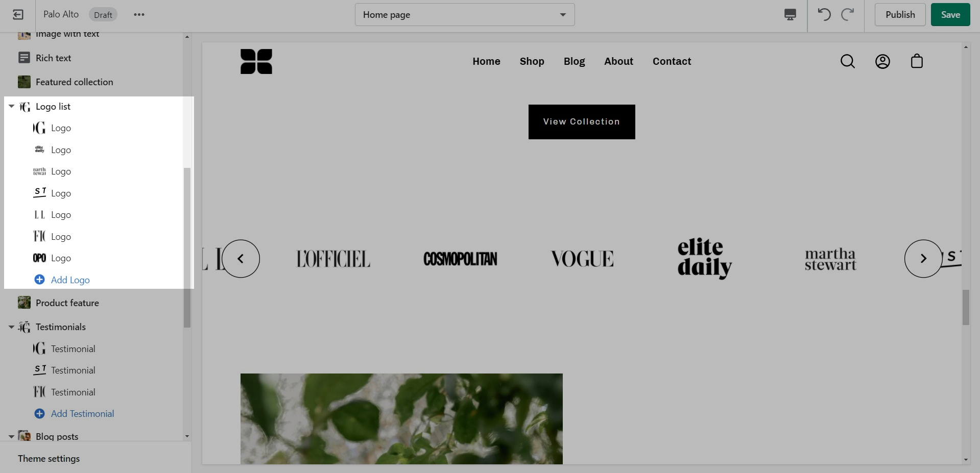
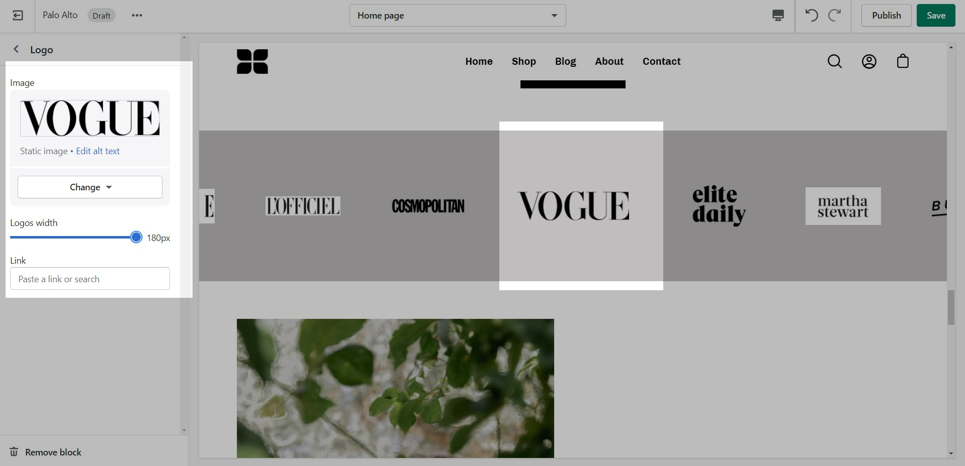
'Logo List' creates a carousel view that you can use to showcase your brand or partnered brand logos.
Add blocks by clicking on the small arrow next to the section then clicking 'Add block'.
Add the logos with their respective links. Also, the background color can be changed.
Set the individual images and sizes for your logo blocks.
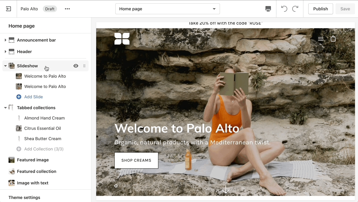
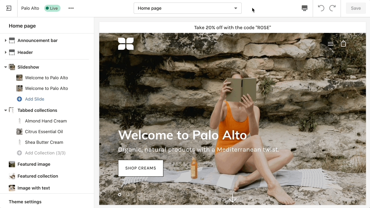
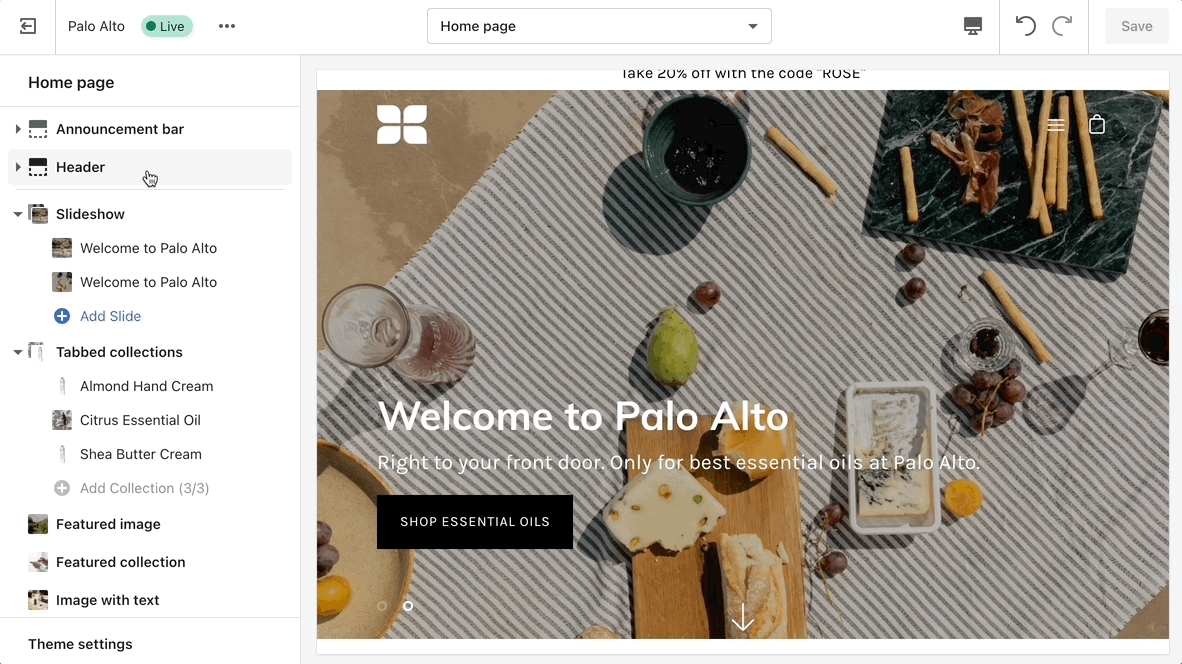
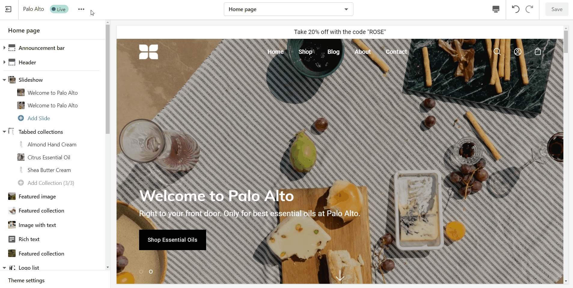
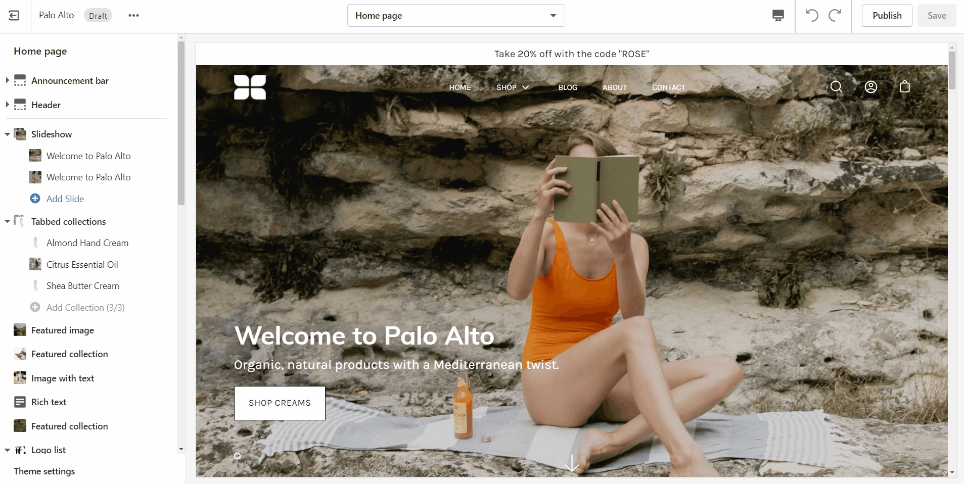
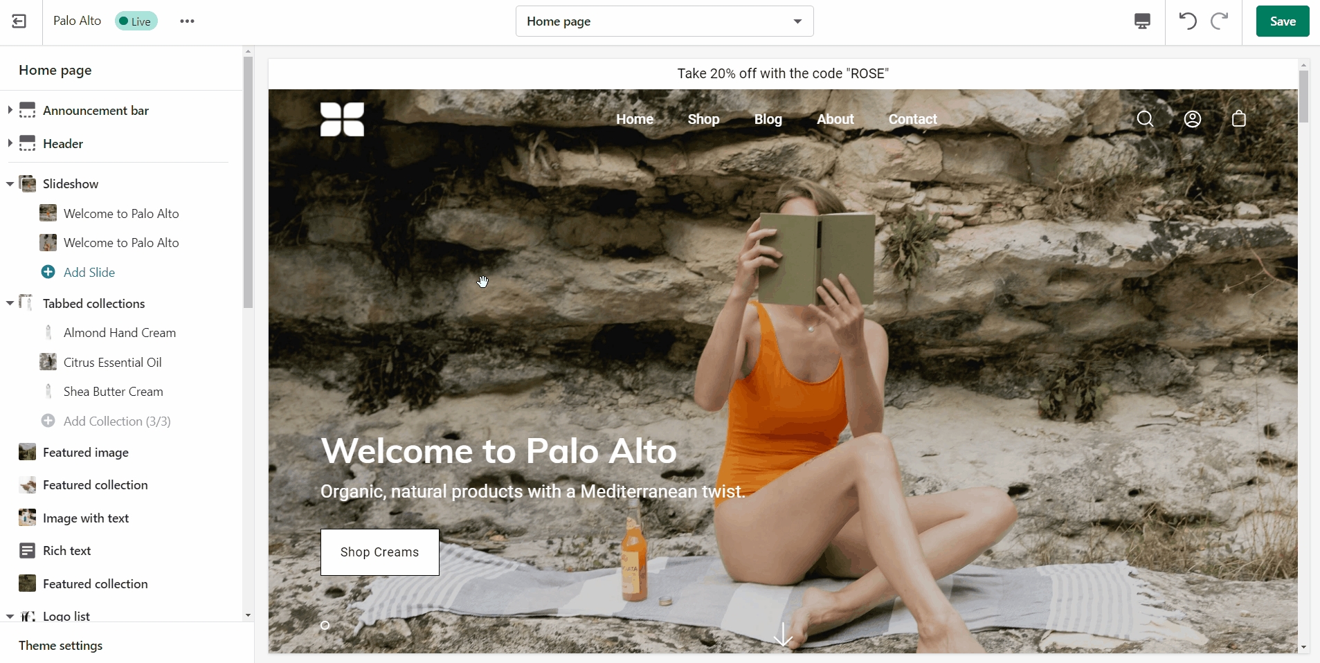
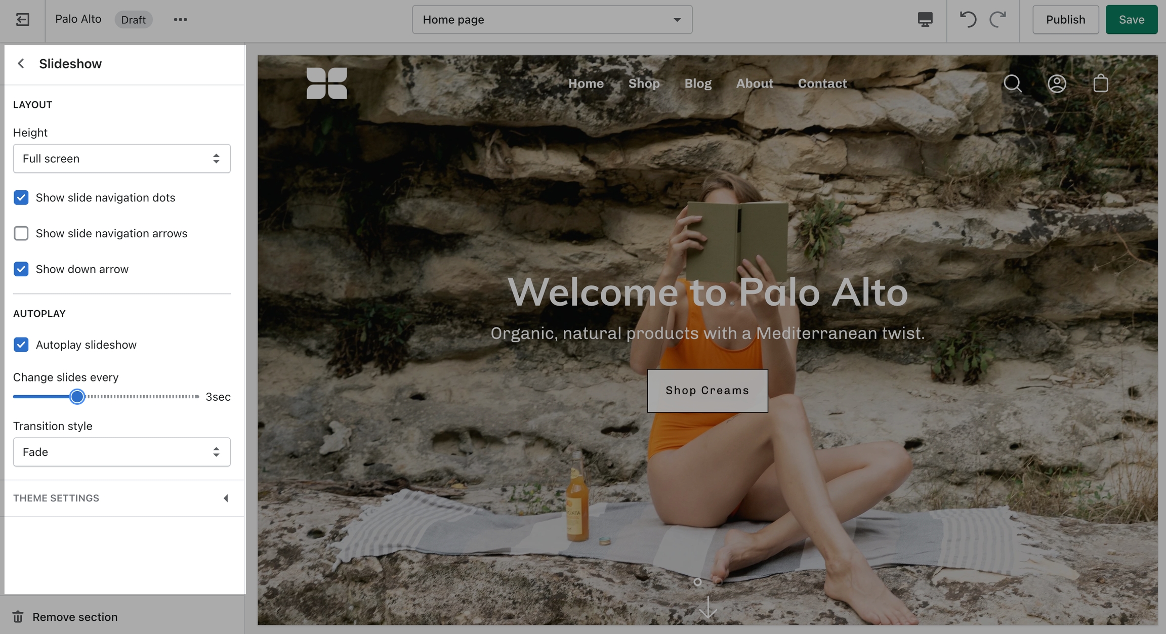
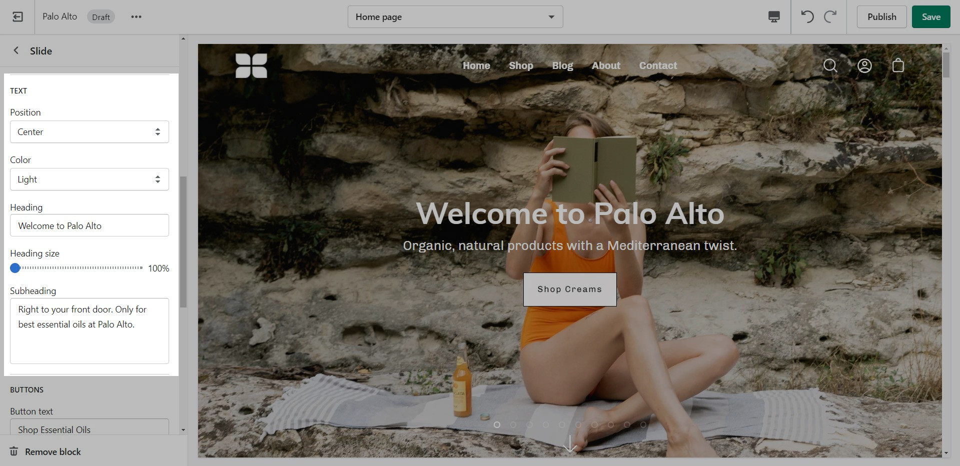
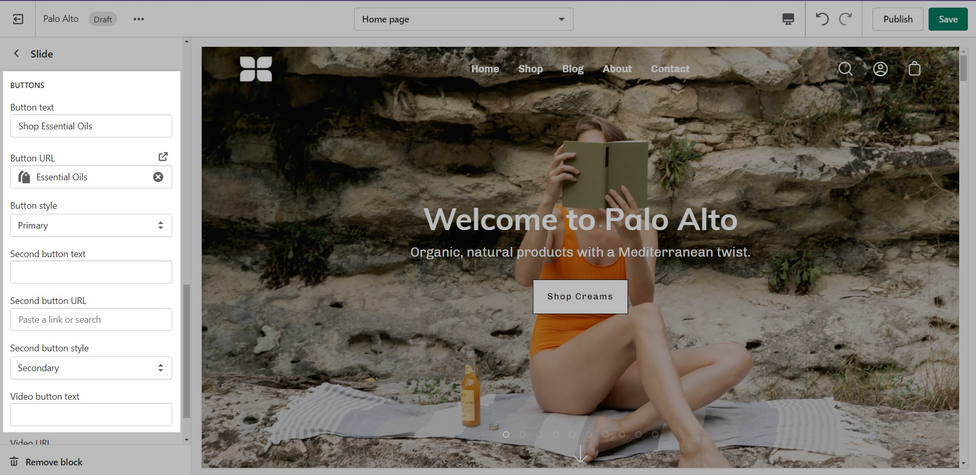
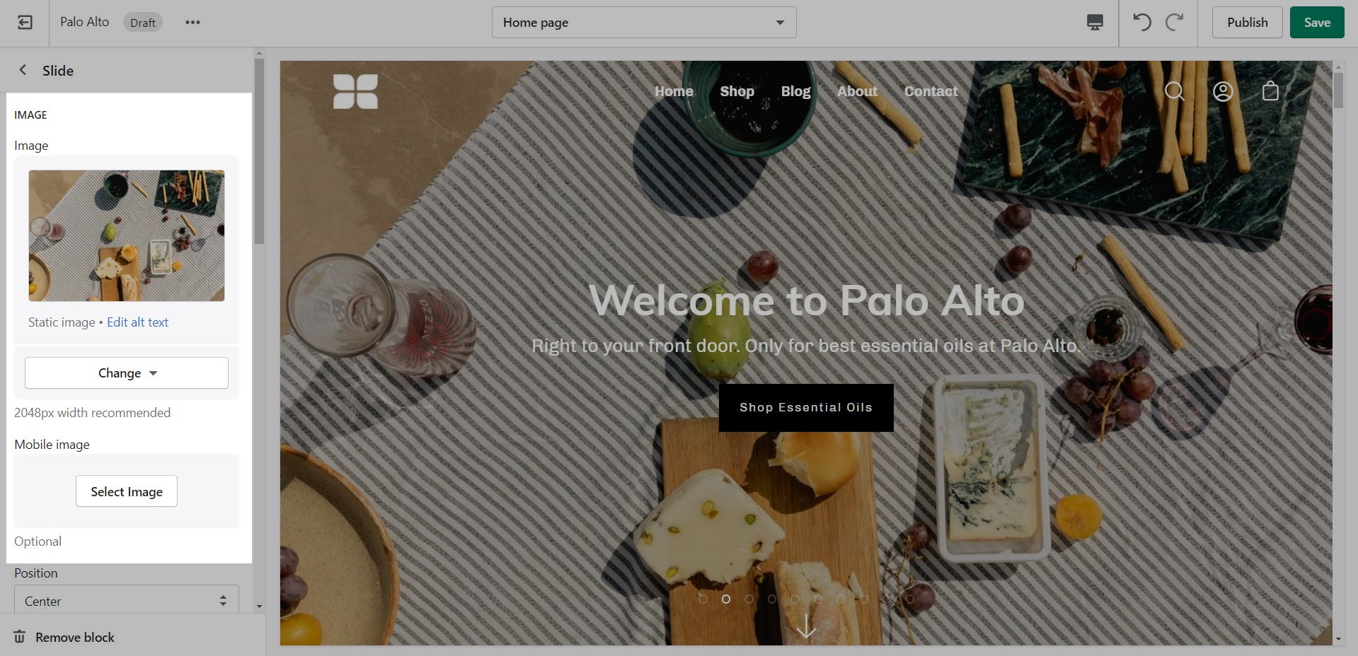
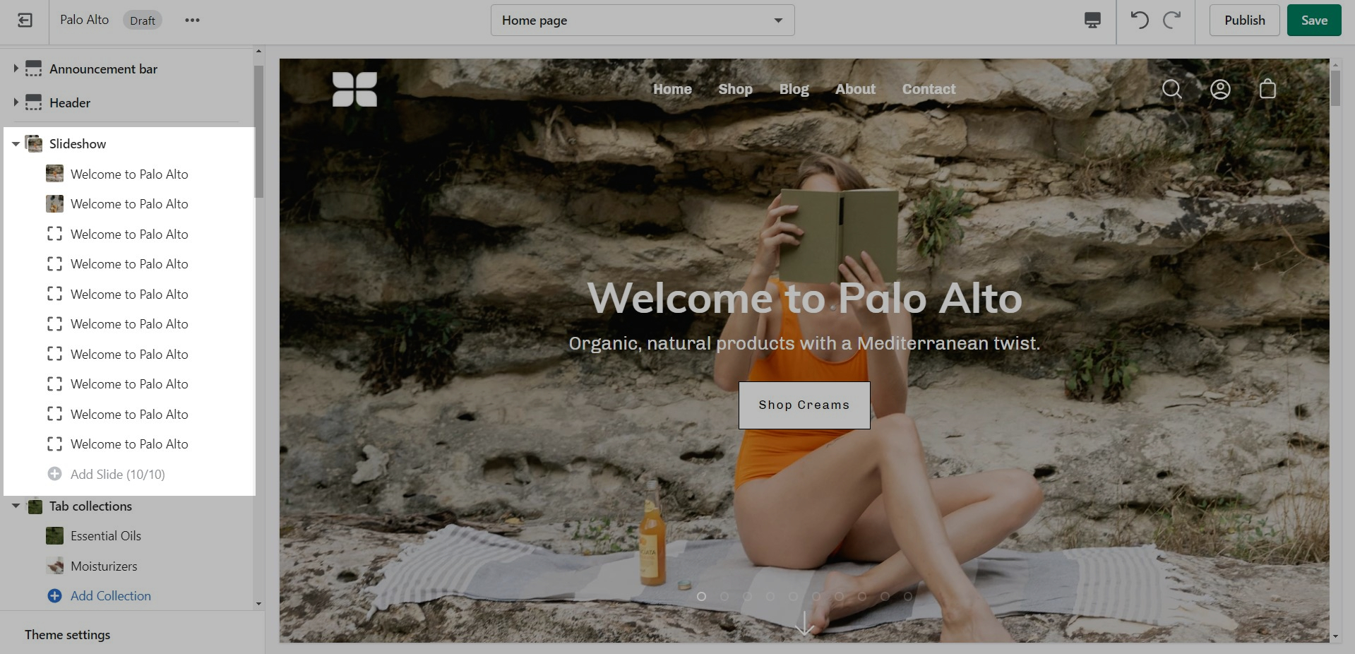
This is the perfect hero section for most stores. Use the Slideshow to create a home page banner with incredible customizability.
Add blocks by clicking on the small arrow next to the section then clicking 'Add block'.
Adjust the general settings of the section.
Adjust the individual blocks settings of this section.
Add a mobile image that will be used on mobile devices. This image can be taller.
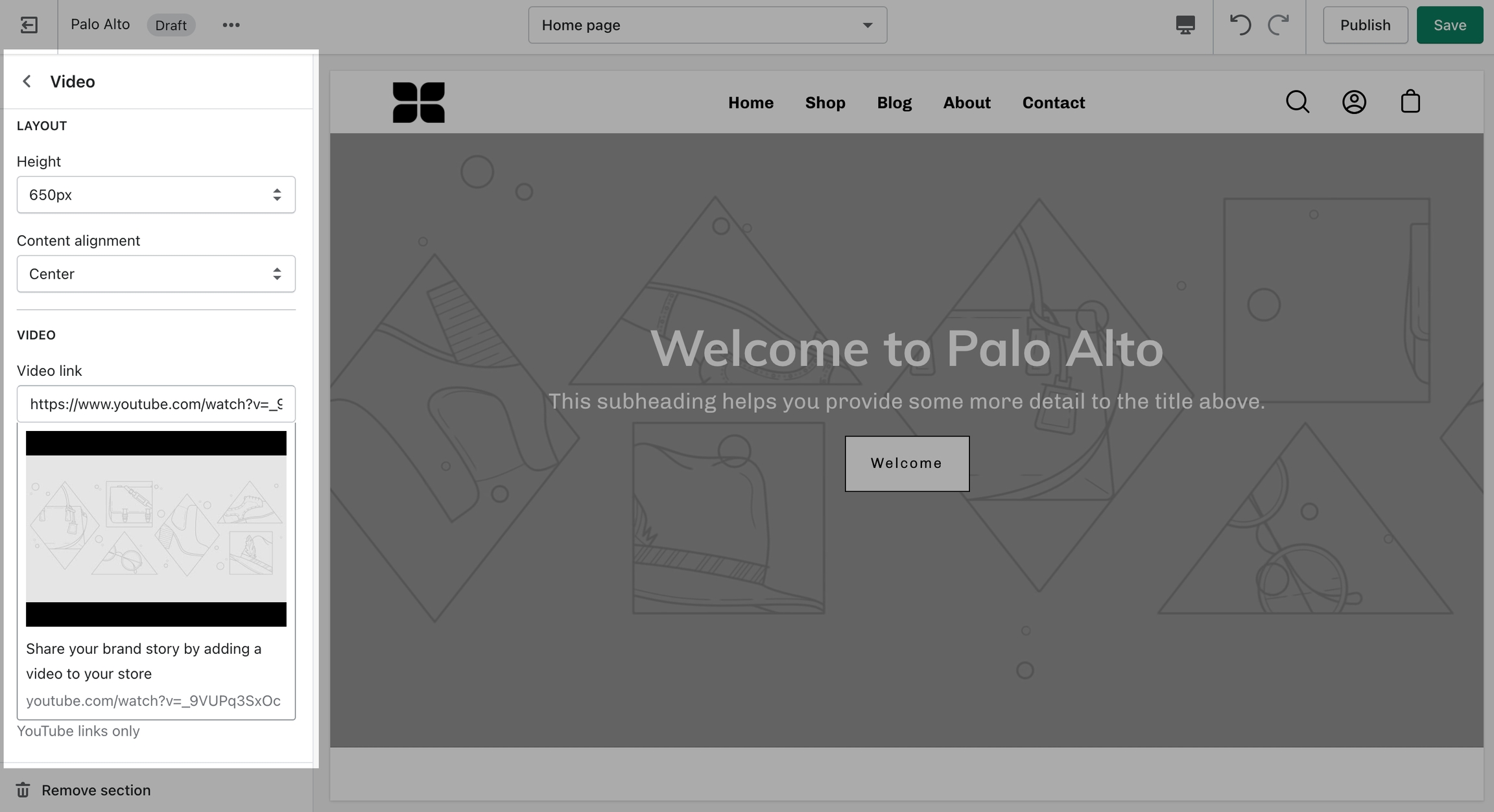
Add a video to your store pages that will autoplay as a background over text.
Set a YouTube or Vimeo link and regulate the size of your video section.
Image Size Recommendations in Palo Alto
Here we will cover recommended image sizes you can use within various sections in Palo Alto. These include the slideshow section, collection banners, blog post featured images, logo, product images, and product feature section images.
The key across all image sections is to keep the focal point of the image in the center. For example, if you're adding text or graphics on top of the image they can easily be cropped out of view.
The Slideshow section allows you to specify desktop and mobile images as well as specify the slide height.
Desktop: We recommend using images 1920px in width.
Mobile: We recommend using images 1080px in width.
Remember: Mobile devices are tall. You need to use an image that has a bigger height than it does width in order to fill the vertical aspect ratio.
Palo Alto provides an option to specify various slide height sizes: Full Screen Height, Image Height, 750px, 650px, 550px,450px.
Static sizes: If you want to use a static slide height (750px, 650px, 550px or 450px), make sure your image height is around that size.
For example, if you'd like to use a slide image height of 750px, you'll want to save your image around this same size. This will prevent image cropping both towards the top and bottom. This applies to the other slide height sizes (650px, 550px and 450px).
Full-screen height: This option will fit the images to the entire height of the browser window. This option is recommended for images with medium height sizes and not for images with large height sizes, as these will be cropped at the bottom of the image.
Image height: Setting this option will have the images displayed in the original height as uploaded. This option is quite useful if you want to have the full image displayed as there will be no cropping of the images.
We recommend using images at a ratio of one to one and sizes around 1024 by 1024 pixels or smaller images of about 600 by 600 pixels.
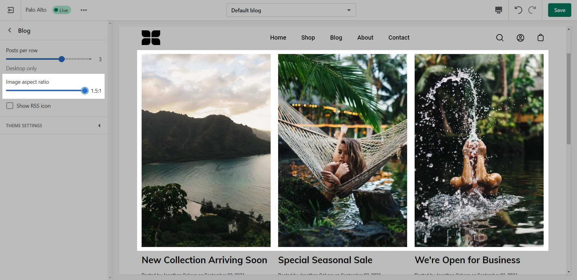
Palo Alto provides an option to adjust image aspect ratios for the blog page.
This is the standard setting that works well with square-shaped images. We recommend this square ratio because the images will be cropped square on the blog overview page and they'll display in their uploaded ratio on the individual blog post page.
This ratio will result in taller images or portrait images.
This ratio can be used to display wider images. We recommend it for landscape images.
This is the page with the "/collections/all" URL that lists all of the visible products in the store. By default, products on the catalog page are shown in alphabetic order.
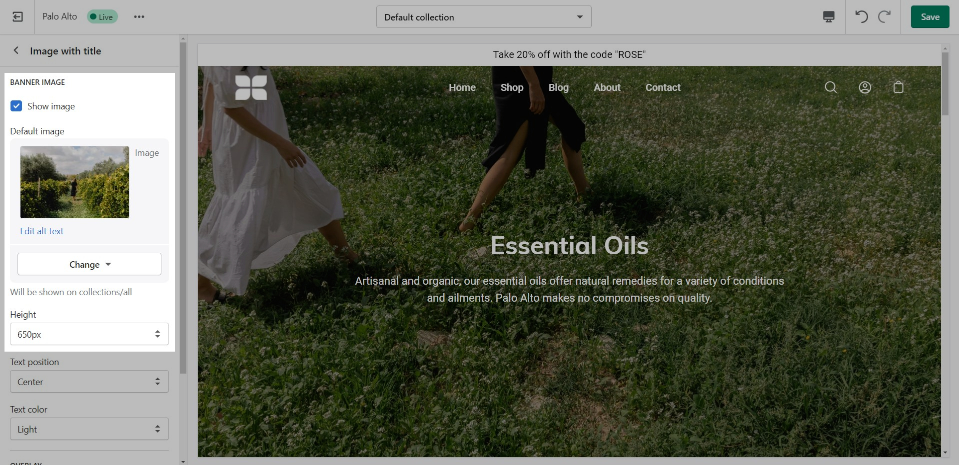
Palo Alto provides an option to specify this image within the Image with Title section settings.
We recommend using image sizes around 1400px in width.
Palo Alto provides you with options to specify the banner height. These include: Full Screen, Image Height, 750px, 650px, 550px.
These options are applied the same as with the slideshow section images definitions discussed above.
We recommend using logo images at a width of around 440px.
The maximum logo height applied is 100px therefore it is ideal to have a logo with a height around this size or lower.
We recommend using square images around 600 by 600 pixels.
This will give you a squared-off image:
This option is perfect for taller images:
For our Popup section, we recommend using an image with at least 600 pixels in its lower dimension. The default aspect ratio here is 8 by 7.
In pixels that should translate to 690 by 600 pixels or 1380 by 1200 pixels if you're looking to create a retina image.
A retina image is an image twice as big as its block or recommended size. This ensures that the final image is sharp even if rendered on an unusually bigger device.
There are also triple retina images which are three times the recommended size.


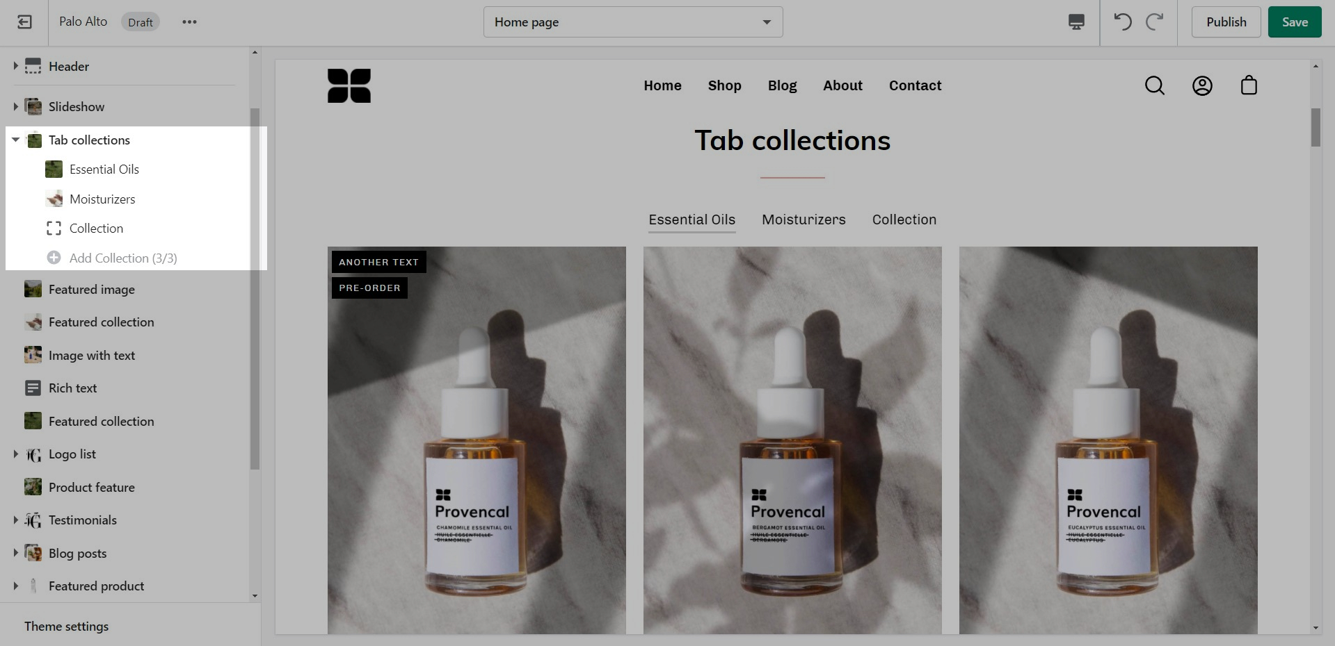
Add blocks by clicking on the small arrow next to the section then clicking 'Add block'.
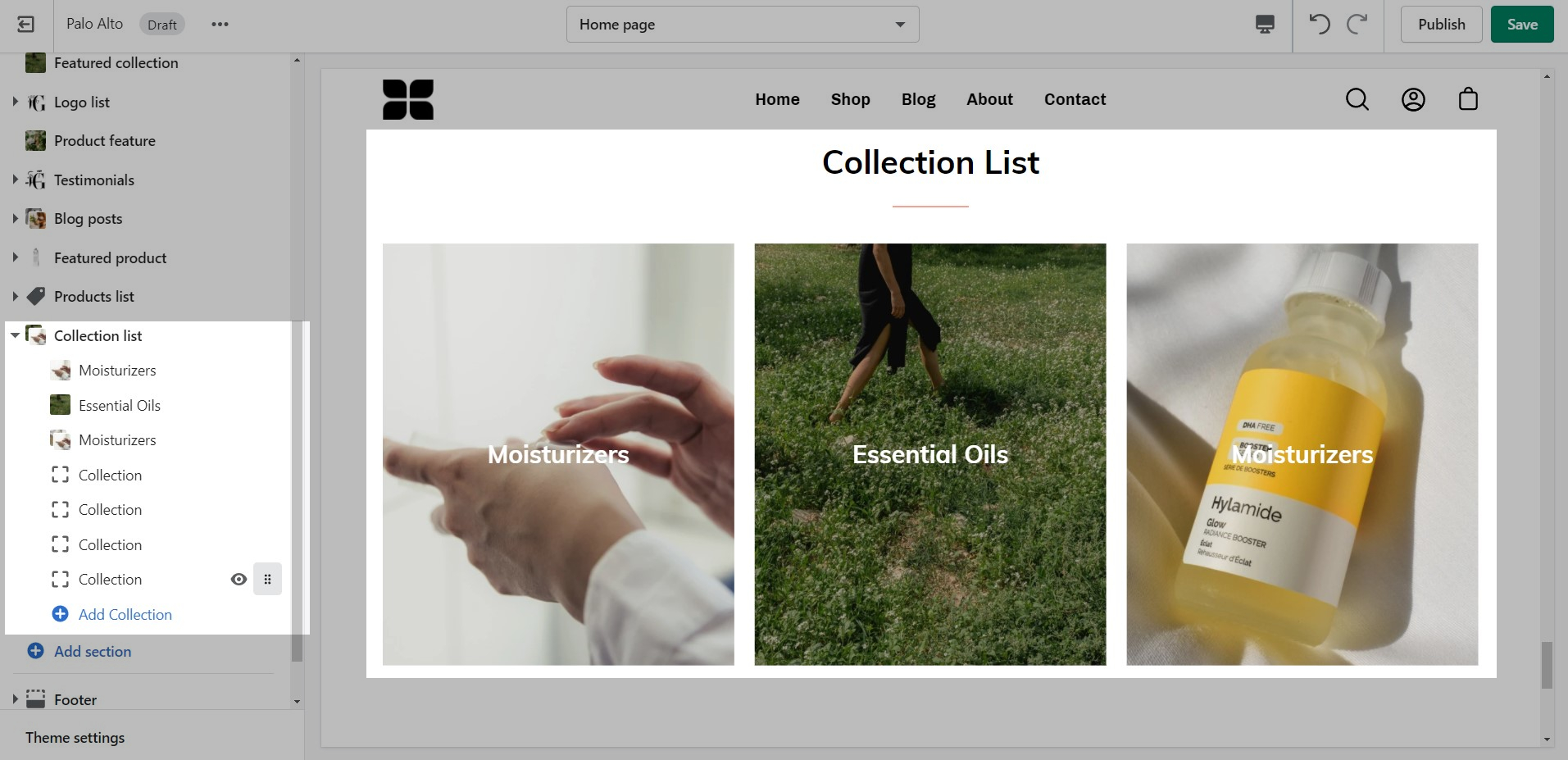
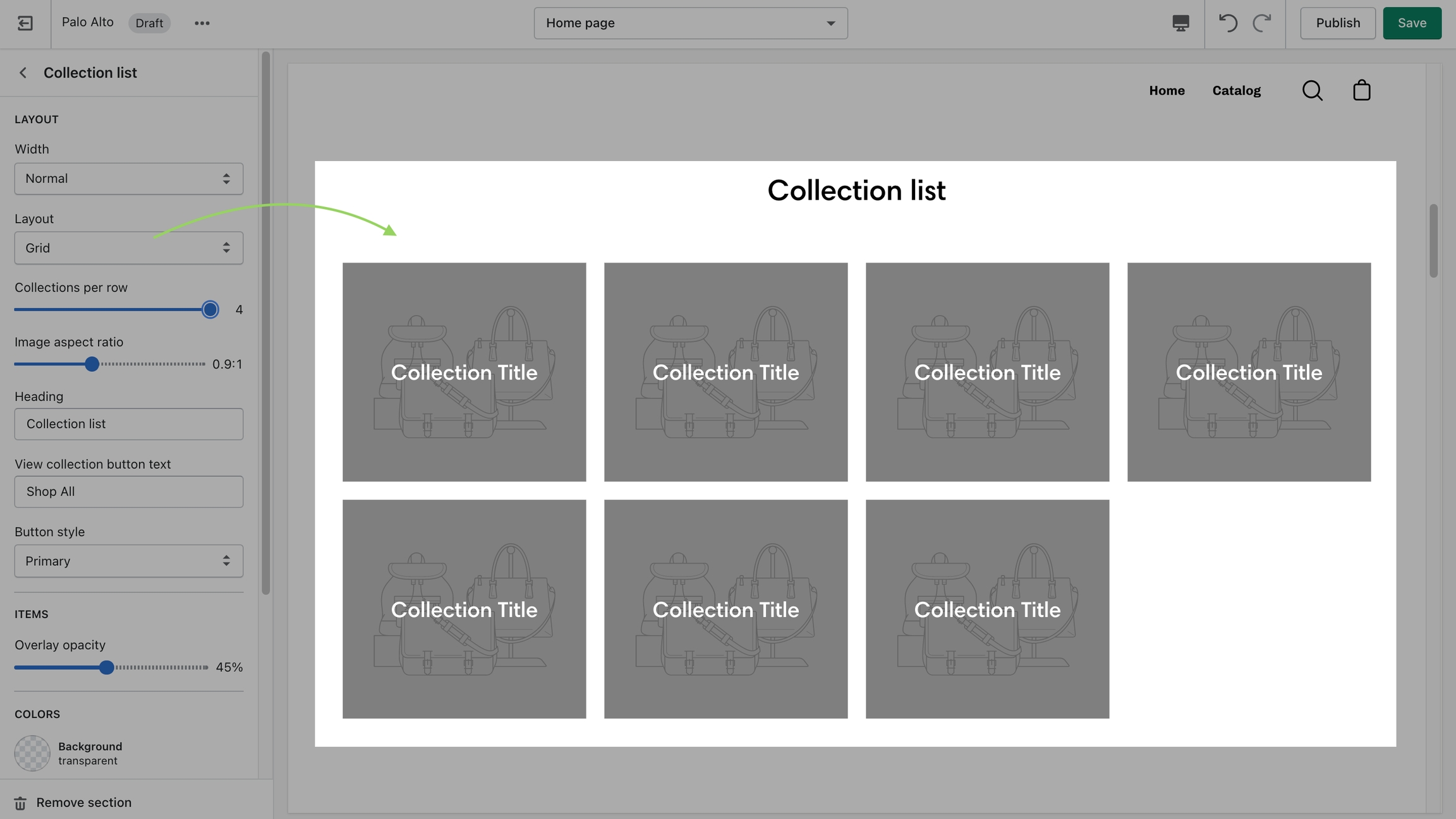
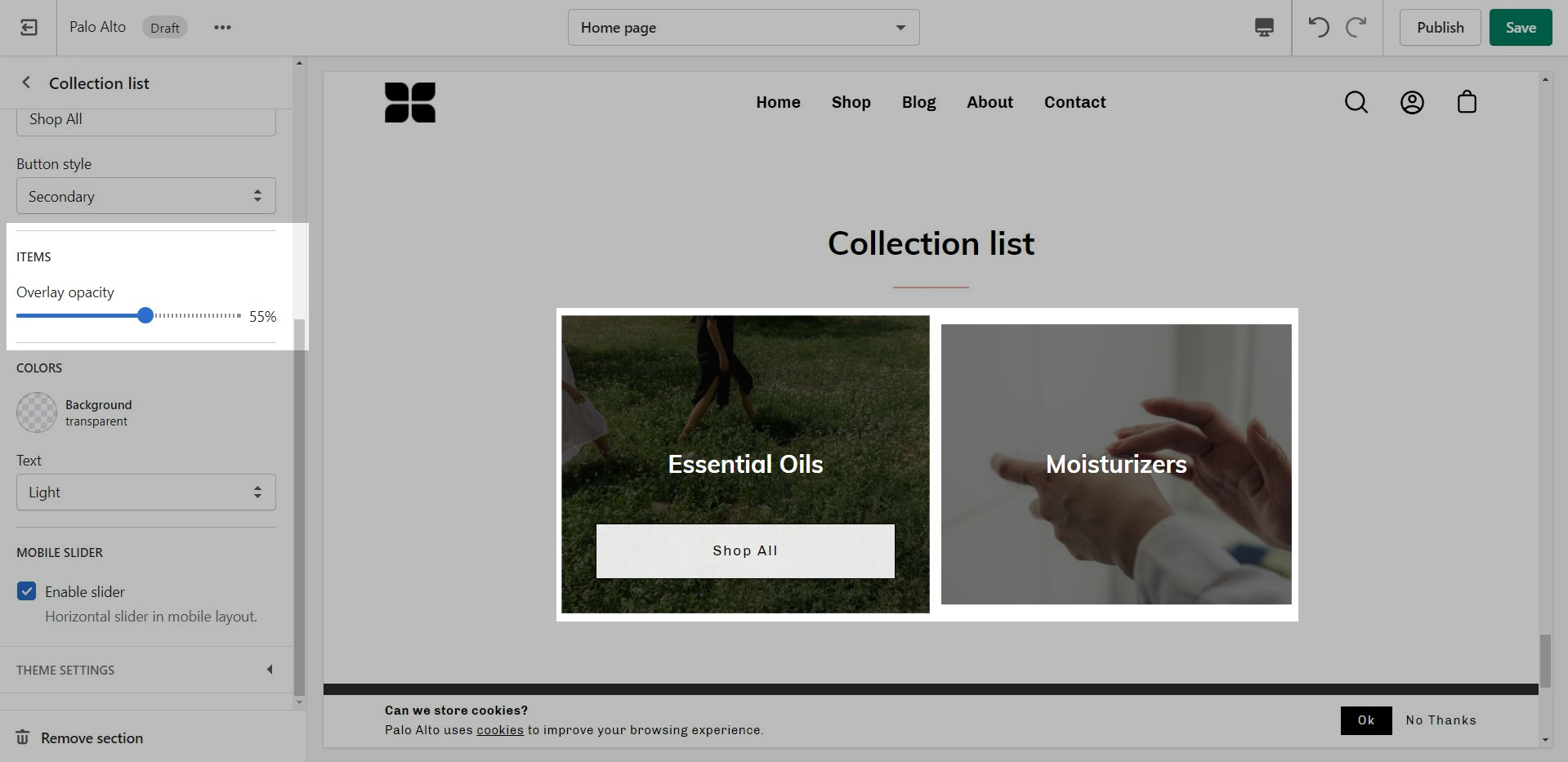
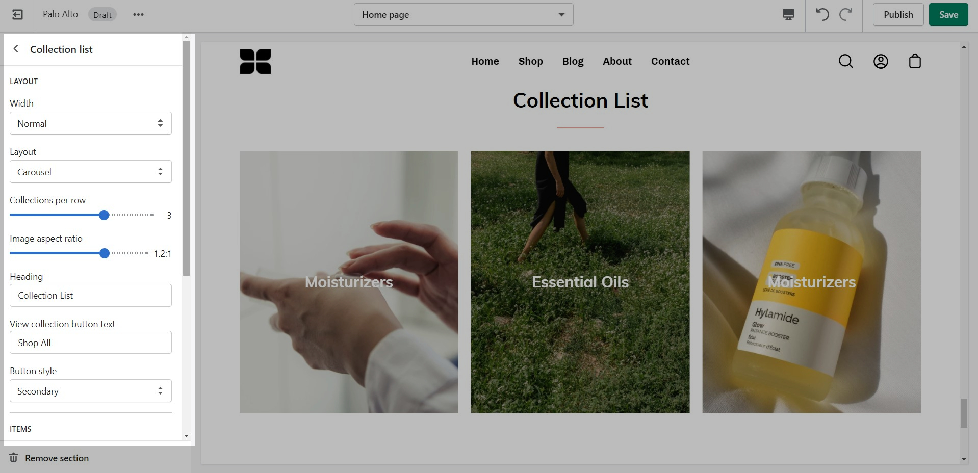
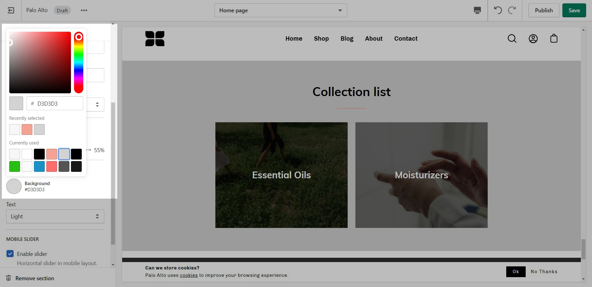
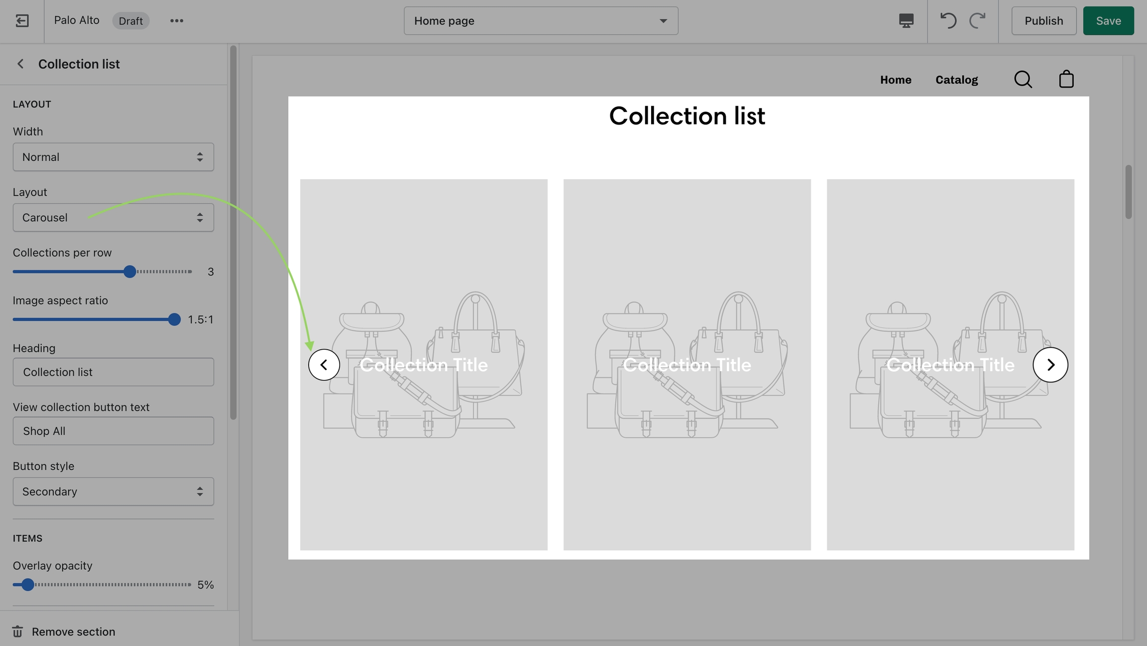
The 'Collection list' section allows you to add up to 12 collection blocks per section. You can use multiple sections to show more collections.
There are two different layouts for this section: grid and carousel:
There are also controls for the main heading and button text.
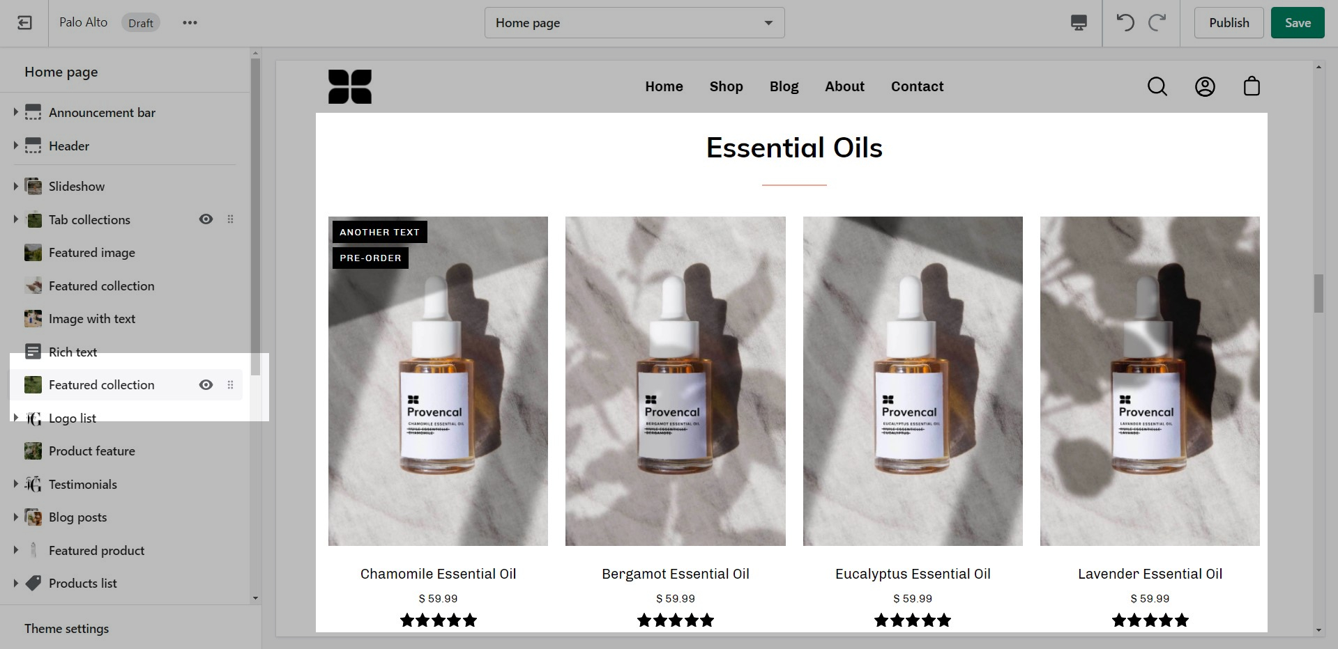
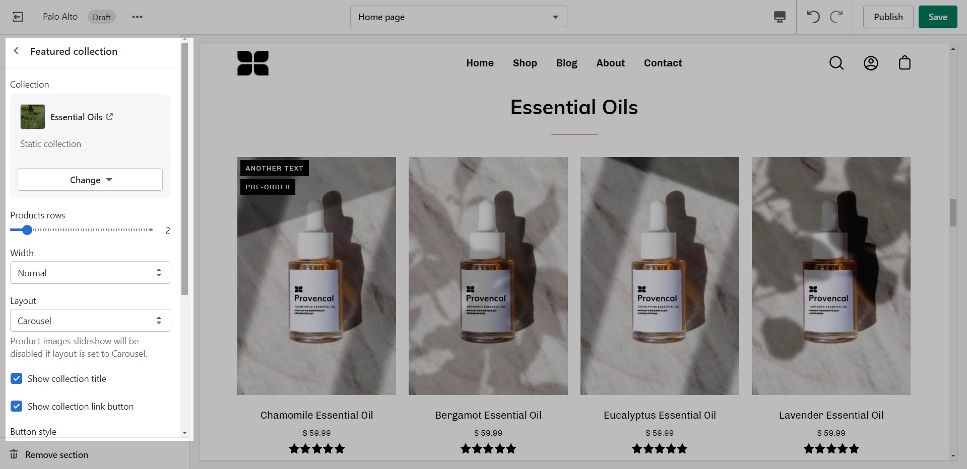
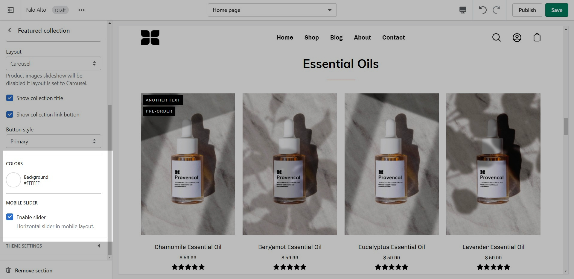
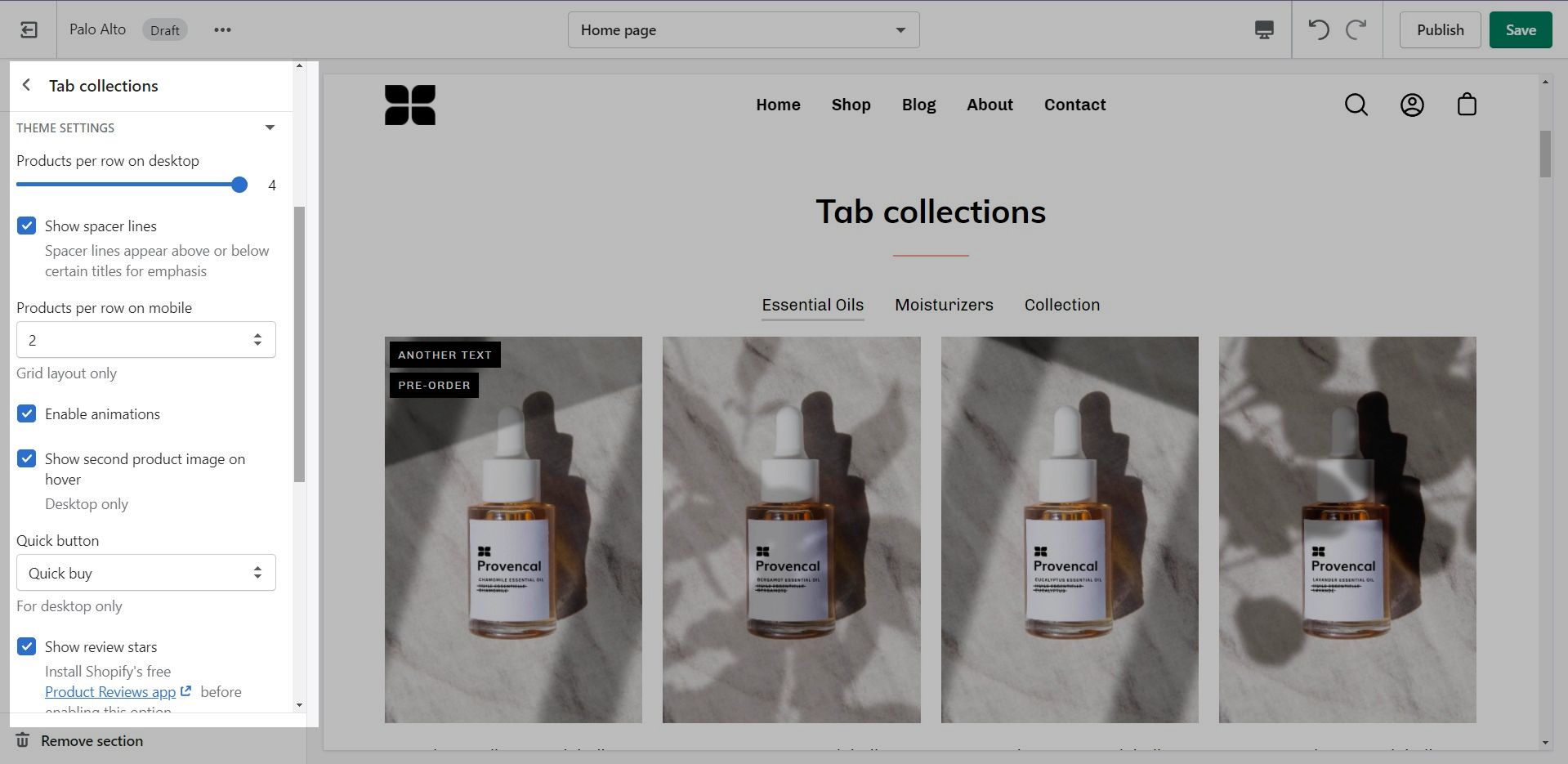
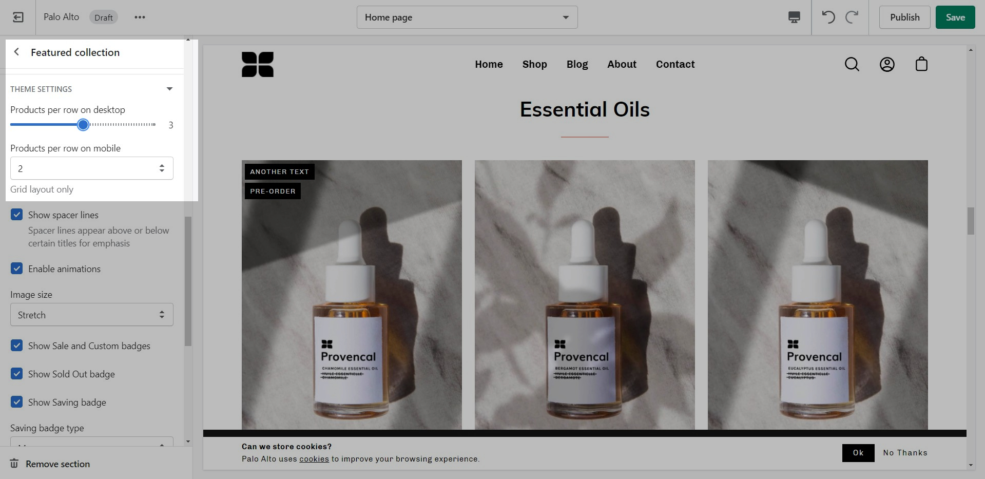
The 'Featured collection' section allows you to highlight a specific collection of products on your store pages. This section generates blocks with links to each product page.
From the settings of this section, you can control which collection to display, the number of rows, as well as a handful of other settings.
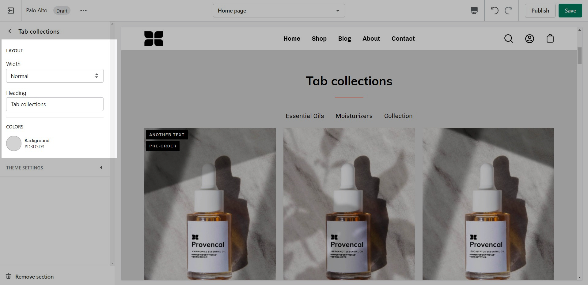
At the bottom of all the section settings, you can find a tab with some more features.
A common example here is the 'products per row' option. This option allows you to set the number of products per row but also affects the look of your collection pages.
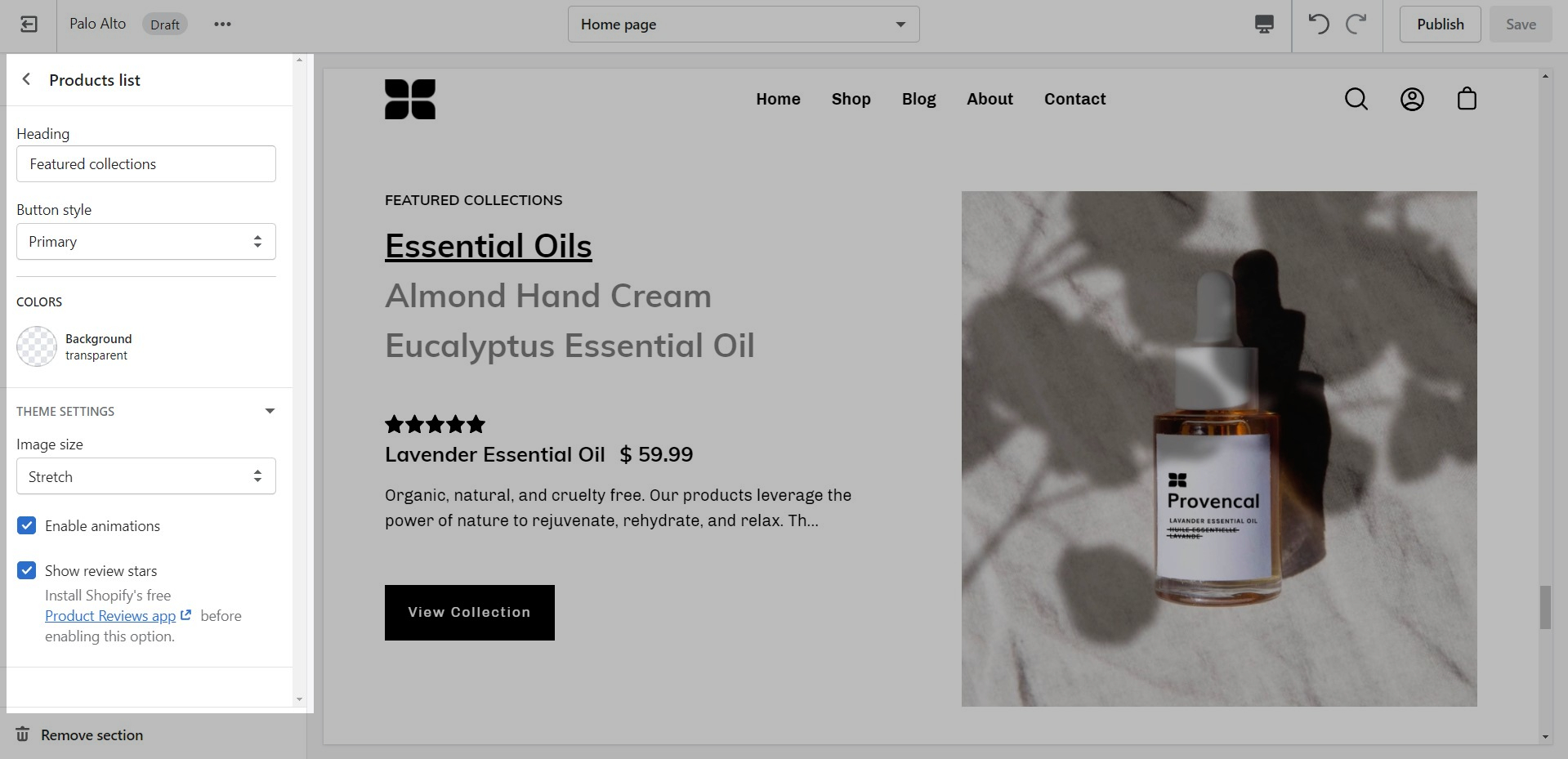
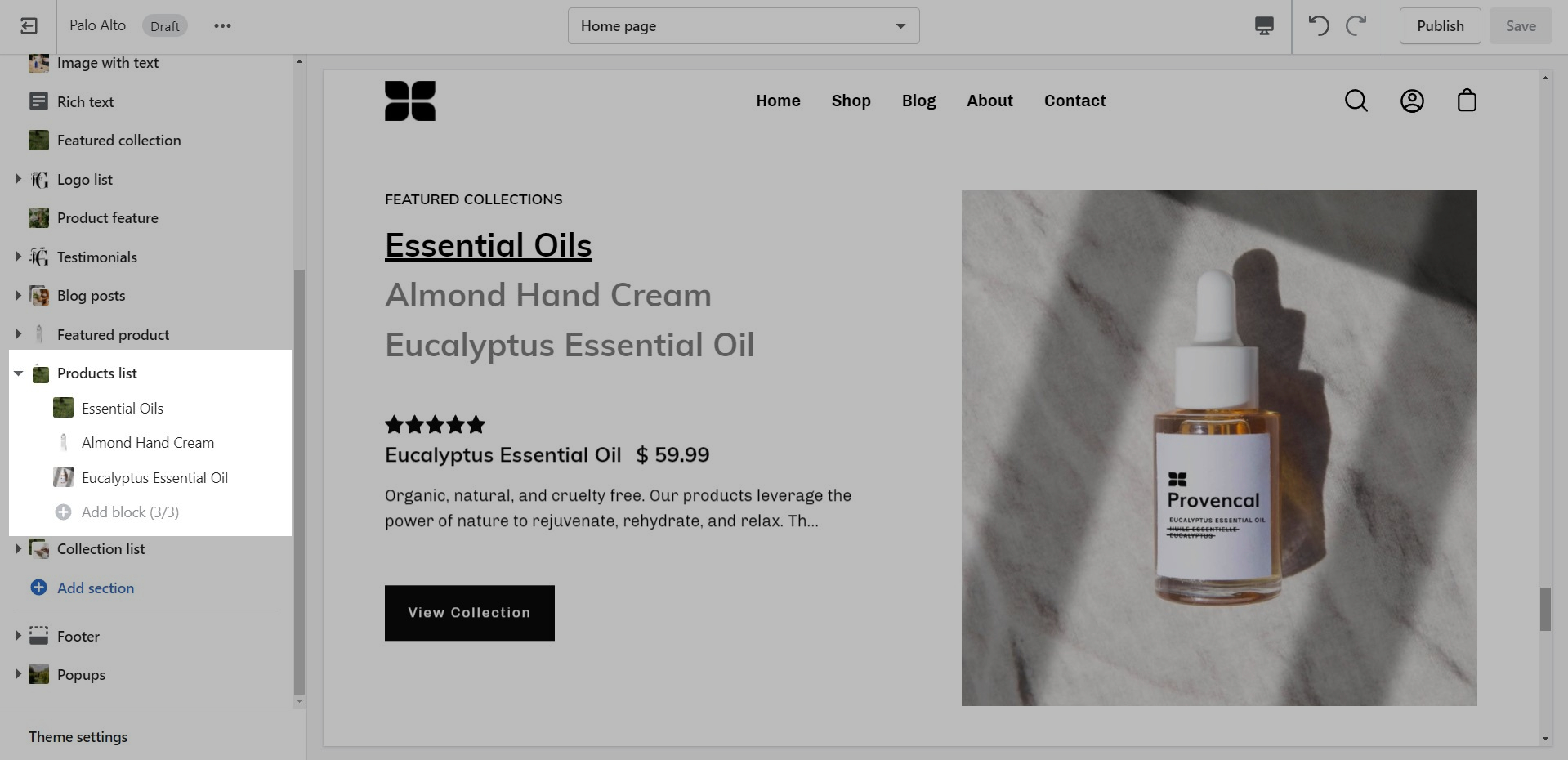
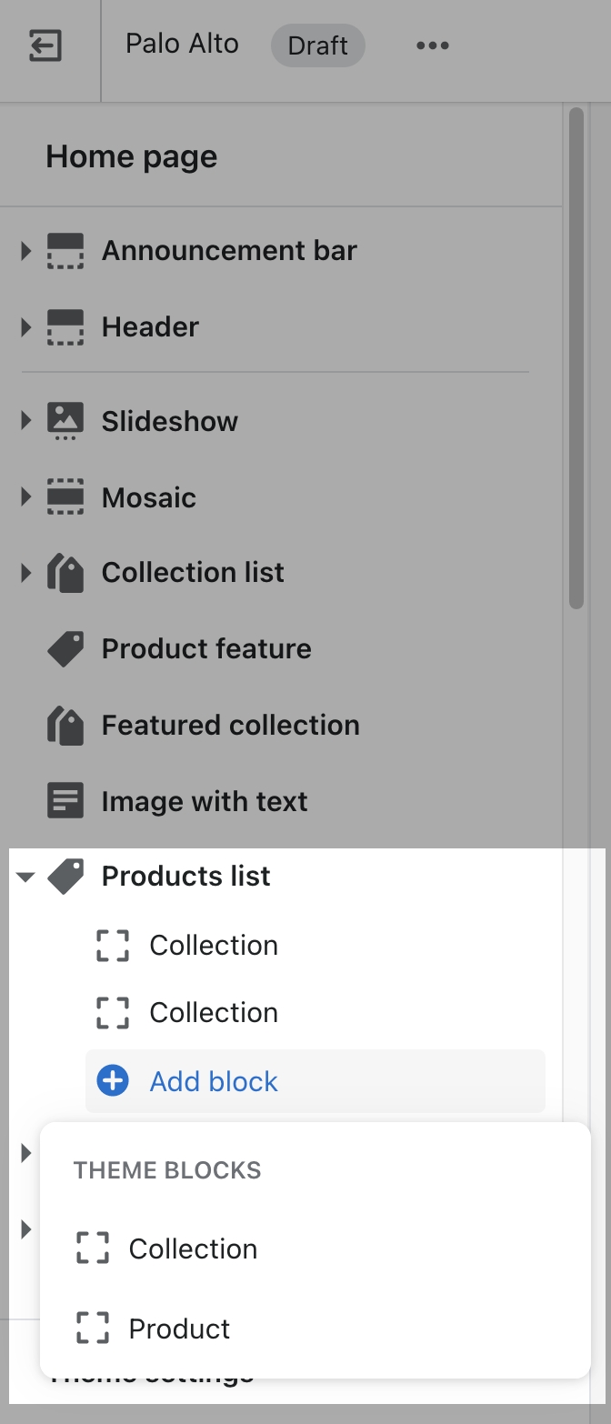
The 'Products list' section creates a split view of text and images. This section can show products or collections.
Add blocks by clicking on the small arrow next to the section then clicking 'Add block'.
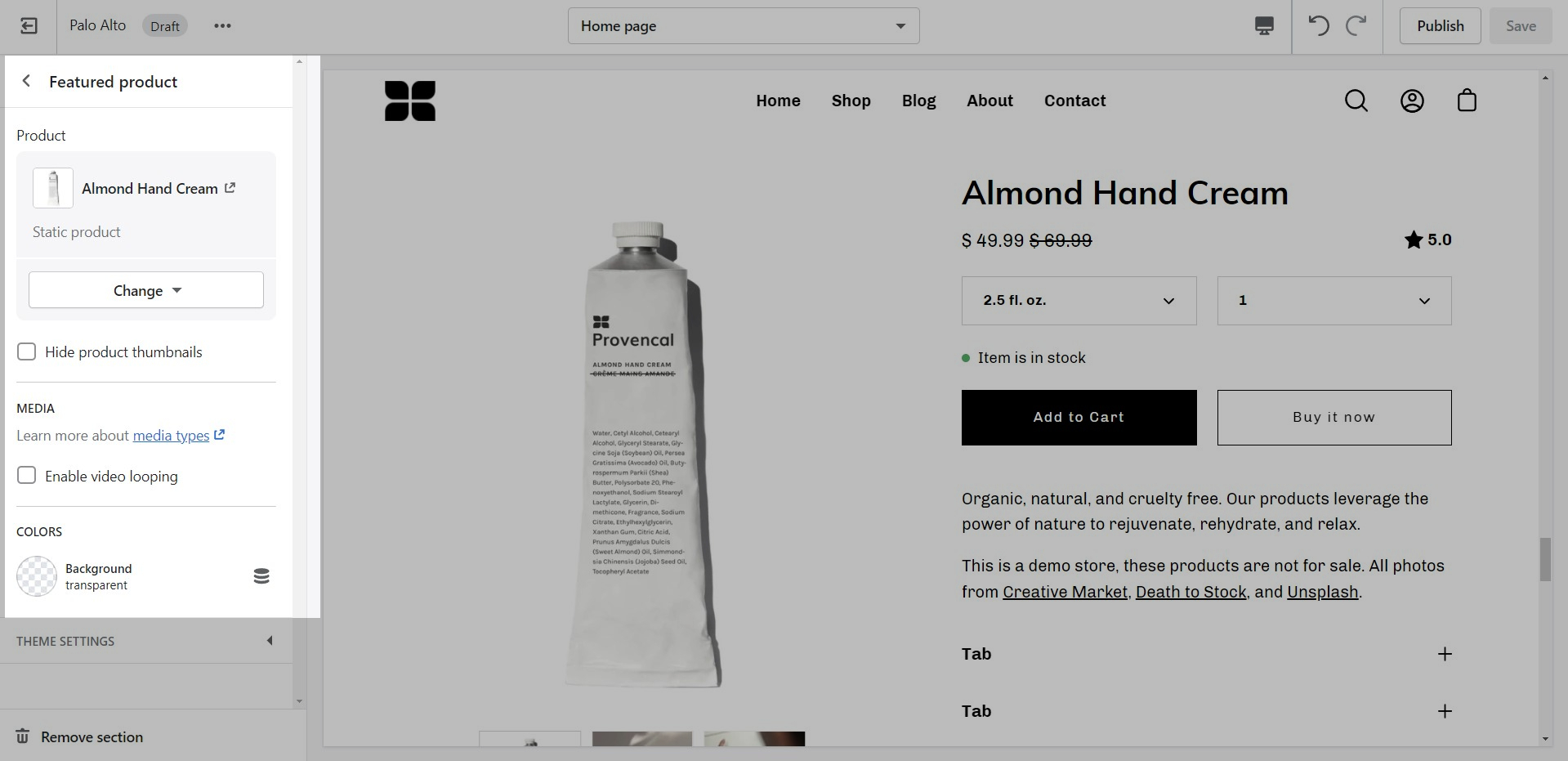
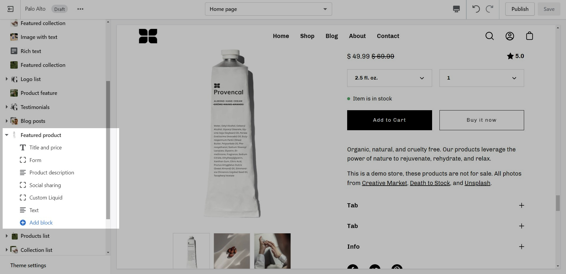
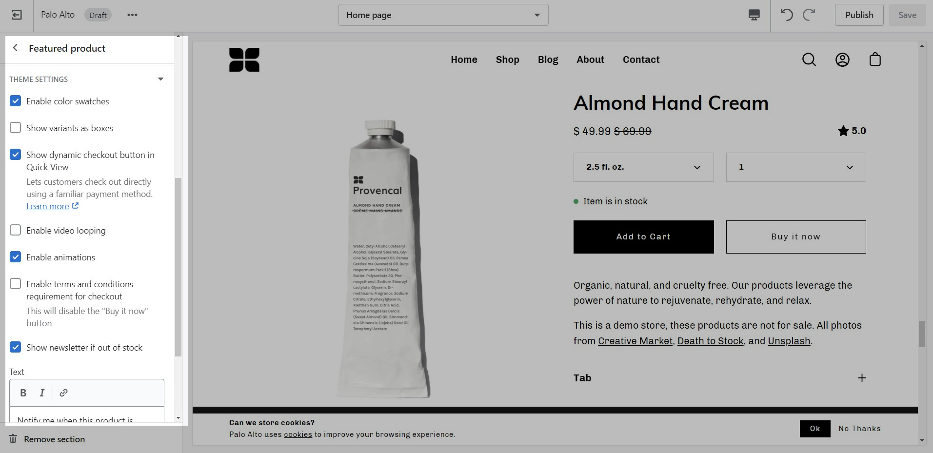
Use the 'Featured product' section to bring a product gallery and form to your store pages.
Add blocks by clicking on the small arrow next to the section then clicking 'Add block'.
At the bottom of all the section settings, you can find a tab with some more features.
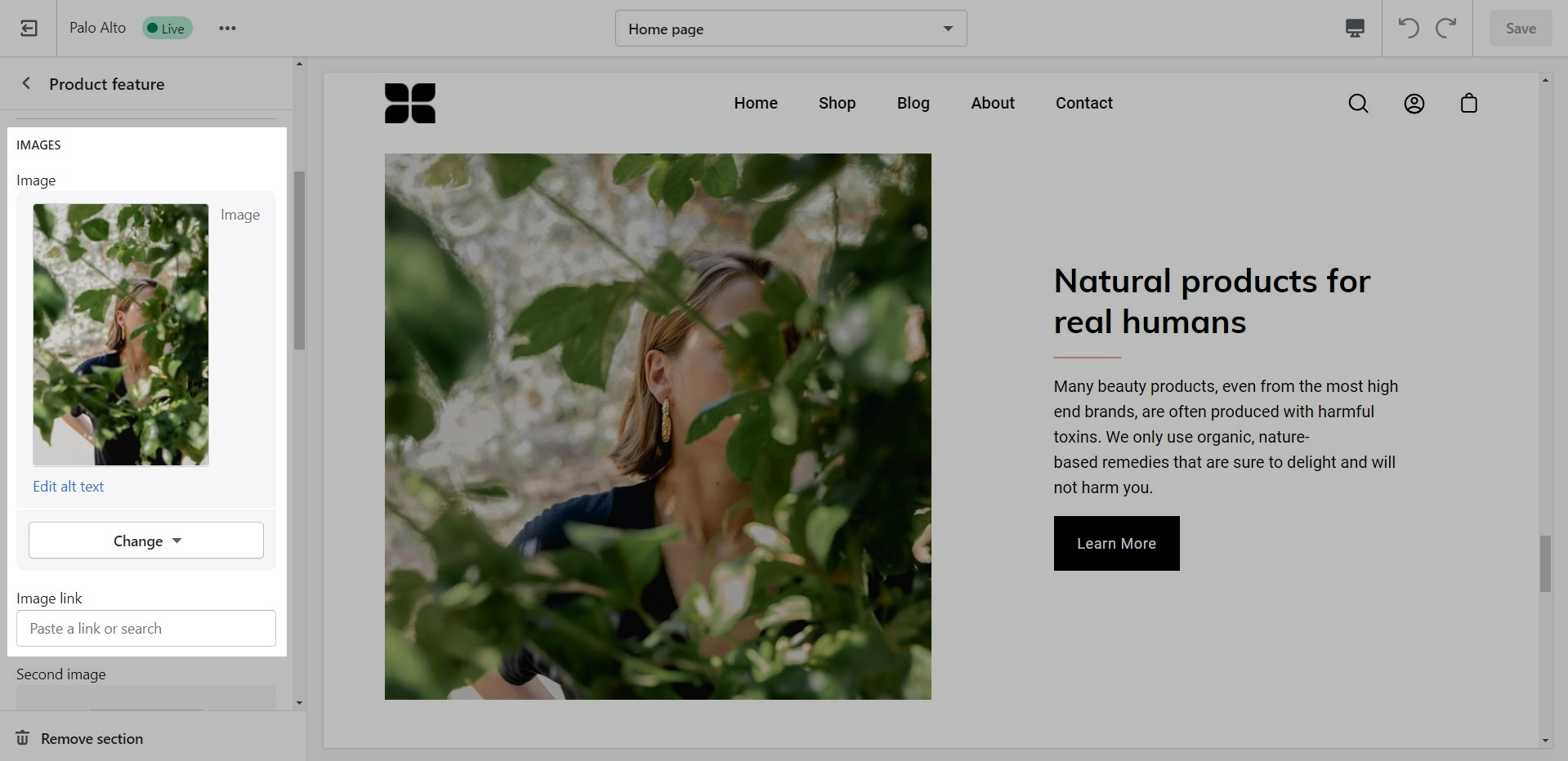
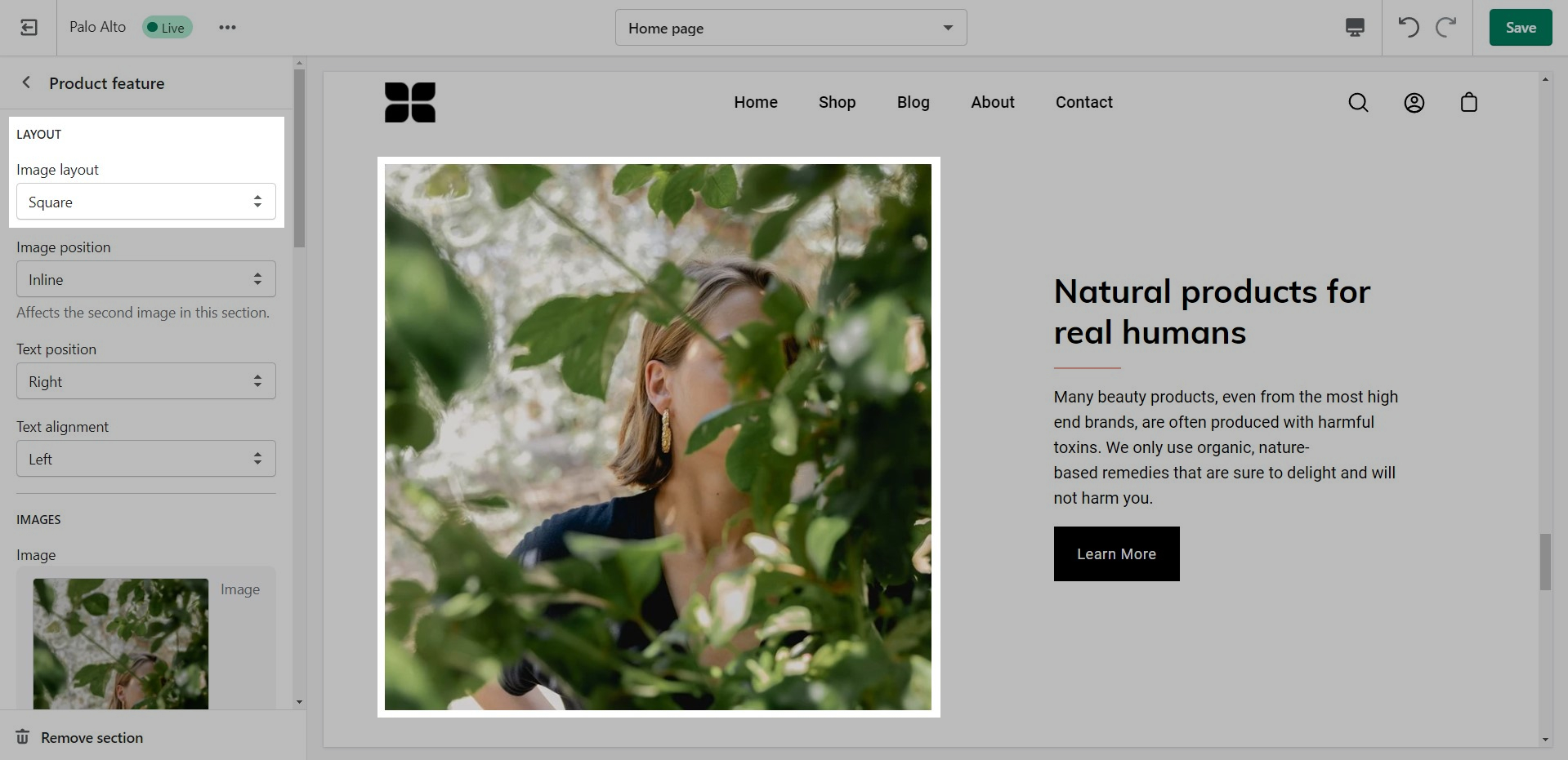
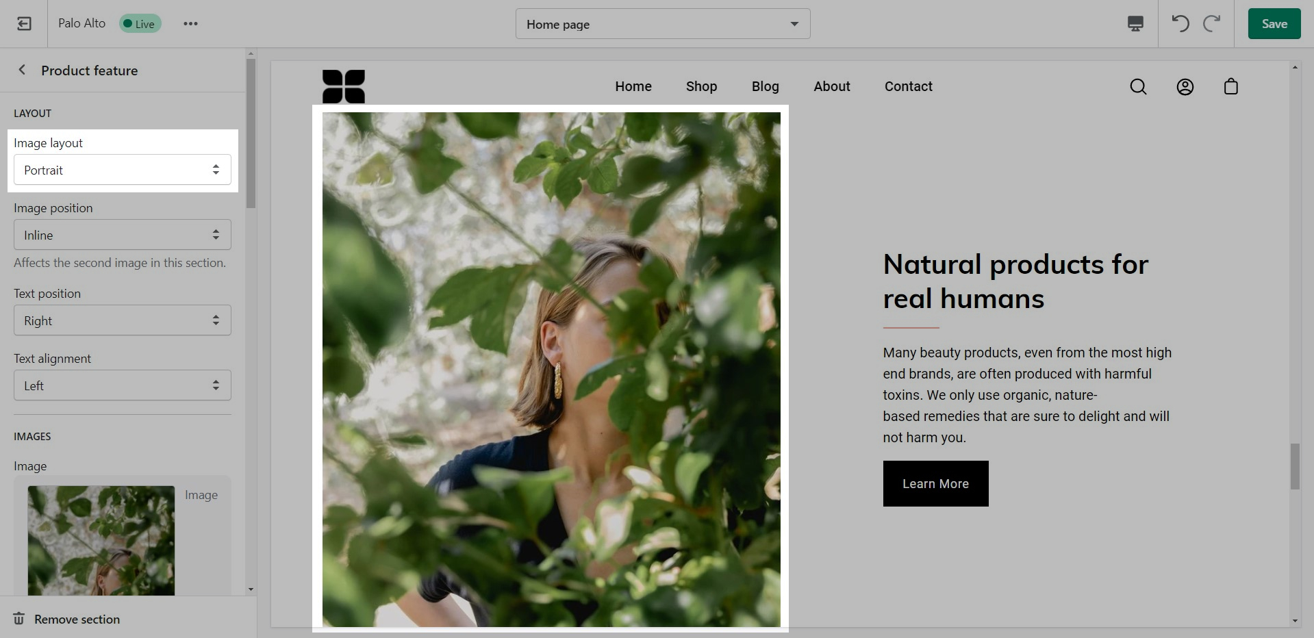
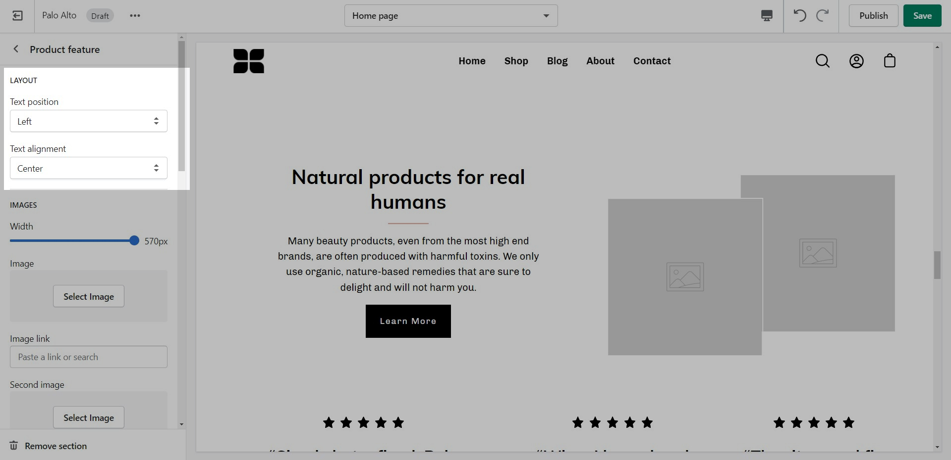
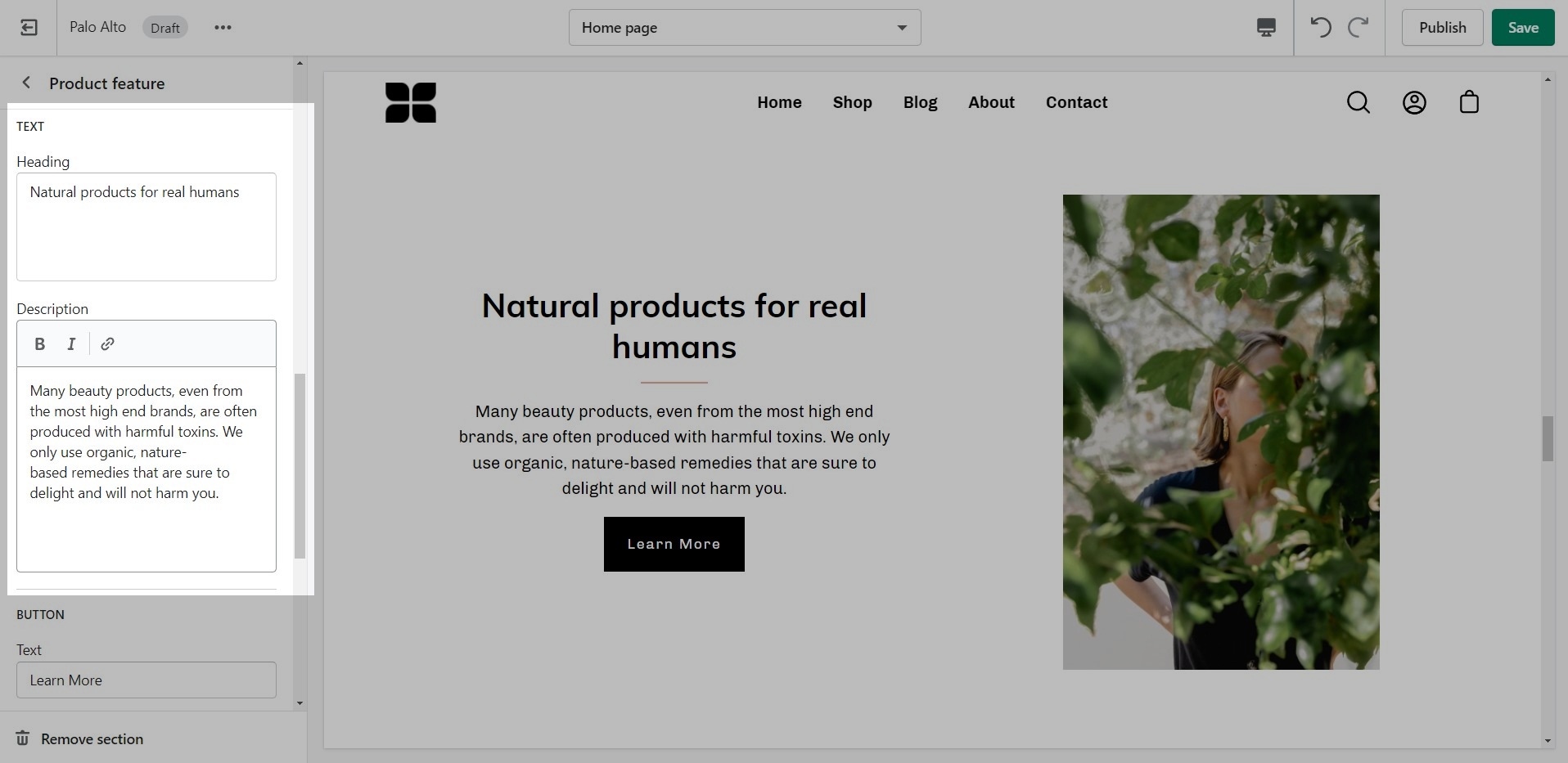
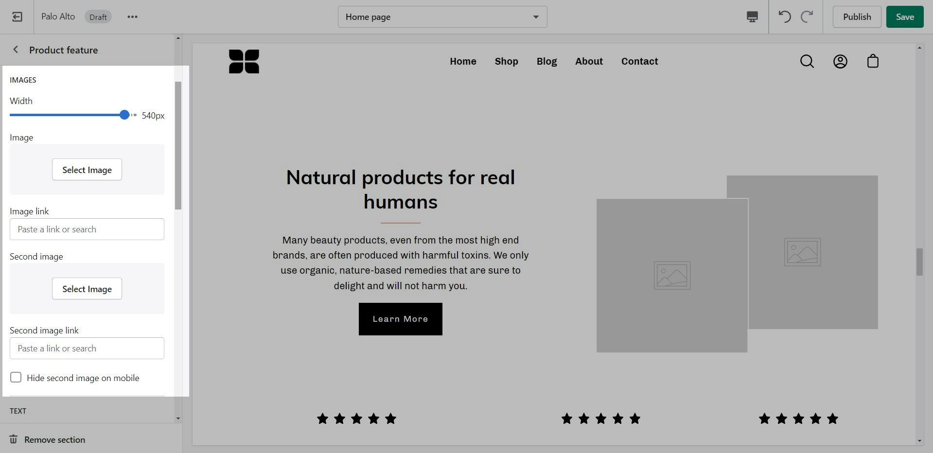
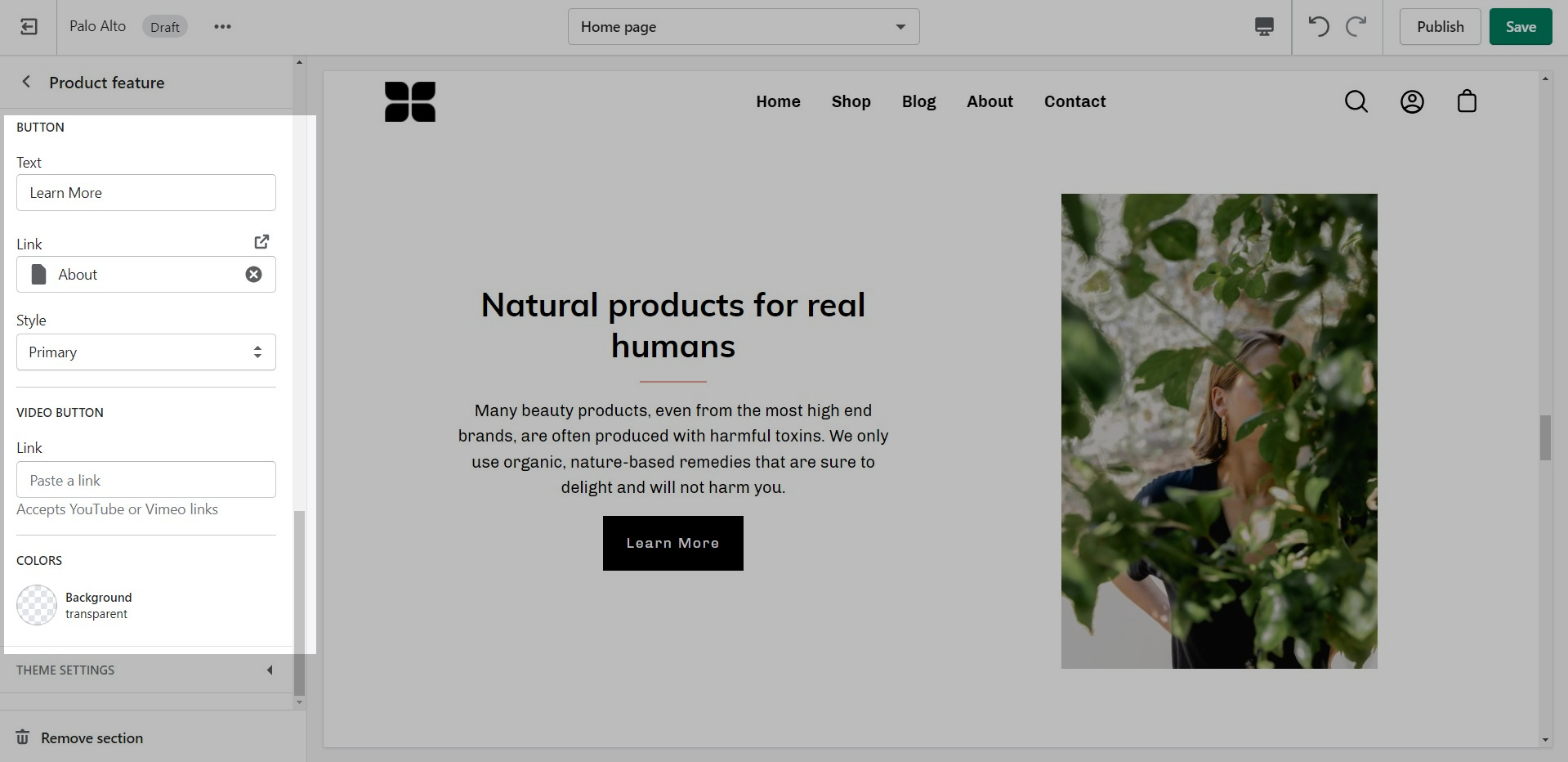
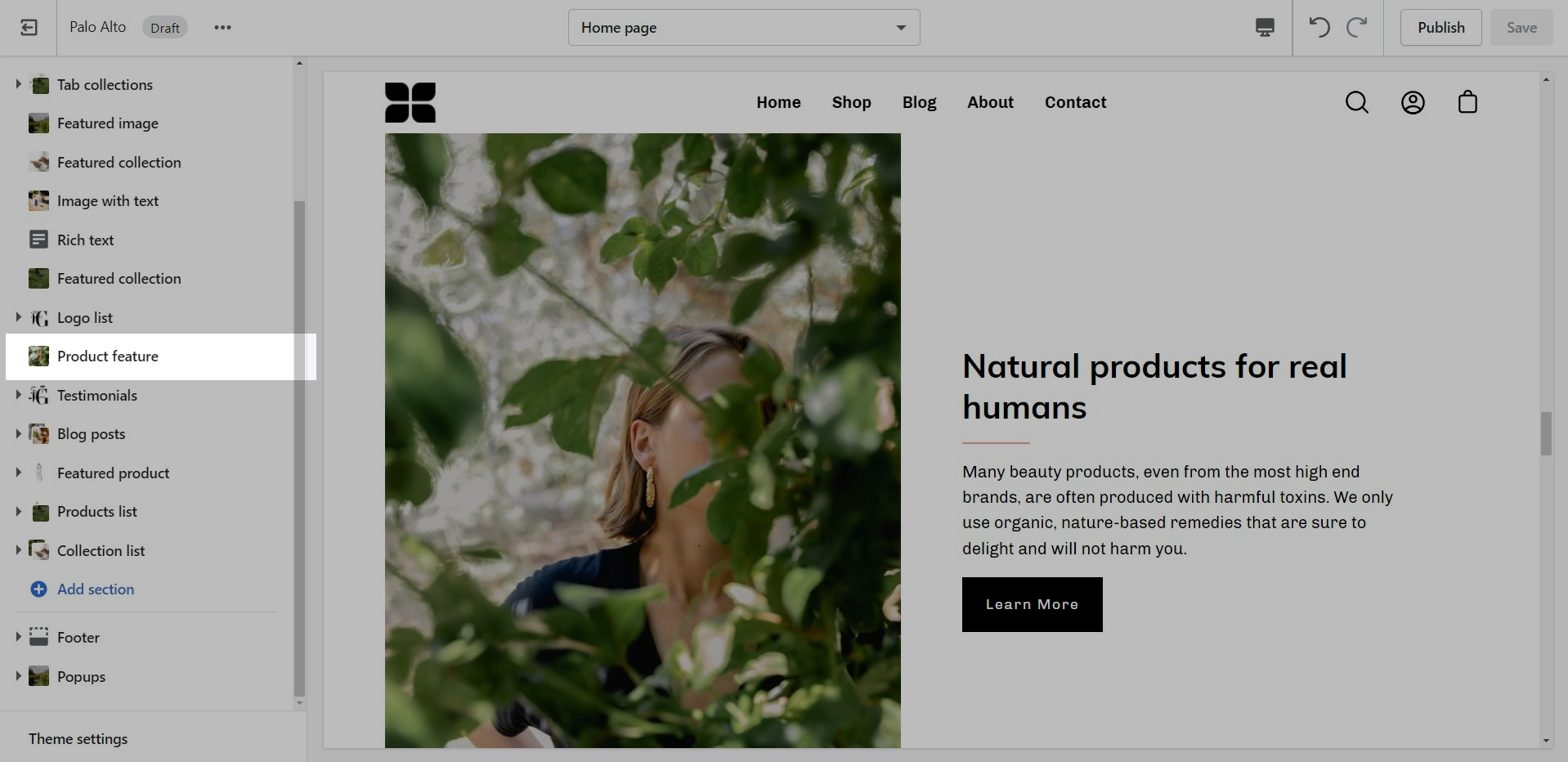
The 'Product Feature' section creates a split view of text and images.
Use one or more images to create a unique design.
Showcase up to three collections on your store pages.
Add blocks by clicking on the small arrow next to the section then clicking 'Add block'.
Change the width and the heading of this section from the Section settings.
At the bottom of all the section settings, you can find a tab with some more features.
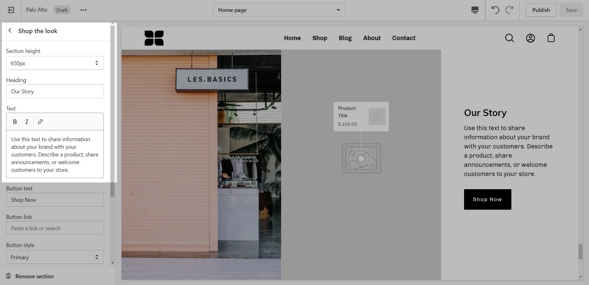
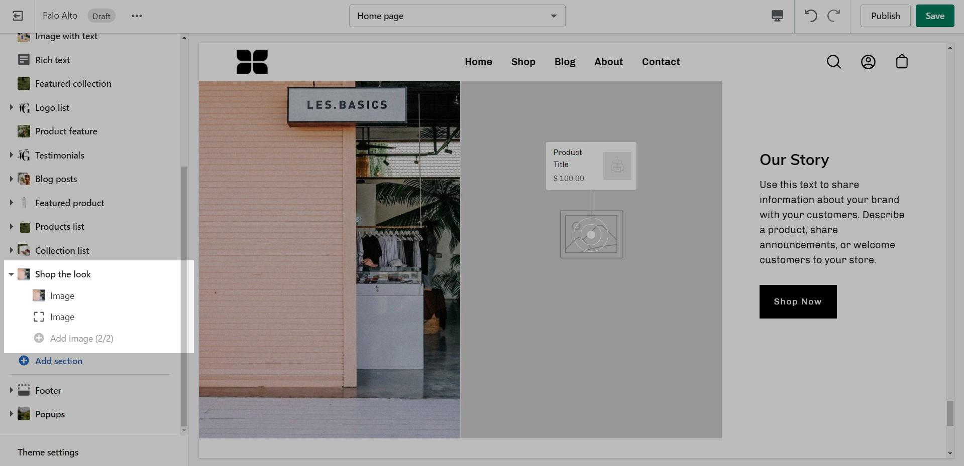
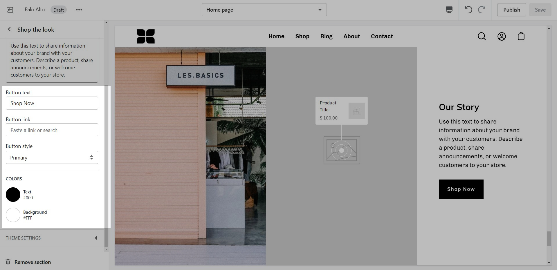
'Shop the look' allows you to use images and dots to highlight specific points of your products. Use this section to create a unique way of getting your customer's attention!
Add blocks by clicking on the small arrow next to the section then clicking 'Add block'.
The individual blocks of this section are images. From their own settings, you can gain access to add different images as well as moving the dots to different places.

Remove Powered by Shopify credit in Footer
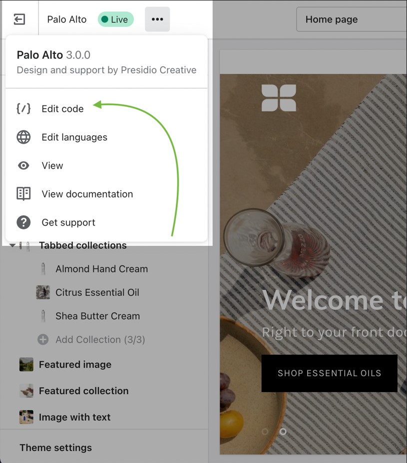
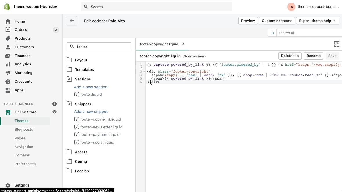
Click on the ellipses (three dots) icon at the top of the Theme Editor to view the theme actions and choose Edit code:
Open the 'footer-copyright.liquid' file from the Snippets folder.
Place an opening ({% comment %}) comment tag before the powered_by_link span.
Place a closing ({% endcomment %}) comment tag after the

powered_by_linkSave the changes.

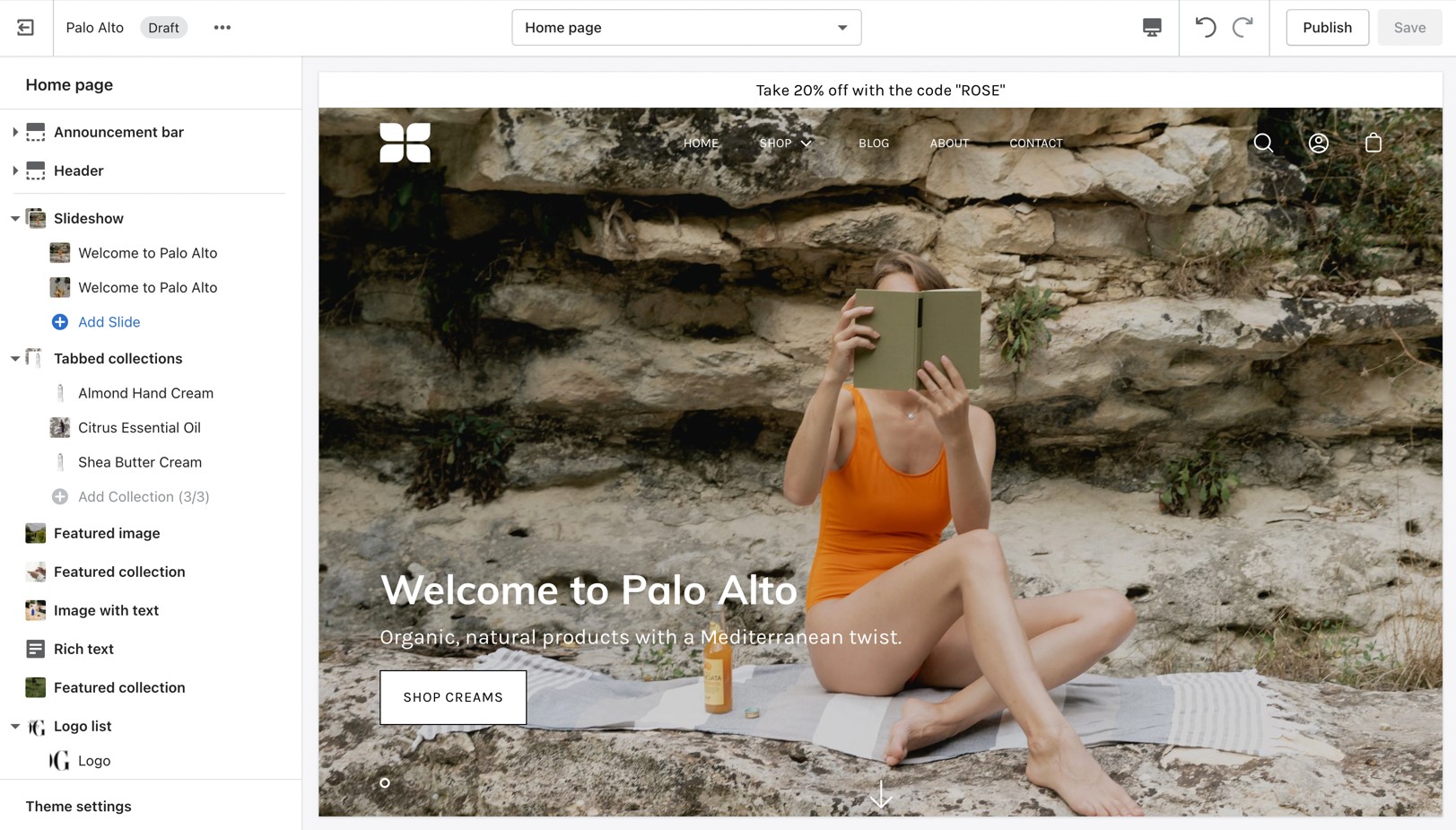
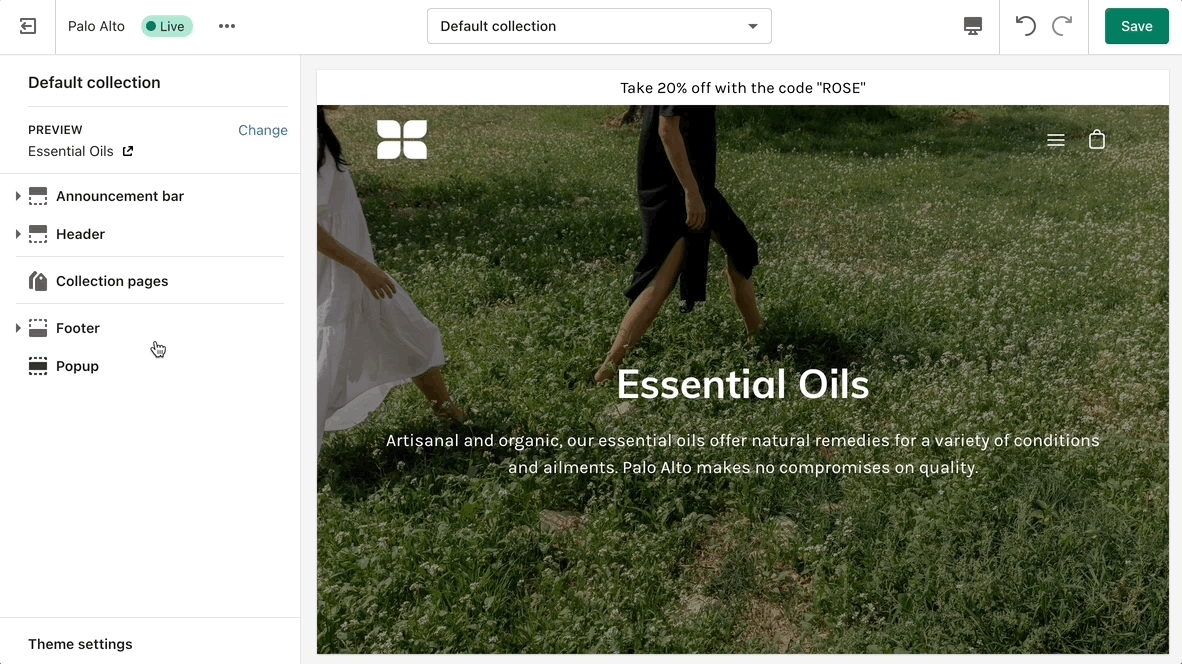
Customize your store using these Palo Alto sections
Palo Alto comes complete with 20+ professional theme sections to help you merchandise your online store. Sections can be added to any page on your store.
Discover the complete range of sections and their settings. Experiment by adding different types of sections and section blocks to the homepage and the other pages within your store.
These sections can be placed on any page including:
Homepage
Product pages
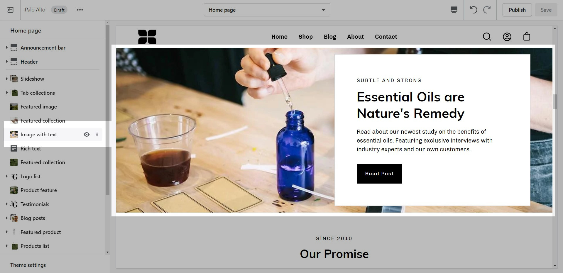
To find the primary settings for each section, click on the section name to view the settings panel. These settings control the elements of the section.
Wider desktops screens will display the settings panel on the right side of your screen.
Scroll towards the bottom, above Footer and Popups. Choose Add section:
Navigate to any product page or choose the default product template. Use Add section located above Footer and Popups:
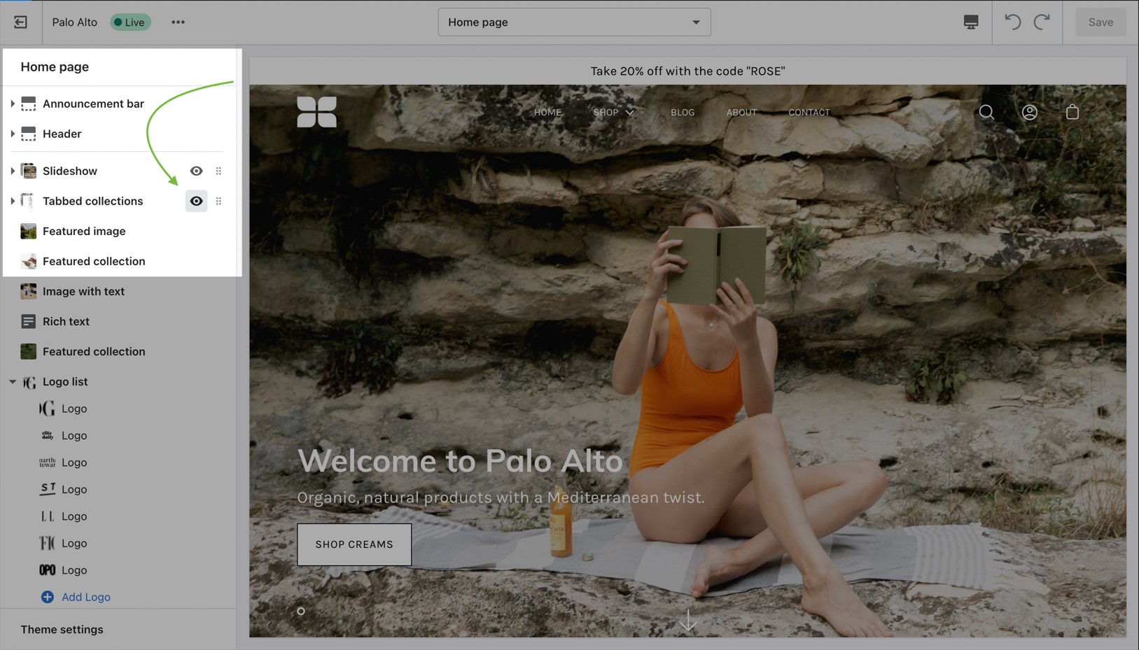
Use the eye icon next to the section title to toggle the display of the entire section:
Tip - Blocks have their own eye icon, be sure to select the section eye icon to toggle display of the entire section.
Use the handle icon which is located next to the eye icon to drag a section and drop it in a new position:
Sections contain content and settings. Experiment with different section types to add rich content on the homepage and all pages within your site. Use the settings to adjust behavior and layout.
Helpful tip, when adding new sections as they appear at the bottom of your section list.
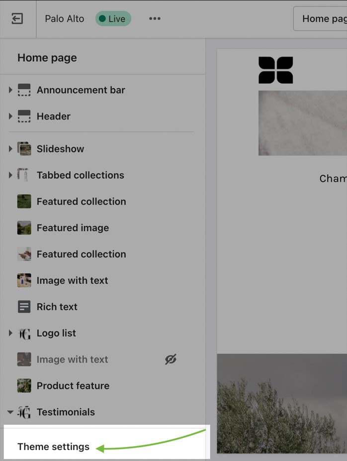
Under each section settings (as well as under all sections inside the Theme Editor) you will find a button to the Theme Settings. These are a number of global settings grouped together for ease of use. Some section settings are also placed under the Theme Settings so if you're looking for a setting you feel are not finding, it might be under this little tab:
Palo Alto is built to use Shopify's Online Store 2.0 (OS2) which allows you to use all of Palo Alto's 20+ sections everywhere including the Homepage, Product pages, Collections, Pages, Blogs, Cart page, Search page, and more. Endless flexibility options for your store.
Shopify's Online Store 2.0 also includes Collection filtering tools, unique content using Metafields (dynamic source), easy to create custom templates, improved storefront performance. Palo Alto uses all the features included in Shopify's new modern platform.
Shopify's platform change completely remodels how you can use your store. Start with learning the features and changes Shopify has introduced:
Collection pages and Collection list
Blog index and Blog posts
Shopify pages
404 error page, Search page, Password page
Cart page
Another method is to use Shopify's insert dynamic source option (metafields) to blocks and then customize content for each product in your product setup.
Navigate to any page on your site or choose any template from the top drop-down. Choose Add section, which is located above Footer and Popups on the left panel: